In this Flutter buttonBar widget example tutorial we will learn how to use a ButtonBar in flutter and its properties in detail with example.
Flutter ButtonBar
Flutter button bar is used to arrange buttons in a particular order. We can use any button like FlatButton or Raised button etc., inside this widget. When the directionality is set as ltr ( left to right ) it will arrange the buttons from left to right. If directionality is set as rtl ( right to left ) it will arrange the buttons from right to left. When the button bar width exceeds the maximum with it will align the buttons in a column. The spacing between the buttons can be changed using the button padding property.
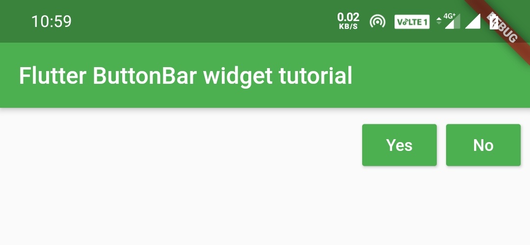
Flutter ButtonBar Example
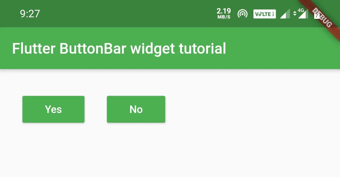
ButtonBar(
              children: [
                RaisedButton(
                  child: Text("Yes"),
                  textColor: Colors.white,
                  color: Colors.green,
                  onPressed: (){},
                ),
                RaisedButton(
                  child: Text("No"),
                  textColor: Colors.white,
                  color: Colors.green,
                  onPressed: (){},
                ),
              ],
            )
Output:
ButtonBar Properties
Flutter ButtonBar has a few properties for arranging the buttons inside it. Let’s see the constructor of the Button Bar.
ButtonBar(
{Key key,
MainAxisAlignment alignment,
MainAxisSize mainAxisSize,
ButtonTextTheme buttonTextTheme,
double buttonMinWidth,
double buttonHeight,
EdgeInsetsGeometry buttonPadding,
bool buttonAlignedDropdown,
ButtonBarLayoutBehavior layoutBehavior,
VerticalDirection overflowDirection,
double overflowButtonSpacing,
List<Widget> children: const []
})
Let’s see some properties of flutter button bar with example.
alignment
We will use this property to align the buttons in the button bar. The alignment takes MainAxisAlignment class as a value that has constants like start, center, end, spaceEvenly, spaceBetween, spaceAround. I am showing examples for start and center. Try the rest for yourself.
alignment of the button bar is similar to the alignment of flutter row and column widgets.
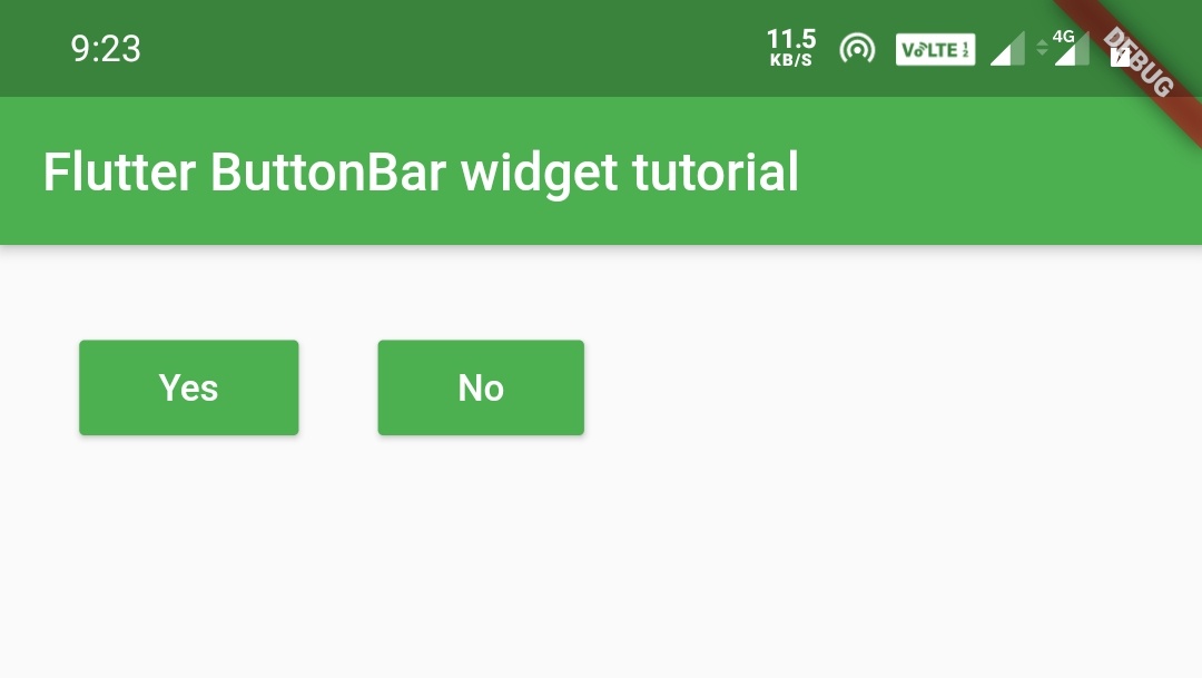
start
We will use this to align all the buttons inside the button bar to the left/start.
ButtonBar(
              alignment: MainAxisAlignment.start,
              buttonPadding:EdgeInsets.symmetric(
                   horizontal: 30,
                   vertical: 10
              ),
              children: [
                RaisedButton(
                  child: Text("Yes"),
                  textColor: Colors.white,
                  color: Colors.green,
                  onPressed: (){},
                ),
                RaisedButton(
                  child: Text("No"),
                  textColor: Colors.white,
                  color: Colors.green,
                  onPressed: (){},
                ),
              ],
            )
Output:
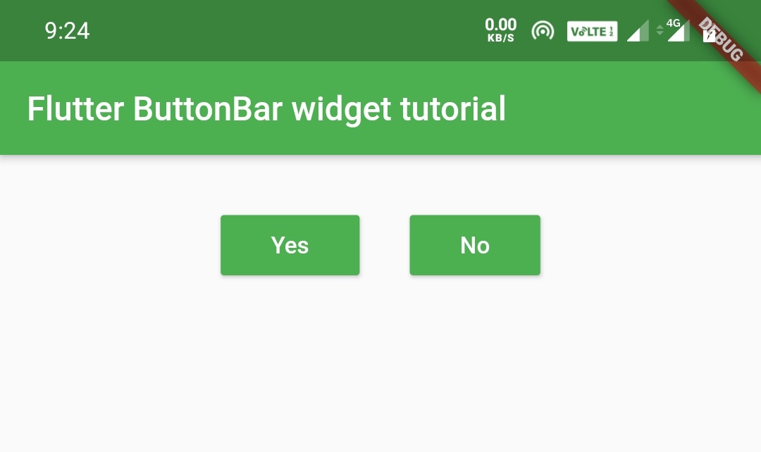
center
We will use this to align the buttons in the button bar to the center.
ButtonBar(
              alignment: MainAxisAlignment.center,
              buttonPadding:EdgeInsets.symmetric(
                   horizontal: 30,
                   vertical: 10
              ),
              children: [
                RaisedButton(
                  child: Text("Yes"),
                  textColor: Colors.white,
                  color: Colors.green,
                  onPressed: (){},
                ),
                RaisedButton(
                  child: Text("No"),
                  textColor: Colors.white,
                  color: Colors.green,
                  onPressed: (){},
                ),
              ],
            )
Output:
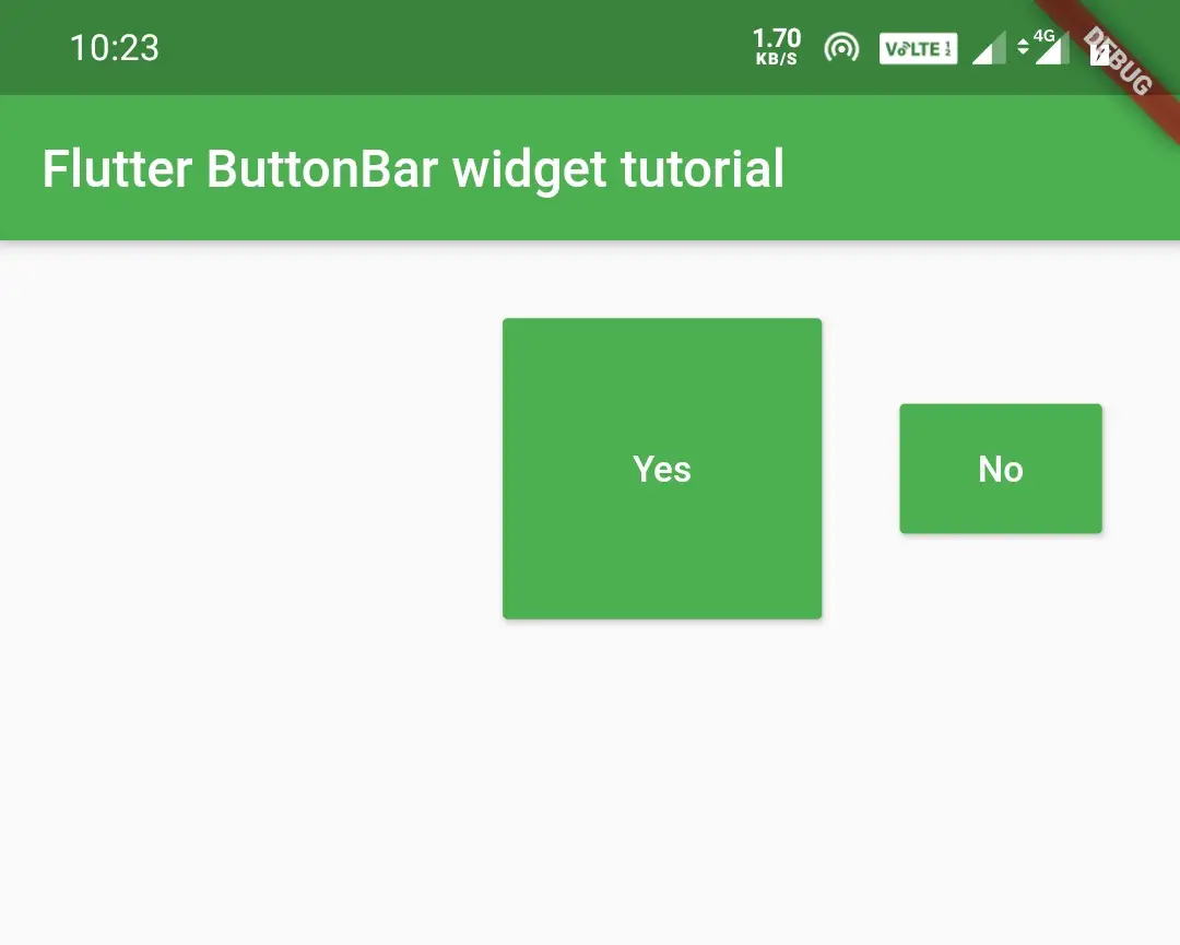
mainAxisSize
This is used to define the size of the main axis. It takes MainAxisSize class which has two constants min & max.
min
ButtonBar(
              buttonPadding:EdgeInsets.symmetric(
                  horizontal: 30,
                  vertical: 10
              ),
              mainAxisSize: MainAxisSize.min,
              children: [
                RaisedButton(
                  child: Text("Yes"),
                  textColor: Colors.white,
                  color: Colors.green,
                  onPressed: (){},
                ),
                RaisedButton(
                  child: Text("No"),
                  textColor: Colors.white,
                  color: Colors.green,
                  onPressed: (){},
                ),
              ],
            )
Output:
max
ButtonBar(
              buttonPadding:EdgeInsets.symmetric(
                  horizontal: 30,
                  vertical: 10
              ),
              mainAxisSize: MainAxisSize.max,
              children: [
                RaisedButton(
                  child: Text("Yes"),
                  textColor: Colors.white,
                  color: Colors.green,
                  onPressed: (){},
                ),
                RaisedButton(
                  child: Text("No"),
                  textColor: Colors.white,
                  color: Colors.green,
                  onPressed: (){},
                ),
              ],
            )
Output:

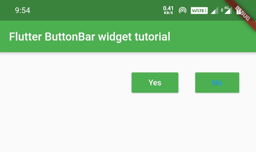
we will use this property to apply text color to buttons inside the button bar. It takes ButtonTextTheme class as a value which has two constants primary and accent.
If we don’t define text color for a button inside a button bar it will take the color defined in the buttonTextTheme property value of the button bar. In the below example the second button has no text color defined which will take accent as the text color as defined in the button bar.
ButtonBar(
              buttonPadding:EdgeInsets.symmetric(horizontal: 30,vertical: 10),
              buttonMinWidth: 100,
              children: [
                RaisedButton(
                  child: Text("Yes"),
                  textColor: Colors.white,
                  color: Colors.green,
                  onPressed: (){},
                ),
                RaisedButton(
                  child: Text("No"),
                  color: Colors.green,
                  onPressed: (){},
                ),
              ],
            )
Output:
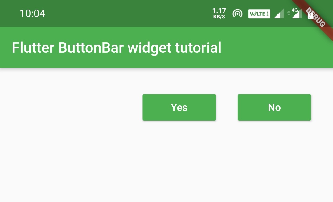
We will use this property to define the minimum width of the buttons inside the button bar.
ButtonBar(
           buttonPadding:EdgeInsets.symmetric(
               horizontal: 30,
               vertical: 10
           ),
           buttonMinWidth: 100,
           children: [
            RaisedButton(
              child: Text("Yes"),
              textColor: Colors.white,
              color: Colors.green,
              onPressed: (){},
            ),
            RaisedButton(
              child: Text("No"),
              color: Colors.green,
              onPressed: (){},
            ),
          ],
        )
Output:
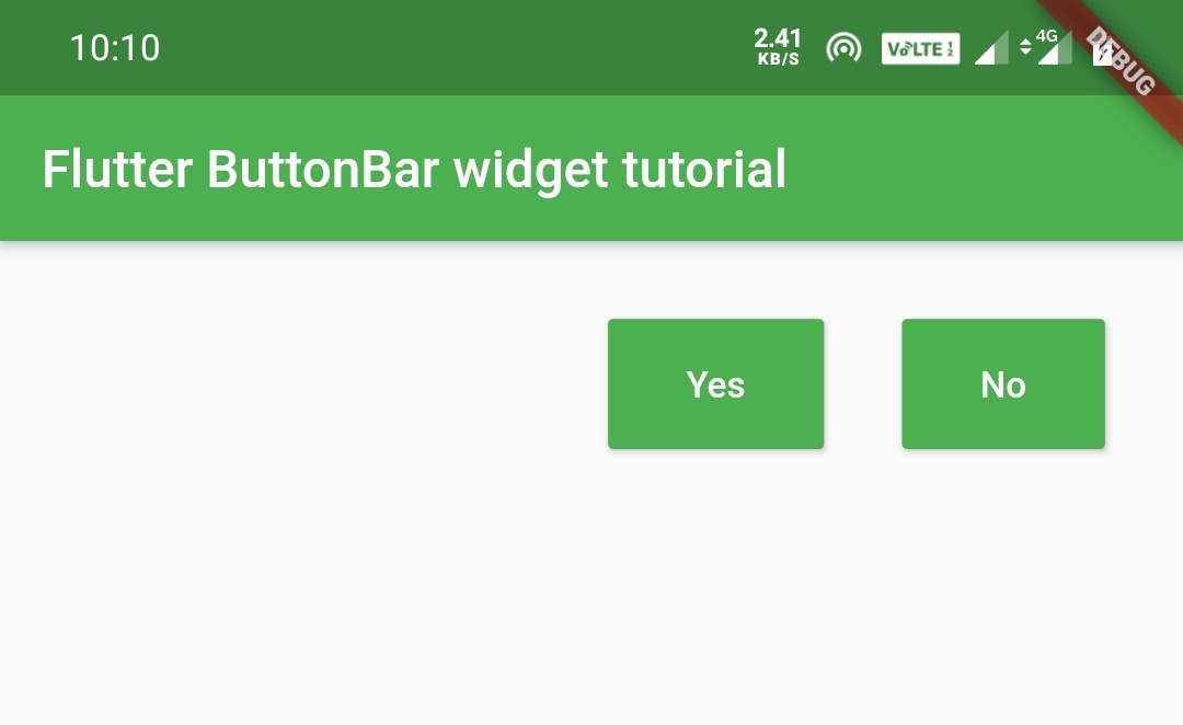
We will use this property to define the height of the buttons inside the button bar.
ButtonBar(
           buttonPadding:EdgeInsets.symmetric(
               horizontal: 30,
               vertical: 10
           ),
           buttonHeight: 50,
           children: [
            RaisedButton(
              child: Text("Yes"),
              textColor: Colors.white,
              color: Colors.green,
              onPressed: (){},
            ),
            RaisedButton(
              child: Text("No"),
              color: Colors.green,
              onPressed: (){},
            ),
          ],
        )
Output:
We will use this property to apply padding to buttons inside the button bar. It takes EdgeInsets as value. The buttonPadding value is applicable to a button inside a button bar if that button doesn’t have a padding value and will not be applicable if the button has padding defined.
ButtonBar(
              buttonPadding:EdgeInsets.symmetric(horizontal: 30,vertical: 10),
              buttonHeight: 50,
              children: [
                RaisedButton(
                  child: Text("Yes"),
                  textColor: Colors.white,
                  color: Colors.green,
                  padding: EdgeInsets.all(50),
                  onPressed: (){},
                ),
                RaisedButton(
                  child: Text("No"),
                  textColor: Colors.white,
                  color: Colors.green,
                  onPressed: (){},
                ),
              ],
            )
Output:
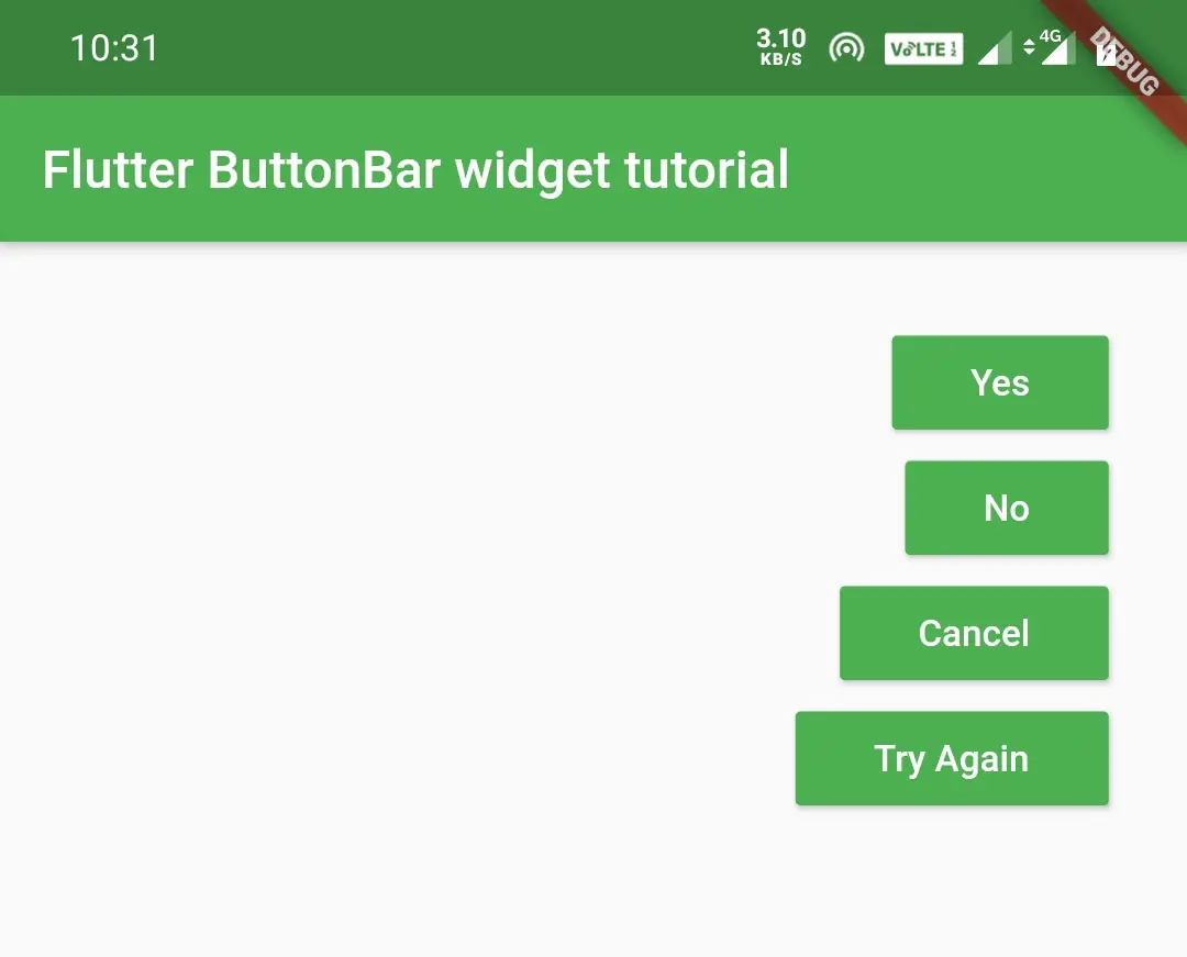
overflowDirection
We will use this to define which directions should the buttons flow if the horizontal space fills with buttons and there is no more space left for new buttons. It takes VerticalDirection class as a value that has two constants up and down.
down
Aligns the overflow buttons in the downward direction.
ButtonBar(
              buttonPadding:EdgeInsets.symmetric(horizontal: 30,vertical: 10),
              overflowDirection: VerticalDirection.down,
              children: [
                RaisedButton(
                  child: Text("Yes"),
                  textColor: Colors.white,
                  color: Colors.green,
                  onPressed: (){},
                ),
                RaisedButton(
                  child: Text("No"),
                  textColor: Colors.white,
                  color: Colors.green,
                  onPressed: (){},
                ),
                RaisedButton(
                  child: Text("Cancel"),
                  textColor: Colors.white,
                  color: Colors.green,
                  onPressed: (){},
                ),
                RaisedButton(
                  child: Text("Try Again"),
                  textColor: Colors.white,
                  color: Colors.green,
                  onPressed: (){},
                ),
              ],
            )
Output:
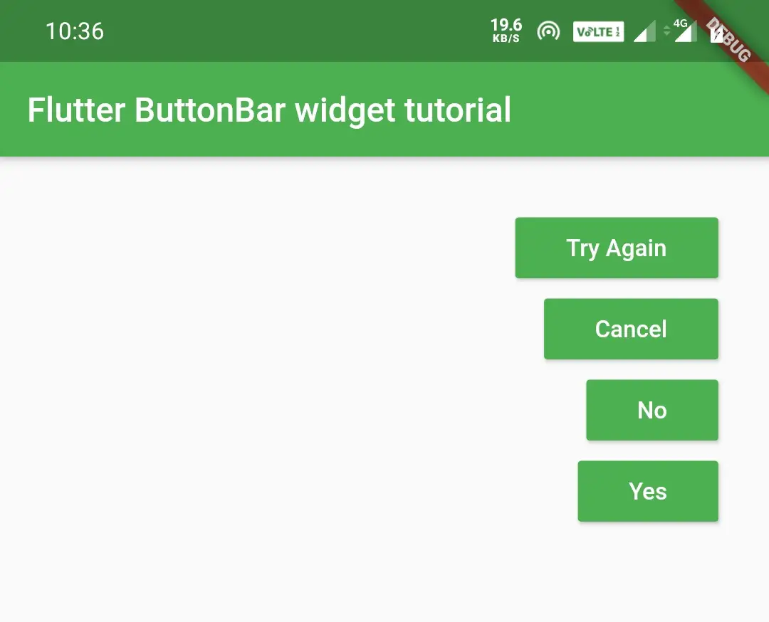
up
Aligns the overflow buttons in the upward direction.
ButtonBar(
              buttonPadding:EdgeInsets.symmetric(horizontal: 30,vertical: 10),
              overflowDirection: VerticalDirection.up,
              children: [
                RaisedButton(
                  child: Text("Yes"),
                  textColor: Colors.white,
                  color: Colors.green,
                  onPressed: (){},
                ),
                RaisedButton(
                  child: Text("No"),
                  textColor: Colors.white,
                  color: Colors.green,
                  onPressed: (){},
                ),
                RaisedButton(
                  child: Text("Cancel"),
                  //textColor: Colors.white,
                  color: Colors.green,
                  onPressed: (){},
                ),
                RaisedButton(
                  child: Text("Try Again"),
                  textColor: Colors.white,
                  color: Colors.green,
                  onPressed: (){},
                ),
              ],
            )
Output:
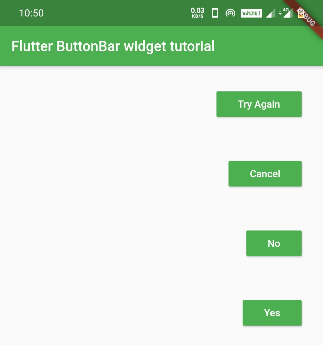
overflowButtonSpacing
We will use this property to define the space that we want to give between the buttons when they overflow.
ButtonBar(
              buttonPadding:EdgeInsets.symmetric(horizontal: 30,vertical: 10),
              overflowDirection: VerticalDirection.down,
              overflowButtonSpacing: 50,
              children: [
                RaisedButton(
                  child: Text("Yes"),
                  textColor: Colors.white,
                  color: Colors.green,
                  onPressed: (){},
                ),
                RaisedButton(
                  child: Text("No"),
                  textColor: Colors.white,
                  color: Colors.green,
                  onPressed: (){},
                ),
                RaisedButton(
                  child: Text("Cancel"),
                  //textColor: Colors.white,
                  color: Colors.green,
                  onPressed: (){},
                ),
                RaisedButton(
                  child: Text("Try Again"),
                  textColor: Colors.white,
                  color: Colors.green,
                  onPressed: (){},
                ),
              ],
            )
Output:
That’s all about flutter button bar example. Let’s catch up with some other cool flutter tutorial in the future. Have a great day!!
Do like and share and comment if you find this post helpful. Thank you!!
Reference: Flutter Official Documentation


Leave a Reply