Flutter TextField widget
TextField in flutter is nothing but a widget used to accept input from the user. While designing applications we need to accept input from the users. Screens like registration and login require textfields to get the user info for validating and proceeding further. We can control the type of text to be entered using some keyboard properties.
In this tutorial, you will learn how to create and use a textfield widget in flutter with example. There are many properties available for customizing the style of the textfiled.
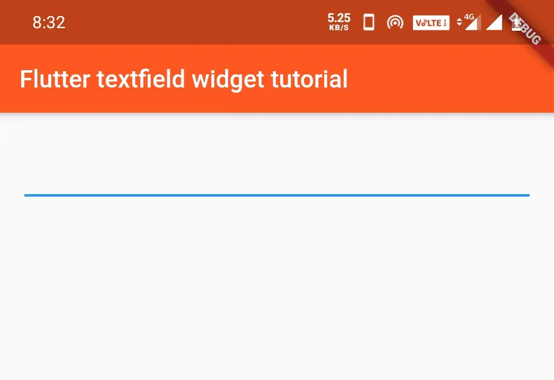
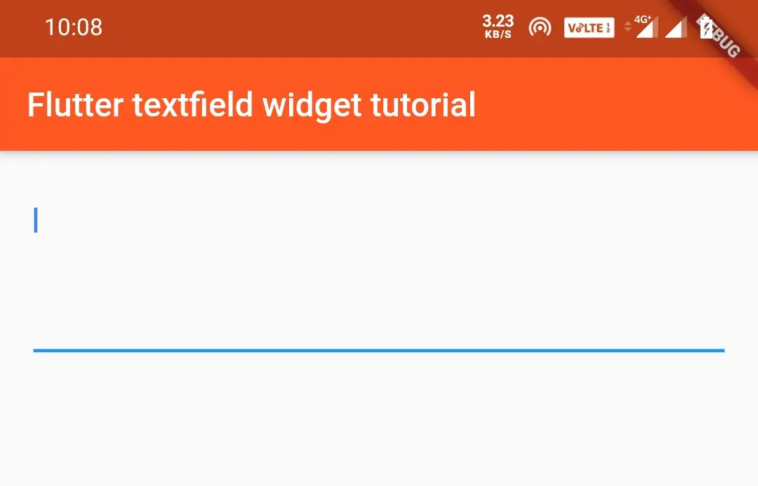
Basic TextField
Displays a basic TextField.
Container(
          padding: EdgeInsets.all(20),
            child:TextField()
        )
Output:
TextField autoFocus
Setting this value to true will sets focus to the TextField automatically when the screen loads.
Container(
          padding: EdgeInsets.all(20),
            child:TextField(
              autofocus: true,
            )
            )
Enabling/Disabling TextField
Setting enabled to false will make the TextField disabled. You cannot input data into TextField. By default, the value is true, which is enabled.
Container(
          padding: EdgeInsets.all(20),
            child:TextField(
              enabled: false,
            )
            )
TextField readOnly
ReadOnly is similar to disabled TextField, but it will give callbacks like onTap().
Container(
          padding: EdgeInsets.all(20),
            child:TextField(
              readOnly: true,
            )
            )
How To Create TextField In Flutter ?
We can create a textfield in flutter by calling the constructor of textfield class. The constructor has no required properties so we can call the constructor without providing any parameters.
const TextField(

    {Key? key,
    TextEditingController? controller,
    FocusNode? focusNode,
    InputDecoration? decoration,
    TextInputType? keyboardType,
    TextInputAction? textInputAction,
    TextCapitalization textCapitalization,
    TextStyle? style,
    StrutStyle? strutStyle,
    TextAlign textAlign,
    TextAlignVertical? textAlignVertical,
    TextDirection? textDirection,
    bool readOnly,
    ToolbarOptions? toolbarOptions,
    bool? showCursor,
    bool autofocus,
    String obscuringCharacter,
    bool obscureText,
    bool autocorrect,
    SmartDashesType? smartDashesType,
    SmartQuotesType? smartQuotesType,
    bool enableSuggestions,
    int? maxLines,
    int? minLines,
    bool expands,
    int? maxLength,
    @Deprecated('Use maxLengthEnforcement parameter which provides more specific ' 'behavior related to the maxLength limit. ' 'This feature was deprecated after v1.25.0-5.0.pre.') bool maxLengthEnforced,
    MaxLengthEnforcement? maxLengthEnforcement,
    ValueChanged<String>? onChanged,
    VoidCallback? onEditingComplete,
    ValueChanged<String>? onSubmitted,
    AppPrivateCommandCallback? onAppPrivateCommand,
    List<TextInputFormatter>? inputFormatters,
    bool? enabled,
    double cursorWidth,
    double? cursorHeight,
    Radius? cursorRadius,
    Color? cursorColor,
    BoxHeightStyle selectionHeightStyle,
    BoxWidthStyle selectionWidthStyle,
    Brightness? keyboardAppearance,
    EdgeInsets scrollPadding,
    DragStartBehavior dragStartBehavior,
    bool enableInteractiveSelection,
    TextSelectionControls? selectionControls,
    GestureTapCallback? onTap,
    MouseCursor? mouseCursor,
    InputCounterWidgetBuilder? buildCounter,
    ScrollController? scrollController,
    ScrollPhysics? scrollPhysics,
    Iterable<String>? autofillHints,
    String? restorationId,
    bool enableIMEPersonalizedLearning}

)
Styling Flutter TextField
For styling a TextField widget, we have to use decoration property which takes InputDecoration.This class has a constructor with many arguments. Let’s discuss few important properties as we cant discuss all of them in one article.
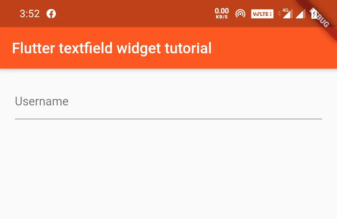
Hint, Label and Helper Text
hintText
The hint is nothing but a placeholder. It is used to inform the user what information should be entered in the textfield. It disappears when TextField is focused.
Eg: Email, Username, Password, etc.
Container(
          padding: EdgeInsets.all(20),
            child:TextField(
              decoration: InputDecoration(
                hintText: "Username",
              ),
            )
        )
Output:
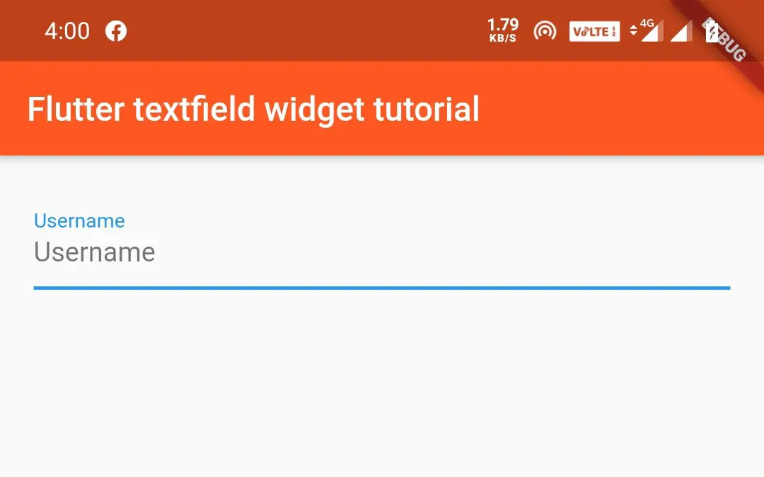
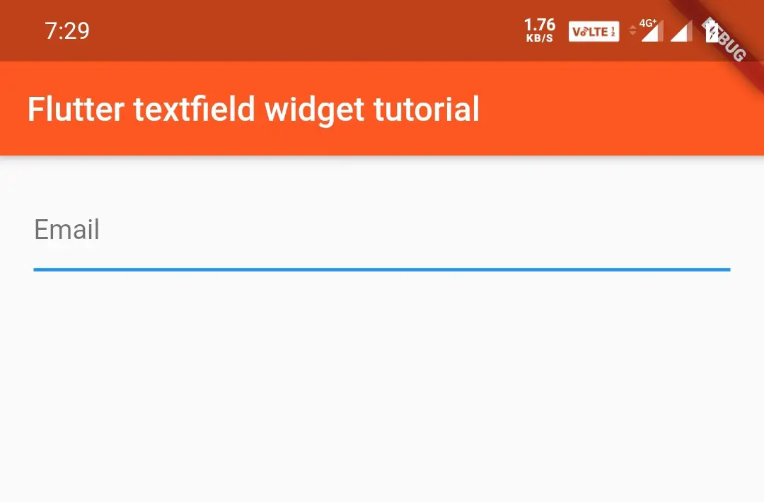
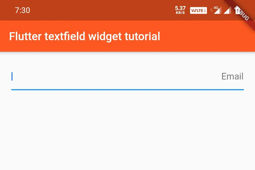
labelText
Label is similar to hint, but it will hide the hint until the TextField is focused. when the user touches the TextField, the label will go upward and the hint will appear.
Container(
          padding: EdgeInsets.all(20),
            child:TextField(
              decoration: InputDecoration(
                hintText: "Username",
                labelText: "Username",
              ),
            )
        )
Output:
helperText
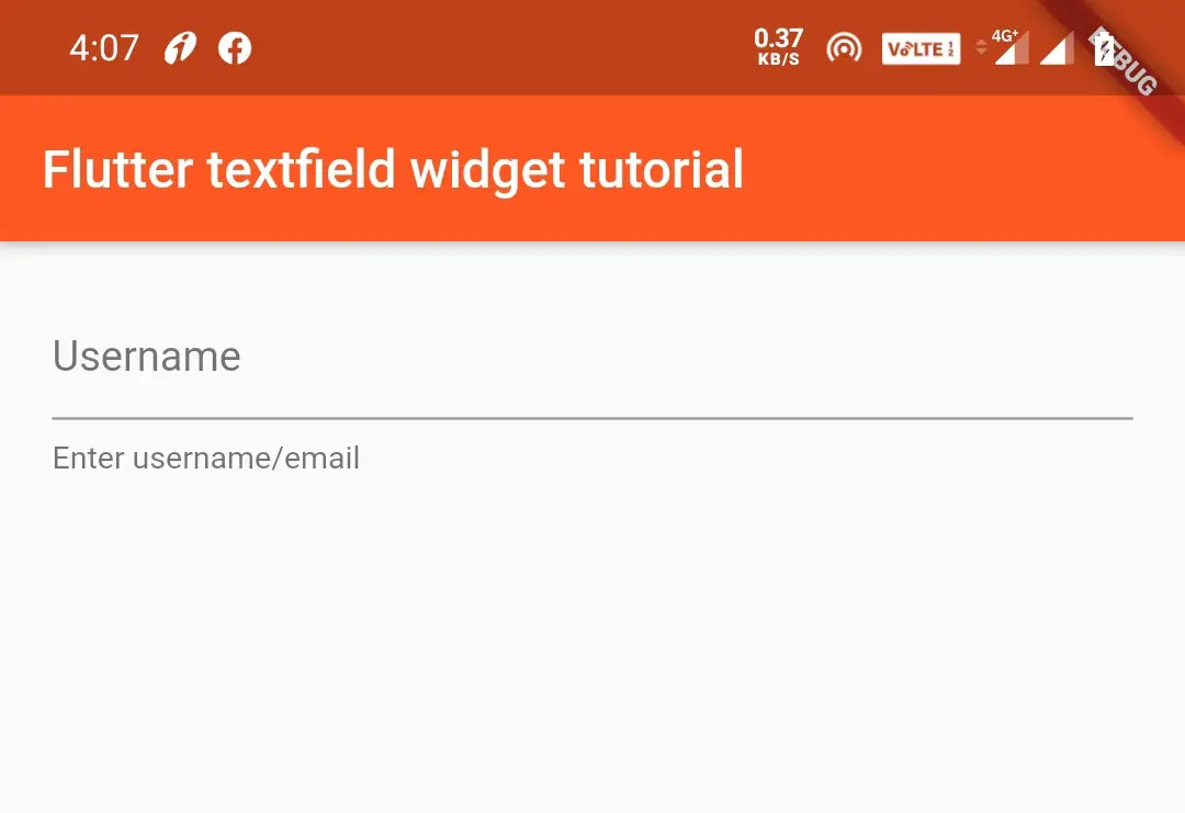
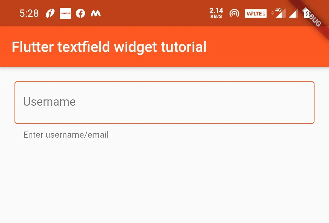
If we want don’t want to display a label, but want to display a message we can use helperText.
Container(
          padding: EdgeInsets.all(20),
            child:TextField(
              decoration: InputDecoration(
                hintText: "Username",
                helperText: "Enter username/email "
              ),
            )
        )
Output:
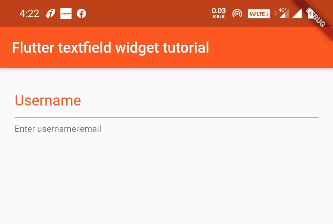
we can style the hint, label, and helper using hintStyle, labelStyle, and helperStyle respectively. All three properties take TextStyle as value. So I’m just styling the hint. You try styling label and helper text by urself using TextStyle.
hintStyle
Container(
          padding: EdgeInsets.all(20),
            child:TextField(
              decoration: InputDecoration(
                hintText: "Username",
                hintStyle: TextStyle(
                  color: Colors.deepOrange,
                  fontSize: 20
                ),
                helperText: "Enter username/email "
              ),
            )
        )
Output:
Border
No border
If we don’t want the border under the text we can do so by using below code snippet.
Container(
          padding: EdgeInsets.all(20),
            child:TextField(
              decoration: InputDecoration(
                border: InputBorder.none
              ),
            )
        )
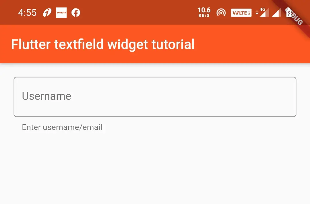
Rectangular border
To give a rectangular border to TextField we can do it by using border property.
Container(
          padding: EdgeInsets.all(20),
            child:TextField(
              decoration: InputDecoration(
                border: OutlineInputBorder(),
                hintText: "Username",
                helperText: "Enter username/email ",
              ),
            )
        )
Output:
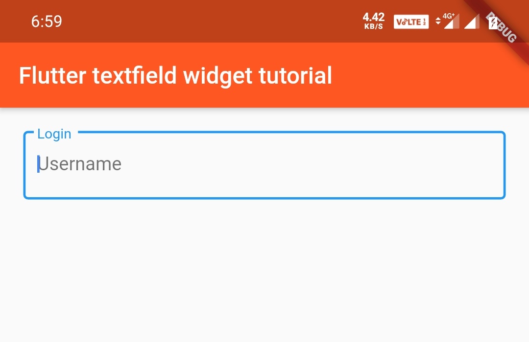
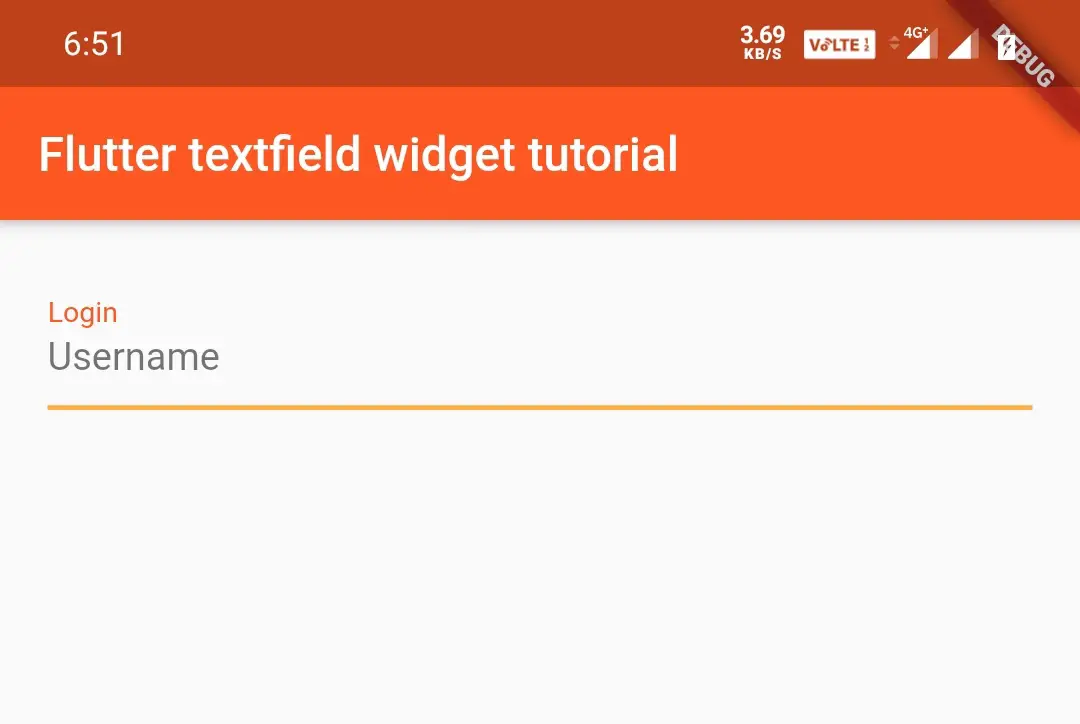
Rectangular border with label
Container(
          padding: EdgeInsets.all(20),
            child:TextField(
              decoration: InputDecoration(
                border: OutlineInputBorder(),
                hintText: "Username",
                labelText: "Login",
              ),
            )
            )
Output:
Colouring the border
We can change the border color of a rectangular border by using enabledBorder and focusedBorder.The enabledBorder applies border color when the page loads, which means when there is no focus. When TextField has focused the focusedBorder changes the border color defined in that method.
Container(
          padding: EdgeInsets.all(20),
            child:TextField(
              decoration: InputDecoration(
                border: InputBorder.none,
                enabledBorder: OutlineInputBorder(borderSide: BorderSide(color: Colors.black54)),
                focusedBorder: OutlineInputBorder(borderSide: BorderSide(color: Colors.deepOrange)),
                hintText: "Username",
                helperText: "Enter username/email ",
              ),
            )
        )
Output:
To apply color to the default border you have to wrap the TextField widget inside the new Theme()
Container(
          padding: EdgeInsets.all(20),
            child:new Theme(
                    data: new ThemeData(
                    primaryColor: Colors.orangeAccent,
                    primaryColorDark: Colors.orange,
                    ),
              child:TextField(
              decoration: InputDecoration(
                hintText: "Username",
                labelText: "Login",
                labelStyle: TextStyle(color: Colors.deepOrange)
              ),
            )
            )
        )
Output:
Adding Icons & Text
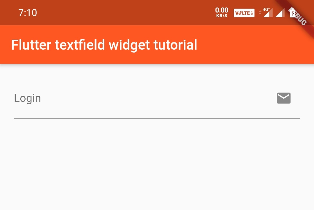
We can use Icon, prefixIcon, and SuffixIcon for adding icons to the text field. In the same way, we can use prefixText and suffixText to add text to the text. We can also add a widget at the start/end of the textfield using prefix/suffix. Let’s see them with examples.
Icon
 Container(
          padding: EdgeInsets.all(20),
            child:TextField(
              decoration: InputDecoration(
                hintText: "Username",
                labelText: "Login",
                icon: Icon(Icons.email)
              ),
            )
            )
Output:
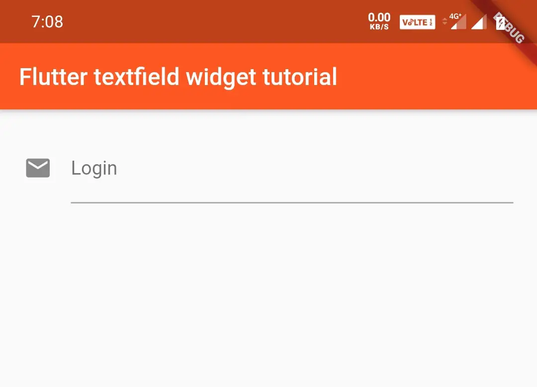
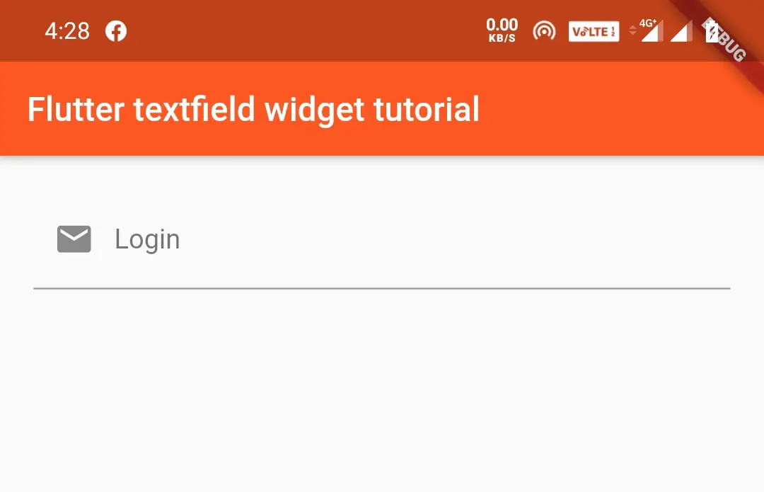
prefixIcon
Container(
          padding: EdgeInsets.all(20),
            child:TextField(
              decoration: InputDecoration(
                hintText: "Username",
                labelText: "Login",
                prefixIcon: Icon(Icons.email)
              ),
            )
            )
Output:
suffixIcon
Container(
          padding: EdgeInsets.all(20),
            child:TextField(
              decoration: InputDecoration(
                hintText: "Username",
                labelText: "Login",
                suffixIcon: Icon(Icons.email)
              ),
            )
            )
Output:
Colouring the icon
Container(
          padding: EdgeInsets.all(20),
            child:TextField(
              decoration: InputDecoration(
                hintText: "Username",
                labelText: "Login",
                prefixIcon: Icon(Icons.email,color: Colors.deepOrange,)
              ),
            )
            )
Output:
prefixText
It will be displayed when the TextField is focused.
Container(
          padding: EdgeInsets.all(20),
            child:TextField(
              decoration: InputDecoration(
                  prefixText: "Email"
              ),
            )
            )
Output:
suffixText
Container(
          padding: EdgeInsets.all(20),
            child:TextField(
              decoration: InputDecoration(
                  suffixText: "Email"
              ),
            )
            )
Output:
You can also style the prefixText/suffixText using prefixStyle/suffixStyle. We will use TextStyle class for styling.
Refer flutter text widget to know more about styling a text.
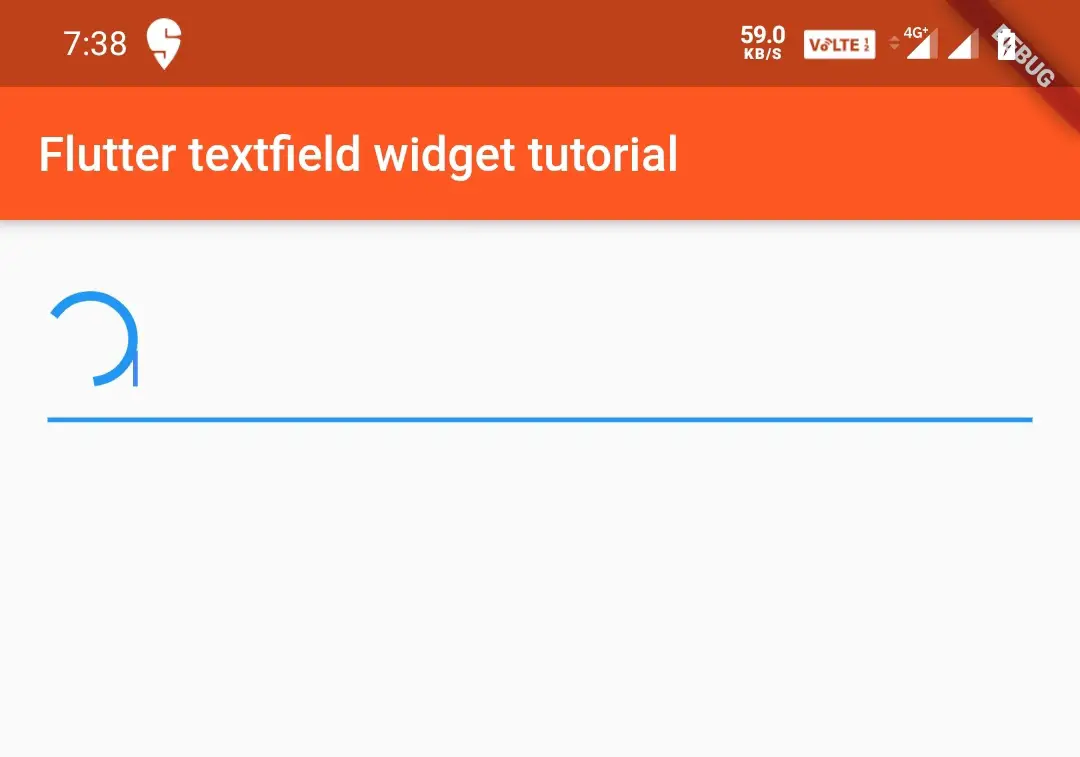
prefix
Container(
          padding: EdgeInsets.all(20),
            child:TextField(
              decoration: InputDecoration(
                 prefix: CircularProgressIndicator(),
              ),
            )
            )
Output:
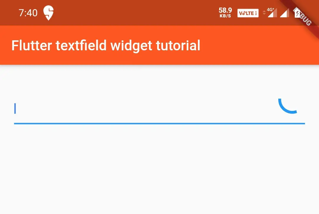
suffix
Container(
          padding: EdgeInsets.all(20),
            child:TextField(
              decoration: InputDecoration(
                 suffix: CircularProgressIndicator(),
              ),
            )
            )
Output:
Styling Cursor
We can customize the cursor of a text field with different properties like color, width, etc. Let’s have a look.
Container(
          padding: EdgeInsets.all(20),
            child:TextField(
              decoration: InputDecoration(
                   cursorColor: Colors.deepOrange,
                   cursorWidth: 15,
              ),
            )
            )
Output:
You can even add radius using cursorRadius: Radius.circular(doube value). For an elliptical shape use cursorRadius: Radius.elliptical(double value1, double value 2).
Example: cursorRadius: Radius.circular(15)
cursorRadius: Radius.elliptical(15,20)
Try those for yourself for a better understanding of the cursor radius.
Hiding cursor
You can also hide the cursor by setting showCursor: property to false
 Container(
          padding: EdgeInsets.all(20),
            child:TextField(
              showCursor: false,
            )
            )
Output:
TextStyle and Alignment
Styling the text of textfield
We will use style property to apply different styles to the text of a TextField.By using style property, we can change color, fontsize, fontweight etc,.Styling a TextField is exactly similar to styling a text widget. So you can refer flutter text widget tutorial to learn to style the text using the TextStyle class.
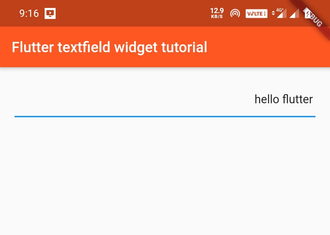
Aligning the text
We can align the text of the TextField using the textAlign property which takes TextAlign class. This class has constants like right, left, start, end, center, justify. I will show you one example and you try the rest.
Container(
          padding: EdgeInsets.all(20),
            child:TextField(
              textAlign: TextAlign.right,
            )
            )
Output:
You can also find alignment properties in the above link.
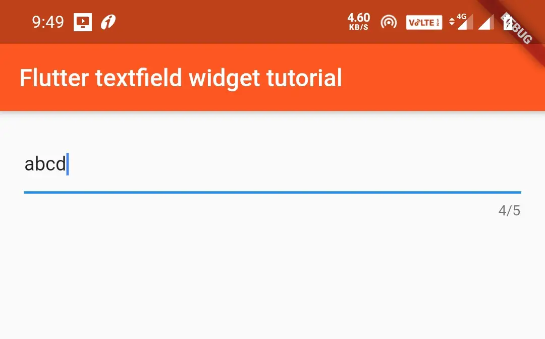
Maximum Length And Number of Lines
We can control the maximum number of characters written in the TextField.We can also define the number of lines a TextField can expand.
maxLength
The maximum number of characters that a user can enter in the TextField.
Container(
          padding: EdgeInsets.all(20),
            child:TextField(
              maxLength: 5,
            )
            )
Output:
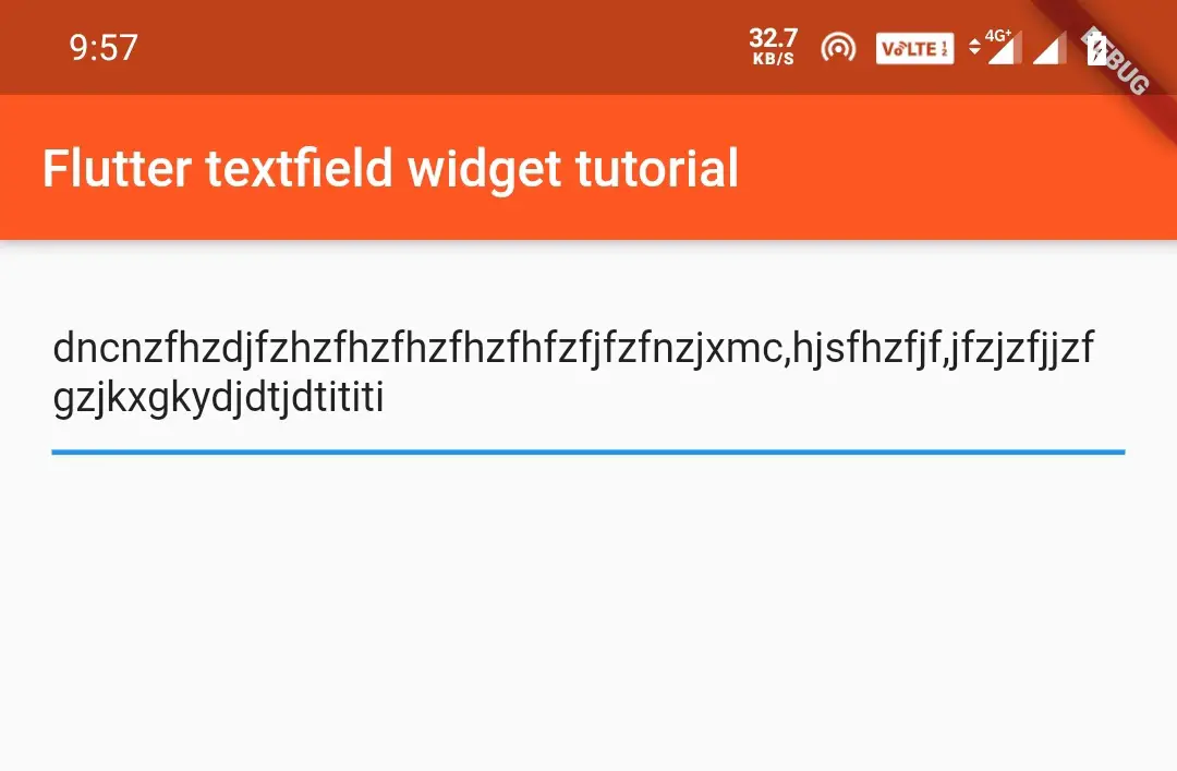
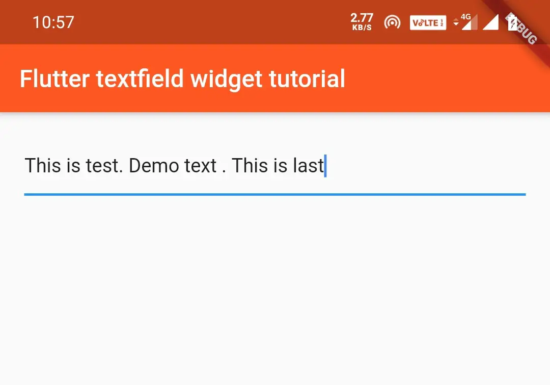
Expanding TextField
Sometimes, we need TextField to expand if the first line reaches the end. In such cases, we have to set the maxLines property to null. By default, this value is 1.
 Container(
          padding: EdgeInsets.all(20),
            child:TextField(
            maxLines: null,
            )
            )
Output:
maxLines
If we set maxLines to a value then it will expand to that number of lines directly.
Container(
          padding: EdgeInsets.all(20),
            child:TextField(
              maxLines: 4,
            )
            )
Output:
MinLines and MaxLines
If we set both minLines and maxLines values then the lines will start from minimum lines value and will expand up to maximum lines value.
Container(
          padding: EdgeInsets.all(20),
            child:TextField(
              minLines: 1,
              maxLines: 4,
            )
            )
Keyboard Properties For a TextField Widget
In flutter we can customize the properties related to the keyboard like showing numeric keypad, normal keypad etc.
KeyboardType
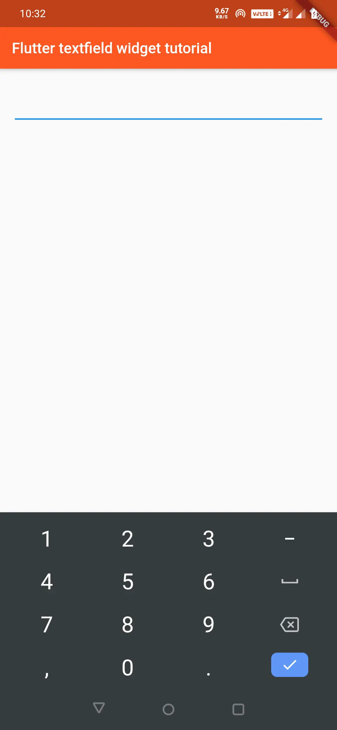
By using keyboardType property, we can change the type of keyboard to be displayed. It takes TextInputType class which has many constants. The constants are text, number, datetime, numberWithOptions, phone, multiline, etc. There is a lot more to the list. I will show you one example. Do check the rest as we can’t discuss all the things in one article.
Container(
          padding: EdgeInsets.all(20),
            child:TextField(
              keyboardType: TextInputType.number,
            )
            )
Output:
Container(
          padding: EdgeInsets.all(20),
            child:TextField(
              keyboardType: TextInputType.text,
            )
            )
Output:
textInputAction
To change the action button of the keyboard we will use textInputAction which will take TextInputAction constants. The constants are none, done, search, go, continueAction, join, newline, next, previous, route, send, emergencyCall, etc. We will see a few as we can’t explore all of them now.
Search
The done button will be replaced with a search button.
Container(
          padding: EdgeInsets.all(20),
            child:TextField(
              textInputAction: TextInputAction.search,
            )
            )
Output:

Send
The done button will be replaced with the send button.
Container(
          padding: EdgeInsets.all(20),
            child:TextField(
              textInputAction: TextInputAction.send,
            )
            )
Output:
AutoCorrect
Setting autoCorrect to true will enable autocorrect to TextField, which will also disable suggestions to the user.
Container(
          padding: EdgeInsets.all(20),
            child:TextField(
              autocorrect: false,
            )
            )
TextCapitalization
TextField has a few options on how to capitalize the letters of the text entered by the user. It uses textCapitalization property, which takes TextCapitalization class. It has many constants like characters, sentences, words.
sentences
The first letter of every sentence is capitalized.
Container(
          padding: EdgeInsets.all(20),
            child:TextField(
              textCapitalization: TextCapitalization.sentences,
            )
            )
Output:
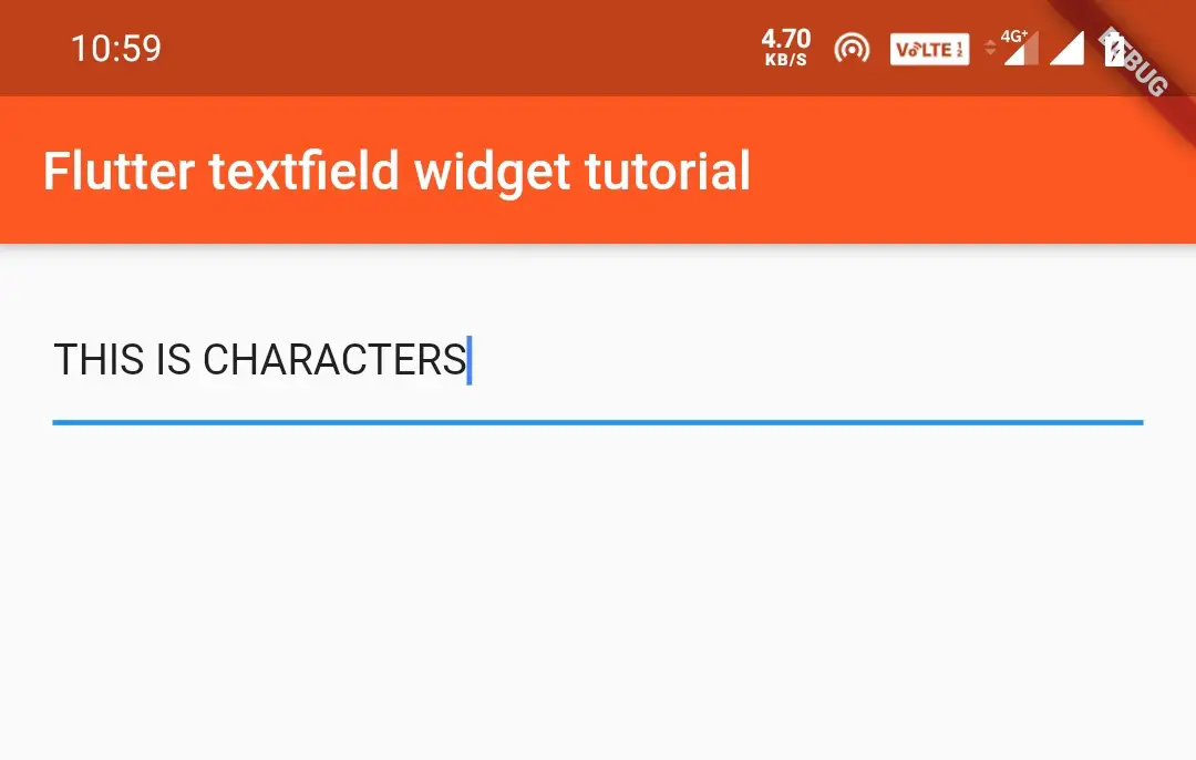
characters
Capitalizes every letter in the sentence.
Container(
          padding: EdgeInsets.all(20),
            child:TextField(
              textCapitalization: TextCapitalization.characters,
            )
            )
Output:
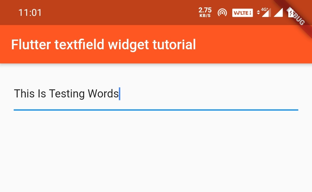
words
Capitalizes the first letter in every word of the sentence. It is also called a camel case.
Container(
          padding: EdgeInsets.all(20),
            child:TextField(
              textCapitalization: TextCapitalization.words,
            )
            )
Output:
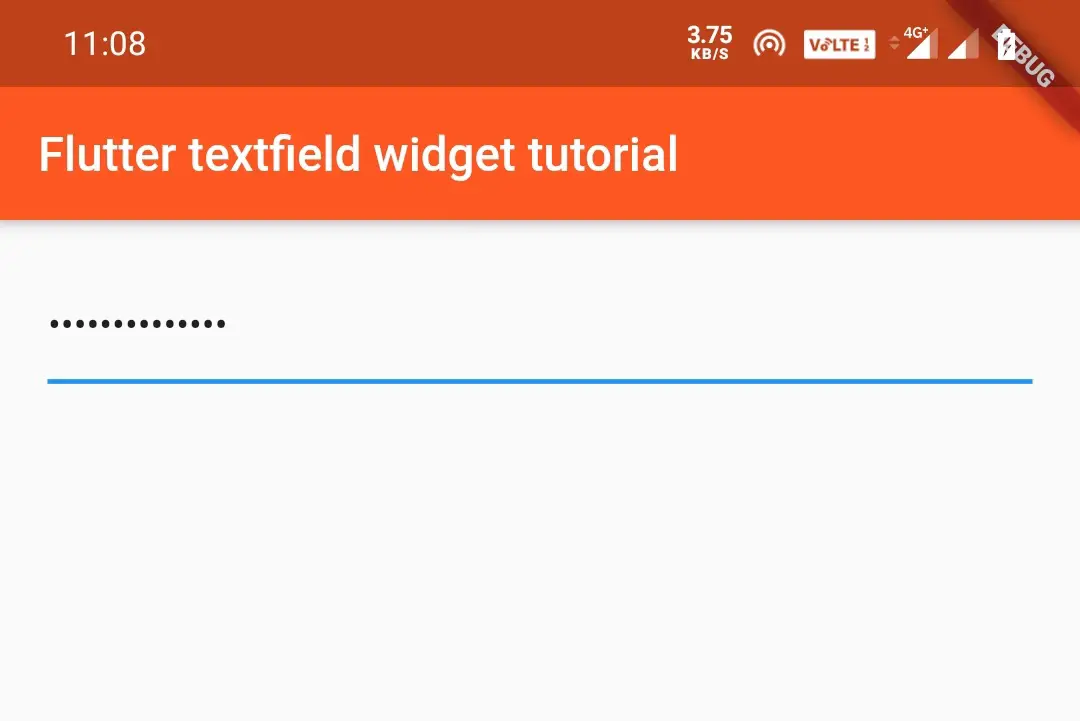
ObscuringText in TextField
This is used to hide or display dots instead of text. It is used for passwords etc. Setting this to true will make the text entered display in dots.
Container(
          padding: EdgeInsets.all(20),
            child:TextField(
              obscureText: true,
            )
         )
Output:
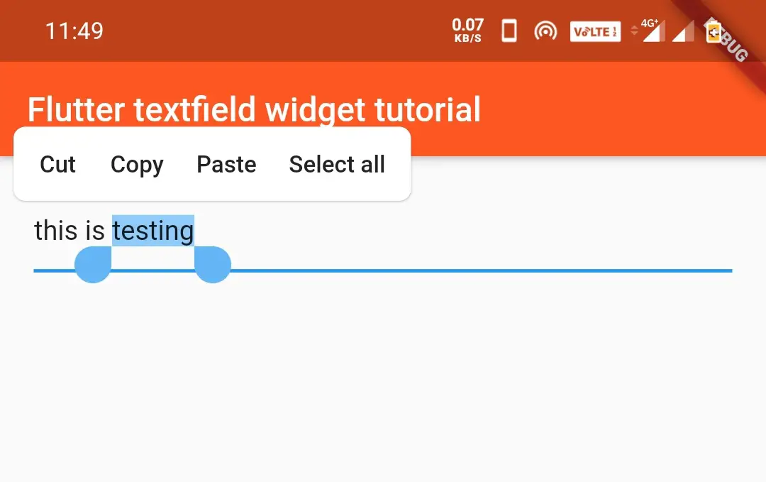
ToolbarOptions in TextField
This will add/remove toolbar options like cut, copy, paste, selectAll.
 Container(
          padding: EdgeInsets.all(20),
            child:TextField(
              toolbarOptions: ToolbarOptions(
                  cut: false,
                  copy: true,
                  paste: true,
                  selectAll: true),
            )
            )
Output:
TextField OnTap()
When the user taps the TextField the onTap method is invoked. We can do things like displaying a message or something else when tapped.
Container(
          padding: EdgeInsets.all(20),
            child:TextField(
              onTap: (){
                print("pressed the textfield");
              },
            )
            )
Getting Information From a TextField
To retrieve text from a TextField we need to store it inside a variable. The variable must be assigned with the value inside the onChanged method. Another way to get text is using a controller.
TextField onChanged
Every time the text changes, the onChanged method invokes and updates the value to val variable.
String val = "";
Container(
          padding: EdgeInsets.all(20),
            child:TextField(
              onChanged: (value) {
                val = value;
              },
            )
            )
Other than onChanged we have two more callbacks. They are onSubmitted and onEditingComplete.These callbacks are used to listen to the changes for TextField.
TextField onSubmitted
The on onSubmitted callback works similar to onChanged callback.
 Container(
          padding: EdgeInsets.all(20),
            child:TextField(
              onSubmitted: (value) {
                //value is the text of the text field.
              },
            )
            )
TextField onEditingComplete
onEditingComplete is invoked when the editing is completed.
Container(
          padding: EdgeInsets.all(20),
            child:TextField(
              onEditingComplete: () {
                //do something
              },
            )
            )
TextField TextEditingcontroller
TextField has a TextEditingcontroller, which lets us listen to the changes to TextField.We can also control the text using this controller.
TextEditingController controller = TextEditingController();
Container(
          padding: EdgeInsets.all(20),
            child:TextField(
              controller:controller,
            )
            )
Getting text using controller
controller.text;
Setting text using controller
controller.text = "new text";
Listening to changes using a controller
TextEditingController controller = new TextEditingController();
    controller.addListener(() {
      //Your logic here eg:print(controller.text);
    });
That’s all about flutter TextField widget tutorial in detail. Let’s catch up with some other flutter widget in the next post. Have a great day!!
Do like and share if you find this post helpful. Thank you!!
Reference: Flutter Official Documentation.


Leave a Reply