
Flutter Cupertino Segmented Control
Cupertino segmented control is nothing but ios style segmented control in flutter. CupertinoSegmentedControl widget lets us create a segmented control in ios style. It displays a horizontal list of options. We can select an option by tapping on it. These options are generated using map (key-value pairs <String, widget>). The keys should be similar for all the children of the map. We will use the keys to identify the selection by the user. The values can be any widget & don’t need to be similar. When we select one option we can’t select other options in the segmented control. It means we can’t select more than one option at a time.
Don’t know what Cupertino is? It is nothing but a set of flutter widgets that follow the ios design pattern. These widgets are designed to implement ios features in flutter apps built for the ios platform.
In this tutorial, we will learn how to use cupertino segmented control in flutter with example. We will also learn how to customize the CupertinoSegmentedControl widget using different properties.
To implement similar behaviour for android platform using flutter refer tabbar in flutter.
How To Create Cupertino Segmented Control In Flutter?
To create a cupertino segmented control in flutter we have to use CupertinoSegmentedControl class. Call the constructor of the class and provide required properties. The constructor has two required properties children & onValueChanged. The children should be of type map.
Flutter Cupertino Segmented Control Constructor:
CupertinoSegmentedControl(
{Key? key,
 required Map<T, Widget> children,
 required ValueChanged<T> onValueChanged,
 T? groupValue,
 Color? unselectedColor,
 Color? selectedColor,
 Color? borderColor,
 Color? pressedColor,
 EdgeInsetsGeometry? padding}
)
Flutter Cupertino Segmented Control Properties
The properties of a cupertino segmented control are:
- children
- onValueChanged
- groupValue
- unselectedColor
- selectedColor
- borderColor
- pressedColor
- padding
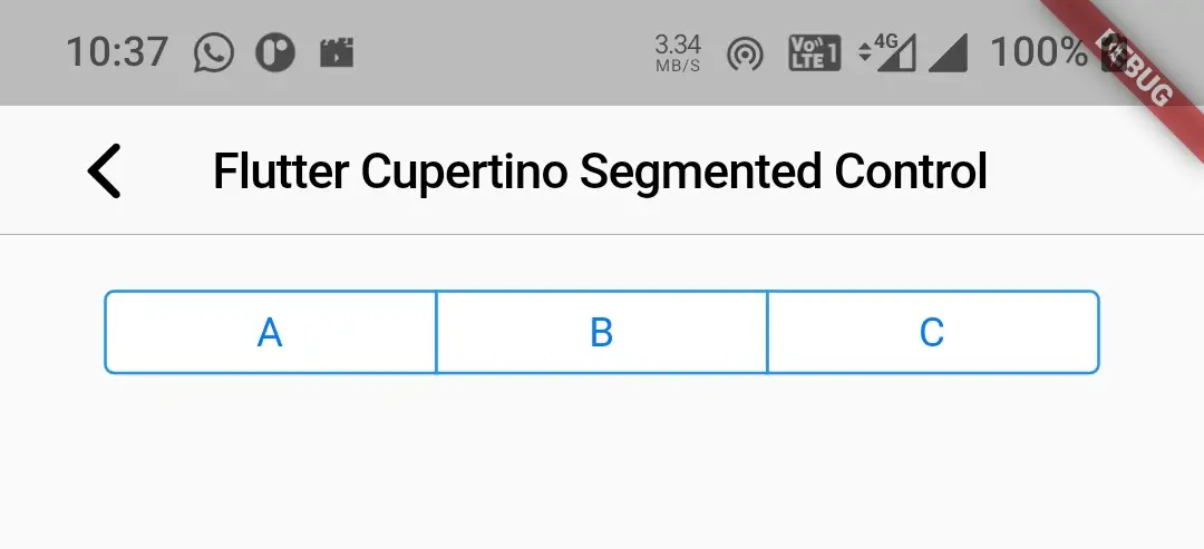
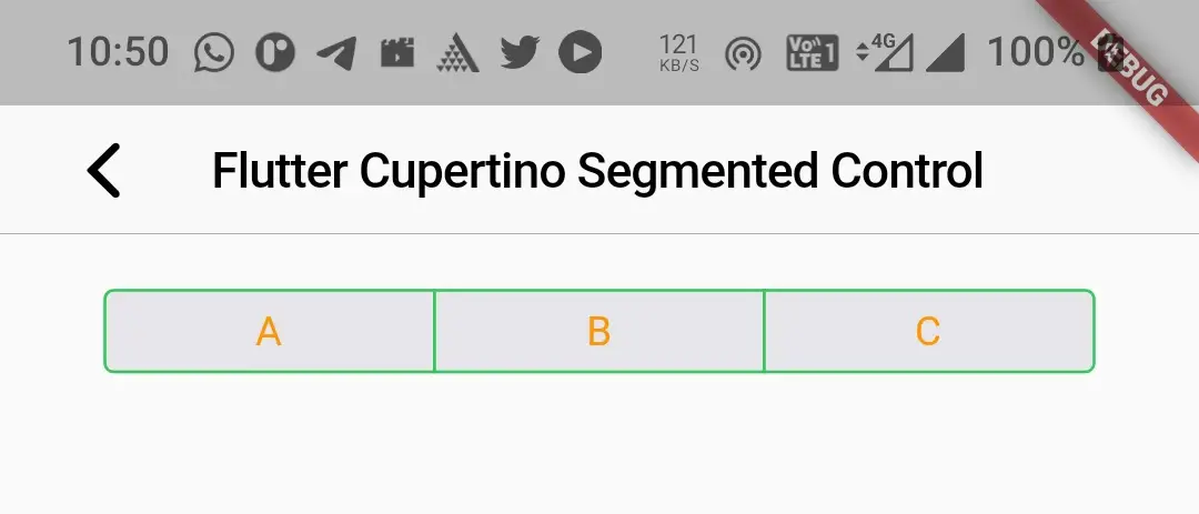
children
This property is used to provide children (options) to the segmented control. It takes a map as value.
child: CupertinoSegmentedControl(
                    children: {
                      "A": Expanded(
                        child: Text("A"),
                      ),
                      "B": Expanded(
                        child: Text("B"),
                      ),
                      "C": Expanded(
                        child: Text("C"),
                      ),
                    },
                  onValueChanged: (value)
                  {

                  },
                ),
Output:
onValueChanged
This property takes a callback function as a value. It will invoke every time the user selects an option. We can get the selected value inside this function. Based on the value we will update the UI.
child: CupertinoSegmentedControl(
                    children: {
                      "A": Expanded(
                        child: Text("A"),
                      ),
                      "B": Expanded(
                        child: Text("B"),
                      ),
                      "C": Expanded(
                        child: Text("C"),
                      ),
                    },
                  onValueChanged: (value)
                  {
                    selectedValue = value;
                    setState(() {

                    });
                  },
                ),
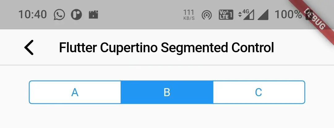
groupValue
This indicates the option that is selected currently. It should be one of the keys in the map or null. If null no option is selected. If it is key then it will select the option for that key.
child: CupertinoSegmentedControl(
                    children: {
                      "A": Expanded(
                        child: Text("A"),
                      ),
                      "B": Expanded(
                        child: Text("B"),
                      ),
                      "C": Expanded(
                        child: Text("C"),
                      ),
                    },
                  onValueChanged: (value)
                  {
                    selectedValue = value;
                    setState(() {

                    });
                  },
                  groupValue: selectedValue,
                ),
Output:
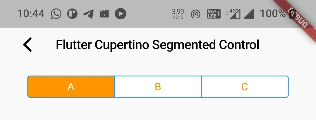
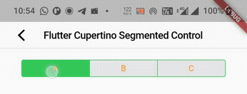
selectedColor
We will use this property to change the selected option color. It takes CupertinoColors or Colors constant as value. To use custom color consider using Color class constructor and provide your desired color.
child: CupertinoSegmentedControl(
                    children: {
                      "A": Expanded(
                        child: Text("A"),
                      ),
                      "B": Expanded(
                        child: Text("B"),
                      ),
                      "C": Expanded(
                        child: Text("C"),
                      ),
                    },
                  onValueChanged: (value)
                  {
                    selectedValue = value;
                    setState(() {

                    });
                  },
                  selectedColor: CupertinoColors.activeOrange,
                  groupValue: selectedValue,
                ),
Output:
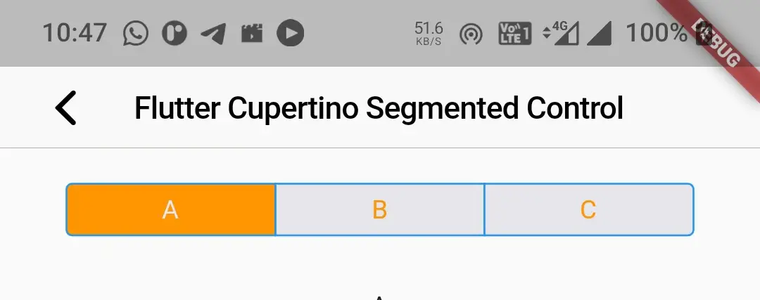
unselectedColor
We will use this property to change the unselected option’s color. It also takes CupertinoColors or Colors constant as value. To use custom color consider using Color class constructor and provide your desired color.
child: CupertinoSegmentedControl(
                    children: {
                      "A": Expanded(
                        child: Text("A"),
                      ),
                      "B": Expanded(
                        child: Text("B"),
                      ),
                      "C": Expanded(
                        child: Text("C"),
                      ),
                    },
                  onValueChanged: (value)
                  {
                    selectedValue = value;
                    setState(() {

                    });
                  },
                  selectedColor: CupertinoColors.activeOrange,
                  unselectedColor: CupertinoColors.systemGrey5,
                  groupValue: selectedValue,
                ),
Output:
borderColor
To change the border of the segmented control we will use this property.
child: CupertinoSegmentedControl(
                    children: {
                      "A": Expanded(
                        child: Text("A"),
                      ),
                      "B": Expanded(
                        child: Text("B"),
                      ),
                      "C": Expanded(
                        child: Text("C"),
                      ),
                    },
                  onValueChanged: (value)
                  {
                    selectedValue = value;
                    setState(() {

                    });
                  },
                  selectedColor: CupertinoColors.activeOrange,
                  unselectedColor: CupertinoColors.systemGrey5,
                  borderColor: CupertinoColors.activeGreen,
                  groupValue: selectedValue,
                ),
Output:
pressedColor
To change the color of the option while pressed we will use this property. The color only appears while pressing the option. When we release our finger from the option it will disappear.
child: CupertinoSegmentedControl(
                    children: {
                      "A": Expanded(
                        child: Text("A"),
                      ),
                      "B": Expanded(
                        child: Text("B"),
                      ),
                      "C": Expanded(
                        child: Text("C"),
                      ),
                    },
                  onValueChanged: (value)
                  {
                    selectedValue = value;
                    setState(() {

                    });
                  },
                  selectedColor: CupertinoColors.activeOrange,
                  unselectedColor: CupertinoColors.systemGrey5,
                  borderColor: CupertinoColors.activeGreen,
                  pressedColor: CupertinoColors.activeGreen,
                  groupValue: selectedValue,
                ),
Output:
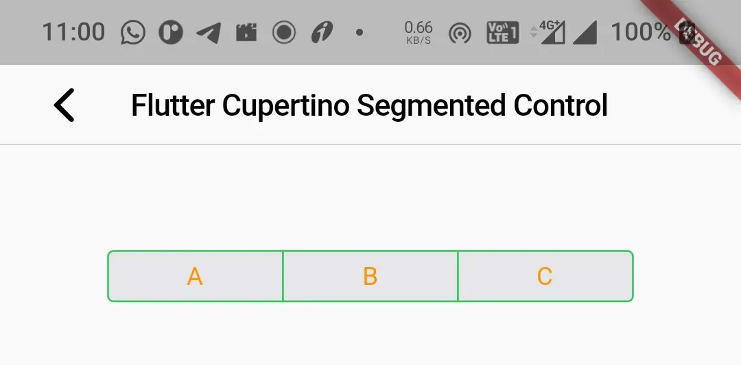
padding
We will use this property to apply padding to the segmented control. Instead of padding the options the segmented control itself will be placed inside the padding we provide. It takes EdgeInsetsGeometry as value. By default it is EdgeInsets.symmetric(horizontal:16.0).
child: CupertinoSegmentedControl(
                    children: {
                      "A": Expanded(
                        child: Text("A"),
                      ),
                      "B": Expanded(
                        child: Text("B"),
                      ),
                      "C": Expanded(
                        child: Text("C"),
                      ),
                    },
                  onValueChanged: (value)
                  {
                    selectedValue = value;
                    setState(() {

                    });
                  },
                  selectedColor: CupertinoColors.activeOrange,
                  unselectedColor: CupertinoColors.systemGrey5,
                  borderColor: CupertinoColors.activeGreen,
                  pressedColor: CupertinoColors.activeGreen,
                  groupValue: selectedValue,
                  padding: EdgeInsets.all(40)
                ),
Output:
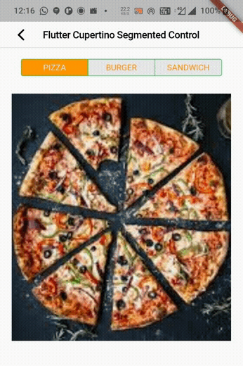
Flutter Cupertino Segmented Control Example
Let’s create an example where we implement cupertino segmented control in flutter using CupertinoSegmentedControl widget. In this example, we will display segmented control with three options. We will display the corresponding image when the option is selected. For this, we will need a map for children and a list for holding images.
Let’s declare a map for our children.
Map <int, Widget> children = <int, Widget>{
    0: Expanded(
    child: Text("PIZZA"),
    ),
    1: Expanded(
      child: Text("BURGER"),
    ),
    2: Expanded(
      child: Text("SANDWICH"),
    ),
};
Now we will declare the List with the path to images. Please download three images for pizza, burger, and sandwich. Name them as pizza, burger, and sandwich. Add the images into assets folder. Refer how to add images to flutter app if you don’t know how to use images in a flutter.
List<String> images = ["assets/images/pizza.jpg", "assets/images/burger.jpg","assets/images/sandwich.jpg"];
Declare an integer variable that will hold the selected key.
int selectedValue = 0;
We are done declaring the children and corresponding images. Now let’s declare our cupertino segmented control.
CupertinoSegmentedControl(
                    children:children,
                  onValueChanged: (value)
                  {
                    selectedValue = value;
                    setState(() {

                    });
                  },
                  selectedColor: CupertinoColors.activeOrange,
                  unselectedColor: CupertinoColors.systemGrey5,
                  borderColor: CupertinoColors.activeGreen,
                  pressedColor: CupertinoColors.activeGreen,
                  groupValue: selectedValue,
                ),
Now let’s declare the widget for displaying the image corresponding to the selected option.
Container(
                height: MediaQuery.of(context).size.height*0.80,
                width: double.infinity,
                child: Image.asset(images[selectedValue],
                    fit: BoxFit.cover),
              )
Complete Code:
Let’s sum up the code snippets above to complete cupertino segmented control example in flutter. Create a new flutter project and replace the code in main.dart file with the code below.
import 'package:flutter/cupertino.dart';
import 'package:flutter/material.dart';
import 'package:flutter/widgets.dart';

void main()
{
  runApp(MyApp());
}

class MyApp extends StatelessWidget {
  @override
  Widget build(BuildContext context) {
    return MaterialApp(
      title: 'Flutter Learning',
      theme: ThemeData(
        primarySwatch: Colors.blue,
      ),
      home:MyHomePage(),
    );
  }
}

class MyHomePage extends StatefulWidget {
  @override
  _MyHomePageState createState()
  {
    return _MyHomePageState();
  }
}

class _MyHomePageState extends State<MyHomePage> {
  int selectedValue = 0;
  Map <int, Widget> children = <int, Widget>{
    0: Expanded(
    child: Text("PIZZA"),
    ),
    1: Expanded(
      child: Text("BURGER"),
    ),
    2: Expanded(
      child: Text("SANDWICH"),
    ),};

  List<String> images = ["assets/images/pizza.jpg", "assets/images/burger.jpg","assets/images/sandwich.jpg"];

  @override
  Widget build(BuildContext context) {
    return new CupertinoPageScaffold(
      navigationBar:CupertinoNavigationBar(
        leading: CupertinoNavigationBarBackButton(
          onPressed: ()
          { },
          color: CupertinoColors.label,
        ),
        middle: Text("Flutter Cupertino Segmented Control")
      ),
      child:Material(
        child: Container(
          margin: EdgeInsets.only(top:100, left: 20, right: 20),
          child:Column(
            children: [
              Container(
                width:double.infinity,
                child: CupertinoSegmentedControl(
                    children:children,
                  onValueChanged: (value)
                  {
                    selectedValue = value;
                    setState(() {

                    });
                  },
                  selectedColor: CupertinoColors.activeOrange,
                  unselectedColor: CupertinoColors.systemGrey5,
                  borderColor: CupertinoColors.activeGreen,
                  pressedColor: CupertinoColors.activeGreen,
                  groupValue: selectedValue,
                ),
              ),
              SizedBox(
                height:30,
              ),
              Container(
                height: MediaQuery.of(context).size.height*0.80,
                width: double.infinity,
                child: Image.asset(images[selectedValue],
                    fit: BoxFit.cover),
              )
            ],
          ),
        ),
      ),
    );
  }
}
Output:
I hope you understand the tutorial on how to create & use cupertino segmented control in flutter. We have also seen an example where we have used the CupertinoSegmentedControl widget and customized its style. Let’s catch up with some other widget in the next post. Have a great day !!
Do like & share my Facebook page. Subscribe to the newsletter if you find this post helpful. Thank you !!
Reference: Flutter Official Documentation.


Leave a Reply