In flutter, RaisedButton widget is one of the most used flutter widgets from material library. In this example tutorial we will learn how to use a RaisedButton in flutter and its properties in detail.
Flutter RaisedButton
Flutter Raised Button is a material widget. It has an elevation which is a material property.By default the elevation value for raised button is 2. Use raised buttons to add dimension to otherwise mostly flat layouts, e.g. in long busy lists of content, or in wide spaces.
Note: Avoid using raised button on already-raised content such as dialogs or cards.
Flutter RaisedButton Properties
Raised Button has almost similar properties of a flutter FlatButton widget. It has many properties like color, textColor, elevation etc.. Lets see the constructor for a RaisedButton to know all the properties.
RaisedButton({
Key key,
@required VoidCallback onPressed,
VoidCallback onLongPress,
ValueChanged<bool> onHighlightChanged,
MouseCursor mouseCursor,
ButtonTextTheme textTheme,
Color textColor,
Color disabledTextColor,
Color color,
Color disabledColor,
Color focusColor,
Color hoverColor,
Color highlightColor,
Color splashColor,
Brightness colorBrightness,
double elevation,
double focusElevation,
double hoverElevation,
double highlightElevation,
double disabledElevation,
EdgeInsetsGeometry padding,
VisualDensity visualDensity,
ShapeBorder shape,
Clip clipBehavior: Clip.none,
FocusNode focusNode,
bool autofocus: false,
MaterialTapTargetSize materialTapTargetSize,
Duration animationDuration,
Widget child})
Handling Callbacks of RaisedButton
onPressed
When we tap the button this gets called. It is a VoidCallback method which means no arguments and return values. We need to pass a method with no arguments. The button will be disabled if we don’t provide onPressed: property or if we set onPressed: to null.
E.g. void testFunction();
Container(
width:double.infinity ,
padding: EdgeInsets.all(20),
alignment: Alignment.topCenter,
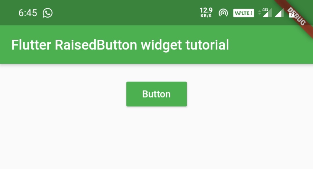
child:RaisedButton(
child:Text("Button"),
onPressed: () {
//your code
},
)
)
or we can use a function name inside the anonymous method of onPressed callback.
Container(
            width:double.infinity ,
            padding: EdgeInsets.all(20),
            alignment: Alignment.topCenter,
            child:RaisedButton(
              child:Text("Button"),
              onPressed: () {
                 //your method name without paranthesis
eg: testFunction;
              },
            )
        )
onLongPress
This callback is invoked when the user long press the button. It works similar to onPressed.
Container(
            width:double.infinity ,
            padding: EdgeInsets.all(20),
            alignment: Alignment.topCenter,
            child:RaisedButton(
              child:Text("Button"),
              onLongPress: () {
//you can implement code here or use a function name without parnthesis similar to onPressed.
              },
            )
        )
onHighlightChanged
It gets called when the button is pressed/down or released/up. It will return true when the button is pressed and false when released.
Container(
            width:double.infinity ,
            padding: EdgeInsets.all(20),
            alignment: Alignment.topCenter,
            child:RaisedButton(
              child:Text("Button"),
              onHighlightChanged: (value) {
                print(value);
              },
              onPressed: () {
              },
            )
        )
Styling the RaisedButton widget
RaisedButton – textTheme
To change text color based on theme we will use textTheme property. This property takes ButtonTextTheme which has three constants like normal, accent and primary.
ButtonTextTheme.accent
Container(
            width:double.infinity ,
            padding: EdgeInsets.all(20),
            alignment: Alignment.topCenter,
            child:RaisedButton(
              child:Text("Button"),
              textTheme: ButtonTextTheme.accent,
             onPressed: () {},
            )
        )
Output:
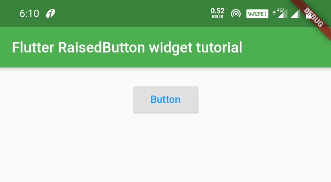
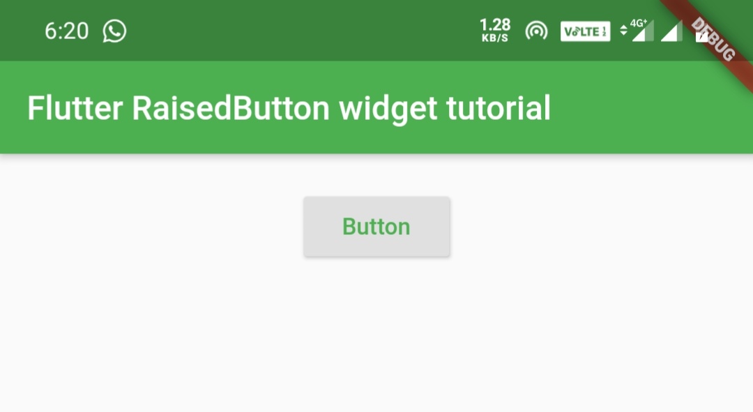
RaisedButton – textColor
We will use textColor property to change the color of button text.
Container(
            width:double.infinity ,
            padding: EdgeInsets.all(20),
            alignment: Alignment.topCenter,
            child:RaisedButton(
              child:Text("Button"),
              textColor: Colors.green,
             onPressed: () {},
            )
        )
Output:
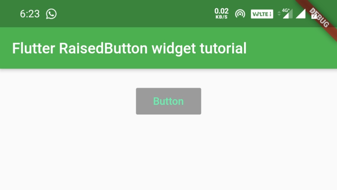
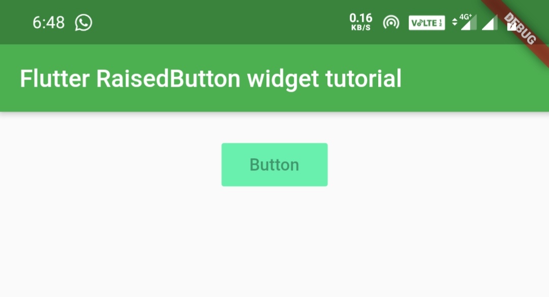
RaisedButton – disabledTextColor
We will use this property to set text color to be displayed, when the button is disabled. In this example i am setting onPressed to null so that we can see the output.
Container(
            width:double.infinity ,
            padding: EdgeInsets.all(20),
            alignment: Alignment.topCenter,
            child:RaisedButton(
              child:Text("Button"),
              textColor: Colors.green,
              disabledTextColor: Colors.greenAccent,
             onPressed:null,
            )
        )
Output:
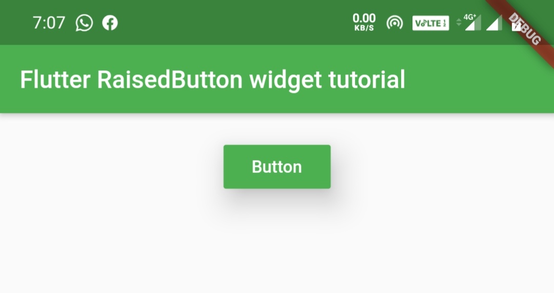
RaisedButton – color
We will use this property to set background color for the button.
Container(
            width:double.infinity ,
            padding: EdgeInsets.all(20),
            alignment: Alignment.topCenter,
            child:RaisedButton(
              child:Text("Button"),
              textColor: Colors.white,
              color:Colors.green,
             onPressed: (){},
            )
        )
Output:
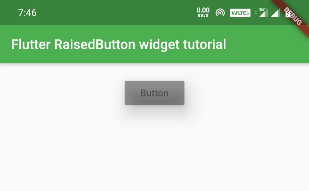
RaisedButton – disabledColor
We will use disabledColor property to set background color that we want to display when the button is disabled. In this example i am setting onPressed to null so that we can see the output.
Container(
            width:double.infinity ,
            padding: EdgeInsets.all(20),
            alignment: Alignment.topCenter,
            child:RaisedButton(
              child:Text("Button"),
              textColor: Colors.white,
              color:Colors.green,
             disabledColor: Colors.greenAccent,
             onPressed:null,
            )
        )
Output:
RaisedButton – highlightColor
When we tap the button, highlightColor displays over the entire button and fades out when we release the button.
Container(
            width:double.infinity ,
            padding: EdgeInsets.all(20),
            alignment: Alignment.topCenter,
            child:RaisedButton(
              child:Text("Button"),
              textColor: Colors.white,
              color:Colors.green,
              highlightColor: Colors.deepOrange,
              onPressed:(){},
            )
        )
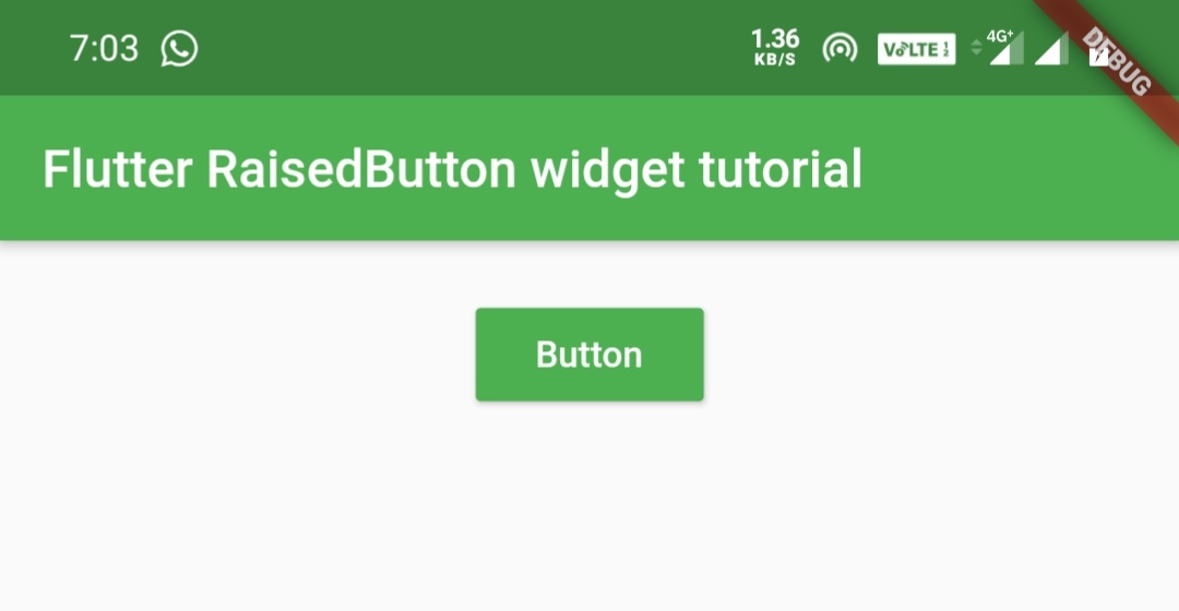
RaisedButton – splashColor
When the user taps the button the splashColor starts filling the button slowly. It fades out when the user releases the button.
Container(
            width:double.infinity ,
            padding: EdgeInsets.all(20),
            alignment: Alignment.topCenter,
            child:RaisedButton(
              child:Text("Button"),
              textColor: Colors.white,
              color:Colors.green,
              splashColor: Colors.deepOrange,
              onPressed:(){},
            )
        )
RaisedButton – colorBrightness
The colorBrightness property increases the readability of button text. This property takes Brightness which has two constants light and dark. Its better to use Brightness.dark for dark backgrounds and Brightness.light for light background.
Container(
            width:double.infinity ,
            padding: EdgeInsets.all(20),
            alignment: Alignment.topCenter,
            child:RaisedButton(
              child:Text("Button"),
              textColor: Colors.white,
              color:Colors.green,
              colorBrightness:Brightness.light,
              onPressed:(){},
            )
        )
RaisedButton – Padding
The padding property provides padding to the button,which means internal spacing. It takes EdgeInsets which has three methods all, only and symmetric.
EdgeInsets.all()
It takes one value and sets that amount of padding for all the sides.
Container(
            width:double.infinity ,
            padding: EdgeInsets.all(20),
            alignment: Alignment.topCenter,
            child:RaisedButton(
              child:Text("Button"),
              textColor: Colors.white,
              color:Colors.green,
              padding: EdgeInsets.all(20),
              onPressed:(){},
            )
        )
Output:

EdgeInsets.only()
You can specify up to 4 sides, which means you can define any number of sides you want below four.
Container(
            width:double.infinity ,
            padding: EdgeInsets.all(20),
            alignment: Alignment.topCenter,
            child:RaisedButton(
              child:Text("Button"),
              textColor: Colors.white,
              color:Colors.green,
              padding: EdgeInsets.only(left: 20,right: 20,bottom: 30),
              onPressed:(){},
            )
        )
Output:
EdgeInsets.symmetric()
This accepts horizontal and vertical values. You can provide only horizontal, only vertical or both.
Container(
            width:double.infinity ,
            padding: EdgeInsets.all(20),
            alignment: Alignment.topCenter,
            child:RaisedButton(
              child:Text("Button"),
              textColor: Colors.white,
              color:Colors.green,
              padding: EdgeInsets.symmetric(horizontal: 20, vertical: 10),
              onPressed:(){},
            )
        )
Output:
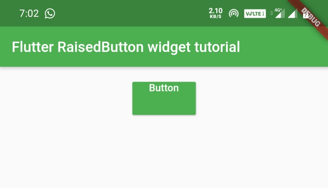
RaisedButton Elevation
Elevation means nothing but the button or any widget looks raised upward in the air. Like raising a bit upward from the surface where it was placed where we can also observe some shadow. This is a material property which is used to provide more style to the designs.
RaisedButton – elevation
We will use this property to provide elevation to the button.
Container(
            width:double.infinity ,
            padding: EdgeInsets.all(20),
            alignment: Alignment.topCenter,
            child:RaisedButton(
              child:Text("Button"),
              textColor: Colors.white,
              color:Colors.green,
              elevation: 20,
              onPressed:(){},
            )
        )
Output:
RaisedButton – highlightElevation
When the user taps the button, you can observe highlightElevation as the button raises up. The elevation reduces when the user releases the button.
Container(
            width:double.infinity ,
            padding: EdgeInsets.all(20),
            alignment: Alignment.topCenter,
            child:RaisedButton(
              child:Text("Button"),
              textColor: Colors.white,
              color:Colors.green,
              highlightElevation: 20,
              onPressed:(){},
            )
         )
RaisedButton – disabledElevation
We will use this property to set elevation when a button is disabled. The elevation will be visible only when the button is disabled.
Container(
            width:double.infinity ,
            padding: EdgeInsets.all(20),
            alignment: Alignment.topCenter,
            child:RaisedButton(
              child:Text("Button"),
              textColor: Colors.white,
              color:Colors.green,
              disabledElevation: 20,
              onPressed:null,
            )
        )
Output:
Shaping RaisedButton
RaisedButton – shape
By using shape property we can apply different shapes to the button. We can apply shapes like rectangular , rounded rectangle, circular, etc.
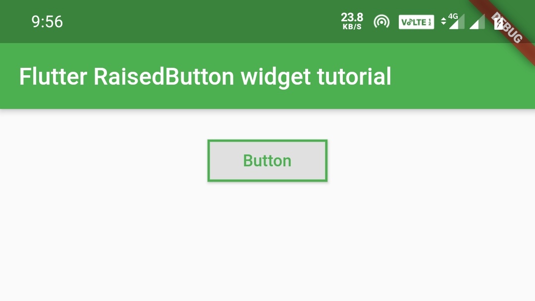
Rectangular Border
Container(
            width:double.infinity ,
            padding: EdgeInsets.all(20),
            alignment: Alignment.topCenter,
            child:RaisedButton(
              child:Text("Button"),
              padding: EdgeInsets.symmetric(horizontal: 30,vertical: 10),
              shape:Border.all(width: 2,color: Colors.green),
              textColor: Colors.green,
              onPressed: (){},
            )
        )
Output:
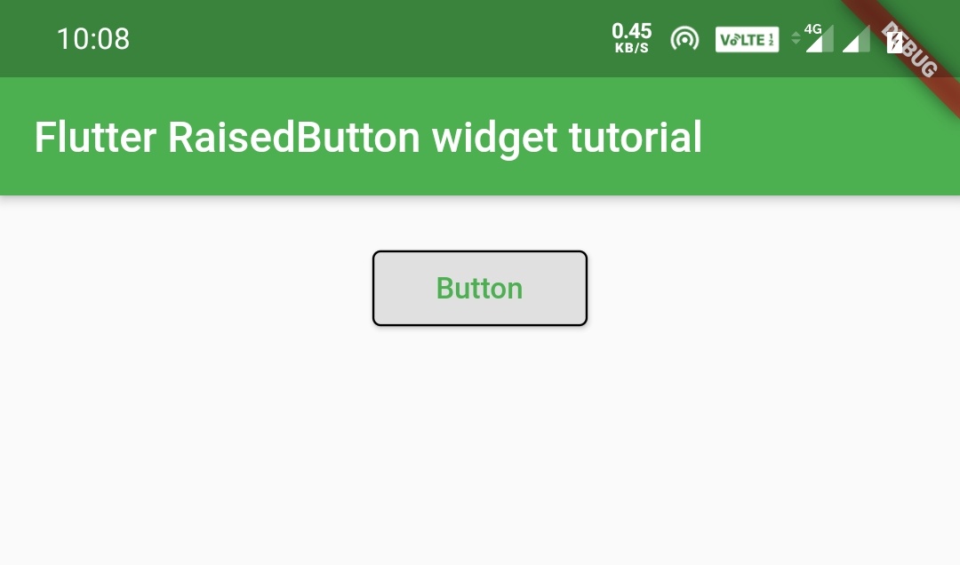
OutlineInputBorder
Container(
            width:double.infinity ,
            padding: EdgeInsets.all(20),
            alignment: Alignment.topCenter,
            child:RaisedButton(
              child:Text("Button"),
              padding: EdgeInsets.symmetric(
                 horizontal: 30,
                 vertical: 10
              ),
              shape:OutlineInputBorder(),
              textColor: Colors.green,
              onPressed: (){},
            )
        )
Output:
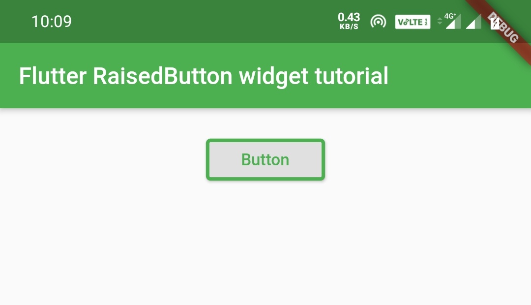
Using borderSide for styling border.
Container(
            width:double.infinity ,
            padding: EdgeInsets.all(20),
            alignment: Alignment.topCenter,
            child:RaisedButton(
              child:Text("Button"),
              padding: EdgeInsets.symmetric(
                horizontal: 30,
                vertical: 10
              ),
              shape:OutlineInputBorder(
                  borderSide: BorderSide(
                      color: Colors.green,
                      width: 3,
                      style: BorderStyle.solid
                  )
              ),
              textColor: Colors.green,
              onPressed: (){},
            )
        )
Output:
We will be using borderSide property for all the border types from now. You can leave them without providing border side.
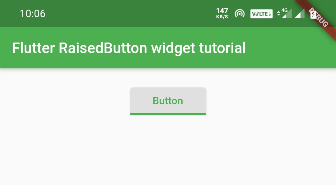
UnderlineInputBorder
Container(
            width:double.infinity ,
            padding: EdgeInsets.all(20),
            alignment: Alignment.topCenter,
            child:RaisedButton(
              child:Text("Button"),
              padding: EdgeInsets.symmetric(horizontal: 30,vertical: 10),
              shape:UnderlineInputBorder(
                  borderSide: BorderSide(
                      color: Colors.green,
                      width: 3,
                      style: BorderStyle.solid
                  )
              ),
              textColor: Colors.green,
              onPressed: (){},
            )
        )
Output:
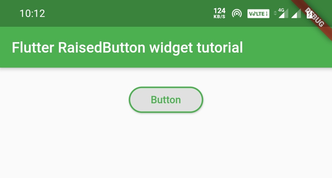
StadiumBorder
It directly forms the shape with rounded edges without providing any BorderRadius.It looks similar to roundeRectangleBorder.
Container(
            width:double.infinity ,
            padding: EdgeInsets.all(20),
            alignment: Alignment.topCenter,
            child:RaisedButton(
              child:Text("Button"),
              padding: EdgeInsets.symmetric(
                  horizontal: 30,
                  vertical: 10
              ),
              shape:StadiumBorder(
                  side: BorderSide(
                      color: Colors.green,
                      width: 2
                  )
              ),
              textColor: Colors.green,
              onPressed: (){},
            )
        )
Output:
RoundedRectangleBorder
Container(
            width:double.infinity ,
            padding: EdgeInsets.all(20),
            alignment: Alignment.topCenter,
            child:RaisedButton(
              child:Text("Button"),
              padding: EdgeInsets.symmetric(
                  horizontal: 30,
                  vertical: 10
              ),
              shape:RoundedRectangleBorder(
                  side: BorderSide(
                      color: Colors.green,
                      width: 2
                  ),
                  borderRadius: BorderRadius.circular(20)
              ),
              textColor: Colors.green,
              onPressed: (){},
            )
        )
Output:
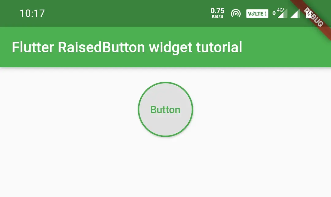
CircleBorder
Container(
            width:double.infinity ,
            padding: EdgeInsets.all(20),
            alignment: Alignment.topCenter,
            child:RaisedButton(
              child:Text("Button"),
              padding: EdgeInsets.symmetric(
                  horizontal: 30,
                  vertical: 30
              ),
              shape:CircleBorder(
                  side: BorderSide(
                      color: Colors.green,
                      width: 2
                  )
              ),
              textColor: Colors.green,
              onPressed: (){},
            )
        )
Output:
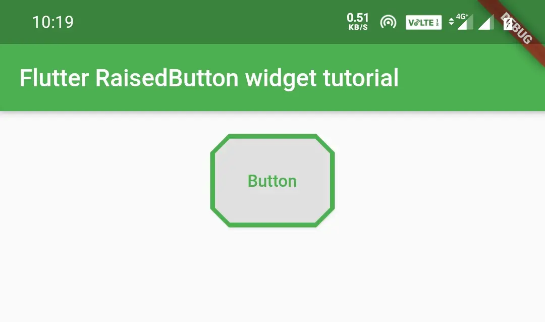
BeveledRectangleBorder
Container(
            width:double.infinity ,
            padding: EdgeInsets.all(20),
            alignment: Alignment.topCenter,
            child:RaisedButton(
              child:Text("Button"),
              padding: EdgeInsets.symmetric(
                  horizontal: 30,
                  vertical: 30
              ),
              shape:BeveledRectangleBorder(
                  side: BorderSide(
                      color: Colors.green,
                      width: 2
                  ),
                  borderRadius: BorderRadius.circular(15)
              ),
              textColor: Colors.green,
              onPressed: (){},
            )
        )
Output:
That all about flutter Raisedbutton widget example tutorial. I’ll see you again with some other flutter tutorial.Have a great day!!
Do like and share if you find this post helpful.Thank you!!
Reference: Flutter Official Documentation.


Leave a Reply