
In this tutorial, we will learn how to use a dropdown button or dropdown list in flutter. We will also customize its style using different properties and create an example. We will use Flutter dropdown button widget to display a dropdown list / menu in our app similar to android and web.
Flutter Dropdown Button Widget
Dropdown button is a material widget that displays a dropdown list / menu in flutter. The user can select an item from a list of items. The currently selected item will be displayed on the button along with an arrow. The arrow indicates that it is a dropdown menu / list so that the user can select another item.
It is nothing but a dropdown list / menu. We will use this to display a list of items to the user when clicked on it. We have to use Stateful widget as dropdown button will have change in state based on the user selection.
Also read: flutter raised button widget example
Flutter Dropdown Button Constructor:
DropdownButton(
{Key key,
@required List<DropdownMenuItem<T>> items,
DropdownButtonBuilder selectedItemBuilder,
T value,
Widget hint,
Widget disabledHint,
@required ValueChanged<T> onChanged,
VoidCallback onTap,
int elevation: 8,
TextStyle style,
Widget underline,
Widget icon,
Color iconDisabledColor,
Color iconEnabledColor,
double iconSize: 24.0,
bool isDense: false,
bool isExpanded: false,
double itemHeight: kMinInteractiveDimension,
Color focusColor,
FocusNode focusNode,
bool autofocus: false,
Color dropdownColor
}
)
Basic Dropdown Button Code
import 'package:flutter/cupertino.dart';
import 'package:flutter/material.dart';
import 'package:flutter/rendering.dart';

void main() {
  runApp(MyApp());
}
class MyApp extends StatefulWidget {
  @override
  _MyState createState() => _MyState();
}
class _MyState extends State<MyApp>
{
  int _value = 1;
  @override
  Widget build(BuildContext context) {
    return MaterialApp(
      home: Scaffold(
        appBar: AppBar(
          backgroundColor: Colors.green,
          title: Text("Flutter Dropdown Button Tutorial"),
        ),
        body:Container(
          padding: EdgeInsets.all(20),
          child:DropdownButton(
            value: _value,
            items: [
              DropdownMenuItem(
                child: Text("First Item"),
                value: 1,
              ),
              DropdownMenuItem(
                child: Text("Second Item"),
                value: 2,
              )
            ],

            onChanged: (int value) {
              setState(() {
                _value = value;
              });
            },
            hint:Text("Select item")
            ),
          )
        )
    );
  }
}
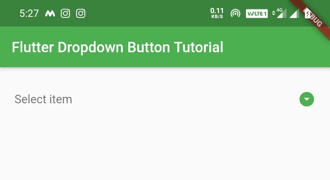
Output:
Flutter Dropdown Button Properties
Dropdown button has a few properties that control the beheaviour and handle state changes. Let’s see some of the properties of dropdown button with example.
- Items
- selectedItemBuilder
- value
- hint
- disabledHint
- elevation
- style
- icon
- iconDisabledColor
- iconEnabledColor
- iconSize
- isExpanded
- dropdownColor
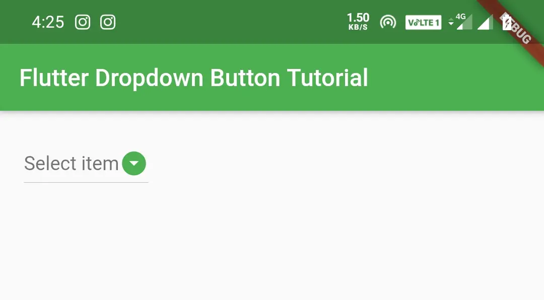
Items
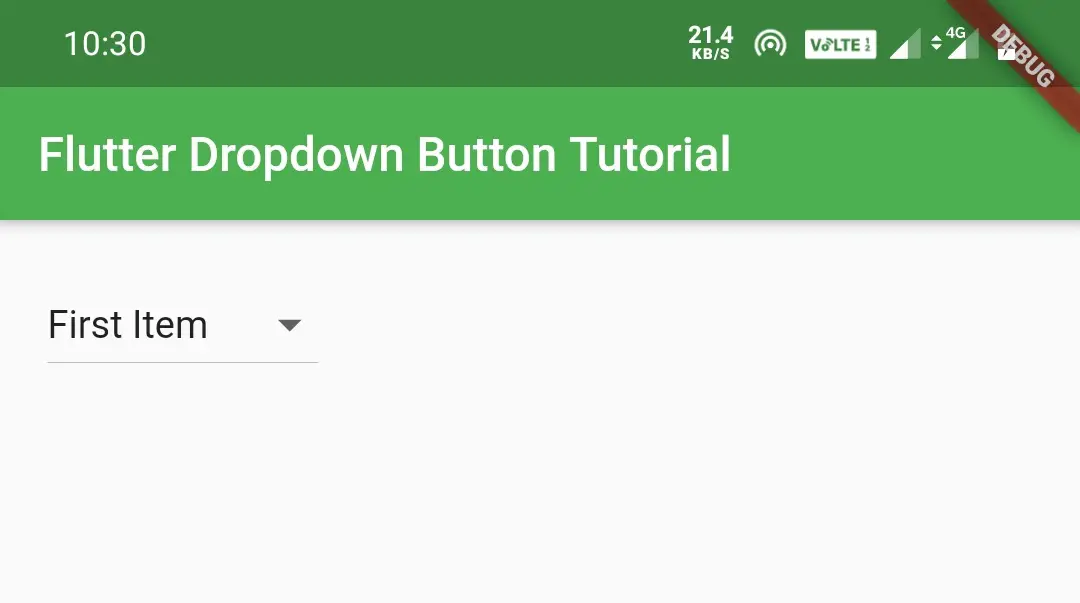
We will use this property to define items to be displayed in the dropdown list. We can define the items directly or we can define using a list.
Lest see how to define items directly. By default the flutter dropdown button’s selected value will be empty as the value property will be empty on loading. So to solve this we will declare a global variable and assign the value of the first Dropdown item to it so that the dropdown button by default displays the first item instead of empty. We can also use hint property to display our desired text instead of first value.
import 'package:flutter/cupertino.dart';
import 'package:flutter/material.dart';
import 'package:flutter/rendering.dart';

void main() {
  runApp(MyApp());
}
class MyApp extends StatefulWidget {
  @override
  _MyState createState() => _MyState();
}
class _MyState extends State<MyApp>
{
  int _value = 1;
  @override
  Widget build(BuildContext context) {
    return MaterialApp(
      home: Scaffold(
        appBar: AppBar(
          backgroundColor: Colors.green,
          title: Text("Flutter Dropdown Button Tutorial"),
        ),
        body:Container(
          padding: EdgeInsets.all(20),
          child:DropdownButton(
            value: _value,
            items: [
              DropdownMenuItem(
                child: Text("First Item"),
                value: 1,
              ),
              DropdownMenuItem(
                child: Text("Second Item"),
                value: 2,
              )
            ],

            onChanged: (int value) {
              setState(() {
                _value = value;
              });
            },
            ),
          )
        )
    );
  }
}
When the user selects an item from the list onChanged will be invoked and gets the selected item value. We are setting the selected item value to our global variable using setState() method so that it will display the selected item on the button.
Output:
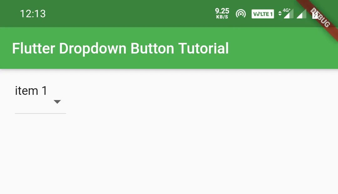
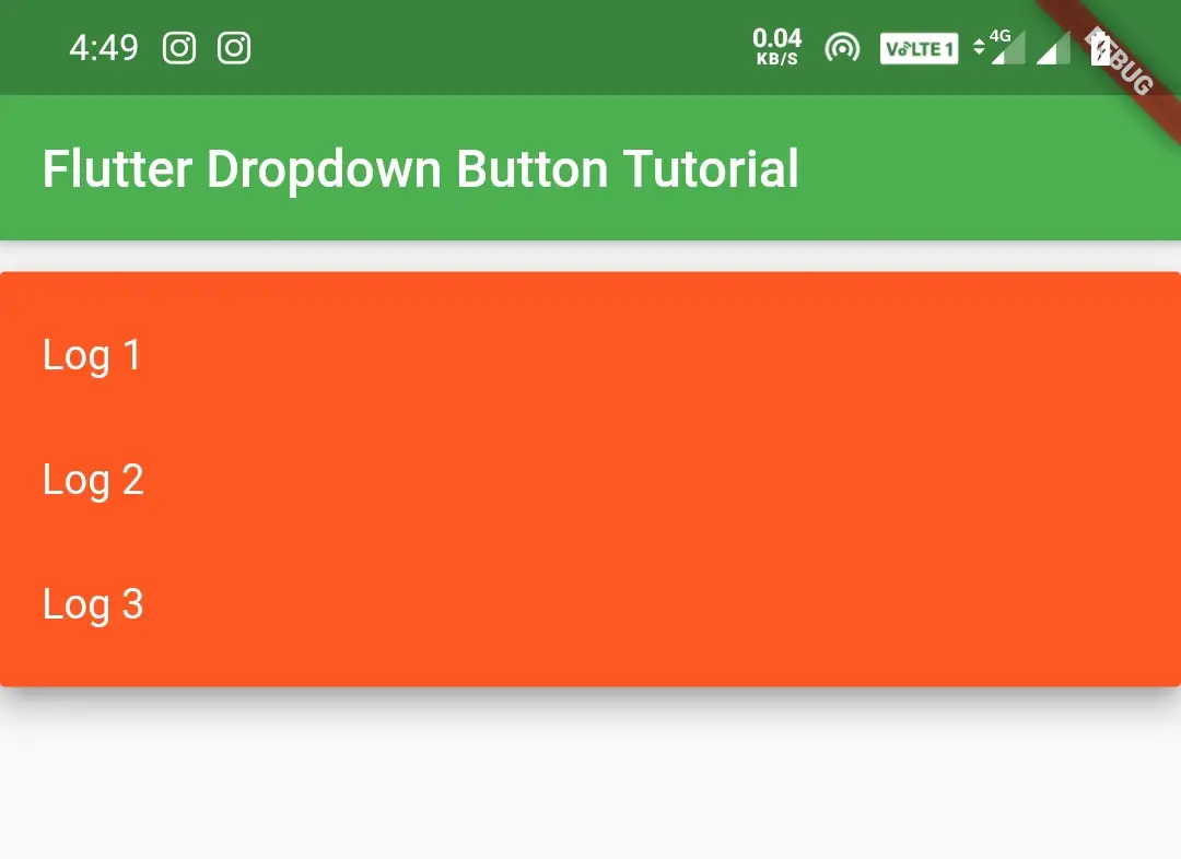
selectedItemBuilder
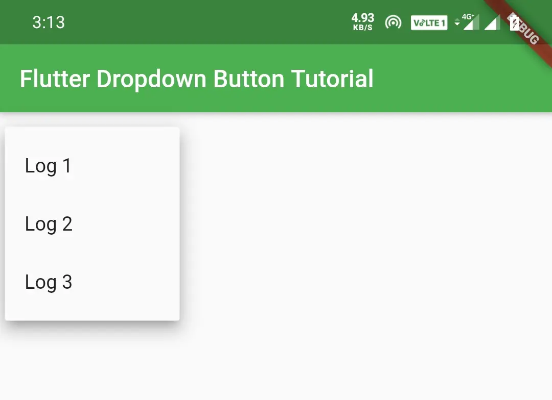
Generally in flutter, dropdown button will display a list of items. When we select an option it will display the option on the button. If we want to display some other text instead of the selected option on the button we will use selectedItemBuilder.
DropdownButton(
            value: _value,
            selectedItemBuilder: (BuildContext context)
            {
              return list_items.map<Widget>((int item) {
              return Text('item $item');
              }).toList();
            },
            items: list_items.map((int item) {
              return DropdownMenuItem<int>(
                child: Text('Log $item'),
                value: item,
              );
            }).toList(),
            onChanged: (value) {
              setState(() {
                _value = value;
              });
            },
            ),
Generally if we click on the dropdown button it will display options like Log 1, Log2 and Log 3. If we select Log 1 it will display Log 1 on the button like below before implementing selectedItemBuilder.
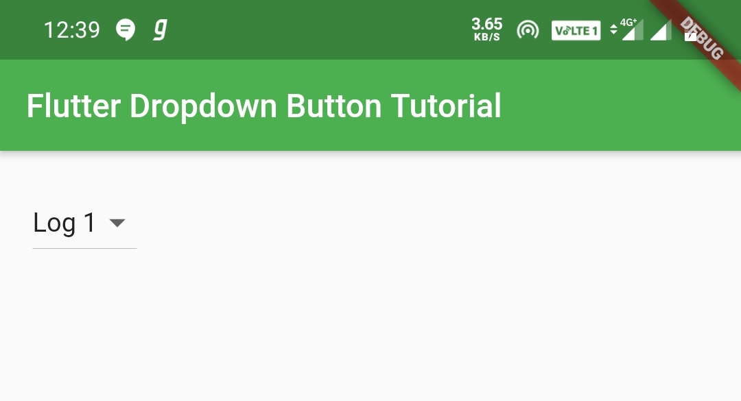
But after implementing selectedItemBuilder, when we select Log 1 it will display our desired text on the dropdown button instead of Log 1. In our case it will be item 1 like below.
value
We will use value property to set the selected item to the dropdown button. When the user selects the option from the dropdown the onChanged() callback method will be invoked with the value of the dropdownMenuItem. We can get the value of the selected item but we can’t set the selected option on the button.
When the user don’t see the selected option on the button he will get confused. So to avoid this we have to set the selected item on the button so that the user will be clear about his selection. To do this will set the value that we get in onChanged() callback method using setState() method to a global variable.
onChanged: (value) {
              setState(() {
                _value = value;
              });
            },
In the above code snippet, the onChanged is returning a value which is the value of the selected DropdownMenuItem. Inside that we are setting the value to _value which is a global variable. Now we have to set the _value to the value property so that when the user changes the option it will automatically reflect on the button.
DropdownButton(
            value: _value,
            selectedItemBuilder: (BuildContext context)
            {
              return list_items.map<Widget>((int item) {
              return Text('item $item');
              }).toList();
            },
            items: list_items.map((int item) {
              return DropdownMenuItem<int>(
                child: Text('Log $item'),
                value: item,
              );
            }).toList(),
            onChanged: (value) {
              setState(() {
                _value = value;
              });
            },
            ),
Try removing the value property, you will observe that whatever value we choose, the button text will remain the same. It will not display the selected option.
Note: By default the dropdown button will display nothing on it. To display one of the options from the dropdown on the button by default we have to assign the value of that item to a global variable. Now we have to set that variable as value to value attribute. If we don’t assign a value to the global variable it will display nothing on the button by default.
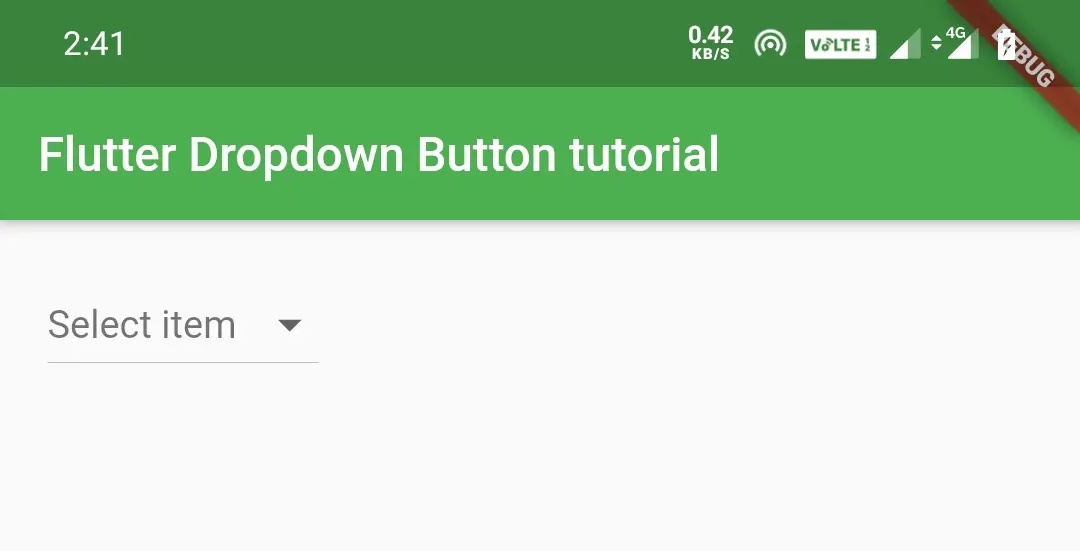
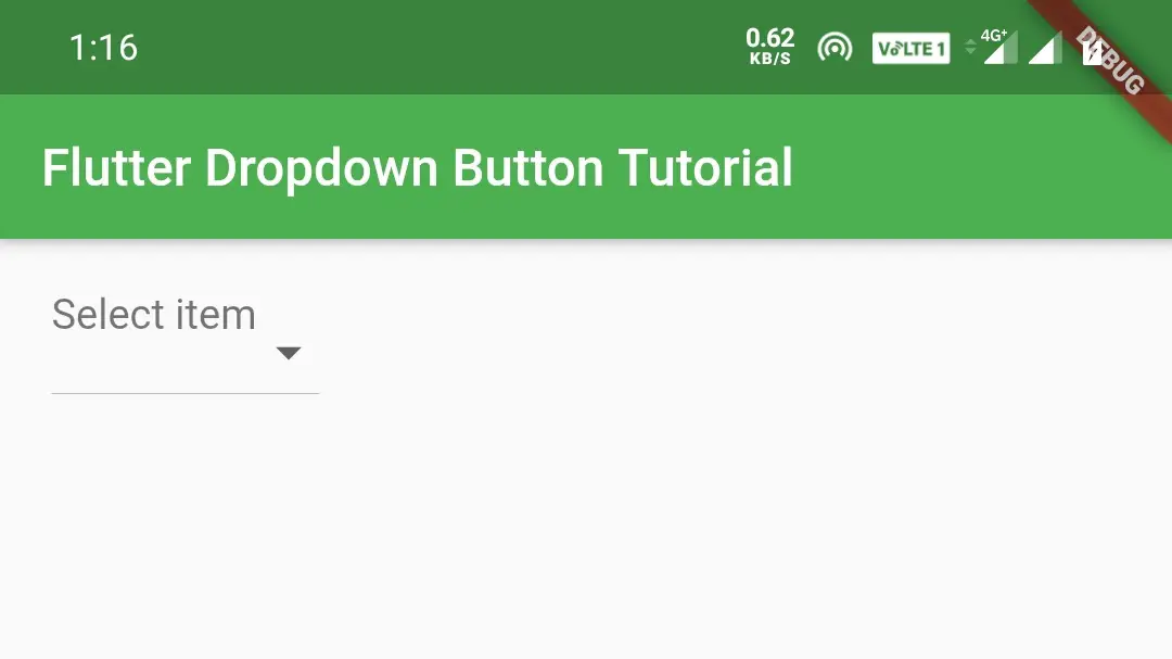
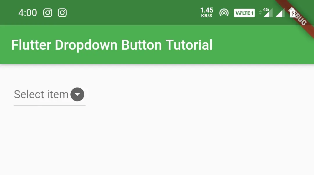
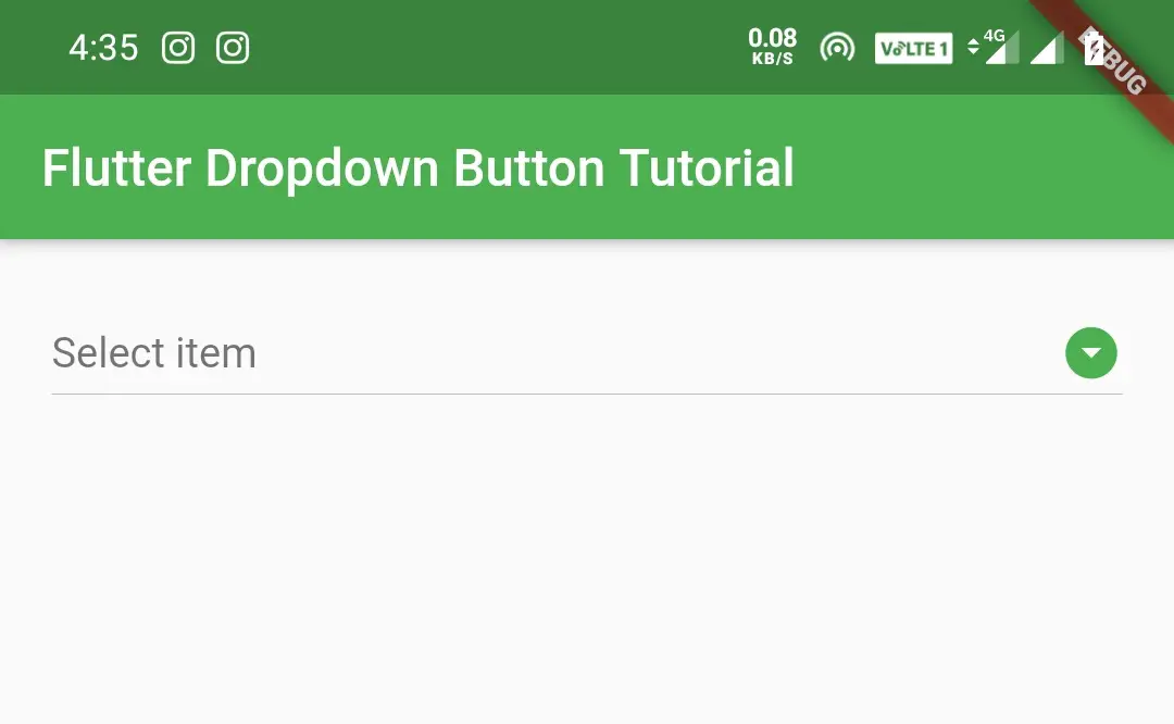
hint
By default, the dropdown button will display nothing on it but the down indicator. We can display one of the options from dropdown on the button or we can set our desired text by default using hint.
To display a hint we should not assign any value to the global variable at the time of declaring. If we assign a value it will consider it as selection and display the option corresponding to the value we have assigned at the time of declaring.
DropdownButton(
            value: _value,
            items: list_items.map((int item) {
              return DropdownMenuItem<int>(
                child: Text('Log $item'),
                value: item,
              );
            }).toList(),
            onChanged: (value) {
              setState(() {
                _value = value;
              });
            },
            hint: Text("Select item"),
            ),
Output:
We can also add “select item” as first item of the DropdownMenuItems and initialize the global variable with the value of the first item to display the “select item” on the button by default without using hint. But this is not the standard way i guess.
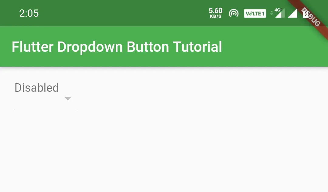
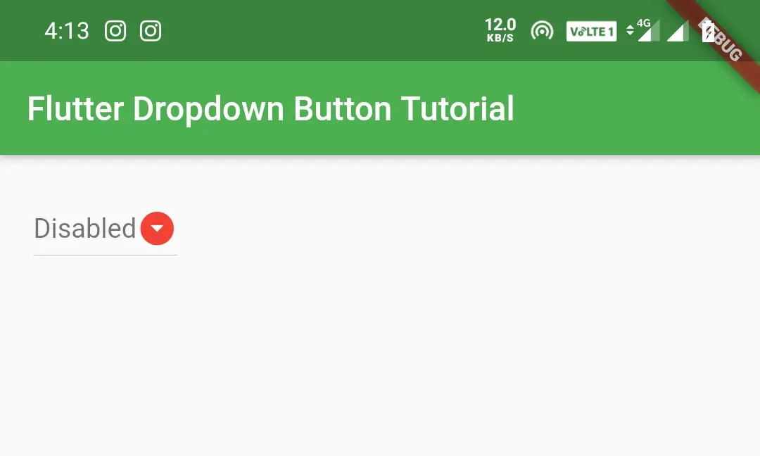
disabledHint
We will use the disabledHint property to display a text when the dropdown button is disabled. The button will be disabled if the onChanged is set to null or when there are no dropdown menu items. To show the disabledHint i’m setting the onChanged to null.
Container(
          padding: EdgeInsets.all(20),
          child:DropdownButton(
            value: _value,
            items: list_items.map((int item) {
              return DropdownMenuItem<int>(
                child: Text('Log $item'),
                value: item,
              );
            }).toList(),
            onChanged: (value) {
              setState(() {
                _value = value;
              });
            },
            hint: Text("Select item"),
            disabledHint: Text("Disabled"),
            ),
          )
Output:
elevation
We will use elevation property to elevate the dropdown list. The value can be from 1 to 9.
Container(
          padding: EdgeInsets.all(20),
          child:DropdownButton(
            value: _value,
            items: list_items.map((int item) {
              return DropdownMenuItem<int>(
                child: Text('Log $item'),
                value: item,
              );
            }).toList(),
            onChanged: (value) {
              setState(() {
                _value = value;
              });
            },
            hint: Text("Select item"),
            disabledHint: Text("Disabled"),
            elevation: 8,
            ),
          )
Output:
style
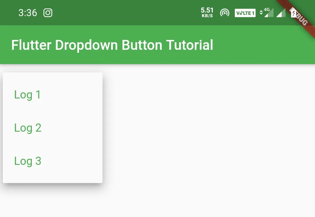
We will use style property to apply style like color, font size, etc. to the items of the dropdown.
Container(
          padding: EdgeInsets.all(20),
          child:DropdownButton(
            value: _value,
            items: list_items.map((int item) {
              return DropdownMenuItem<int>(
                child: Text('Log $item'),
                value: item,
              );
            }).toList(),
            onChanged: (value) {
              setState(() {
                _value = value;
              });
            },
            hint:Text("Select item"),
            disabledHint:Text("Disabled"),
            elevation: 8,
            style:TextStyle(color:Colors.green, fontSize: 16),
            ),
          )
Note: The style will apply only to items in the dropdown menu. To apply style to hint we have to apply style to Text widget of hint.
To know more about style property refer flutter text widget tutorial.
icon
Icon property is used to set icon to the dropdown button.
Container(
          padding: EdgeInsets.all(20),
          child:DropdownButton(
            value: _value,
            items: list_items.map((int item) {
              return DropdownMenuItem<int>(
                child: Text('Log $item'),
                value: item,
              );
            }).toList(),
            onChanged: (value) {
              setState(() {
                _value = value;
              });
            },
            hint:Text("Select item"),
            disabledHint:Text("Disabled"),
            elevation: 8,
            style:TextStyle(color:Colors.green, fontSize: 16),
            icon: Icon(Icons.arrow_drop_down_circle),
            ),
          )
Output:
iconDisabledColor
This property is used to set icon color when the dropdown button is disabled. To show the output i’m disabling the button by setting onChange to null.
Container(
          padding: EdgeInsets.all(20),
          child:DropdownButton(
            value: _value,
            items: list_items.map((int item) {
              return DropdownMenuItem<int>(
                child: Text('Log $item'),
                value: item,
              );
            }).toList(),
            onChanged:null,
            hint:Text("Select item"),
            disabledHint:Text("Disabled"),
            elevation: 8,
            style:TextStyle(color:Colors.green, fontSize: 16),
            icon: Icon(Icons.arrow_drop_down_circle),
            iconDisabledColor: Colors.red,
            ),
          )
Output:
iconEnabledColor
This property is used to set icon color of the dropdown button. This color will apply only if the button is enabled.
Container(
          padding: EdgeInsets.all(20),
          child:DropdownButton(
            value: _value,
            items: list_items.map((int item) {
              return DropdownMenuItem<int>(
                child: Text('Log $item'),
                value: item,
              );
            }).toList(),
            onChanged:(value) {
              setState(() {
                _value = value;
              });
            },
            hint:Text("Select item"),
            disabledHint:Text("Disabled"),
            elevation: 8,
            style:TextStyle(color:Colors.green, fontSize: 16),
            icon: Icon(Icons.arrow_drop_down_circle),
            iconDisabledColor: Colors.red,
            iconEnabledColor: Colors.green,
            ),
          )
Output:
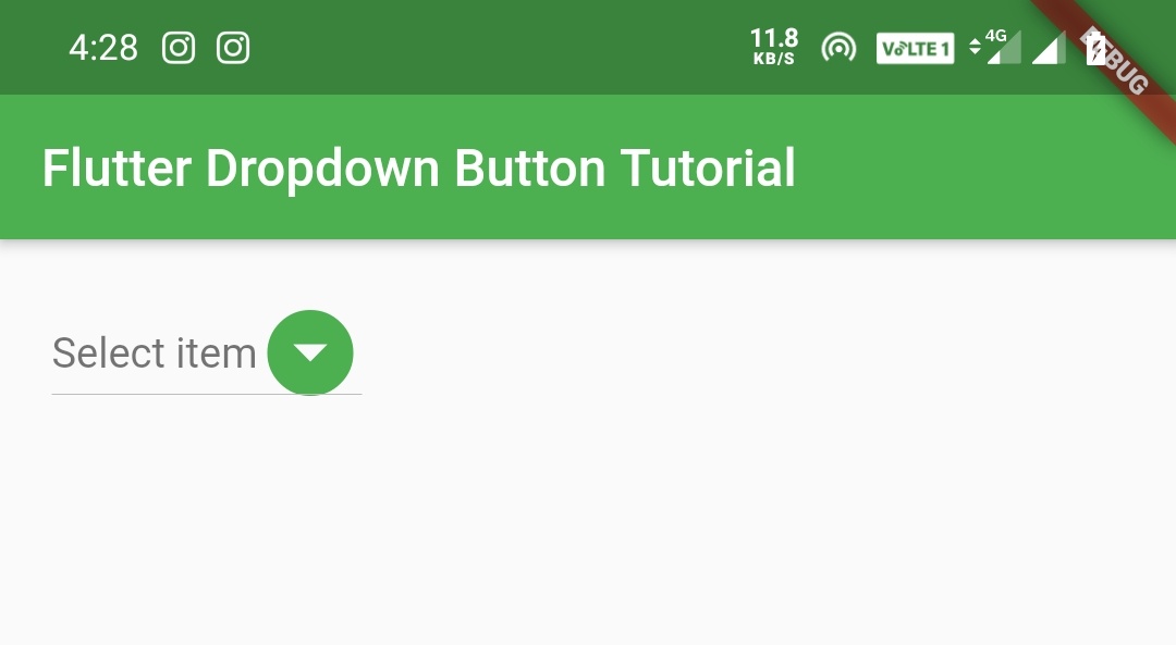
iconSize
IconSize property is used to define icon size of the dropdown button.
Container(
          padding: EdgeInsets.all(20),
          child:DropdownButton(
            value: _value,
            items: list_items.map((int item) {
              return DropdownMenuItem<int>(
                child: Text('Log $item'),
                value: item,
              );
            }).toList(),
            onChanged:(value) {
              setState(() {
                _value = value;
              });
            },
            hint:Text("Select item"),
            disabledHint:Text("Disabled"),
            elevation: 8,
            style:TextStyle(color:Colors.green, fontSize: 16),
            icon: Icon(Icons.arrow_drop_down_circle),
            iconDisabledColor: Colors.red,
            iconEnabledColor: Colors.green,
            iconSize: 40,
            ),
          )
Output:
isExpanded
This property is used to expand the dropdown button to full width. Setting the value to true will expand and false will keep the button width to default.
Container(
          padding: EdgeInsets.all(20),
          child:DropdownButton(
            value: _value,
            items: list_items.map((int item) {
              return DropdownMenuItem<int>(
                child: Text('Log $item'),
                value: item,
              );
            }).toList(),
            onChanged:(value) {
              setState(() {
                _value = value;
              });
            },
            hint:Text("Select item"),
            disabledHint:Text("Disabled"),
            elevation: 8,
            style:TextStyle(color:Colors.green, fontSize: 16),
            icon: Icon(Icons.arrow_drop_down_circle),
            iconDisabledColor: Colors.red,
            iconEnabledColor: Colors.green,
            isExpanded: true,
            ),
          )
Output:
dropdownColor
DropdownColor property is used to set color of the dropdown list.
Container(
          padding: EdgeInsets.all(20),
          child:DropdownButton(
            value: _value,
            items: list_items.map((int item) {
              return DropdownMenuItem<int>(
                child: Text('Log $item'),
                value: item,
              );
            }).toList(),
            onChanged:(value) {
              setState(() {
                _value = value;
              });
            },
            hint:Text("Select item"),
            disabledHint:Text("Disabled"),
            elevation: 8,
            style:TextStyle(color:Colors.white, fontSize: 16),
            icon: Icon(Icons.arrow_drop_down_circle),
            iconDisabledColor: Colors.red,
            iconEnabledColor: Colors.green,
            isExpanded: true,
            dropdownColor: Colors.deepOrange,
            ),
          )
Output:
Getting Dropdown Button Menu Items From a List In Flutter
We have seen how to add dropdown menu items to dropdown button manually. Now let’s see how to get dropdown menu items from a list to a dropdown button. In the below example we have defined a list of type int and added three values. Now we will create the dropdown from the list items.
import 'package:flutter/cupertino.dart';
import 'package:flutter/material.dart';
import 'package:flutter/rendering.dart';

void main() {
  runApp(MyApp());
}
//void main() => runApp(MyApp());
class MyApp extends StatefulWidget {
  @override
  _MyState createState() => _MyState();
}
class _MyState extends State<MyApp>
{
  int _value = 1;
  final List<int> list_items = <int>[1, 2, 3];
  @override
  Widget build(BuildContext context) {
    return MaterialApp(
      home: Scaffold(
        appBar: AppBar(
          backgroundColor: Colors.green,
          title: Text("Flutter Dropdown Button Tutorial"),
        ),
        body:Container(
          padding: EdgeInsets.all(20),
          child:DropdownButton(
            value: _value,
            items: list_items.map((int item) {
              return DropdownMenuItem<int>(
                child: Text('Log $item'),
                value: item,
              );
            }).toList(),

            onChanged: (int value) {
              setState(() {
                _value = value;
              });
            },
            ),
          )
        )
    );
  }
}
Output:
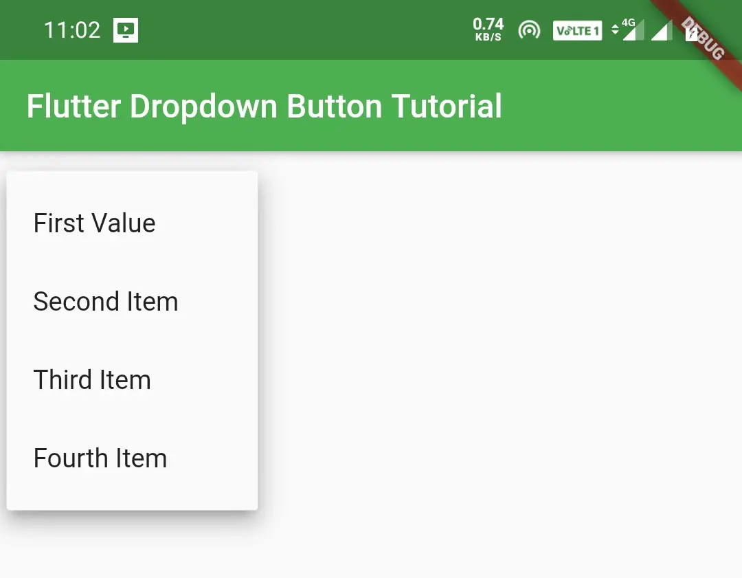
Let’s see another example where the list type is an object.
import 'package:flutter/cupertino.dart';
import 'package:flutter/material.dart';
import 'package:flutter/rendering.dart';

void main() {
  runApp(MyApp());
}
class MyApp extends StatefulWidget {
  @override
  _MyState createState() => _MyState();

class ListItem{
  int value;
  String name;
  ListItem(this.value, this.name);
}
class _MyState extends State<MyApp>
{
  int _value = 1;
  List<ListItem> _dropdownItems = [
    ListItem(1, "First Value"),
    ListItem(2, "Second Item"),
    ListItem(3, "Third Item"),
    ListItem(4, "Fourth Item")
  ];
  @override
  Widget build(BuildContext context) {
    return MaterialApp(
      home: Scaffold(
        appBar: AppBar(
          backgroundColor: Colors.green,
          title: Text("Flutter Dropdown Button Tutorial"),
        ),
        body:Container(
          padding: EdgeInsets.all(20),
          child:DropdownButton(
            value: _value,
            items: _dropdownItems.map((ListItem item) {
              return DropdownMenuItem<int>(
                child: Text(item.name),
                value: item.value,
              );
            }).toList(),
            onChanged: (value) {
              setState(() {
                _value = value;
              });
            },
            ),
          )
        )
    );
  }
}
Output:
Removing Underline of Dropdown Button
If you want to remove the underline for the dropdown button we can do so by wrapping it inside the DropdownButtonHideUnderline widget.
Container(
          padding: EdgeInsets.all(20),
          child:DropdownButtonHideUnderline(
            child:DropdownButton(
            value: _value,
            items: list_items.map((int item) {
              return DropdownMenuItem<int>(
                child: Text('Log $item'),
                value: item,
              );
            }).toList(),
            onChanged:(value) {
              setState(() {
                _value = value;
              });
            },
            hint:Text("Select item"),
            disabledHint:Text("Disabled"),
            elevation: 8,
            style:TextStyle(color:Colors.white, fontSize: 16),
            icon: Icon(Icons.arrow_drop_down_circle),
            iconDisabledColor: Colors.red,
            iconEnabledColor: Colors.green,
            isExpanded: true,
            dropdownColor: Colors.deepOrange,
            ),
          )
        )
Output:
That’s all about flutter dropdown button example with its properties in detail. Let’s catch up with some other cool flutter tutorials in next posts. Have a great day!!
Do share, subscribe and like my facebook page if you find this post helpful. Thank you!!
Reference: Flutter Official Documentation


Leave a Reply