Flutter Buttons
Buttons are material components in flutter which are used to trigger actions like submitting forms, making selections, etc in applications. Buttons are one of the most used components while designing an application. Flutter provides different types of buttons for different instances. For example text button for displaying text and an icon button for displaying an icon that is clickable. In addition to different buttons flutter also provides a wide range of features for styling and shaping the buttons.
In flutter, buttons are one of the most used flutter widgets in developing an application. In this tutorial, we will learn different types of buttons in flutter and how to use them.
Types of Flutter Buttons
Different types of buttons in flutter are:
- Flat Button
- Raised Button
- Outline Button
- Text Button
- Elevated Button
- Outlined Button
- Floating Action Button
- Icon Button
- Drop Down Button
- Popup Menu Button
Lets see the buttons individually
Flutter FlatButton
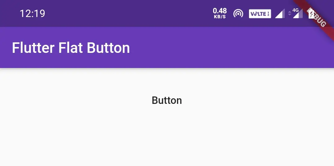
In flutter, we will use FlatButton widget to display a simple button. FlatButton is just a text button, because it has no style and border. It has no elevation, button color and text color like raised button. The text color is black with no background by default.
Example:
import 'package:flutter/cupertino.dart';
import 'package:flutter/material.dart';
import 'package:flutter/rendering.dart';

void main() {
  runApp(MyApp());
}
class MyApp extends StatefulWidget {
  @override
  _MyState createState() {
    return _MyState();
  }
}

class _MyState extends State<MyApp>
{
  @override
  Widget build(BuildContext context) {
    return MaterialApp(
      home: Scaffold(
        appBar: AppBar(
          backgroundColor: Colors.deepPurple,
          title: Text("Flutter Flat Button"),
        ),
        body: Container(
            width:double.infinity ,
            padding: EdgeInsets.all(20),
            alignment: Alignment.topCenter,
            child:FlatButton(
              child:Text("Button"),
              onPressed: () {
              },
            )
        ),
      )
    );
  }
}
Output:
Futter RaisedButton
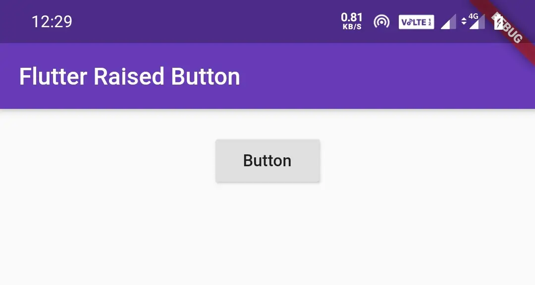
Flutter RaisedButton is a material widget. It has an elevation which is a material property.By default the elevation value for RaisedButton is 2. Use raised buttons to add dimension to otherwise mostly flat layouts, e.g. in long busy lists of content, or in wide spaces.
Note: Avoid using raised buttons on already-raised content such as dialogs or cards.
Example:
import 'package:flutter/cupertino.dart';
import 'package:flutter/material.dart';
import 'package:flutter/rendering.dart';

void main() {
  runApp(MyApp());
}
class MyApp extends StatefulWidget {
  @override
  _MyState createState() {
    return _MyState();
  }
}

class _MyState extends State<MyApp>
{
  @override
  Widget build(BuildContext context) {
    return MaterialApp(
      home: Scaffold(
        appBar: AppBar(
          backgroundColor: Colors.deepPurple,
          title: Text("Flutter Raised Button"),
        ),
        body: Container(
            width:double.infinity ,
            padding: EdgeInsets.all(20),
            alignment: Alignment.topCenter,
            child:RaisedButton(
              child:Text("Button"),
              onPressed: () {},
            )
        ),
      )
    );
  }
}
Output:
Flutter OutlineButton
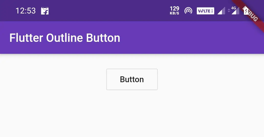
In flutter, we will use OutlineButton to display a simple button. It is nothing but a FlatButton with outline border. An OutlineButton is a label (child) displayed on a (zero elevation) Material widget.
Outlined buttons are medium-emphasis buttons. They contain actions that are important, but they aren’t the primary action in an app.
Example:
import 'package:flutter/cupertino.dart';
import 'package:flutter/material.dart';
import 'package:flutter/rendering.dart';

void main() {
  runApp(MyApp());
}
class MyApp extends StatefulWidget {
  @override
  _MyState createState() {
    return _MyState();
  }
}

class _MyState extends State<MyApp>
{
  @override
  Widget build(BuildContext context) {
    return MaterialApp(
      home: Scaffold(
        appBar: AppBar(
          backgroundColor: Colors.deepPurple,
          title: Text("Flutter Raised Button"),
        ),
        body: Container(
            width:double.infinity ,
            padding: EdgeInsets.all(20),
            alignment: Alignment.topCenter,
            child:OutlineButton(
              child:Text("Button"),
              onPressed: () {},
            )
        ),
      )
    );
  }
}
Output:
Note : The FlatButton, RaisedButton and Outlinebutton are going to depricate. The new widgets to use instead of those buttons are TextButton, ElevatedButton and OutlinedButton respectively. To use these new widget in our projects we have to use latest flutter sdk release.
I’m using sdk version 1.22.1 at the time of writing this article.
Flutter TextButton
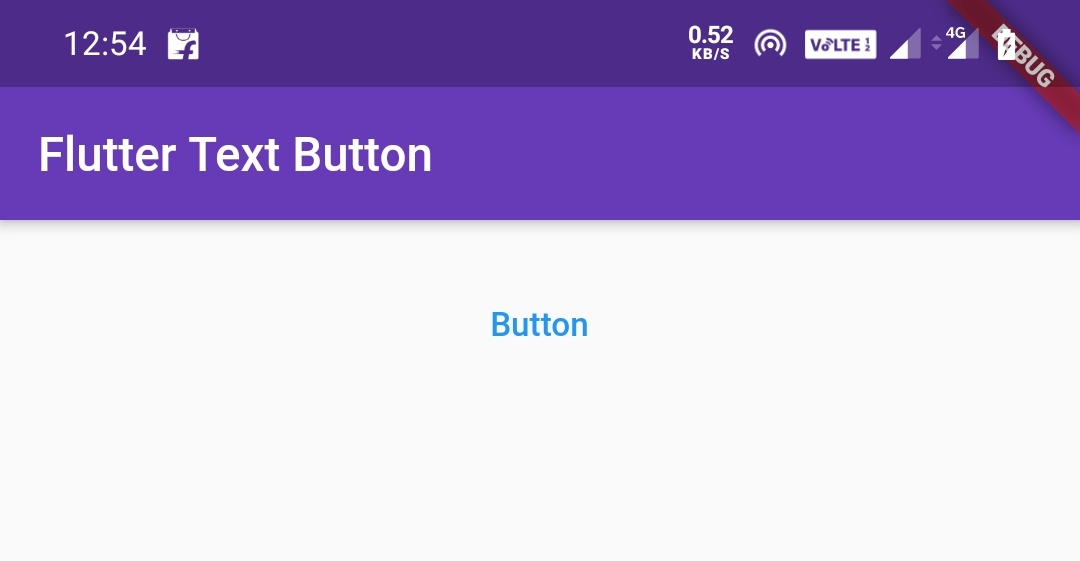
In flutter, we will use TextButton widget to display a simple button. A text button is a label (child) displayed on a (zero elevation) Material widget. We can style the label’s Text and Icon widgets using the style property of the individual widgets. The button reacts to touches by filling with the style’s ButtonStyle.backgroundColor.
Example:
import 'package:flutter/cupertino.dart';
import 'package:flutter/material.dart';
import 'package:flutter/rendering.dart';

void main() {
  runApp(MyApp());
}
class MyApp extends StatefulWidget {
  @override
  _MyState createState() {
    return _MyState();
  }
}

class _MyState extends State<MyApp>
{
  @override
  Widget build(BuildContext context) {
    return MaterialApp(
      home: Scaffold(
        appBar: AppBar(
          backgroundColor: Colors.deepPurple,
          title: Text("Flutter Text Button"),
        ),
        body: Container(
            width:double.infinity ,
            padding: EdgeInsets.all(20),
            alignment: Alignment.topCenter,
            child:TextButton(
              child: Text("Button"),
              onPressed:() {

              },
            )
        ),
      )
    );
  }
}
Output:
Flutter ElevatedButton
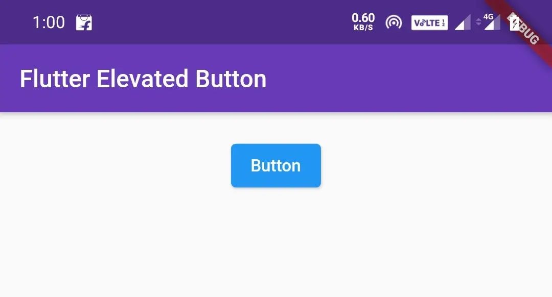
An elevated button is a label child displayed on a Material widget whose Material.elevation increases when the button is pressed. We can style the label’s Text and Icon widgets using the style property of the individual widgets.
Use elevated buttons to add dimension to otherwise mostly flat layouts, e.g. in long busy lists of content, or in wide spaces. Avoid using elevated buttons on already-elevated content such as dialogs or cards.
Example:
import 'package:flutter/cupertino.dart';
import 'package:flutter/material.dart';
import 'package:flutter/rendering.dart';

void main() {
  runApp(MyApp());
}
//void main() => runApp(MyApp());
class MyApp extends StatefulWidget {
  @override
  _MyState createState() {
    return _MyState();
  }
}

class _MyState extends State<MyApp>
{
  @override
  Widget build(BuildContext context) {
    return MaterialApp(
      home: Scaffold(
        appBar: AppBar(
          backgroundColor: Colors.deepPurple,
          title: Text("Flutter Elevated Button"),
        ),
        body: Container(
            width:double.infinity ,
            padding: EdgeInsets.all(20),
            alignment: Alignment.topCenter,
            child:ElevatedButton(
              child: Text("Button"),
              onPressed:() {

              },
            )
        ),
      )
    );
  }
}
Output:
Flutter OutlinedButton
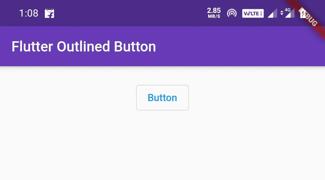
An OutlinedButton is a label (child) displayed on a (zero elevation) Material widget. It is nothing but a TextButton with outline border.
We can style the label’s Text and Icon widgets using the style property of the individual widgets. The outline’s weight and color are defined by ButtonStyle.side. The button reacts to touches by filling with the style’s ButtonStyle.backgroundColor.
Outlined buttons are medium-emphasis buttons. They contain actions that are important, but they aren’t the primary action in an app.
Example:
import 'package:flutter/cupertino.dart';
import 'package:flutter/material.dart';
import 'package:flutter/rendering.dart';

void main() {
  runApp(MyApp());
}
//void main() => runApp(MyApp());
class MyApp extends StatefulWidget {
  @override
  _MyState createState() {
    return _MyState();
  }
}

class _MyState extends State<MyApp>
{
  @override
  Widget build(BuildContext context) {
    return MaterialApp(
      home: Scaffold(
        appBar: AppBar(
          backgroundColor: Colors.deepPurple,
          title: Text("Flutter Outlined Button"),
        ),
        body: Container(
            width:double.infinity ,
            padding: EdgeInsets.all(20),
            alignment: Alignment.topCenter,
            child:OutlinedButton(
              child: Text("Button"),
              onPressed:() {

              },
            )
        ),
      )
    );
  }
}
Output:
Flutter FloatingActionButton
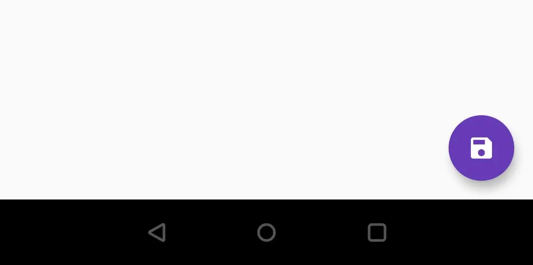
A floating action button is a circular icon button that hovers over content to promote a primary action in the application. We will use floating action buttons in the Scaffold.floatingActionButton field. The default position will be bottom right corner of the screen.
Example:
import 'package:flutter/cupertino.dart';
import 'package:flutter/material.dart';
import 'package:flutter/rendering.dart';

void main() {
  runApp(MyApp());
}
//void main() => runApp(MyApp());
class MyApp extends StatefulWidget {
  @override
  _MyState createState() {
    return _MyState();
  }
}

class _MyState extends State<MyApp>
{
  @override
  Widget build(BuildContext context) {
    return MaterialApp(
      home: Scaffold(
        appBar: AppBar(
          backgroundColor: Colors.deepPurple,
          title: Text("Flutter Floating Action Button"),
        ),
        floatingActionButton: FloatingActionButton(
          child: Icon(Icons.save),
          backgroundColor: Colors.deepPurple,
          foregroundColor: Colors.white,
          onPressed: () {
            setState(() {

            });
          },
        ),
      )
    );
  }
}
Output:
Flutter IconButton
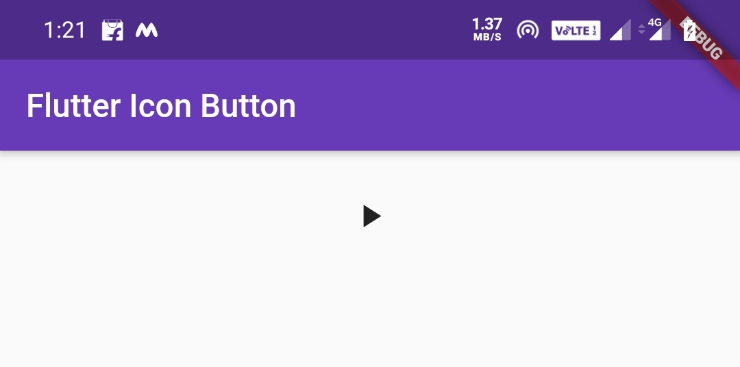
An icon button is a picture printed on a Material widget that reacts to touches by filling with color (ink).
Generally we will use IconButtons in the AppBar.actions field, but we can use them in many other places as well.
If the onPressed callback is null, then the button will be disabled and will not react to touch.
Example:
import 'package:flutter/cupertino.dart';
import 'package:flutter/material.dart';
import 'package:flutter/rendering.dart';

void main() {
  runApp(MyApp());
}
//void main() => runApp(MyApp());
class MyApp extends StatefulWidget {
  @override
  _MyState createState() {
    return _MyState();
  }
}

class _MyState extends State<MyApp>
{
  @override
  Widget build(BuildContext context) {
    return MaterialApp(
      home: Scaffold(
        appBar: AppBar(
          backgroundColor: Colors.deepPurple,
          title: Text("Flutter Icon Button"),
        ),
        body: Container(
          padding: EdgeInsets.all(20),
          alignment: Alignment.center,
          height: 50,
          child:IconButton(
            icon: Icon(Icons.play_arrow),
            onPressed: () {

            },
          ),
        ),
      )
    );
  }
}
Output:
Flutter DropdownButton
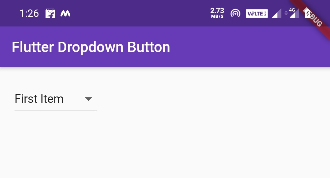
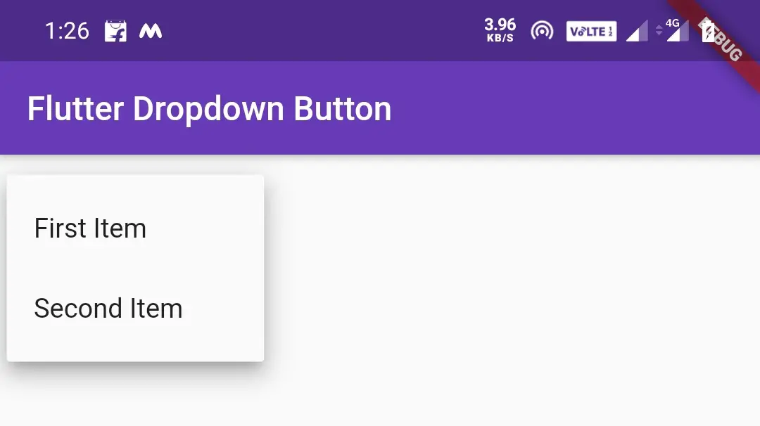
In flutter, dropdown button lets the user select from a number of items. The button shows the currently selected item as well as an arrow that opens a menu for selecting another item.
It is nothing but a dropdown list. We will use this to display a list of items to the user when clicked on it.
We have to use Stateful widget as dropdown button will have change in state based on the user selection.
Example:
import 'package:flutter/cupertino.dart';
import 'package:flutter/material.dart';
import 'package:flutter/rendering.dart';

void main() {
  runApp(MyApp());
}
class MyApp extends StatefulWidget {
  @override
  _MyState createState() => _MyState();
}
class _MyState extends State<MyApp>
{
  int _value = 1;
  @override
  Widget build(BuildContext context) {
    return MaterialApp(
      home: Scaffold(
        appBar: AppBar(
          backgroundColor: Colors.green,
          title: Text("Flutter Dropdown Button Tutorial"),
        ),
        body:Container(
          padding: EdgeInsets.all(20),
          child:DropdownButton(
            value: _value,
            items: [
              DropdownMenuItem(
                child: Text("First Item"),
                value: 1,
              ),
              DropdownMenuItem(
                child: Text("Second Item"),
                value: 2,
              )
            ],

            onChanged: (int value) {
              setState(() {
                _value = value;
              });
            },
            hint:Text("Select item")
            ),
          )
        )
    );
  }
}
Output:
After Clicking
Flutter Popup Menu Button
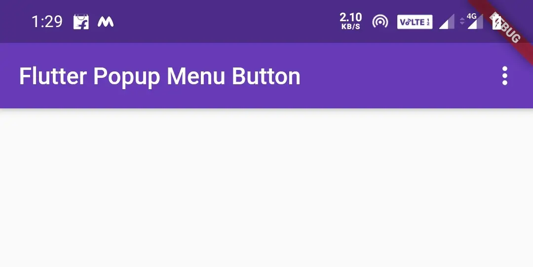
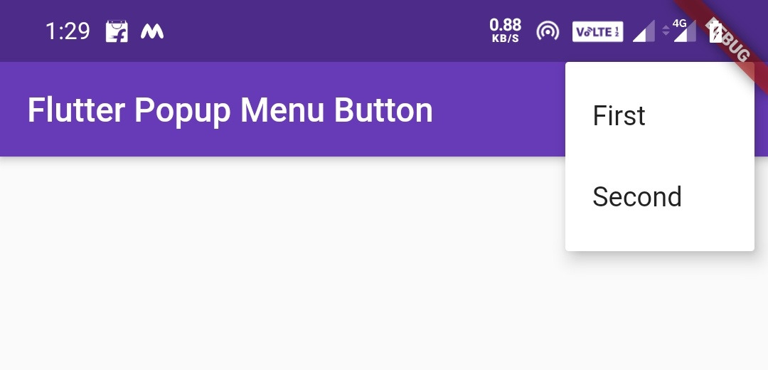
In flutter, popup menu button widget displays a menu when clicked/pressed. When we select an item the onSelected callback will invoke and the menu will dismiss. The value passed to onSelected is the value of the selected menu item.
The itemBuilder property is required which means without using it will throw an error.
Example:
import 'package:flutter/cupertino.dart';
import 'package:flutter/material.dart';
import 'package:flutter/rendering.dart';

void main() {
  runApp(MyApp());
}
class MyApp extends StatefulWidget {
  @override
  _MyState createState() {
    return _MyState();
  }
}
class _MyState extends State<MyApp>
{
  @override
  Widget build(BuildContext context) {
    return MaterialApp(
        home: Scaffold(
          appBar: AppBar(
            backgroundColor: Colors.deepPurple,
            title: Text("Flutter Popup Menu Button"),
            actions: [
              PopupMenuButton(
                  itemBuilder: (context) => [
                    PopupMenuItem(
                      child: Text("First"),
                      value: 1,
                    ),
                    PopupMenuItem(
                      child: Text("Second"),
                      value: 2,
                    )
                  ]
              )
            ],
          ),
        )
    );
  }
}
Output:
After clicking the popup menu button
Flutter ButtonBar
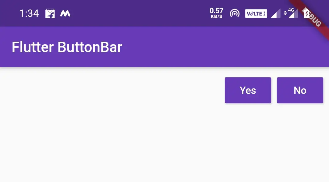
In flutter, ButtonBar places the buttons horizontally according to the buttonPadding. The children are laid out in a Row with MainAxisAlignment.end. When the Directionality is TextDirection.ltr, the button bar’s children are right justified and the last child becomes the rightmost child. When the Directionality is TextDirection.rtl the children are left justified and the last child becomes the leftmost child.
Example:
import 'package:flutter/cupertino.dart';
import 'package:flutter/material.dart';
import 'package:flutter/rendering.dart';

void main() {
  runApp(MyApp());
}
class MyApp extends StatefulWidget {
  @override
  _MyState createState() {
    return _MyState();
  }
}
class _MyState extends State<MyApp>
{
  @override
  Widget build(BuildContext context) {
    return MaterialApp(
        home: Scaffold(
          appBar: AppBar(
            backgroundColor: Colors.deepPurple,
            title: Text("Flutter ButtonBar "),
          ),
          body: ButtonBar(
            children: [
              RaisedButton(
                child: Text("Yes"),
                textColor: Colors.white,
                color: Colors.deepPurple,
                onPressed: (){},
              ),
              RaisedButton(
                child: Text("No"),
                textColor: Colors.white,
                color: Colors.deepPurple,
                onPressed: (){},
              ),
            ],
          ),
        )
    );
  }
}
Output:
That’s all about different types of flutter buttons in detail. Let’s catch up with some other flutter tutorial. Have a great day!!
Do share, subscribe and like my facebook page if you find this post helpful. Thank you!!
Reference: Flutter Official Documentation


Leave a Reply