Flutter FloatingActionButton
FloatingActionButton is a material widget in flutter that appears above the content of the screen. Generally, a floating action button is positioned at the bottom right corner of the screen by default. It represents the important action a user can perform in the app. It is recommended to use only one floating action button per screen. You can find floating action buttons in apps like Gmail and WhatsApp for composing new mail and to make a new conversation respectively.
In this tutorial, you will learn how to create and use a FloatingActionButton in flutter with example. We will also look at different types of floating action buttons and customizing them with different properties.
Also read Flutter dropdown Button Example.
Types Of FloatingActionButton In Flutter
In flutter there are two types of FloatingActionButtons.
- FloatingActionButton
- FloatingActionButton.extended
FloatingActionButton
We can create a floating action button by calling its constructor and by providing the required properties. The only required property is onPressed callback. We have to provide the child property with a text or icon to make the floating action button complete.
Generally, flutter will create a FloatingActionButton by default. It will have a child to display a widget and onPressed() method to respond to user taps. It is commonly used inside the scaffold widget.
Constructor:
FloatingActionButton(
{Key key,
Widget child,
String tooltip,
Color foregroundColor,
Color backgroundColor,
Color focusColor,
Color hoverColor,
Color splashColor,
Object heroTag: const _DefaultHeroTag(),
double elevation,
double focusElevation,
double hoverElevation,
double highlightElevation,
double disabledElevation,
@required VoidCallback onPressed,
MouseCursor mouseCursor,
bool mini: false,
ShapeBorder shape,
Clip clipBehavior: Clip.none,
FocusNode focusNode,
bool autofocus: false,
MaterialTapTargetSize materialTapTargetSize,
bool isExtended: false
})
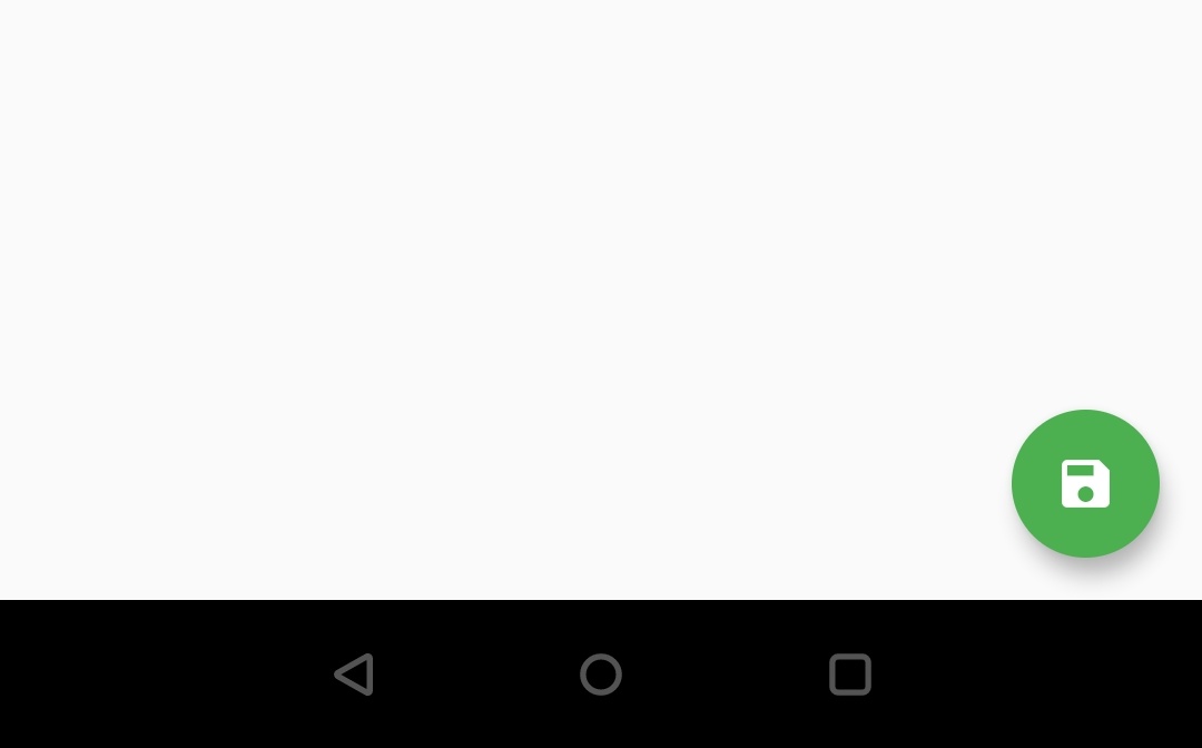
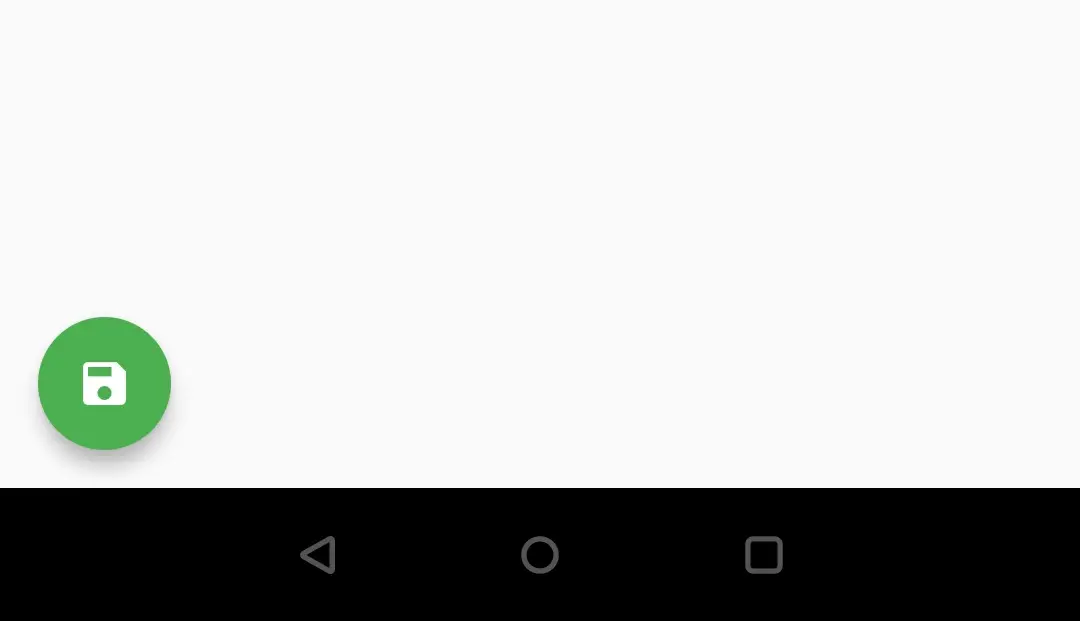
Flutter FloatingActionButton Example
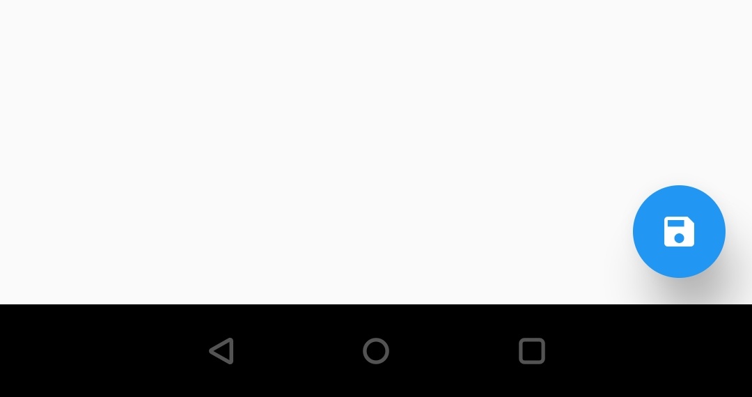
floatingActionButton: FloatingActionButton(
          child: Icon(Icons.save),
          backgroundColor: Colors.green,
          foregroundColor: Colors.white,
          onPressed: () {
            setState(() {

            });
          },
        ),
Output:
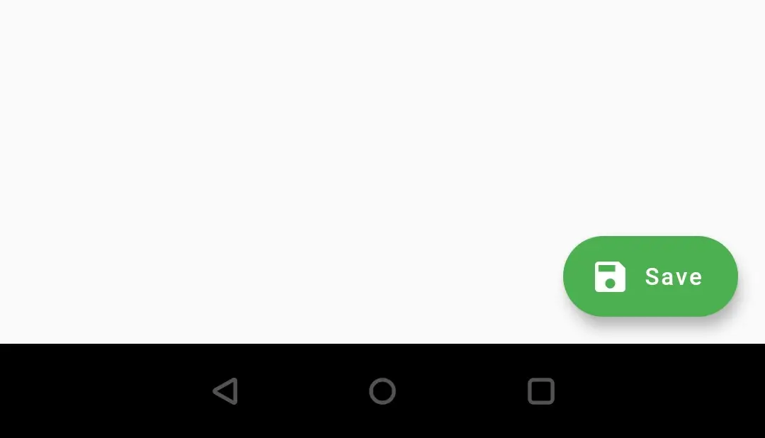
FloatingActionButton.extended
FloatingActionButton.extended is a bit wide with an icon and a label.
Constructor:
FloatingActionButton.extended(
{Key key,
String tooltip,
Color foregroundColor,
Color backgroundColor,
Color focusColor,
Color hoverColor,
Object heroTag: const _DefaultHeroTag(),
double elevation,
double focusElevation,
double hoverElevation,
Color splashColor,
double highlightElevation,
double disabledElevation,
@required VoidCallback onPressed,
MouseCursor mouseCursor: SystemMouseCursors.click,
ShapeBorder shape,
bool isExtended: true,
MaterialTapTargetSize materialTapTargetSize,
Clip clipBehavior: Clip.none,
FocusNode focusNode,
bool autofocus: false,
Widget icon,
@required Widget label
})
Example snippet
floatingActionButton: FloatingActionButton.extended(
          icon: Icon(Icons.save),
          label: Text("Save"),
          backgroundColor: Colors.green,
          foregroundColor: Colors.white,
        ),
Output:
FloatingActionButton Position
By default the position of the floating action button is endFloat. There is no property in FloatingActionButton to position it, but we can position it by using the floatingActionButtonLocation property of the scaffold. It takes FloatingActionButtonLocation class which has many constants. Let’s see them below
- FloatingActionButtonLocation.startDocked
- FloatingActionButtonLocation.startFloat
- FloatingActionButtonLocation.startTop
- FloatingActionButtonLocation.centerDocked
- FloatingActionButtonLocation.centerFloat
- FloatingActionButtonLocation.centerTop
- FloatingActionButtonLocation.endDocked
- FloatingActionButtonLocation.endFloat
- FloatingActionButtonLocation.endTop
- FloatingActionButtonLocation.miniStartDocked
- FloatingActionButtonLocation.miniStartFloat
- FloatingActionButtonLocation.miniStartTop
- FloatingActionButtonLocation.miniCenterDocked
- FloatingActionButtonLocation.miniCenterFloat
- FloatingActionButtonLocation.miniCenterTop
- FloatingActionButtonLocation.miniEndDocked
- FloatingActionButtonLocation.miniEndFloat
- FloatingActionButtonLocation.miniEndTop
I will show you two constant with examples and you guys try the rest as we have a lot more to discuss.
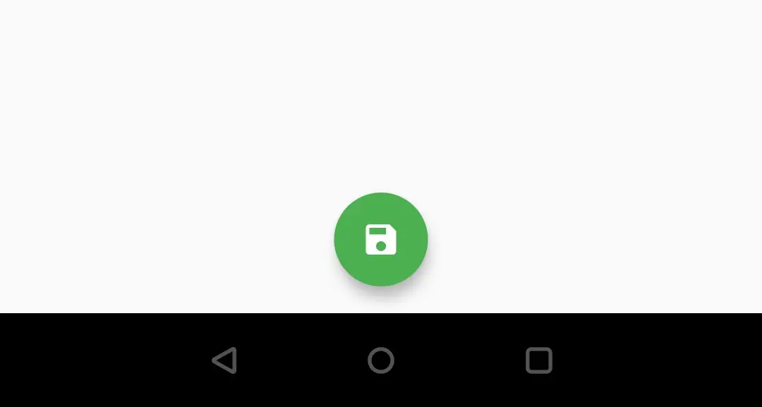
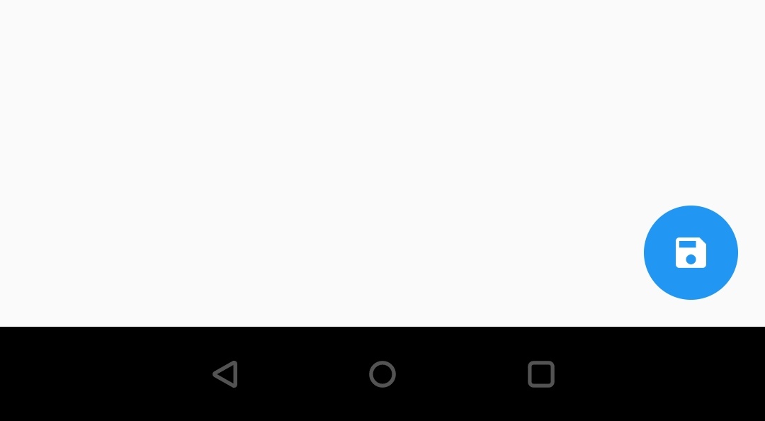
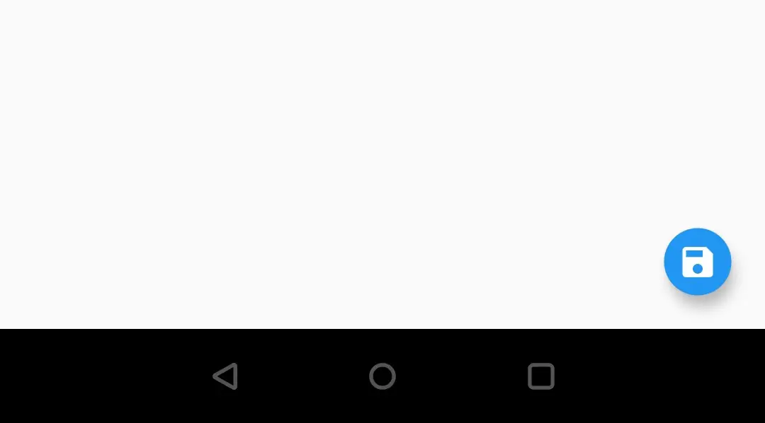
FloatingActionButtonLocation.centerFloat
floatingActionButtonLocation: FloatingActionButtonLocation.centerFloat,
        floatingActionButton: FloatingActionButton(
          child: Icon(Icons.save),
          backgroundColor: Colors.green,
          foregroundColor: Colors.white,
        ),
Output:
FloatingActionButtonLocation.startFloat
floatingActionButtonLocation: FloatingActionButtonLocation.startFloat,
        floatingActionButton: FloatingActionButton(
          child: Icon(Icons.save),
          backgroundColor: Colors.green,
          foregroundColor: Colors.white,
        ),
Output:
Flutter FloatingActionButton Properties
We can style the FloatingActionButton widget by changing colors, shape, etc. Let’s see the properties that help us to style the floating action button.
- backgroundColor
- foregroundColor
- splashColor
- elevation
- disabledElevation
- highlightElevation
- mini
- shape
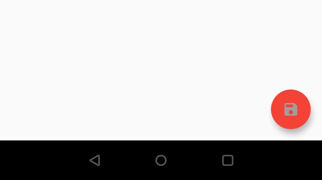
backgroundColor
We will use backgroundColor property to apply color to the button background.
floatingActionButton: FloatingActionButton(
          child: Icon(Icons.save),
          backgroundColor: Colors.red,
          onPressed: () {

          },
        ),
Output:

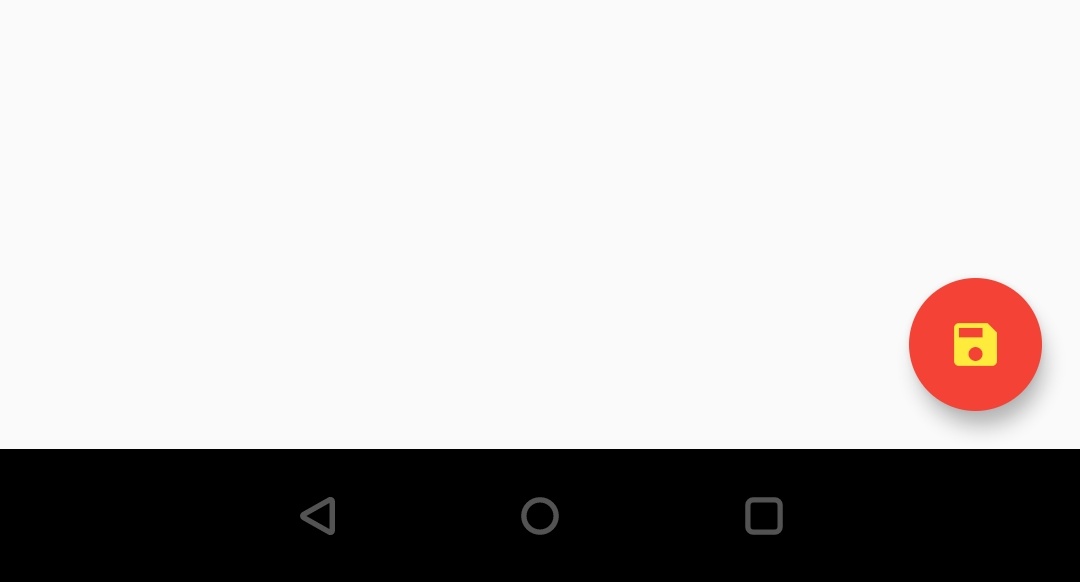
foregroundColor
ForegroundColor property is used to apply color to the child( text or icon ) of the button. If we use color property in the child widget then it will override the foreground color.
foregroundColor with no color applied to the child.
In this case, we are applying foreground color but not applying any color to the icon widget. The foreground color will apply to the icon as we have not defined color to Icon widget.
floatingActionButton: FloatingActionButton(
          child: Icon(Icons.save),
          backgroundColor: Colors.red,
          foregroundColor: Colors.grey,
          onPressed: () {

          },
        ),
Output:
foregroundColor with color applied to child.
Here we are applying foregroundColor and also defined color to the icon widget. As we have defined color to the icon widget, it will take that color but not the foreground color. The color of the icon widget overrides the foreground color.
floatingActionButton: FloatingActionButton(
          child: Icon(Icons.save, color: Colors.yellow,),
          backgroundColor: Colors.red,
          foregroundColor: Colors.grey,
          onPressed: () {

          },
        ),
Output:
splashColor
SplashColor property is used to apply color which appears when we tap the button. When the user taps the button the splashColor starts filling the button slowly. It fades out when the user releases the button.
floatingActionButton: FloatingActionButton(
          child: Icon(Icons.save),
          splashColor: Colors.deepOrange,
          onPressed: () {

          },
        ),
elevation
The elevation property is used to define the amount of elevation we want to apply to the FloatingActionButton.
Let’s set the elevation to 0 and see the output
floatingActionButton: FloatingActionButton(
          child: Icon(Icons.save),
          elevation: 0,
          onPressed: () {

          },
        ),
Output:
Now let’s set the elevation to 20 and see the output
floatingActionButton: FloatingActionButton(
          child: Icon(Icons.save),
          elevation: 20,
          onPressed: () {

          },
        ),
Output:
disabledElevation
The disabledElevation property is used to apply elevation when the button is disabled. To display the output I’m disabling the button by removing the onPressed property. We can also disable a button by setting onPressed to null.
floatingActionButton: FloatingActionButton(
          child: Icon(Icons.save),
          elevation: 0,
          disabledElevation: 20,
        ),
Output:
highlightElevation
We use the highlightElevation property to apply elevation when the button is highlighted or pressed.
floatingActionButton: FloatingActionButton(
          child: Icon(Icons.save),
          elevation: 0,
          highlightElevation: 20,
          onPressed: () {

          },
        ),
mini
The mini property is used to display a mini button instead of the default one. It takes a boolean value which we have to set true to display a mini button.
floatingActionButton: FloatingActionButton(
          child: Icon(Icons.save),
          mini: true,
          onPressed: () {

          },
        ),
Output:
shape
By using the shape property we can apply different shapes to the FloatingActionbutton. We can apply shapes like rectangular, rounded rectangle, circular, etc.
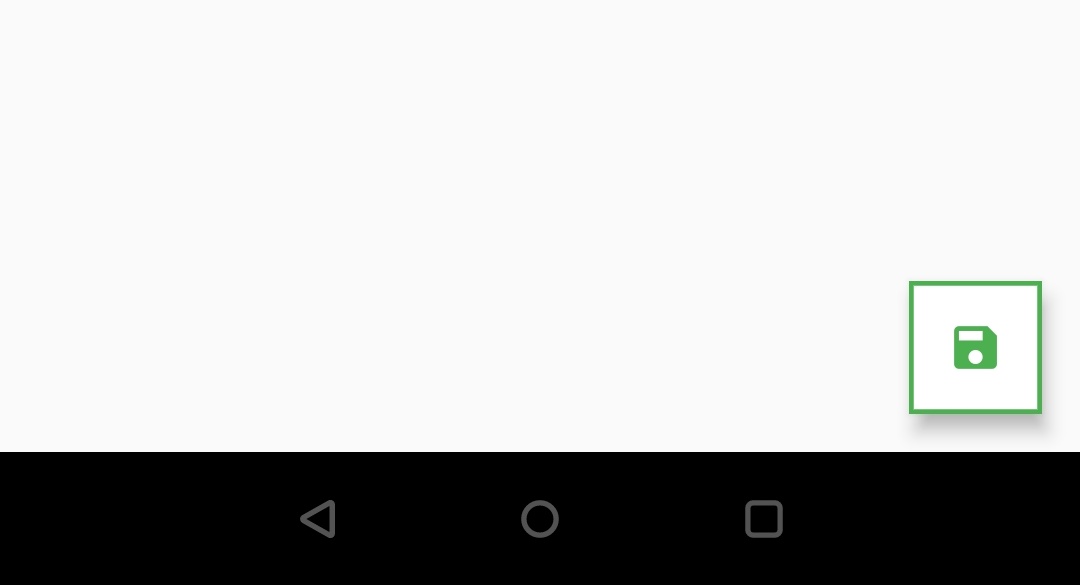
Rectangular border
floatingActionButton: FloatingActionButton(
          child: Icon(Icons.save),
          backgroundColor: Colors.white,
          foregroundColor: Colors.green,
          shape:Border.all(width: 2,color: Colors.green),
          onPressed: () {

          },
        ),
Output:
To know about more shapes please refer shaping raised button section of flutter raisedButton widget example.
That brings an end to the flutter FloatingActionButton example. I will see you in the next article with another flutter widget. Have a great day!!
Do share, subscribe, and like my Facebook page if you find this post helpful. Thank you!!
Reference: Flutter Official Documentation


Leave a Reply