
Flutter Text Widget
Text widget is one of the most used widgets in flutter. To display text in flutter applications we have to use a text widget. We can’t imagine an application without text in it. Using this widget we can display the text in single line or multiple lines. The text can be customized with different properties like fontsize, fontfamily, fontweight, color etc.
In this tutorial you will learn how to use a text widget in flutter with example. We will also customize the widget with different properties.
import 'package:flutter/cupertino.dart';
import 'package:flutter/gestures.dart';
import 'package:flutter/material.dart';
void main() {
runApp(MyApp());
}
class MyApp extends StatelessWidget {
@override
Widget build(BuildContext context) {
return MaterialApp(
home: Scaffold(
appBar: AppBar(
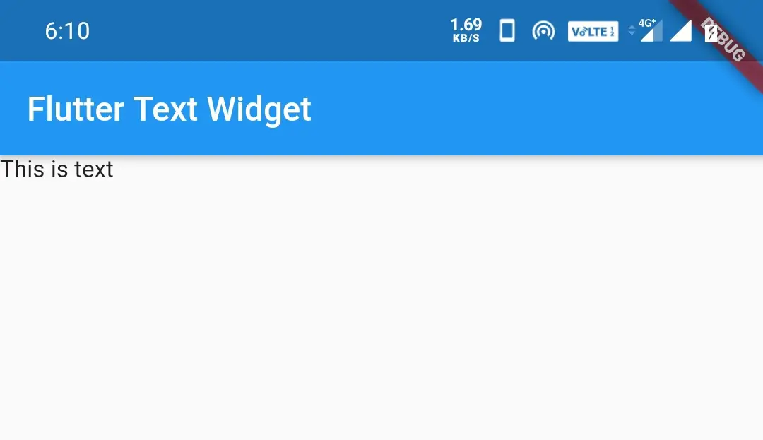
title: Text("Flutter Text Widget"),
),
body: Text("This is text"),
),
);
}
}
Output:
How To Create a Text Widget In Flutter ?
We can create a text widget in flutter by calling the constructor of Text class and provide the required arguments. As we can observe from the constuctor below there are no required properties for the text widget. But in order to display the text we have to provide the data property with some value.
Flutter Text Widget Constructor:
const Text(

    String data,
    {Key? key,
    TextStyle? style,
    StrutStyle? strutStyle,
    TextAlign? textAlign,
    TextDirection? textDirection,
    Locale? locale,
    bool? softWrap,
    TextOverflow? overflow,
    double? textScaleFactor,
    int? maxLines,
    String? semanticsLabel,
    TextWidthBasis? textWidthBasis,
    TextHeightBehavior? textHeightBehavior}

)
Flutter Text Widget Properties
The text widget has many properties for styling and aligning the text. Let’s see each property with an example in detail. Let’s see the properties list below.
- style
- textAlign
- textDirection
- softWrap
- overflow
- textScaleFactor
- maxlines
style
The text style property of the Text widget is used to apply different styles to the text. The style parameter uses the TextStyle class to apply styles. It has many parameters like color, fontSize, etc. Let’s see each parameter in detail with examples.
- color
- fontSize
- fontWeight
- fontStyle
- letterSpacing
- wordSpacing
- height
- foreground
- background
- shadows
- decoration
- decorationColor
- decorationStyle
- fontFamily
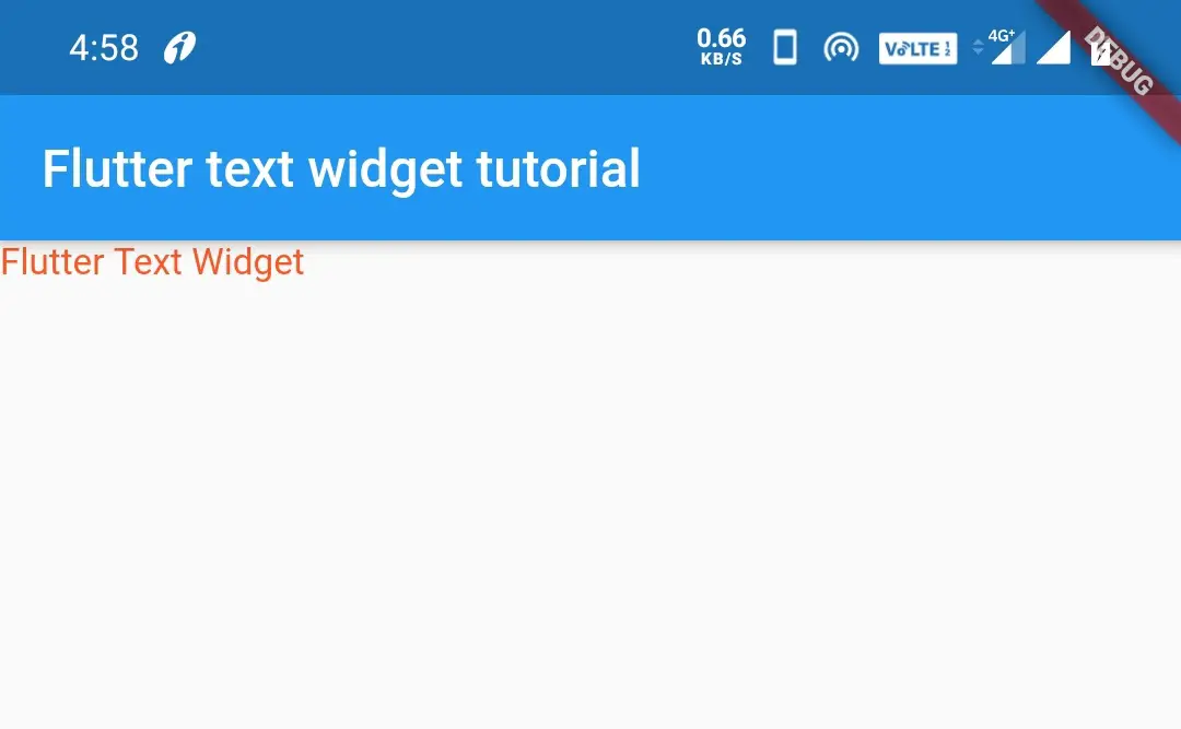
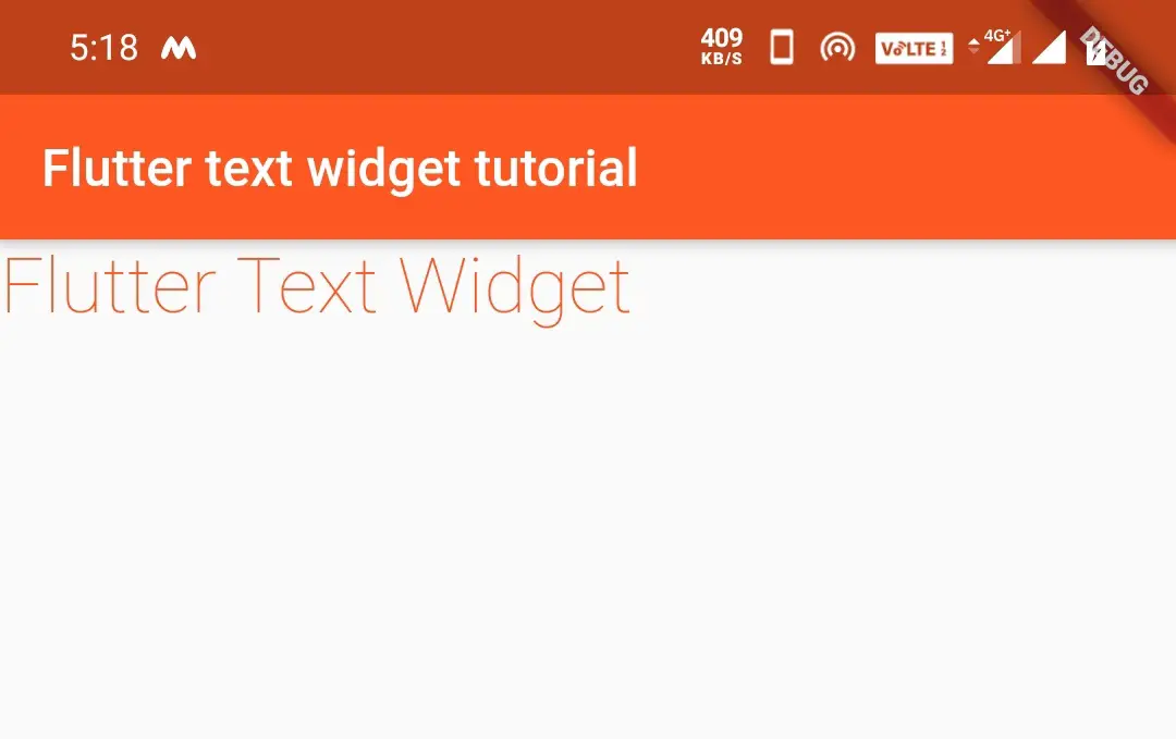
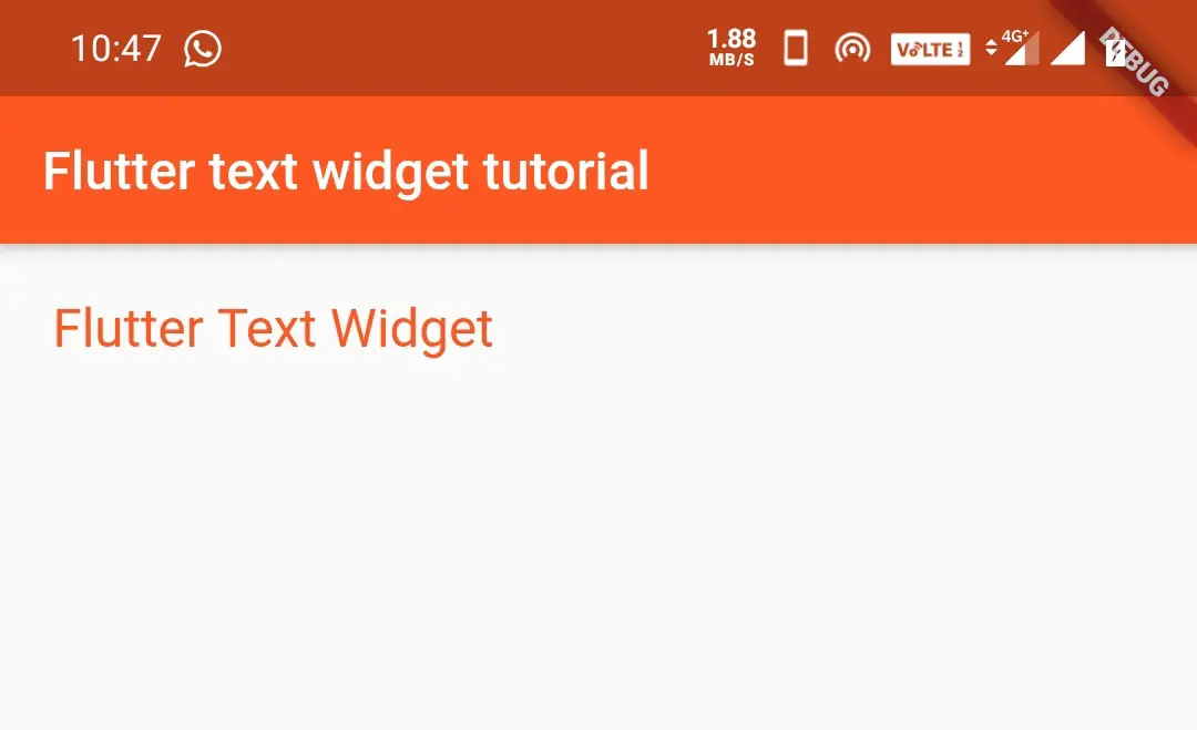
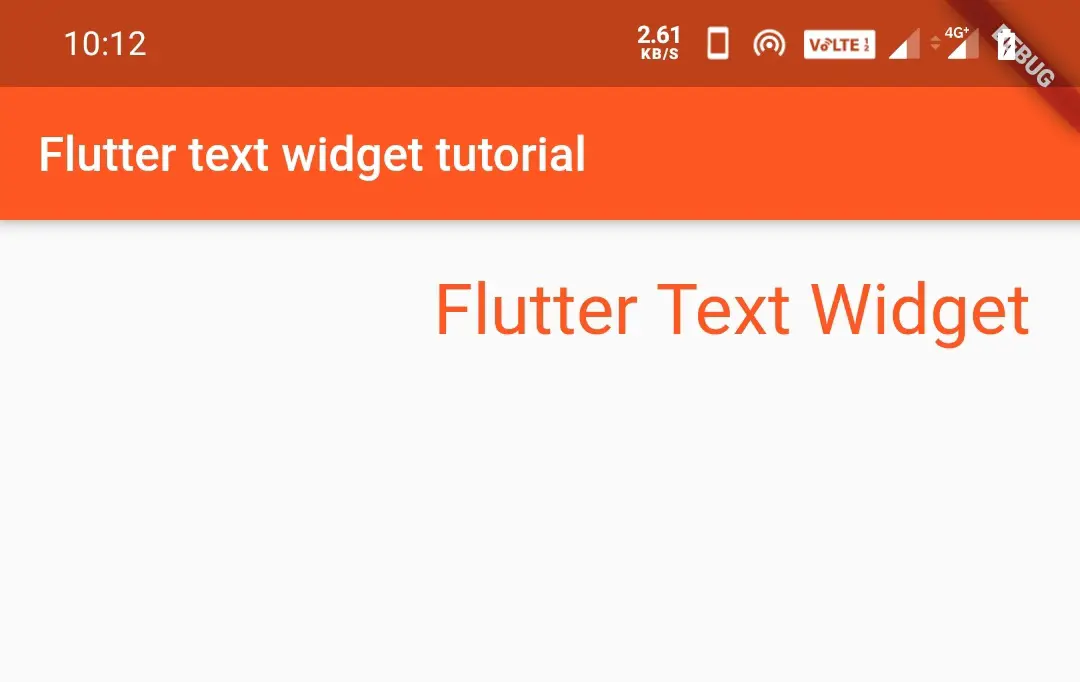
color:
When we define text, it will be displayed in black color by default. In some cases, we want to change color for making the app much better. In such cases, we use color parameter.
Text("Flutter Text Widget Tutorial",
style: TextStyle(
        color: Colors.deepOrange
        )
       )
Output:
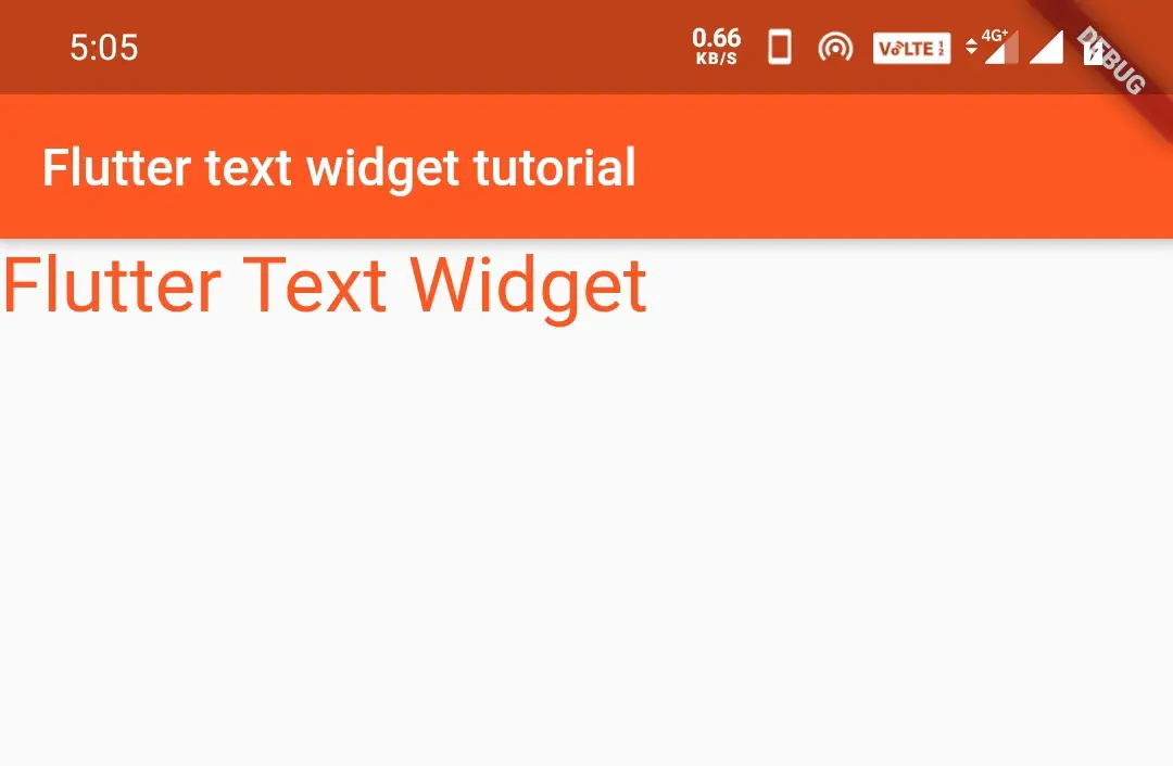
fontSize:
By default the text of the text widget is small. We will use fontSize when we want to increase or decrease the size of the text.
Text("Flutter Text Widget",
style: TextStyle(
        color: Colors.deepOrange,
        fontSize: 30
        )
       )
Output:
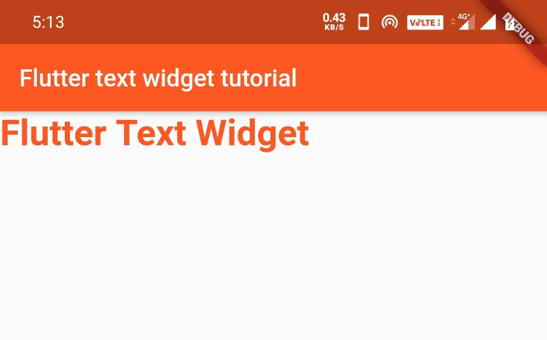
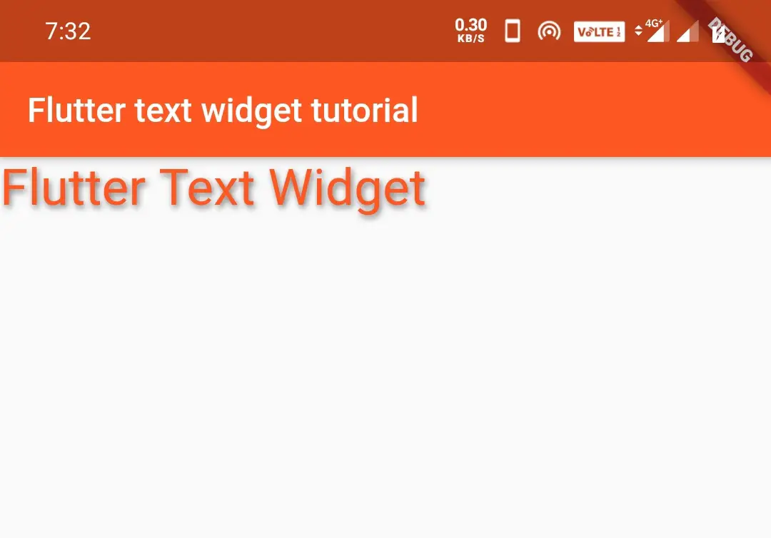
fontWeight:
The fontWeight parameter is used to define whether the text should be normal, bold, or values ranging from w100 to w900.
FontWeight.Bold
If we want to highlight some text, the bold parameter is used. It will display bold text. It is useful if we want to indicate headings with bold letters.
Text("Flutter Text Widget",
style: TextStyle(
color: Colors.deepOrange,
fontSize: 30,
fontWeight: FontWeight.bold)
)
Output:
FontWeight.w100 -w900
This gives weight from the lower value to high which means w100 is the least value and w900 gives height weight. Try the values for yourself.
Text("Flutter Text Widget",
style: TextStyle(
color: Colors.deepOrange,
fontSize: 30,
fontWeight: FontWeight.w100)
)
Output:
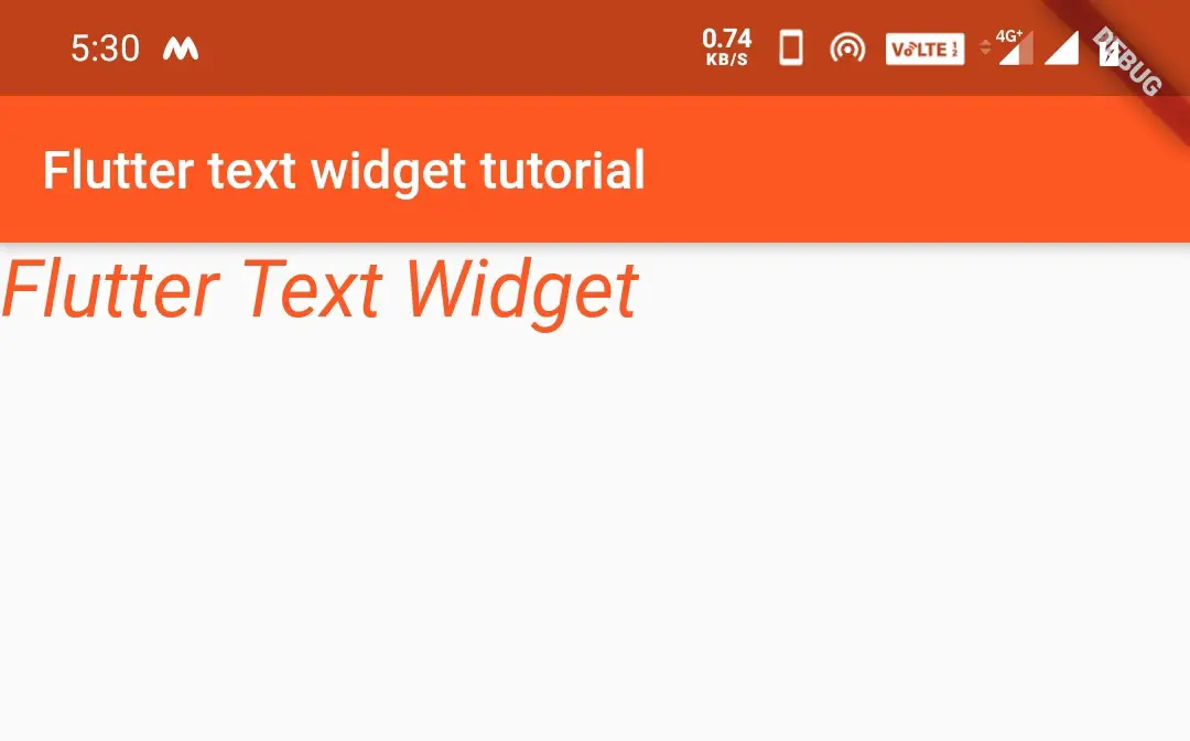
fontStyle:
The fontStyle is used to define the style for the font which can be normal or italic.
Text("Flutter Text Widget",
style: TextStyle(
color: Colors.deepOrange,
fontSize: 30,
fontWeight: FontWeight.normal,
 fontStyle: FontStyle.italic
)
)
Output:
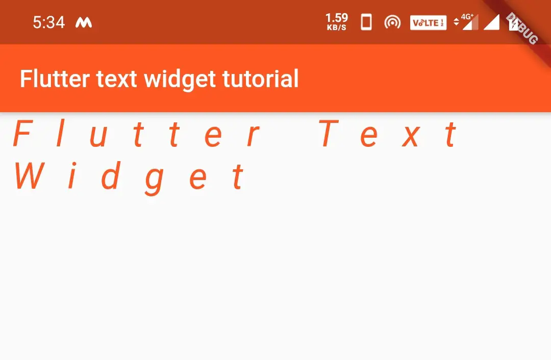
letterSpacing:
If we feel that the letters are too close we can use letter spacing parameter. The letterSpacing is used to define the amount of space between the letters.
Text("Flutter Text Widget",
            style: TextStyle(
                color: Colors.deepOrange,fontSize: 30,
                fontWeight: FontWeight.normal,
                fontStyle: FontStyle.italic,
                letterSpacing: 20
            )
        )
Output:
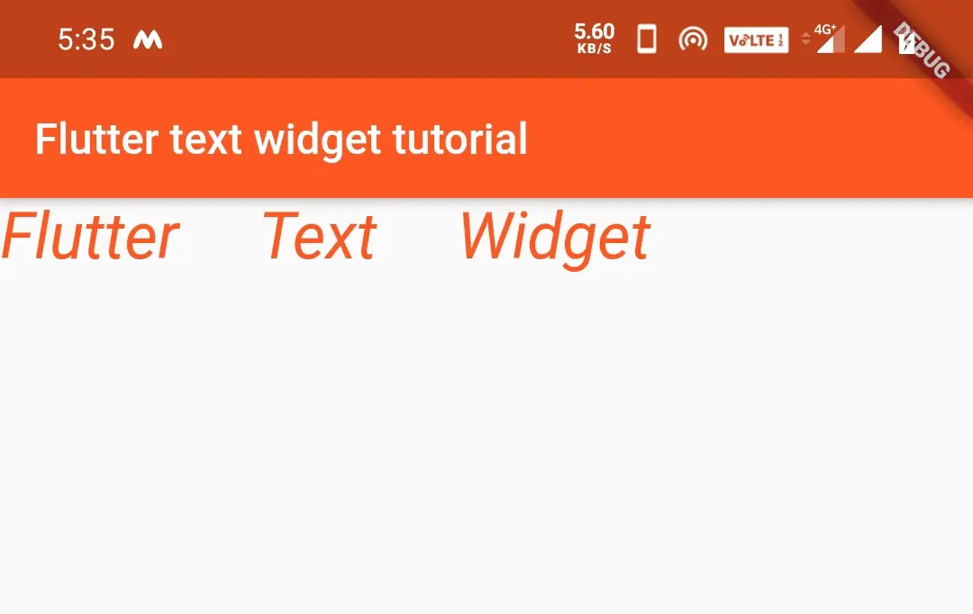
wordSpacing:
The wordSpacing is used to define the amount of space between the words. It will be useful if the words are too close.
Text("Flutter Text Widget",
            style: TextStyle(
                color: Colors.deepOrange,fontSize: 30,
                fontWeight: FontWeight.normal,
                fontStyle: FontStyle.italic,
                wordSpacing: 30
            )
        )
Output:
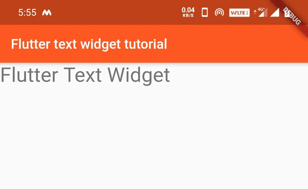
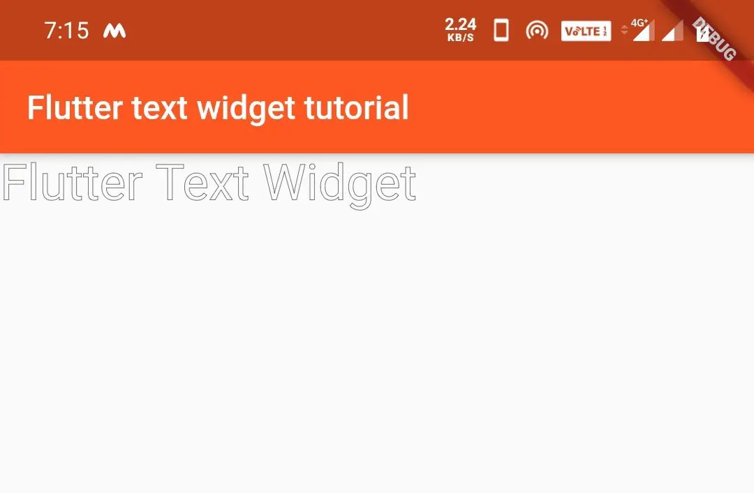
foreground:
The foreground parameter is used to style the text foreground properties. It accepts paint as value. Remember that you cannot apply text color when you use foreground.
PaintingStyle.fill
import 'package:flutter/cupertino.dart';
import 'package:flutter/gestures.dart';
import 'package:flutter/material.dart';

void main() {
  runApp(MyApp());
}
class MyApp extends StatelessWidget {
  @override
  Widget build(BuildContext context) {
    var paint = Paint();
    paint.color = Colors.black54;
    paint.style = PaintingStyle.fill;
    return MaterialApp(
      home: Scaffold(
        appBar: AppBar(
          backgroundColor: Colors.deepOrange,
          title: Text("Flutter text widget tutorial"),
        ),
        body: Text("Flutter Text Widget",
            style: TextStyle(
                fontSize: 30,
                fontWeight: FontWeight.normal,
                fontStyle: FontStyle.normal,
                foreground: paint,
            )
        )
      ),
    );
  }
}
Output:
PaintingStyle.stroke
import 'package:flutter/cupertino.dart';
import 'package:flutter/gestures.dart';
import 'package:flutter/material.dart';

void main() {
  runApp(MyApp());
}
class MyApp extends StatelessWidget {
  @override
  Widget build(BuildContext context) {
    var paint = Paint();
    paint.color = Colors.black54;
    paint.style = PaintingStyle.stroke;

return MaterialApp(
      home: Scaffold(
        appBar: AppBar(
          backgroundColor: Colors.deepOrange,
          title: Text("Flutter text widget tutorial"),
        ),
        body: Text("Flutter Text Widget",
            style: TextStyle(
                fontSize: 30,
                fontWeight: FontWeight.normal,
                fontStyle: FontStyle.normal,
                foreground: paint,
            )
        )
      ),
    );
  }
}
Output:
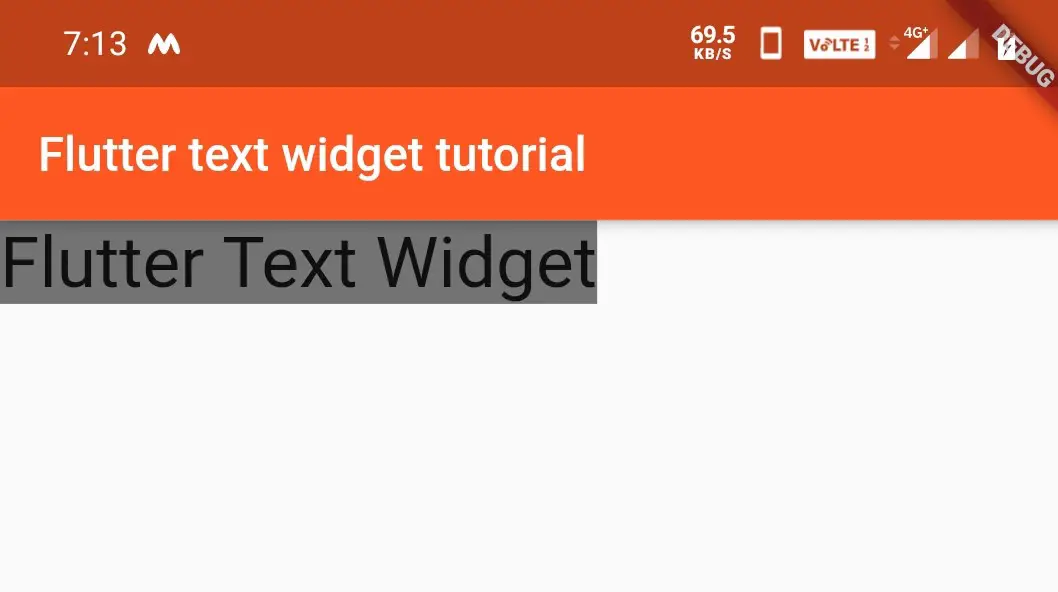
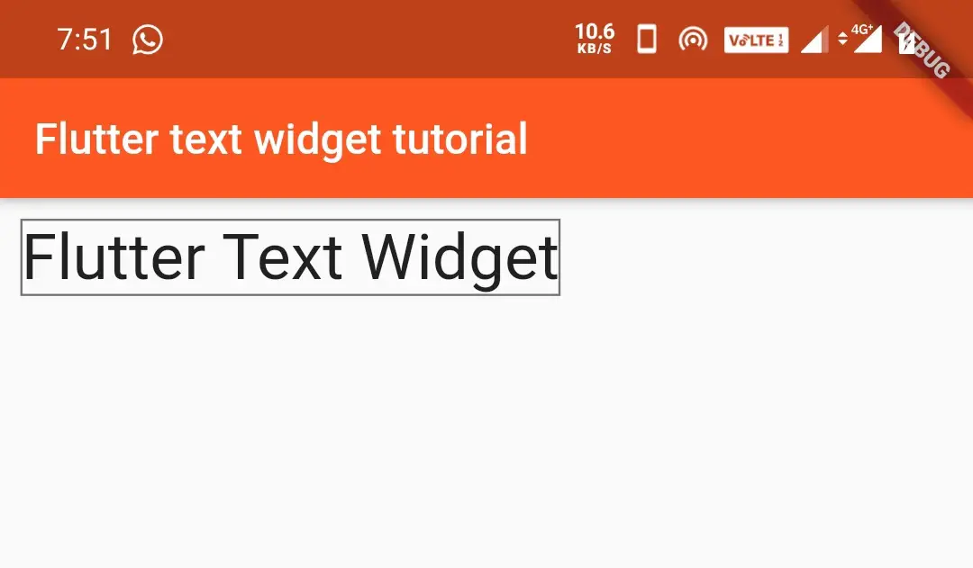
background:
The background parameter is used to style the text background properties. It accepts paint as value.
PaintingStyle.fill
Text("Flutter Text Widget",
            style: TextStyle(
                fontSize: 30,
                fontWeight: FontWeight.normal,
                fontStyle: FontStyle.normal,
                background: new Paint()
                ..color = Colors.black54
                ..style = PaintingStyle.fill
                ..strokeWidth = 1
            )
        )
Output:
PaintingStyle.stroke
Padding(
          padding: EdgeInsets.all(10),
            child:Text("Flutter Text Widget",
            style: TextStyle(
              fontSize: 30,
              fontWeight: FontWeight.normal,
              fontStyle: FontStyle.normal,
              background: new Paint()
                ..color = Colors.black54
                ..style = PaintingStyle.stroke
                ..strokeWidth = 1
            )
        )
        )
Output:
shadow:
When we want to display shadow to the text, the shadow parameter is used. The constructor has three arguments color, offset, and blurRadius.We can add multiple shadows using shadows[Shadow1, Shadow2].
- Color is color of the shadow.
- Offset is direction from the origin of the text widget.
- BlurRadius is the amount of space to be blurred.
Text("Flutter Text Widget",
            style: TextStyle(
                color: Colors.deepOrange,
                fontSize: 30,
                fontWeight: FontWeight.normal,
                fontStyle: FontStyle.normal,
                shadows:[Shadow(color:Colors.black54, offset:Offset(1,2), blurRadius: 4 ) ]
            )
        )
Output:
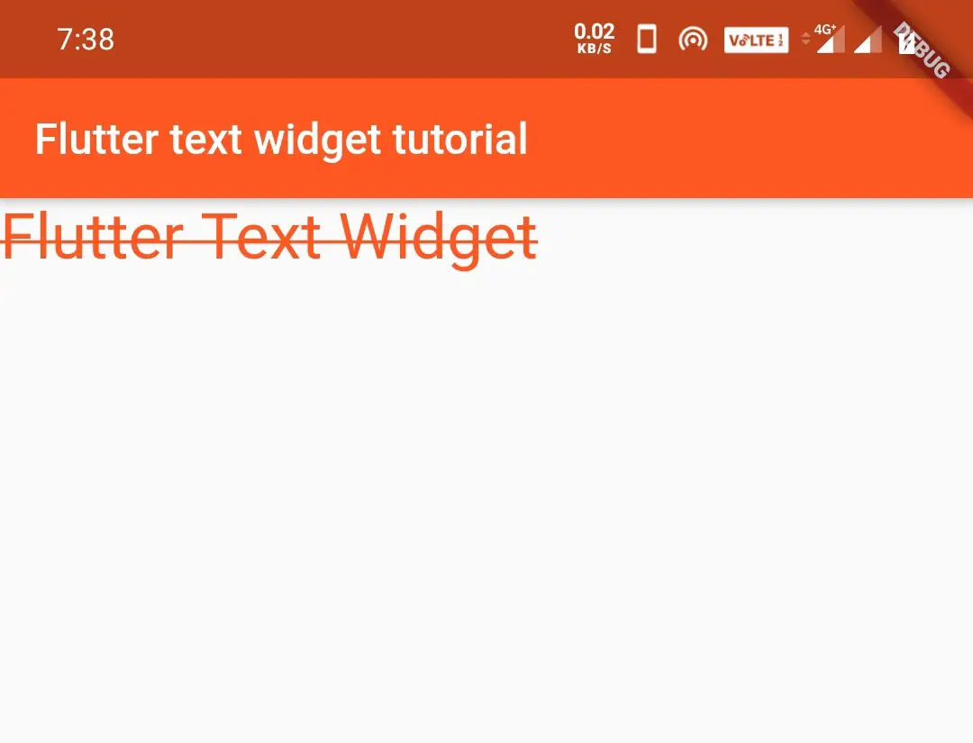
decoration:
This decoration parameter is used to decorate the text using TextDecoration class. It has three constants lineThrough, overline, and underline.
TextDecoration.lineThrough
The lineThrough constant of TextDecoration class draws a line horizontally in the center of the text. This line strikes the text making exactly two equal halves horizontally.
Text("Flutter Text Widget",
            style: TextStyle(
                color: Colors.deepOrange,
                fontSize: 30,
                fontWeight: FontWeight.normal,
                fontStyle: FontStyle.normal,
                decoration:TextDecoration.lineThrough
            )
        )
Output:
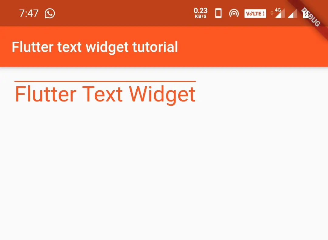
TextDecoration.overline
The overline constant of TextDecoration class displays a line horizontally above the text.
Container(
          padding: EdgeInsets.all(20),
            child:Text("Flutter Text Widget",
            style: TextStyle(
                color: Colors.deepOrange,
                fontSize: 30,
                fontWeight: FontWeight.normal,
                fontStyle: FontStyle.normal,
                decoration:TextDecoration.overline
            )
        ),
        )
Output:
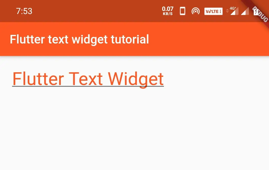
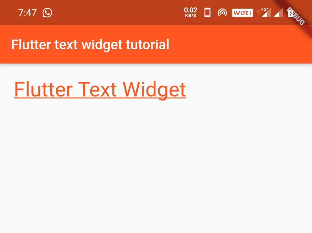
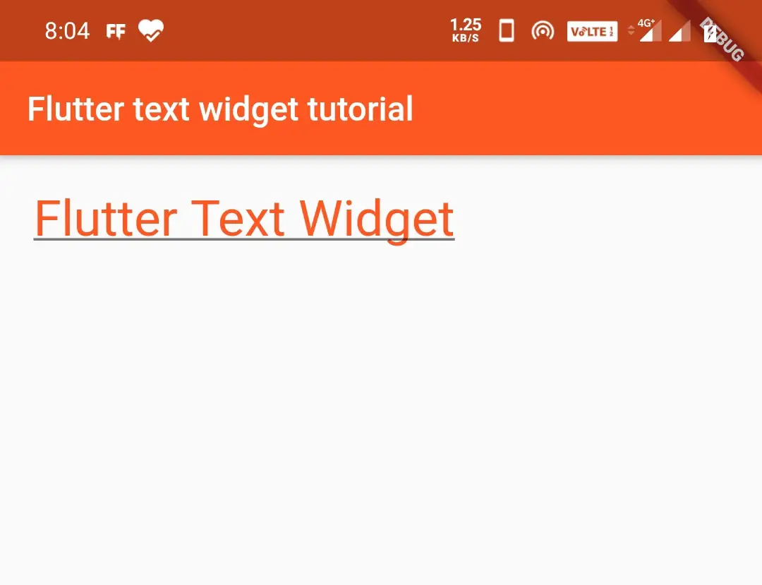
TextDecoration.underline
The underline constant of TextDecoration class displays a line horizontally under the text.
Container(
          padding: EdgeInsets.all(20),
            child:Text("Flutter Text Widget",
            style: TextStyle(
                color: Colors.deepOrange,
                fontSize: 30,
                fontWeight: FontWeight.normal,
                fontStyle: FontStyle.normal,
                decoration:TextDecoration.underline
            )
        ),
        )
Output:
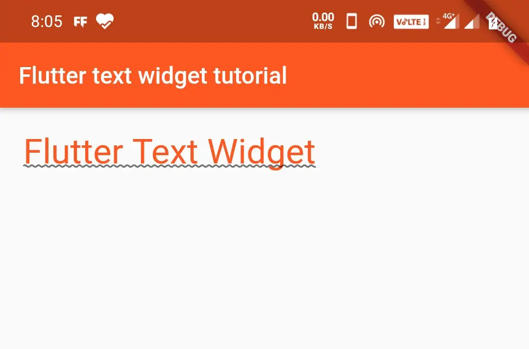
decorationColor:
In the above example, we have applied decoration to text. If we want to apply color to that decoration we will use decorationColor parameter.
Container(
          padding: EdgeInsets.all(20),
            child:Text("Flutter Text Widget",
            style: TextStyle(
                color: Colors.deepOrange,
                fontSize: 30,
                fontWeight: FontWeight.normal,
                fontStyle: FontStyle.normal,
                decoration:TextDecoration.underline,
              decorationColor: Colors.black54
            )
        ),
        )
Output:
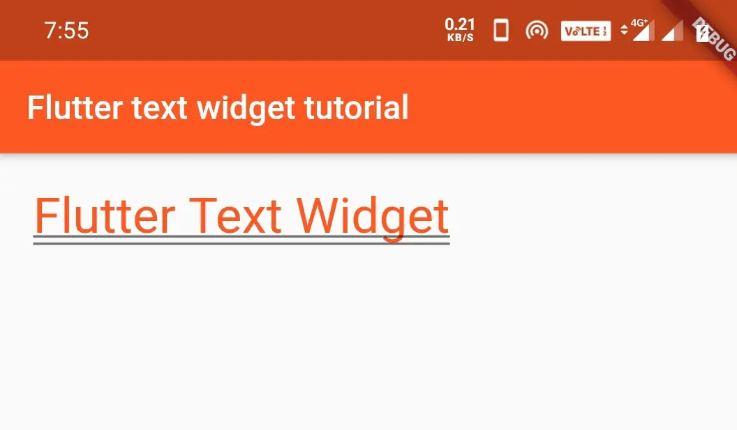
decorationStyle:
The decorationStyle parameter uses TextDecorationStyle class to apply a style to the text. The TextDecoration style class has many constants like double, dashed, dotted, solid, wavy.
TextDecorationStyle.double
The double constant of TextDecorationStyle is used to style the decoration applied to the text. It displays a double line over, under, or through the text as per the decoration.
Container(
          padding: EdgeInsets.all(20),
            child:Text("Flutter Text Widget",
            style: TextStyle(
                color: Colors.deepOrange,
                fontSize: 30,
                fontWeight: FontWeight.normal,
                fontStyle: FontStyle.normal,
                decoration:TextDecoration.underline,
              decorationColor: Colors.black54,
                decorationStyle: TextDecorationStyle.double
            )
        ),
        )
Output:
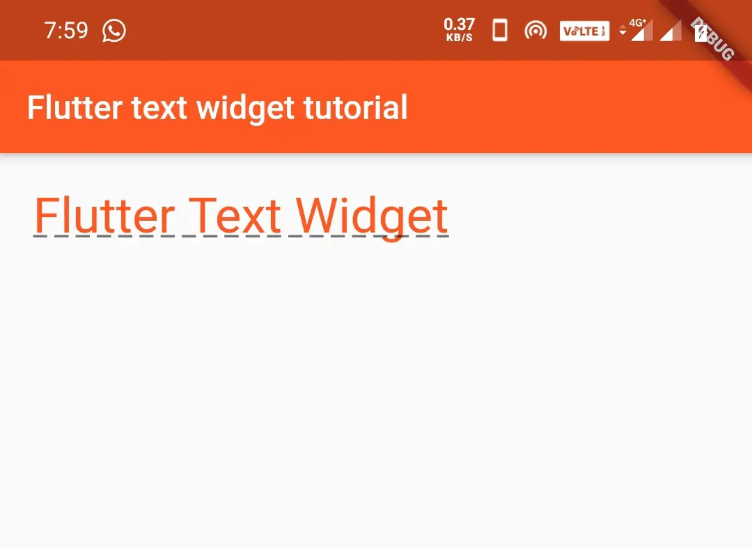
TextDecorationStyle.dashed
Displays a dashed line over, under, or through the text as per the decoration.
Container(
          padding: EdgeInsets.all(20),
            child:Text("Flutter Text Widget",
            style: TextStyle(
                color: Colors.deepOrange,
                fontSize: 30,
                fontWeight: FontWeight.normal,
                fontStyle: FontStyle.normal,
                decoration:TextDecoration.underline,
              decorationColor: Colors.black54,
                decorationStyle: TextDecorationStyle.dashed
            )
        ),
        )
Output:
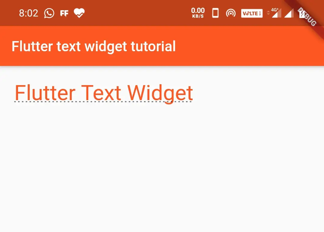
TextDecorationStyle.dotted
Displays a dotted line over, under, or through the text as per the decoration.
 Container(
          padding: EdgeInsets.all(20),
            child:Text("Flutter Text Widget",
            style: TextStyle(
                color: Colors.deepOrange,
                fontSize: 30,
                fontWeight: FontWeight.normal,
                fontStyle: FontStyle.normal,
                decoration:TextDecoration.underline,
                decorationColor: Colors.black54,
                decorationStyle: TextDecorationStyle.dotted
            )
        ),
        )
Output:
TextDecorationStyle.solid
Displays a solid line over, under, or through the text as per the decoration.
Container(
          padding: EdgeInsets.all(20),
            child:Text("Flutter Text Widget",
            style: TextStyle(
                color: Colors.deepOrange,
                fontSize: 30,
                fontWeight: FontWeight.normal,
                fontStyle: FontStyle.normal,
                decoration:TextDecoration.underline,
                decorationColor: Colors.black54,
                decorationStyle: TextDecorationStyle.solid
            )
        ),
        )
Output:
TextDecorationStyle.wavy
Displays a wavy line over, under, or through the text as per the decoration.
Container(
          padding: EdgeInsets.all(20),
            child:Text("Flutter Text Widget",
            style: TextStyle(
                color: Colors.deepOrange,
                fontSize: 30,
                fontWeight: FontWeight.normal,
                fontStyle: FontStyle.normal,
                decoration:TextDecoration.underline,
                decorationColor: Colors.black54,
                decorationStyle: TextDecorationStyle.wavy
            )
        ),
        )
Output:
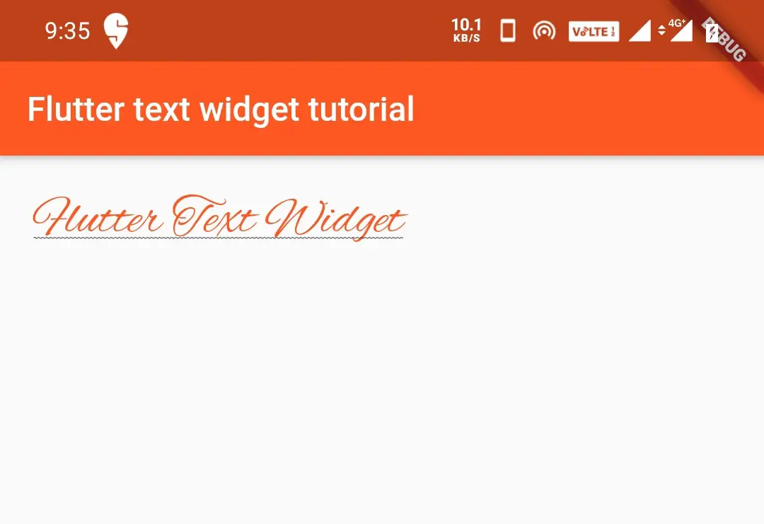
fontFamily:
The fontFamily parameter is used to change the font/typeface of the text. First, we should download a typeface file of our desired font. This file extension will be .ttf.Create a folder named assets/fonts in the root directory of your project. Now copy and paste the file inside the assets/fonts directory.
Update the pubspec.yaml file with the following code. I have added alexbrush.ttf into the assets/fonts folder.
flutter:
  assets:
    - assets/images/
    - assets/fonts/

  fonts:
    - family: alex
      fonts:
      - asset: assets/fonts/alexbrush.ttf
Now to use the font/typeface we have to use the family name. In my case it’s alex. We have to use this name as the value for fontFamily: property.
Container(
          padding: EdgeInsets.all(20),
            child:Text("Flutter Text Widget",
            style: TextStyle(
                color: Colors.deepOrange,
                fontSize: 30,
                fontWeight: FontWeight.normal,
                fontStyle: FontStyle.normal,
                decoration:TextDecoration.underline,
                decorationColor: Colors.black54,
                decorationStyle: TextDecorationStyle.wavy,
                fontFamily: "alex"
            )
        ),
        )
Output:
textAlign
The textAlign parameter aligns the text position in a parent widget. The constants of TextAlign are start, end, left, right, center, and justify. I am using a container as a parent widget in the below example. Both start and left will give the same result. In the same way, right and end will give the same result. So I am only giving examples for start, end & center.
TextAlign.start
Aligns text to the start of the screen horizontally.
Container(
          padding: EdgeInsets.all(20),
            child:Text("Flutter Text Widget",
            style: TextStyle(
                color: Colors.deepOrange,
                fontSize: 30,
                fontWeight: FontWeight.normal,
            ),
                textAlign: TextAlign.start,
        ),
        )
Output:
TextAlign.end
Aligns text to the end of the screen horizontally.
Container(
          padding: EdgeInsets.all(20),
            child:Text("Flutter Text Widget",
            style: TextStyle(
                color: Colors.deepOrange,
                fontSize: 30,
                fontWeight: FontWeight.normal,
            ),
                textAlign: TextAlign.end,
        ),
        )
Output:
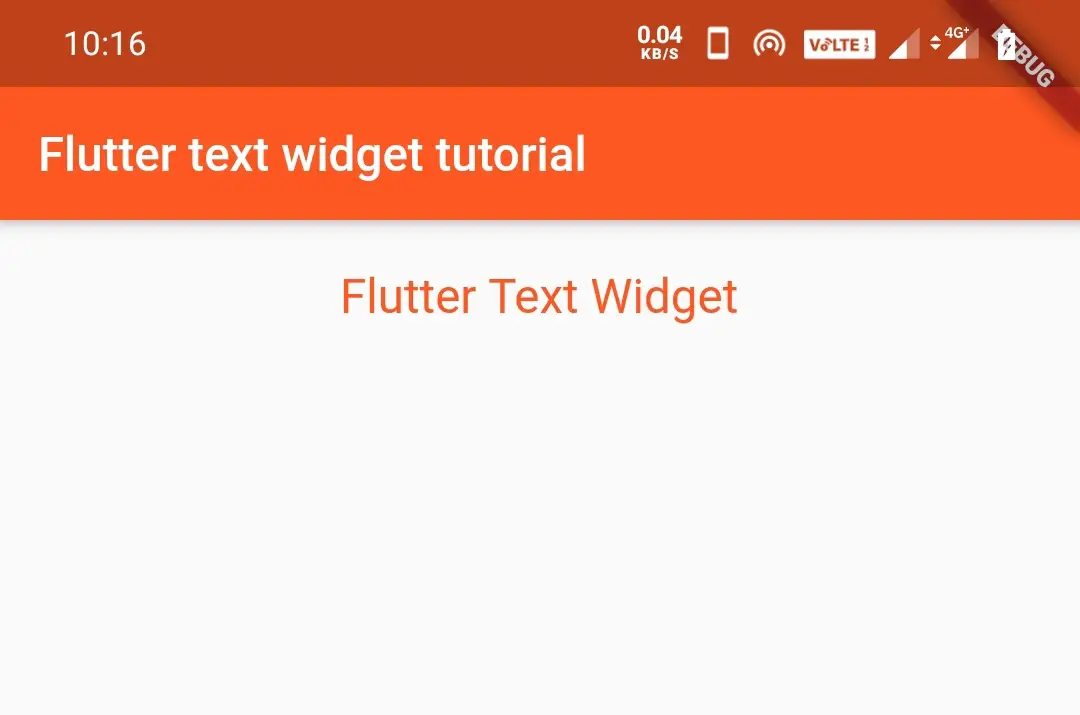
TextAlign.center
Aligns the text in the center of the screen horizontally.
 Container(
          width: double.infinity,
          padding: EdgeInsets.all(20),
            child:Text("Flutter Text Widget",
            style: TextStyle(
                color: Colors.deepOrange,
                fontSize: 20,
                fontWeight: FontWeight.normal,
            ),
                textAlign: TextAlign.center,
        ),
        )
Output:
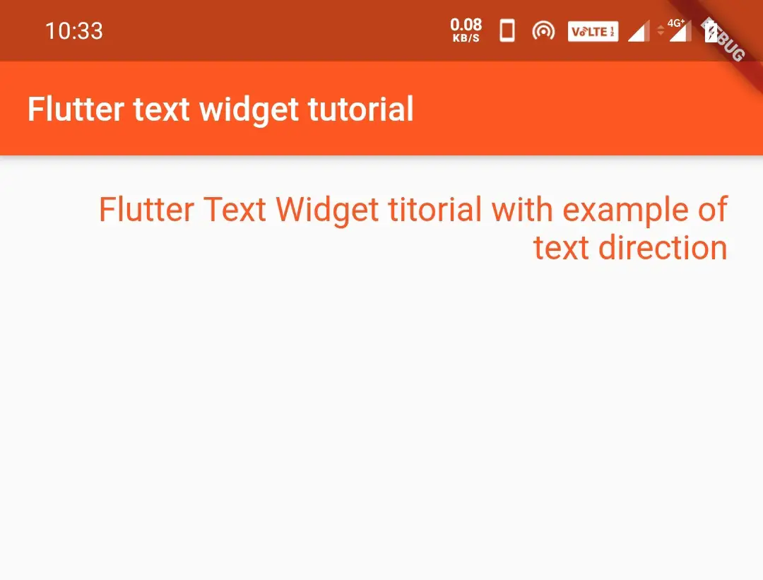
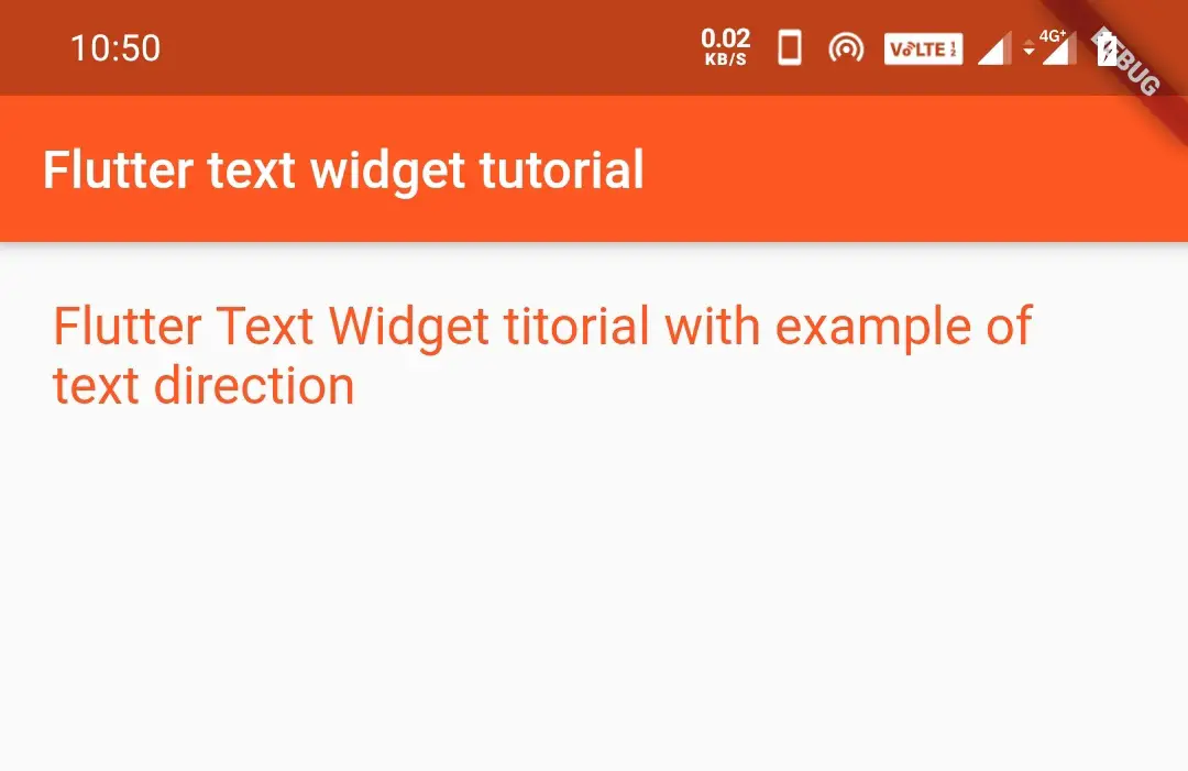
textDirection
It defines the direction of the text. Generally, we write from left to right, but we can change the direction using textDirection parameter.
 Container(
          width: double.infinity,
          padding: EdgeInsets.all(20),
            child:Text("Flutter Text Widget titorial with example of text direction",
            style: TextStyle(
                color: Colors.deepOrange,
                fontSize: 20,
                fontWeight: FontWeight.normal,
            ),
              textDirection: TextDirection.rtl,
        ),
        )
Output:
softWrap
When there is not enough space for the text to show, we will use softWrap. We can set either true or false to this parameter. If we set this parameter to true it will display the text else it won’t display the text.
softWrap:flase
If softWrap is set to false the text data is not wrapped. It shows only the amount of text which fits in one line and the rest will be invisible.
 Container(
          width: double.infinity,
          padding: EdgeInsets.all(20),
            child:Text("Flutter Text Widget titorial with example of text direction",
            style: TextStyle(
                color: Colors.deepOrange,
                fontSize: 20,
                fontWeight: FontWeight.normal,
            ),
              softWrap: false,
        ),
        )
Output:
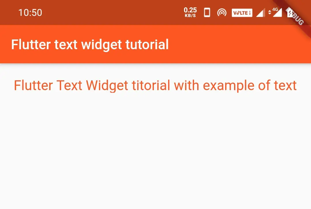
softWrap:true
If softWrap is set to true, it wraps the text to the next line if the first line is full. It displays all the text of the text widget.
 Container(
          width: double.infinity,
          padding: EdgeInsets.all(20),
            child:Text("Flutter Text Widget titorial with example of text direction",
            style: TextStyle(
                color: Colors.deepOrange,
                fontSize: 20,
                fontWeight: FontWeight.normal,
            ),
              softWrap: true,
        ),
        )
Output:
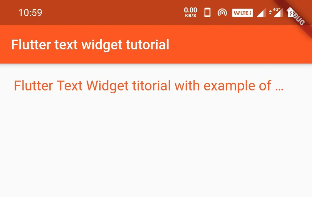
overflow
When there is not enough place to show, we can use softWrap. But we can’t say whether there is more text or not. To indicate more text is there, three dots(…) will be displayed at the end of the text.
By using overflow we can show these dots. I am using the ellipsis constant. You can try to use clip, fade, and visible.
 Container(
          width: double.infinity,
          padding: EdgeInsets.all(20),
            child:Text("Flutter Text Widget titorial with example of text direction",
            style: TextStyle(
                color: Colors.deepOrange,
                fontSize: 20,
                fontWeight: FontWeight.normal,
            ),
              overflow: TextOverflow.ellipsis,
        ),
        )
Output:
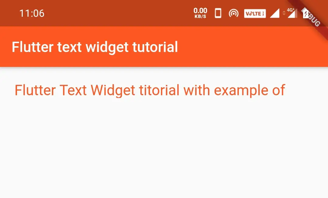
maxLines
We can limit the text space to one line even if the text is longer, using maxlines parameter.
Container(
          width: double.infinity,
          padding: EdgeInsets.all(20),
            child:Text("Flutter Text Widget titorial with example of text direction",
            style: TextStyle(
                color: Colors.deepOrange,
                fontSize: 20,
                fontWeight: FontWeight.normal,
            ),
              maxLines: 1,
        ),
        )
Output:
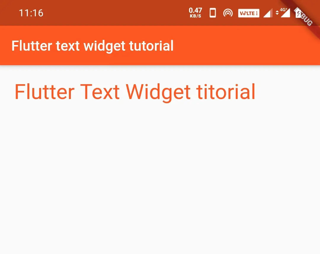
textScaleFactor
The textScaleFactor scales the text based on the fontSize defined. It simply scales the text size, by multiplying the font size with textScaleFactor.For instance, lets say font size is 20 and textScaleFactor is 2.Now the scaled text size will be equal to 40, which is fontSize*textScaleFactor.
 Container(
          width: double.infinity,
          padding: EdgeInsets.all(20),
            child:Text("Flutter Text Widget titorial",
            style: TextStyle(
                color: Colors.deepOrange,
                fontSize: 15,
                fontWeight: FontWeight.normal,
            ),
              textScaleFactor: 2,
        ),
        )
Output:
That brings an end to Flutter text widget tutorial with examples for all the properties in detail. Let’s learn about some other flutter widgets in the next post. Have a great day!
Do Like and Share if you find this post helpful. Thank you!!
Reference: Flutter Official Documentation.


Leave a Reply