In flutter, we will use OutlinedButton to display a simple button. It is nothing but a TextButton with outline border. It is the replaced version of OutlineButton widget as the OutlineButton will be deprecated soon. In this example tutorial, we will learn how to use an OutlinedButton widget in flutter and its properties in detail.
Note: OutlinedButton widget will be available in latest sdk releases. Try upgrading to latest sdk if you can’t use OutlinedButton in your project. Also update your flutter plugin.
Flutter OutlinedButton
OutlinedButton is a material widget in flutter which is similar to the text button but with an outline. It has zero elevation by default. We can customize the color and weight of the outline of the button. It has an onPressed callback which will be invoked when we tap on the button. Outlined buttons are used to indicate important actions but those actions are not first priority. For example, if we want to display accept and cancel actions we have to use the outlined button for cancel action.
Types of Flutter OutlinedButton
Flutter offers two types of OutlinedButtons.
- OutlinedButton
- OutlinedButton.icon
Both OutlinedButton and OutlinedButton.icon have the same properties. The only difference is, OutlinedButton requires a child, and OutlinedButton.icon requires an icon and label.
OutlinedButton
OutlinedButton contains a child widget and onPressed and onLongPress callback to listen to user click/tap. The child is required which means we can’t use the button without providing a value to the child property. Setting onPressed to null or not using onPressed property will disable the button.
Constructor:
OutlinedButton(
{Key key,
@required VoidCallback onPressed,
VoidCallback onLongPress,
ButtonStyle style,
FocusNode focusNode,
bool autofocus: false,
Clip clipBehavior: Clip.none,
@required Widget child}
)
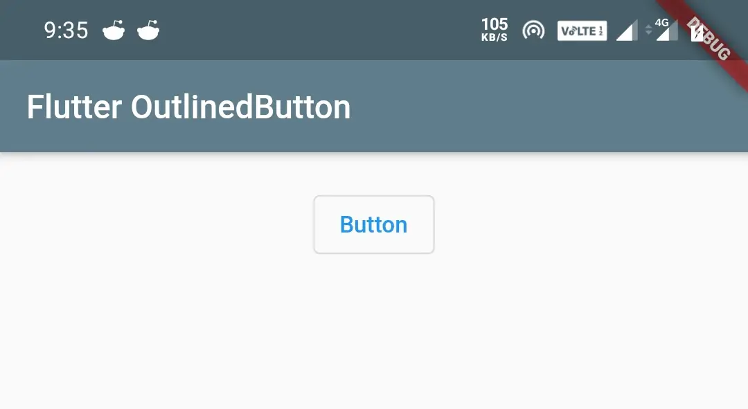
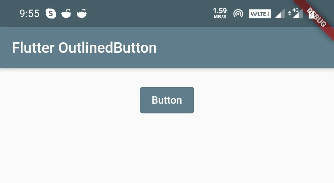
Basic OutlinedButton code
OutlinedButton(
              child: Text("Button"),
              onPressed:() {

              },
            )
Output:
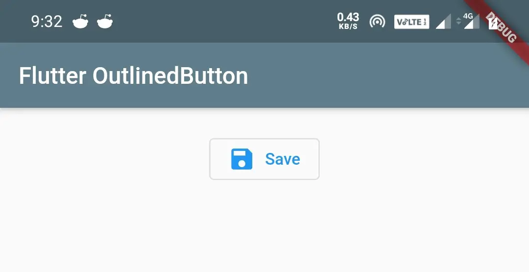
OutlinedButton.icon
It contains icon, label widgets, and an onPressed and onLongPress callback. The icon and label properties are required which means we can’t use ElevatedButton.icon without providing values to icon and label properties. Setting onPressed to null or not using onPressed property will disable the button.
Constructor:
OutlinedButton.icon(
{Key key,
@required VoidCallback onPressed,
VoidCallback onLongPress,
ButtonStyle style,
FocusNode focusNode,
bool autofocus,
Clip clipBehavior,
@required Widget icon,
@required Widget label}
)
Basic OutlinedButton.icon code
OutlinedButton.icon(
              icon: Icon(Icons.save),
              label: Text("Save"),
              onPressed:() {

              },
            )
Output:
Styling OutlinedButton
We can style the OutlinedButton widget by changing colors, backgroundColor, etc. To style the OutlinedButton we have to use style property which takes ButtonStyle() or styleFrom().
The static styleFrom method is a convenient way to create an OutlinedButton ButtonStyle from simple values rather than ButtonStyle(). We can observe the difference from the code below.
Using ButtonStyle() for changing foregroundColor.
OutlinedButton(
  style: ButtonStyle(
    backgroundColor: MaterialStateProperty.all<Color>(Colors.green),
  ),
)
Using styleFrom() for changing foregroundColor.
OutlinedButton(
              child: Text("button"),
               style: OutlinedButton.styleFrom(
                 onPrimary: Colors.green
               ),
If we observe the above two cases the code of styleFrom() is simple compared to ButtonStyle(). So I will be using styleFrom() in the coming examples.
The styleFrom() has many properties. Let’s see the important ones in detail.
- primary
- backgroundColor
- onSurface
- side
- elevation
- minimumSize
- shadowColor
- shape
- padding
- textStyle
Flutter OutlinedButton foregroundColor(primary)
We will use the primary(foregroundColor) property to apply color to the text and icon of the OutlinedButton.
OutlinedButton(
              child: Text("Button"),
              style: OutlinedButton.styleFrom(
                  primary: Colors.blueGrey,
              ),
              onPressed:() {

              },
            )
Output:
Flutter OutlinedButton backgroundColor
We will use backgroundColor property to apply background color to the OutlinedButton.
OutlinedButton(
              child: Text("Button"),
              style: OutlinedButton.styleFrom(
                  primary: Colors.white,
                  backgroundColor: Colors.blueGrey
              ),
              onPressed:() {

              },
            )
Output:
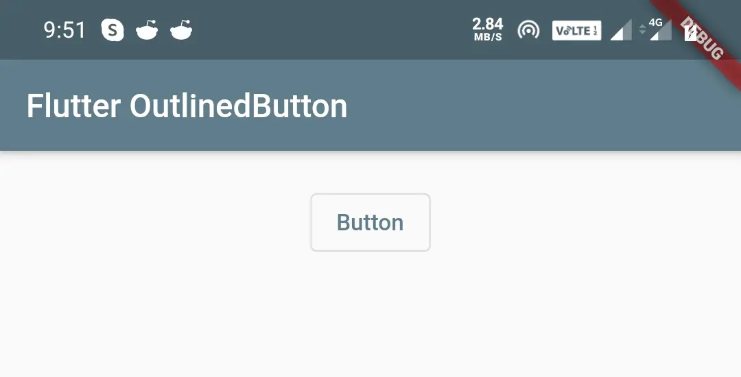
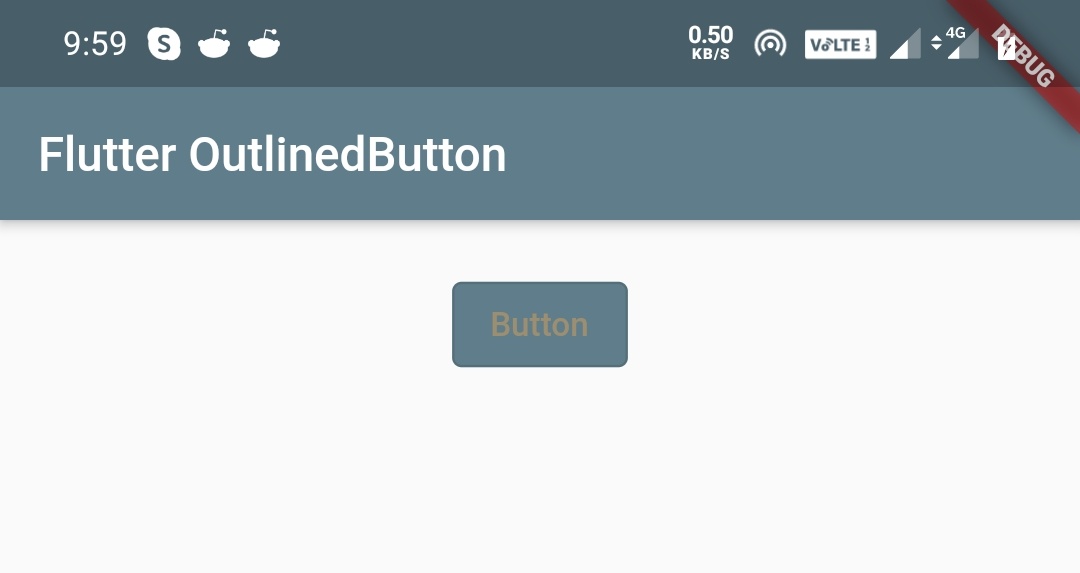
Flutter OutlinedButton disabledColor(onSurface)
We will use onSurface (disabledColor) property to define the color of the OutlinedButton text we want to display when the button is disabled. I’m disabling the button by setting the onPressed to null, to display the output.
OutlinedButton(
              child: Text("Button"),
              style: OutlinedButton.styleFrom(
                  primary: Colors.white,
                  backgroundColor: Colors.blueGrey,
                  onSurface: Colors.orangeAccent,
              ),
              onPressed:null,
            )
Output:
Flutter OutlinedButton overlayColor
We will use overlayColor property to display color when we press (down) the OutlinedButton. It will start filling the button when we press (down) the button and disappears when we release the button. For this purpose I’m using ButtonStyle() as styleFrom() don’t have overlayColor property.
OutlinedButton(
   child: Text("button"),
   style: ButtonStyle(
            foregroundColor: MaterialStateProperty.all<Color>(Colors.white),
            backgroundColor: MaterialStateProperty.all<Color>(Colors.blueGrey),
            overlayColor: MaterialStateProperty.all<Color>(Colors.deepOrange),
          ),
   onPressed:() {

   },
)
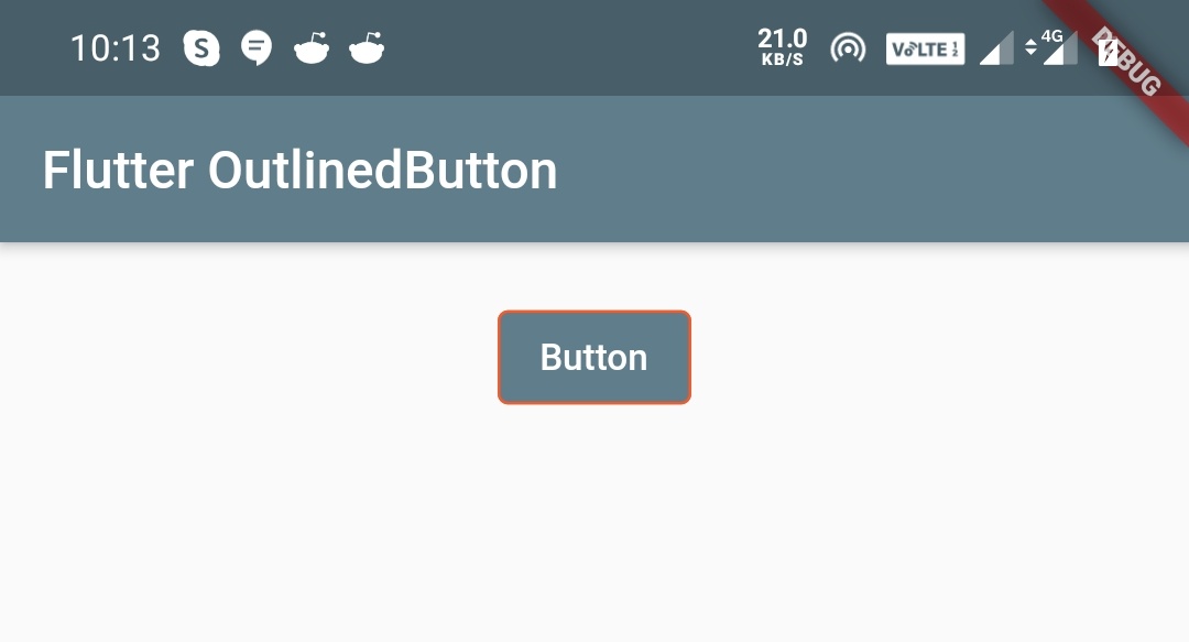
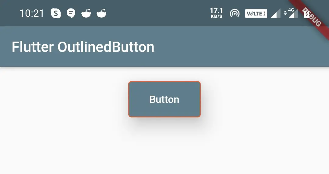
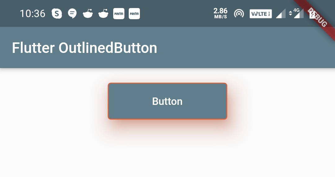
Flutter OutlinedButton side
We will use the side property if we want to apply a border to the OutlinedButton. We can define the border color, width, and style.
OutlinedButton(
              child: Text("Button"),
              style: OutlinedButton.styleFrom(
                  primary: Colors.white,
                  backgroundColor: Colors.blueGrey,
                  onSurface: Colors.orangeAccent,
                  side: BorderSide(
                     color: Colors.deepOrange,
                     width: 1
                  )
              ),
              onPressed:() {

              },
            )
Output:
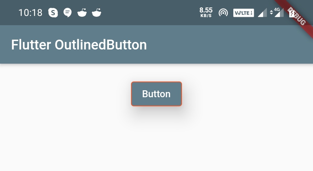
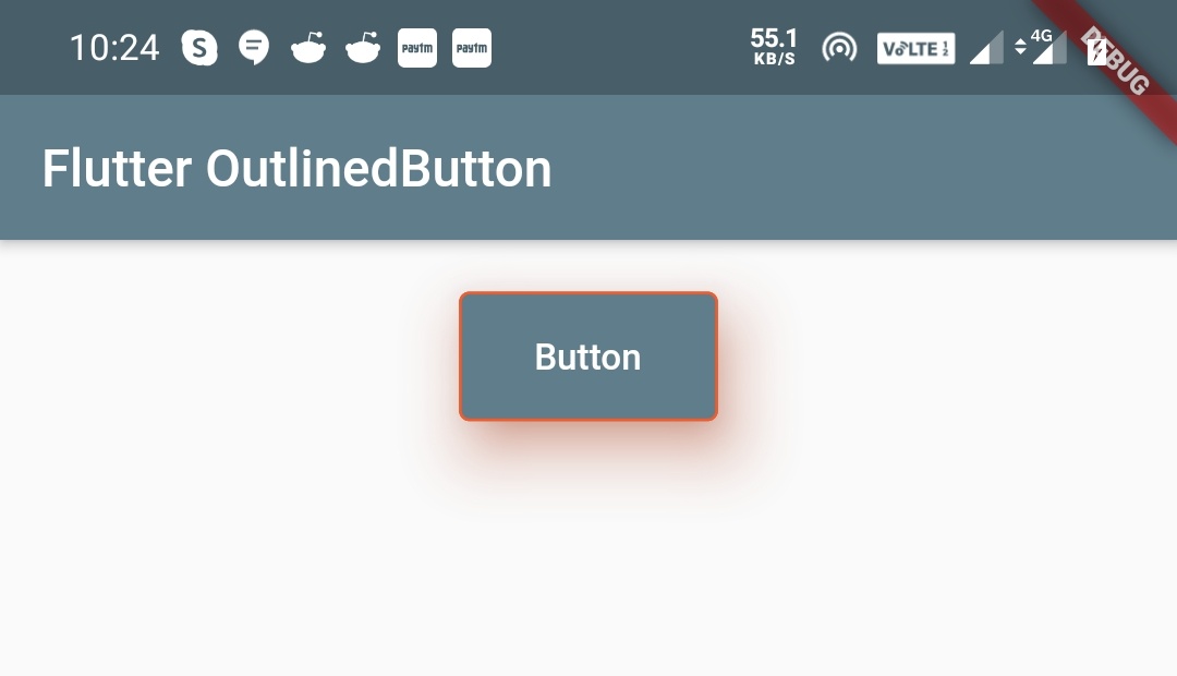
Flutter OutlinedButton elevation
We will use the elevation property to apply elevation to the OutlinedButton. Elevation makes a button look like as it is lifted upward from the background/surface on which the button is placed.
OutlinedButton(
              child: Text("Button"),
              style: OutlinedButton.styleFrom(
                  primary: Colors.white,
                  backgroundColor: Colors.blueGrey,
                  onSurface: Colors.orangeAccent,
                  side: BorderSide(
                    color: Colors.deepOrange,
                    width: 1
                  ),
                  elevation: 20,
              ),
              onPressed:() {

              },
            )
Output:
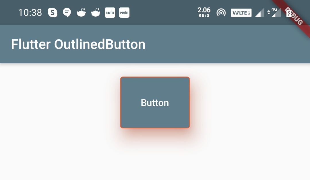
Flutter OutlinedButton minimumSize
We will use minimumSize property to define the minimum size we want the OutlinedButton to be displayed.
OutlinedButton(
              child: Text("Button"),
              style: OutlinedButton.styleFrom(
                  primary: Colors.white,
                  backgroundColor: Colors.blueGrey,
                  onSurface: Colors.orangeAccent,
                  side: BorderSide(
                    color: Colors.deepOrange,
                    width: 1
                  ),
                  elevation: 20,
                  minimumSize: Size(100, 50),
              ),
              onPressed:() {

              },
            )
Output:
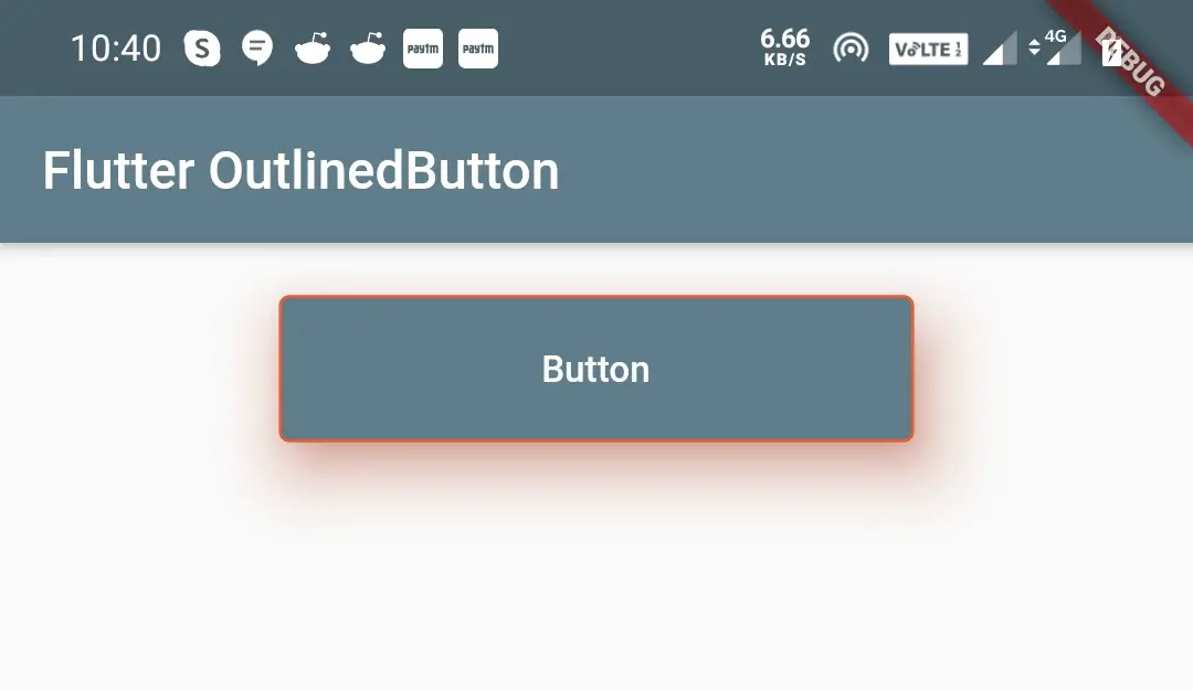
Flutter OutlinedButton shadowColor
We will use shadowColor property to change the color of the shadow that appears when the OutlinedButton is elevated.
OutlinedButton(
              child: Text("Button"),
              style: OutlinedButton.styleFrom(
                  primary: Colors.white,
                  backgroundColor: Colors.blueGrey,
                  onSurface: Colors.orangeAccent,
                  side: BorderSide(
                    color: Colors.deepOrange,
                    width: 1
                  ),
                  elevation: 20,
                  minimumSize: Size(100, 50),
                  shadowColor: Colors.deepOrange,
              ),
              onPressed:() {

              },
            )
Output:
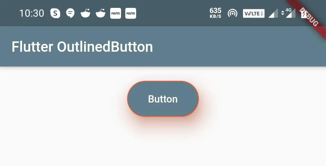
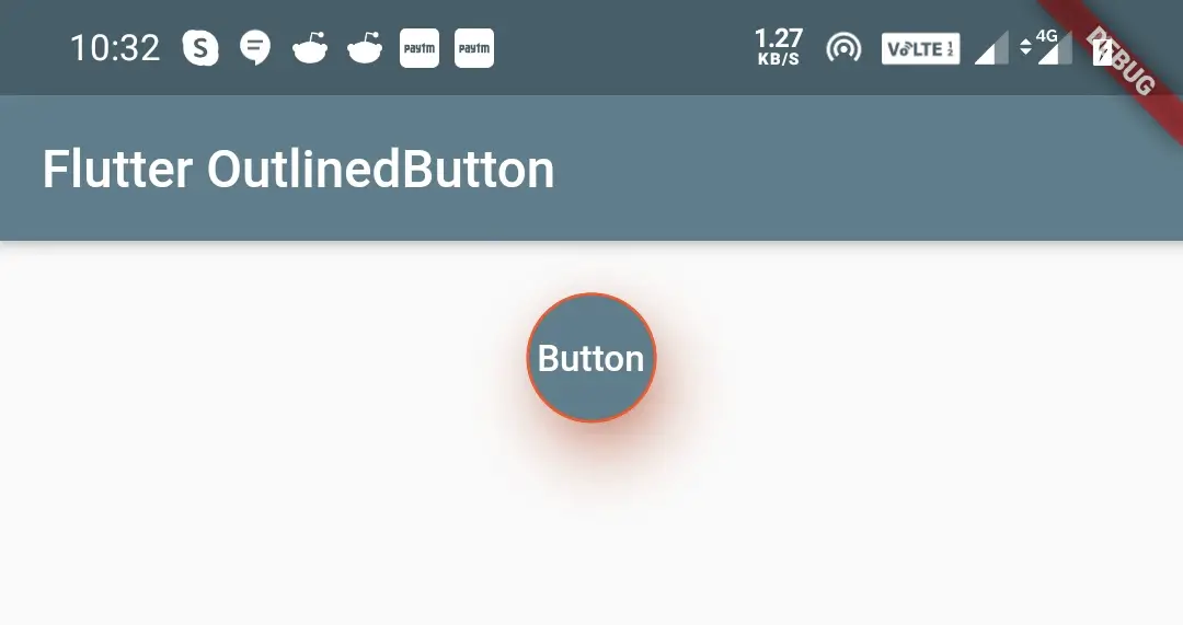
Flutter OutlinedButton shape
By using the shape property we can apply different shapes to the OutlinedButton. We can apply shapes like rectangular, rounded rectangle, circular, etc.
I’m explaining two shapes as we can’t discuss all the concepts in one article. So try the rest for yourself. To know more about different shapes refer shaping RaisedButton section of flutter RaisedButton widget Example.
RoundedRectangleBorder()
OutlinedButton(
              child: Text("Button"),
              style: OutlinedButton.styleFrom(
                  primary: Colors.white,
                  backgroundColor: Colors.blueGrey,
                  onSurface: Colors.orangeAccent,
                  side: BorderSide(color: Colors.deepOrange, width: 1),
                  elevation: 20,
                  minimumSize: Size(100, 50),
                  shadowColor: Colors.deepOrange,
                  shape: RoundedRectangleBorder(borderRadius: BorderRadius.circular(30)),
              ),
              onPressed:() {

              },
            )
Output:
CircleBorder()
OutlinedButton(
              child: Text("Button"),
              style: OutlinedButton.styleFrom(
                  primary: Colors.white,
                  backgroundColor: Colors.blueGrey,
                  onSurface: Colors.orangeAccent,
                  side: BorderSide(color: Colors.deepOrange, width: 1),
                  elevation: 20,
                  minimumSize: Size(100, 50),
                  shadowColor: Colors.deepOrange,
                  shape: CircleBorder(),
              ),
              onPressed:() {

              },
            )
Output:
Flutter OutlinedButton padding
The padding property provides padding to the OutlinedButton, which means internal spacing. It takes EdgeInsetsGeometry which has three methods all, only and symmetric.
EdgeInsets.only()
We can specify up to four values, which means we can define our desired sides and leave the sides we don’t want to define padding for.
OutlinedButton(
              child: Text("Button"),
              style: OutlinedButton.styleFrom(
                  primary: Colors.white,
                  backgroundColor: Colors.blueGrey,
                  onSurface: Colors.orangeAccent,
                  side: BorderSide(color: Colors.deepOrange, width: 1),
                  elevation: 20,
                  minimumSize: Size(100, 50),
                  shadowColor: Colors.deepOrange,
                  padding: EdgeInsets.only(
                      left: 60,
                      right: 60,
                      top: 15,
                      bottom: 15
                  )
              ),
              onPressed:() {

              },
            )
Output:
EdgeInsets.all()
It accepts one value which will be applied to all the sides.
OutlinedButton(
              child: Text("Button"),
              style: OutlinedButton.styleFrom(
                  primary: Colors.white,
                  backgroundColor: Colors.blueGrey,
                  onSurface: Colors.orangeAccent,
                  side: BorderSide(color: Colors.deepOrange, width: 1),
                  elevation: 20,
                  minimumSize: Size(100, 50),
                  shadowColor: Colors.deepOrange,
                  padding: EdgeInsets.all(30)
              ),
              onPressed:() {

              },
            )
Output:
EdgeInsets.symmetric()
This accepts horizontal and vertical values. You can provide only horizontal, only vertical, or both.
OutlinedButton(
              child: Text("Button"),
              style: OutlinedButton.styleFrom(
                  primary: Colors.white,
                  backgroundColor: Colors.blueGrey,
                  onSurface: Colors.orangeAccent,
                  side: BorderSide(color: Colors.deepOrange, width: 1),
                  elevation: 20,
                  minimumSize: Size(100, 50),
                  shadowColor: Colors.deepOrange,
                  padding: EdgeInsets.symmetric(
                      vertical: 20,
                      horizontal: 100
                  )
              ),
              onPressed:() {

              },
            )
Output:
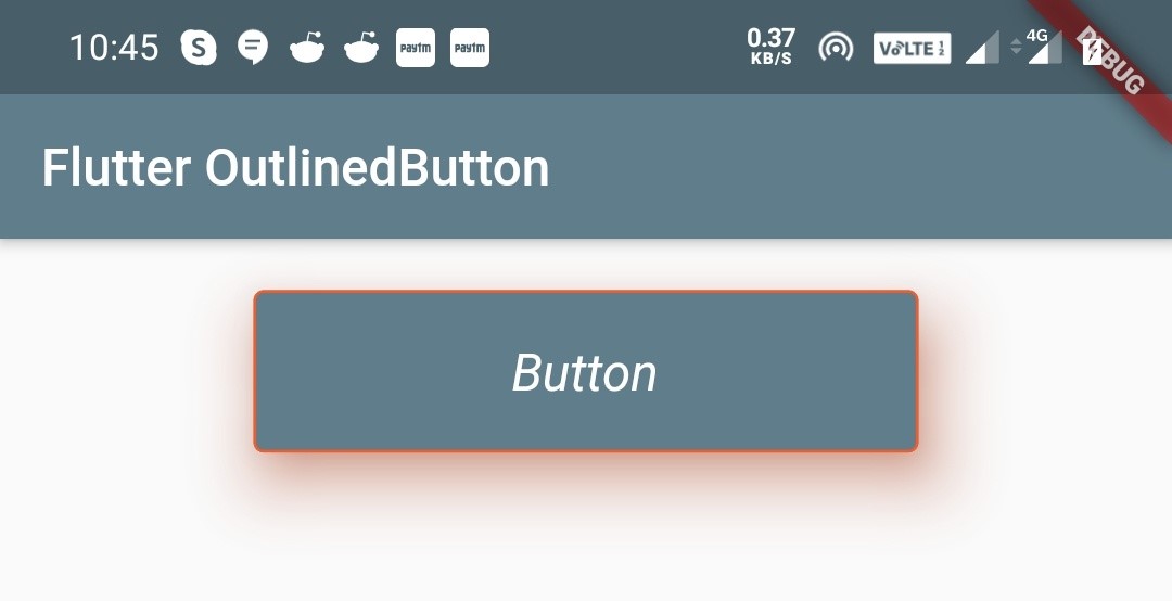
Flutter OutlinedButton textStyle
We will use the textStyle property to apply different properties like fontStyle, fontSize, etc. to the OutlinedButton text. It accepts TextStyle class as the value.
We can’t discuss all the properties of TextStyle class in this article so I’m showing a single example with fontStyle and fontSize. Try the rest for yourself. To know about all the properties of the TextStyle class refer flutter text widget tutorial.
OutlinedButton(
              child: Text("Button"),
              style: OutlinedButton.styleFrom(
                  primary: Colors.white,
                  backgroundColor: Colors.blueGrey,
                  onSurface: Colors.orangeAccent,
                  side: BorderSide(color: Colors.deepOrange, width: 1),
                  elevation: 20,
                  minimumSize: Size(100, 50),
                  shadowColor: Colors.deepOrange,
                  padding: EdgeInsets.symmetric(
                      vertical: 20,
                      horizontal: 100
                  ),
                  textStyle: TextStyle(
                      fontSize: 20,
                      fontStyle: FontStyle.italic
                  )
              ),
              onPressed:() {

              },
            )
Output:
Comparing ButtonStyle and styleFrom
Let’s see how the code will look like if we use ButtonStyle() instead of styleFrom() with all the properties.
Using ButtonStyle() for styling the OutlinedButton.
OutlinedButton(
   child: Text("button"),
   style:ButtonStyle(
      backgroundColor: MaterialStateProperty.all<Color>(Colors.blueGrey),
      foregroundColor: MaterialStateProperty.all<Color>(Colors.white),
      elevation: MaterialStateProperty.all<double>(20),
      minimumSize: MaterialStateProperty.all<Size>(Size(100, 50)),
      shadowColor: MaterialStateProperty.all<Color>(Colors.deepOrange),
      padding: MaterialStateProperty.all<EdgeInsetsGeometry>(
                    EdgeInsets.all(30)
              ),
      textStyle: MaterialStateProperty.all<TextStyle>(
                    TextStyle(
                        fontSize: 20,
                        fontStyle: FontStyle.italic
                    )
                )
              ),
              onPressed:() {

              },
          )
Using styleFrom() for styling the OutlinedButton.
OutlinedButton(
              child: Text("Button"),
              style: OutlinedButton.styleFrom(
                  primary: Colors.white,
                  backgroundColor: Colors.blueGrey,
                  elevation: 20,
                  minimumSize: Size(100, 50),
                  shadowColor: Colors.deepOrange,
                  padding: EdgeInsets.all(30),
                  textStyle: TextStyle(
                      fontSize: 20,
                      fontStyle: FontStyle.italic
                  )
              ),
              onPressed:() {

              },
            )
If we observe the above code snippets, the output will be the same for both, but we can see that the styleFrom() is clear and convenient than ButtonStyle(). So its better to use styleFrom() instead of ButtonStyle().
That’s all about flutter OutlinedButton example. Let’s catch up with some other flutter widget in the next article. Have a great day!!
Do share, subscribe, and like my Facebook page, if you find this post helpful. Thank you!!
Reference:Flutter Official Documentation.


Leave a Reply