
In flutter, popup menu button widget is nothing but a popup / overflow menu in android and ios. It is similar to flutter dropdownButton but has additional features. In this example tutorial, we will learn how to use a popup menu button widget in flutter and its properties in detail.
Flutter Popup Menu Button Widget
In flutter, popup menu button widget displays an overflow menu when pressed. When we select an item the onSelected callback will be invoked and the menu is dismissed. The value of the menu item selected by the user will be passed to onSelected callback. We will save the value to a global variable & use the value wherever we want.
The itemBuilder property is required which means without using it will throw an error. We have to use the Stateful widget as popup menu button will have a change in the state based on the user selection.
Constructor:
PopupMenuButton(
{Key key,
@required PopupMenuItemBuilder<T> itemBuilder,
T initialValue,
PopupMenuItemSelected<T> onSelected,
PopupMenuCanceled onCanceled,
String tooltip,
double elevation,
EdgeInsetsGeometry padding: const EdgeInsets.all(8.0),
Widget child,
Widget icon,
Offset offset: Offset.zero,
bool enabled: true,
ShapeBorder shape,
Color color,
bool captureInheritedThemes: true}
)
Flutter Popup Menu Button Example
import 'package:flutter/cupertino.dart';
import 'package:flutter/material.dart';
import 'package:flutter/rendering.dart';

void main() {
  runApp(MyApp());
}
class MyApp extends StatefulWidget {
  @override
  _MyState createState() {
    return _MyState();
  }
}
class _MyState extends State<MyApp>
{
  @override
  Widget build(BuildContext context) {
    return MaterialApp(
      home: Scaffold(
        appBar: AppBar(
          backgroundColor: Colors.deepPurple,
          title: Text("Flutter Popup Menu Button"),
          actions: [
            PopupMenuButton(
                itemBuilder: (context) => [
                  PopupMenuItem(
                    child: Text("First"),
                    value: 1,
                  ),
                  PopupMenuItem(
                    child: Text("Second"),
                    value: 2,
                  )
                ]
            )
          ],
        ),
      )
    );
  }
}
Output:
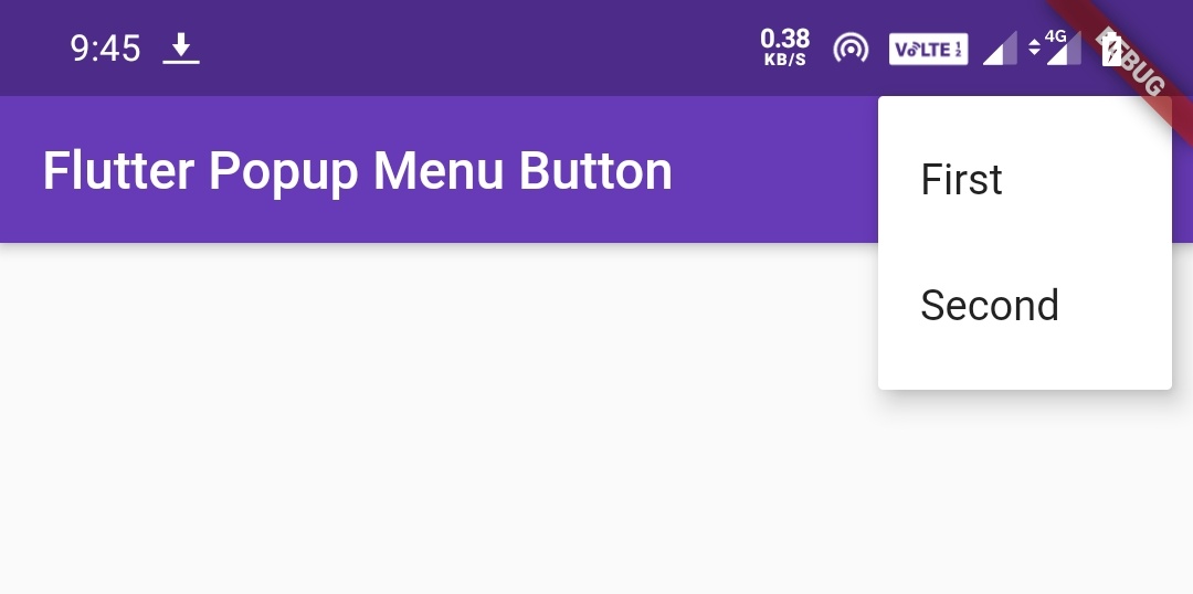
Flutter Popup Menu Button Properties
It has a lot of properties but I’m going to discuss the most used ones. Try the rest for yourself.
- child
- icon
- itemBuilder
- color
- elevation
- shape
- enabled
- onSelected
- onCancelled
Flutter Popup Menu Button child
The child property can be any widget, but generally, we use the Text widget to display a text for the popup menu as there is an icon property to display icon instead of text.
Note: We should use either child or icon property but not both as it will throw an error.
PopupMenuButton(
                child: Padding(
                  padding: EdgeInsets.symmetric(
                    horizontal: 10,
                    vertical: 20
                  ),
                  child:Text("Menu"),
                ),
                itemBuilder: (context) => [

                ]
            )
Output:
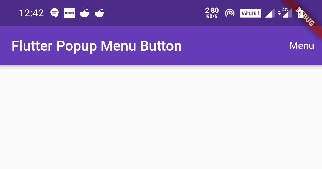
Flutter Popup Menu Button icon
The icon property is used to change the icon of the popup menu. By default, the popup menu displays an overflow menu(three dots) icon even if we don’t use the icon property.
PopupMenuButton(
                icon: Icon(Icons.more_horiz),
                itemBuilder: (context) => [

                ]
            )
Output:
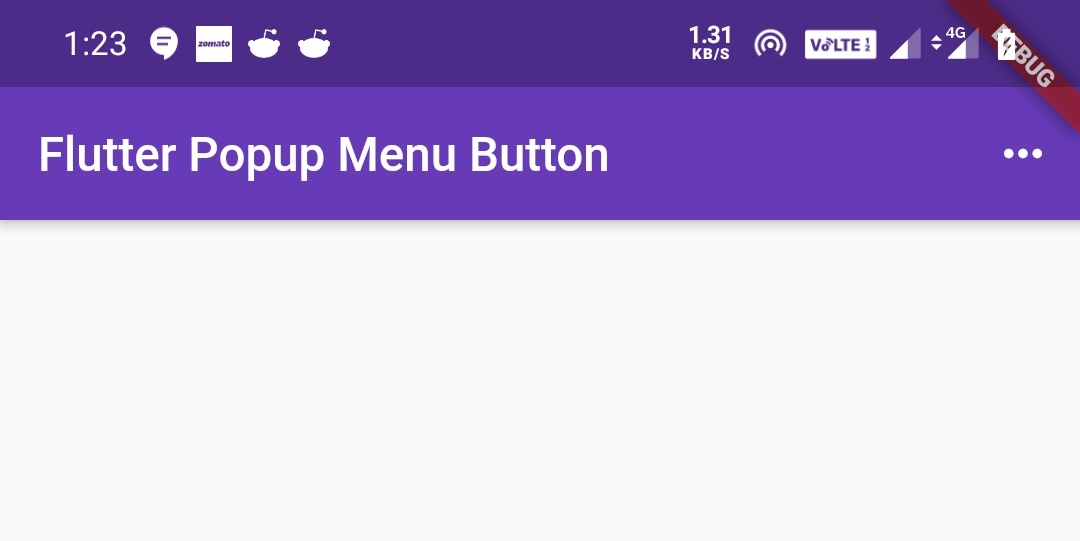
The default icon will look like below

Flutter Popup Menu itemBuilder
We will use the itemBuilder property to add items to Popup Menu Button. It accepts a list of PopupMenuItems.
PopupMenuButton(
                itemBuilder:(context) => [
                  PopupMenuItem(
                    child: Text("First"),
                    value: 1,
                  ),
                  PopupMenuItem(
                    child: Text("Second"),
                    value: 2,
                  )
                ]
            )
Output:

Flutter Popup Menu color
We will use the color property to change the backgroundColor of the popup menu.
PopupMenuButton(
                color: Colors.yellowAccent,
                itemBuilder:(context) => [
                  PopupMenuItem(
                    child: Text("First"),
                    value: 1,
                  ),
                  PopupMenuItem(
                    child: Text("Second"),
                    value: 2,
                  ),

                ]
            )
Output:
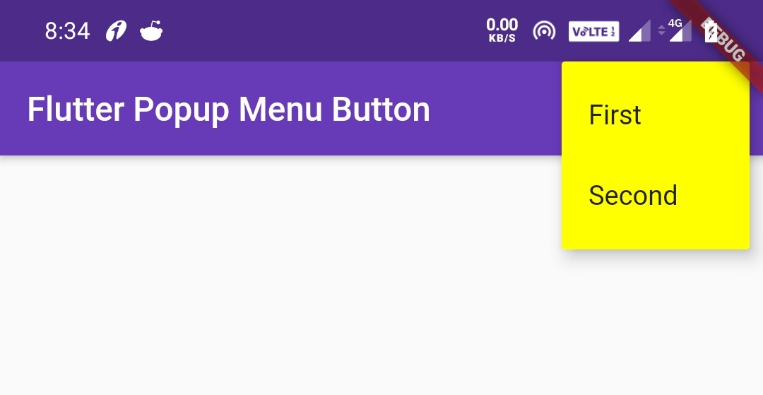
Flutter Popup Menu elevation
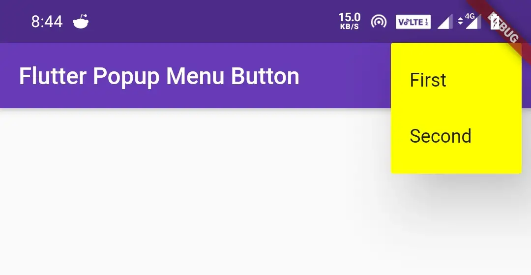
We will use the elevation property to apply elevation to the popup menu. Elevation makes the popup menu look as it is lifted upward from the background.
PopupMenuButton(
                color: Colors.yellowAccent,
                elevation: 40,
                itemBuilder:(context) => [
                  PopupMenuItem(
                    child: Text("First"),
                    value: 1,
                  ),
                  PopupMenuItem(
                    child: Text("Second"),
                    value: 2,
                  ),
                ]
            )
Output:
Flutter Popup Menu shape
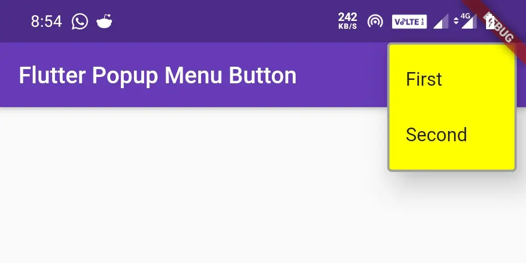
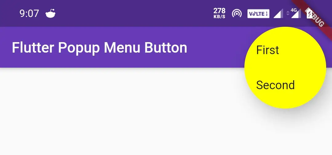
We will use the shape property to change the shape of the popup menu. We can apply different shapes like CircleBorder, OutlineInputBorder, etc.
I’m explaining two shapes as we can’t discuss all the concepts in one article. So try the rest for yourself. To know more about different shapes refer shaping RaisedButton section of flutter RaisedButton widget Example.
OutlineInputBorder()
PopupMenuButton(
                color: Colors.yellowAccent,
                elevation: 20,
                shape: OutlineInputBorder(
                    borderSide: BorderSide(
                        color: Colors.grey,
                        width: 2
                    )
                ),
                itemBuilder:(context) => [
                  PopupMenuItem(
                    child: Text("First"),
                    value: 1,
                  ),
                  PopupMenuItem(
                    child: Text("Second"),
                    value: 2,
                  ),
                ]
            )
Output:
CircleBorder()
PopupMenuButton(
                color: Colors.yellowAccent,
                elevation: 20,
                shape: CircleBorder(),
                itemBuilder:(context) => [
                  PopupMenuItem(
                    child: Text("First"),
                    value: 1,
                  ),
                  PopupMenuItem(
                    child: Text("Second"),
                    value: 2,
                  ),
                ]
            )
Output:
Flutter Popup Menu Button enabled
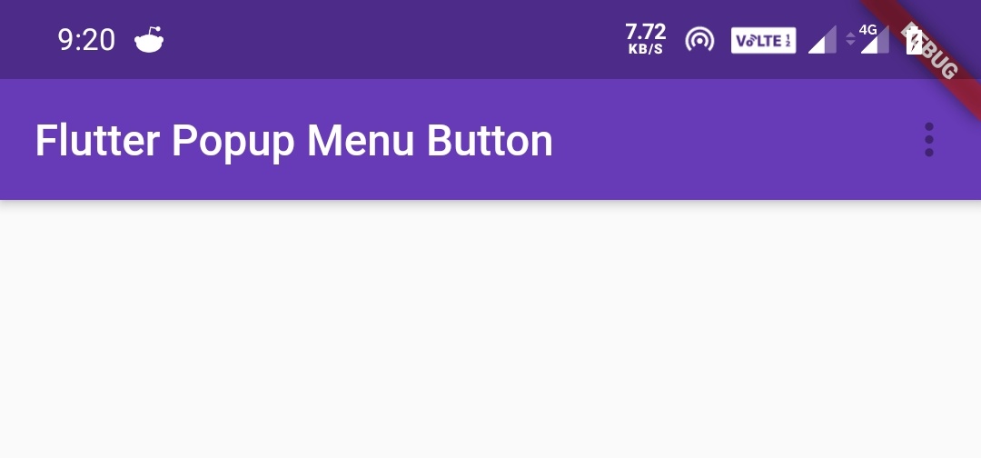
The enabled property takes a boolean value which is used to enable/disable the button. Setting enabled to true will make the button enable and false will disable the button.
PopupMenuButton(
                color: Colors.yellowAccent,
                elevation: 20,
                enabled: false,
                itemBuilder:(context) => [
                  PopupMenuItem(
                    child: Text("First"),
                    value: 1,
                  ),
                  PopupMenuItem(
                    child: Text("Second"),
                    value: 2,
                  ),
                ]
            )
Output:
Popup Menu onSelected
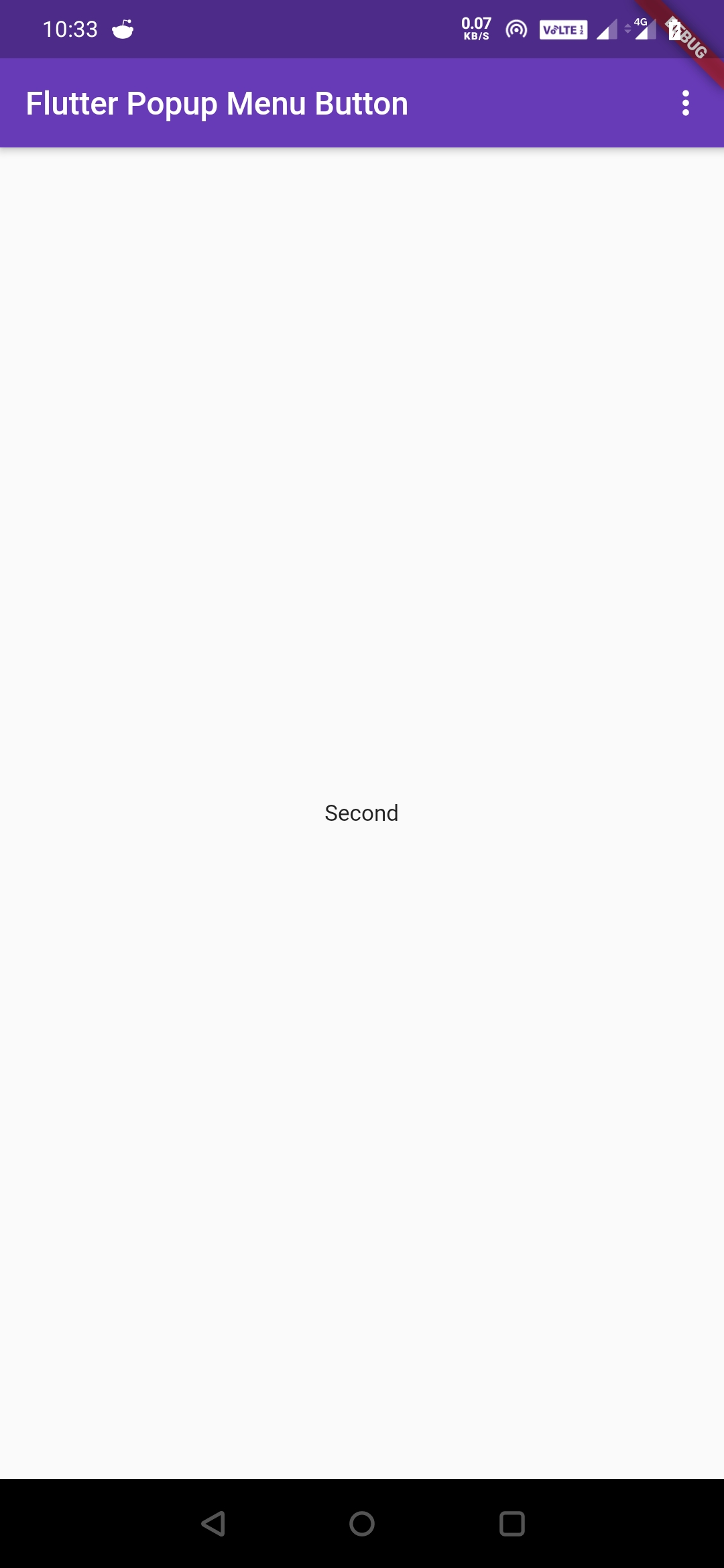
The onSelected property is used to invoke the onSelected callback when the user selects an item from the popup menu. The popup menu will be dismissed when the user selects an item.
In the below code snippet we have taken a text widget in the center. We are setting text to the text widget based on the user selection.
import 'package:flutter/cupertino.dart';
import 'package:flutter/material.dart';
import 'package:flutter/rendering.dart';

void main() {
  runApp(MyApp());
}
class MyApp extends StatefulWidget {
  @override
  _MyState createState() {
    return _MyState();
  }
}
class _MyState extends State<MyApp>
{
  String _value = "";
  @override
  Widget build(BuildContext context) {
    return MaterialApp(
      home: Scaffold(
        appBar: AppBar(
          backgroundColor: Colors.deepPurple,
          title: Text("Flutter Popup Menu Button"),
          actions: [
            PopupMenuButton(
                color: Colors.yellowAccent,
                elevation: 20,
                enabled: true,
                onSelected: (value) {
                  setState(() {
                     _value = value;
                  });
                },
                itemBuilder:(context) => [
                  PopupMenuItem(
                    child: Text("First"),
                    value: "first",
                  ),
                  PopupMenuItem(
                    child: Text("Second"),
                    value: "Second",
                  ),
                ]
            )
          ],
        ),
        body: Center(
          child: Text(_value),
        ),
      )
    );
  }
}
Output:
We will use this property to do something when the user cancels the menu without selecting it. Generally, we don’t want to do anything if the user cancels the selection. If you still want to perform some action when the user cancels you can do it using the onCancelled property.
PopupMenuButton(
                color: Colors.yellowAccent,
                elevation: 20,
                enabled: true,
                onCanceled: () {
                  //do something
                },
                itemBuilder:(context) => [
                  PopupMenuItem(
                    child: Text("First"),
                    value: "first",
                  ),
                  PopupMenuItem(
                    child: Text("Second"),
                    value: "Second",
                  ),
                ]
            )
Getting Popup Menu Items From a List In Flutter
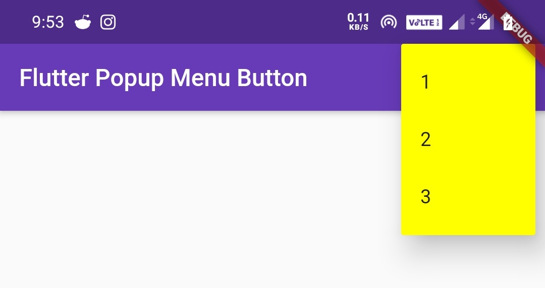
We have seen how to add Popup menu items to the Popup menu button manually. Now let’s see how to get popup menu items from a list to a popup menu button. In the below example we have defined a list of type int and added three values. Now we will create the popup menu from the list items.
import 'package:flutter/cupertino.dart';
import 'package:flutter/material.dart';
import 'package:flutter/rendering.dart';

void main() {
  runApp(MyApp());
}
//void main() => runApp(MyApp());
class MyApp extends StatefulWidget {
  @override
  _MyState createState() {
    return _MyState();
  }
}
class _MyState extends State<MyApp>
{
  String _value = "";
  List<int> _list = [1,2,3];
  @override
  Widget build(BuildContext context) {
    return MaterialApp(
      home: Scaffold(
        appBar: AppBar(
          backgroundColor: Colors.deepPurple,
          title: Text("Flutter Popup Menu Button"),
          actions: [
            PopupMenuButton(
                color: Colors.yellowAccent,
                elevation: 20,
                enabled: true,
                onSelected: (value) {
                  setState(() {
                     _value = value;
                  });
                },
                itemBuilder:(context) {
                  return _list.map((int choice) {
                    return PopupMenuItem(
                      value: choice,
                      child: Text("$choice"),
                    );
                  }).toList();
                }
            )
          ],
        ),
        body: Center(
          child: Text(_value),
        ),
      )
    );
  }
}
Output:
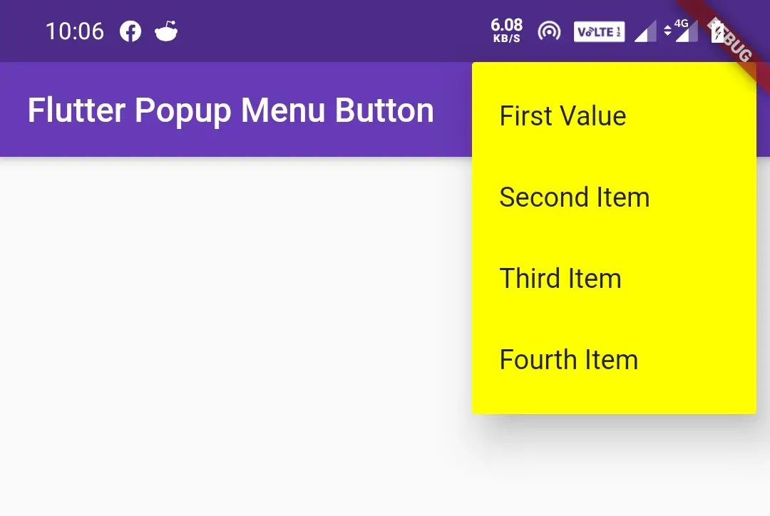
Let’s create a custom popup menu in the below example. For this, we will create a podo class PopupItem which will hold the data of the popup menu items. We will also create a List _list for holding the objects of the podo class.
import 'package:flutter/cupertino.dart';
import 'package:flutter/material.dart';
import 'package:flutter/rendering.dart';

void main() {
  runApp(MyApp());
}
//void main() => runApp(MyApp());
class MyApp extends StatefulWidget {
  @override
  _MyState createState() {
    return _MyState();
  }
}
class PopupItem{
  int value;
  String name;
  PopupItem(this.value, this.name);
}

class _MyState extends State<MyApp>
{
  String _value = "";
  List<PopupItem> _list = [
    PopupItem(1, "First Value"),
    PopupItem(2, "Second Item"),
    PopupItem(3, "Third Item"),
    PopupItem(4, "Fourth Item")
  ];
  @override
  Widget build(BuildContext context) {
    return MaterialApp(
      home: Scaffold(
        appBar: AppBar(
          backgroundColor: Colors.deepPurple,
          title: Text("Flutter Popup Menu Button"),
          actions: [
            PopupMenuButton(
                color: Colors.yellowAccent,
                elevation: 20,
                enabled: true,
                onSelected: (value) {
                  setState(() {
                     _value = value;
                  });
                },
                itemBuilder:(context) {
                  return _list.map((PopupItem choice) {
                    return PopupMenuItem(
                      value: choice,
                      child: Text(choice.name),
                    );
                  }).toList();
                }
            )
          ],
        ),
        body: Center(
          child: Text(_value),
        ),
      )
    );
  }
}
Output:
That’s all about the flutter popup menu button example with its properties in detail. Let’s catch up with some other cool flutter tutorials in the next posts. Have a great day!!
Do share, subscribe, and like my Facebook page if you find this post helpful. Thank you!!
Reference: Flutter Official Documentation.


Leave a Reply