
In flutter, IconButton acts just like FlatButton or RaisedButton but with an icon instead of a regular button. In this example tutorial, we will learn how to use an IconButton widget in flutter and its properties in detail.
Flutter IconButton
Iconbutton in flutter is nothing but an icon that acts as a button and reacts to touch by the user. Generally, we will use icon buttons in app bar as actions. We can also use them in places where they are well suited. For example, the favorite and bookmark icons in many applications are nothing but icon buttons. The IconButton has onPressed callback to handle the touch by the user. If we set this property to null the icon button will be disabled.
Also read: Flutter FloatingActionButton Example
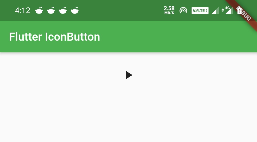
Flutter IconButton Example
IconButton(
            icon: Icon(Icons.play_arrow),
            onPressed: () {

            },
          ),
Output:
How To Create An IconButton In flutter ?
We can create an iconbutton in flutter by calling its constructor. Just provide the constructor with the required properties. The icon button has two required properties icon and onPressed callback. The icon will be Icon widget and onPressed callback will handle the touch interaction.
Flutter IconButton Constructor:
IconButton(
{Key key,
double iconSize: 24.0,
VisualDensity visualDensity,
EdgeInsetsGeometry padding: const EdgeInsets.all(8.0), AlignmentGeometry alignment: Alignment.center,
double splashRadius,
@required Widget icon,
Color color,
Color focusColor,
Color hoverColor,
Color highlightColor,
Color splashColor,
Color disabledColor,
@required VoidCallback onPressed,
MouseCursor mouseCursor: SystemMouseCursors.click,
FocusNode focusNode,
bool autofocus: false,
String tooltip,
bool enableFeedback: true,
BoxConstraints constraints
}
)
Flutter IconButton Properties
We can style the IconButton widget by changing color, splashColor, etc. Let’s see the properties that help us to style the IconButton.
- iconSize
- color
- splashColor
- splashRadius
- highlightColor
- disabledColor
- tooltip
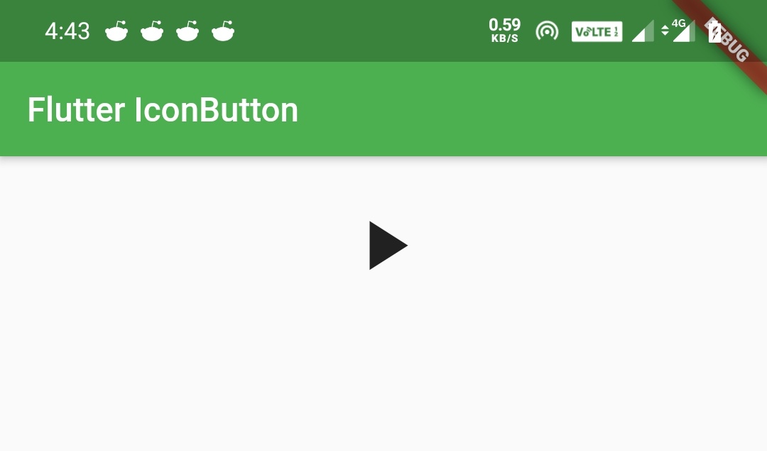
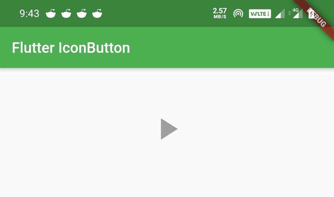
IconButton iconSize
We will use iconSize property to define the size of the icon inside the button.
Container(
          padding: EdgeInsets.all(20),
          alignment: Alignment.center,
          height: 50,
          child:IconButton(
              icon: Icon(Icons.play_arrow),
              iconSize: 50,
              onPressed: () {

              },
          ),
        )
Output:
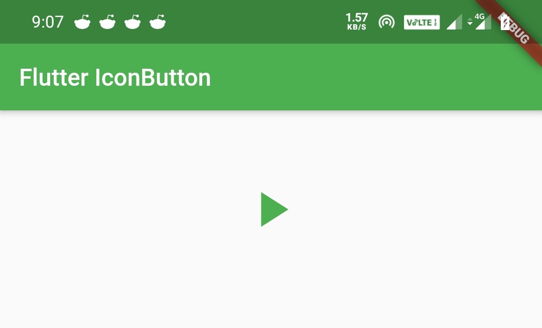
IconButton color
We will use this Property when we want to change the color of the IconButton. If we use color property in child widget then it will override the color property of IconButton.
Note: Color applied to individual widgets/elements will override the color property of IconButton.
Let’s see the output by defining color to IconButton but not the child(Icon).
Column(
              mainAxisSize: MainAxisSize.min,
              mainAxisAlignment: MainAxisAlignment.center,
              children: [
                Container(
                  height: 50,
                ),
                IconButton(
                  icon: Icon(Icons.play_arrow),
                  color: Colors.green,
                  iconSize: 50,
                  onPressed: () {

                  },
                )
              ]
        ),
Output:
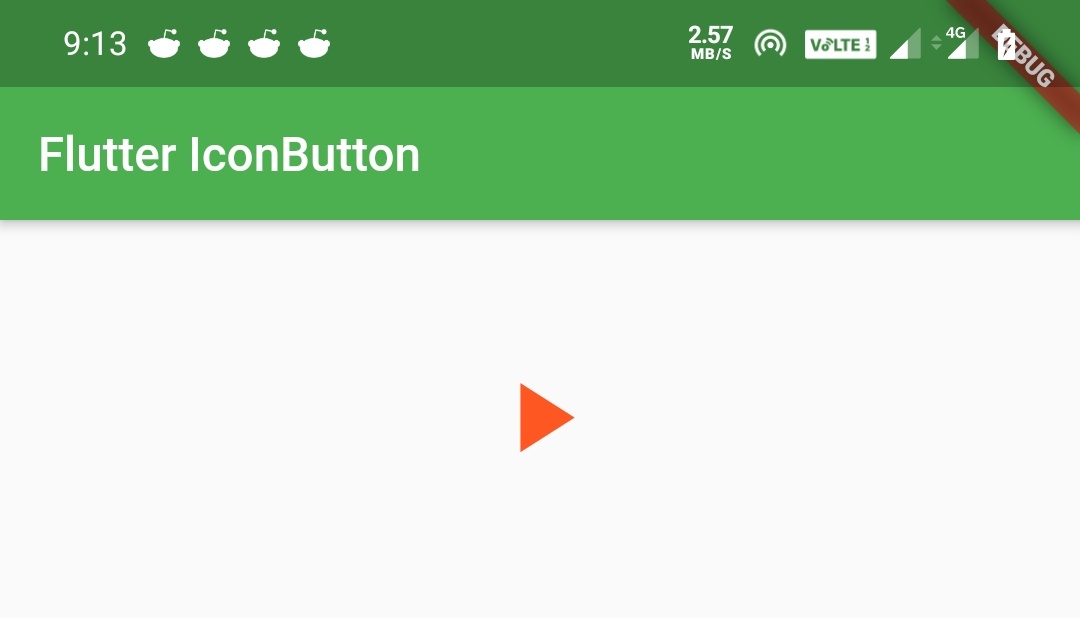
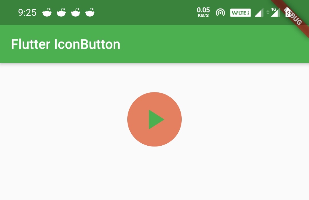
Now let’s see what will happen if we apply color to the child widget. In this case, the child is an icon widget.
Column(
              mainAxisSize: MainAxisSize.min,
              mainAxisAlignment: MainAxisAlignment.center,
              children: [
                Container(
                  height: 50,
                ),
                IconButton(
                  icon: Icon(
                    Icons.play_arrow,
                    color: Colors.deepOrange,
                  ),
                  color: Colors.green,
                  iconSize: 50,
                  onPressed: () {

                  },
                )
              ]
        ),
Output:
IconButton splashColor
We will use splashColor property to apply color which appears when we tap the IconButton. When the user taps the IconButton the splashColor starts filling the button slowly. It fades out when the user releases the button.
Note: To see the effects of splashColor, splashRadius, etc, we should wrap the IconButton inside a material widget. I’m using the column widget in the examples.
Column(
              mainAxisSize: MainAxisSize.min,
              mainAxisAlignment: MainAxisAlignment.center,
              children: [
                Container(
                  height: 50,
                ),
                IconButton(
                  icon: Icon(Icons.play_arrow),
                  color: Colors.green,
                  iconSize: 50,
                  splashRadius: 40,
                  splashColor: Colors.deepOrange,
                  onPressed: () {

                  },
                )
              ]
        ),
Output:
IconButton splashRadius
We will use splashRadius property to define what extent the splashColor should fill.
Column(
              mainAxisSize: MainAxisSize.min,
              mainAxisAlignment: MainAxisAlignment.center,
              children: [
                Container(
                  height: 50,
                ),
                IconButton(
                  icon: Icon(Icons.play_arrow),
                  color: Colors.green,
                  iconSize: 50,
                  splashRadius: 40,
                  splashColor: Colors.deepOrange,
                  onPressed: () {

                  },
                )
              ]
        ),
Output:
IconButton highlightColor
HighlightColor is the secondary color of the button when the button is in the down (pressed) state. The highlight color is represented as a solid color that is overlaid over the button color (if any). If the highlight color has transparency, the button color will show through. The highlight fades in quickly as the button is held down.
Column(
              mainAxisSize: MainAxisSize.min,
              mainAxisAlignment: MainAxisAlignment.center,
              children: [
                Container(
                  height: 50,
                ),
                IconButton(
                  icon: Icon(Icons.play_arrow),
                  color: Colors.green,
                  iconSize: 50,
                  splashRadius: 40,
                  highlightColor: Colors.deepOrange,
                  onPressed: () {

                  },
                )
              ]
        ),
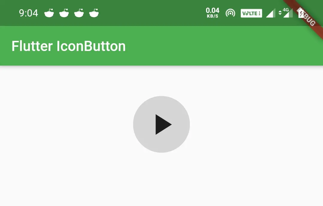
IconButton disabledColor
We will use disabledColor property to define the color to be displayed when the button is disabled. I’m disabling the button by setting onPressed to null.
Column(
              mainAxisSize: MainAxisSize.min,
              mainAxisAlignment: MainAxisAlignment.center,
              children: [
                Container(
                  height: 50,
                ),
                IconButton(
                  icon: Icon(Icons.play_arrow),
                  color: Colors.green,
                  iconSize: 50,
                  splashRadius: 40,
                  disabledColor: Colors.grey,
                  onPressed: null,
                )
              ]
        ),
Output:
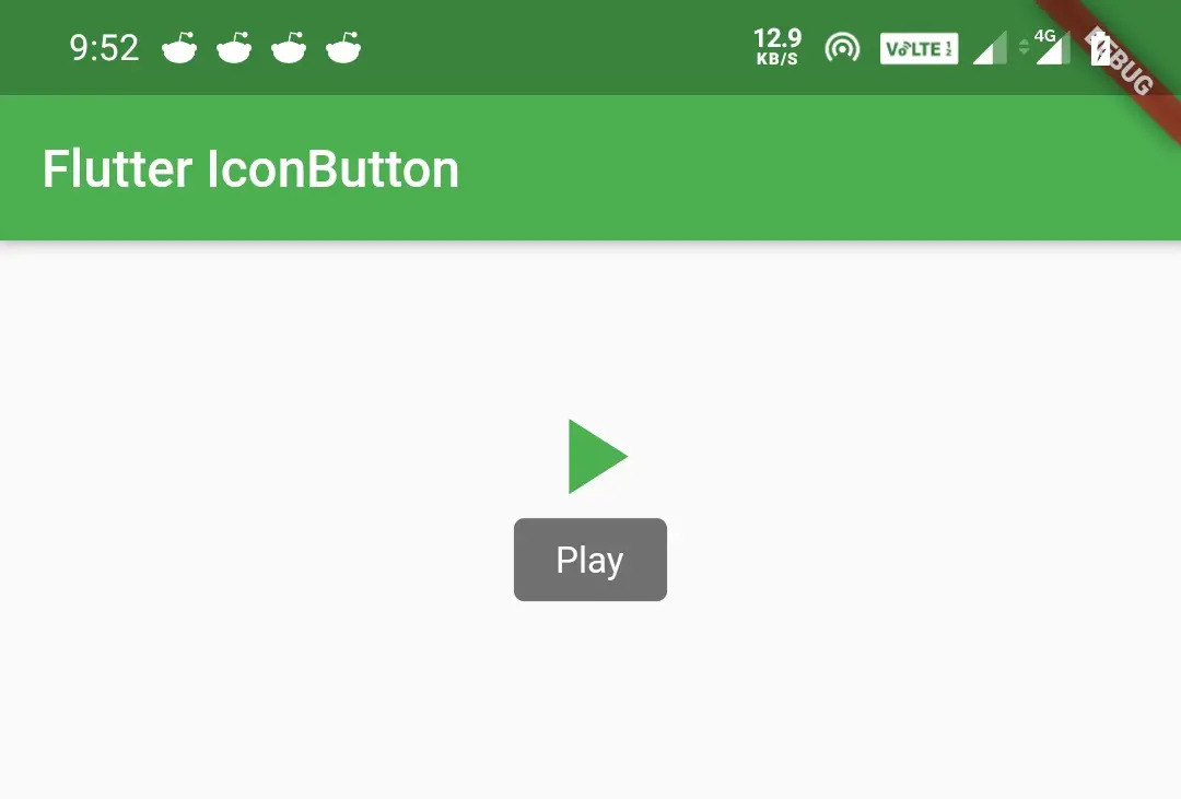
IconButton tooltip
We will use this property to display a text that describes the action that will occur when the button is pressed.
Column(
              mainAxisSize: MainAxisSize.min,
              mainAxisAlignment: MainAxisAlignment.center,
              children: [
                Container(
                  height: 50,
                ),
                IconButton(
                  icon: Icon(Icons.play_arrow),
                  color: Colors.green,
                  iconSize: 50,
                  splashRadius: 40,
                  disabledColor: Colors.grey,
                  onPressed: () {},
                  tooltip: "Play",
                )
              ]
        ),
Output:
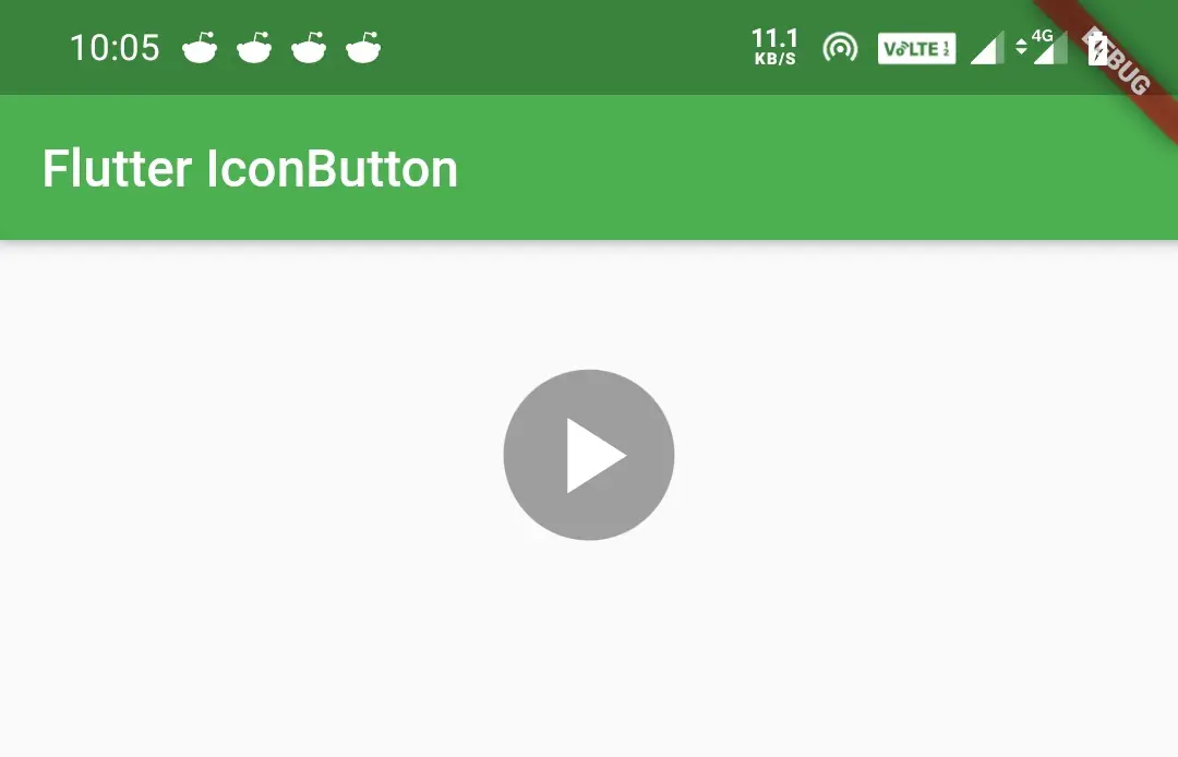
Applying BackgroundColor to Flutter IconButton
There is no property to apply background color to IconButton. We can do it by wrapping the IconButton inside the Ink widget and applying decoration to the Ink widget.
Column(
              mainAxisSize: MainAxisSize.min,
              mainAxisAlignment: MainAxisAlignment.center,
              children: [
                Container(
                  height: 50,
                ),
                Ink(
                    child:IconButton(
                      icon: Icon(Icons.play_arrow),
                      color: Colors.white,
                      iconSize: 50,
                      splashRadius: 40,
                      disabledColor: Colors.grey,
                      onPressed: () {},
                      tooltip: "Play",
                    ),
                  decoration: ShapeDecoration(
                    color: Colors.grey,
                    shape: CircleBorder()
                  ),
                )
              ]
        ),
Output:
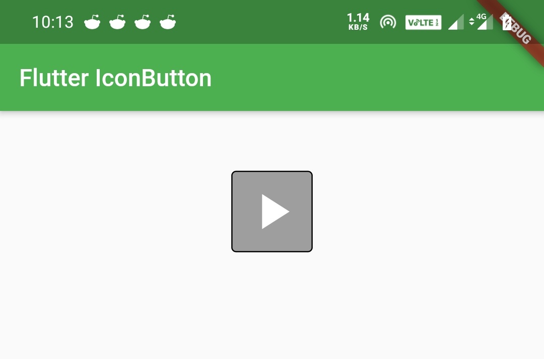
To change the background shape to a rectangle just replace the CircleBorder() in the above code snippet with RoundedRectangleBorder()
Column(
              mainAxisSize: MainAxisSize.min,
              mainAxisAlignment: MainAxisAlignment.center,
              children: [
                Container(
                  height: 50,
                ),
                Ink(
                    child:IconButton(
                      icon: Icon(Icons.play_arrow),
                      color: Colors.white,
                      iconSize: 50,
                      splashRadius: 40,
                      disabledColor: Colors.grey,
                      onPressed: () {},
                      tooltip: "Play",
                    ),
                  decoration: ShapeDecoration(
                    color: Colors.grey,
                    shape: OutlineInputBorder()
                  ),
                )
              ]
        ),
Output:
To apply more shapes please refer shaping raised button section of flutter raisedButton widget example to learn about more shapes.
That brings an end to flutter IconButton example. See you in the next article with some other flutter widget. Have a great day!!
Do share, subscribe, and like my Facebook page if you find this post helpful. Thank you!!
Reference: Flutter Official Documentation


Leave a Reply