
In this tutorial we will learn how to use card in flutter with example. Learn how to customize it’s look by styling it with different properties.
Flutter Card Widget
Card widget in flutter is a sheet of Material used to represent all the similar information in a single block. For example, a card can be used to design an album cover as it will represent all the songs that belong to that album. A card will have rounded corners and is elevated by default. We can change the value of elevation as per our requirement. While designing a card we can use elements like text, images, videos, text buttons etc. Cards make the application UI more beautiful and eye-catching to the user.
Creating And Showing Card In Flutter
To create and display a card in flutter we have to call the constructor of the card class provided by flutter. There are no required properties for a card widget but to show the card we have to provide the child property with a widget. Without providing the child with a widget we cannot see the card.
Flutter Card Constructor :
 Card(
    {Key? key,
    Color? color,
    Color? shadowColor,
    double? elevation,
    ShapeBorder? shape,
    bool borderOnForeground,
    EdgeInsetsGeometry? margin,
    Clip? clipBehavior,
    Widget? child,
    bool semanticContainer}
)
Below is the example code to add a card to our flutter application.
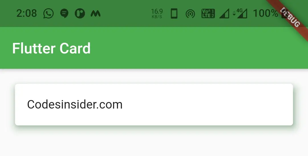
Card(
        child: ListTile(
          title: Text("Codesinsider.com"),
        ),
     )
Flutter Card Properties
The properties of the card widget are:
- color
- elevation
- shadowColor
- shape
- margin
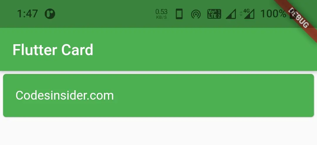
color / backgroundColor
We will use this property to change the background color of the card. It takes Color as value.
Card(
          child: ListTile(
            title: Text("Codesinsider.com", style: TextStyle(color: Colors.white),),
          ),
          color: Colors.green,
        )
Output :
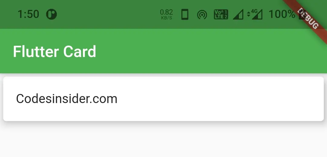
elevation
We will use this property to add or change elevation of the card. It takes double as value.
Card(
          child: ListTile(
            title: Text("Codesinsider.com"),
          ),
          elevation: 8,
        )
Output :
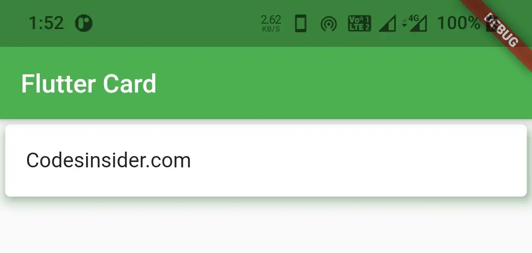
shadowColor
To change the color of the shadow that appears when the card is elevated we will use shadow color property. It takes color as value.
Card(
          child: ListTile(
            title: Text("Codesinsider.com"),
          ),
          elevation: 8,
          shadowColor: Colors.green,
        )
Output :
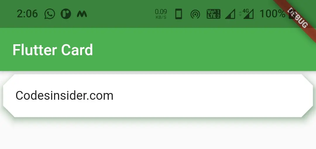
shape
To change the shape of the card we will use this property. By using shape property we can add border, change border color, make rounded corners, circular card etc. In the below example i’ m using BeveledRectangleBorder shape. If you want to try other shapes refer flutter RaisedButton example.
Card(
          child: ListTile(
            title: Text("Codesinsider.com"),
          ),
          elevation: 8,
          shadowColor: Colors.green,
          shape: BeveledRectangleBorder(
              borderRadius: BorderRadius.circular(15)
          ),
        )
Output :
margin
To provide margin to card we will use this property. It takes EdgeInsets Geometry as value.
Card(
          child: ListTile(
            //leading: Icon(Icons.music_note),
            title: Text("Codesinsider.com"),
          ),
          elevation: 8,
          shadowColor: Colors.green,
          margin: EdgeInsets.all(20),
        )
Output :
height and width
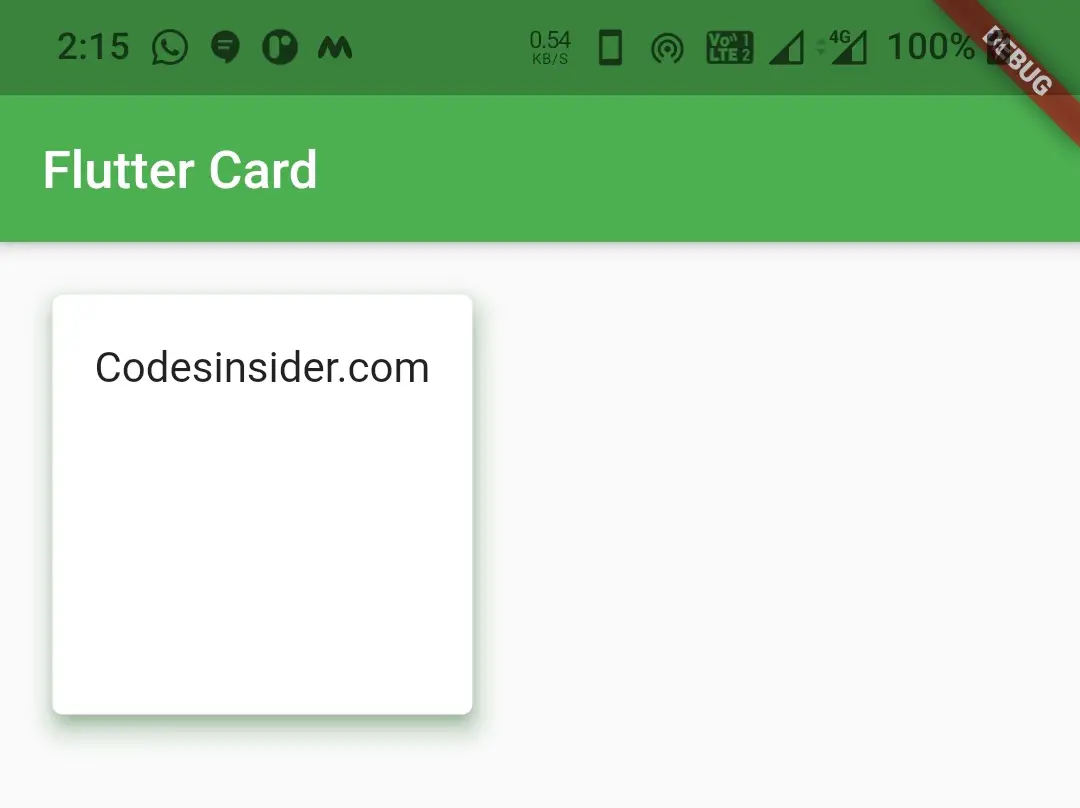
Since card widget has no height and width properties we will use container and add card as child to it. The card will take the height and width of the container.
Container(
          height: 200,
          width: 200,
          child: Card(
            child: ListTile(
              title: Text("Codesinsider.com"),
            ),
            elevation: 8,
            shadowColor: Colors.green,
            margin: EdgeInsets.all(20),
          ),
        )
Output :
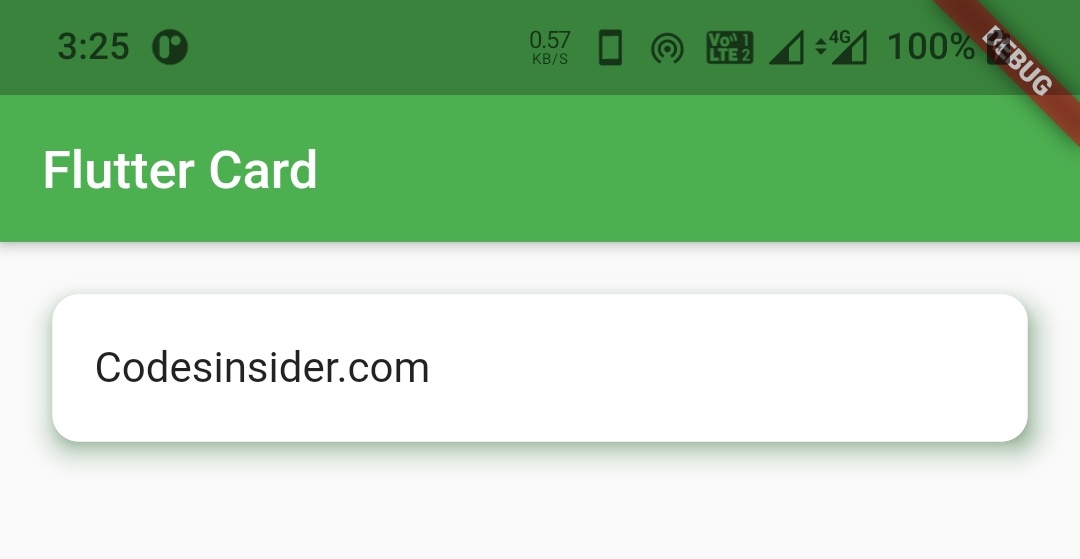
rounded corners
There is no property available for making rounded corners so we will use shape property to make rounded corners.
Card(
          child: ListTile(
            title: Text("Codesinsider.com"),
          ),
          elevation: 8,
          shadowColor: Colors.green,
          margin: EdgeInsets.all(20),
          shape:  OutlineInputBorder(
              borderRadius: BorderRadius.circular(10),
              borderSide: BorderSide(color: Colors.white)
          ),
        )
Output :
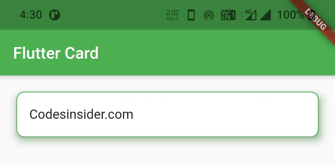
border and border color
To add border and border color i’ ve used outlineInputBorder since there is no property in card widget to add border and border color. To try other shapes and borders for refere
Card(
          child: ListTile(
            title: Text("Codesinsider.com"),
          ),
          elevation: 8,
          shadowColor: Colors.green,
          margin: EdgeInsets.all(20),
          shape:  OutlineInputBorder(
              borderRadius: BorderRadius.circular(10),
              borderSide: BorderSide(color: Colors.green, width: 1)
          ),
        )
Output :
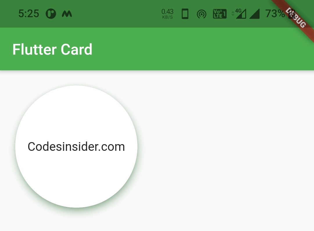
circular card
To make a circular card we will use CircleBorder shape.
Card(
          child: Container(
            height: 160,
            width: 160,
            child: Center(
              child: ListTile(
                title: Text("Codesinsider.com"),
              ),
            ),
          ),
          elevation: 8,
          shadowColor: Colors.green,
          margin: EdgeInsets.all(20),
          shape: CircleBorder(side: BorderSide(width: 1, color: Colors.white),
          ),
        )
Output :
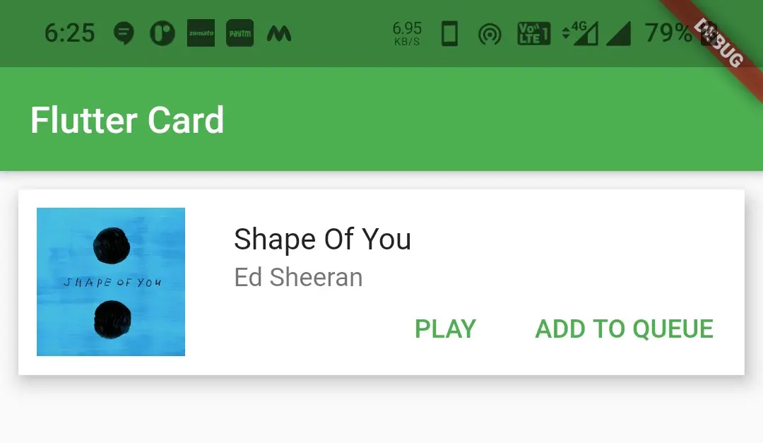
Flutter Card Example
Let’s see an example where we design a music album card with white background color, an image to left and some text in the right. Below the text we will add two Text buttons play and add to queue.
import 'package:flutter/cupertino.dart';
import 'package:flutter/material.dart';
import 'package:flutter/widgets.dart';
import 'package:flutter_app_learning/NavDrawer.dart';
import 'package:flutter_app_learning/contact.dart';
void main()
{
  runApp(MyApp());
}

class MyApp extends StatelessWidget {
  @override
  Widget build(BuildContext context) {
    return MaterialApp(
      title: 'Flutter Learning',
      theme: ThemeData(
        primarySwatch: Colors.green,
      ),
      home: MyHomePage(),
    );
  }
}

class MyHomePage extends StatefulWidget {
  @override
  _MyHomePageState createState()
  {
    return _MyHomePageState();
  }
}

class _MyHomePageState extends State<MyHomePage> {
  @override
  Widget build(BuildContext context) {
    return Scaffold(
      appBar: AppBar(
        title: Text("Flutter Card"),
      ),
        body:Card(
          child:Container(
            height: 100,
            color: Colors.white,
            child: Row(
              children: [
                Center(
                  child: Padding(
                    padding: EdgeInsets.all(10),
                    child: Expanded(
                      child:Image.asset("assets/images/shape_of_you.png"),
                      flex:2 ,
                    ),
                  ),
                ),
                Expanded(
                  child:Container(
                    alignment: Alignment.topLeft,
                    child: Column(
                      children: [
                        Expanded(
                          flex: 5,
                          child: ListTile(
                            title: Text("Shape Of You"),
                            subtitle: Text("Ed Sheeran"),
                          ),
                        ),
                        Expanded(
                          flex: 5,
                          child: Row(
                            mainAxisAlignment: MainAxisAlignment.end,
                            children: [
                              TextButton(
                                child:Text("PLAY"),
                                onPressed: ()
                                {},
                              ),
                              SizedBox(width: 8,),
                              TextButton(
                                child: Text("ADD TO QUEUE"),
                                onPressed: (){},
                              ),
                              SizedBox(width: 8,)
                            ],
                          ),
                        )
                      ],
                    ),
                  ),
                  flex:8 ,
                ),
              ],
            ),
          ),
          elevation: 8,
          margin: EdgeInsets.all(10),
        ),
    );
  }
}
Output :
That brings an end to the tutorial on how to create and display or show Card in flutter. We have also seen an example where we’ve used Card widget and customized it. Let’s catch up with some other widget in the next post. Have a great day!!
Do like & share my facebook page. Subscribe to newsletter if you find this post helpful. Thank you!!
Reference : Flutter Official Documentation


Leave a Reply