In this tutorial we will learn how to use TabBar and TabBarview in flutter. We will also customize the style of the widgets with different properties. In the end we will create an example using both the widgets.
Flutter TabBar
TabBar is a material widget in flutter that displays a tab layout. Generally, tabbar is placed at the bottom section of the appbar. To display content based on the selected tab we have to use tabbar along with TabbarView. Tab bar will be useful when we have to display different categories of content to users. Using tab bar users can quickly navigate between different categories and view content related to that category. A real-time example for a TabBar is the WhatsApp application. It contains a tab bar with tabs like chats, status, and calls.
How To Create TabBar In Flutter ?
To create a tab bar in flutter we have to call its constructor and provide the required properties.There is one required property for the TabBar widget which is the tabs property. This property takes a list of widgets as value, usually a list of Tab widgets. We must use either a TabController or a DefaultTabController for a TabBar to coordinate with TabBarView.
Flutter TabBar constructor :
TabBar(
    {Key? key,
    required List<Widget> tabs,
    TabController? controller,
    bool isScrollable,
    Color? indicatorColor,
    bool automaticIndicatorColorAdjustment,
    double indicatorWeight,
    EdgeInsetsGeometry indicatorPadding,
    Decoration? indicator,
    TabBarIndicatorSize? indicatorSize,
    Color? labelColor,
    TextStyle? labelStyle,
    EdgeInsetsGeometry? labelPadding,
    Color? unselectedLabelColor,
    TextStyle? unselectedLabelStyle,
    DragStartBehavior dragStartBehavior,
    MaterialStateProperty<Color?>? overlayColor,
    MouseCursor? mouseCursor,
    bool? enableFeedback,
    ValueChanged<int>? onTap,
    ScrollPhysics? physics}
)
To use DefaultTabcontroller we have to provide it as an ancestor for TabBar. If we want to use TabController instead, we have to create a TabController instance and provide it to controller property of both TabBar and TabBarView widgets.
The length of the controller must be equal to the length of TabBar’s tabs list and the length of the TabBarView’s children list.
Basic implementation of TabBar
DefaultTabController(
      length: 3,
      child: Scaffold(
        appBar: AppBar(
          bottom: TabBar(
            tabs: [
              Tab(icon: Icon(Icons.cloud)),
              Tab(icon: Icon(Icons.beach_access)),
              Tab(icon: Icon(Icons.wb_sunny)),
            ],
          ),
          title: Text('Tabs Demo'),
        ),
      ),
    );
Flutter TabBar Properties
The properties of a flutter TabBar are :
- isScrollable
- indicatorColor
- indicatorWeight
- indicator
- indictorPadding
- indicatorSize
- labelColor
- labelStyle
- labelPadding
- unselectedLabelColor
- unselectedLabelStyle
- onTap
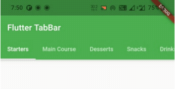
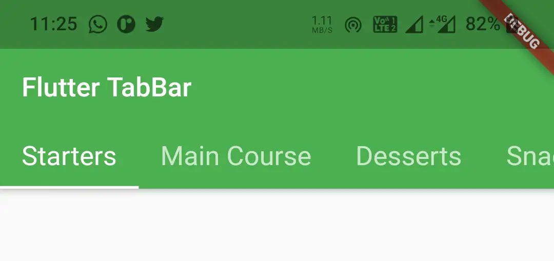
isScrollable
It is a boolean value where setting it to true will make the TabBar scroll if there are more tabs. If there are less tabs the tabs will be centered leaving space on both sides. Setting it to false will make the TabBar adjust the tabs to occupy the entire tabbar with equal width.
TabBar(
            tabs: [
              Tab(text: "Starters", ),
              Tab(text: "Main Course",),
              Tab(text: "Desserts",),
              Tab(text: "Snacks", ),
              Tab(text: "Drinks",),
              Tab(text: "Fast Foods",),
            ],
            isScrollable: true,
          ),
Output :
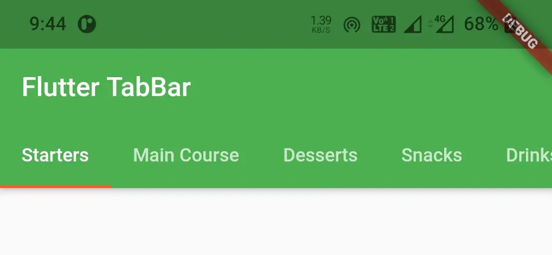
indicatorColor
We will use this property to change the tab indicator color of the TabBar. It takes Color as value.
TabBar(
            tabs: [
              Tab(text: "Starters", ),
              Tab(text: "Main Course",),
              Tab(text: "Desserts",),
              Tab(text: "Snacks", ),
              Tab(text: "Drinks",),
              Tab(text: "Fast Foods",),
            ],
            isScrollable: true,
            indicatorColor: Colors.deepOrange,
          ),
Output :
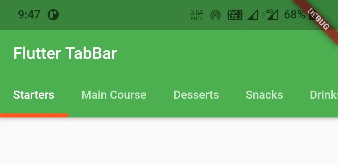
indicatorWeight
Indicator weight is nothing but the thickness of the indicator. If we want to increase or decrease the weight we will use this property. The value for this property is double.
TabBar(
            tabs: [
              Tab(text: "Starters", ),
              Tab(text: "Main Course",),
              Tab(text: "Desserts",),
              Tab(text: "Snacks", ),
              Tab(text: "Drinks",),
              Tab(text: "Fast Foods",),
            ],
            isScrollable: true,
            indicatorColor: Colors.deepOrange,
            indicatorWeight: 5,
          ),
Output :
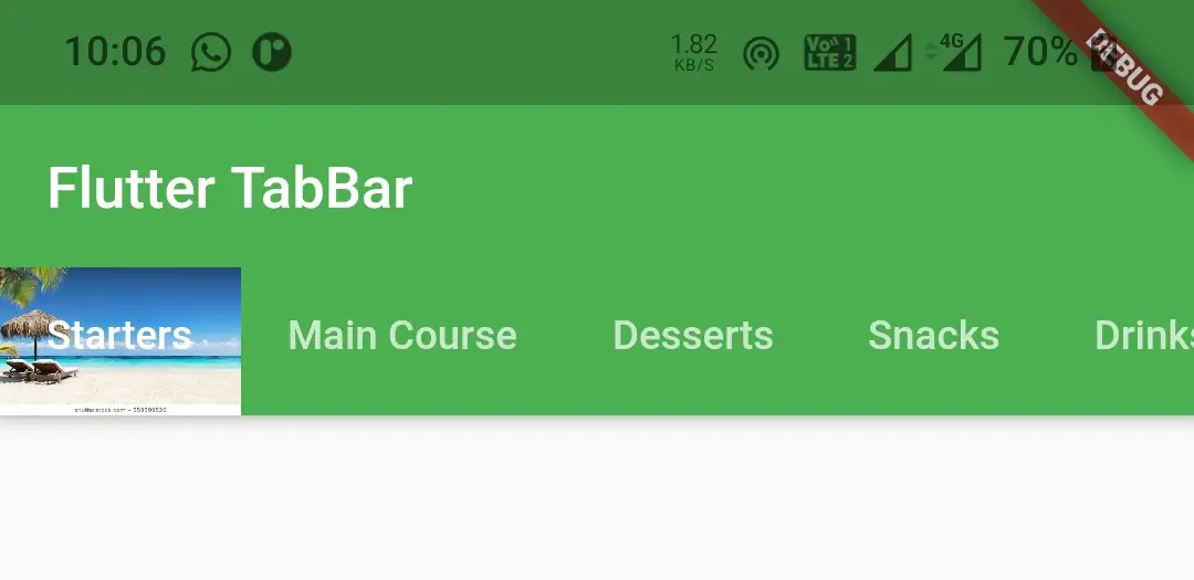
indicator
We will use this property to design a custom indicator with a background image or color etc. This property takes a value of type Decoration.
TabBar(
            tabs: [
              Tab(text: "Starters", ),
              Tab(text: "Main Course",),
              Tab(text: "Desserts",),
              Tab(text: "Snacks", ),
              Tab(text: "Drinks",),
              Tab(text: "Fast Foods",),
            ],
            isScrollable: true,
            indicator: BoxDecoration(
              color: Colors.grey,
              image: DecorationImage(
                image: AssetImage("assets/images/flutter_stack.jpg"),
                fit: BoxFit.cover,
              )
            ),
          ),
Output :
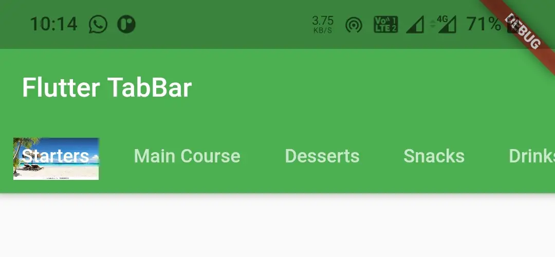
indicatorPadding
To provide padding to the indicator we will use this property. It takes EdgeInsetsGeometry as value.
TabBar(
            tabs: [
              Tab(text: "Starters", ),
              Tab(text: "Main Course",),
              Tab(text: "Desserts",),
              Tab(text: "Snacks", ),
              Tab(text: "Drinks",),
              Tab(text: "Fast Foods",),
            ],
            isScrollable: true,
            indicatorColor: Colors.deepOrange,
            indicatorWeight: 5,
            indicator: BoxDecoration(
              color: Colors.grey,
              image: DecorationImage(
                image: AssetImage("assets/images/flutter_stack.jpg"),
                fit: BoxFit.cover,
              )
            ),
            indicatorPadding: EdgeInsets.all(10),
          ),
Output :
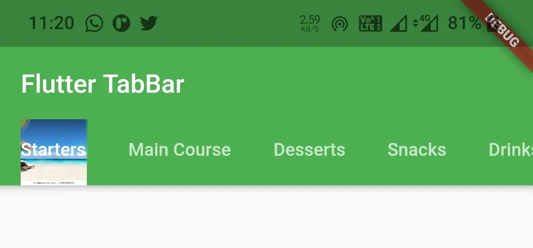
indicatorSize
This proerty is used to set indicator size. It takes TabBarIndicatorSize as value which has two constants Tab and label. If we use tab the the indicator will occupy full tab and if we set label it will occupy label width.
TabBar(
            tabs: [
              Tab(text: "Starters", ),
              Tab(text: "Main Course",),
              Tab(text: "Desserts",),
              Tab(text: "Snacks", ),
              Tab(text: "Drinks",),
              Tab(text: "Fast Foods",),
            ],
            isScrollable: true,
            indicatorColor: Colors.deepOrange,
            indicatorWeight: 5,
            indicator: BoxDecoration(
              color: Colors.grey,
              image: DecorationImage(
                image: AssetImage("assets/images/flutter_stack.jpg"),
                fit: BoxFit.cover,
              )
            ),
            indicatorSize: TabBarIndicatorSize.label,
          ),
Output :
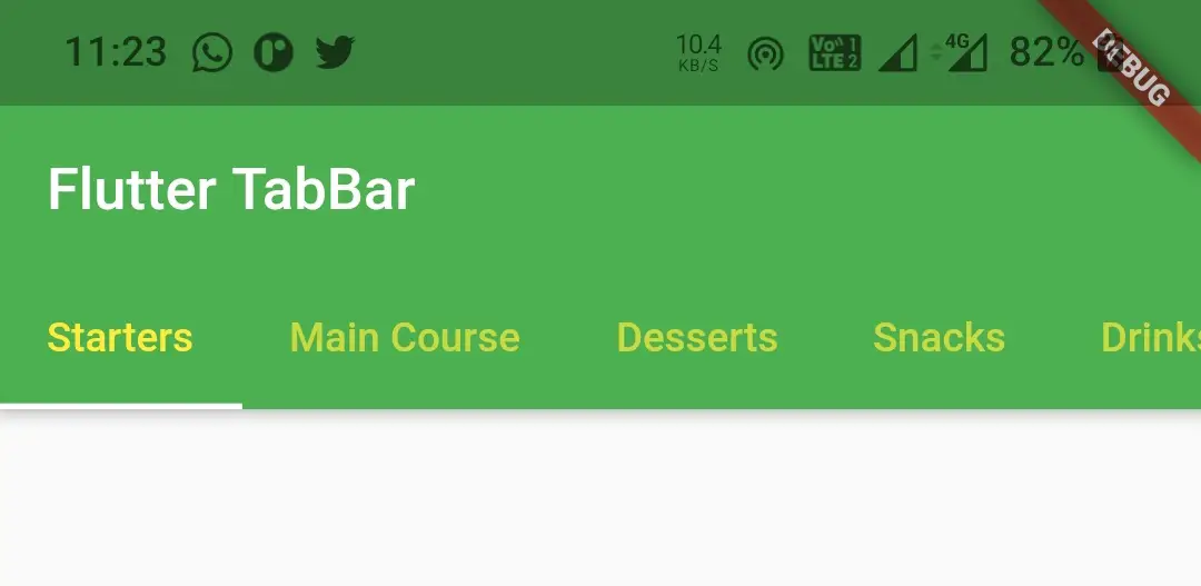
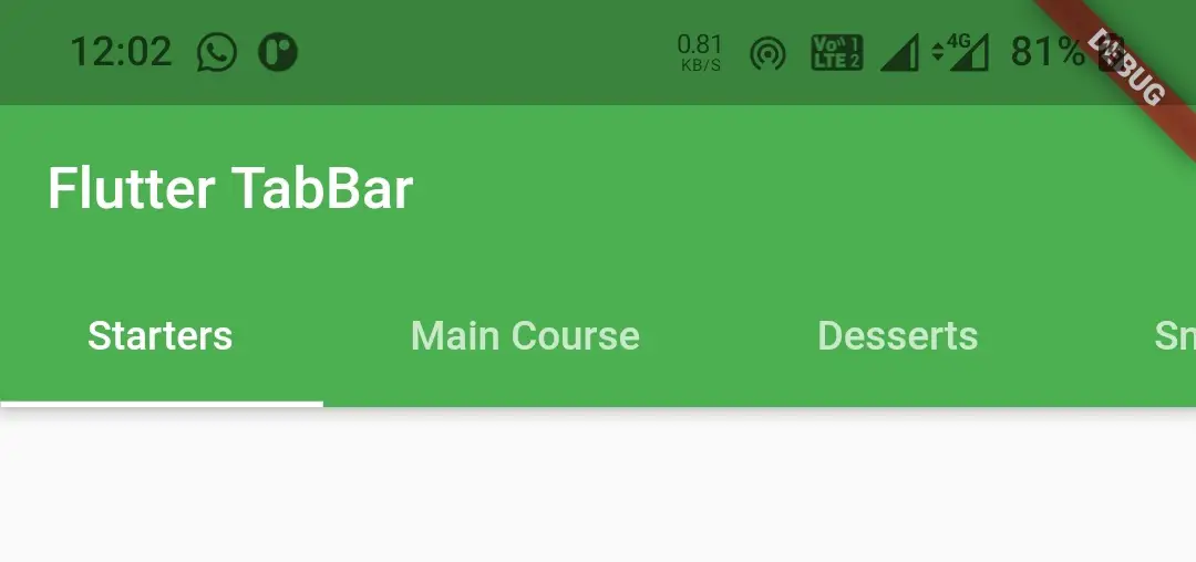
labelColor
We will use this property to change the color of the label of a tab.
TabBar(
            tabs: [
              Tab(text: "Starters", ),
              Tab(text: "Main Course",),
              Tab(text: "Desserts",),
              Tab(text: "Snacks", ),
              Tab(text: "Drinks",),
              Tab(text: "Fast Foods",),
            ],
            isScrollable: true,
            labelColor: Colors.yellow,
          ),
Output :
labelStyle
We will use this property to apply style to the label text like changing fontsize background etc. It takes TextStyle as value.
TabBar(
            tabs: [
              Tab(text: "Starters", ),
              Tab(text: "Main Course",),
              Tab(text: "Desserts",),
              Tab(text: "Snacks", ),
              Tab(text: "Drinks",),
              Tab(text: "Fast Foods",),
            ],
            isScrollable: true,
            labelStyle: TextStyle(fontSize: 20 ),
          ),
Output :
labelPadding
We will use this property to apply padding to label. It takes EdgeInsetsGeoetry as value.
TabBar(
            tabs: [
              Tab(text: "Starters", ),
              Tab(text: "Main Course",),
              Tab(text: "Desserts",),
              Tab(text: "Snacks", ),
              Tab(text: "Drinks",),
              Tab(text: "Fast Foods",),
            ],
            isScrollable: true,
            labelPadding: EdgeInsets.only(left: 30, right: 30),
          ),
Output :
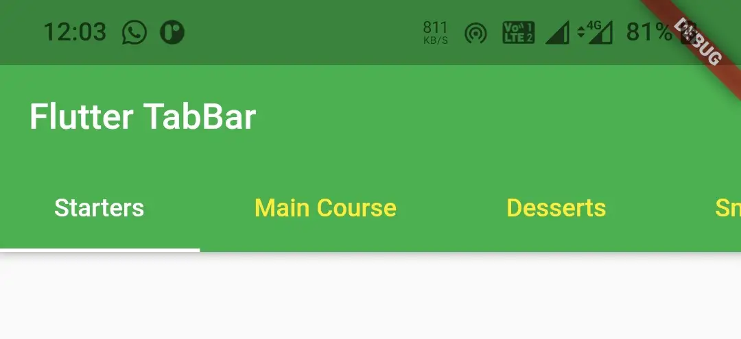
unselectedLabelColor
This property is used to change the color of unselected labels. It takes Color as value.
TabBar(
            tabs: [
              Tab(text: "Starters", ),
              Tab(text: "Main Course",),
              Tab(text: "Desserts",),
              Tab(text: "Snacks", ),
              Tab(text: "Drinks",),
              Tab(text: "Fast Foods",),
            ],
            isScrollable: true,
            labelPadding: EdgeInsets.only(left: 30, right: 30),
            unselectedLabelColor: Colors.yellow,
          ),
Output :
unselectedLabelStyle
This property is used to apply style to unselected labels like changing font size and font weight etc. It takes TextStyle as value.
TabBar(
            tabs: [
              Tab(text: "Starters", ),
              Tab(text: "Main Course",),
              Tab(text: "Desserts",),
              Tab(text: "Snacks", ),
              Tab(text: "Drinks",),
              Tab(text: "Fast Foods",),
            ],
            isScrollable: true,
            labelPadding: EdgeInsets.only(left: 30, right: 30),
            unselectedLabelStyle: TextStyle(fontWeight: FontWeight.bold, fontSize: 16),
          ),
Output :
Flutter TabBarView
TabBarView widget is a page view in flutter that displays the widget / content which corresponds to the currently selected tab. It will be used in combination with TabBar widget. TabBarView has one required property called children. It takes a List of widgets as value. The length of children must match the length of the TabBar’s tabs list and length of the controller.
To create a tab bar view we have to use a widget called TabBarView in flutter.
Flutter TabBarView Constructor :
TabBarView(
    {Key? key,
    required List<Widget> children,
    TabController? controller,
    ScrollPhysics? physics,
    DragStartBehavior dragStartBehavior}
)
Basic implementation of TabBarView
TabBarView(
          children: const <Widget>[
            Center(
              child: Text("Clouds"),
            ),
            Center(
              child: Text("Rain"),
            ),
            Center(
              child: Text("Sun"),
            ),
          ],
        ),
Flutter TabBar Example
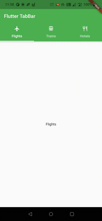
Let’s see an example where we create a TabBar with three tabs where each tab will have an icon and a label. For this purpose we have to use TabBar widget for displaying tabs and TabBarView widget for displaying content related to selected tab. We will be using DefaultTabController to maintain coordination between the tab bar and tab bar view.
import 'package:flutter/material.dart';
import 'package:flutter/widgets.dart';
void main()
{
  runApp(MyApp());
}

class MyApp extends StatelessWidget {
  @override
  Widget build(BuildContext context) {
    return MaterialApp(
      title: 'Flutter Learning',
      theme: ThemeData(
        primarySwatch: Colors.green,
      ),
      home: MyHomePage(),
    );
  }
}

class MyHomePage extends StatefulWidget {

  @override
  _MyHomePageState createState()
  {
    return _MyHomePageState();
  }
}

class _MyHomePageState extends State<MyHomePage> {

  @override
  Widget build(BuildContext context) {
    return DefaultTabController(
      length: 3,
      child: Scaffold(
        appBar: AppBar(
          bottom: TabBar(
            tabs: [
              Tab(text: "Flights", icon: Icon(Icons.flight),),
              Tab(text: "Trains", icon: Icon(Icons.train)),
              Tab(text: "Hotels",icon: Icon(Icons.restaurant)),
            ],
          ),
          title: Text('Flutter TabBar'),
        ),
        body: TabBarView(
          children: const <Widget>[
            Center(
              child: Text("Flights"),
            ),
            Center(
              child: Text("Trains"),
            ),
            Center(
              child: Text("Hotels"),
            ),
          ],
        ),
      ),
    );
  }
}
Output :
Listening Tab Change Event
Sometimes we might want to listen to tab change event, if we want to perform some actions when a particular tab is opened or closed. We can listen to tab change event by using onTap callback of TabBar widget. The problem with onTap callback is, it only works when the user taps on the TabBar but not when the user swipes the TabBarView. So we have to add a listener to the controller instead of using onTap Callback. We can’t add listener to DefaultTabController so we will use TabController for this purpose. Let’s see how to create a TabController and use it with TabBar.
To use TabController, we should provide our class with SingleTickerProviderStateMixin like below
class _MyHomePageState extends State<MyHomePage> with SingleTickerProviderStateMixin {
}
Declare the TabController and an integer variable to hold the selected index.
TabController _controller;
int _selectedIndex = 0;
Now let’s create or initialize the controller and add a listener to it.
@override
  void initState() {
    _controller = new TabController(length: 3, vsync: this);

    _controller.addListener(() {
      setState(() {
        _selectedIndex = _controller.index;
      });
      // Do whatever you want based on the tab index
    });

    super.initState();
  }
Providing controller to TabBar and TabBarView.
Scaffold(
      appBar: AppBar(
        bottom: TabBar(
          controller: _controller,
          tabs: [
            ...
          ],
        ),
        title: Text('Flutter TabBar'),
      ),
      body: TabBarView(
        controller: _controller,
        children: const <Widget>[
          ...
        ],
      ),
    );
The final code will be
import 'package:flutter/material.dart';
import 'package:flutter/widgets.dart';
void main()
{
  runApp(MyApp());
}

class MyApp extends StatelessWidget {
  @override
  Widget build(BuildContext context) {
    return MaterialApp(
      title: 'Flutter Learning',
      theme: ThemeData(
        primarySwatch: Colors.green,
      ),
      home: MyHomePage(),
    );
  }
}

class MyHomePage extends StatefulWidget {

  @override
  _MyHomePageState createState()
  {
    return _MyHomePageState();
  }
}

class _MyHomePageState extends State<MyHomePage> with SingleTickerProviderStateMixin {
  TabController _controller;
  int _selectedIndex = 0;

  @override
  void initState() {
    _controller = new TabController(length: 3, vsync: this);

    _controller.addListener(() {
      setState(() {
        _selectedIndex = _controller.index;
      });
      // Do whatever you want based on the tab index
    });

    super.initState();
  }

  @override
  Widget build(BuildContext context) {
    return Scaffold(
      appBar: AppBar(
        bottom: TabBar(
          controller: _controller,
          tabs: [
             Tab(text: "Flights", icon: Icon(Icons.flight),),
             Tab(text: "Trains", icon: Icon(Icons.train)),
             Tab(text: "Hotels",icon: Icon(Icons.restaurant)),
          ],
        ),
        title: Text('Flutter TabBar'),
      ),
      body: TabBarView(
        controller: _controller,
        children: const <Widget>[
          Center(
              child: Text("Flights"),
            ),
          Center(
              child: Text("Trains"),
            ),
          Center(
              child: Text("Hotels"),
            ),
        ],
      ),
    );
  }
}
That brings an end to the tutorial on how to create and display or show TabBar with TabBarView in flutter. We have also seen an example where we’ve used TabBar and TabBarView widgets and customize them. Let’s catch up with some other widget in the next post. Have a great day!!
Do share, subscribe and like my facebook page if you find this post helpful. Thank you!!
Reference : Official Documentation – TabBar, TabBarView


Leave a Reply