
In flutter, RadioListTile is a ListTile with a Radio Button. We can also call it a radio button with a label. In this example tutorial, we will discuss how to use a RadioListTile widget in flutter and its properties with examples.
Flutter RadioListTile
The RadioListTile is nothing but a ListTile containing a radio button by default. If we tap anywhere on the list tile it will select the radio button. RadioListTile can be used as a child of listview. For example, If we want the users to choose a single option from a list of options we can use RadioListTile.
Most of the properties of the RadioListTile are similar to radio button and listtile. So check those widgets for reference. If you want to select the list tile when the radio button is selected radio button set the selected property to true when the value and groupValue match.
Constructor:
RadioListTile({
Key key,
@required T value,
@required T groupValue,
@required ValueChanged<T> onChanged,
bool toggleable: false,
Color activeColor,
Widget title,
Widget subtitle,
bool isThreeLine: false,
bool dense,
Widget secondary,
bool selected: false,
ListTileControlAffinity controlAffinity:ListTileControlAffinity.platform,
bool autofocus: false
})
Flutter RadioListTile Example
import 'package:flutter/cupertino.dart';
import 'package:flutter/material.dart';
import 'package:flutter/rendering.dart';

void main() {
  runApp(MyApp());
}
//void main() => runApp(MyApp());
class MyApp extends StatefulWidget {
  @override
  _MyState createState() {
    return _MyState();
  }
}

class _MyState extends State<MyApp>
{
  bool _value = false;
  int val = -1;
  @override
  Widget build(BuildContext context) {
    return MaterialApp(
        home: Scaffold(
          appBar: AppBar(
            backgroundColor: Colors.blueGrey[300],
            title: Text("Flutter RadioListTile"),
          ),
          body:RadioListTile(
            value: 1,
            groupValue: val,
            onChanged: (value) {
              setState(() {
                val = value;
              });
            },
            title: Text("Radio"),
          )
        )
    );
  }
}
Output:
Flutter RadioListTile Properties
The different flutter RadioListTile properties are:
- value (required)
- groupValue (required)
- onChanged (required)
- activeColor
- title
- subtitle
- secondary
- selected
- toggleable
- controlAffinity
As the value, groupValue, onChanged, activeColor, properties of this widget are identical to the similarly-named properties on the RadioButton widget, i’m not discussing them in this post.
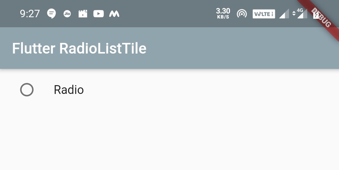
title
We will use title property to set a text or label to the radio button. To show the users what the radio button indicates, we will use this property.
body:RadioListTile(
            value: 1,
            groupValue: val,
            onChanged: (value) {
              setState(() {
                val = value;
              });
            },
            title: Text("Radio"),
          )
Output:
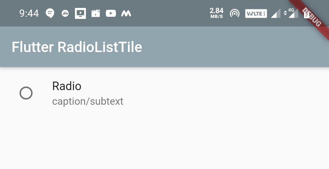
subtitle
We will use subtitle property to add or change subtitle to the radio button title.
body:RadioListTile(
            value: 1,
            groupValue: val,
            onChanged: (value) {
              setState(() {
                val = value;
              });
            },
            title: Text("Radio"),
            subtitle: Text("caption/subtext"),
          )
Output:
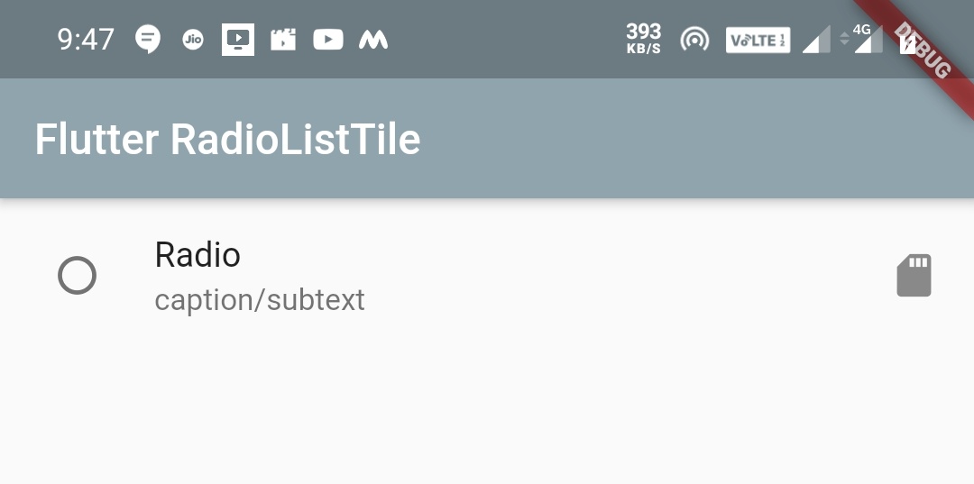
secondary
The secondary property can be any widget, generally we will use an icon as secondary widget. We can use Text or any other widget instead.
body:RadioListTile(
            value: 1,
            groupValue: val,
            onChanged: (value) {
              setState(() {
                val = value;
              });
            },
            title: Text("Radio"),
            subtitle: Text("caption/subtext"),
            secondary: Icon(Icons.sd_storage),
          )
Output:
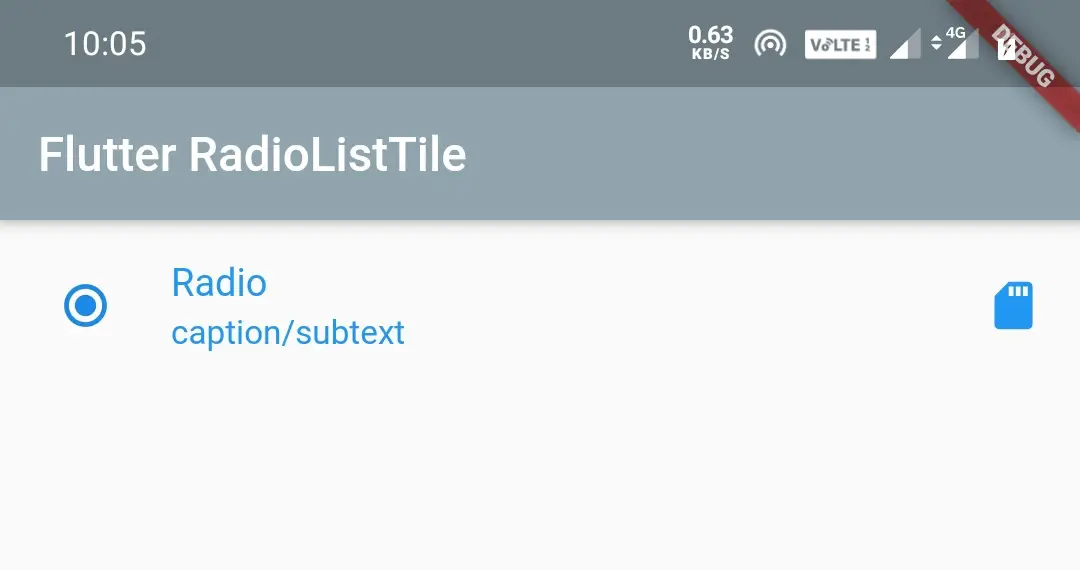
selected
We will use selected property to decide whether we want to render icon and text colors with the color of activeColor property. If there is no active color applied, it will use default color.
It takes a boolean value. If we set it to true it will render icon and text colors with the activecolor. If we set it to false there will be no change in text and icon colors.
To make the ListTile appear selected when the radio button is selected, we have to pass true to the selected property. For this purpose we have to declare a global variable (_value) whose value is false when declared. Now we have to assign the value returned by onChanged to the global variable inside setState of onChanged callback. Now set the global variable to both value and selected properties.
body:RadioListTile(
            value: 1,
            groupValue: val,
            onChanged: (value) {
              setState(() {
                val = value;
                _value = true;
              });
            },
            title: Text("Radio"),
            subtitle: Text("caption/subtext"),
            secondary: Icon(Icons.sd_storage),
            selected: _value,
          )
Output:
If the toggleable property is set to true the above logic will not work. As the global variable (_value) will always be true, the text and icon colors will not change even if we unselect the radio button. We have to apply a condition to solve the issue. Using the below code snippet, the text and icon colors also changes based on the state of the radio button.
body:RadioListTile(
            value: 1,
            groupValue: val,
            onChanged: (value) {
              setState(() {
                val = value;
                if(_value == false)
                  {
                    _value = true;
                  }
                else
                  {
                    _value = false;
                  }
              });
            },
            title: Text("Radio"),
            subtitle: Text("caption/subtext"),
            secondary: Icon(Icons.sd_storage),
            selected: _value,
            toggleable: true,
          )
toggleable
Generally, the radio button once selected cannot be unselected. If we want the user to be able to unselect, we will use the toggleable property. When we select, the onChanged will pass the value of the radio button and when we unselect, it will pass null.
body:RadioListTile(
            value: 1,
            groupValue: val,
            onChanged: (value) {
              setState(() {
                val = value;
              });
            },
            title: Text("Radio"),
            subtitle: Text("caption/subtext"),
            secondary: Icon(Icons.sd_storage),
            toggleable: true,
          )
controlAffinity
We will use controlAffinity property to control the position of the radio button relative to the text. It takes ListTileControlAffinity which has constants leading, trailing and platform.
ListTileControlAffinity.trailing
Positions radio button to right, text to center and secondary (generally an icon) to left.
body:RadioListTile(
            value: 1,
            groupValue: val,
            onChanged: (value) {
              setState(() {
                val = value;
              });
            },
            title: Text("Radio"),
            subtitle: Text("caption/subtext"),
            secondary: Icon(Icons.sd_storage),
            toggleable: true,
            controlAffinity: ListTileControlAffinity.trailing,
          )
Output:
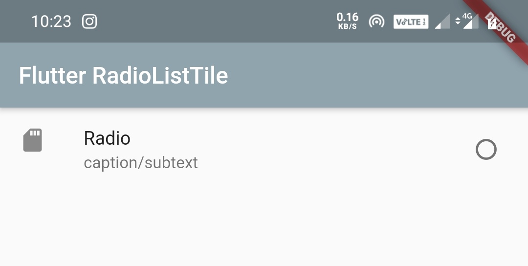
ListTileControlAffinity.leading
Positions radio button to left, text to center and secondary (generally an icon) to right.
body:RadioListTile(
            value: 1,
            groupValue: val,
            onChanged: (value) {
              setState(() {
                val = value;
              });
            },
            title: Text("Radio"),
            subtitle: Text("caption/subtext"),
            secondary: Icon(Icons.sd_storage),
            toggleable: true,
            controlAffinity: ListTileControlAffinity.leading,
          )
Output:
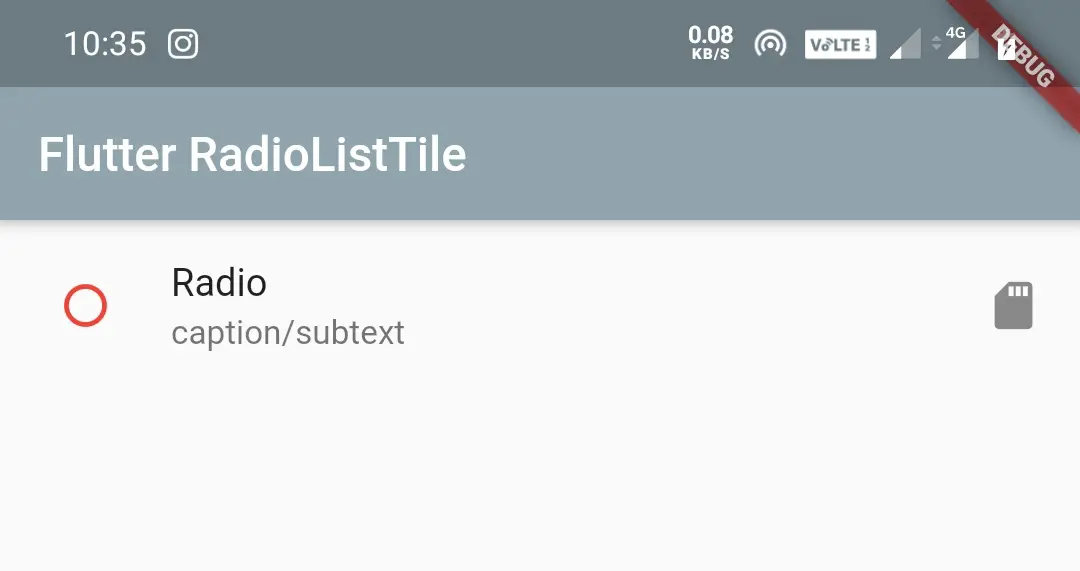
Changing RadioListTile border color when unselected
To change the border color of the checkbox inside CheckboxListTile when it is unchecked just wrap the CheckboxListTile widget inside a Theme widget as a child and set ThemeData‘ s unselectedWidgetColor property to your desired color.
body:Theme(
          data: ThemeData(
              unselectedWidgetColor: Colors.red,
          ),
          child: RadioListTile(
            value: 1,
            groupValue: val,
            onChanged: (value) {
              setState(() {
                val = value;
              });
            },
            title: Text("Radio"),
            subtitle: Text("caption/subtext"),
            secondary: Icon(Icons.sd_storage),
            toggleable: true,
            controlAffinity: ListTileControlAffinity.leading,
          )
        )
Output:
That’s all about flutter RadioListTile example tutorial. Let’s catch up with some other flutter widget in the next post. Have a great day!!
Do share, subscribe and like my facebook page if you find this post helpful. Thank you!!
Reference: Flutter Official Documentation


Leave a Reply