
In flutter, Radio Button is a material widget. We can use it in cases where the user has to select a single value from a set of values. If one radio button is selected, we cannot select the other radio buttons in the same group. In this example tutorial, we will learn how to use a radio button widget in flutter and its properties with examples.
Flutter Radio Button
Radio button in flutter is nothing but an option button where the user can select only one option from a group of options. The selected state is nothing but ON and unselected is OFF. If the user selects another option in the group then the currently selected option will be unselected. It means you can’t select more than one option.
The radio Button widget displays only a simple radio button without any text or label. To display a radio button with text/label use RadioListTile or wrap radio button and Text widgets in a row widget. I will use list tile in the examples below.
Constructor:
Radio({
Key key,
@required T value,
@required T groupValue,
@required ValueChanged<T> onChanged,
MouseCursor mouseCursor,
bool toggleable: false,
Color activeColor,
Color focusColor,
Color hoverColor,
MaterialTapTargetSize materialTapTargetSize,
VisualDensity visualDensity,
FocusNode focusNode,
bool autofocus: false
})
Flutter RadioButton Example
import 'package:flutter/cupertino.dart';
import 'package:flutter/material.dart';
import 'package:flutter/rendering.dart';
void main() {
runApp(MyApp());
}
//void main() => runApp(MyApp());
class MyApp extends StatefulWidget {
@override
_MyState createState() {
return _MyState();
}
}
class _MyState extends State<MyApp>
{
bool _value = false;
int val = -1;
@override
Widget build(BuildContext context) {
return MaterialApp(
home: Scaffold(
appBar: AppBar(
backgroundColor: Colors.green[400],
title: Text("Flutter RadioButton"),
),
body: Column(
mainAxisAlignment: MainAxisAlignment.start,
children: [
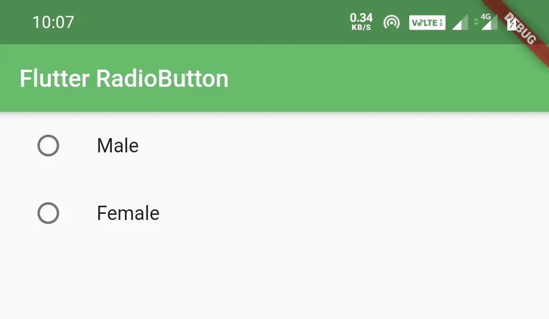
ListTile(
title: Text("Male"),
leading: Radio(
value: 1,
groupValue: val,
onChanged: (value) {
setState(() {
val = value;
});
},
activeColor: Colors.green,
),
),
ListTile(
title: Text("Female"),
leading: Radio(
value: 2,
groupValue: val,
onChanged: (value) {
setState(() {
val = value;
});
},
activeColor: Colors.green,
),
),
],
)
)
);
}
}
Output:
Flutter Radio Button Properties
Different flutter radio button properties are:
- value(required)
- groupValue(required)
- activeColor
- toggleable
- onChanged(required)
value
We will use the value property to assign a value to the radio button. It represents the radio button. It is a required property which means without using it will throw an error.
Radio(
   value: 1,
   onChanged: (value) {
   },
),
groupValue
The groupValue is the currently selected value for a group of radio buttons. The radio button is considered selected if the value matches the groupValue.
When we select the radio button the onChanged callback will be invoked. It will pass the value of the selected radio button. We will set the value to a global variable(val in our case). We will assign the global variable(val) to the groupValue property. It is also required property.
Radio(
   value: 1,
   groupValue: val,
   onChanged: (value) {
     setState(() {
       val = value;
     });
   },
),
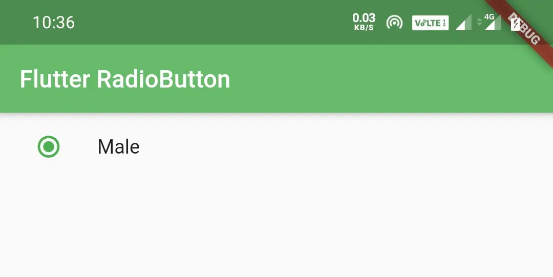
activeColor
We will use the activeColor property to change the color of the radio button when it is in selected state. By default the active color will be theme’s primary color.
Radio(
   value: 1,
   groupValue: val,
   onChanged: (value) {
      setState(() {
         val = value;
      });
   },
   activeColor: Colors.green,
   ),
Output:
toggleable
Generally, the radio button once selected cannot be unselected. If we want the user to be able to unselect, we will use the toggleable property. When we select, the onChanged will pass the value of the radio button and when we unselect, it will pass null.
Radio(
   value: 1,
   groupValue: val,
   onChanged: (value) {
     setState(() {
       val = value;
     });
   },
   toggleable: true,
),
onChanged
We will use onChanged property to get the value of the selected radio button. When we check the radio button the onChanged callback will invoke and pass the value of the radio button. The onChanged is a required property.
Radio(
   value: 1,
   groupValue: val,
   onChanged: (value) {
     setState(() {
       val = value;
     });
   },
),
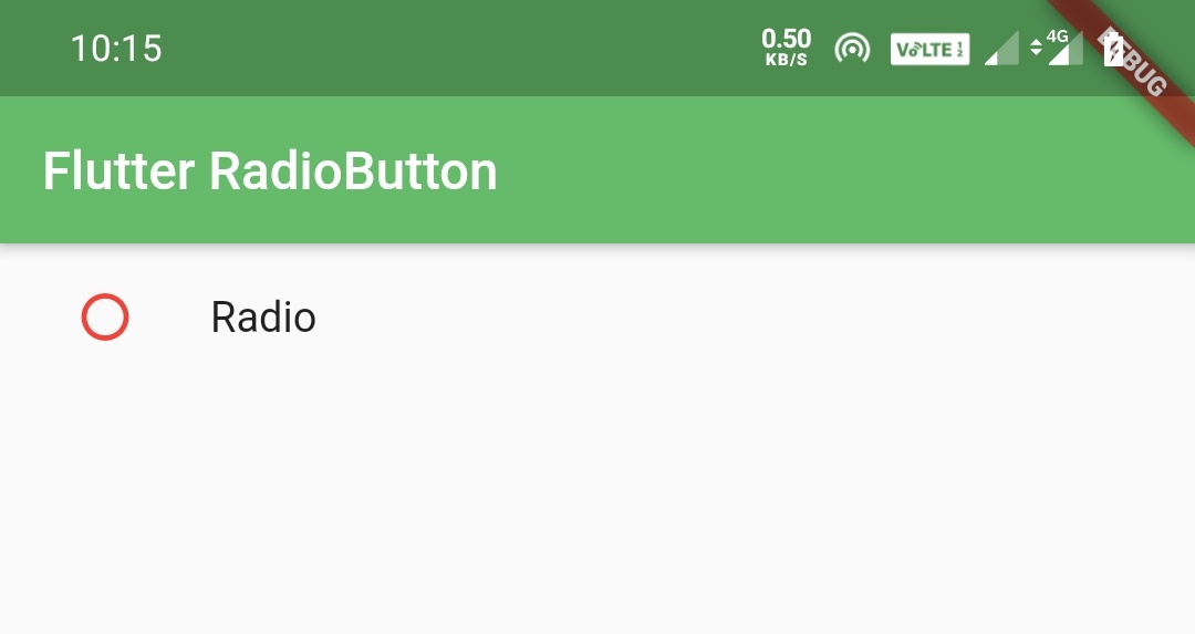
To change the border color of the radio button when it is unselected just wrap the radio button inside a Theme widget as a child and set ThemeData‘s unselectedWidgetColor property to your desired color.
body: Theme(
            data: ThemeData(
                unselectedWidgetColor: Colors.red
            ),
            child:ListTile(
              title: Text("Radio"),
              leading:Radio(
                  value: 1,
                  groupValue:val,
                  onChanged: (value) {
                    setState(() {
                      val = value;
                      print(val);
                    });
                  },
                  activeColor: Colors.green,
                  toggleable: true,
                ),
            )
          ),
Output:
That brings an end to flutter radio button example tutorial. Let’s catch up with some other flutter widget in the next post. Have a great day!!
Do share, subscribe and like my facebook page if you find this post helpful. Thank you!!
Reference: Flutter Official Documentation


Awesome and straight forward tutorial.
Thank you so much Moses.