
Flutter Cupertino Scrollbar
Cupertino scrollbar in flutter is nothing but an ios like (style) scrollbar. The CupertinoScrollbar widget lets us create ios style scrollbar. A scrollbar indicates to the user how lengthy the view is. It has a thumb that indicates how long the user has scrolled either from top or bottom. To display a scrollbar for a scrollview we have to add the scrollview as a child to scrollbar widget. The thumb will fade in and out while we scroll the scrollview associated with the scrollbar. To make the thumb visible all the time we have to set isAlwaysShown property to true. We can scroll to our desired position by dragging the thumb or by tapping on the track of the scrollbar.
Don’t know what Cupertino is? it is nothing but a set of flutter widgets that follow the ios design pattern. These widgets are designed to implement ios features in flutter apps built for the ios platform.
In this tutorial, we will learn how to use cupertino scrollbar in flutter with example. We will also learn how to customize the CupertinoScrollbar widget using different properties.
Also read: Flutter cupertino popup surface.
How To Create Cupertino Scrollbar In Flutter?
To create a cupertino scrollbar in flutter we have to call the constructor of CupertinoScrollbar class and provide the required properties. It has one required property child. It takes a widget as a child. Generally, we will use scrollable widgets like a listview, gridview, etc as child.
Flutter Cupertino Scrollbar Constructor:
CupertinoScrollbar(
{Key? key,
 required Widget child,
 ScrollController? controller,
 bool isAlwaysShown = false,
 double thickness = defaultThickness,
 double thicknessWhileDragging,
 Radius radius = defaultRadius,
 Radius radiusWhileDragging,
 ScrollNotificationPredicate? notificationPredicate,
 ScrollbarOrientation? scrollbarOrientation}
)
Flutter Cupertino Scrollbar Properties
The properties of a cupertino scrollbar are:
- child
- controller
- isAlwaysShown
- thickness
- thicknessWhileDragging
- radius
- radiusWhileDragging
- notificationPredicate
- scrollbarOrientation
child
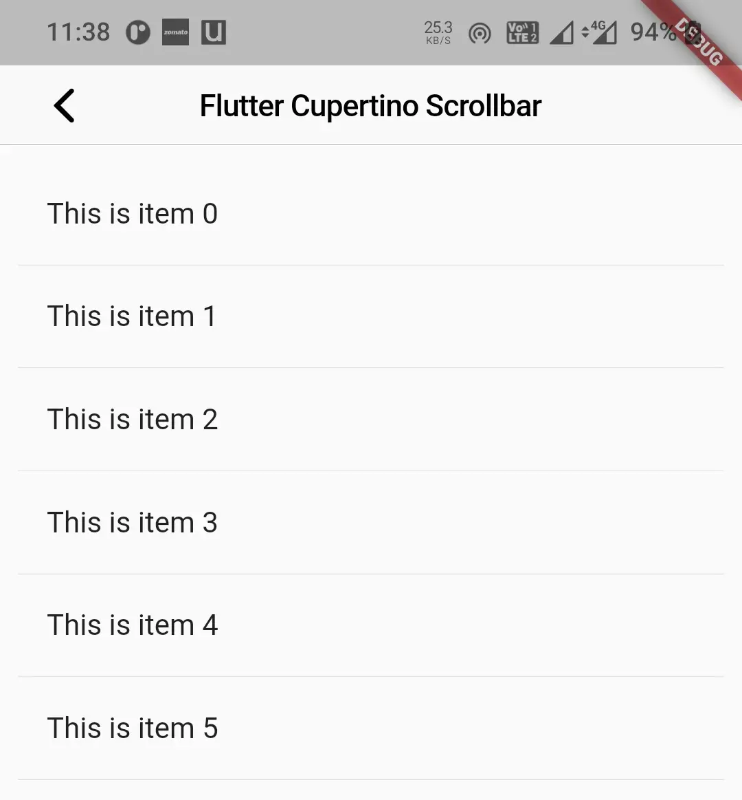
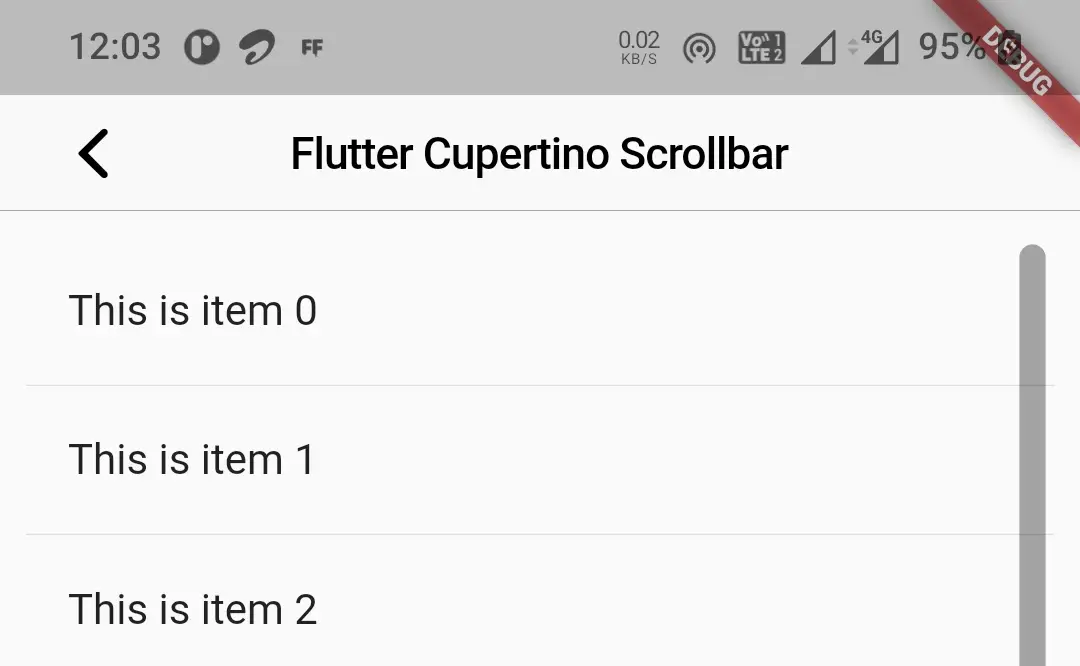
The child will be the widget to which we will show the scrollbar for. Generally, we will use scrollable widgets like listview or gridview as child. We can also add a widget with content that can’t be displayed on the available screen space as the child.
CupertinoScrollbar(
            child: ListView.builder(
              itemBuilder:(context, index) {
                return Material(
                  child: Column(
                    mainAxisAlignment: MainAxisAlignment.spaceBetween,
                    children: [
                      ListTile(
                        title: Text(items[index]),
                      ),
                      Divider(
                        height: 1,
                      )
                    ],
                  )
                );
              },
              itemCount: items.length,
            ),
          )
Output:
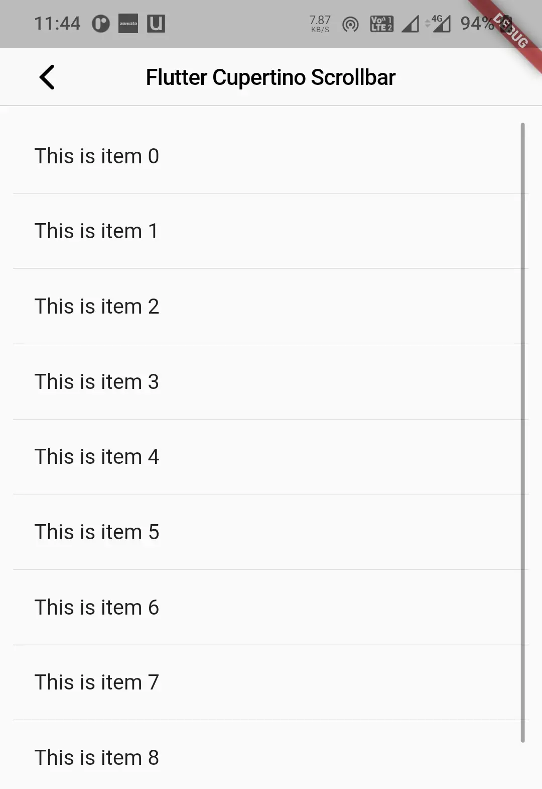
isAlwaysShown
It takes boolean as value. The scrollbar thumb fades in and out when the user scrolls the child. To make the scrollbar visible all the time set this property to true.
CupertinoScrollbar(
            child: ListView.builder(
              itemBuilder:(context, index) {
                return Material(
                  child: Column(
                    mainAxisAlignment: MainAxisAlignment.spaceBetween,
                    children: [
                      ListTile(
                        title: Text(items[index]),
                      ),
                      Divider(
                        height: 1,
                      )
                    ],
                  )
                );
              },
              itemCount: items.length,
            ),
            isAlwaysShown: true,
          )
Output:
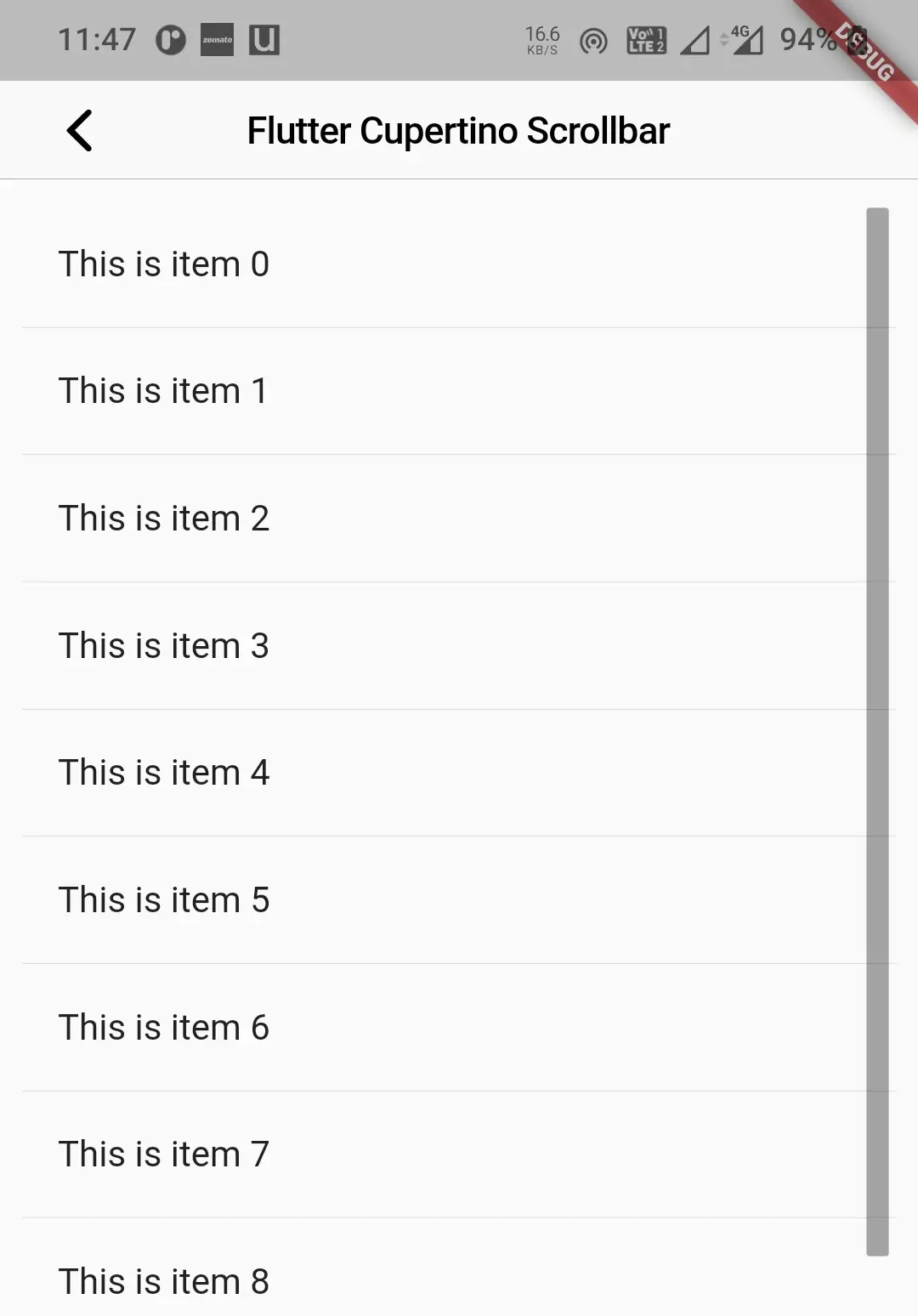
thickness
To change the thickness of the scrollbar thumb we will use this property. It takes double as value. By default, it is 3.
CupertinoScrollbar(
            child: ListView.builder(
              itemBuilder:(context, index) {
                return Material(
                  child: Column(
                    mainAxisAlignment: MainAxisAlignment.spaceBetween,
                    children: [
                      ListTile(
                        title: Text(items[index]),
                      ),
                      Divider(
                        height: 1,
                      )
                    ],
                  )
                );
              },
              itemCount: items.length,
            ),
            isAlwaysShown: true,
            thickness: 10,
          )
Output:
thicknessWhileDragging
To increase or decrease the thickness of the scrollbar thumb while dragging we will use this property. It takes double as value. By default, it is 8.
CupertinoScrollbar(
            child: ListView.builder(
              itemBuilder:(context, index) {
                return Material(
                  child: Column(
                    mainAxisAlignment: MainAxisAlignment.spaceBetween,
                    children: [
                      ListTile(
                        title: Text(items[index]),
                      ),
                      Divider(
                        height: 1,
                      )
                    ],
                  )
                );
              },
              itemCount: items.length,
            ),
            isAlwaysShown: true,
            thickness: 10,
            thicknessWhileDragging: 15,
          )
Output:
radius
To apply rounded corners to the scrollbar thumb we will use this property. It takes the Radius class constant as value. By default, the radius is 1.5.
CupertinoScrollbar(
            child: ListView.builder(
              itemBuilder:(context, index) {
                return Material(
                  child: Column(
                    mainAxisAlignment: MainAxisAlignment.spaceBetween,
                    children: [
                      ListTile(
                        title: Text(items[index]),
                      ),
                      Divider(
                        height: 1,
                      )
                    ],
                  )
                );
              },
              itemCount: items.length,
            ),
            isAlwaysShown: true,
            thickness: 10,
            thicknessWhileDragging: 15,
            radius: 5
          )
Output:
radiusWhileDragging
To apply rounded corners to the scrollbar thumb while dragging we will use this property. It takes the Radius class constant as value. By default, the radius is 4.
CupertinoScrollbar(
            child: ListView.builder(
              itemBuilder:(context, index) {
                return Material(
                  child: Column(
                    mainAxisAlignment: MainAxisAlignment.spaceBetween,
                    children: [
                      ListTile(
                        title: Text(items[index]),
                      ),
                      Divider(
                        height: 1,
                      )
                    ],
                  )
                );
              },
              itemCount: items.length,
            ),
            isAlwaysShown: true,
            thickness: 10,
            thicknessWhileDragging: 15,
            radius: 5,
            radiusWhileDragging: 3,
          )
Output:
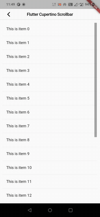
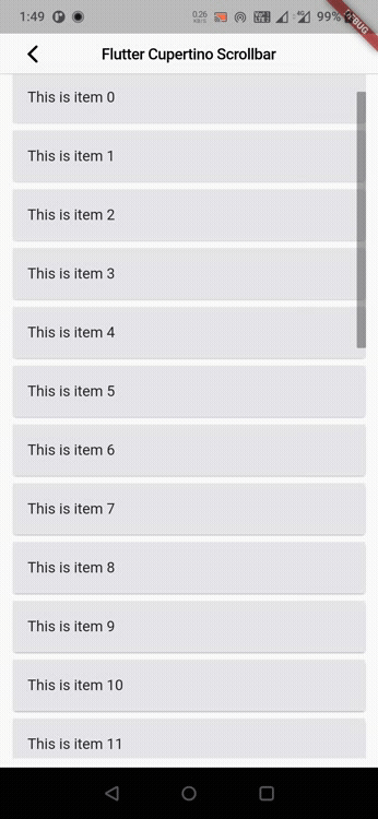
Flutter Cupertino Scrollbar Example
Let’s create an example where we will implement cupertino scrollbar in flutter using CupertinoScrollbar widget. In this example, we will display a listView with 30 items as a child to the scrollbar. We will display the children usig card widget.
First lets create a list (items) and add data to it using List.generate method. We will use the generated data as item to the listview.
List items = List.generate(30, (index) => "This is item $index");
Now lets add the cupertino scrollbar to child of CupertinoPageScaffold. We will provide a listview as child to the CupertinoScrollbar widget. Inside the builder of the listview we will return card widget. The card widget contains a ListTile as a child. The title for list tile is set using the list (items) created above based on index. The item count of the listview will be the length of the items.
Container(
          margin: EdgeInsets.all(10),
          child: CupertinoScrollbar(
            child: ListView.builder(
              itemBuilder:(context, index) {
                return Card(
                  child: Material(
                    child: ListTile(
                      title: Text(items[index]),
                      tileColor: CupertinoColors.systemGrey5,
                    ),
                  ),
                );
              },
              itemCount: items.length,
            ),
            isAlwaysShown: true,
            thickness: 10,
          )
      ),
Complete Code:
Lets see the complete code for cupertino scrollbar example in flutter. Create a new flutter project and replace the code in main.dart file with the code below.
import 'dart:async';
import 'package:flutter/cupertino.dart';
import 'package:flutter/material.dart';
import 'package:flutter/widgets.dart';

void main()
{
  runApp(MyApp());
}

class MyApp extends StatelessWidget {
  @override
  Widget build(BuildContext context) {
    return MaterialApp(
      title: 'Flutter Learning',
      theme: ThemeData(
        primarySwatch: Colors.blue,
      ),
      home:MyHomePage(),
    );
  }
}

class MyHomePage extends StatefulWidget {
  @override
  _MyHomePageState createState()
  {
    return _MyHomePageState();
  }
}

class _MyHomePageState extends State<MyHomePage> {

  List items = List.generate(30, (index) => "This is item $index");
  @override
  Widget build(BuildContext context) {
    return new CupertinoPageScaffold(
      navigationBar:CupertinoNavigationBar(
        leading: CupertinoNavigationBarBackButton(
          onPressed: ()
          {

          },
          color: CupertinoColors.label,
        ),
        middle: Text("Flutter Cupertino Scrollbar"),
      ),
      child:Container(
          margin: EdgeInsets.all(10),
          child: CupertinoScrollbar(
            child: ListView.builder(
              itemBuilder:(context, index) {
                return Card(
                  child: Material(
                    child: ListTile(
                      title: Text(items[index]),
                      tileColor: CupertinoColors.systemGrey5,
                    ),
                  ),
                );
              },
              itemCount: items.length,
            ),
            isAlwaysShown: true,
            thickness: 10,
          )
      ),
    );
  }
}
Output:
That brings an end to the tutorial on how to create & use Cupertino Scrollbar in flutter. We have also seen an example where we have used the CupertinoScrollbar widget to display the cupertino scrollbar. Let’s catch up with some other widget in the next post. Have a great day !!
Do like & share my Facebook page. Subscribe to the newsletter if you find this post helpful. Thank you !!
Reference: Flutter Official Documentation.


Leave a Reply