
Flutter Cupertino Search Textfield
Cupertino search textfield in flutter is ios style (like) searchTextfield. A cupertinoSearchTextField widget lets us create a searchTextField in ios style. It is used to display a text field where the user can type his search query. When the user submits the query it will return the results based on the query. By default, the widget will display basic things like a search icon in the prefix, a placeholder (search), and a close icon (‘x‘) in the suffix.
Don’t know what Cupertino is? It is nothing but a set of flutter widgets that follow the ios design pattern. These widgets are designed to implement ios features in flutter apps built for the ios platform.
In this tutorial, we will learn how to use cupertino search textfield in flutter with example. We will also learn how to customize the CupertinoSearchTextField widget using different properties.
Also read: Flutter Cupertino Scrollbar.
How To Create Cupertino Search TextField In Flutter?
To create a cupertino search textfield in flutter we have to call the constructor of CupertinoSearchTextField class and provide the required properties. There are no requierd properties for cupertino search textfield. We can create one by directly calling the constructor. The constructor has a lot of features that help in customizing the search text field.
Flutter Cupertino Search TextField Constructor:
CupertinoSearchTextField(
{Key? key,
 TextEditingController? controller,
 ValueChanged<String>? onChanged,
 ValueChanged<String>? onSubmitted,
 TextStyle? style,
 String? placeholder,
 TextStyle? placeholderStyle,
 BoxDecoration? decoration,
 Color? backgroundColor,
 BorderRadius? borderRadius,
 EdgeInsetsGeometry padding,
 Color itemColor,
 double itemSize,
 EdgeInsetsGeometry prefixInsets,
 Widget prefixIcon,
 EdgeInsetsGeometry suffixInsets,
 Icon suffixIcon,
 OverlayVisibilityMode suffixMode,
 VoidCallback? onSuffixTap,
 String? restorationId,
 FocusNode? focusNode,
 bool autofocus,
 VoidCallback? onTap,
 bool autocorrect,
 bool? enabled
})
Flutter Cupertino Search TextField Properties
The properties of flutter cupertino search textfield are:
- onChanged
- onSubmitted
- controller
- style
- placeholder
- placeholderStyle
- decoration
- backgroundColor
- borderRadius
- padding
- itemColor
- itemSize
- prefixInsets
- prefixIcon
- suffixInsets
- suffixIcon
- suffixMode
- onSuffixTap
- restorationId
- focusNode
- autoFocus
- onTap
- autoCorrect
- enabled.
Since the list is so long we will discuss a few important properties.
onChanged
This property accepts a callback function that invokes every time the text of the textfield changes. We can get the changed text inside this function and use it according to our needs. For example, showing results matching or related to the query.
middle: CupertinoSearchTextField(
          onChanged: (value){
            //Do whatever you like when the text changes
          },

        ),
onSubmitted
This property accepts a callback function that invokes when the user presses the send button or submits the query. We can get the submitted text inside this function and use it according to our needs.
middle: CupertinoSearchTextField(
          onChanged: (value){
            //Do whatever you like when the text changes
          },
          onSubmitted: (value){

          },
        ),
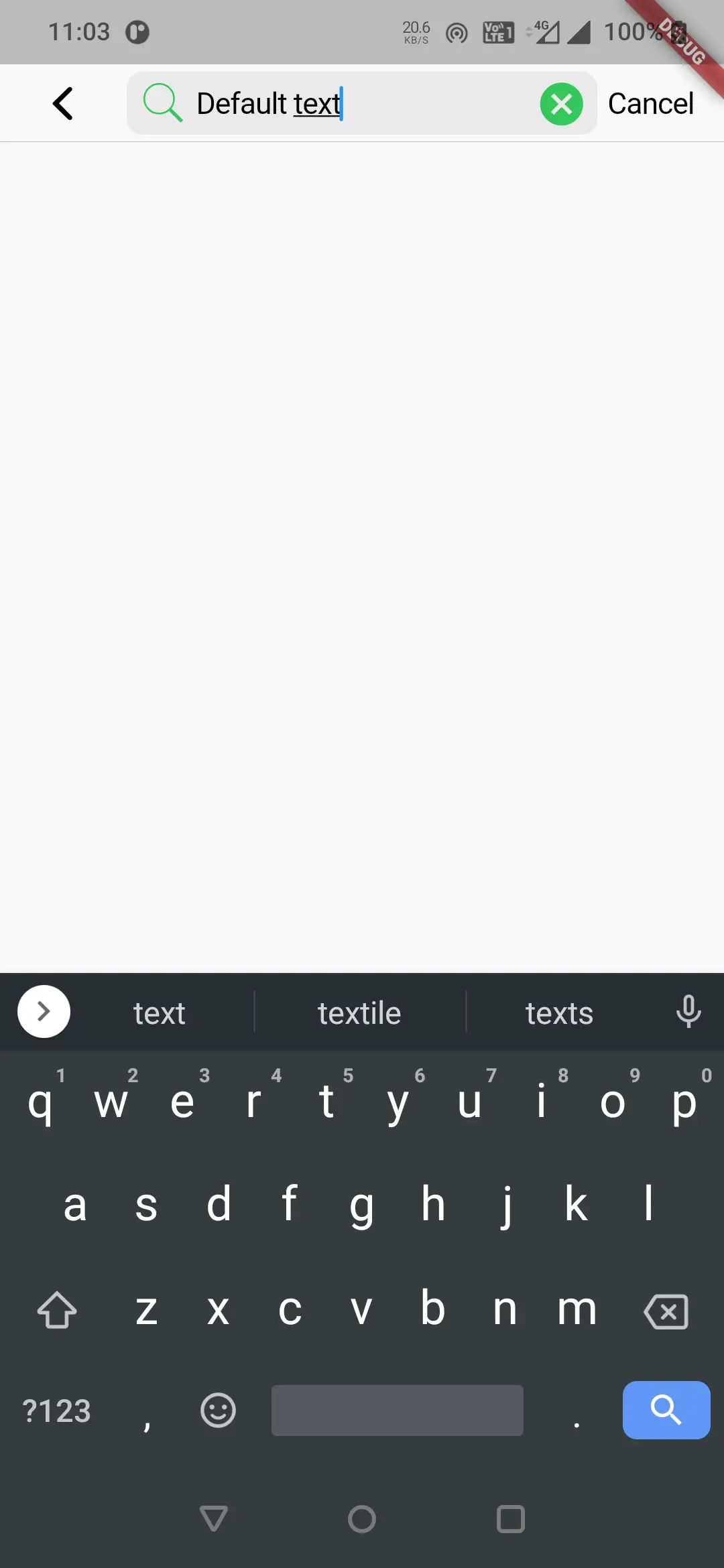
controller
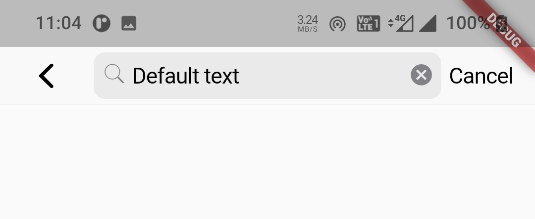
This property is used to manipulate the text that is being edited by the user. For example, to display a search textfield with some text initially we can use the controller.
Declare a controller and initialize it with some text.
TextEditingController controller = new TextEditingController(text: 'Default text');
Now set this controller to controller property of search textfield.
middle: CupertinoSearchTextField(
          onChanged: (value){},
          onSubmitted: (value){},
          controller: controller,
        ),
Output:
Style & placeholderStyle
Both style and placeholderStyle accept TextStyle as value. To know how to use TextStyle refer Text widget in flutter.
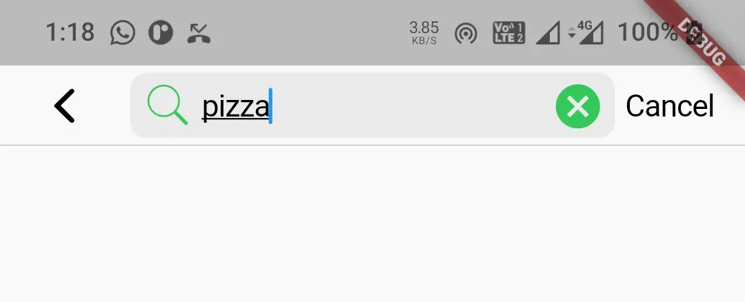
itemSize & itemColor
To change the color and size of prefixIcon and suffixIcon we will use these properties. The itemSize property accepts double as value and itemColor accepts Colors or CupertinoColors class constant.
middle: CupertinoSearchTextField(
          onChanged: (value){},
          onSubmitted: (value){},
          itemSize: 30,
          itemColor: CupertinoColors.activeGreen,
        ),
Output:
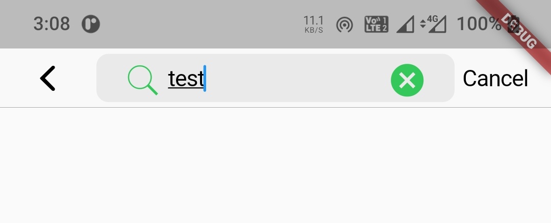
prefixInsets & suffixInsets
To prode padding to prefix and suffix icons we will use prefixInsets and suffixInsets properties. They take EdgeInsets as value.
middle: CupertinoSearchTextField(
          onChanged: (value){},
          onSubmitted: (value){},
          itemSize: 30,
          itemColor: CupertinoColors.activeGreen,
          prefixInsets: EdgeInsets.only(left: 20),
          suffixInsets: EdgeInsets.only(right: 20),
        ),
Output:
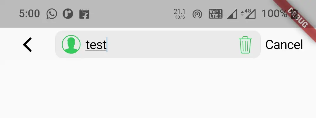
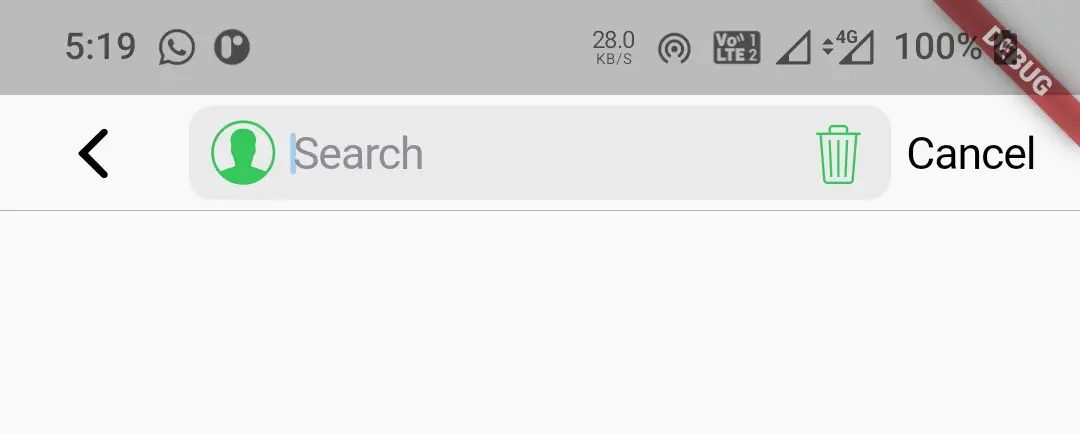
prefixIcon & suffixIcon
To change prefix and suffux icons we will use prefixIcon & suffixIcon properties. The prefixIcon take Widget as value & suffixIcon take Icon as value.
middle: CupertinoSearchTextField(
          onChanged: (value){},
          onSubmitted: (value){},
          itemSize: 30,
          itemColor: CupertinoColors.activeGreen,
          prefixIcon: Icon(CupertinoIcons.profile_circled),
          suffixIcon: Icon(CupertinoIcons.delete),
        ),
Output:
suffixMode
Using this property we can display the suffixIcon initially and make it disappear when the user starts typing and vice versa. It takes OverlayVisibilitMode constant as value. By default it is OverlayVisibilityMode.editing. Let’s change it to OverlayVisibilityMode.notEditing.
middle: CupertinoSearchTextField(
          onChanged: (value){},
          onSubmitted: (value){},
          itemSize: 30,
          itemColor: CupertinoColors.activeGreen,
          prefixIcon: Icon(CupertinoIcons.profile_circled),
          suffixIcon: Icon(CupertinoIcons.delete),
          suffixMode: OverlayVisibilityMode.notEditing,
        ),
Output:
onSuffixTap
It takes a callback function as the value that will invoke when the user taps the suffix icon.
middle: CupertinoSearchTextField(
          onChanged: (value){},
          onSubmitted: (value){},
          itemSize: 30,
          itemColor: CupertinoColors.activeGreen,
          prefixIcon: Icon(CupertinoIcons.profile_circled),
          suffixIcon: Icon(CupertinoIcons.delete),
          suffixMode: OverlayVisibilityMode.notEditing,
          onSuffixTap: (){
           //Do whatever you want when the user taps the suffix icon
          },
        ),
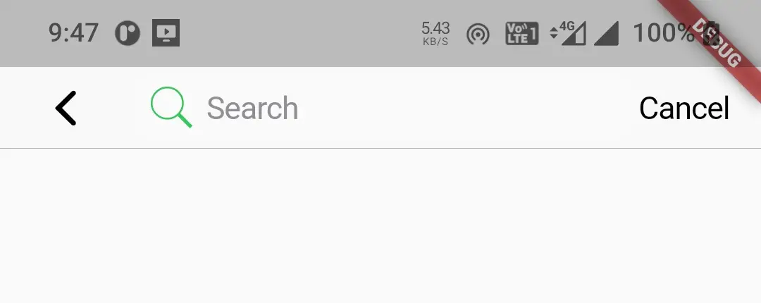
auofocus
It takes boolean as value. Setting this property to true will automatically focus the textfield and opens the keyboard to type.
middle: CupertinoSearchTextField(
          onChanged: (value){},
          onSubmitted: (value){},
          itemSize: 30,
          itemColor: CupertinoColors.activeGreen,
          autofocus: true,
        ),
Output:
onTap
This property accepts a callback function as value. This function will invoke when the user taps on the search textfield. We can do our desired task inside this function which will trigger when the user taps on the textfield.
middle: CupertinoSearchTextField(
          onChanged: (value){},
          onSubmitted: (value){},
          itemSize: 30,
          itemColor: CupertinoColors.activeGreen,
          autofocus: true,
          onTap: (){

          },
        ),
autoCorrect
It takes boolean as value. To enable auto correction of the text entered by the user we have to set this property to true.
middle: CupertinoSearchTextField(
          onChanged: (value){},
          onSubmitted: (value){},
          itemSize: 30,
          itemColor: CupertinoColors.activeGreen,
          autocorrect: true,
        ),
enabled
Boolean which will eneble or disable the text field. Setting this property to true will enable and false will disable the search textfield. By default, it is true.
middle: CupertinoSearchTextField(
          onChanged: (value){},
          onSubmitted: (value){},
          itemSize: 30,
          itemColor: CupertinoColors.activeGreen,
          autocorrect: true,
          enabled: false,
        ),
Output:
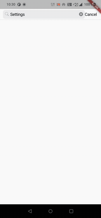
Flutter Cupertino Search TextField Example
Let’s create an example where we will implement cupertino search textfield in flutter using CupertinoSearchTextField widget. In this example we will display a search text field with some text initially. We will also display a cancel text which on press will clear the text as well.
Declare the controller for our search textfield.
TextEditingController controller = new TextEditingController(text:"Settings");
Now lets create the cupertino search textfield and provide the above controller to the controller property of the textfield. We will also add the code for displaying a text to the trailing of navigatio bar. So we will provide the search textfiled to middle and cancel text to trailing properties of CupertinoNavigationBar widget.
navigationBar:CupertinoNavigationBar(
        leading: CupertinoNavigationBarBackButton(
          onPressed: ()
          {

          },
          color: CupertinoColors.label,
        ),
        middle: CupertinoSearchTextField(
          controller: controller,
          onChanged: (value){},
          onSubmitted: (value){},
          autocorrect: true,
        ),
        trailing: GestureDetector(
          child:Text("Cancel"),
          onTap: (){
            setState(() {
              controller.clear();
            });
          },
        )
      ),
Complete Code:
Let’s complete our cupertino search textfield example in flutter by summing up the code snippets above. Create a new flutter project and replace the code in main.dart file with the code below.
import 'dart:async';
import 'package:flutter/cupertino.dart';
import 'package:flutter/material.dart';
import 'package:flutter/widgets.dart';

void main()
{
  runApp(MyApp());
}

class MyApp extends StatelessWidget {
  @override
  Widget build(BuildContext context) {
    return MaterialApp(
      title: 'Flutter Learning',
      theme: ThemeData(
        primarySwatch: Colors.blue,
      ),
      home:MyHomePage(),
    );
  }
}

class MyHomePage extends StatefulWidget {
  @override
  _MyHomePageState createState()
  {
    return _MyHomePageState();
  }
}

class _MyHomePageState extends State<MyHomePage> {
  TextEditingController controller = new  TextEditingController(text:"Settings");

  @override
  Widget build(BuildContext context) {
    return new CupertinoPageScaffold(
      navigationBar:CupertinoNavigationBar(
        middle: CupertinoSearchTextField(
          controller: controller,
          onChanged: (value){},
          onSubmitted: (value){},
          autocorrect: true,
        ),
        trailing: GestureDetector(
          child:Text("Cancel"),
          onTap: (){
            setState(() {
              controller.clear();
            });
          },
        )
      ),
      child:Container(
      ),
    );
  }
}
Output:
I hope you understand the tutorial on how to create & use Cupertino search textfield in flutter. We have also seen an example where we have used the CupertinoSearchTextField widget to display the cupertino search textfield. Let’s catch up with some other widget in the next post. Have a great day !!
Do like & share my Facebook page. Subscribe to the newsletter if you find this post helpful. Thank you !!
Reference: Flutter Official Documentation.


Leave a Reply