
Flutter Cupertino Datepicker
Cupertino datepicker in flutter is nothing but ios style date picker. Using CupertinoDatePicker widget we can also create a timepicker like ios in flutter. It lets the user select a date, time, or both in many instances like booking movie tickets & train tickets, etc. When the datepicker is displayed for the first time it will select the date provided to initialDateTime property. We can display a datepicker either by using showCupertinoMoadlPopup or showModalBottomSheet.
Don’t know what Cupertino is? it is nothing but a set of flutter widgets that follow the ios design pattern. These widgets are designed to implement ios features in flutter apps built for the ios platform.
In this tutorial, we will learn how to use cupertino datepicker in flutter with example. We will also learn how to customize the widget using different properties.
To create a date picker for android platform consider using material design datepicker in flutter.
How To Create Cupertino DatePicker In Flutter?
To create a cupertino datepicker in flutter we have to call the constructor of CupertinoDatePicker class and provide the required properties. The cupertino date picker has one required property onDateTimeChanged. This property accepts a callback function that will invoke when the user changes the selection. We will get the date selected by the user inside this function so that we can update the UI with user selection.
DatePickers are not intended to display directly like other widgets. We have to display them when an event is triggered. To disaplay a cupertino datepicker we have to use showCupertinoMoadlPopup or showModalBottomSheet functions.
Flutter Cupertino DatePicker Constructor:
CupertinoDatePicker(
{Key? key,
 CupertinoDatePickerMode mode,
 required ValueChanged<DateTime> onDateTimeChanged,
 DateTime? initialDateTime,
 DateTime? minimumDate,
 DateTime? maximumDate,
 int minimumYear,
 int? maximumYear,
 int minuteInterval,
 bool use24hFormat,
 DatePickerDateOrder? dateOrder,
 Color? backgroundColor}
)
Flutter Cupertino DatePicker Properties
The properties of a cupertino datepicker are:
- mode
- onDateTimeChanged
- initialDateTime
- minimumDate
- maximumDate
- minimumYear
- maximumYear
- minuteInterval
- use24hFormat
- backgroundColor
mode
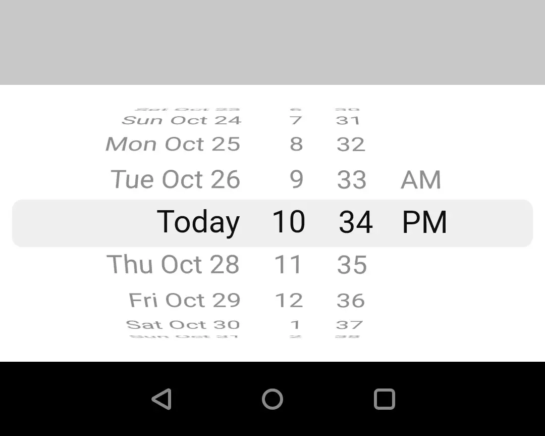
We will use this property to change the mode of cupertino datepicker. It takes CupertinoDatePickerMode constant as value. It has three constants date, dateAndtime and time. By default it is CupertinoDatePickerMode.dateAndTime.
dateAndTime
Setting this mode will enable the user to select both date and time.
CupertinoDatePicker(
              mode: CupertinoDatePickerMode.dateAndTime,
              onDateTimeChanged: (value) {

              },
              initialDateTime: DateTime.now(),
            ),
Output:
date
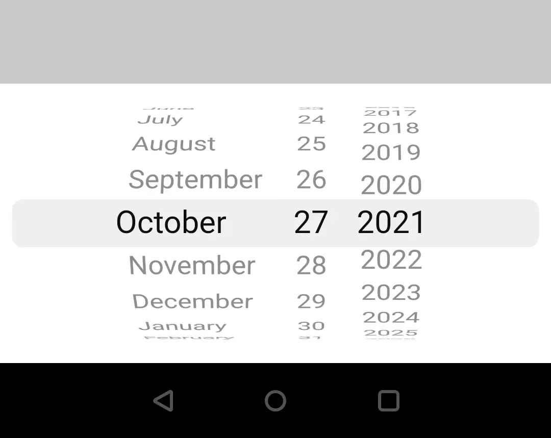
Using this mode the user can only select date but not time.
CupertinoDatePicker(
              mode: CupertinoDatePickerMode.date,
              onDateTimeChanged: (value) {

              },
              initialDateTime: DateTime.now(),
            ),
Output:
time
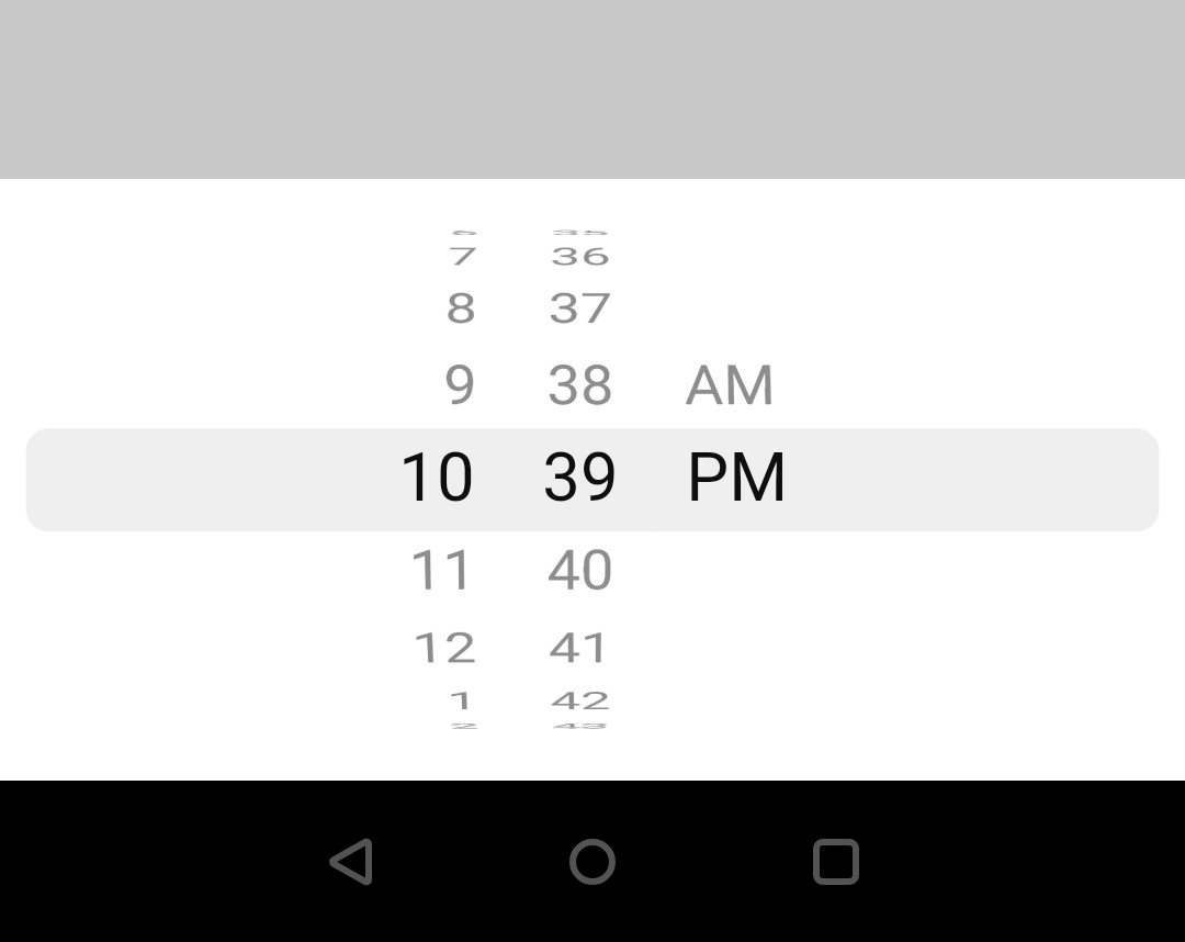
This mode lets the user select only the time.
CupertinoDatePicker(
              mode: CupertinoDatePickerMode.time,
              onDateTimeChanged: (value) {

              },
              initialDateTime: DateTime.now(),
            ),
Output:
onDateTimeChanged
This property uses a callback function which gets invoked whenever the user changes the selection. It returns the date selected by the user so that we can update the UI.
CupertinoDatePicker(
              mode: CupertinoDatePickerMode.date,
              onDateTimeChanged: (value) {
                if (value != null && value != selectedDate)
                  setState(() {
                    selectedDate = value;

                  });
              },
              initialDateTime: DateTime.now(),
            ),
minimumDate and maximumDate
We can set or change the minimum and maximum allowed dates for a cupertino datepicker by using minimumDate and maximumDate properties. We can only select the dates that fall between the minimum and maximum dates. These properties take DateTime as value.
CupertinoDatePicker(
              mode: CupertinoDatePickerMode.date,
              onDateTimeChanged: (value) {
                if (value != null && value != selectedDate)
                  setState(() {
                    selectedDate = value;

                  });
              },
              initialDateTime: DateTime.now(),
              minimumDate: new DateTime(2021,6,1),
              maximumDate: new DateTime(2021,12,31),
            ),
minimumYear and maximumYear
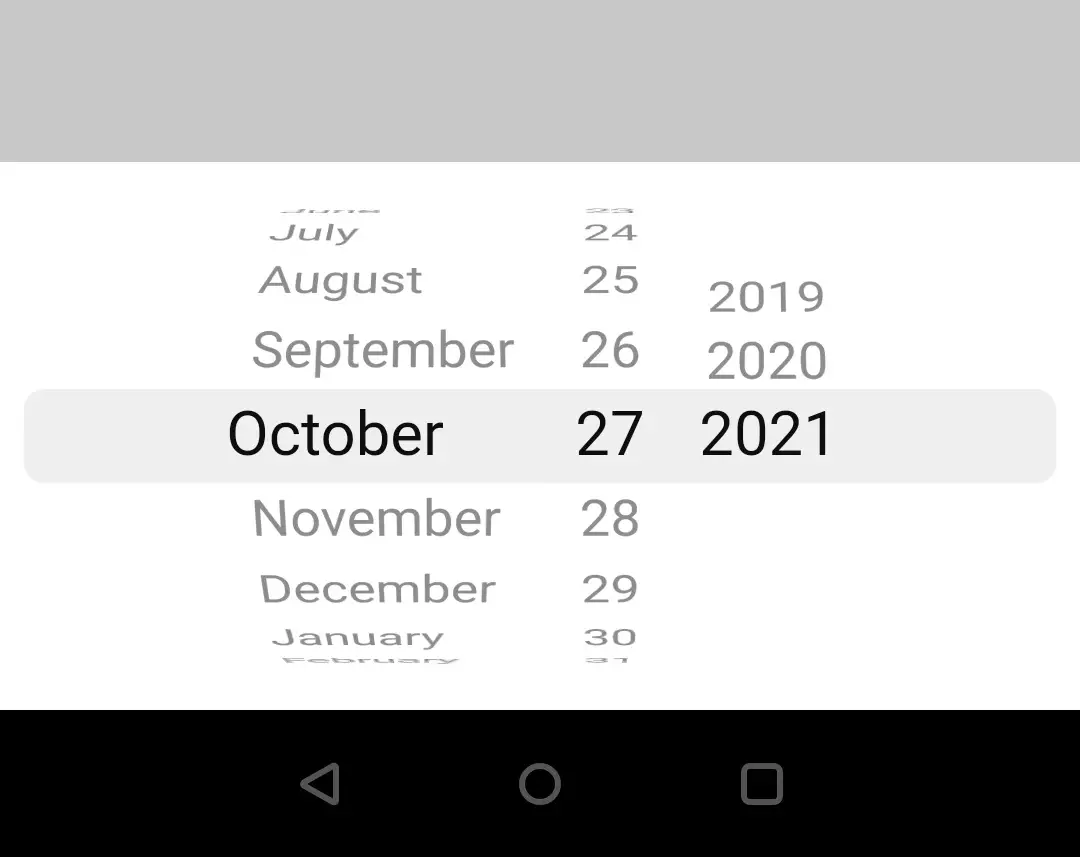
We can set minimum year and maximum year for a date picker by using minimumYear and maximumYear properties. The users can only select the dates that fall between these years. These properties take an int as value.
CupertinoDatePicker(
              mode: CupertinoDatePickerMode.date,
              onDateTimeChanged: (value) {
                if (value != null && value != selectedDate)
                  setState(() {
                    selectedDate = value;

                  });
              },
              initialDateTime: DateTime.now(),
              minimumYear: 2019,
              maximumYear: 2021,
            ),
Output:
minuteInterval
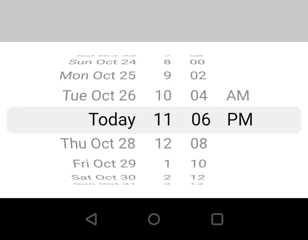
We will use this property to provide intervals for minutes of the datepicker. It takes int as value and defaults to 1.
CupertinoDatePicker(
              mode: CupertinoDatePickerMode.dateAndTime,
              onDateTimeChanged: (value) {
                if (value != null && value != selectedDate)
                  setState(() {
                    selectedDate = value;
                  });
              },
              initialDateTime: DateTime.now(),
              minimumYear: 2019,
              maximumYear: 2021,
              minuteInterval:2
            ),
Output:
use24hFormat
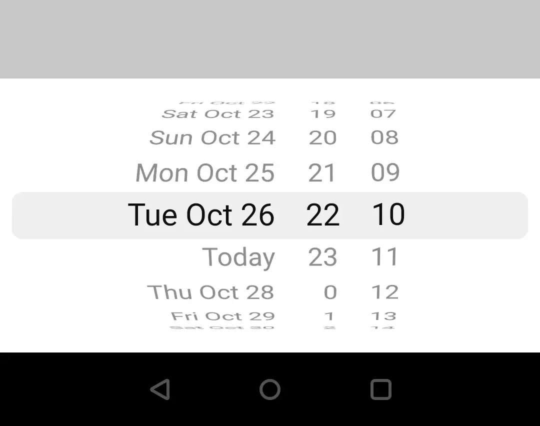
To use 24 hour format we will use this property. By default the format is 12 hours for a cupertino datepicker. It takes boolean as value.
CupertinoDatePicker(
              mode: CupertinoDatePickerMode.dateAndTime,
              onDateTimeChanged: (value) {
                if (value != null && value != selectedDate)
                  setState(() {
                    selectedDate = value;
                  });
              },
              initialDateTime: DateTime.now(),
              minimumYear: 2019,
              maximumYear: 2021,
              use24hFormat: true,
            ),
Output:
backgroundColor
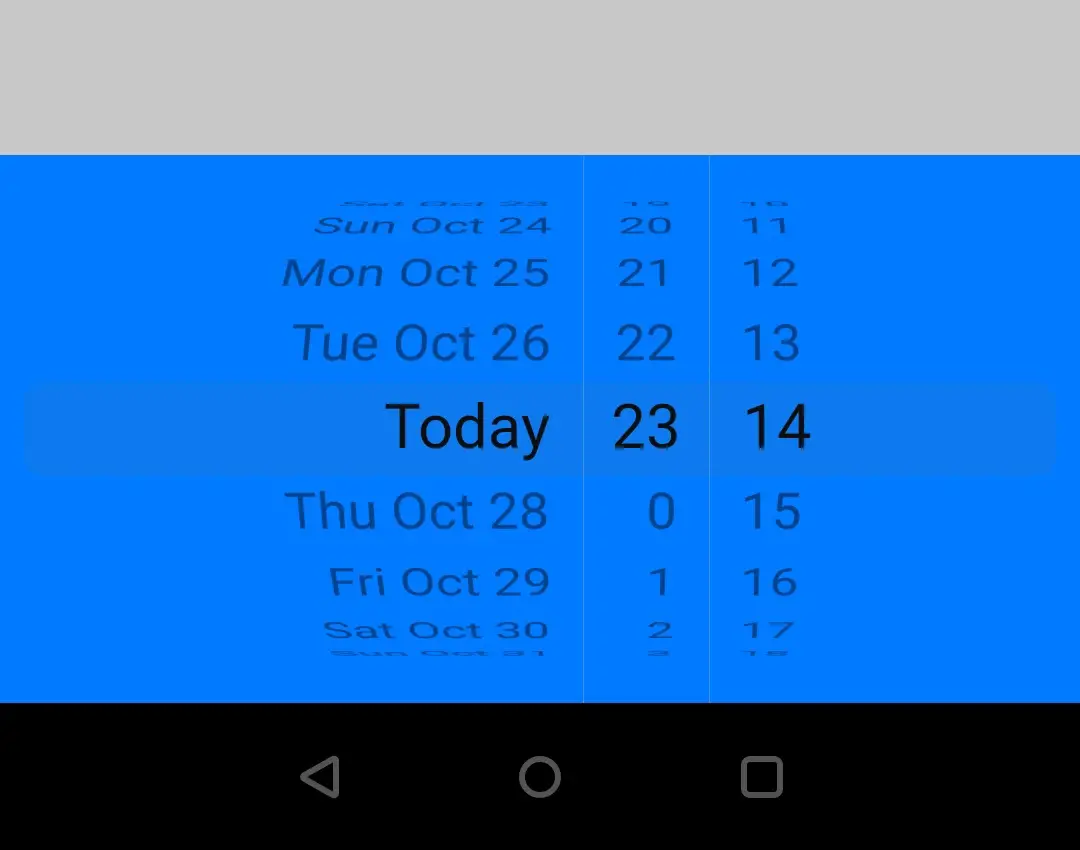
We will use this property to change the background color of the cupertino datepicker. It takes CupertinoColors or Colors class constants as value.
CupertinoDatePicker(
              mode: CupertinoDatePickerMode.dateAndTime,
              onDateTimeChanged: (value) {
                if (value != null && value != selectedDate)
                  setState(() {
                    selectedDate = value;
                  });
              },
              initialDateTime: DateTime.now(),
              minimumYear: 2019,
              maximumYear: 2021,
              use24hFormat: true,
              backgroundColor: CupertinoColors.systemBlue,
            ),
Output:
Flutter Cupertino DatePicker Example
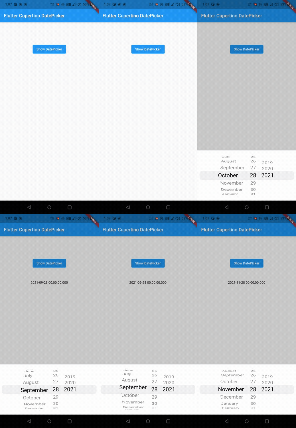
Let’s create an example where we will implement cupertino datepicker in flutter. In this example, we will display a button clicking on which will call a function. Inside the function we will call the showCupertinoModalPopup that will display the cupertino datepicker. When the user selects a date we will display it in a text widget.
First let’s declare a DateTime variable that will hold the selected date.
DateTime selectedDate;
Now let’s display a button and a Text widget. The button will trigger the cupertino datepicker and the text widget will display the selected date.
body:Container(
          margin: EdgeInsets.all(40),
          width: double.infinity,
          height: MediaQuery.of(context).size.height*0.25,
          child: Column(
            mainAxisAlignment: MainAxisAlignment.spaceEvenly,
            children: [
              ElevatedButton(
                child: Text("Show DatePicker"),
                onPressed: (){

                },
              ),
              Text(selectedDate == null? "" : "$selectedDate")
            ],
          )
        )
Since we are done with displaying button and text widgets let’s create the function. This function will display the cupertino datepicker.
void showDatePicker()
  {  showCupertinoModalPopup(
        context: context,
        builder: (BuildContext builder) {
          return Container(
            height: MediaQuery.of(context).copyWith().size.height*0.25,
            color: Colors.white,
            child: CupertinoDatePicker(
              mode: CupertinoDatePickerMode.date,
              onDateTimeChanged: (value) {
                if (value != null && value != selectedDate)
                  setState(() {
                    selectedDate = value;
                  });
              },
              initialDateTime: DateTime.now(),
              minimumYear: 2019,
              maximumYear: 2021,
            ),
          );
        }
        );
  }
Call the above function inside onPressed callback of ElevatedButton create above.
ElevatedButton(
                child: Text("Show DatePicker"),
                onPressed: (){
                  showDatePicker();
                },
              ),
Complete Code:
Let’s complete the flutter cupertino datepicker example in flutter by summing up the above code snippets. Create a new flutter project and replace the code in main.dart file with below code.
import 'dart:async';
import 'package:flutter/cupertino.dart';
import 'package:flutter/material.dart';
import 'package:flutter/widgets.dart';

void main()
{
  runApp(MyApp());
}

class MyApp extends StatelessWidget {
  @override
  Widget build(BuildContext context) {
    return MaterialApp(
      title: 'Flutter Learning',
      theme: ThemeData(
        primarySwatch: Colors.blue,
      ),
      home:MyHomePage(),
    );
  }
}

class MyHomePage extends StatefulWidget {
  @override
  _MyHomePageState createState()
  {
    return _MyHomePageState();
  }
}

class _MyHomePageState extends State<MyHomePage> {
  DateTime selectedDate;
  @override
  Widget build(BuildContext context) {
    return new Scaffold(
        appBar: AppBar(
          title: Text("Flutter Cupertino DatePicker"),
        ),
        body:Container(
          margin: EdgeInsets.all(40),
          width: double.infinity,
          height: MediaQuery.of(context).size.height*0.25,
          child: Column(
            mainAxisAlignment: MainAxisAlignment.spaceEvenly,
            children: [
              ElevatedButton(
                child: Text("Show DatePicker"),
                onPressed: (){
                  showDatePicker();
                },
              ),
              Text(selectedDate == null? "" : "$selectedDate")
            ],
          )
        )
    );
  }

  void showDatePicker()
  {  showCupertinoModalPopup(
        context: context,
        builder: (BuildContext builder) {
          return Container(
            height: MediaQuery.of(context).copyWith().size.height*0.25,
            color: Colors.white,
            child: CupertinoDatePicker(
              mode: CupertinoDatePickerMode.date,
              onDateTimeChanged: (value) {
                if (value != null && value != selectedDate)
                  setState(() {
                    selectedDate = value;
                  });
              },
              initialDateTime: DateTime.now(),
              minimumYear: 2019,
              maximumYear: 2021,
            ),
          );
        }
        );
  }
}
Output:
That brings an end to the tutorial on how to create & use cupertino datepicker in flutter. We have also seen an example where we have used the CupertinoDatePicker widget to display the date picker. Let’s catch up with some other widget in the next post. Have a great day !!
Do like & share my Facebook page. Subscribe to the newsletter if you find this post helpful. Thank you !!
Reference: Flutter Official Documentation.


Leave a Reply