
Cupertino navigation bar in flutter is nothing but ios like (style) navigation bar or appbar. CupertinoNavigationBar widget lets us create an appbar in ios style. It is a toolbar that is used in almost all kinds of ios applications. It contains a widget in the middle along with leading and trailing widgets. The middle widget is generally a Text widget that we will use to display the page title. The leading widget will be mostly a back button that can be displayed using CupertinoNavigationBarBackButton widget. If It is a fullscreen dialog the leading will be a close icon button. The trailing widget can be any widget like search etc. We have to use cupertino navigation bar with navigationBar property of CupertinoPageScaffold widget.
Don’t know what Cupertino is? it is nothing but a set of flutter widgets that follow the ios design pattern. These widgets are designed to implement ios features in flutter apps built for the ios platform.
In this tutorial, we will learn how to use cupertino navigation bar in flutter with example. We will also learn how to customize the widget using different properties.
To create a navigation bar in android applications consider using appbar in flutter instead.
To create a cupertino navigation bar in flutter we have to call the constructor of CupertinoNavigationBar class and provide the required properties. Since there are no required properties for navigation bar we can use the available properties according to or need. Generally we will use the middle & leading widgets to make a basic navigation bar.
Flutter Cupertino Navigation Bar Constructor:
CupertinoNavigationBar(
{Key? key,
 Widget? leading,
 bool automaticallyImplyLeading,
 bool automaticallyImplyMiddle,
 String? previousPageTitle,
 Widget? middle,
 Widget? trailing,
 Border? border,
 Color? backgroundColor,
 Brightness? brightness,
 EdgeInsetsDirectional? padding,
 bool transitionBetweenRoutes,
 Object heroTag}
)
The properties of a flutter cupertino navigation bar are:
- leading
- automaticallyImplyLeading
- automaticallyImplyMiddle
- previousPageTitle
- middle
- trailing
- border
- backgroundColor
- brightness
- padding
- transitionBetweenRoutes
- heroTag
leading
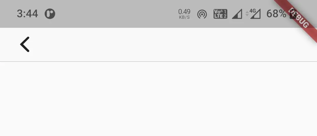
To provide a leading widget to the navigation bar we will use leading property. It takes a widget as value. Generally, we will use the back button or close button for a leading widget. In the below example we will use CupertinoNavigationBarBackButton widget for leading.
return new CupertinoPageScaffold(
      navigationBar:CupertinoNavigationBar(
          leading: CupertinoNavigationBarBackButton(
            onPressed: ()
            {

            },
            color: CupertinoColors.label,
          ),
        ),
      child:Container()
    );
Output:
automaticallyImplyLeading
It takes boolean as value. Setting this property to true will automatically display a leading widget according to the scenario. For example, it will display a back arrow (‘<‘) for a cupertinoPageRoute and close icon (‘x‘) for a full screen dialog. This only works if the leading property is null or ignored.
return new CupertinoPageScaffold(
      navigationBar:CupertinoNavigationBar(
          automaticallyImplyLeading: true,
        ),
      child:Container()
    );
automaticallyImplyMiddle
It takes boolaen as value. Setting this property to true will automatically display current routes title in the middle if the current route is a CupertinoPageRoute. It only works when the middle widget is null or ignored.
return new CupertinoPageScaffold(
      navigationBar:CupertinoNavigationBar(
          automaticallyImplyMiddle: true,
        ),
      child:Container()
    );
previousPageTitle
It is used to specify the previous page route’s title. When the leading is null and automaticallyImplyLeading is true the navigation bar will use this title as leading. It takes atring as value.
return new CupertinoPageScaffold(
      navigationBar:CupertinoNavigationBar(
          automaticallyImplyMiddle: true,
          previousPageTitle: "Dashboard"
        ),
      child:Container()
    );
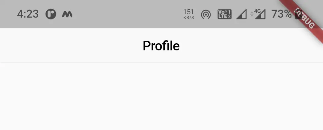
middle
To display a title in the middle of navigation bar we will use this property. It takes widge as value generally a text widget.
return new CupertinoPageScaffold(
      navigationBar:CupertinoNavigationBar(
          middle:Text("Profile")
        ),
      child:Container()
    );
Output:
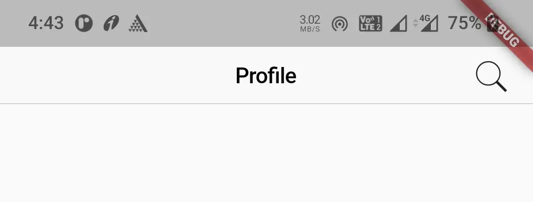
trailing
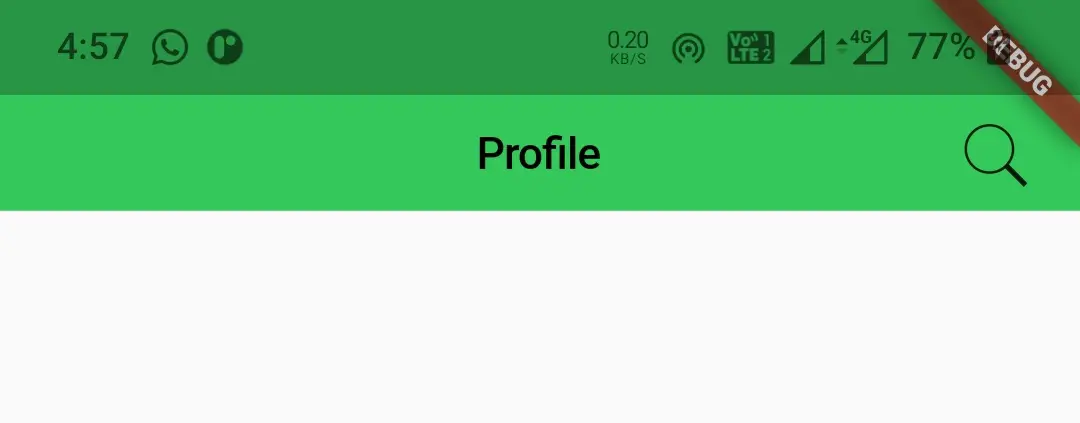
We will use this property to display a trailing widget. Generally actions like edit and search are used as trailing widgtes.
return new CupertinoPageScaffold(
      navigationBar:CupertinoNavigationBar(
          middle:Text("Profile"),
          trailing: GestureDetector(
            child: Icon(CupertinoIcons.search),
            onTap: (){},
          ),
        ),
      child:Container()
    );
Output:
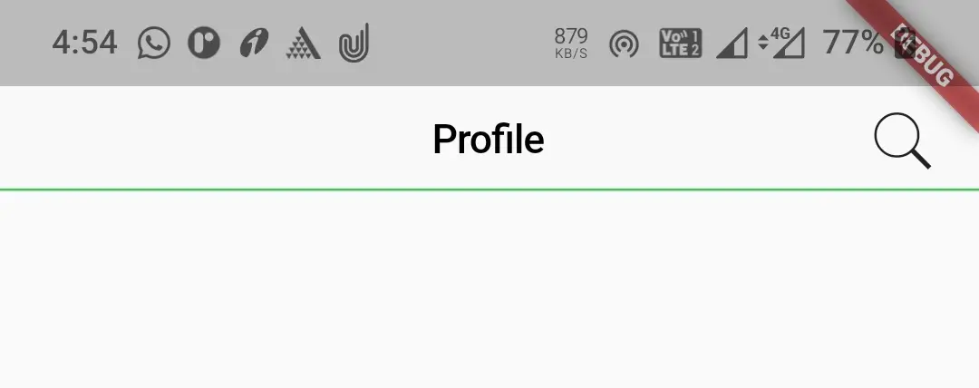
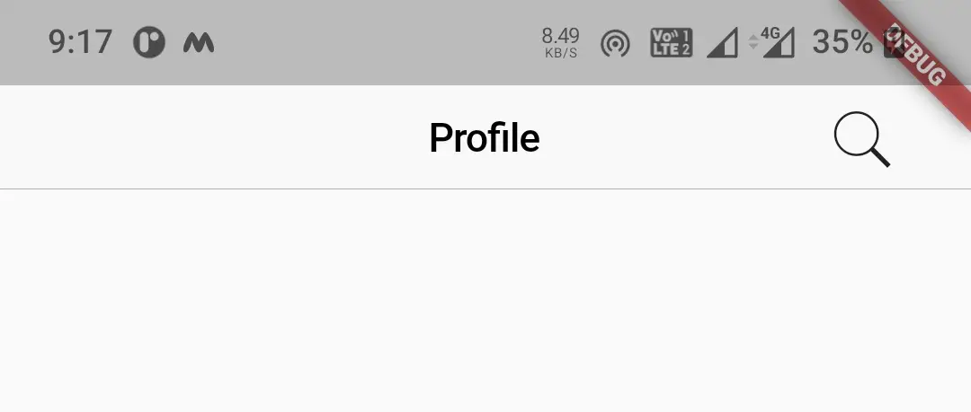
border
We can change the width and color of the border of a navigation bar by using border property. It takes Border class constructor as value. By default the navigation bar displays a bottom border with 1px width. If we set this property to null there will be no border. We can display border for all the sides. In the below example i’m modifying the bottom border.
return new CupertinoPageScaffold(
      navigationBar:CupertinoNavigationBar(
          middle:Text("Profile"),
          trailing: GestureDetector(
            child: Icon(CupertinoIcons.search),
            onTap: (){},
          ),
          border: Border(
              bottom:BorderSide(
                  width: 1,
                  color: CupertinoColors.activeGreen,
                  style: BorderStyle.solid
              )
          ),
        ),
      child:Container()
    );
Output:
backgroundColor
We will use this property to apply or change background color to the navigation bar. It takes CupertinoColors or Colors constants as value. To define a custom color use Color class constructor.
return new CupertinoPageScaffold(
      navigationBar:CupertinoNavigationBar(
          middle:Text("Profile"),
          trailing: GestureDetector(
            child: Icon(CupertinoIcons.search),
            onTap: (){},
          ),
          backgroundColor: CupertinoColors.activeGreen,
        ),
      child:Container()
    );
Output:
padding
We will use this property to apply padding to the navigation bar. It takes EdgeInsetsDirectional constant as value. It has constants all, only, fromSTEB, and zero. I will use fromSTEB in following example. Try the rest for yourself.
return new CupertinoPageScaffold(
      navigationBar:CupertinoNavigationBar(
          middle: Text("Profile"),
          trailing: GestureDetector(
            child: Icon(CupertinoIcons.search),
            onTap: (){},
          ),
          padding: EdgeInsetsDirectional.fromSTEB(30, 0, 30, 0)
        ),
      child:Container()
    );
Output:
transitionBetweenRoutes
This property is used to enable or disable transition to take place between the routes. It takes boolean as value. Setting this property to true will enable transition.
return new CupertinoPageScaffold(
      navigationBar:CupertinoNavigationBar(
          middle: Text("Profile"),
          trailing: GestureDetector(
            child: Icon(CupertinoIcons.search),
            onTap: (){},
          ),
          transitionBetweenRoutes: true,
        ),
      child:Container()
    );
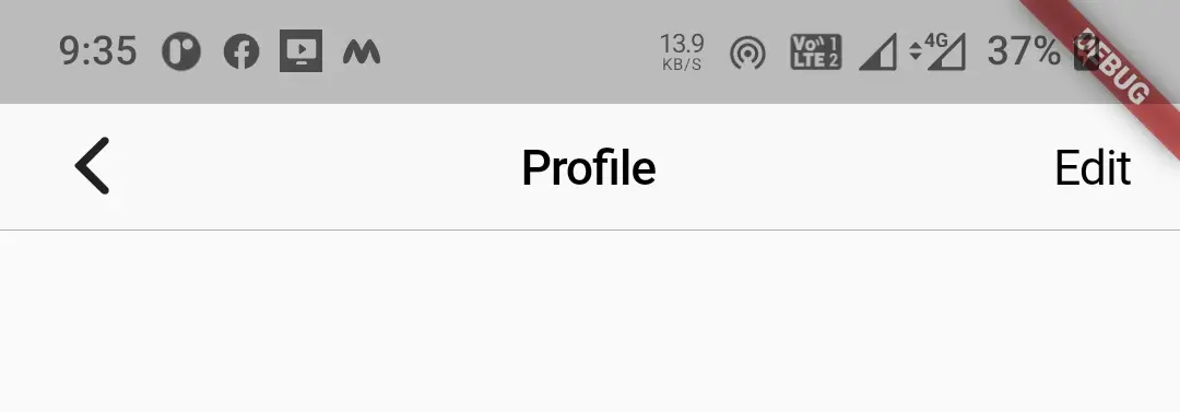
Lets create an exampe where we will implement cupertino navigation bar in flutter using CupertinoNavigationBar widget. In this example we will display a navigation bar with a leading and trailing widgets and middle widget with some text. For leading we will display back button and for trailing we will display text.
mport 'dart:async';
import 'package:flutter/cupertino.dart';
import 'package:flutter/material.dart';
import 'package:flutter/widgets.dart';

void main()
{
  runApp(MyApp());
}

class MyApp extends StatelessWidget {
  @override
  Widget build(BuildContext context) {
    return MaterialApp(
      title: 'Flutter Learning',
      theme: ThemeData(
        primarySwatch: Colors.blue,
      ),
      home:MyHomePage(),
    );
  }
}

class MyHomePage extends StatefulWidget {
  @override
  _MyHomePageState createState()
  {
    return _MyHomePageState();
  }
}

class _MyHomePageState extends State<MyHomePage> {

  @override
  Widget build(BuildContext context) {
    return new CupertinoPageScaffold(
      navigationBar:CupertinoNavigationBar(
          leading: GestureDetector(
            child: Icon(CupertinoIcons.back),
            onTap: (){},
          ),
          middle: Text("Profile"),
          trailing: GestureDetector(
            child: Text("Edit"),
            onTap: (){},
          ),
        ),
      child:Container()
    );
  }
}
Output:
That brings an end to the tutorial about how to create and use Cupertino Navigation Bar in flutter with example. I hope you understand how to use CupertinoNavigationBar widget & customize it. Let’s catch up with some other widget in the next post. Have a great day!!
Do share, subscribe, and like my Facebook page if you find this post helpful. Thank you!!
Reference: Flutter Official Documentation.


Leave a Reply