In this tutorial you will learn how to use appbar in flutter with example. We will also customize it’s style with different properties.
Flutter AppBar Widget
AppBar is a material widget in flutter which is most commonly used in almost all kinds of applications. Appbar will display the toolbar that we see in every application. It also displays several widgets like the title of the screen, the back button (‘<-‘) / close button (‘x‘) & actions like search, etc. The actions are indicated using icon buttons. It is also responsible for displaying a PopupMenuButton ( overflow menu ) which is used for actions that are performed less frequently.
Creating And Displaying AppBar
To create an appbar in flutter we have to call its constructor and provide required properties. There are no required properties for this widget but generally, we will use the title property. This property is used to describe the contents of the current screen.
Flutter AppBar Constructor :
AppBar(
{Key? key,
Widget? leading,
bool automaticallyImplyLeading,
Widget? title,
List<Widget>? actions,
Widget? flexibleSpace,
PreferredSizeWidget? bottom,
double? elevation,
Color? shadowColor,
ShapeBorder? shape,
Color? backgroundColor,
Color? foregroundColor,
Brightness? brightness,
IconThemeData? iconTheme,
IconThemeData? actionsIconTheme,
TextTheme? textTheme,
bool primary,
bool? centerTitle,
bool excludeHeaderSemantics,
double? titleSpacing,
double toolbarOpacity,
double bottomOpacity,
double? toolbarHeight,
double? leadingWidth,
bool? backwardsCompatibility,
TextStyle? toolbarTextStyle,
TextStyle? titleTextStyle,
SystemUiOverlayStyle? systemOverlayStyle}
)
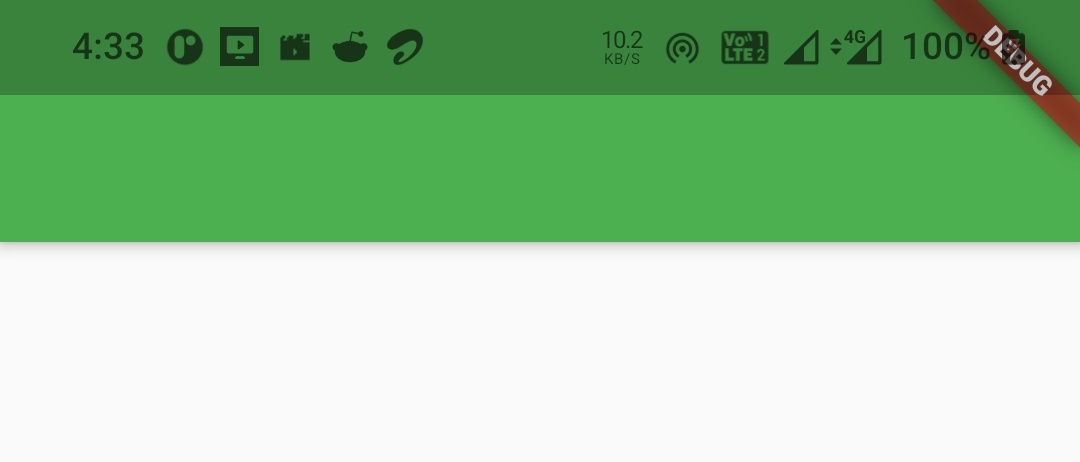
Basic implementation of AppBar
Scaffold(
    appBar: AppBar(
      ),
  );
Output :
Flutter AppBar Properties
There are a lot of properties for appbar widget, but we can’t discuss them all in this tutorial. We will discuss a few properties which are mostly used. Try the rest for yourself.
- leading
- automaticallyImplyLeading
- title
- centerTitle
- actions
- elevation
- shadowColor
- shape
- backgroundColor
- textTheme
- actionsIconTheme
- toolbarHeight
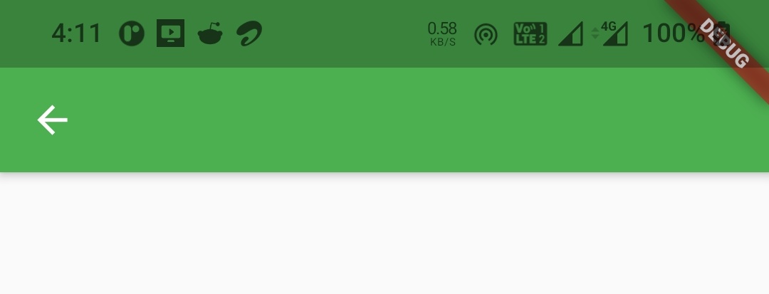
leading
We will use leading property to display a widget at the start ( left ) of the appbar title. It can be any widget like Text, Icon, Image etc. But generally we will use an icon for leading.
Scaffold(
      appBar: AppBar(
        leading: Icon(Icons.arrow_back),
      ),
      body:Container()
    );
Output :
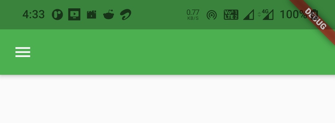
automaticallyImplyLeading
It is useful when leading property is not provided with a widget. If we set this property to true it will make the appbar automatically imply a leading widget for us. For instance if we add a drawer to the scaffold it will automatically display a menu icon to the leading. We can disable this behavior it by setting automaticallyImplyLeading to false. By default this value will be true.
Scaffold(
      appBar: AppBar(
        automaticallyImplyLeading: true,
      ),
      drawer: Drawer(),
      body:Container()
    );
Output :
Scaffold(
      appBar: AppBar(
        automaticallyImplyLeading: false,
      ),
      drawer: Drawer(),
      body:Container()
    );
Output :
title
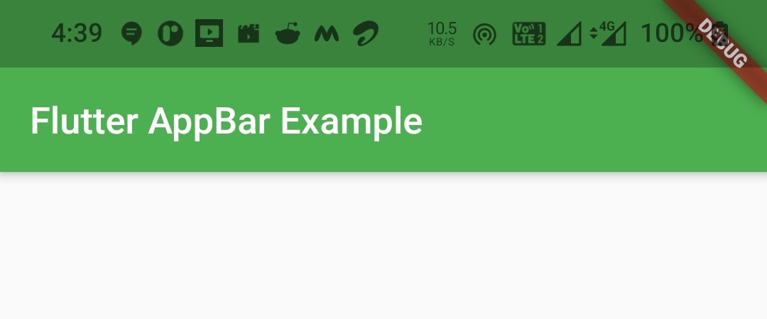
We will use this property to display a title typically a text widget to describe the contents of the current screen.
Scaffold(
      appBar: AppBar(
        title: Text("Flutter AppBar Example"),
      ),
      body:Container()
    );
Output :
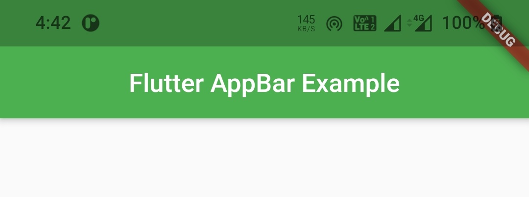
centerTitle
We will use this property to display the title widget to the center of the appbar. Setting this property to true will display the title in the center.
Scaffold(
      appBar: AppBar(
        title: Text("Flutter AppBar Example"),
        centerTitle: true,
      ),
      body:Container()
    );
Output :
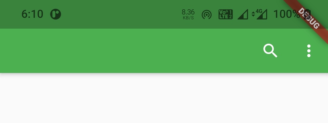
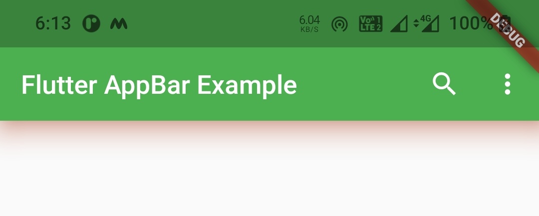
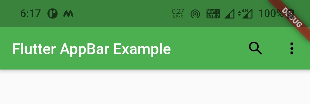
actions
Actions are nothing but a list of widgets displayed to the right of the appbar. Generally most common actions are represented with IconButtons and the rest with a popupMenuButton which is also called as overflow menu.
Scaffold(
      appBar: AppBar(
        actions: [
          IconButton(
            icon: Icon(Icons.search),
            onPressed: () {
            },
          ),
          IconButton(
              icon: Icon(Icons.more_vert,),
              onPressed: () {
              },
          )
        ],
      ),
      body:Container()
    );
Output :
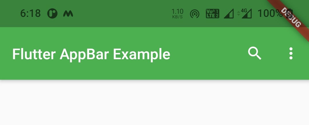
elevation
We will use this property to provide elevation to the appbar.
Scaffold(
      appBar: AppBar(
        title: Text("Flutter AppBar Example"),
        actions: [
          Icon(Icons.search),
          Icon(Icons.more_vert)
        ],
        elevation: 8,
      ),
      body:Container()
    );
Output :
shadowColor
We will use this color to apply or change the shadow color when the appbar is elevated.
Scaffold(
      appBar: AppBar(
        title: Text("Flutter AppBar Example"),
        actions: [
          Icon(Icons.search),
          Icon(Icons.more_vert)
        ],
        elevation: 8,
        shadowColor: Colors.deepOrange,
      ),
      body:Container()
    );
Output :
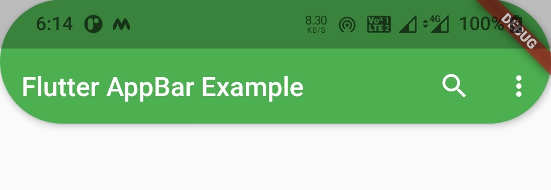
shape
If we want to change the shape of the appbar we can change it by using this property. In this example i am using stadiumBorder. If you wanna try other shapes just refer shaping RaisedButton section of flutter RaisedButton widget Example.
Scaffold(
      appBar: AppBar(
        title: Text("Flutter AppBar Example"),
        actions: [
          Icon(Icons.search),
          Icon(Icons.more_vert)
        ],
        shape: StadiumBorder(),
      ),
      body:Container()
    );
Output :
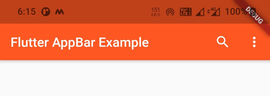
backgroundColor
We can change the background color of the appbar by using backgroundColor property.
Scaffold(
      appBar: AppBar(
        title: Text("Flutter AppBar Example"),
        actions: [
          Icon(Icons.more_vert)
        ],
        backgroundColor: Colors.deepOrange,
      ),
      body:Container()
    );
Output :
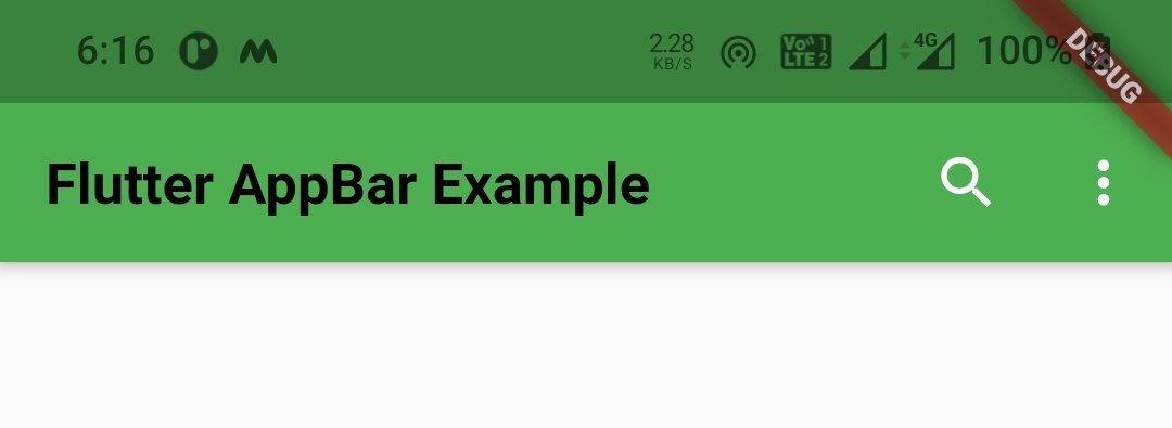
textTheme
If we want to customize the appbar’s text like changing color, size, weigth etc we can do so by using the textTheme property.
Scaffold(
      appBar: AppBar(
        title: Text("Flutter AppBar Example"),
        actions: [
          Icon(Icons.more_vert)
        ],
        textTheme: TextTheme(
          headline6: TextStyle(
             color: Colors.black,
             fontSize: 20,
             fontWeight: FontWeight.bold
          )
        ),
      ),
      body:Container()
    );
Output :
actionsIconTheme
This property is used to customize the action icons of the appbar like changing color size etc.
Scaffold(
      appBar: AppBar(
        title: Text("Flutter AppBar Example"),
        actions: [
          Icon(Icons.more_vert)
        ],
        actionsIconTheme: IconThemeData(color:Colors.black, size: 40),
      ),
      body:Container()
    );
Output :
toolbarHeight
As per material guidelines the toolbar height should be 56 which is the default. If we want to change the height of the toolbar we can change it using the toolbarHeight property.
Scaffold(
      appBar: AppBar(
        title: Text("Flutter AppBar Example"),
        actions: [
          Icon(Icons.search)
        ],
        toolbarHeight: 70,
      ),
      body:Container()
    );
Output :
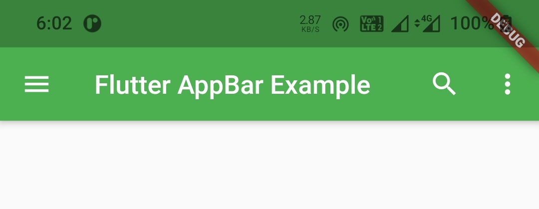
Flutter AppBar Example
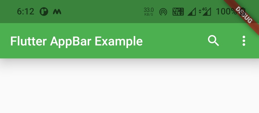
Let’s create an example where we display an appbar with a leading icon along with title and some actions. The leading icon will be a drawer and the actions will be IconButtons for search and overflow menu (three dots).
import 'package:flutter/cupertino.dart';
import 'package:flutter/material.dart';
import 'package:flutter/widgets.dart';
import 'widgets/add_entry_dialog.dart';
void main()
{
  runApp(MyApp());
}

class MyApp extends StatelessWidget {
  @override
  Widget build(BuildContext context) {
    return MaterialApp(
      title: 'Flutter Exxpansion Panel List',
      theme: ThemeData(
        primarySwatch: Colors.green,
      ),
      home: MyHomePage(),
    );
  }
}

class MyHomePage extends StatefulWidget {
  @override
  _MyHomePageState createState()
  {
    return _MyHomePageState();
  }
}

class _MyHomePageState extends State<MyHomePage> {
  @override
  Widget build(BuildContext context) {
    return Scaffold(
      appBar: AppBar(
        title: Text("Flutter AppBar Example"),
        actions: [
          IconButton(
            icon: Icon(Icons.search),
            onPressed: () {
            },
          ),
          IconButton(
              icon: Icon(Icons.more_vert,),
              onPressed: () {
              },
          )
        ],
        actionsIconTheme: IconThemeData(size: 32,),

      ),
      drawer: Drawer(),
      body:Container()
    );
  }
}
Output :
That brings an end to the tutorial on how to use AppBar widget in flutter with example. I hope you understand how to create and display or show appbar in flutter. Let’s catch up with some other widget in the next post. Have a great day!!
Do share, subscribe and like my facebook page if you find this post helpful. Thank you!!
Reference : Flutter Official Documentation


Leave a Reply