
Flutter Cupertino Button
Cupertino button is a widget in flutter used to display ios style button. A CupertinoButton can have text or icon & optional background which is no background by default. It fades out when the user presses the button and fades in when the user releases the button. The default padding of the button is 16px. If you are designing applications for ios this widget will come in handy.
We can create a cupertino button in two ways.
- CupertinoButton
- CupertinoButton.filled
Don’t know what Cupertino is? it is nothing but a set of flutter widgets that follow the ios design pattern. These widgets are designed to implement ios features in flutter apps built for the ios platform.
In this tutorial we will learn how to use a cupertino button widget in flutter with example. We will also customize the widget with different properties.
If you are building applications for android platform consider using material buttons in flutter.
How To Create Cupertino Button In Flutter?
To create a cupertino button in flutter we have to call the constructor of CupertinoButton class and provide the required properties. The cupertino button has one required property child. We can use any widget for child property but generally, we will use a text widget. The button will be in the disabled state even if we provide the child. In order to enable the button, we have to use onPressed property. Provide an empty function to onPressed callback.
Flutter Cupertino Button Constructor:
CupertinoButton(
{Key? key,
 required Widget child,
 EdgeInsetsGeometry? padding,
 Color? color,
 Color disabledColor,
 double? minSize,
 double? pressedOpacity,
 BorderRadius? borderRadius,
 AlignmentGeometry alignment,
 required VoidCallback? onPressed}
)
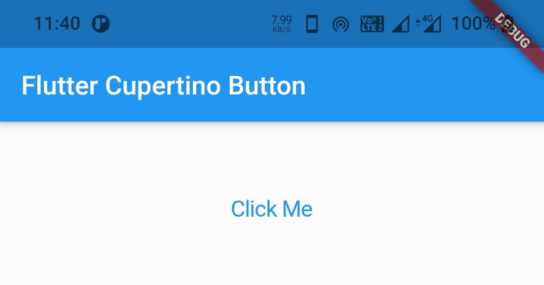
Basic implementation of CupertinoButton.
CupertinoButton(
  child:Text("Click Me"),
  onPressed: (){}
)
Output:
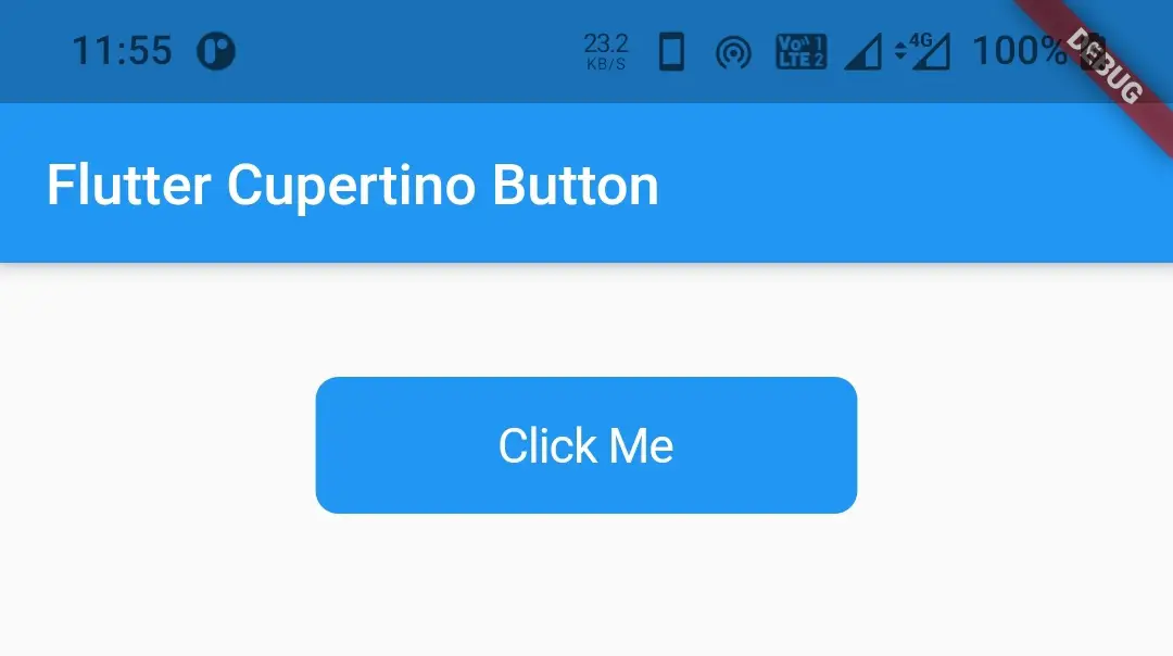
How To Create CupertinoButton.filled In Flutter?
To create a cupertino button with a background use this constructor. All the properties are similar to the previous constructor except the color property.
Flutter CupertinoButton.filled Constructor:
CupertinoButton.filled(
{Key? key,
 required Widget child,
 EdgeInsetsGeometry? padding,
 Color disabledColor,
 double? minSize,
 double? pressedOpacity,
 BorderRadius? borderRadius,
 AlignmentGeometry alignment,
 required VoidCallback? onPressed}
)
Basic implementation of CupertionButton.filled
CupertinoButton.filled(
  child:Text("Click Me"),
  onPressed: (){}
)
Output:
Flutter Cupertino Button Properties
The properties of a flutter cupertion button are:
- child
- color
- padding
- disabledColor
- minSize
- pressedOpacity
- borderRadius
- alignment
- onPressed
child
To add a child widget like text or icon to cupertino button we have to use child property. It accepts a widget as a child.
CupertinoButton(
  child:Text("Click Me"),
  onPressed: (){}
)
Output:
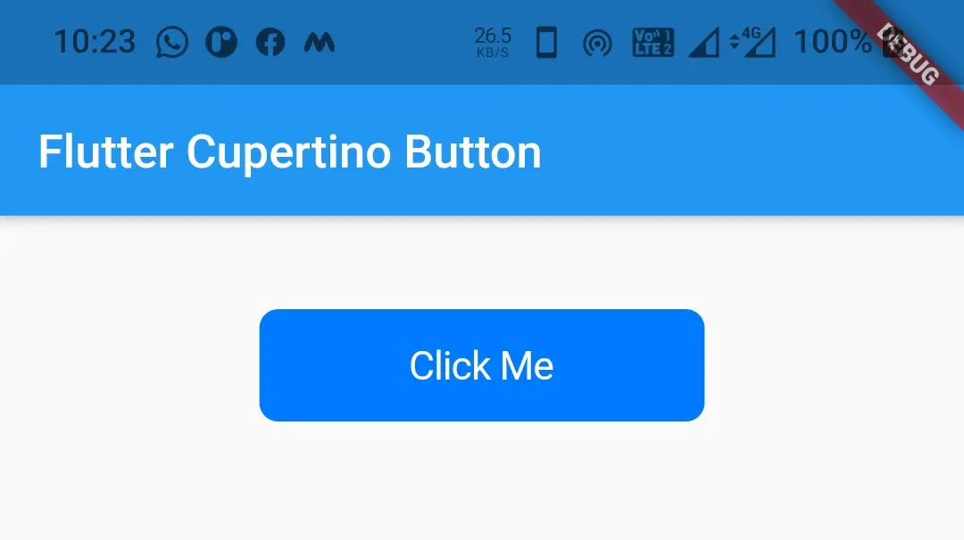
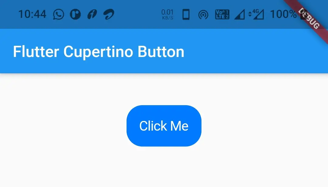
color
To apply a background color to the cupertino button we will use color property. By default, there is no background for cupertino button. It takes CupertinoColors constant as value.
CupertinoButton(
            onPressed: ()
            {},
            child: Text("Click Me"),
            color: CupertinoColors.activeBlue
          )
Output:
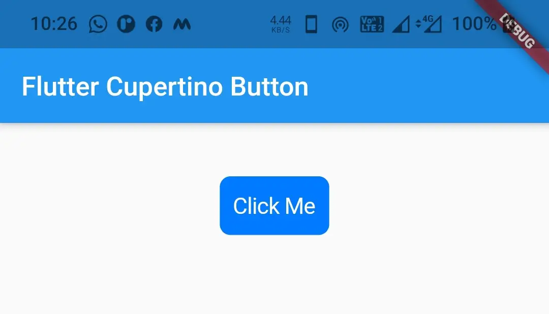
padding
To add padding to the cupertino button we have to use the padding property. It accepts EdgeinsetsGeometry as a value. By default it is 16px.
CupertinoButton(
            onPressed: ()
            {},
            child: Text("Click Me"),
            color: CupertinoColors.activeBlue,
            padding: EdgeInsets.all(10),
          )
Output:
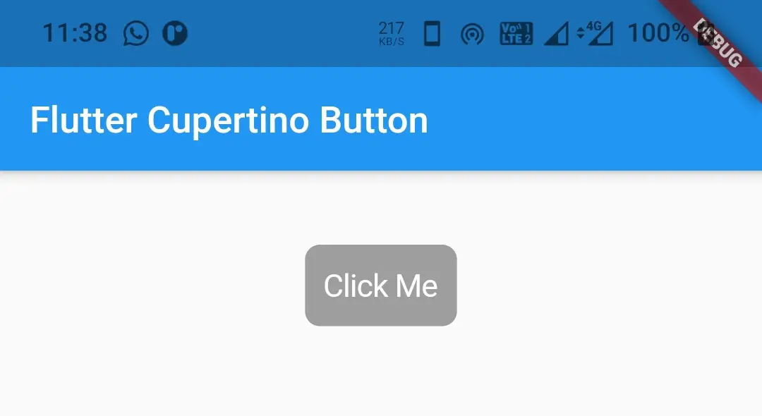
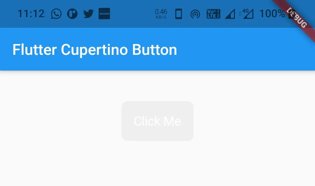
disabedColor
To apply a color to the cupertino button when it is disabled we have to use the disabledColor property. It takes CupertinoColors or Colors class constant as value. To disable the button I’m ignoring the onPressed property. We can also disable the button by setting onPressed to null.
CupertinoButton(
            /*onPressed: ()
            {},*/
            child: Text("Click Me"),
            color: CupertinoColors.activeBlue,
            padding: EdgeInsets.all(10),
            disabledColor: Colors.grey,
          )
Output:
minSize
To apply a minimum size to the button we will use the minSize property. It takes double as a vale.
CupertinoButton(
            onPressed: ()
            {},
            child: Text("Click Me"),
            color: CupertinoColors.activeBlue,
            padding: EdgeInsets.all(10),
            disabledColor: Colors.grey,
            minSize: 60,
          )
Output:

pressedOpacity
To apply opacity when we press the cupertino button we will use the pressedOpacity property. It takes double as value. It ranges from 0.0 to 1.0. By default, the pressed opacity is 0.4.
CupertinoButton(
            onPressed: ()
            {},
            child: Text("Click Me"),
            color: CupertinoColors.activeBlue,
            padding: EdgeInsets.all(10),
            disabledColor: Colors.grey,
            pressedOpacity:0.6,
          )
borderRadius
To apply rounded corners to the cupertino button we will use borderRadius property.
CupertinoButton(
            onPressed: ()
            {},
            child: Text("Click Me"),
            color: CupertinoColors.activeBlue,
            padding: EdgeInsets.all(16),
            disabledColor: Colors.grey,
            pressedOpacity:0.6,
            borderRadius: BorderRadius.all(Radius.circular(20)),
          )
Output:
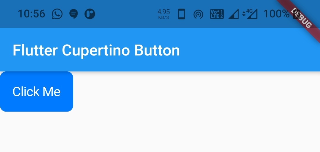
alignment
To align the cupertino button at different positions we will use the alignment property. It takes Alignment constant as value. By default, its value is Alignment.center. Other constants are topLeft, topCenter, topRight, centerLeft, centerRight, bottomLeft, bottomCenter, bottomRight.
Container(
          margin: EdgeInsets.all(40),
          alignment: Alignment.topCenter,
          child: CupertinoButton(
            onPressed: ()
            {},
            child: Text("Click Me"),
            color: CupertinoColors.activeBlue,
            padding: EdgeInsets.all(16),
            disabledColor: Colors.grey,
            pressedOpacity:0.6,
            alignment: Alignment.topLeft
          )
        ),
Output:
onPressed
To listen to click events of the cupertino button we will use onPressed callback. If we set it to null or ignore using it the button will be disabled. If we provide a function to it we can listen to the click of the button and perform some action. In the below example I will disable the button by setting the onPressed to null.
 CupertinoButton(
            onPressed: null,
            child: Text("Click Me"),
            color: CupertinoColors.activeBlue,
            padding: EdgeInsets.all(16),
          )
Output:
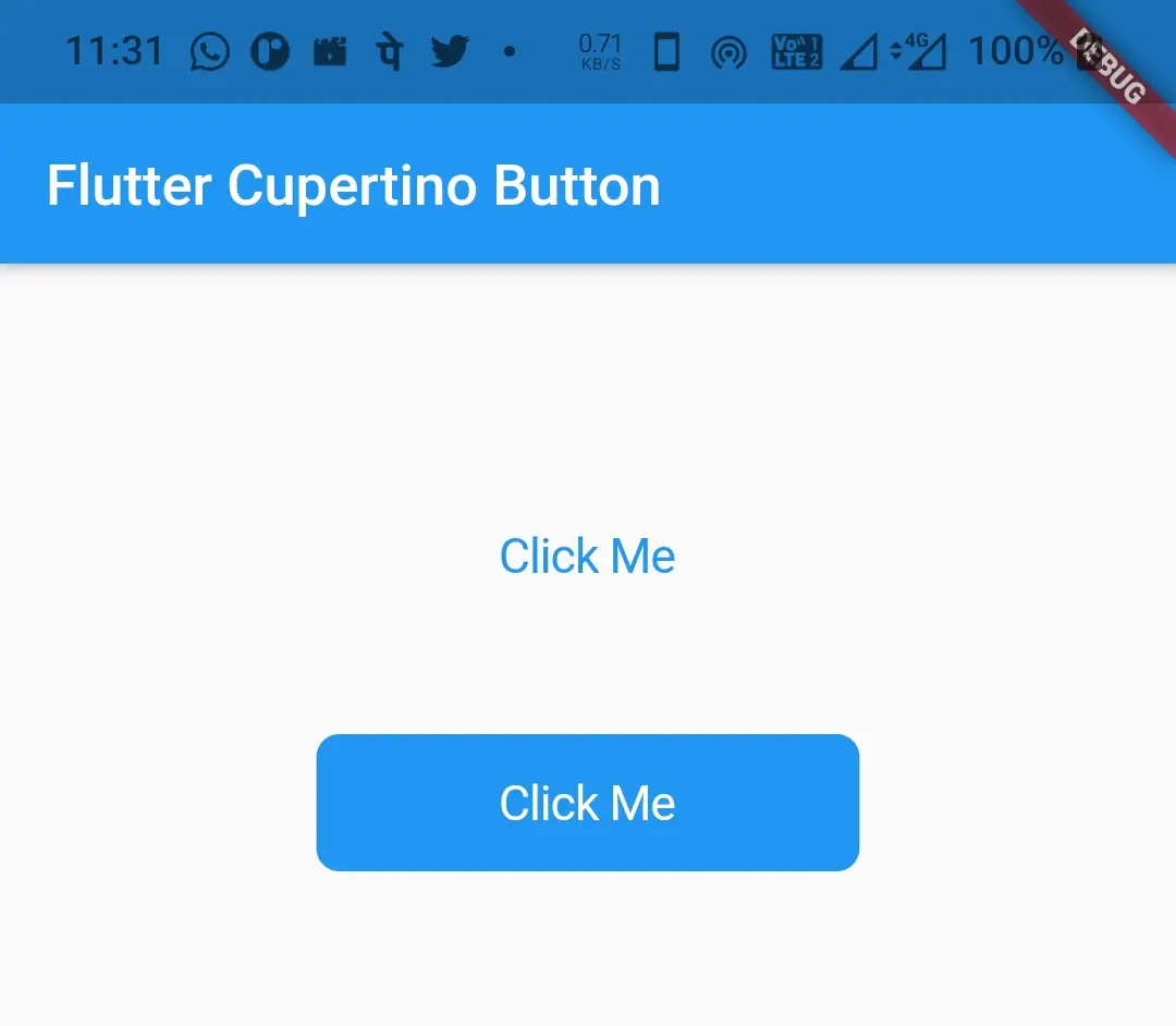
Flutter Cupertino Button Example
Let’s create an example that demonstrates the use of cupertino button in flutter. In this example, we will display two cupertino buttons. We will create one using CupertinoButton constructor and the other using CupertinoButton.filled constructor.
Create a new Flutter project and replace the code in main.dart file with the code below.
Complete Code:
import 'dart:async';
import 'package:flutter/cupertino.dart';
import 'package:flutter/material.dart';
import 'package:flutter/widgets.dart';

void main()
{
  runApp(MyApp());
}

class MyApp extends StatelessWidget {
  @override
  Widget build(BuildContext context) {
    return MaterialApp(
      title: 'Flutter Learning',
      theme: ThemeData(
        primarySwatch: Colors.blue,
      ),
      home:MyHomePage(),
    );
  }
}

class MyHomePage extends StatefulWidget {
  @override
  _MyHomePageState createState()
  {
    return _MyHomePageState();
  }
}

class _MyHomePageState extends State<MyHomePage> {
  double value = 0;
  @override
  Widget build(BuildContext context) {
    return new Scaffold(
        appBar: AppBar(
          title: Text("Flutter Cupertino Button"),
        ),
        body:Container(
          height: MediaQuery.of(context).size.height*0.25,
          margin: EdgeInsets.all(40),
          alignment: Alignment.topCenter,
          child: Column(
            mainAxisAlignment: MainAxisAlignment.spaceEvenly,
            children: [
              CupertinoButton(
                onPressed: (){},
                child: Text("Click Me"),
                padding: EdgeInsets.all(16),
              ),
              CupertinoButton.filled(
                  child: Text("Click Me"),
                  onPressed: (){}
                  )
            ],
          )
        ),
    );
  }
}
Output:
That’s all about the tutorial on how to use cupertino button widget in flutter. We have also seen an example where we implemented the same. Let’s catch up with some other widget in the next post. Have a great day !!
Do like & share my Facebook page. Subscribe to the newsletter if you find this post helpful. Thank you !!
Reference: Flutter Official Documentation.


Leave a Reply