
In flutter, checkbox is a material widget. It is used to display a group of options so that the user can select a few or all the options. In this example tutorial we will discuss how to use a checkbox widget in flutter and its properties in detail.
Flutter Checkbox
Checkbox is a material widget in flutter which is a two state button where the user can check/uncheck. The checked state is nothing but ON and unchecked is OFF. It allows the user to toggle between checked and unchecked states.
The checkbox cannot maintain the state. So when the checkbox is checked or unchecked the onChanged callback will be invoked. Whenever the callback is invoked the checkbox will be rebuilt to update the UI with the current state (checked/unchecked).
The checkbox widget displays only a simple checkbox without any text or label. To display a checkbox with text/label use CheckboxListTile or wrap Checkbox and Text widgets in a row widget.
If the tristate property of checkbox is set to true it will display null option along with true and false. When the value is null it will display a dash.
Requires one of its ancestors to be a Material widget.
Constructor:
Checkbox({
Key key, @required bool value,
bool tristate: false,
@required ValueChanged<bool> onChanged,
MouseCursor mouseCursor,
Color activeColor,
Color checkColor,
Color focusColor,
Color hoverColor,
MaterialTapTargetSize materialTapTargetSize,
VisualDensity visualDensity,
FocusNode focusNode,
bool autofocus: false
})
Basic checkbox example:
import 'package:flutter/cupertino.dart';
import 'package:flutter/material.dart';
import 'package:flutter/rendering.dart';

void main() {
  runApp(MyApp());
}
class MyApp extends StatefulWidget {
  @override
  _MyState createState() {
    return _MyState();
  }
}
class _MyState extends State<MyApp>
{
  bool _value = false;
  @override
  Widget build(BuildContext context) {
    return MaterialApp(
        home: Scaffold(
          appBar: AppBar(
            backgroundColor: Colors.deepPurple[200],
            title: Text("Flutter Checkbox"),
          ),
          body: Container(
            width: double.infinity,
            height: 100,
            child:Checkbox(
              value: _value,
              onChanged: (value) {

              },
            ),
          )
        )
    );
  }
}
Output:
Flutter checkbox properties
The different properties of a flutter checkbox are:
- value(required)
- activeColor
- checkColor
- onChanged(required)
- tristate
Let’s look into each property with example.
Value
We will use the value property to set the state of the checkbox. It is a boolean value which means it can be true/false.
body: Container(
            width: double.infinity,
            height: 100,
            child:Checkbox(
              value: false,
              onChanged: (value) {
                setState(() {
                  _value = value;
                });
              },
            ),
          )
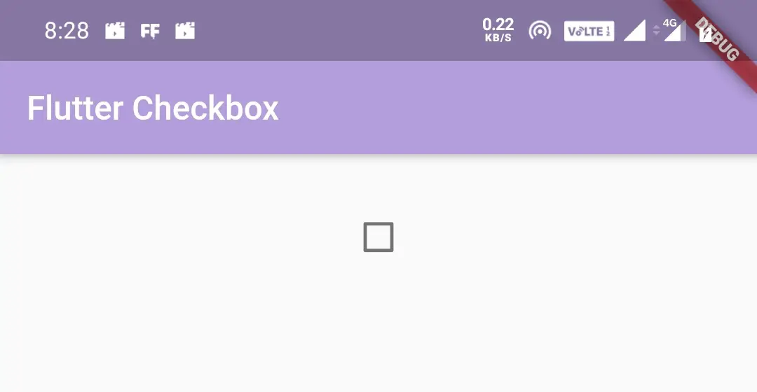
Output:
When value property is set to false(unchecked)
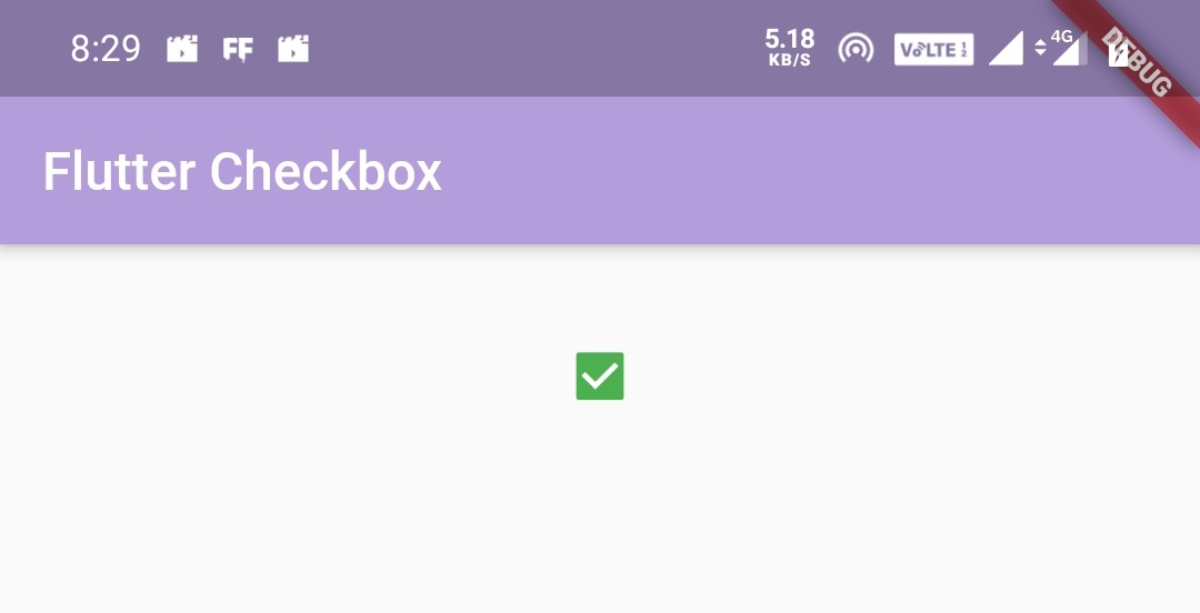
When value property is set to true(checked)

ActiveColor
We will use the activeColor property to change the color that appears when the checkbox is checked.
body: Container(
            width: double.infinity,
            height: 100,
            child:Checkbox(
              value: true,
              onChanged: (value) {
                setState(() {
                  _value = value;
                });
              },
              activeColor: Colors.green,
            ),
          )
Output:
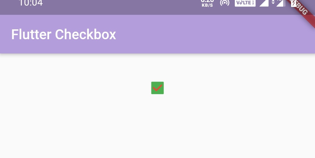
CheckColor
We will use the checkColor property to change the color of the check mark that appears when the checkbox is checked.
body: Container(
            width: double.infinity,
            height: 100,
            child:Checkbox(
              value: true,
              onChanged: (value) {
                setState(() {
                  _value = value;
                });
              },
              activeColor: Colors.green,
              checkColor: Colors.red,
            ),
          )
Output:
onChanged
We will use onChanged callback to listen to change in state of the checkbox. We can listen to change in state but we cant change the visual appearance of the checkbox. we have to rebuild the checkbox with a new value to update the visual appearance of the checkbox.
To change the visual appearance when there is change in state we will use a global variable(_value) whose value will be false while initializing. Now when the checkbox’s state is changed(when the user taps) the onChanged callback will be invoked and will get the current value(true/false) of the checkbox. Inside the onChanged callback we will use setState to assign the current value to global variable and set the global variable to value property.
initializing global variable _value with false as value.
bool _value = false;
Setting the global variable to value property.
value: _value,
Setting the value returned from onChanged callback to global variable _value.
onChanged: (value) {
                setState(() {
                  _value = value;
                });
              },
The value can be true or false depending on the checkbox’ s state.
Final code will be
import 'package:flutter/cupertino.dart';
import 'package:flutter/material.dart';
import 'package:flutter/rendering.dart';

void main() {
  runApp(MyApp());
}
//void main() => runApp(MyApp());
class MyApp extends StatefulWidget {
  @override
  _MyState createState() {
    return _MyState();
  }
}

class _MyState extends State<MyApp>
{
  bool _value = false;
  @override
  Widget build(BuildContext context) {
    return MaterialApp(
        home: Scaffold(
          appBar: AppBar(
            backgroundColor: Colors.deepPurple[200],
            title: Text("Flutter Checkbox"),
          ),
          body: Container(
            width: double.infinity,
            height: 100,
            child:Checkbox(
              value: _value,
              onChanged: (value) {
                setState(() {
                  _value = value;
                });
              },
              activeColor: Colors.green,
            ),
          )
        )
    );
  }
}
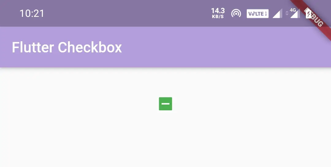
tristate
If we set tristate property to true, the checkbox’s value can be true, false or null. Checkbox displays a dash when its value is null. If tristate is false (the default), value must not be null.
When a tri-state checkbox (tristate is true) is tapped, its onChanged callback will be applied to true if the current value is false, to null if value is true, and to false if value is null (i.e. it cycles through false => true => null => false when tapped).
In the below example i’m setting tristate property to true and the initial value to false. Let’s see the output of each tap for three taps.
import 'package:flutter/cupertino.dart';
import 'package:flutter/material.dart';
import 'package:flutter/rendering.dart';

void main() {
  runApp(MyApp());
}
//void main() => runApp(MyApp());
class MyApp extends StatefulWidget {
  @override
  _MyState createState() {
    return _MyState();
  }
}

class _MyState extends State<MyApp>
{
  bool _value = false;
  @override
  Widget build(BuildContext context) {
    return MaterialApp(
        home: Scaffold(
          appBar: AppBar(
            backgroundColor: Colors.deepPurple[200],
            title: Text("Flutter Checkbox"),
          ),
          body: Container(
            width: double.infinity,
            height: 100,
            child:Checkbox(
              value: _value,
              onChanged: (value) {
                setState(() {
                  _value = value;
                });
              },
              activeColor: Colors.green,
              tristate: true,

            ),
          )
        )
    );
  }
}
Output:
First tap
Second tap
Third tap
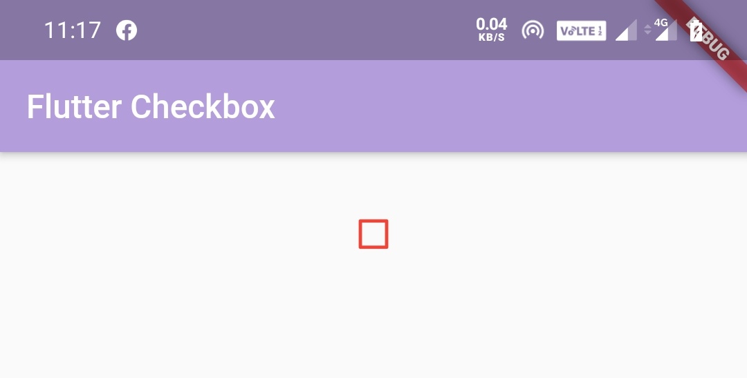
Changing checkbox border color when unchecked
To change the border color of the checkbox when it is unchecked just wrap the checkbox inside a Theme widget as a child and set ThemeData‘s unselectedWidgetColor property to your desired color.
body: Theme(
            data: ThemeData(
                unselectedWidgetColor: Colors.red
            ),
              child:Container(
                width: double.infinity,
                height: 100,
                child:Checkbox(
                  value: _value,
                  onChanged: (value) {
                  setState(() {
                    _value = value;
                  });
                },
                activeColor: Colors.green,
                tristate: true,
                ),
              )
          )
Output:
That brings an end to flutter checkbox example tutorial. Let’s catch up with some other flutter tutorial soon. Have a great day!!
Do share, subscribe and like my facebook page if you find this post helpful. Thank you!!
Reference: Flutter Official Documentation


Leave a Reply