
Flutter ListTile
Listtile is a material widget in flutter used to display some text and an icon or other widget. We can have the widget at the start or end of the title. The widget can be shown using leading or trailing property. List tile has two properties title and subtitle to display some text. The title is mandatory where the subtitle is optional. If we set the threeLine property to true the subtitle will occupy two lines else it will wrap in one line. Make sure the title and subtitle are of optimal length or else they will wrap. Generally, list titles are used as children in listviews.
Constructor:
ListTile({
Key key,
Widget leading,
Widget title,
Widget subtitle,
Widget trailing,
bool isThreeLine: false,
bool dense,
VisualDensity visualDensity,
ShapeBorder shape,
EdgeInsetsGeometry contentPadding,
bool enabled: true,
GestureTapCallback onTap,
GestureLongPressCallback onLongPress,
MouseCursor mouseCursor,
bool selected: false,
Color focusColor,
Color hoverColor,
FocusNode focusNode,
bool autofocus: false,
Color tileColor, Color selectedTileColor
})
Flutter ListTile Example
import 'package:flutter/cupertino.dart';
import 'package:flutter/material.dart';
import 'package:flutter/rendering.dart';
void main() {
runApp(MyApp());
}
//void main() => runApp(MyApp());
class MyApp extends StatefulWidget {
@override
_MyState createState() {
return _MyState();
}
}
class _MyState extends State<MyApp>
{
bool _value = false;
@override
Widget build(BuildContext context) {
return MaterialApp(
home: Scaffold(
appBar: AppBar(
backgroundColor: Colors.green[400],
title: Text("Flutter ListTile"),
),
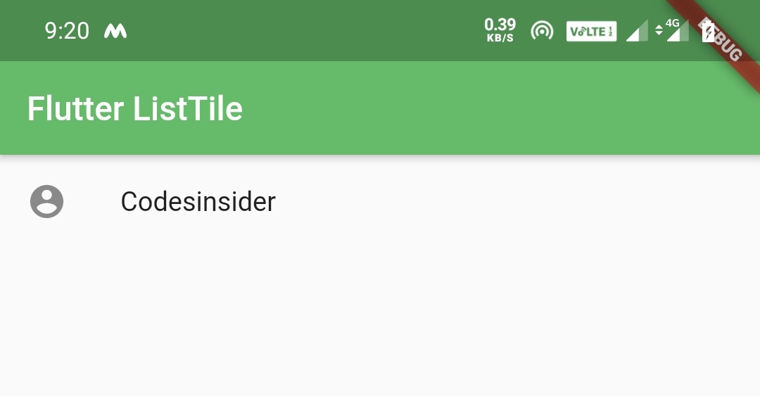
body: ListTile(
leading: Icon(Icons.account_circle),
title: Text("Codesinsider"),
selectedTileColor:Colors.green[400],
onTap: () {
setState(() {
});
},
)
)
);
}
}
Output:
Flutter ListTile Properties
The flutter ListTile properties are:
- title
- subtitle
- leading
- trailing
- selected
- enabled
- shape
- dense
- tileColor
- selectedTileColor
- contentPadding
- onTap
Lets see each property with example.
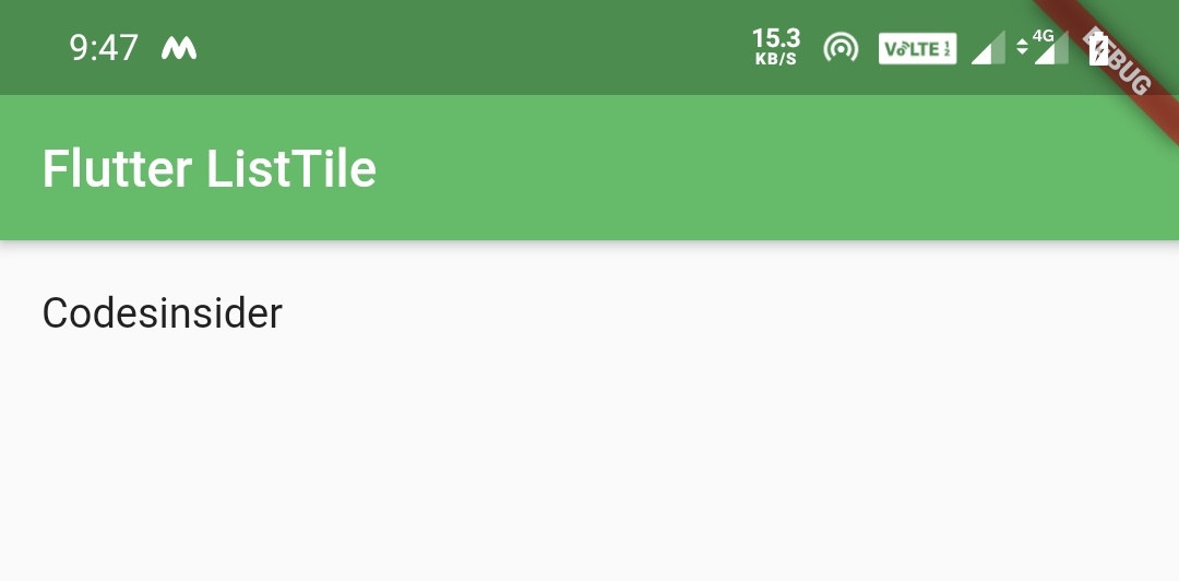
title
We can use any widget for title property but as the name suggests, it should be a Text widget in general.
body: ListTile(
            title: Text("Codesinsider"),
            selectedTileColor:Colors.green[400],
            onTap: () {
              setState(() {

              });
            },
          )
Output:
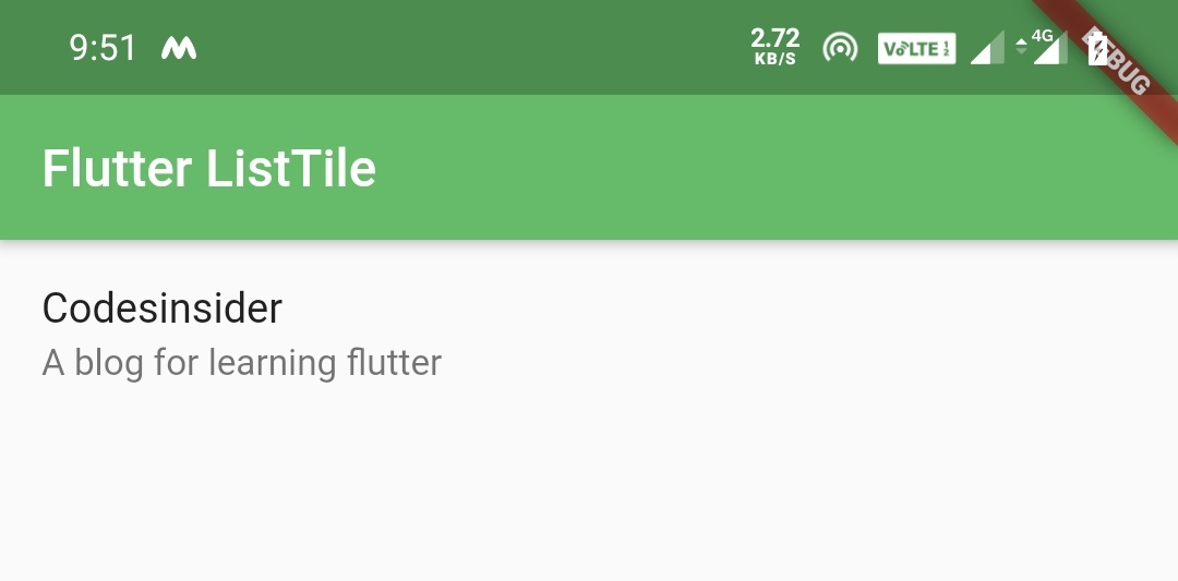
subtitle
We will use subtitle property to display a subtext to the title text. Like title property subtitle also accepts any widget.
body: ListTile(
            title: Text("Codesinsider"),
            subtitle: Text("A blog for learning flutter"),
            selectedTileColor:Colors.green[400],
            onTap: () {
              setState(() {

              });
            },
          )
Output:
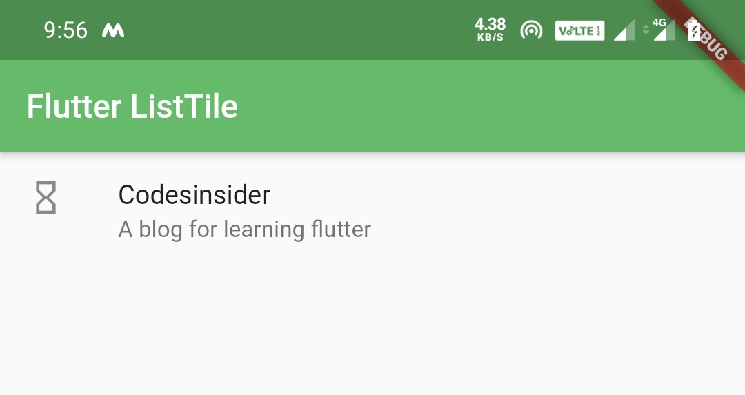
leading
We will use leading property to display an icon/image or any other widget at the starting of the ListTile.
body: ListTile(
            title: Text("Codesinsider"),
            subtitle: Text("A blog for learning flutter"),
            leading: Icon(Icons.hourglass_empty),
            selectedTileColor:Colors.green[400],
            onTap: () {
              setState(() {

              });
            },
          )
Output:
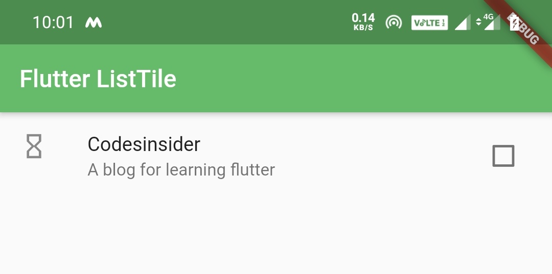
trailing
We will use trailing property to display an icon/image or any other widget at the end of the ListTile.
body: ListTile(
            title: Text("Codesinsider"),
            subtitle: Text("A blog for learning flutter"),
            leading: Icon(Icons.hourglass_empty),
            trailing: Checkbox(
              value: false,
              onChanged: (value) {

              },
            ),
            selectedTileColor:Colors.green[400],
            onTap: () {
              setState(() {

              });
            },
          )
Output:
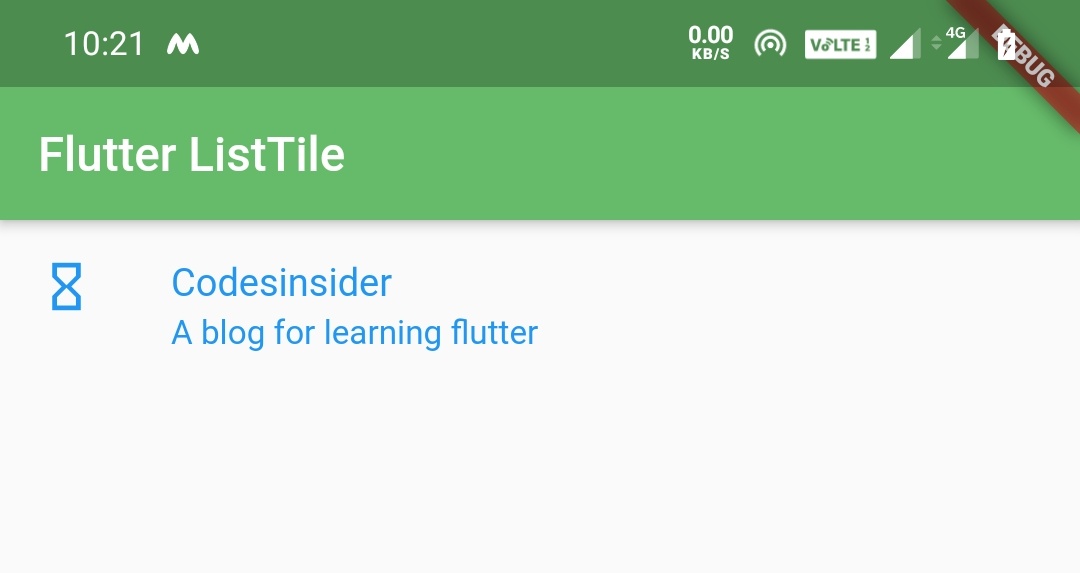
selected
We will use selected property if we want to render the text and icon colors with the theme’s primary color. We have to set this property to true to do so. By default the value for selected property is false.
body: ListTile(
            title: Text("Codesinsider"),
            subtitle: Text("A blog for learning flutter"),
            leading: Icon(Icons.hourglass_empty),
            selected: true,
            onTap: () {
              setState(() {

              });
            },
          )
Output:
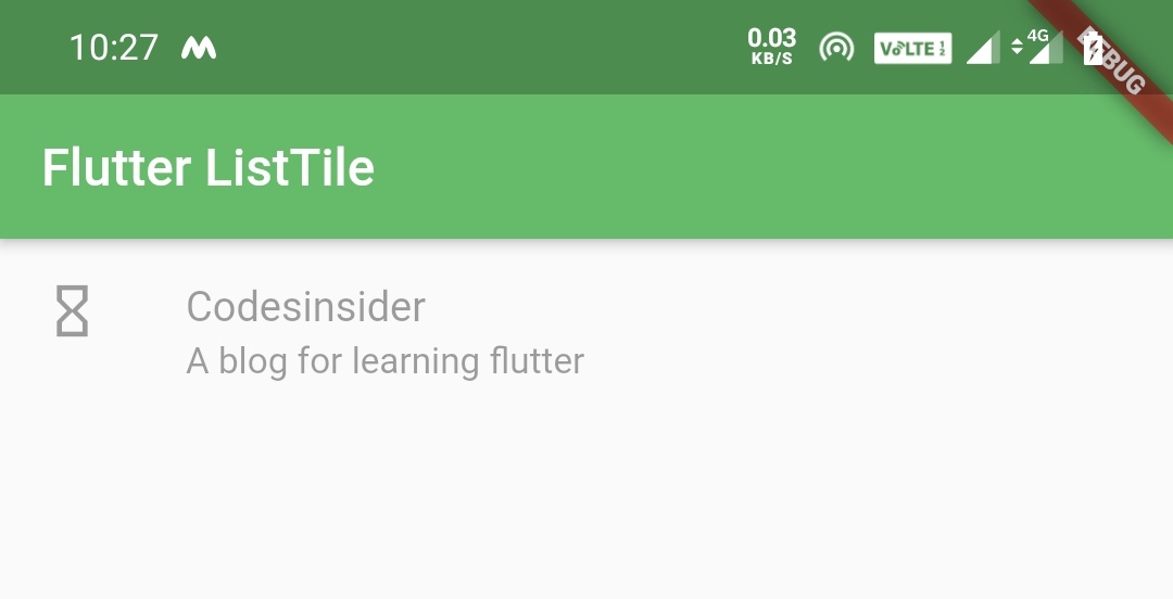
enabled
We will use enabled property to enable/disable the tap on the ListTile. If we set false to enabled property it will disable the tap/click. By default the value for enabled property is true.
body: ListTile(
            title: Text("Codesinsider"),
            subtitle: Text("A blog for learning flutter"),
            leading: Icon(Icons.hourglass_empty),
            selected: true,
            enabled: false,
            onTap: () {
              setState(() {

              });
            },
          )
Output:
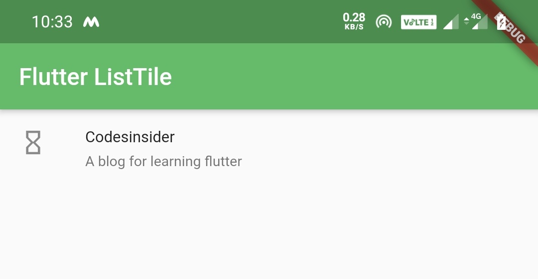
dense
We will use the dense property to make the text smaller. Setting this property to true will make the text small. By default the value is false.
body: ListTile(
            title: Text("Codesinsider"),
            subtitle: Text("A blog for learning flutter"),
            leading: Icon(Icons.hourglass_empty),
            dense: true,
            onTap: () {
              setState(() {

              });
            },
          )
Output:
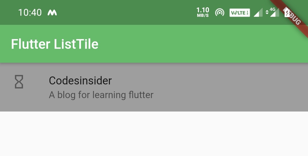
tileColor
We will use tileColor property to change the background color of the tile. By default the background color is white.
body: ListTile(
            title: Text("Codesinsider"),
            subtitle: Text("A blog for learning flutter"),
            leading: Icon(Icons.hourglass_empty),
            dense: true,
            tileColor: Colors.grey,
            onTap: () {
              setState(() {

              });
            },
          )
Output:
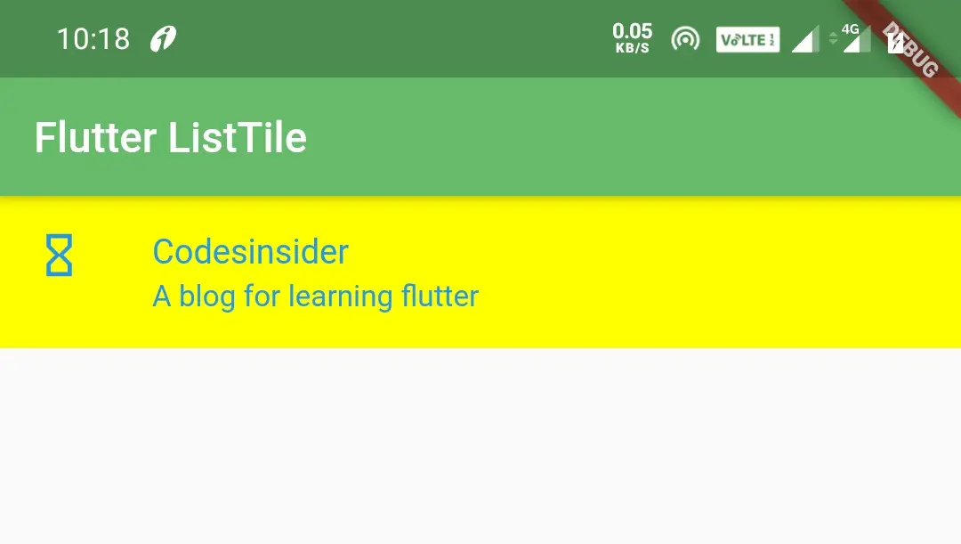
selectedTileColor
We will use selectedTileColor property to change the background color of the tile when the tile’s selected property is true (when the tile is selected). I’m setting the selected property to true to view the output.
body: ListTile(
            title: Text("Codesinsider"),
            subtitle: Text("A blog for learning flutter"),
            leading: Icon(Icons.hourglass_empty),
            tileColor: Colors.grey,
            selectedTileColor: Colors.yellowAccent,
            selected: true,
            onTap: () {
              setState(() {

              });
            },
          )
Output:
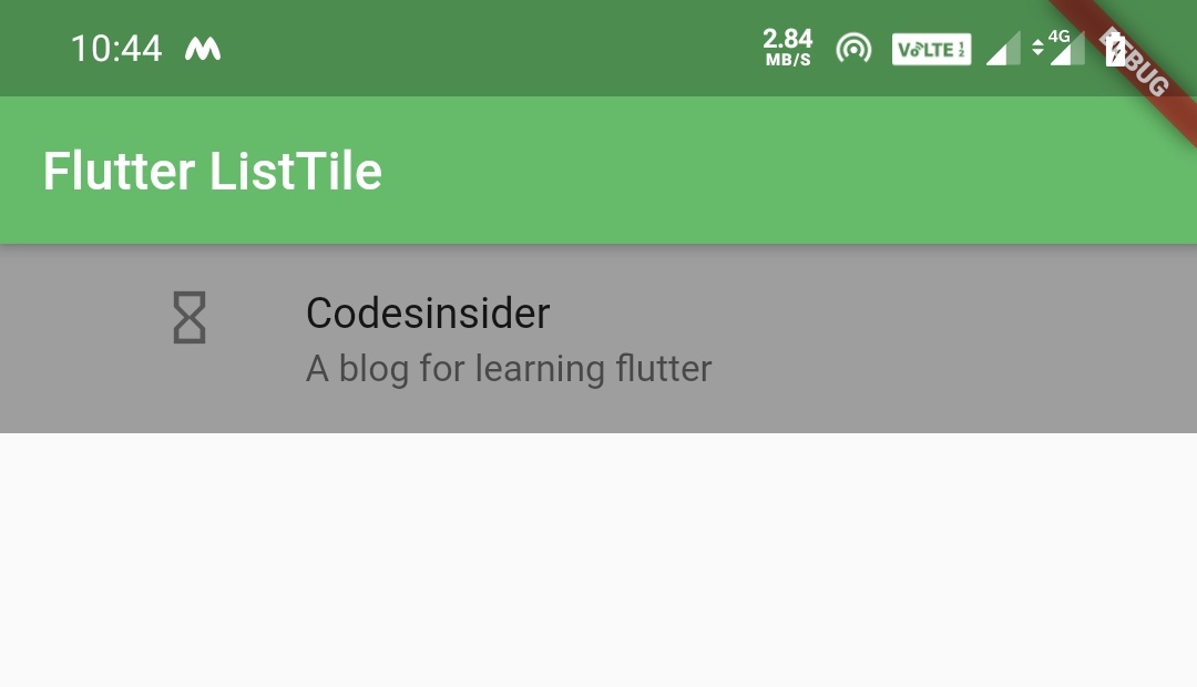
contentPadding
We will use the contentPadding property to apply padding to the content of the ListTile.
body: ListTile(
            title: Text("Codesinsider"),
            subtitle: Text("A blog for learning flutter"),
            leading: Icon(Icons.hourglass_empty),
            tileColor: Colors.grey,
            contentPadding: EdgeInsets.symmetric(horizontal: 60),
            onTap: () {
              setState(() {

              });
            },
          )
Output:
onTap
We will use onTap property to listen whether the list tile is clicked/pressed. When we tap the ListTile the onTap callback will be invoked where we can execute our logic.
onTap: () {
    setState(() {
     //Do whatever you want here
    });
},
That brings an end to flutter ListTile example tutorial. Let’s catch up with some other flutter widget in the next post. Have a great day!!
Do share, subscribe and like my facebook page if you find this post helpful. Thank you!!
Reference: Flutter Official Documentation


Leave a Reply