
Flutter Cupertino TabBar
Cupertino tabbar is nothing but ios style bottom tabbar or bottom navigation bar in flutter. A CupertinoTabBar widget lets us add an ios like tabbar to our application. It is similar to bottom navigation bar in flutter for the android platform. It displays a row of tabs where each tab will have a label and an icon. The first tab will be active by default. Each tab will be built using BottomNavigationBarItem widget.
We have to use the cupertino tabbar with a CupertinoTabScaffold to automatically reflect new data when there is a tab change. We can also use tabbar without the cupertinoTabScaffold. In that case we have to listen to tab changes manually. We have to call setState to update the cureent Index with selected tab index to reflect new data.
Whenever there is a change in tab it will trigger a change of navigator. Each navigator will have a seperate navigation stack. We can acheive this kind of behavior using CupertinoTabView inside the tabBuilder of CupertinoTabScaffold.
Don’t know what Cupertino is? It is nothing but a set of flutter widgets that follow the ios design pattern. These widgets are designed to implement ios features in flutter apps built for the ios platform.
In this tutorial, we will learn how to use cupertino tabbar in flutter with example. We will also learn how to customize the style of CupertinoTabBar widget using different properties.
To implement similar behavior in android platform using flutter refer bottom navigation bar in flutter.
How To Create Cupertino TabBar In Flutter?
To create a cupertino tabbar in flutter we have to use CupertinoTabBar class. We have to call the constructor of the class and provide required properties. Tabbar has only one required property items. We should provide a list of BottomNavigationBarItem(s) as value for items.
Flutter CupertinoTabBar Constructor:
CupertinoTabBar(
{Key? key,
 required List<BottomNavigationBarItem> items,
 ValueChanged<int>? onTap,
 int currentIndex,
 Color? backgroundColor,
 Color? activeColor,
 Color inactiveColor,
 double iconSize,
 Border? border}
)
Flutter Cupertino TabBar Properties
The properties of a flutter cupertino tabbar are:
- items
- onTap
- currentIndex
- backgroundColor
- activeColor
- inactiveColor
- iconSize
- border
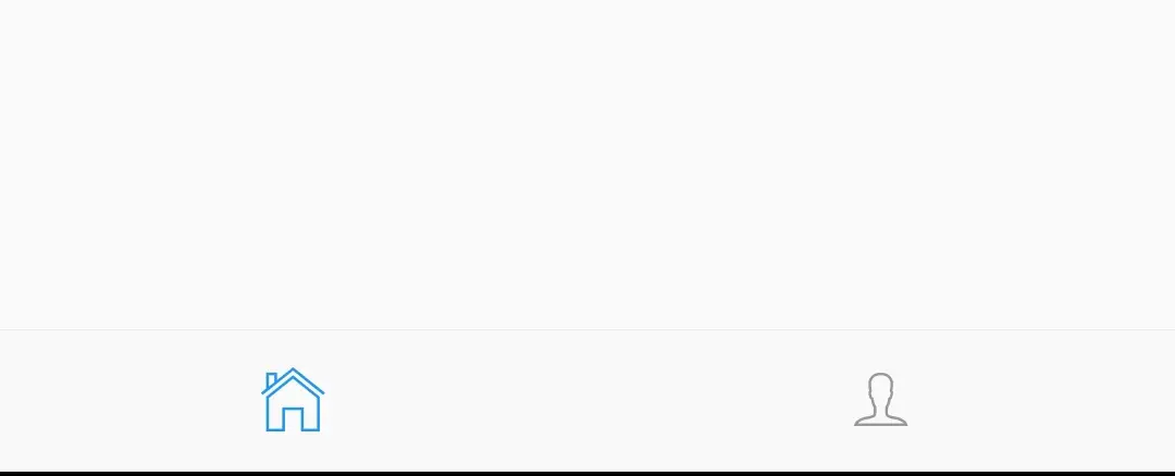
items
We will use this property to provide items to the cupertino tabbar. It takes a list of BottomNavigationBarItems as value.
CupertinoTabBar(
              items: [
                  BottomNavigationBarItem(
                  icon: Icon(CupertinoIcons.home),
                  ),
                  BottomNavigationBarItem(
                  icon: Icon(CupertinoIcons.person),
                  )
              ],
            ),
Output:
onTap
It is a callback function that will invoke when the user taps on a tab. Inside this function we will get the index of the selected tab. We have to set this value to currentIndex property and call setState to update the selection in UI. We can ignore this property if we use tabbar with cupertinoTabScaffold widget.
CupertinoTabBar(
              items: [
                  BottomNavigationBarItem(
                  icon: Icon(CupertinoIcons.home),
                  ),
                  BottomNavigationBarItem(
                  icon: Icon(CupertinoIcons.person),
                  )
              ],
              onTap: (value){
                index = value;
                setState(() {

                });
              },
            ),
currentIndex
We will use this property to indicate the currently selected tab. It takes int as value. We can ignore this property if we use tabbar with cupertinoTabScaffold widget.
CupertinoTabBar(
              items: [
                  BottomNavigationBarItem(
                  icon: Icon(CupertinoIcons.home),
                  ),
                  BottomNavigationBarItem(
                  icon: Icon(CupertinoIcons.person),
                  )
              ],
              onTap: (value){
                index = value;
                setState(() {

                });
              },
              currentIndex:index,
            ),
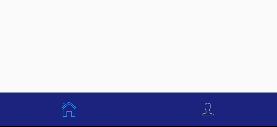
backgroundColor
We will use this property to apply or change the background color of the tabbar. It takes CupertinoColors or Colors class constant as value.
CupertinoTabBar(
              items: [
                  BottomNavigationBarItem(
                  icon: Icon(CupertinoIcons.home),
                  ),
                  BottomNavigationBarItem(
                  icon: Icon(CupertinoIcons.person),
                  )
              ],
              backgroundColor: Colors.indigo.shade900,
            ),
Output:
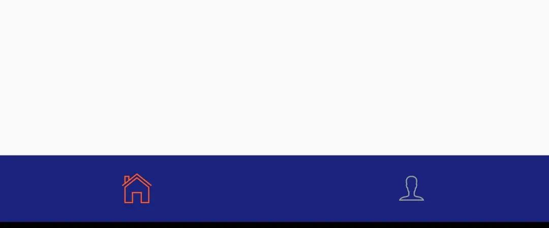
activeColor
We will use this property to change the color of the active tab (tab that is currently selected).
CupertinoTabBar(
              items: [
                  BottomNavigationBarItem(
                  icon: Icon(CupertinoIcons.home),
                  ),
                  BottomNavigationBarItem(
                  icon: Icon(CupertinoIcons.person),
                  )
              ],
              backgroundColor: Colors.indigo.shade900,
              activeColor: Colors.deepOrange,
            ),
Output:
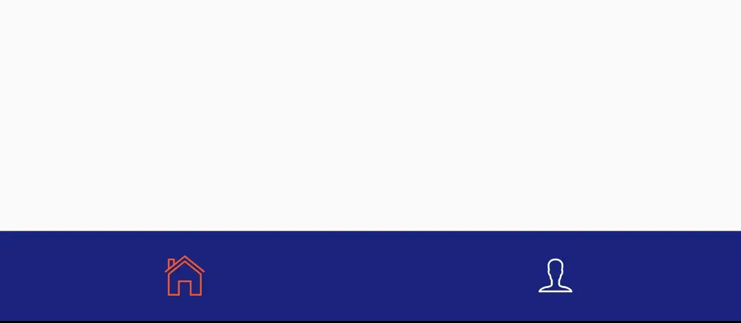
inactiveColor
We will use this property to change the inactive tab (tab that is not selected) color.
CupertinoTabBar(
items: [
BottomNavigationBarItem(
icon: Icon(CupertinoIcons.home),
),
BottomNavigationBarItem(
icon: Icon(CupertinoIcons.person),
)
],
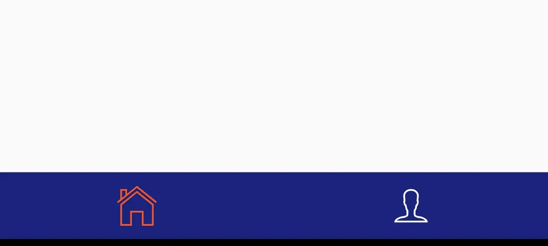
backgroundColor: Colors.indigo.shade900,
activeColor: Colors.deepOrange,
inactiveColor:Colors.white,
),
Output:
iconSize
To change the size of the icon of the tabbar we will use this property. It takes double as value.
CupertinoTabBar(
              items: [
                  BottomNavigationBarItem(
                  icon: Icon(CupertinoIcons.home),
                  ),
                  BottomNavigationBarItem(
                  icon: Icon(CupertinoIcons.person),
                  )
              ],
              backgroundColor: Colors.indigo.shade900,
              activeColor: Colors.deepOrange,
              inactiveColor:Colors.white,
              iconSize: 40,
            ),
Output:
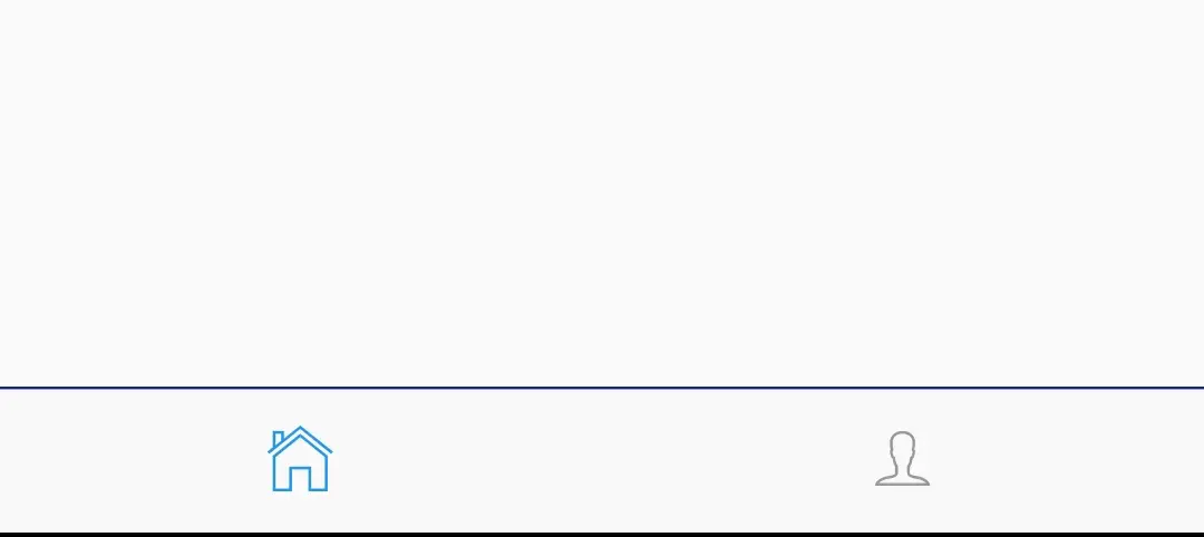
border
To provide a border to the tabbar we will use this property. It takes Border class as value.
CupertinoTabBar(
              items: [
                  BottomNavigationBarItem(
                  icon: Icon(CupertinoIcons.home),
                  ),
                  BottomNavigationBarItem(
                  icon: Icon(CupertinoIcons.person),
                  )
              ],
              border: Border(top: BorderSide(color: Colors.indigo.shade900)),
            ),
Output:
Flutter Cupertino TabBar Example
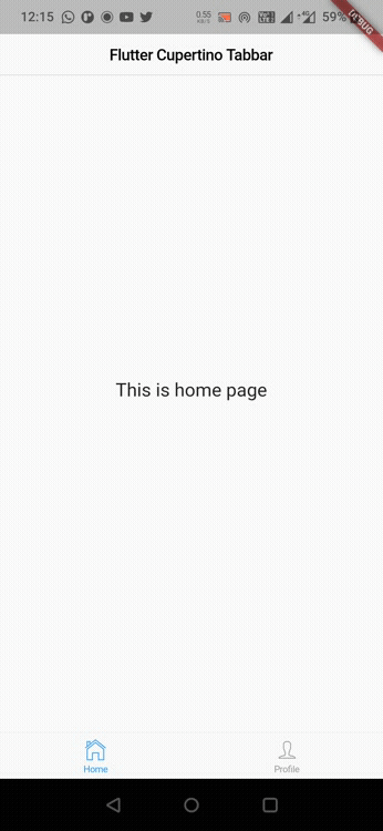
Lets Create an example where we will implement cupertino tabbar in flutter using CupertinoTabBar widget. In this example we will dsiplay a tabbar with two tabs home and profile. When the use taps on the tab we will display the corresponding widgets. We will be using the cupertino tabbar with CupertinoTabScaffold so we don’t have to use onTap and currentIndex properties. It will automatically reflect the data when the tab changes.
First lets declare a list that will hold the widgets for the tabs.
List<Widget> data = [HomeTab(), ProfileTab()];
Now add the CupertinoTabScaffold to the child of CupertinoPageScaffold widget. Provide CupertinoTabBar to tabbar property of CupertinoTabScaffold.
child: CupertinoTabScaffold(
            tabBar: CupertinoTabBar(
              items: [
                BottomNavigationBarItem(
                  icon: Icon(CupertinoIcons.home),
                  label: "Home",
                ),
                BottomNavigationBarItem(
                  icon: Icon(CupertinoIcons.person),
                  label: "Profile",
                )
              ],
            ),
        )
Provide a callback function to tabBuilder property of CupertinoTabScaffold widget. This callback function will provide the index of the currently selected tab. Return the widget based on the index inside the callback function.
child: CupertinoTabScaffold(
            tabBar: CupertinoTabBar(
              items: [
                BottomNavigationBarItem(
                  icon: Icon(CupertinoIcons.home),
                  label: "Home",
                ),
                BottomNavigationBarItem(
                  icon: Icon(CupertinoIcons.person),
                  label: "Profile",
                )
              ],
            ),
            tabBuilder: (context, index) {
              return CupertinoTabView(
                  builder: (context) {
                    return data[index];
                  },
              );
            },
        )
We are done creating the tabbar. Now create classes for home and profile tabs. We can create these classes in seperate dart files. In this example i am creating them in the same file (main.dart).
Home class
class HomeTab extends StatelessWidget {
  @override
  Widget build(BuildContext context) {
    return Material(
      child: Container(
        alignment: Alignment.center,
        height: MediaQuery.of(context).size.height,
        child:Text(
          "This is home page",
          style:TextStyle(
              fontSize: 20
          ) ,
        ),
      ),
    );
  }
}
Profile class
class ProfileTab extends StatelessWidget {
  @override
  Widget build(BuildContext context) {
    return Material(
      child: Container(
        alignment: Alignment.center,
        height: MediaQuery.of(context).size.height,
        child:Text(
          "This is profile page",
          style: TextStyle(
              fontSize: 20,
          ),
        ),
      ),
    );
  }
}
Complete Code
Lets complete our cupertino tabbar example in flutter by summing up the code snippets above. Create a new flutter project and replace the code in main.dart file with the code below.
import 'package:flutter/cupertino.dart';
import 'package:flutter/material.dart';
import 'package:flutter/widgets.dart';

void main()
{
  runApp(MyApp());
}

class MyApp extends StatelessWidget {
  @override
  Widget build(BuildContext context) {
    return MaterialApp(
      title: 'Flutter Learning',
      theme: ThemeData(
        primarySwatch: Colors.blue,
      ),
      home:MyHomePage(),
    );
  }
}

class MyHomePage extends StatefulWidget {
  @override
  _MyHomePageState createState()
  {
    return _MyHomePageState();
  }
}

class _MyHomePageState extends State<MyHomePage> {
  List<Widget> data = [HomeTab(), ProfileTab()];
  @override
  Widget build(BuildContext context) {
    return new CupertinoPageScaffold(
      navigationBar: CupertinoNavigationBar(
        middle:Text("Flutter Cupertino Tabbar"),
      ),
        child: CupertinoTabScaffold(
            tabBar: CupertinoTabBar(
              items: [
                BottomNavigationBarItem(
                  icon: Icon(CupertinoIcons.home),
                  label: "Home",
                ),
                BottomNavigationBarItem(
                  icon: Icon(CupertinoIcons.person),
                  label: "Profile",
                )
              ],
            ),
            tabBuilder: (context, index) {
              return CupertinoTabView(
                  builder: (context) {
                    return data[index];
                  },
              );
            },
        )
    );
  }
}

class HomeTab extends StatelessWidget {
  @override
  Widget build(BuildContext context) {
    return Material(
      child: Container(
        alignment: Alignment.center,
        height: MediaQuery.of(context).size.height,
        child:Text(
          "This is home page",
          style:TextStyle(
              fontSize: 20
          ) ,
        ),
      ),
    );
  }
}

class ProfileTab extends StatelessWidget {
  @override
  Widget build(BuildContext context) {
    return Material(
      child: Container(
        alignment: Alignment.center,
        height: MediaQuery.of(context).size.height,
        child:Text(
          "This is profile page",
          style: TextStyle(
              fontSize: 20,
          ),
        ),
      ),
    );
  }
}
Output:
Thats all about the tutorial on how to create & use cupertino tabbar in flutter. We have also seen an example where we have used the CupertinoTabBar widget and customized its style. Let’s catch up with some other widgets in the next post. Have a great day !!
Do like & share my Facebook page. Subscribe to the newsletter if you find this post helpful. Thank you !!
Reference: Flutter Official Documentation.


Leave a Reply