
Cupertino sliver navigation bar is ios style sliver navigation bar in flutter. CupertinoSliverNavigationBar widget lets us add an ios style sliver navigation bar to our application. It is similar to sliver appbar or collapsing toolbar in android. We will use it to display the navigation bar with a large title which is ios 11 style. To implement it we have to place it inside a sliver group.
Cupertino sliver navigation bar has two sections where one section is fixed at the top. The second one is a sliding section with a large title. The second section will appear below the first. It will slide down to show the large title when the sliver expands. It will hide under the first section if the sliver collapses.
Don’t know what Cupertino is? It is nothing but a set of flutter widgets that follow the ios design pattern. These widgets are designed to implement ios features in flutter apps built for the ios platform.
In this tutorial, we will learn how to use cupertino sliver navigation bar in flutter with example. We will also learn how to customize the style of CupertinoSliverNavigationBar widget using different properties.
To implement similar behavior in android platform using flutter refer SliverAppbar or collapsing toolbar in flutter.
To create a cupertino sliver navigation bar in flutter we have to use CupertinoSliverNavigationBar class. Call the constructor of the class and provide the required properties. It has no require properties so simply calling the constructor will do the work. Generally we will use the middle & leading widgets to make a basic navigation bar.
Flutter CupertinoSliverNavigationBar Constructor:
CupertinoSliverNavigationBar(
{Key? key,
 Widget? largeTitle,
 Widget? leading,
 bool automaticallyImplyLeading,
 bool automaticallyImplyTitle,
 String? previousPageTitle,
 Widget? middle,
 Widget? trailing,
 Border? border,
 Color? backgroundColor,
 Brightness? brightness,
 EdgeInsetsDirectional? padding,
 bool transitionBetweenRoutes,
 Object heroTag,
 bool stretch}
)
The properties of a flutter cupertino sliver navigation bar are:
- largeTitle
- leading
- automaticallyImplyLeading
- automaticallyImplyTitle
- previousPageTitle
- middle
- trailing
- border
- backgroundColor
- brightness
- padding
- transitionBetweenRoutes
- heroTag
- stretch
The cupertino sliver navigation bar is nothing but a navigation bar with additional feature. So most of the properties of it are similar to cupertino navigation bar.
Note: In order to display a cupertino sliver navigation bar we have to place it inside a sliver group. The sliver navigation bar won’t work if we don’t provide a sliverList or sliverGrid after it. So we have to add one of them to the sliver group.
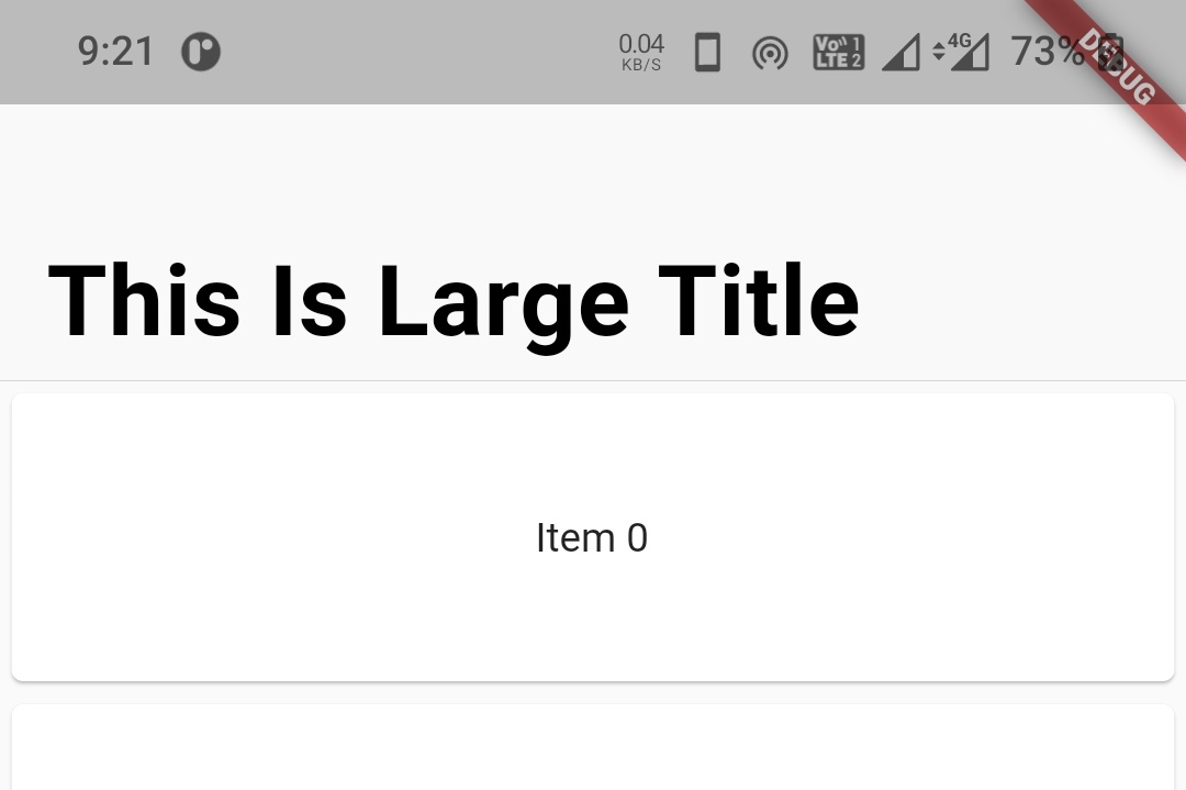
largeTitle
We will use this property to display large title that appears when the sliver expands.
CupertinoSliverNavigationBar(
            largeTitle: Text("This Is Large Title"),
          ),
Output:
leading
To provide a leading widget to the sliver navigation bar we will use leading property. It takes a widget as value. Generally, we will use the back button or close button for a leading widget. In the below example we will use CupertinoNavigationBarBackButton widget for leading.
CupertinoSliverNavigationBar(
            leading: CupertinoNavigationBarBackButton(
              onPressed: ()
              { },
              color: CupertinoColors.label,
            ),
            largeTitle: Text("This Is Large Title"),
          ),
Output:
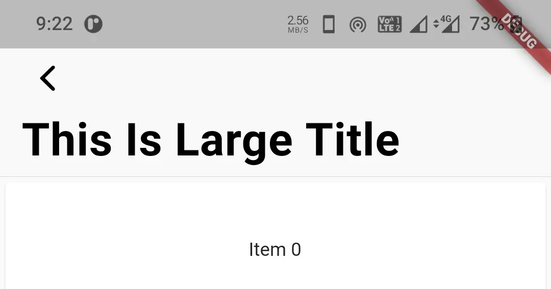
automaticallyImplyLeading
It takes boolean as value. Setting this property to true will automatically display a leading widget according to the scenario. For example, it will display a back arrow (‘<‘) for a cupertinoPageRoute and close icon (‘x‘) for a full screen dialog. This only works if the leading property is null or ignored.
CupertinoSliverNavigationBar(
            leading: CupertinoNavigationBarBackButton(
              onPressed: ()
              { },
              color: CupertinoColors.label,
            ),
            largeTitle: Text("This Is Large Title"),
            automaticallyImplyLeading: true,
          ),
automaticallyImplyTitle
It takes boolaen as value. Setting this property to true will automatically display current routes title as the largeTitle if the current route is a CupertinoPageRoute. It only works when the largeTitle widget is null or ignored.
CupertinoSliverNavigationBar(
            leading: CupertinoNavigationBarBackButton(
              onPressed: ()
              { },
              color: CupertinoColors.label,
            ),
            largeTitle: Text("This Is Large Title"),
            automaticallyImplyLeading: true,
            automaticallyImplyTitle: true,
          ),
previousPageTitle
It is used to specify the previous page route’s title. When the leading is null and automaticallyImplyLeading is true the sliver navigation bar will use this title as leading. It takes atring as value.
CupertinoSliverNavigationBar(
            leading: CupertinoNavigationBarBackButton(
              onPressed: ()
              { },
              color: CupertinoColors.label,
            ),
            largeTitle: Text("This Is Large Title"),
            automaticallyImplyLeading: true,
            automaticallyImplyTitle: true,
            previousPageTitle: "Profile"
          ),
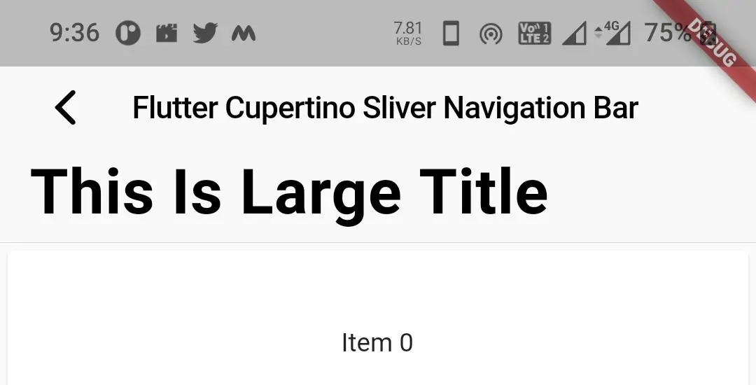
middle
To display a title in the middle of sliver navigation bar we will use this property. It takes widge as value generally a text widget.
CupertinoSliverNavigationBar(
            leading: CupertinoNavigationBarBackButton(
              onPressed: ()
              { },
              color: CupertinoColors.label,
            ),
            middle: Text("Flutter Cupertino Sliver Navigation Bar"),
            automaticallyImplyLeading: true,
            automaticallyImplyTitle: true,
            previousPageTitle: "Profile"
            largeTitle: Text("This Is Large Title"),
          ),
Output:
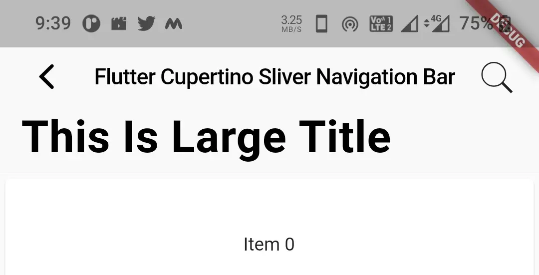
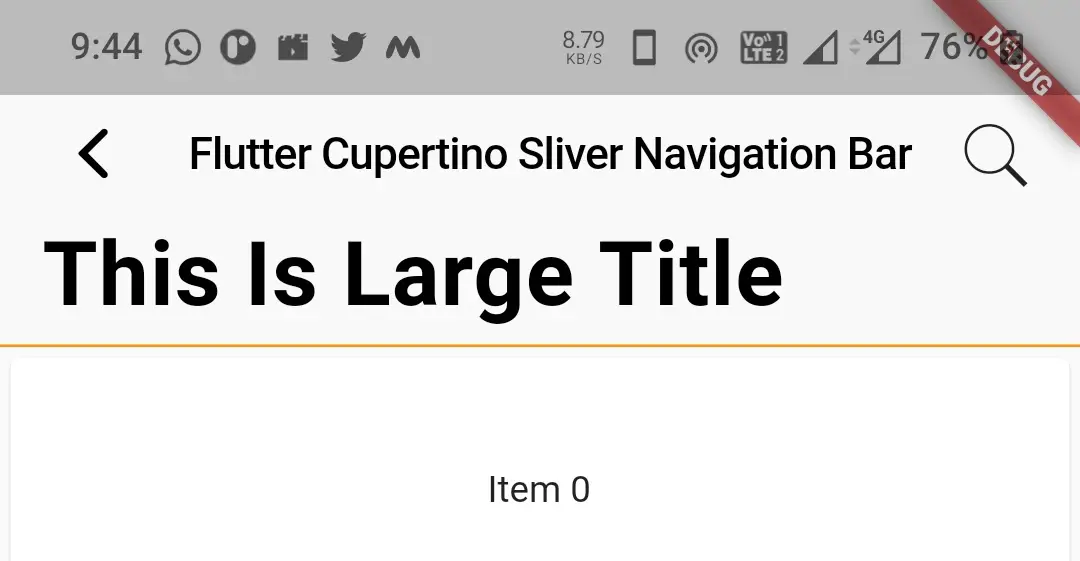
trailing
We will use this property to display a trailing widget. Generally actions like edit and search are used as trailing widgtes.
CupertinoSliverNavigationBar(
            leading: CupertinoNavigationBarBackButton(
              onPressed: ()
              { },
              color: CupertinoColors.label,
            ),
            middle: Text("Flutter Cupertino Sliver Navigation Bar"),
            automaticallyImplyLeading: true,
            automaticallyImplyTitle: true,
            previousPageTitle: "Profile"
            largeTitle: Text("This Is Large Title"),
            trailing: GestureDetector(
              child: Icon(CupertinoIcons.search),
              onTap: (){},
            ),
          ),
Output:
border
We can change the width and color of the border of a sliver navigation bar by using border property. It takes Border class constructor as value. By default the navigation bar displays a bottom border with 1px width. If we set this property to null there will be no border. We can display border for all the sides. In the below example i’m modifying the bottom border.
CupertinoSliverNavigationBar(
            leading: CupertinoNavigationBarBackButton(
              onPressed: ()
              { },
              color: CupertinoColors.label,
            ),
            middle: Text("Flutter Cupertino Sliver Navigation Bar"),
            automaticallyImplyLeading: true,
            automaticallyImplyTitle: true,
            previousPageTitle: "Profile"
            largeTitle: Text("This Is Large Title"),
            trailing: GestureDetector(
              child: Icon(CupertinoIcons.search),
              onTap: (){},
            ),
            border: Border(
                bottom:BorderSide(
                    width: 1,
                    color: CupertinoColors.activeOrange,
                    style: BorderStyle.solid
                )
            ),
          ),
Output:
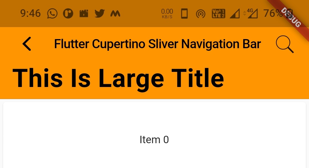
backgroundColor
We will use this property to apply or change background color to the sliver navigation bar. It takes CupertinoColors or Colors constants as value. To define a custom color use Color class constructor.
CupertinoSliverNavigationBar(
            leading: CupertinoNavigationBarBackButton(
              onPressed: ()
              { },
              color: CupertinoColors.label,
            ),
            middle: Text("Flutter Cupertino Sliver Navigation Bar"),
            automaticallyImplyLeading: true,
            automaticallyImplyTitle: true,
            previousPageTitle: "Profile"
            largeTitle: Text("This Is Large Title"),
            trailing: GestureDetector(
              child: Icon(CupertinoIcons.search),
              onTap: (){},
            ),
            backgroundColor: CupertinoColors.activeOrange,
          ),
Output:
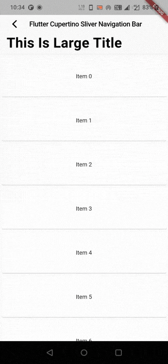
Lets create an exampe where we will implement cupertino sliver navigation bar in flutter using CupertinoSliverNavigationBar widget. In this example we will display a sliver navigation bar with a leading & middle widget with some text. For leading we will display back button. We will aslo provide a large title and a sliverList below the sliver navigation bar.
First add CustomScrollView to the child of cupertinoPageScaffold since it is a sliverGroup.
child: CustomScrollView(
        slivers: [

        ],
      )
Now add CupertinoSliverNavigationBar widget to the sliver group.
child: CustomScrollView(
        slivers: [
          CupertinoSliverNavigationBar(
            leading: CupertinoNavigationBarBackButton(
              onPressed: ()
              { },
              color: CupertinoColors.label,
            ),
            middle: Text("Flutter Cupertino Sliver Navigation Bar"),
            largeTitle: Text("This Is Large Title"),
          ),
        ],
      )
Like we have discussed we need to add a sliverList or sliverGrid to the sliver group in order for sliver navigation bar to work. In this example we will add a sliver list that will display 20 items as children.
child: CustomScrollView(
        slivers: [
          CupertinoSliverNavigationBar(
            leading: CupertinoNavigationBarBackButton(
              onPressed: ()
              { },
              color: CupertinoColors.label,
            ),
            middle: Text("Flutter Cupertino Sliver Navigation Bar"),
            largeTitle: Text("This Is Large Title"),
          ),
          SliverList(
            delegate: SliverChildListDelegate(
              List.generate(20, (index) {
                return Card(
                  child: Container(
                    height:100,
                    alignment: Alignment.center,
                    child: Text("Item $index")
                  )
                );
              }
              ),
            )
          )
        ],
      )
Complete Code:
We are done with creating everything. Now lets sum up all the code snippets together to complete our cupertino sliver navigation bar example in flutter. Create a new flutter project and replace the code in main.dart file with the code below.
import 'package:flutter/cupertino.dart';
import 'package:flutter/material.dart';
import 'package:flutter/widgets.dart';

void main()
{
  runApp(MyApp());
}

class MyApp extends StatelessWidget {
  @override
  Widget build(BuildContext context) {
    return MaterialApp(
      title: 'Flutter Learning',
      theme: ThemeData(
        primarySwatch: Colors.blue,
      ),
      home:MyHomePage(),
    );
  }
}

class MyHomePage extends StatefulWidget {
  @override
  _MyHomePageState createState()
  {
    return _MyHomePageState();
  }
}

class _MyHomePageState extends State<MyHomePage> {
  bool state = false;
  @override
  Widget build(BuildContext context) {
    return new CupertinoPageScaffold(
      child: CustomScrollView(
        slivers: [
          CupertinoSliverNavigationBar(
            leading: CupertinoNavigationBarBackButton(
              onPressed: ()
              { },
              color: CupertinoColors.label,
            ),
            middle: Text("Flutter Cupertino Sliver Navigation Bar"),
            largeTitle: Text("This Is Large Title"),
          ),
          SliverList(
            delegate: SliverChildListDelegate(
              List.generate(20, (index) {
                return Card(
                  child: Container(
                    height:100,
                    alignment: Alignment.center,
                    child: Text("Item $index")
                  )
                );
              }
              ),
            )
          )
        ],
      )
    );
  }
}
Output:
That brings an end to the tutorial on how to create & use cupertino sliver navigation bar in flutter. We have also seen an example where we have used the CupertinoSliverNavigationBar widget and customized its style. Let’s catch up with some other widgets in the next post. Have a great day !!
Do like & share my Facebook page. Subscribe to the newsletter if you find this post helpful. Thank you !!
Reference: Flutter Official Documentation.


Leave a Reply