
Flutter GridView
Gridview in flutter is a widget used to display other widgets in rows and columns. For example, using grid view we can display products in 2 dimension in e-commerce applications. It allows us to view multiple items in the same screen space as it is a scrollable widget. Generally, images or images & text are used as children for a grid view. We can use any widget to display as a child instead of images. Since it is a scrollable widget we have to specify the scroll direction (horizontal/vertical).
Flutter provides a widget called GridView which allows us to add a grid view to our flutter application. The most common usage of GridView is the gallery app on our mobiles. In this tutorial, we will learn how to use a GridView widget in flutter with example. We will also learn how to customize the widget using different properties.
Creating GridView In Flutter
We can create a grid view in flutter by calling the constructor of GridView class and providing it with required properties. It has one required property which is gridDelegate. It controls the layout of the child widgets of the grid view.
Constructor :
GridView(

    {Key? key,
    Axis scrollDirection = Axis.vertical,
    bool reverse = false,
    ScrollController? controller,
    bool? primary,
    ScrollPhysics? physics,
    bool shrinkWrap = false,
    EdgeInsetsGeometry? padding,
    required SliverGridDelegate gridDelegate,
    bool addAutomaticKeepAlives = true,
    bool addRepaintBoundaries = true,
    bool addSemanticIndexes = true,
    double? cacheExtent,
    List<Widget> children = const <Widget>[],
    int? semanticChildCount,
    DragStartBehavior dragStartBehavior = DragStartBehavior.start,
    Clip clipBehavior = Clip.hardEdge,
    ScrollViewKeyboardDismissBehavior keyboardDismissBehavior = ScrollViewKeyboardDismissBehavior.manual,
    String? restorationId}

)
Basic implementation of a grid view in flutter.
GridView(
        gridDelegate: SliverGridDelegateWithFixedCrossAxisCount(
          crossAxisCount: 2,
          crossAxisSpacing: 5,
          mainAxisSpacing: 5,
          mainAxisExtent: 150
        ),
        children: [
          widget1,
          widget2,
          ...
        ],
        padding: EdgeInsets.all(10),
        shrinkWrap: true,
      )
Flutter GridView Properties
The important properties of a GridView are :
- gridDelegate
- padding
- shrinkWrap
- reverse
- scrollDirection
gridDelegate
It takes sliverGridDelegate object as the value. A delegate that controls the layout of the children within the GridView. We can use SliverGridDelegateWithFixedCrossAxisCount or SliverGridDelegateWithMaxCrossAxisExtent as value.
SliverGridDelegateWithFixedCrossAxisCount
As the name suggests we can define the crossAxisCount which is nothing but the number of columns in a row. The column count will not change even for devices with more screen width. It has 5 properties that control the layout of the children. Let’s see them with an example.
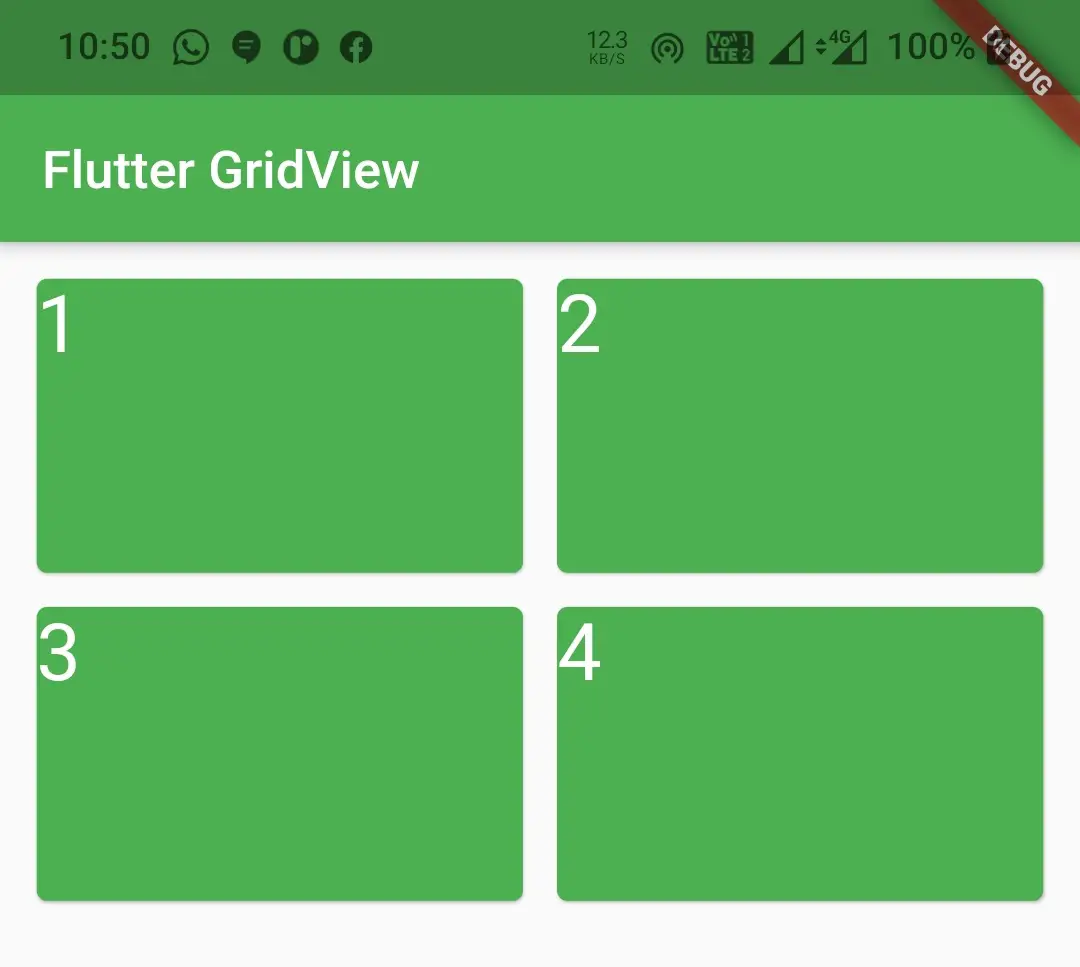
crossAxisCount : It is used to define the number of columns we want to display in the grid view. It takes int as value.
GridView(
        gridDelegate: SliverGridDelegateWithFixedCrossAxisCount(
          crossAxisCount: 2,
        ),
        children: [
          Card(
              color: Colors.green,
              child: Text("1", style: TextStyle(color: Colors.white,fontSize: 30),),
          ),
          Card(
            color: Colors.green,
            child: Text("2", style: TextStyle(color: Colors.white,fontSize: 30),),
          ),
          Card(
            color: Colors.green,
            child: Text("3", style: TextStyle(color: Colors.white,fontSize: 30),),
          ),
          Card(
            color: Colors.green,
            child: Text("4", style: TextStyle(color: Colors.white,fontSize: 30),),
          ),
        ],
      )
Output :
crossAxisSpacing & mainAxisSpacing
The crossAxisSpacing is used to provide space between the columns in a row. The mainAxisSpacing is used to provide spacing between rows. Both take double as value.
GridView(
        gridDelegate: SliverGridDelegateWithFixedCrossAxisCount(
          crossAxisCount: 2,
          crossAxisSpacing: 5,
          mainAxisSpacing: 5,
        ),
        children: [
          Card(
              color: Colors.green,
              child: Text("1", style: TextStyle(color: Colors.white,fontSize: 30),),
          ),
          Card(
            color: Colors.green,
            child: Text("2", style: TextStyle(color: Colors.white,fontSize: 30),),
          ),
          Card(
            color: Colors.green,
            child: Text("3", style: TextStyle(color: Colors.white,fontSize: 30),),
          ),
          Card(
            color: Colors.green,
            child: Text("4", style: TextStyle(color: Colors.white,fontSize: 30),),
          ),
        ],
      )
Output :
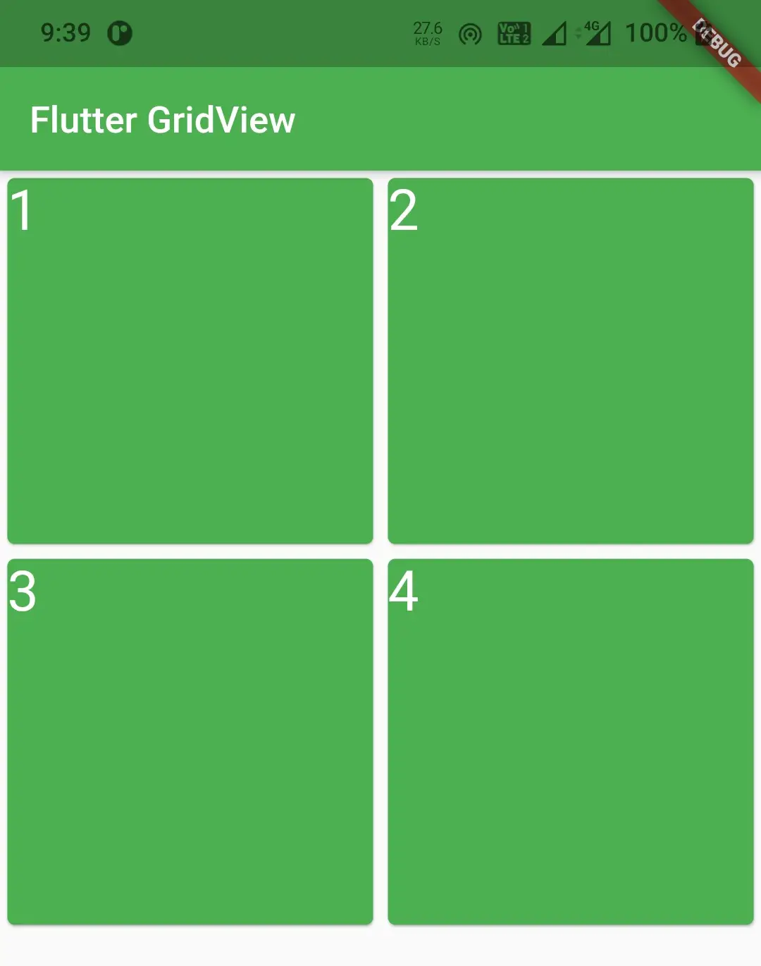
mainAxisExtent
It is used to change the height of the grid view child. It takes double as value.
GridView(
        gridDelegate: SliverGridDelegateWithFixedCrossAxisCount(
          crossAxisCount: 2,
          crossAxisSpacing: 5,
          mainAxisSpacing: 5,
          mainAxisExtent: 120,
        ),
        children: [
          Card(
              color: Colors.green,
              child: Text("1", style: TextStyle(color: Colors.white,fontSize: 30),),
          ),
          Card(
            color: Colors.green,
            child: Text("2", style: TextStyle(color: Colors.white,fontSize: 30),),
          ),
          Card(
            color: Colors.green,
            child: Text("3", style: TextStyle(color: Colors.white,fontSize: 30),),
          ),
          Card(
            color: Colors.green,
            child: Text("4", style: TextStyle(color: Colors.white,fontSize: 30),),
          ),
        ],
      )
Output :
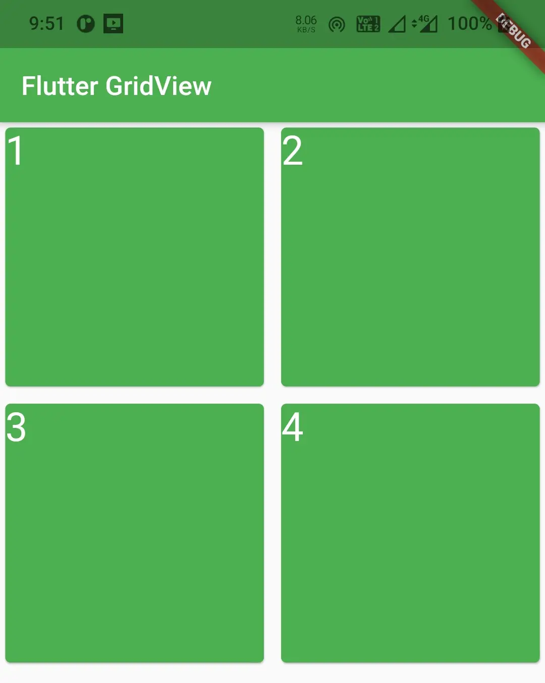
childAspectRatio
The ratio of cross-axis to the main-axis extent of each child in the grid view. It takes double as value.
GridView(
        gridDelegate: SliverGridDelegateWithFixedCrossAxisCount(
          crossAxisCount: 2,
          crossAxisSpacing: 5,
          mainAxisSpacing: 5,
          mainAxisExtent: 120,
          childAspectRatio: 1
        ),
        children: [
          Card(
              color: Colors.green,
              child: Text("1", style: TextStyle(color: Colors.white,fontSize: 30),),
          ),
          Card(
            color: Colors.green,
            child: Text("2", style: TextStyle(color: Colors.white,fontSize: 30),),
          ),
          Card(
            color: Colors.green,
            child: Text("3", style: TextStyle(color: Colors.white,fontSize: 30),),
          ),
          Card(
            color: Colors.green,
            child: Text("4", style: TextStyle(color: Colors.white,fontSize: 30),),
          ),
        ],
      )
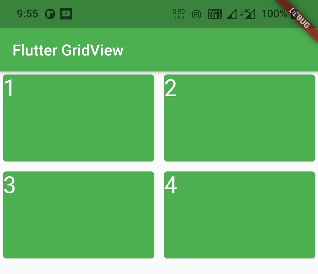
SliverGridDelegateWithMaxCrossAxisExtent
Using this delegate we can define the max-width and height of the child widget in the grid. It means the column count will vary based on the width of the device’s screen. It also has 5 properties that control the child’s layout.
maxCrossAxisExten & mainAxisExtent
To set the maximum width of the child widget of the grid view use maxCrossAxisExtent. To set the height of the child widget inside the grid view use mainAxisExtent. Both take double as value.
GridView(
        gridDelegate: SliverGridDelegateWithMaxCrossAxisExtent(
          maxCrossAxisExtent: 150,
          mainAxisExtent: 50,
        ),
        children: [
          Card(
              color: Colors.green,
              child: Text("1", style: TextStyle(color: Colors.white,fontSize: 30),),
          ),
          Card(
            color: Colors.green,
            child: Text("2", style: TextStyle(color: Colors.white,fontSize: 30),),
          ),
          Card(
            color: Colors.green,
            child: Text("3", style: TextStyle(color: Colors.white,fontSize: 30),),
          ),
          Card(
            color: Colors.green,
            child: Text("4", style: TextStyle(color: Colors.white,fontSize: 30),),
          ),
        ],
      )
Output :
crossAxisSpacing, mainAxisSpacing & childAspectRatio
The crossAxisSpacing, mainAxisSpacing and childAspectRatio work exactly like the similarly named properties of the sliverGridDelegateWithFixedCrossAxisCount deligate discussed above.
padding
Use this property to apply padding to the entire gridview. It takes EdgeinsetsGeometry as value.
GridView(
        gridDelegate: SliverGridDelegateWithFixedCrossAxisCount(
          crossAxisCount: 2,
          crossAxisSpacing: 5,
          mainAxisSpacing: 5,
          mainAxisExtent: 120,
          childAspectRatio: 1
        ),
        children: [
          Card(
              color: Colors.green,
              child: Text("1", style: TextStyle(color: Colors.white,fontSize: 30),),
          ),
          Card(
            color: Colors.green,
            child: Text("2", style: TextStyle(color: Colors.white,fontSize: 30),),
          ),
          Card(
            color: Colors.green,
            child: Text("3", style: TextStyle(color: Colors.white,fontSize: 30),),
          ),
          Card(
            color: Colors.green,
            child: Text("4", style: TextStyle(color: Colors.white,fontSize: 30),),
          ),
        ],
       padding: EdgeInsets.all(10),
      )
Output :
shrinkWrap
It takes boolean as value which is false by default. If shrinkWrap is false the grid view will take more space for scrolling in scroll direction. It will cause memory wastage and reduces the app performance. So to avoid memory leakage we have to set it to true which will wrap the child widgets with shrinkWrap.
GridView(
        gridDelegate: SliverGridDelegateWithFixedCrossAxisCount(
          crossAxisCount: 2,
          crossAxisSpacing: 5,
          mainAxisSpacing: 5,
          mainAxisExtent: 120,
          childAspectRatio: 1
        ),
        children: [
          Card(
              color: Colors.green,
              child: Text("1", style: TextStyle(color: Colors.white,fontSize: 30),),
          ),
          Card(
            color: Colors.green,
            child: Text("2", style: TextStyle(color: Colors.white,fontSize: 30),),
          ),
          Card(
            color: Colors.green,
            child: Text("3", style: TextStyle(color: Colors.white,fontSize: 30),),
          ),
          Card(
            color: Colors.green,
            child: Text("4", style: TextStyle(color: Colors.white,fontSize: 30),),
          ),
        ],
       padding: EdgeInsets.all(10),
       shrinkWrap: true
      )
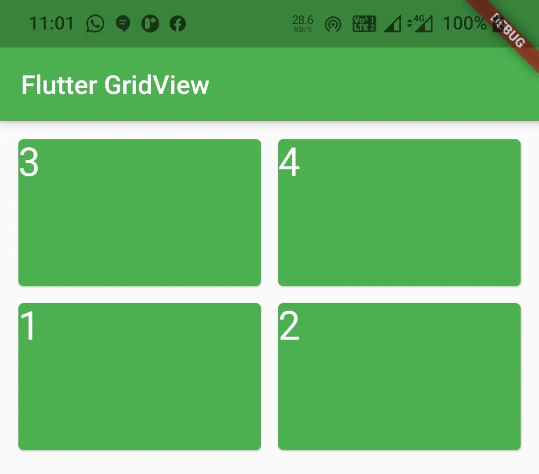
reverse
It takes boolean as value which is false by default. Use this property if you want to display the children widgets of the grid view in reverse order.
GridView(
        gridDelegate: SliverGridDelegateWithFixedCrossAxisCount(
          crossAxisCount: 2,
          crossAxisSpacing: 5,
          mainAxisSpacing: 5,
          mainAxisExtent: 120,
          childAspectRatio: 1
        ),
        children: [
          Card(
              color: Colors.green,
              child: Text("1", style: TextStyle(color: Colors.white,fontSize: 30),),
          ),
          Card(
            color: Colors.green,
            child: Text("2", style: TextStyle(color: Colors.white,fontSize: 30),),
          ),
          Card(
            color: Colors.green,
            child: Text("3", style: TextStyle(color: Colors.white,fontSize: 30),),
          ),
          Card(
            color: Colors.green,
            child: Text("4", style: TextStyle(color: Colors.white,fontSize: 30),),
          ),
        ],
        padding: EdgeInsets.all(10),
        shrinkWrap: true,
        reverse: true,
      )
Output :
scrollDirection
It takes Axis as value. By default, the value is Axis.vertical. Use this property to change the scroll direction of the grid view.
GridView(
        gridDelegate: SliverGridDelegateWithFixedCrossAxisCount(
          crossAxisCount: 2,
          crossAxisSpacing: 5,
          mainAxisSpacing: 5,
          mainAxisExtent: 120,
          childAspectRatio: 1
        ),
        children: [
          Card(
              color: Colors.green,
              child: Text("1", style: TextStyle(color: Colors.white,fontSize: 30),),
          ),
          Card(
            color: Colors.green,
            child: Text("2", style: TextStyle(color: Colors.white,fontSize: 30),),
          ),
          Card(
            color: Colors.green,
            child: Text("3", style: TextStyle(color: Colors.white,fontSize: 30),),
          ),
          Card(
            color: Colors.green,
            child: Text("4", style: TextStyle(color: Colors.white,fontSize: 30),),
          ),
        ],
        padding: EdgeInsets.all(10),
        shrinkWrap: true,
        reverse: true,
        scrollDirection: Axis.horizontal
      )
Output :
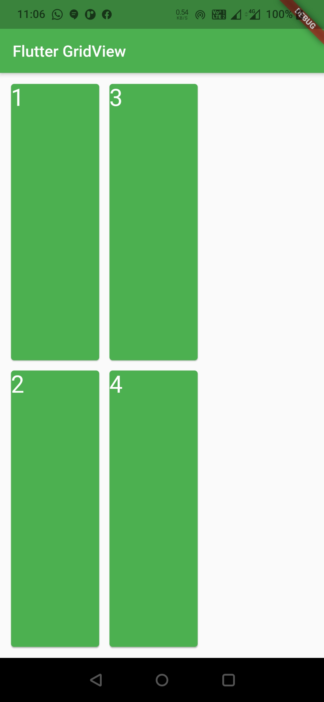
Note : When scroll direction is horizontal the main axis will be horizontal and cross axis will be vertical and vice versa. For example, when scroll direction is set to horizontal the mainAxisSpacing will create spacing between columns instead of rows. So when we change the scroll direction height will be width and width will be height.
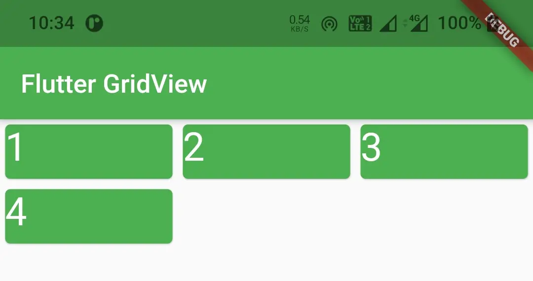
In flutter, we can create a gridview in 4 different ways other than the basic gridview discussed above. They are :
- GridView.count()
- GridView.builder()
- GridView.custom()
- GridView.extent()
GridView.count()
If you already know the size of the grid use GridView.count(). It will have fixed number of tiles on the cross axis. It is one of the most used grid layouts in flutter along with GridView.builder(). To create GridView.count() call the constructor and provide the required properties. The only required property for this widget is crossAxisCount.
GridView.count() Constructor :
GridView.count(

    {Key? key,
    Axis scrollDirection = Axis.vertical,
    bool reverse = false,
    ScrollController? controller,
    bool? primary,
    ScrollPhysics? physics,
    bool shrinkWrap = false,
    EdgeInsetsGeometry? padding,
    required int crossAxisCount,
    double mainAxisSpacing = 0.0,
    double crossAxisSpacing = 0.0,
    double childAspectRatio = 1.0,
    bool addAutomaticKeepAlives = true,
    bool addRepaintBoundaries = true,
    bool addSemanticIndexes = true,
    double? cacheExtent,
    List<Widget> children = const <Widget>[],
    int? semanticChildCount,
    DragStartBehavior dragStartBehavior = DragStartBehavior.start,
    ScrollViewKeyboardDismissBehavior keyboardDismissBehavior = ScrollViewKeyboardDismissBehavior.manual,
    String? restorationId,
    Clip clipBehavior = Clip.hardEdge}

)
GridView.count() Example In Flutter
Let’s have an example where we use GridView.count() for creating our gridview and display some images. Create a new flutter project and replace the main.dart file code with below code.
import 'package:flutter/cupertino.dart';
import 'package:flutter/material.dart';

void main() {
  runApp(MyApp());
}

class MyApp extends StatelessWidget {
  @override
  Widget build(BuildContext context) {
    return MaterialApp(
      title: 'Flutter App Learning',
      theme: ThemeData(
        primarySwatch: Colors.green,
      ),
      home: MyHomePage()
    );
  }
}

class MyHomePage extends StatefulWidget {
  MyHomePage({Key? key}) : super(key: key);
  @override
  _MyHomePageState createState() => _MyHomePageState();
}

class _MyHomePageState extends State<MyHomePage> {

  @override
  Widget build(BuildContext context) {
    return Scaffold(
      appBar: AppBar(
        title: Text("Flutter GridView"),
      ),
      body: GridView.count(
        crossAxisCount: 4,
        children:[
          Container(
            color: Colors.green,
            child: Column(
              mainAxisAlignment: MainAxisAlignment.spaceEvenly,
              children: [
                Icon(Icons.home, color: Colors.white,),
                Text("Home", style:TextStyle(color: Colors.white))
              ],
            ),
          ),
          Container(
            color: Colors.green,
            child: Column(
              mainAxisAlignment: MainAxisAlignment.spaceEvenly,
              children: [
                Icon(Icons.account_circle, color: Colors.white,),
                Text("Account", style:TextStyle(color: Colors.white))
              ],
            ),
          ),
          Container(
            color: Colors.green,
            child: Column(
              mainAxisAlignment: MainAxisAlignment.spaceEvenly,
              children: [
                Icon(Icons.message, color: Colors.white,),
                Text("Messages", style:TextStyle(color: Colors.white))
              ],
            ),
          ),
          Container(
            color: Colors.green,
            child: Column(
              mainAxisAlignment: MainAxisAlignment.spaceEvenly,
              children: [
                Icon(Icons.list_alt, color: Colors.white,),
                Text("Orders", style:TextStyle(color: Colors.white))
              ],
            ),
          ),
        ],
        padding: EdgeInsets.all(10),
        shrinkWrap: true,
        mainAxisSpacing: 10,
        crossAxisSpacing: 10,
      )
    );
  }
}
Output :
GridView.builder()
Use this constructor if you want to create a grid dynamically or with data from API (backend). This constructor is suitable if we don’t know the number of children. We can use either a SliverGridDelegateWithFixedCrossAxisCount or a SliverGridDelegateWithMaxCrossAxisExtent for the gridDelegate.
To create GridView.builder() call the constructor and provide required properties. It has two required properties itemBuilder and gridDelegate. The item builder is used to build the children. The gridDelegate is used to control the layout of the children in the grid view. Even the itemCount is not a required property we have to provide it with some value. If we don’t provide a value to it the grid view will be infinite and throws errors.
GridView.builder() Constructor :
GridView.builder(

    {Key? key,
    Axis scrollDirection = Axis.vertical,
    bool reverse = false,
    ScrollController? controller,
    bool? primary,
    ScrollPhysics? physics,
    bool shrinkWrap = false,
    EdgeInsetsGeometry? padding,
    required SliverGridDelegate gridDelegate,
    required IndexedWidgetBuilder itemBuilder,
    int? itemCount,
    bool addAutomaticKeepAlives = true,
    bool addRepaintBoundaries = true,
    bool addSemanticIndexes = true,
    double? cacheExtent,
    int? semanticChildCount,
    DragStartBehavior dragStartBehavior = DragStartBehavior.start,
    ScrollViewKeyboardDismissBehavior keyboardDismissBehavior = ScrollViewKeyboardDismissBehavior.manual,
    String? restorationId,
    Clip clipBehavior = Clip.hardEdge}

)
GridView.builder() Example In Flutter
Let’s create an example where we display some images from a list using GridView.builder(). Create a new flutter project and replace the main.dart file code with the below code. Add images to the project with image names I’ve used in the below example. To use your own images, replace the image names in the below example with your image names.
import 'package:flutter/cupertino.dart';
import 'package:flutter/material.dart';
void main() {
runApp(MyApp());
}
class MyApp extends StatelessWidget {
@override
Widget build(BuildContext context) {
return MaterialApp(
title: 'Flutter App Learning',
theme: ThemeData(
primarySwatch: Colors.green,
),
home: MyHomePage()
);
}
}
class MyHomePage extends StatefulWidget {
MyHomePage({Key? key}) : super(key: key);
@override
_MyHomePageState createState() => _MyHomePageState();
}
class _MyHomePageState extends State<MyHomePage> {
List<String> images = [
"assets/images/scenary.jpg",
"assets/images/scenary_red.jpg",
"assets/images/waterfall.jpg",
"assets/images/tree.jpg",
"assets/images/scenary.jpg",
"assets/images/scenary_red.jpg",
"assets/images/waterfall.jpg",
"assets/images/tree.jpg",
];
@override
Widget build(BuildContext context) {
return Scaffold(
appBar: AppBar(
title: Text("Flutter GridView"),
),
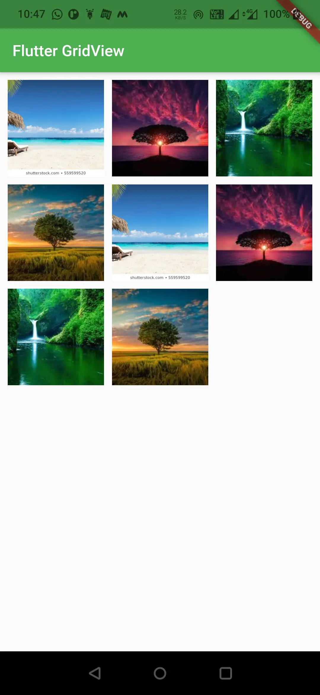
body: GridView.builder(
itemCount: images.length,
itemBuilder: (BuildContext context, int index) {
return Image.asset(images[index], fit: BoxFit.cover);
},
gridDelegate: SliverGridDelegateWithFixedCrossAxisCount(
crossAxisCount: 3,
mainAxisSpacing: 10,
crossAxisSpacing: 10
),
padding: EdgeInsets.all(10),
shrinkWrap: true,
)
);
}
}
Output :
GridView.extent()
Use this constructor to create a grid view with children having custom cross axis extent value. For GridView.extent() constructor we have to define the maxCrossAxisExtent for the children. It uses a SliverGridDelegateWithMaxCrossAxisExtent as the gridDelegate.
To create a GridView.extent() call the constructor and provide the required properties. The only required property for this constructor is maxCrossAxisExtent ( Width of the child tile ). Since we have to define the width of the tile the number of columns in a row will change based on the device width.
Flutter GridView.extent() Constructor :
GridView.extent(

    {Key? key,
    Axis scrollDirection = Axis.vertical,
    bool reverse = false,
    ScrollController? controller,
    bool? primary,
    ScrollPhysics? physics,
    bool shrinkWrap = false,
    EdgeInsetsGeometry? padding,
    required double maxCrossAxisExtent,
    double mainAxisSpacing = 0.0,
    double crossAxisSpacing = 0.0,
    double childAspectRatio = 1.0,
    bool addAutomaticKeepAlives = true,
    bool addRepaintBoundaries = true,
    bool addSemanticIndexes = true,
    double? cacheExtent,
    List<Widget> children = const <Widget>[],
    int? semanticChildCount,
    DragStartBehavior dragStartBehavior = DragStartBehavior.start,
    ScrollViewKeyboardDismissBehavior keyboardDismissBehavior = ScrollViewKeyboardDismissBehavior.manual,
    String? restorationId,
    Clip clipBehavior = Clip.hardEdge}

)
GridView.extent() Example In Flutter
The below example will demonstrate how to create and use a GridView.extent in flutter. Let’s display tiles with different colors in this example. Create a new flutter project and replace the code of main.dart file with the below code.
import 'package:flutter/cupertino.dart';
import 'package:flutter/material.dart';
void main() {
runApp(MyApp());
}
class MyApp extends StatelessWidget {
@override
Widget build(BuildContext context) {
return MaterialApp(
title: 'Flutter App Learning',
theme: ThemeData(
primarySwatch: Colors.green,
),
home: MyHomePage()
);
}
}
class MyHomePage extends StatefulWidget {
MyHomePage({Key? key}) : super(key: key);
@override
_MyHomePageState createState() => _MyHomePageState();
}
class _MyHomePageState extends State<MyHomePage> {
@override
Widget build(BuildContext context) {
return Scaffold(
appBar: AppBar(
title: Text("Flutter GridView"),
),
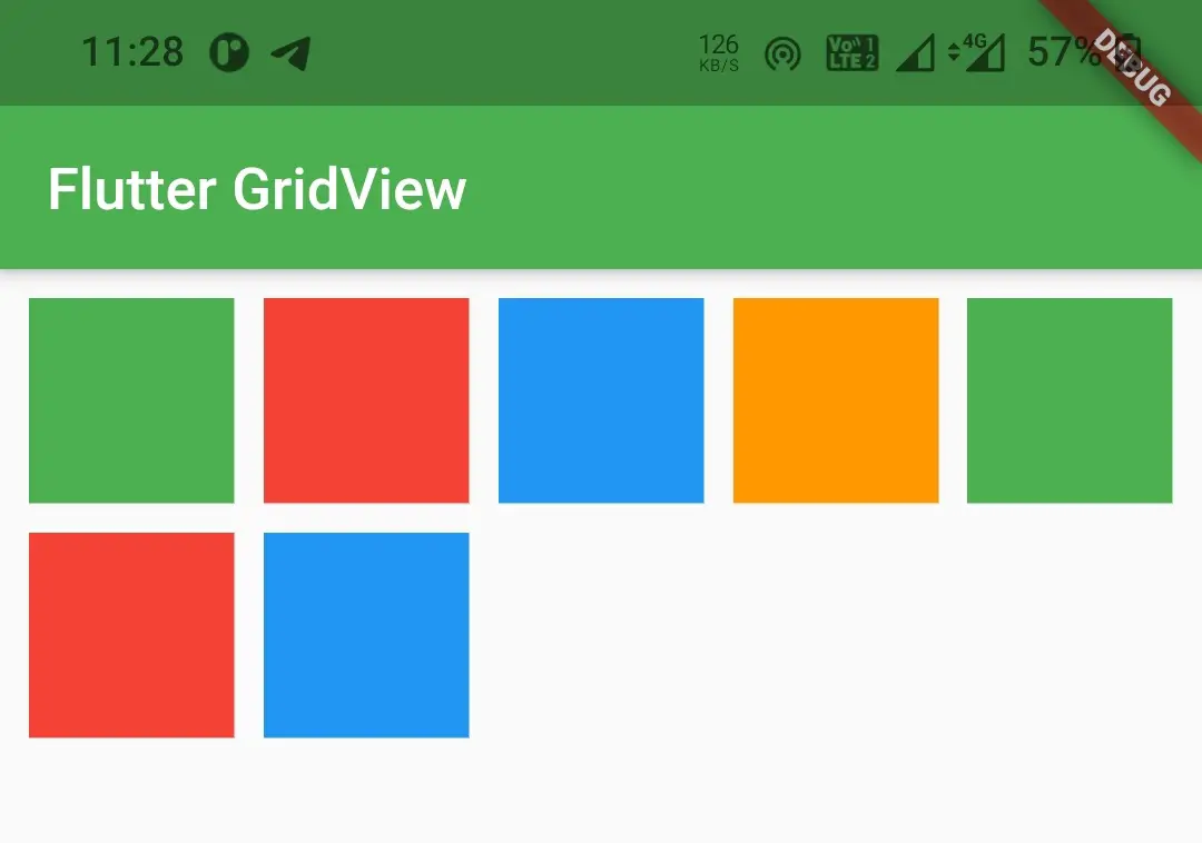
body: GridView.extent(
maxCrossAxisExtent: 70,
crossAxisSpacing: 10,
mainAxisSpacing: 10,
children: [
Container(
color: Colors.green,
),
Container(
color: Colors.red,
),
Container(
color: Colors.blue,
),
Container(
color: Colors.orange,
),
Container(
color: Colors.green,
),
Container(
color: Colors.red,
),
Container(
color: Colors.blue,
),
],
padding: EdgeInsets.all(10),
shrinkWrap: true,
)
);
}
}
Output :
GridView.custom()
To create a GridView.custom() in flutter call the constructor and provide the required properties. It has two required properties which are gridDelegate & childrenDelegate. The gridDelegate is used to control the layout of the children. We can use SliverGridDelegateWithFixedCrossAxisCount() or SliverGridDelegateWithMaxCrossAxisExtent() as value for gridDelegate property. ChildrenDelegate is used to build/generate the children for the grid view.
Flutter GridView.custom() Constructor :
const GridView.custom(

    {Key? key,
    Axis scrollDirection = Axis.vertical,
    bool reverse = false,
    ScrollController? controller,
    bool? primary,
    ScrollPhysics? physics,
    bool shrinkWrap = false,
    EdgeInsetsGeometry? padding,
    required SliverGridDelegate gridDelegate,
    required SliverChildDelegate childrenDelegate,
    double? cacheExtent,
    int? semanticChildCount,
    DragStartBehavior dragStartBehavior = DragStartBehavior.start,
    ScrollViewKeyboardDismissBehavior keyboardDismissBehavior = ScrollViewKeyboardDismissBehavior.manual,
    String? restorationId,
    Clip clipBehavior = Clip.hardEdge}

)
GridView.custom Example In Flutter
Let’s see the implementation of GridView.custom() in the below example. We will display a grid of images in this example. Create a new flutter project and replace the code of main.dart file with the below code.
import 'package:flutter/cupertino.dart';
import 'package:flutter/material.dart';
void main() {
runApp(MyApp());
}
class MyApp extends StatelessWidget {
@override
Widget build(BuildContext context) {
return MaterialApp(
title: 'Flutter App Learning',
theme: ThemeData(
primarySwatch: Colors.green,
),
home: MyHomePage()
);
}
}
class MyHomePage extends StatefulWidget {
MyHomePage({Key? key}) : super(key: key);
@override
_MyHomePageState createState() => _MyHomePageState();
}
class _MyHomePageState extends State<MyHomePage> {
List<String> images = [
"assets/images/scenary.jpg",
"assets/images/scenary_red.jpg",
"assets/images/waterfall.jpg",
"assets/images/tree.jpg",
"assets/images/scenary.jpg",
"assets/images/scenary_red.jpg",
"assets/images/waterfall.jpg",
"assets/images/tree.jpg",
];
@override
Widget build(BuildContext context) {
return Scaffold(
appBar: AppBar(
title: Text("Flutter GridView"),
),
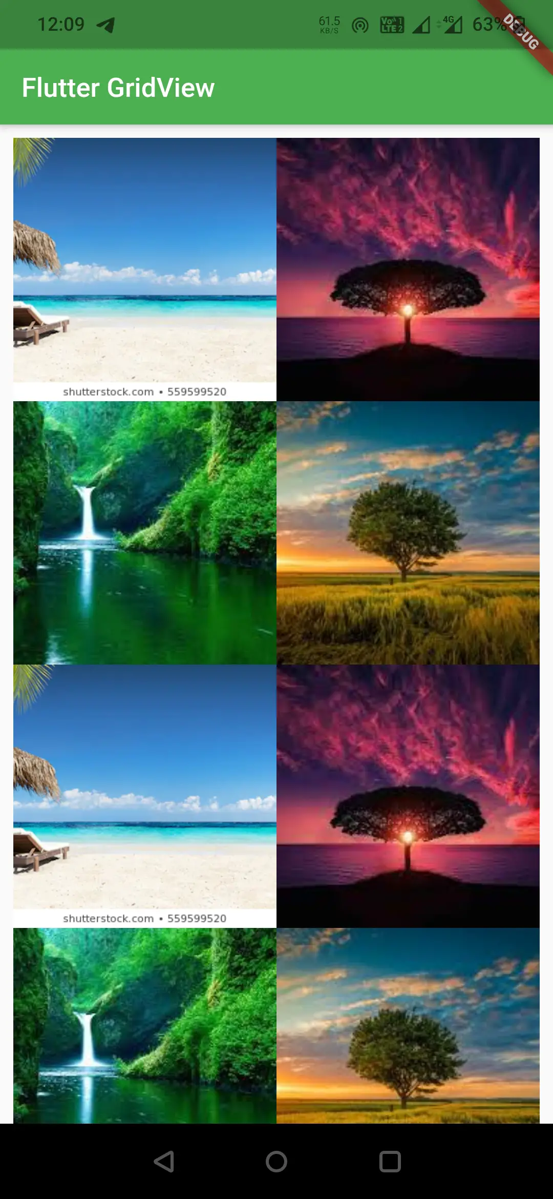
body: GridView.custom(
gridDelegate: SliverGridDelegateWithFixedCrossAxisCount(
crossAxisCount: 2,
),
childrenDelegate: SliverChildBuilderDelegate((BuildContext, index){
return Image.asset(images[index], fit: BoxFit.cover,);
},
childCount: 8,
),
padding: EdgeInsets.all(10),
shrinkWrap: true,
)
);
}
}
Output :
That brings an end to the tutorial on how to create and use a GridView in flutter. We have also seen different constructors of GridView with examples. Let’s catch up with some other widget in the next post. Have a great day !!
Do like & share my Facebook page. Subscribe to the newsletter if you find this post helpful. Thank you !!
Reference : Flutter Official Documentation.


Leave a Reply