
Flutter Linear Progress Indicator Widget
Linear Progress Indicator is a material widget in flutter. A linear progress indicator informs the user that the application is busy by displaying an animating linear bar. It blocks the user from interacting with the application when the application is busy. Flutter provides a widget called LinearProgressIndicator which allows us to add a linear progress indicator to our application. It is used in instances such as downloading and uploading content, fetching data from api, processing data etc.
This tutorial shows you how to use Linear Progress Indicator in flutter. You will also learn how to customize & style the widget with different properties with example.
If you want to show circular progress instead, consider using Circular progress indicator widget.
There are two types of linear progress indicators :
- Determinate
- Indeterminate
Detreminate
Determinate progress indicator means we can determine the progress based on the value provided to it. The value indicates the amount of completion of the task that is going on. To create a determinate progress indicator, we should provide a non-null value to the value property of the circular progress indicator widget. The value should fall between 0.0 and 1.0.
Indeterminate
Indeterminate progress indicator means we cannot determine the progress. It just indicates that progress is happening but won’t show the amount of completion of the task which is going on. To create an indeterminate progress indicator set the value property of the widget to null or ignore using this property at all.
Creating Linear Progress Indicator
To create a linear progress indicator, flutter provides a class called LinearProgressIndicator. We have to call its constructor. There are no required properties for this widget so we can directly call the constructor.
Flutter LinearProgressIndicator Constructor :
LinearProgressIndicator(
    {Key? key,
    double? value,
    Color? backgroundColor,
    Color? color,
    Animation<Color?>? valueColor,
    double? minHeight,
    String? semanticsLabel,
    String? semanticsValue}
)
Below is the basic example code to add linear progress indicator to our flutter application.
LinearProgressIndicator()
Flutter Linear Progress Indicator Properties
The properties of a linear progress indicator are :
- value
- backgroundColor
- color
- valueColor
- minHeight
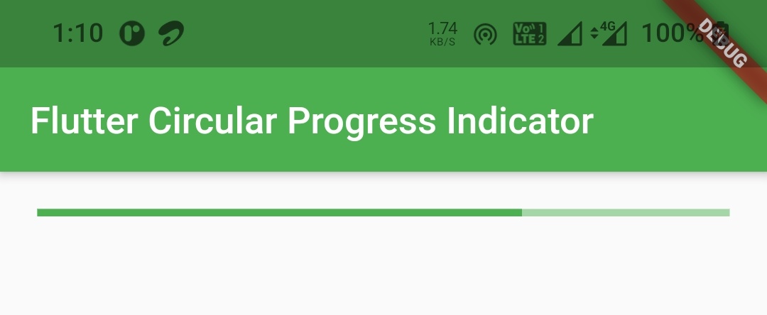
value
We will use this property to indicate the amount of completion of task that is currently running. It takes a value from 0 to 1 where 0 indicates start of task and 1 indicates completion of task.
Container(
          alignment: Alignment.topCenter,
          margin: EdgeInsets.all(20),
          child: LinearProgressIndicator(
            value: 0.7,
          )
        )
Output :
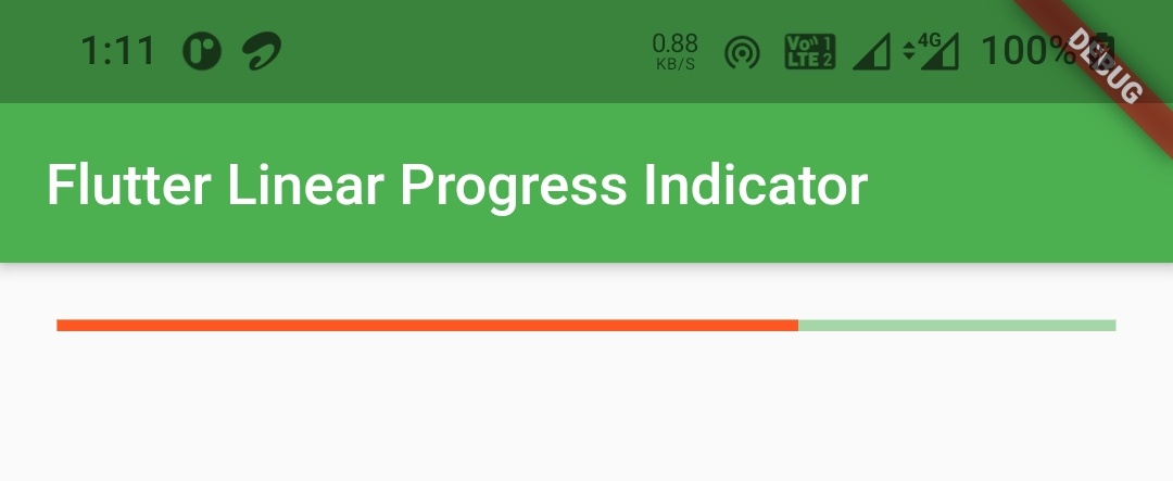
valueColor
We will use this property to apply color to the value indicator. It takes material color as value.
Container(
          alignment: Alignment.topCenter,
          margin: EdgeInsets.all(20),
          child: LinearProgressIndicator(
            value: 0.7,
            valueColor: new AlwaysStoppedAnimation<Color>(Colors.deepOrange),
          )
        )
Output :
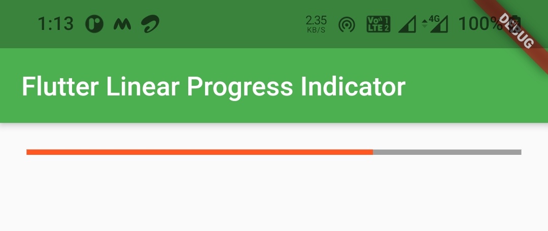
backgroundColor
We will use this property to change the background color of linear progress indicator. It takes material color as value.
Container(
          alignment: Alignment.topCenter,
          margin: EdgeInsets.all(20),
          child: LinearProgressIndicator(
            value: 0.7,
            valueColor: new AlwaysStoppedAnimation<Color>(Colors.deepOrange),
            backgroundColor: Colors.grey,
          )
        )
Output :
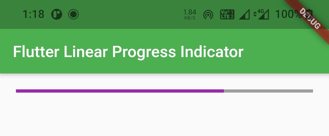
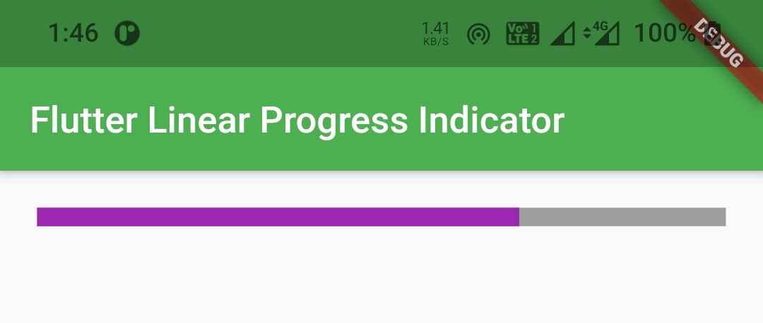
color
We will use this property to change the color of the indicator. It takes material color as value.
Container(
          alignment: Alignment.topCenter,
          margin: EdgeInsets.all(20),
          child: LinearProgressIndicator(
            value:0.7,
            backgroundColor: Colors.grey,
            color: Colors.purple
          )
        )
Output :
minHeight
We will use this property to set the minimum height of the bar. It takes double as value.
Container(
          alignment: Alignment.topCenter,
          margin: EdgeInsets.all(20),
          child: LinearProgressIndicator(
            value: 0.7,
            backgroundColor: Colors.grey,
            color: Colors.purple,
            minHeight: 10,
          )
        )
Output :
Flutter Linear Progress Indicator Example
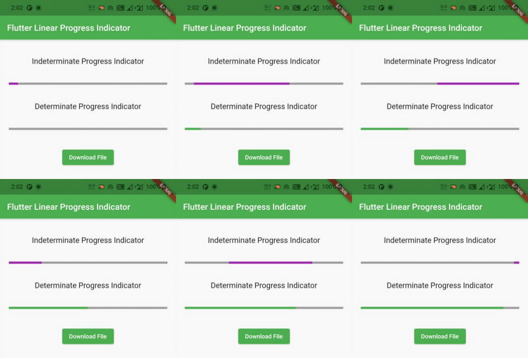
Lets create an example which shows the use of LinearProgressIndicator widget in flutter. In this example we will display both determinate and indeterminate linear progress indicators. For determinate progress indicator we will display a button, pressing on which will show the progress.
We will create a variable value whose value is initially 0.
double value = 0;
We will assign this variable to value property of linear progress indicator.
LinearProgressIndicator(
                      backgroundColor: Colors.grey,
                      color: Colors.green,
                      minHeight: 5,
                      value: value,
                    ),
Now we will create a function downloadData. Inside this function we will create new Timer.periodic and add 0.1 to the value variable every second inside the callback function of the timer. We will also update the state every time the callback function is invoked so that the UI gets updated with the progress. When the value becomes 1.0 we will cancel the timer.
void downloadData(){
     new Timer.periodic(
         Duration(seconds: 1),
             (Timer timer){
            setState(() {
              if(value == 1) {
                  timer.cancel();
              }
              else {
                  value = value + 0.1;
              }
            });
         }
     );
  }
Lets call the above function inside onPressed callback of an elevated button. Also assign 0 to value variable and update state so that the progress starts from 0 and the UI will also be updated with the value.
ElevatedButton(
                  child: Text("Download File"),
                  style: ElevatedButton.styleFrom(
                    onPrimary: Colors.white,
                    primary: Colors.green
                  ),
                  onPressed: ()
                  {
                    value = 0;
                    downloadData();
                    setState(() {

                    });
                  },
                ),
Complete Code:
Lets sum up all the code blocks above to complete our linear progress indicator example in flutter.
import 'dart:async';
import 'package:flutter/cupertino.dart';
import 'package:flutter/material.dart';
import 'package:flutter/widgets.dart';

void main()
{
  runApp(MyApp());
}

class MyApp extends StatelessWidget {
  @override
  Widget build(BuildContext context) {
    return MaterialApp(
      title: 'Flutter Learning',
      theme: ThemeData(
        primarySwatch: Colors.green,
      ),
      home: MyHomePage(),
    );
  }
}

class MyHomePage extends StatefulWidget {
  @override
  _MyHomePageState createState()
  {
    return _MyHomePageState();
  }
}

class _MyHomePageState extends State<MyHomePage> {
  double value  = 0;
  @override
  Widget build(BuildContext context) {
    return Scaffold(
        appBar: AppBar(
          title: Text("Flutter Linear Progress Indicator"),
        ),
        body: Container(
            alignment: Alignment.topCenter,
            margin: EdgeInsets.only(top: 20),
            child: Column(
                children:[
                  Container(
                    child: Text("Indeterminate Progress Indicator",style: TextStyle(fontSize: 18),),
                    margin: EdgeInsets.all(20),
                  ),
                  Container(
                    margin: EdgeInsets.all(20),
                    child: LinearProgressIndicator(
                      backgroundColor: Colors.grey,
                      color: Colors.purple,
                      minHeight: 5,
                    ),
                  ),
                  Container(
                    child: Text("Determinate Progress Indicator",style: TextStyle(fontSize: 18)),
                    margin: EdgeInsets.all(20),
                  ),
                  Container(
                    margin: EdgeInsets.all(20),
                    child: LinearProgressIndicator(
                      backgroundColor: Colors.grey,
                      color: Colors.green,
                      minHeight: 5,
                      value: value,
                    ),
                  ),
                  Container(
                    margin: EdgeInsets.all(20),
                    child: ElevatedButton(
                      child: Text("Download File"),
                      style: ElevatedButton.styleFrom(
                          onPrimary: Colors.white,
                          primary: Colors.green
                      ),
                      onPressed: ()
                      {
                        value = 0;
                        downloadData();
                        setState(() {

                        });
                      },
                    ),
                  )
                ]
            )
        )
    );
  }

  void downloadData(){
    new Timer.periodic(
        Duration(seconds: 1),
            (Timer timer){
          setState(() {
            if(value == 1) {
              timer.cancel();
            }
            else {
              value = value + 0.1;
            }
          });
        }
    );
  }
}
Output :
That brings an end to the tutorial on how to create and display or show linear progress indicator in flutter. We have also seen an example where we’ve used LinearProgressIndicator widget and customized it. Let’s catch up with some other widget in the next post. Have a great day !!
Do like & share my facebook page. Subscribe to newsletter if you find this post helpful. Thank you !!
Reference : Flutter Official Documentation.


Leave a Reply