
Flutter Slider
Slider is a material widget in flutter which is similar to seek bar. We can use sliders for controlling volume, brightness or seek a video/audio to our desired position, etc in our phones. You can choose a value either by dragging the thumb to your desired position or by tapping on the track.
A slider can be implemented in two different ways. The first one is to select from continuous values which is the default way. For this, we have to provide minimum and maximum values where users can select between them. The second one is to select from a discrete set of values. To use this we have to provide a non-null value to divisions property. The value provided to divisions will be the number of intervals. For example, if we set min to 0 and max to 10 and divisions to 10, then the slider will have values from 0 to 10 like 1, 2, 3, …10.
How To Create A Slider In Flutter ?
To create a slider in flutter we have to call the constructor of the slider class and provide the required arguments. The slider has two required properties which are value and onChanged callback. The value is used to indicate the position of the thumb. The onChanged callback is used to update the value when the user changes the slider position.
Constructor:
Slider({
Key key,
@required double value,
@required ValueChanged<double> onChanged,
ValueChanged<double> onChangeStart,
ValueChanged<double> onChangeEnd,
double min: 0.0,
double max: 1.0,
int divisions,
String label,
Color activeColor,
Color inactiveColor,
MouseCursor mouseCursor,
SemanticFormatterCallback semanticFormatterCallback,
FocusNode focusNode,
bool autofocus: false
})
Note: Slider.adaptive creates a CupertinoSlider if the target platform is iOS, creates a Material Design slider otherwise.
Also read:
Basic Slider Example:
import 'package:flutter/cupertino.dart';
import 'package:flutter/gestures.dart';
import 'package:flutter/material.dart';
import 'package:flutter/rendering.dart';
import 'dart:async';
void main() {
runApp(MyApp());
}
//void main() => runApp(MyApp());
class MyApp extends StatefulWidget {
@override
_MyState createState() {
return _MyState();
}
}
class _MyState extends State<MyApp>
{
bool _value = false;
double val = 1;
@override
Widget build(BuildContext context) {
return MaterialApp(
home: Scaffold(
appBar: AppBar(
backgroundColor: Colors.green,
title: Text("Flutter Slider"),
),
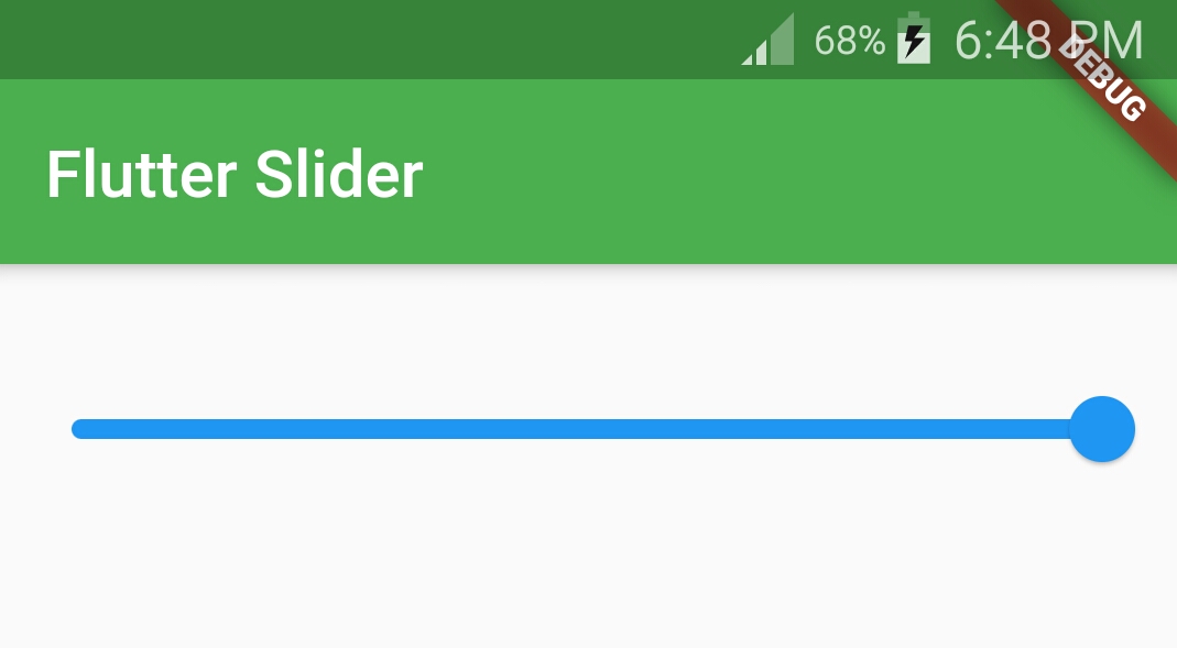
body:Container(
height: 100,
child:Slider(
value: val,
onChanged: (value) {
setState(() {
val = value;
});
},
)
)
)
);
}
}
Output:
Flutter Slider Properties
Different flutter slider properties are:
- value(required)
- onChanged(required)
- min & max
- divisions
- activeColor
- inactiveColor
- label
value
The value property is required which means without using it will throw an error. We need to update the value according to the user’s choice. If we assign a static value to the value property we can’t change it when the user chooses some value.
To update the value dynamically when the user chooses the slider we need to declare a variable and assign the minimum value to it. provide the variable to value property. Now in onChanged callback use the setState method to set the changed value to the global variable.
Slider(
      value: val,
      onChanged: (value) {
        setState(() {
          val = value;
        });
      },
)
onChanged
When we change the value to our desired position the onChanged callback will be invoked. We will get the new value from the callback which we can assign to the variable and update the UI.
Slider(
              value: val,
              onChanged: (value) {
                setState(() {
                  val = value;
                });
              },
            )
min & max
The min & max are the minimum and maximum values we can select from the slider. For example, the volume slider will have a min value of 1 and a max value of 10 or 15.
Slider(
              value: val,
              onChanged: (value) {
                setState(() {
                  val = value;
                });
              },
              min: 0,
              max: 10,
            )
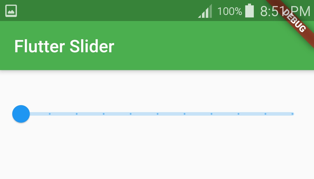
divisions
If we want to divide the slider into equal parts we will use divisions property.
Slider(
              value: val,
              onChanged: (value) {
                setState(() {
                  val = value;
                });
              },
              min: 1,
              max: 10,
              divisions: 10,
            )
Output:
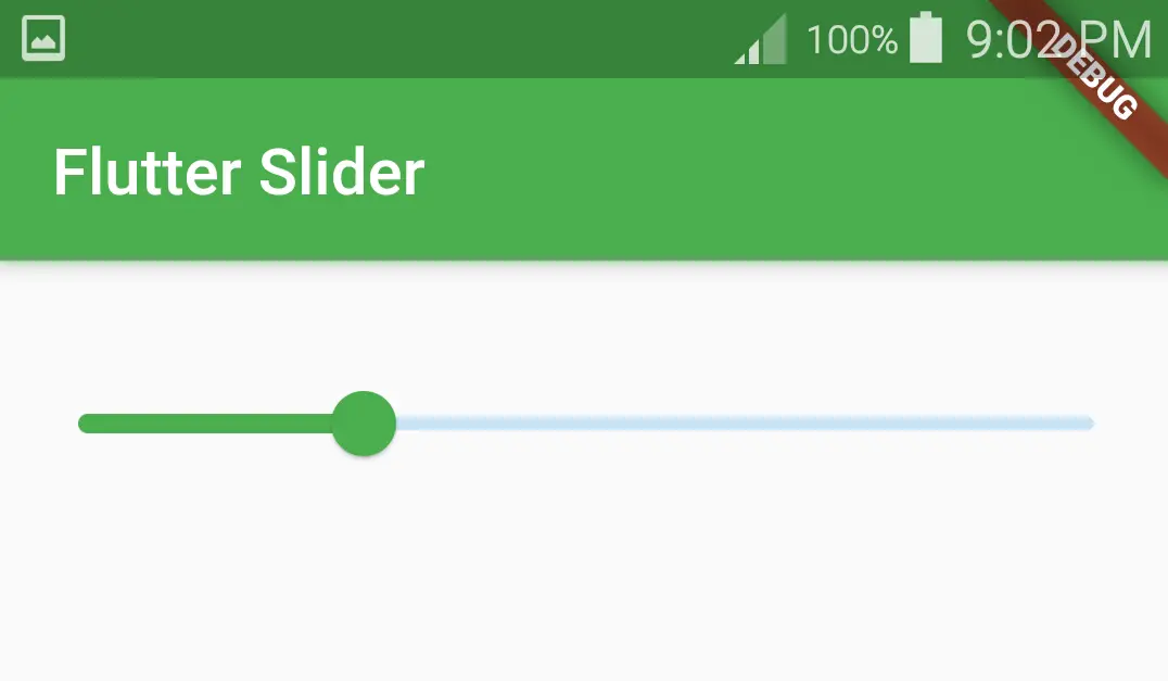
activeColor
The active side of the slider will be from the minimum value to the thumb. If we want to change the color of the active side we will use activeColor property.
Slider(
              value: val,
              onChanged: (value) {
                setState(() {
                  val = value;
                });
              },
              min: 1,
              max: 10,
              activeColor: Colors.green,
            )
Output:
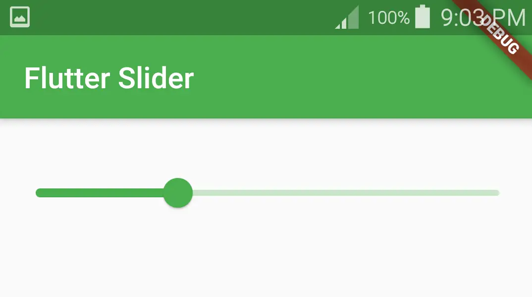
inactiveColor
The inactive side will be from the thumb to the maximum value of the slider. If we want to change the color of the inactive side we will use inactiveColor property.
Slider(
              value: val,
              onChanged: (value) {
                setState(() {
                  val = value;
                });
              },
              min: 1,
              max: 10,
              activeColor: Colors.green,
              inactiveColor: Colors.green[100],
            )
Output:
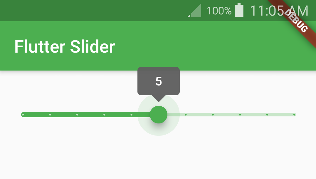
label
The label is nothing but an indicator that pops up when the user drags the thumb. We will use this property to display the value being selected to the user.
Slider(
              value: val,
              onChanged: (value) {
                setState(() {
                  val = value;
                });
              },
              min: 0,
              max: 10,
              activeColor: Colors.green,
              inactiveColor: Colors.green[100],
              label: val.round().toString(),
              divisions: 10,
            )
Output:
That brings an end to the tutorial on how to create and use the slider widget in flutter with example. Let’s catch up with some other widget in the next post. Have a great day!!
Do share, subscribe, and like my Facebook page if you find this post helpful. Thank you!!
Reference: Flutter official documentation.


Leave a Reply