This tutorial explains how to use chip widget in flutter with example.
Flutter Chip Widget
Chip is a material widget in flutter that represents information in compact form. For example, you might have composed a mail in Gmail app. You can observe the ‘to address’ turns into a chip when we choose a contact from suggestion or when we move to the subject field. Flutter provides a widget called Chip which allows us to add a chip to our application. If we provide the onDeleted callback a delete button will be displayed on the chip.
Types of chips in flutter
Flutter offers four types of chips for different scenarios. They are
Creating Chip In Flutter
To create a chip in flutter we have to call the constructor of the chip class provided by flutter. There is one required property for a chip widget which is label property. To use the chip widget we have to provide this property with a value.
Flutter Chip Constructor :
Chip(
    {Key? key,
    Widget? avatar,
    required Widget label,
    TextStyle? labelStyle,
    EdgeInsetsGeometry? labelPadding,
    Widget? deleteIcon,
    VoidCallback? onDeleted,
    Color? deleteIconColor,
    bool useDeleteButtonTooltip,
    String? deleteButtonTooltipMessage,
    BorderSide? side,
    OutlinedBorder? shape,
    Clip clipBehavior,
    FocusNode? focusNode,
    bool autofocus,
    Color? backgroundColor,
    EdgeInsetsGeometry? padding,
    VisualDensity? visualDensity,
    MaterialTapTargetSize? materialTapTargetSize,
    double? elevation,
    Color? shadowColor}
)
Below is the example code to add a chip to our flutter application.
Chip(
       label: Text("Flutter"),
    ),
Flutter Chip Properties
The properties of chip widget are :
- avatar
- label
- labelStyle
- labelPadding
- deleteIcon
- onDeleted
- deleteIconColor
- side
- shape
- backgroundColor
- padding
- elevation
- shadowColor
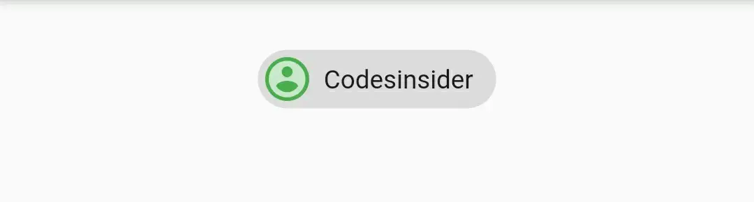
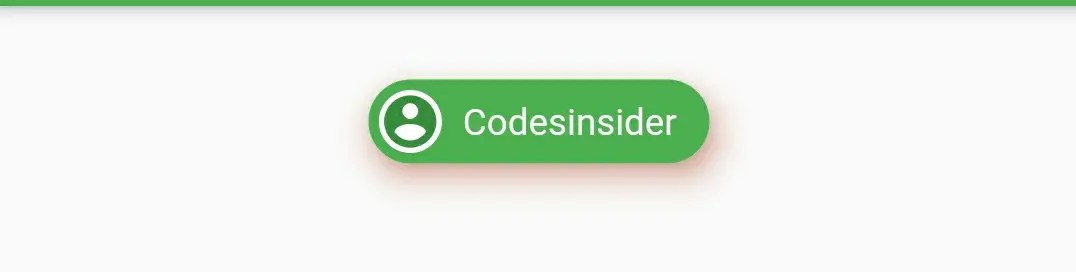
avatar and label
We will use avatar property to display an avatar prior to the chip’s label, usually a CircleAvatar widget. The label property is used to display content of the chip.
Container(
        alignment: Alignment.topCenter,
        margin: EdgeInsets.only(top: 20),
        child: Chip(
          avatar: CircleAvatar(
            child: Icon(Icons.account_circle),
            backgroundColor: Colors.green,
          ),
          label: Text("Codesinsider"),
        ),
      ),
Output :
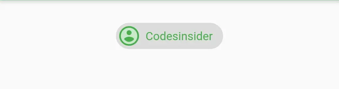
labelStyle
We will use this property to style the label of the chip. It takes TextStyle as value. We can also style the label by using style property of the text widget provided to label.
Container(
        alignment: Alignment.topCenter,
        margin: EdgeInsets.only(top: 20),
        child: Chip(
          avatar: CircleAvatar(
            child: Icon(Icons.account_circle),
            backgroundColor: Colors.green,
          ),
          label: Text("Codesinsider"),
          labelStyle: TextStyle(color: Colors.green),
        ),
      ),
Output :
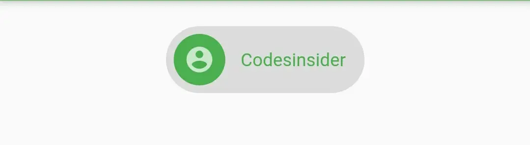
labelPadding
To provide padding to chip label we will use this property. It takes EdgeInsets Geometry as value.
Container(
        alignment: Alignment.topCenter,
        margin: EdgeInsets.only(top: 20),
        child: Chip(
          avatar: CircleAvatar(
            child: Icon(Icons.account_circle),
            backgroundColor: Colors.green,
          ),
          label: Text("Codesinsider"),
          labelStyle: TextStyle(color: Colors.green),
          labelPadding: EdgeInsets.all(10),
        ),
      ),
Output :
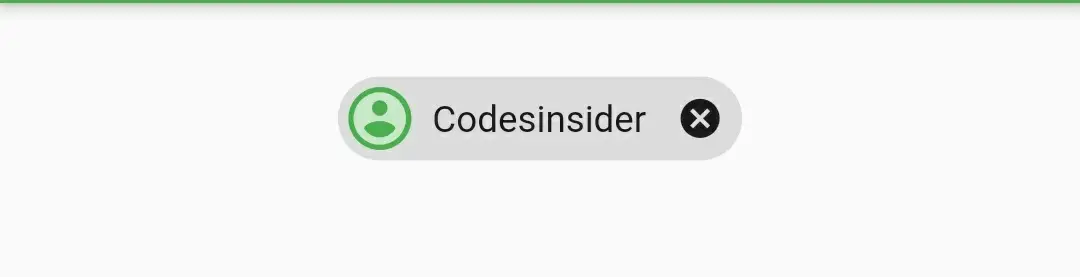
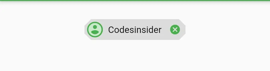
onDeleted
This callback is called when the user taps the delete icon to delete the chip. If the callback is set to null, the delete button will not appear on the chip. The chip will not automatically remove itself, this just tells the app that the user tapped the delete button. By default this callback will display a ‘ x ‘ icon.
Container(
        alignment: Alignment.topCenter,
        margin: EdgeInsets.only(top: 20),
        child: Chip(
          avatar: CircleAvatar(
            child: Icon(Icons.account_circle),
            backgroundColor: Colors.green,
          ),
          label: Text("Codesinsider"),
          onDeleted: (){},
        ),
      ),
Output :
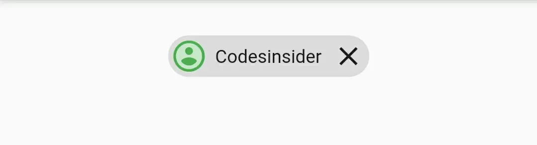
deleteIcon
We will use this property to change the delete icon of the chip. This only works when the onDelete callback is used.
Container(
        alignment: Alignment.topCenter,
        margin: EdgeInsets.only(top: 20),
        child: Chip(
          avatar: CircleAvatar(
            child: Icon(Icons.account_circle),
            backgroundColor: Colors.green,
          ),
          label: Text("Codesinsider"),
          onDeleted: (){},
          deleteIcon: Icon(Icons.close),
        ),
      ),
Output :
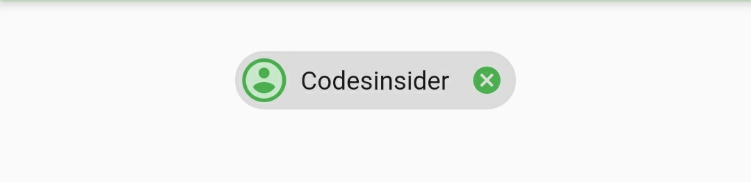
deleteIconColor
We will use this property to change the color of the chip’s delete icon. It takes material color as value.
Container(
        alignment: Alignment.topCenter,
        margin: EdgeInsets.only(top: 20),
        child: Chip(
          avatar: CircleAvatar(
            child: Icon(Icons.account_circle),
            backgroundColor: Colors.green,
          ),
          label: Text("Codesinsider"),
          onDeleted: (){},
          deleteIconColor: Colors.green,
        ),
      ),
Output :
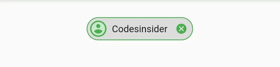
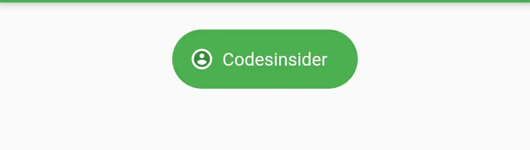
side
We will use this property to provide border and border color to the chip. It takes borderSide as value.
Container(
        alignment: Alignment.topCenter,
        margin: EdgeInsets.only(top: 20),
        child: Chip(
          avatar: CircleAvatar(
            child: Icon(Icons.account_circle),
            backgroundColor: Colors.green,
          ),
          label: Text("Codesinsider"),
          onDeleted: (){},
          deleteIconColor: Colors.green,
          side: BorderSide(
              color: Colors.green,
              width: 1,
              style: BorderStyle.solid
          ),
        ),
      ),
Output :
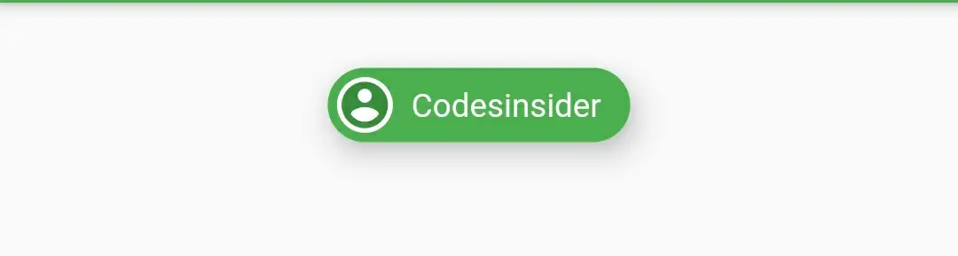
shape
We will use this property to change the shape of the chip. I’ m using BeveledRectangleBorder in the below example. If you want to try other shapes refer flutter RaisedButton example.
Container(
        alignment: Alignment.topCenter,
        margin: EdgeInsets.only(top: 20),
        child: Chip(
          avatar: CircleAvatar(
            child: Icon(Icons.account_circle),
            backgroundColor: Colors.green,
          ),
          label: Text("Codesinsider"),
          onDeleted: (){},
          deleteIconColor: Colors.green,
          shape: BeveledRectangleBorder(
             borderRadius: BorderRadius.circular(10)
          )
        ),
      ),
Output :
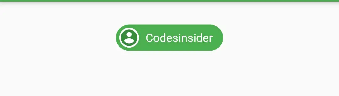
backgroundColor
To change the background color of the chip we will use this property. It takes material color as value.
Container(
        alignment: Alignment.topCenter,
        margin: EdgeInsets.only(top: 20),
        child: Chip(
          avatar: CircleAvatar(
            child: Icon(Icons.account_circle),
            backgroundColor: Colors.white,
          ),
          label: Text("Codesinsider"),
          labelStyle: TextStyle(color: Colors.white),
          backgroundColor: Colors.green,
          ),
        ),
Output :
padding
We will use this property to apply padding to the chip. It takes EdgeInsets geometry as value.
Container(
        alignment: Alignment.topCenter,
        margin: EdgeInsets.only(top: 20),
        child: Chip(
          avatar: CircleAvatar(
            child: Icon(Icons.account_circle, size: 15,),
            backgroundColor: Colors.white,

          ),
          label: Text("Codesinsider"),
          labelStyle: TextStyle(color: Colors.white),
          backgroundColor: Colors.green,
          padding: EdgeInsets.symmetric(horizontal: 15, vertical: 15),
          ),
        ),
Output :
elevation
To add elevation to the chip we will use this property. It takes double as value.
Container(
        alignment: Alignment.topCenter,
        margin: EdgeInsets.only(top: 20),
        child: Chip(
          avatar: CircleAvatar(
            child: Icon(Icons.account_circle),
            backgroundColor: Colors.white,

          ),
          label: Text("Codesinsider"),
          labelStyle: TextStyle(color: Colors.white),
          backgroundColor: Colors.green,
          elevation: 10,
          ),
        ),
Output :
shadowColor
To set a color to the shadow when the chip is elevated we will use this property. It takes material color as value.
Container(
        alignment: Alignment.topCenter,
        margin: EdgeInsets.only(top: 20),
        child: Chip(
          avatar: CircleAvatar(
            child: Icon(Icons.account_circle),
            backgroundColor: Colors.white,
          ),
          label: Text("Codesinsider"),
          labelStyle: TextStyle(color: Colors.white),
          backgroundColor: Colors.green,
          elevation: 10,
          shadowColor: Colors.deepOrange,
          ),
        ),
Output :
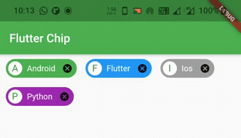
Flutter Chip Example
Let’s see an example which shows the usage of chip widget in flutter. In this example we will display some chips with different colors. We will also implement the code for deleting the chip. We will use a pojo class and a List for creating chips.
For this example we need a pojo class for holding the data of chip like label and background color.
Tech class ( pojo ) :
class Tech
{
  String label;
  Color color;
  Tech(this.label, this.color);
}
Now we need to create a List of type Tech (pojo) and provide the data for chips.
List<Tech> _chipsList = [
    Tech("Android", Colors.green),
    Tech("Flutter", Colors.blue),
    Tech("Ios", Colors.grey),
    Tech("Python", Colors.purple),
  ];
Now let’s see the code for generating and deleting the chips. Let’s create a iterable function techchips() that will return chip widgets.
Iterable<Widget> get techChips sync* {
    for (final Tech tech in _chipsList) {
      yield Padding(
        padding: const EdgeInsets.only(left:10, right: 5),
        child: Chip(
          avatar: CircleAvatar(
            child: Text(
                tech.label[0].toUpperCase()
            ),
            backgroundColor: Colors.white,
          ),
          label: Text(tech.label),
          labelStyle: TextStyle(color: Colors.white),
          backgroundColor: tech.color,
          onDeleted: () {
            setState(() {
              _chipsList.removeWhere((Tech entry) {
                return entry.label == tech.label;
              });
            });
          },
        ),
      );
    }
  }
We will set the above function to children property of wrap widget in body.
Wrap(
        direction: Axis.horizontal,
        children: techChips(),
      )
Complete Code :
Let’s sum up all the code snippets above to complete our chip example.
import 'package:flutter/cupertino.dart';
import 'package:flutter/material.dart';
import 'package:flutter/widgets.dart';
import 'package:flutter_app_learning/NavDrawer.dart';
import 'package:flutter_app_learning/contact.dart';
void main()
{
  runApp(MyApp());
}

class MyApp extends StatelessWidget {
  @override
  Widget build(BuildContext context) {
    return MaterialApp(
      title: 'Flutter Learning',
      theme: ThemeData(
        primarySwatch: Colors.green,
      ),
      home: MyHomePage(),
    );
  }
}

class MyHomePage extends StatefulWidget {
  @override
  _MyHomePageState createState()
  {
    return _MyHomePageState();
  }
}

class Tech
{
  String label;
  Color color;
  Tech(this.label, this.color);
}

class _MyHomePageState extends State<MyHomePage> {
  List<Tech> _chipsList = [
    Tech("Android", Colors.green),
    Tech("Flutter", Colors.blue),
    Tech("Ios", Colors.grey),
    Tech("Python", Colors.purple),
  ];

  @override
  Widget build(BuildContext context) {
    return Scaffold(
      appBar: AppBar(
        title: Text("Flutter Chip"),
      ),
      body: Wrap(
          direction: Axis.horizontal,
          children: techChips.toList()
      ),
    );
  }

  Iterable<Widget> get techChips sync* {
    for (final Tech tech in _chipsList) {
      yield Padding(
        padding: const EdgeInsets.only(left:10, right: 5),
        child: Chip(
          avatar: CircleAvatar(
            child: Text(
                tech.label[0].toUpperCase()
            ),
            backgroundColor: Colors.white,
          ),
          label: Text(tech.label),
          labelStyle: TextStyle(color: Colors.white),
          backgroundColor: tech.color,
          onDeleted: () {
            setState(() {
              _chipsList.removeWhere((Tech entry) {
                return entry.label == tech.label;
              });
            });
          },
        ),
      );
    }
  }
}
Output :
That’s all about the tutorial on how to create and display or show Chip in flutter. We have also seen an example where we’ve used Chip widget and customized it. Let’s catch up with some other widget in the next post. Have a great day!!
Do like & share my facebook page. Subscribe to newsletter if you find this post helpful. Thank you!!
Reference : Flutter Official Documentation.


Leave a Reply