In this tutorial we will learn how to use inputChip widget in flutter.
Flutter InputChip Widget
InputChip is a material widget in flutter that represents a complex piece of information in a compact form. Flutter provides a widget called InputChip which allows us to add an input chip to our application. Input chip by default is disabled. We can enable it by setting onSelected. We can provide a label, leading and trailing icons to it.
Other types of chips are Chip, ChoiceChip, ActionChip & FilterChip.
Creating InputChip
To create an Input chip in flutter we have to use the constructor of InputChip class provided by flutter. There is one required property for InputChip widget which is label property. The label can be any widget usually a text widget. To use the InputChip widget we have to provide this property with a value.
Flutter InputChip Constructor :
InputChip(
    {Key? key,
    Widget? avatar,
    required Widget label,
    TextStyle? labelStyle,
    EdgeInsetsGeometry? labelPadding,
    bool selected,
    bool isEnabled,
    ValueChanged<bool>? onSelected,
    Widget? deleteIcon,
    VoidCallback? onDeleted,
    Color? deleteIconColor,
    bool useDeleteButtonTooltip,
    String? deleteButtonTooltipMessage,
    VoidCallback? onPressed,
    double? pressElevation,
    Color? disabledColor,
    Color? selectedColor,
    String? tooltip,
    BorderSide? side,
    OutlinedBorder? shape,
    Clip clipBehavior,
    FocusNode? focusNode,
    bool autofocus,
    Color? backgroundColor,
    EdgeInsetsGeometry? padding,
    VisualDensity? visualDensity,
    MaterialTapTargetSize? materialTapTargetSize,
    double? elevation,
    Color? shadowColor,
    Color? selectedShadowColor,
    bool? showCheckmark,
    Color? checkmarkColor,
    ShapeBorder avatarBorder}
)
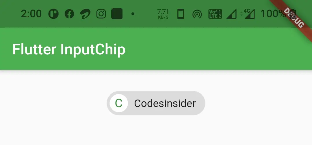
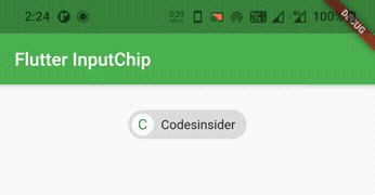
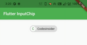
Below is the example code to add Input chip to our flutter application.
InputChip(
          label: Text("Codesinsider"),
        ),
Flutter InputChip Properties
The properties of Inputchip widget are :
- avatar
- label
- labelStyle
- labelPadding
- deleteIcon
- onDeleted
- deleteIconColor
- side
- shape
- backgroundColor
- padding
- elevation
- shadowColor
- selected
- onSelected
- isEnabled
- onPressed
- pressElevation
- disabledColor
- selectedColor
- selectedShadowColor
- showCheckmark
- checkmarkColor
- avatarBorder
Most of the properties of Inputchip widget are similar to basic Chip Widget. Since we can’t discuss all the properties in one article we will discuss the dissimilar ones. If you want to learn the similar ones refer flutter chip widget.
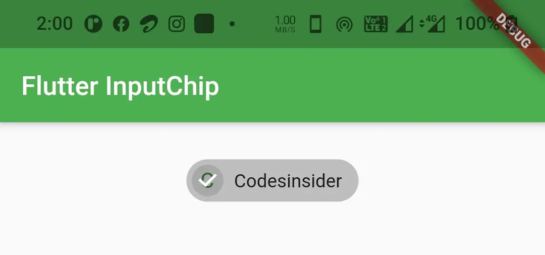
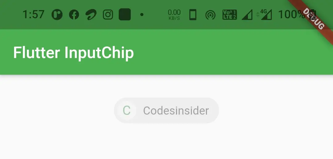
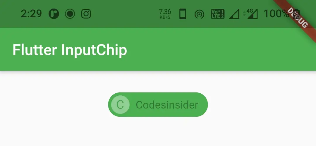
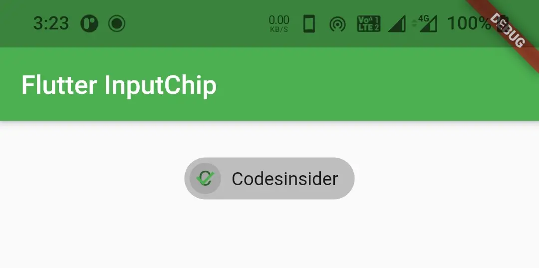
selected
We will use this property to set the chip’s state to selected or unselected. It takes a boolean value setting true will make the chip selected and false will make the chip unselected.
Container(
        alignment: Alignment.topCenter,
        margin: EdgeInsets.only(top: 20),
        child: InputChip(
          avatar: CircleAvatar(
            child: Text("C"),
            backgroundColor: Colors.white,
          ),
          label: Text("Codesinsider"),
          selected: false,
          onSelected:(bool value)
            {

            }
        ),
      )
Output :
Container(
        alignment: Alignment.topCenter,
        margin: EdgeInsets.only(top: 20),
        child: InputChip(
          avatar: CircleAvatar(
            child: Text("C"),
            backgroundColor: Colors.white,
          ),
          label: Text("Codesinsider"),
          selected: true,
          onSelected:(bool value)
            {

            }
        ),
      )
Output :
onSelected
We will use this property to update the selected or unselected state of the Input chip and also to perform some actions when the chip is selected or unselected.
bool isSelected = false;
Container(
        alignment: Alignment.topCenter,
        margin: EdgeInsets.only(top: 20),
        child: InputChip(
        avatar: CircleAvatar(
            child: Text("C"),
            backgroundColor: Colors.white,
        ),
        label: Text("Codesinsider"),
        selected: isSelected,
        onSelected:(bool value)
          {
            setState(() {
              isSelected = value;
            });
              // Do whatever you want when the inputchip is selected or unselected
          }
        ),
      )
isEnabled
We will use this property to enable or disable the inputchip. It take a boolean value. By default the value is true. Even if we set this property to true we have to set one of the callbacks onSelected, onDelete or onPressed to enable the button.
Container(
        alignment: Alignment.topCenter,
        margin: EdgeInsets.only(top: 20),
        child: InputChip(
            avatar: CircleAvatar(
              child: Text("C"),
              backgroundColor: Colors.white,
            ),
            label: Text("Codesinsider"),
            selected: isSelected,
            onSelected:(bool value)
            {
              setState(() {
                isSelected = value;
              });
              // Do whatever you want when the inputchip is selected or unselected
            },
          isEnabled: false,
        ),
      )
Output :
onPressed
We will use this property if we want to perform some action when we press the chip.
Container(
        alignment: Alignment.topCenter,
        margin: EdgeInsets.only(top: 20),
        child: InputChip(
            avatar: CircleAvatar(
              child: Text("C"),
              backgroundColor: Colors.white,
            ),
            label: Text("Codesinsider"),
            selected: isSelected,
            onPressed: ()
            {
              setState(() {
                isSelected = !isSelected;
              });
            },
        ),
      )
pressElevation
We will use this property to change the amount of elevation we want to apply when we press the chip.
Container(
        alignment: Alignment.topCenter,
        margin: EdgeInsets.only(top: 20),
        child: InputChip(
            avatar: CircleAvatar(
              child: Text("C"),
              backgroundColor: Colors.white,
            ),
            label: Text("Codesinsider"),
            selected: isSelected,
            onPressed: ()
            {
              setState(() {
                isSelected = !isSelected;
              });
            },
          pressElevation: 20,
        ),
      )
Output :
disabledcolor
To apply a color to the inputChip when the chip is disabled we will use this property. So to disable the button i’m removing all the callbacks.
Container(
        alignment: Alignment.topCenter,
        margin: EdgeInsets.only(top: 20),
        child: InputChip(
            avatar: CircleAvatar(
              child: Text("C"),
              backgroundColor: Colors.white,
            ),
            label: Text("Codesinsider"),
            selected: isSelected,
            disabledColor: Colors.green,
        ),
      )
Output :
selectedColor
We will use this property to apply color to the chip when the chip is selected.
Container(
        alignment: Alignment.topCenter,
        margin: EdgeInsets.only(top: 20),
        child: InputChip(
            avatar: CircleAvatar(
              child: Text("C"),
              backgroundColor: Colors.white,
            ),
            label: Text("Codesinsider"),
            selected: isSelected,
            onSelected: (bool value)
            {
              setState(() {
                isSelected = value;
              });
            },
            selectedColor: Colors.deepOrange,
        ),
      )
Output :
selectedShadowColor
We will use this property to apply shadow color to the chip when the chip is transforming from selected state to unselected state.
Container(
        alignment: Alignment.topCenter,
        margin: EdgeInsets.only(top: 20),
        child: InputChip(
            avatar: CircleAvatar(
              child: Text("C"),
              backgroundColor: Colors.white,
            ),
            label: Text("Codesinsider"),
            selected: isSelected,
            onSelected: (bool value)
            {
              setState(() {
                isSelected = value;
              });
            },
          pressElevation: 20,
            selectedShadowColor: Colors.green,
        ),
      )
Output :
showCheckmark
We will use this property to show / hide the checkmark that appears when we select the chip. It takes a boolean value.
Container(
        alignment: Alignment.topCenter,
        margin: EdgeInsets.only(top: 20),
        child: InputChip(
            avatar: CircleAvatar(
              child: Text("C"),
              backgroundColor: Colors.white,
            ),
            label: Text("Codesinsider"),
            selected: isSelected,
            onSelected: (bool value)
            {
              setState(() {
                isSelected = value;
              });
            },
          showCheckmark: false,
        ),
      )
Output :
checkmarkColor
We will use this property to change the color of the checkmark.
Container(
        alignment: Alignment.topCenter,
        margin: EdgeInsets.only(top: 20),
        child: InputChip(
            avatar: CircleAvatar(
              child: Text("C"),
              backgroundColor: Colors.white,
            ),
            label: Text("Codesinsider"),
            selected: isSelected,
            onSelected: (bool value)
            {
              setState(() {
                isSelected = value;
              });
            },
          checkmarkColor: Colors.green,
        ),
      )
Output :
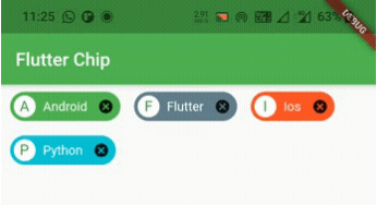
Flutter InputChip Example
Let’s see an example where we display some InputChips with different colors. We will also implement the code for selecting, unselecting and deleting the chip in this example.
For this example we need a pojo class for holding the data of Inputchip. The pojo class will have three parameters label, color and isSelected. The label will hold the label of the chip, color will hold the backgroundColor and isSelected will hold the selected or unselected state of the Input chip.
Tech class ( pojo ) :
class Tech
{
  String label;
  Color color;
  bool isSelected;
  Tech(this.label, this.color, this.isSelected);
}
Now let’s create a List of type Tech (pojo) and provide the data for chips.
List<Tech> _chipsList = [
    Tech("Android", Colors.green, false),
    Tech("Flutter", Colors.blueGrey, false),
    Tech("Ios", Colors.deepOrange, false),
    Tech("Python", Colors.cyan, false),
  ];
Now we will write the code for generating, selecting, unselecting and deleting the chips. Let’s create a function techChips() which will return a List of widgets which will be input chips in our case.
List<Widget> techChips () {
    List<Widget> chips = [];
    for (int i=0; i< _chipsList.length; i++) {
      Widget item = Padding(
        padding: const EdgeInsets.only(left:10, right: 5),
        child: InputChip(
          avatar: CircleAvatar(
            child: Text(
                _chipsList[i].label[0].toUpperCase()
            ),
            backgroundColor: Colors.white,
          ),
          label: Text(_chipsList[i].label),
          labelStyle: TextStyle(color: Colors.white),
          backgroundColor: _chipsList[i].color,
          selected: _chipsList[i].isSelected,
          onDeleted: () {
            setState(() {
              _chipsList.removeAt(i);
              });
          },
          onSelected: (bool value)
          {
            setState(() {
              _chipsList[i].isSelected = value;
            });
          },
        ),
      );
      chips.add(item);
    }
    return chips;
  }
We will set the above function to children property of wrap widget in body.
Wrap(
        direction: Axis.horizontal,
        children: techChips(),
      )
Complete Code :
Now let’ s merge all the code snippets above to complete the input chip example.
import 'package:flutter/cupertino.dart';
import 'package:flutter/material.dart';
import 'package:flutter/widgets.dart';
import 'package:flutter_app_learning/NavDrawer.dart';
import 'package:flutter_app_learning/contact.dart';
void main()
{
  runApp(MyApp());
}

class MyApp extends StatelessWidget {
  @override
  Widget build(BuildContext context) {
    return MaterialApp(
      title: 'Flutter Learning',
      theme: ThemeData(
        primarySwatch: Colors.green,
      ),
      home: MyHomePage(),
    );
  }
}

class MyHomePage extends StatefulWidget {
  @override
  _MyHomePageState createState()
  {
    return _MyHomePageState();
  }
}

class Tech
{
  String label;
  Color color;
  bool isSelected;
  Tech(this.label, this.color, this.isSelected);
}

class _MyHomePageState extends State<MyHomePage> {
  List<Tech> _chipsList = [
    Tech("Android", Colors.green, false),
    Tech("Flutter", Colors.blueGrey, false),
    Tech("Ios", Colors.deepOrange, false),
    Tech("Python", Colors.cyan, false),
  ];

  @override
  Widget build(BuildContext context) {
    return Scaffold(
      appBar: AppBar(
        title: Text("Flutter Chip"),
      ),
      body: Wrap(
          direction: Axis.horizontal,
          children: techChips()
      ),
    );
  }

  List<Widget> techChips () {
    List<Widget> chips = [];
    for (int i=0; i< _chipsList.length; i++) {
      Widget item = Padding(
        padding: const EdgeInsets.only(left:10, right: 5),
        child: InputChip(
          avatar: CircleAvatar(
            child: Text(
                _chipsList[i].label[0].toUpperCase()
            ),
            backgroundColor: Colors.white,
          ),
          label: Text(_chipsList[i].label),
          labelStyle: TextStyle(color: Colors.white),
          backgroundColor: _chipsList[i].color,
          selected: _chipsList[i].isSelected,
          onDeleted: () {
            setState(() {
              _chipsList.removeAt(i);
              });
          },
          onSelected: (bool value)
          {
            setState(() {
              _chipsList[i].isSelected = value;
            });
          },
        ),
      );
      chips.add(item);
    }
    return chips;
  }
}
Output :
That’s all about the tutorial on how to create and display or show InputChip in flutter. We have also seen an example where we’ve used InputChip widget and customized it. Let’s catch up with some other widget in the next post. Have a great day!!
Do like & share my facebook page. Subscribe to newsletter if you find this post helpful. Thank you!!
Reference : Flutter Official Documentation.


Leave a Reply