
Flutter Cupertino Slider
Cupertino slider is nothing but an ios style slider in flutter. A CupertinoSlider widget lets us add an ios style slider in our application. A slider has two main parts track and a thumb. The thumb will slide over the track. We can choose a value either by sliding to our desired position or by simply tapping on the track. It is similar to seek bar which is useful in many instances. For example, to control the brightness of our phone and to seek a video to our desired position we will use a slider.
We can implement a slider in two different ways. The first one is to select from continuous values which is the default way. For this, we have to provide minimum and maximum values where users can select between them. The second one is to select from a discrete set of values. To use this we have to provide a non-null value to divisions property. The value provided to divisions will be the number of intervals. For example, if we set min to 0 and max to 10 and divisions to 10, then the slider will have values from 0 to 10 like 1, 2, 3, …10.
Don’t know what Cupertino is? It is nothing but a set of flutter widgets that follow the ios design pattern. These widgets are designed to implement ios features in flutter apps built for the ios platform.
In this tutorial, we will learn how to use cupertino slider in flutter with example. We will also learn how to customize the style of CupertinoSlider widget using different properties.
To implement similar behavior for the android platform using flutter refer flutter slider example.
How To Create Cupertino Slider In Flutter?
To create a cupertino slider in flutter we have to use CupertinoSlider class. We have to call the constructor of the class and provide the required properties. The slider has two required properties value and onChanged. The value will indicate the position of the thumb. The onChanged callback is used to update the value when the user changes the slider position.
Flutter Cupertino Slider Constructor:
CupertinoSlider(
{Key? key,
 required double value,
 required ValueChanged<double>? onChanged,
 ValueChanged<double>? onChangeStart,
 ValueChanged<double>? onChangeEnd,
 double min,
 double max,
 int? divisions,
 Color? activeColor,
 Color thumbColor}
)
Flutter Cupertino Slider Properties
The properties of a flutter cupertino slider are:
- value
- onChanged
- min
- max
- divisions
- activeColor
- thumbColor
- onChangeStart
- onChangeEnd
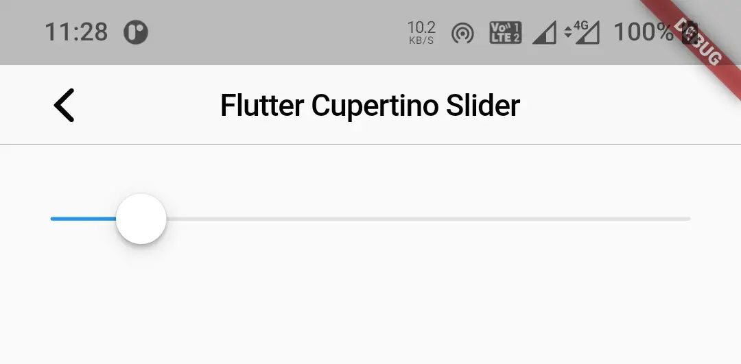
value
It is a required property that indicates the position selected by the user. If we provide a static value for this property the UI will not be updated when the user changes the position. So we have to update this value dynamically when the user changes the position.
CupertinoSlider(
            value:2,
            min:1,
            max:10,
            onChanged: (value){

            },
          )
Output:
onChanged
It is a callback function that will invoke every time the user changes the position of the slider. This function will return the updated value. We will assign the updated value to the value property using a global variable. To update the UI with the latest position we have to call setSatete() inside the onChanged function.
CupertinoSlider(
            value:selectedValue,
            min:1,
            max:10,
            onChanged: (value){
              selectedValue = value;
              setState(() {

              });
            },
          )
min & max
The min & max are the minimum and maximum values one can select using the slider. For example, the volume slider will have a min value of 1 and a max value of 10 or 15.
CupertinoSlider(
            value:selectedValue,
            min:0,
            max:10,
            onChanged: (value){
              selectedValue = value;
              setState(() {

              });
            },
          )
divisions
To divide the slider into some equal number of divisions we will use this property. The value provided to divisions will divide the slider into equal parts.
CupertinoSlider(
            value:selectedValue,
            min:0,
            max:10,
            divisions: 10,
            onChanged: (value){
              selectedValue = value;
              setState(() {

              });
            },
          )
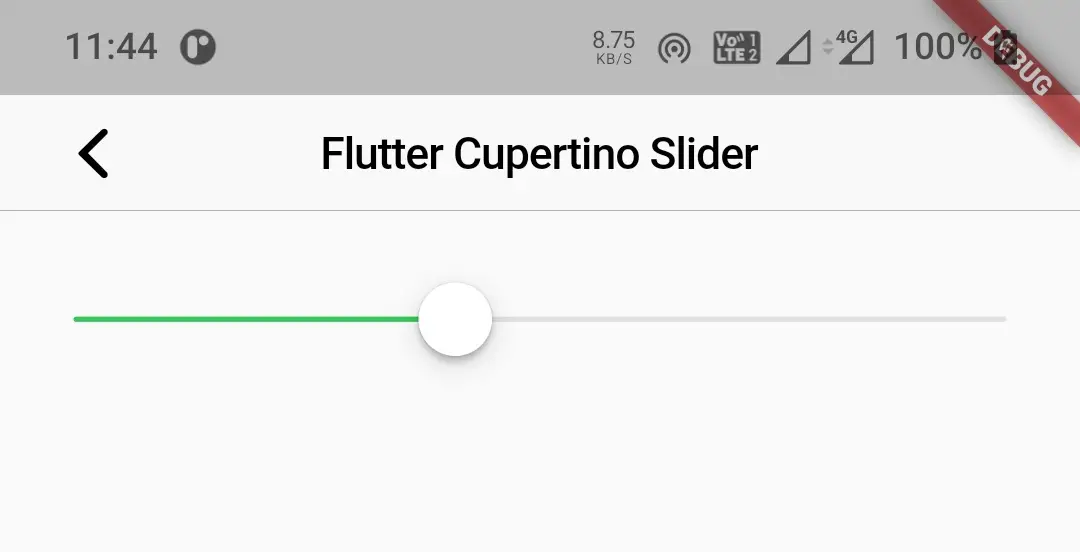
activeColor
We will use this property to apply a color to the part of the slider that is selected. It takes Colors or CupertinoColors constant as value.
CupertinoSlider(
            value:selectedValue,
            min:0,
            max:10,
            onChanged: (value){
              selectedValue = value;
              setState(() {

              });
            },
            activeColor: CupertinoColors.activeGreen,
          )
Output:
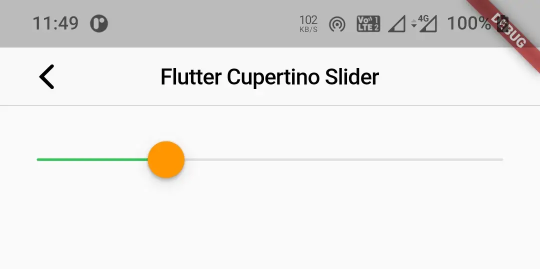
thumbColor
We will use this property to change the color of the thumb of the slider. It also takes Colors or CupertinoColors class constant as value.
CupertinoSlider(
            value:selectedValue,
            min:0,
            max:10,
            onChanged: (value){
              selectedValue = value;
              setState(() {

              });
            },
            activeColor: CupertinoColors.activeGreen,
            thumbColor: CupertinoColors.activeOrange,
          )
Output:
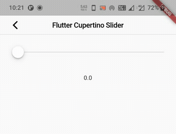
Flutter Cupertino Slider Example
Let’s create an example where we will implement cupertino slider in flutter using the CupertinoSlider widget. In this example, we will display a slider with 10 divisions. When the user drags the slider we will display the selected value in a text widget.
First, declare a variable that will hold the value of the slider selected by the user.
double selectedValue = 0;
Now, let’s add the code for displaying the cupertino slider.
CupertinoSlider(
                  value:selectedValue,
                  min:0,
                  max:10,
                  onChanged: (value){
                  },
                  activeColor: CupertinoColors.activeGreen,
                ),
Inside the onChanged callback function let’s update the variable declared above with the value returned by the function. Now call setState so that the UI will be updated with the latest value.
CupertinoSlider(
                  value:selectedValue,
                  min:0,
                  max:10,
                  divisions:10,
                  onChanged: (value){
                    selectedValue = value;
                    setState(() {

                    });
                  },
                  activeColor: CupertinoColors.activeGreen,
                ),
Now add a text widget to display the value selected by the user.
Text("$selectedValue"),
Complete Code:
Let’s sum up the code snippets above to complete our cupertino slider example in flutter. Create a new flutter project and replace the code in main.dart file with the code below.
import 'package:flutter/cupertino.dart';
import 'package:flutter/material.dart';
import 'package:flutter/widgets.dart';

void main()
{
  runApp(MyApp());
}

class MyApp extends StatelessWidget {
  @override
  Widget build(BuildContext context) {
    return MaterialApp(
      title: 'Flutter Learning',
      theme: ThemeData(
        primarySwatch: Colors.blue,
      ),
      home:MyHomePage(),
    );
  }
}

class MyHomePage extends StatefulWidget {
  @override
  _MyHomePageState createState()
  {
    return _MyHomePageState();
  }
}

class _MyHomePageState extends State<MyHomePage> {
  double selectedValue = 0;
  @override
  Widget build(BuildContext context) {
    return new CupertinoPageScaffold(
      navigationBar:CupertinoNavigationBar(
        leading: CupertinoNavigationBarBackButton(
          onPressed: ()
          { },
          color: CupertinoColors.label,
        ),
        middle: Text("Flutter Cupertino Slider")
      ),
      child:Material(
        child: Container(
          margin: EdgeInsets.only(top:100, left: 20, right: 20),
          width: double.infinity,
          child:Column(
            children: [
              Container(
                width: double.infinity,
                child: CupertinoSlider(
                  value:selectedValue,
                  min:0,
                  max:10,
                  divisions:10,
                  onChanged: (value){
                    selectedValue = value;
                    setState(() {

                    });
                  },
                  activeColor: CupertinoColors.activeGreen,
                ),
              ),
              SizedBox(
                height:30
              ),
              Text("$selectedValue"),
            ],
          )
        ),
      ),
    );
  }
}
Output:
That brings an end to the tutorial on how to create & use cupertino slider in flutter. We have also seen an example where we have used the CupertinoSlider widget and customized its style. Let’s catch up with some other widgets in the next post. Have a great day !!
Do like & share my Facebook page. Subscribe to the newsletter if you find this post helpful. Thank you !!
Reference: Flutter Official documentation.


Leave a Reply