Flutter Motion Toast / Styled Toast
Motion toast is nothing but a toast message in flutter beautifully styled & designed with animations. It works completely similar to toast message. The only difference is, toast message looks simple with no animations where motion toast looks styled & beautiful with animations. If you want to display a styled toast, you can use motion toast in flutter. It offers built-in types of toast messages like success, error, warning, delete & info. We can use them or customize our own toast message instead.
Motion Toast / Styled Toast Features
Motion toast offers different features that help us in enhancing & customizing the toast message. Let’s see the features offered by motion_toast dependency.
- Animated toasts with animated icons
- Built-in types (Success, Warning, Error, Info, Delete)
- Possibility to design your own toast
- Support null safety
- Heartbeat animations
- Full customized text
- Customize toast duration
- Built in animations
- Customize toast layout (LTR/RTL)
- Customize Motion toast position (Center, Bottom, Top)
In flutter, there is no specific widget or function available to display a motion toast message. We can use snackbar widget instead of toast or motion toast but, we cannot change the position of snackbar like toast & motion toast. To add functionality for displaying beautiful and styled toast message to our flutter application we have to use motion toast dependency. This tutorial shows you how to create and show a styled toast message in flutter using motion toast dependency. You will also learn how to create a custom toast message using different properties with example.
Creating Motion Toast / Styled Toast In Flutter
To create and show a motion toast message in flutter follow the steps below :
- Create a flutter project
- Add motion_toast dependency to the project
- Import the motion toast package :- import ‘package: motion_toast/motion_toast.dart’;
- Implement code for creating and showing motion toast in flutter.
Let’s add motion toast depenency to pubspec.yaml file present in the root folder of our project.
pubspec.yaml
dependencies:
  motion_toast: ^1.2.0
Now import the motion toast package to use motion toast functionality in our project.
import 'package:motion_toast/motion_toast.dart';
As we are done with adding the dependency and importing the library, its time to create the toast. Let’s create and show a styled motion toast by calling MotionToast().show(context). Provide values for required properties color, description and icon properties. Without providing these values we cannot create a motion toast.
MotionToast(
              color: Colors.orange,
              description: "This is a styled toast",
              icon: Icons.message,
            ).show(context);
Flutter Motion Toast / Styled Toast Properties
The properties of styled motion toast are :
- color
- title
- description
- icon
- titleStyle
- descriptionStyle
- iconSize
- iconType
- width
- position
- enableAnimation
- animationDuration
- animationCurve
- animationType
- layoutOrientation
- toastDuration
As we can’t display a toast message directly place the below example code snippets inside onPressed callback of any button or widget.
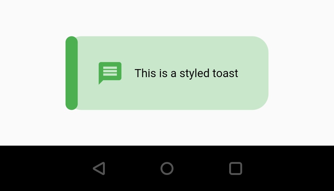
Color
It takes material color as value. We will use this property to add or change background color of the toast.
MotionToast(
              color: Colors.green,
              description: "This is a styled toast",
              icon: Icons.message,
            ).show(context);
Output :
title
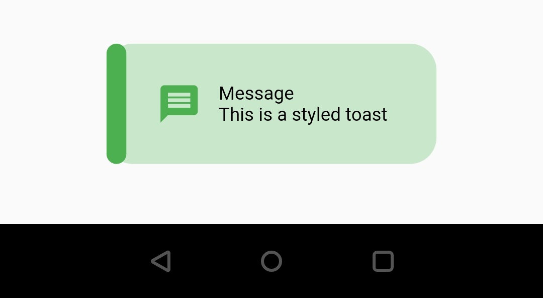
It takes string as value. We will use this property to add title to the toast message.
MotionToast(
              color: Colors.green,
              description: "This is a styled toast",
              icon: Icons.message,
              title: "Message",
            ).show(context);
Output :
description
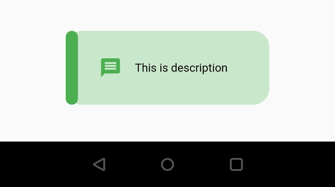
It takes string as value. We will use this property to add the toast message we want to display to the users.
MotionToast(
              color: Colors.green,
              description: "This is description",
              icon: Icons.message,
            ).show(context);
Output :
icon
It accepts IconData as value. We will use this property to display a toast with icon. We don’t have to provide icon if the toast is one of the built-in type. Only custom toast require us to add icon.
MotionToast(
              color: Colors.green,
              description: "This is description",
              icon: Icons.message,
            ).show(context);
Output :
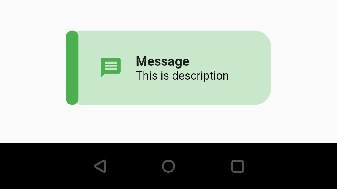
titleStyle
It takes TextStyle as value. We will use this property to apply style to the title of the toast message. We will change the fontSize, color and weight in the below example.
MotionToast(
              color: Colors.green,
              description: "This is description",
              icon: Icons.message,
              title: "Message",
              titleStyle: TextStyle(
                  fontSize: 16,
                  fontWeight:FontWeight.bold,
                  color: Colors.deepOrange
              ),
            ).show(context);
Output :
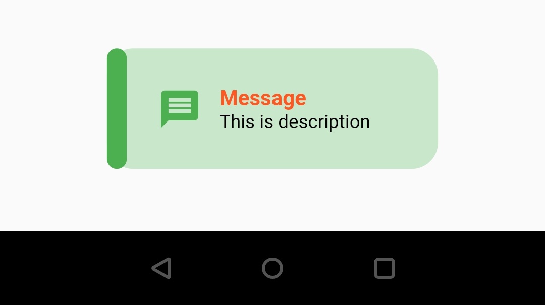
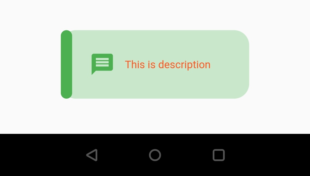
descriptionStyle
It takes TextStyle as value. We will use this property to apply style to the description of the toast message. In the below example we will change text color and fontsize.
MotionToast(
              color: Colors.green,
              description: "This is description",
              icon: Icons.message,
              descriptionStyle: TextStyle(
                  fontSize: 14,
                  color: Colors.deepOrange
              ),
            ).show(context);
Output :
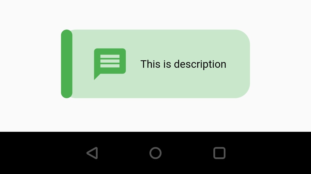
iconSize
It takes double as value. Use this property if you want to change the icon size.
MotionToast(
              color: Colors.green,
              description: "This is description",
              icon: Icons.message,
              iconSize: 60,
            ).show(context);
Output :
iconType
It takes ICON_TYPE as value. ICON_TYPE has two values MATERIAL_DESIGN & CUPERTINO. Use this property to change the type of icon you want to use with the toast message.
MotionToast(
              color: Colors.green,
              description: "This is description",
              icon: Icons.message,
              iconType: ICON_TYPE.CUPERTINO,
            ).show(context);
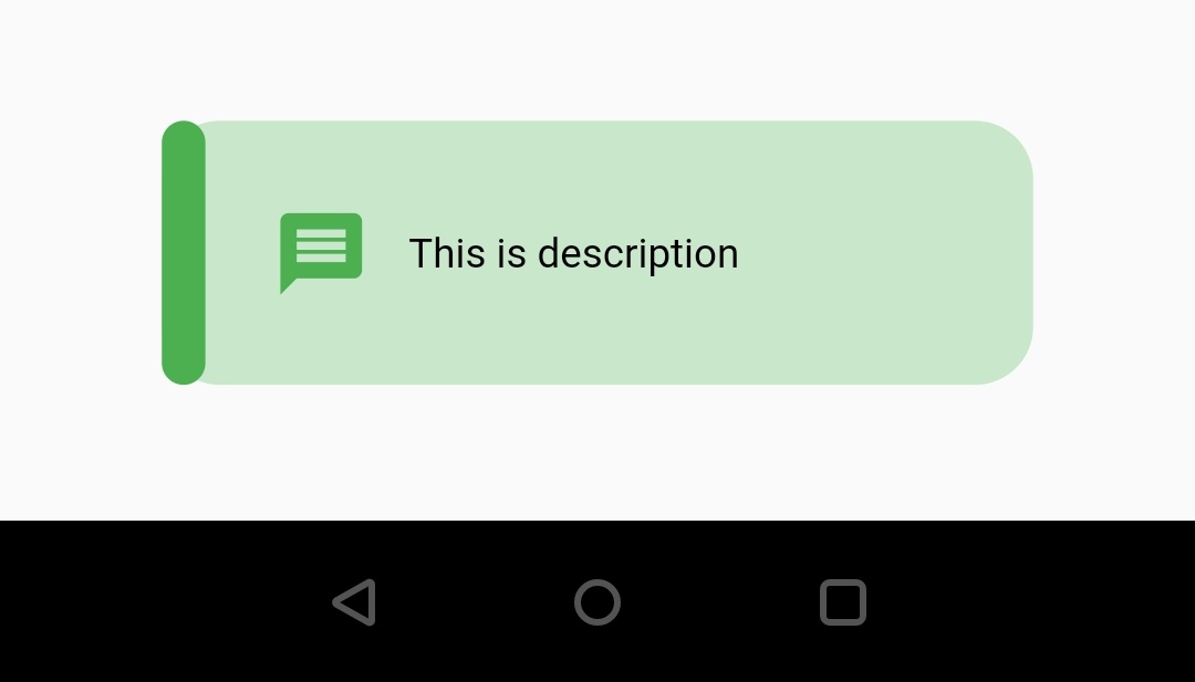
width
It takes double as value. Use this property if you want to change the width of the toast message.
MotionToast(
              color: Colors.green,
              description: "This is description",
              icon: Icons.message,
              width: 300,
            ).show(context);
Output :
position
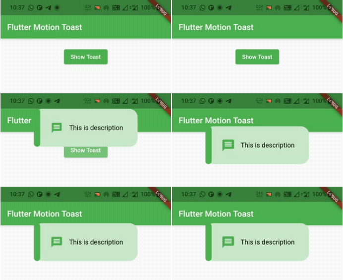
It takes MOTION_TOAST_POSITION as value. MOTION_TOAST_POSITION has three values, TOP, BOTTOM & CENTER. Use this property to change the position of the toast message. I will use TOP in below example.
Note: When position is set to TOP you can’t set animationType to ANIMATION.FROM_BOTTOM & when position is set to BOTTOM you can’t set animationType to ANIMATION.FROM_TOP. By default the animation type is ANIMATION.FROM_BOTTOM & position will be BOTTOM.
MotionToast(
              color: Colors.green,
              description: "This is description",
              icon: Icons.message,
              position: MOTION_TOAST_POSITION.TOP,
              animationType: ANIMATION.FROM_TOP,
            ).show(context);
Output :
enableAnimation
It takes boolean as value. Use this property if you want to enable or disable the heartbeat animation of the icon. By default the value will be true.
MotionToast(
              color: Colors.green,
              description: "This is description",
              icon: Icons.message,
              enableAnimation: false,
            ).show(context);
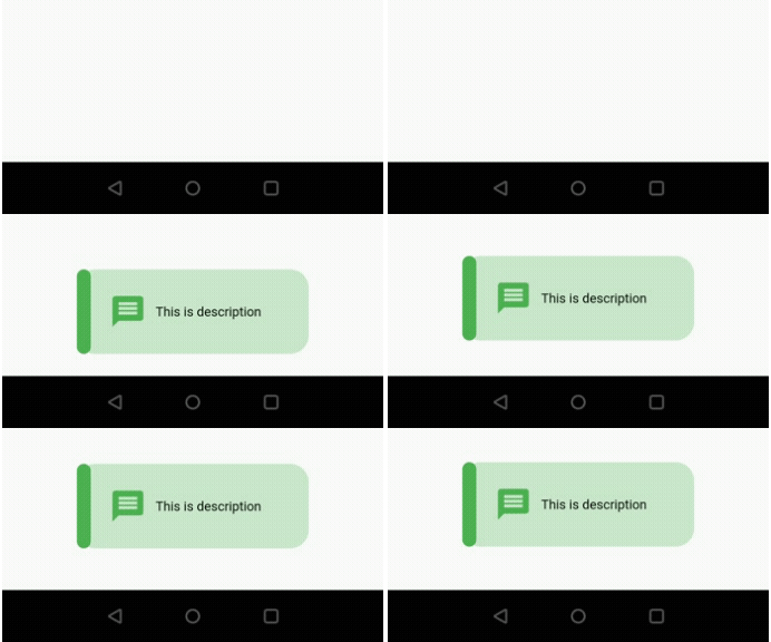
animationDuration
It takes Duration as value. Use this property if you want to change the duration of animation of the toast message. By default the duration of animation is 1.5 seconds.
MotionToast(
              color: Colors.green,
              description: "This is description",
              icon: Icons.message,
              enableAnimation: false,
              animationDuration: Duration(seconds: 3),
            ).show(context);
Output :
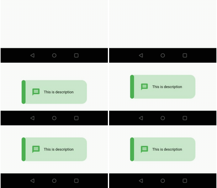
animationCurve
It takes Curves as value. Use this property to change the animation pattern. I will use Curves.bounceIn in the below example. Try the rest for yourself. By default the value is Curves.ease.
MotionToast(
              color: Colors.green,
              description: "This is description",
              icon: Icons.message,
              animationCurve: Curves.bounceIn,
            ).show(context);
Output :
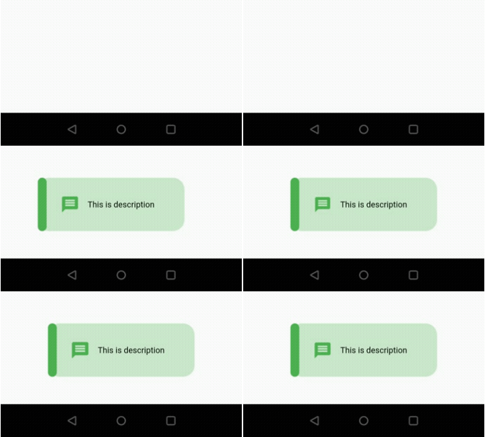
animationType
It takes ANIMATION as value. Use this property to change the animation direction. ANIMATION has four values, FROM_BOTTOM, FROM_TOP, FROM_LEFT & FROM_RIGHT. By default the value will be FROM_BOTTOM. I will use FROM_LEFT in the below example.
MotionToast(
              color: Colors.green,
              description: "This is description",
              icon: Icons.message,
              animationType: ANIMATION.FROM_LEFT,
            ).show(context);
Output :
layoutOrientation
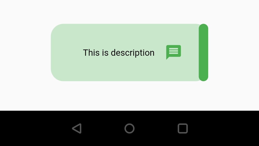
It takes ORIENTATION as value. ORIENTATION has two values LTR( left to right ) & RTL (right to left). Use this property to change the orientation of toast layout. By default the value is LTR. I will use RTL in the below example.
MotionToast(
              color: Colors.green,
              description: "This is description",
              icon: Icons.message,
              layoutOrientation: ORIENTATION.RTL,
            ).show(context);
Output :
toastDuration
It takes Duration as value. Use this property to change the duration you want the toast to appear on screen.
MotionToast(
              color: Colors.green,
              description: "This is description",
              icon: Icons.message,
              toastDuration: Duration(seconds: 3),
            ).show(context);
Flutter Motion Toast / Styled Toast Built-In Types
Motion toast offers five built-in toast messages. You can’t provide values for color and icon properties for these built-in messages. They will be applied automatically based on the type of the message. Let’s see the built-in messages below.
- success
- error
- warning
- delete
- info
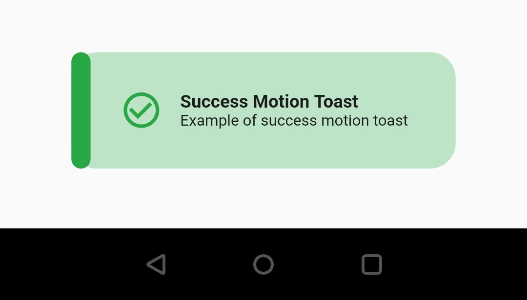
success
MotionToast.success(
	title:  "Success Motion Toast",
	titleStyle:  TextStyle(fontWeight:  FontWeight.bold),
	description:  "Example of success motion toast",
	descriptionStyle:  TextStyle(fontSize:  12),
	width:  300,
).show(context);
Output :
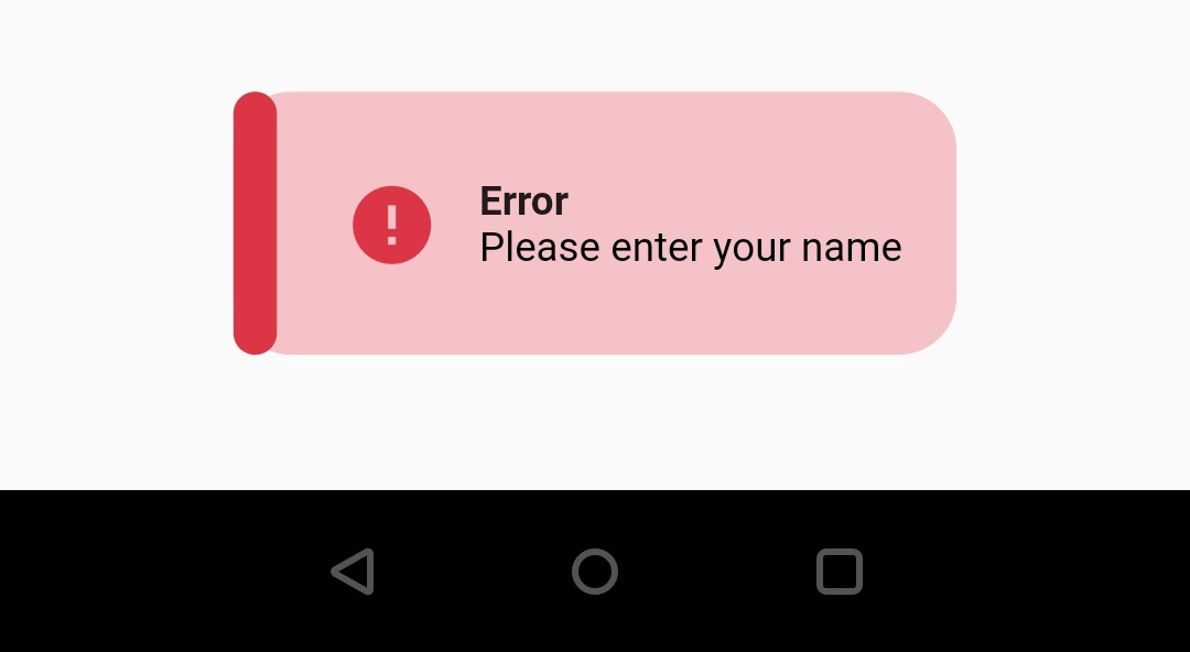
error
MotionToast.error(
	title:  "Error",
	titleStyle:  TextStyle(fontWeight:  FontWeight.bold),
	description:  "Please enter your name"
).show(context);
Output :
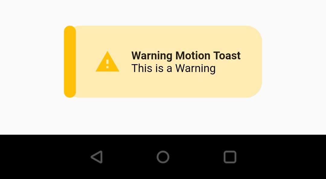
warning
MotionToast.warning(
	title:  "Warning Motion Toast",
	titleStyle:  TextStyle(fontWeight:  FontWeight.bold),
	description:  "This is a Warning"
).show(context);
Output :
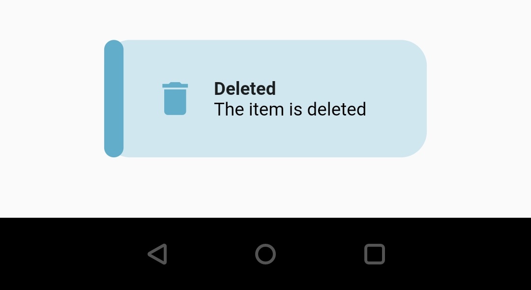
delete
MotionToast.delete(
	title:  "Deleted",
	titleStyle:  TextStyle(fontWeight:  FontWeight.bold),
	description:  "The item is deleted"
).show(context);
Output :
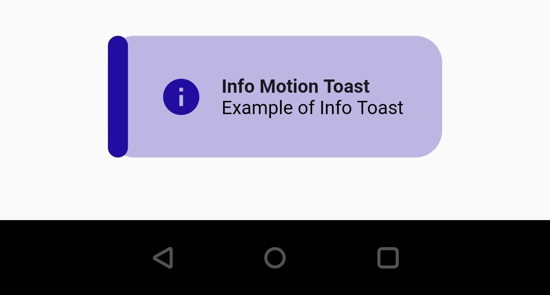
info
MotionToast.info(
	title:  "Info Motion Toast",
	titleStyle:  TextStyle(fontWeight:  FontWeight.bold),
	description:  "Example of Info Toast"
).show(context);
Output :
Flutter Motion Toast / Styled Toast Example
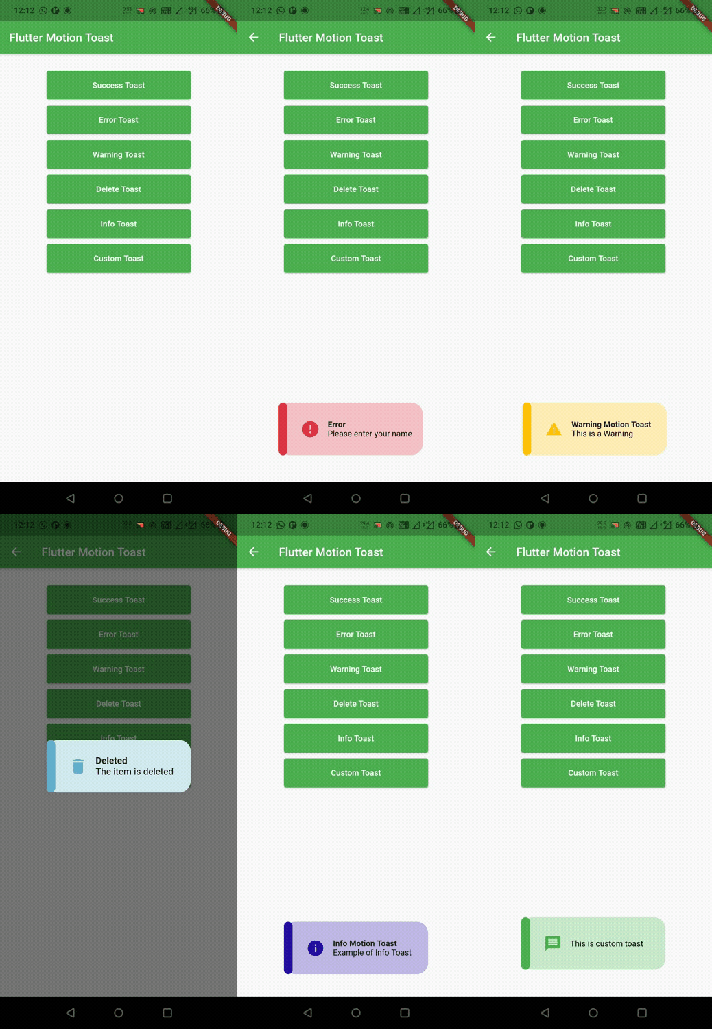
Let’s see an example which shows the usage of motion_toast dependency for creating styled toast message in flutter. In this example we will show six elevated buttons, where the first five buttons will display the five built-in messages. The sixth button will display a custom message.
import 'package:flutter/material.dart';
import 'package:motion_toast/motion_toast.dart';
import 'package:motion_toast/resources/arrays.dart';

void main() {
  runApp(MyApp());
}

class MyApp extends StatelessWidget {
  @override
  Widget build(BuildContext context) {
    return MaterialApp(
      title: 'Flutter App Learning',
      theme: ThemeData(
        primarySwatch: Colors.green,
      ),
      home: Scaffold(
        appBar: AppBar(
          title: Text("Flutter Motion Toast"),
        ),
        body: MyHomePage(),
      ),
    );
  }
}

class MyHomePage extends StatefulWidget {
  MyHomePage({Key? key}) : super(key: key);
  @override
  _MyHomePageState createState() => _MyHomePageState();
}

class _MyHomePageState extends State<MyHomePage> {

  @override
  Widget build(BuildContext context) {
    return Container(
        width: MediaQuery.of(context).size.width,
        margin: EdgeInsets.only(top: 20),
        child: Column(
        mainAxisAlignment: MainAxisAlignment.start,
        crossAxisAlignment: CrossAxisAlignment.center,
        children: [
          Container(
            width: 250,
            height: 50,
            margin: EdgeInsets.only(top: 10),
            child: ElevatedButton(
              onPressed:(){
                successMotionToast();
              },
              child: Text("Success Toast"),),
          ),

          Container(
            width: 250,
            height: 50,
            margin: EdgeInsets.only(top: 10),
            child: ElevatedButton(
              onPressed:(){
                errorMotionToast();
              },
              child: Text("Error Toast"),),
          ),

          Container(
            width: 250,
            height: 50,
            margin: EdgeInsets.only(top: 10),
            child: ElevatedButton(
              onPressed:(){
                warningMotionToast();
              },
              child: Text("Warning Toast"),),
          ),

          Container(
            width: 250,
            height: 50,
            margin: EdgeInsets.only(top: 10),
            child: ElevatedButton(
              onPressed:(){
                deleteMotionToast();
              },
              child: Text("Delete Toast"),),
          ),

          Container(
            width: 250,
            height: 50,
            margin: EdgeInsets.only(top: 10),
            child: ElevatedButton(
              onPressed:(){
                infoMotionToast();
              },
              child: Text("Info Toast"),),
          ),

          Container(
            width: 250,
            height: 50,
            margin: EdgeInsets.only(top: 10),
            child: ElevatedButton(
              onPressed:(){
                customMotionToast();
              },
              child: Text("Custom Toast"),),
          ),

       ]
    )
    );
  }

  void successMotionToast()
  {
    MotionToast.success(
      title:  "Success Motion Toast",
      titleStyle:  TextStyle(fontWeight:  FontWeight.bold),
      description:  "Example of success motion toast",
      descriptionStyle:  TextStyle(fontSize:  12),
      width:  300,
    ).show(context);
  }

  void errorMotionToast()
  {
    MotionToast.error(
        title:  "Error",
        titleStyle:  TextStyle(fontWeight:  FontWeight.bold),
        description:  "Please enter your name",
        animationType: ANIMATION.FROM_LEFT,
    ).show(context);
  }

  void warningMotionToast()
  {
    MotionToast.warning(
        title:  "Warning Motion Toast",
        titleStyle:  TextStyle(fontWeight:  FontWeight.bold),
        description:  "This is a Warning",
        animationType: ANIMATION.FROM_RIGHT,
    ).show(context);

  }

  void deleteMotionToast()
  {
    MotionToast.delete(
        title:  "Deleted",
        titleStyle:  TextStyle(fontWeight:  FontWeight.bold),
        description:  "The item is deleted",
        position: MOTION_TOAST_POSITION.CENTER,
        animationType: ANIMATION.FROM_LEFT,
    ).show(context);
  }

  void infoMotionToast()
  {
    MotionToast.info(
        title:  "Info Motion Toast",
        titleStyle:  TextStyle(fontWeight:  FontWeight.bold),
        description:  "Example of Info Toast"
    ).show(context);
  }

  void customMotionToast()
  {
    MotionToast(
      color: Colors.green,
      description: "This is custom toast",
      icon: Icons.message,
      toastDuration: Duration(seconds: 3),
    ).show(context);
  }
}
Output :
That brings an end to the tutorial on how to create and show styled toast or motion toast in flutter. We have also seen an example where we’ve used motion_toast dependency for adding styled toast functionality to our flutter project. Let’s catch up with some other widget in the next post. Have a great day !!
Do like & share my facebook page. Subscribe to newsletter if you find this post helpful. Thank you !!
Reference : motion_toast dependency.


Leave a Reply