Flutter SnackBar
SnackBar is a material widget in flutter used to notify the user with a short message. We will use snackbar after a particular action takes place. For example, we will use snackbar in instances like after deleting a file or when there is no network connection, etc. Generally, it will be displayed at the bottom of the screen. It displays the message for a very short period of time and disappears. We can also add an action button that can undo the action that has taken place.
Flutter provides a widget called SnackBar that lets us add a snack bar to our application. This tutorial shows you how to use a snackbar widget in flutter with example. We will also customize its style with different properties.
Creating SnackBar In Flutter
We can create a snackbar in flutter by calling its constructor. There is only one required property to create a snackbar which is content. Usually we will use a Text widget for content since we need to show some message to the user. We can use other widgets instead if we want.
Constructor:
SnackBar({
    Key? key,
    required Widget content,
    Color? backgroundColor,
    double? elevation,
    EdgeInsetsGeometry? margin,
    EdgeInsetsGeometry? padding,
    double? width,
    ShapeBorder? shape,
    SnackBarBehavior? behavior,
    SnackBarAction? action,
    Duration duration,
    Animation<double>? animation,
    VoidCallback? onVisible
})
Basic implementation of snackbar:
SnackBar(
     content: Text('Hi! i am snackbar'),
 )
Showing Snackbar In Flutter
We can’t display a snackbar continuously like other widgets. Generally, it will be triggered by click events and lasts for few seconds and disappears. Previously a snackbar is displayed using Scaffold.of(context).showSnackBar() method which is depricated. Now we can display a snackbar using scaffoldMessenger.
ScaffoldMessenger.of(context).showSnackBar(
          SnackBar(
            content: Text('Hi! i am snackbar'),
          )
      );
SnackBar Example Complete Code
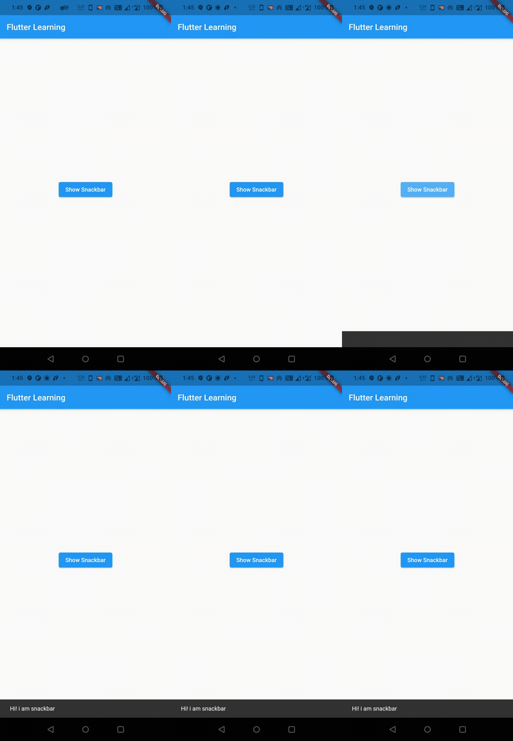
Let’s see an example where we create and display a snackbar. For this we will create a button and inside the onPressed callback of that button we will trigger a snackbar with a message.
import 'dart:io';
import 'package:flutter/cupertino.dart';
import 'package:flutter/material.dart';
//import 'widgets/add_entry_dialog.dart';
void main()
{
  runApp(MyApp());
}
class MyApp extends StatelessWidget {
  @override
  Widget build(BuildContext context) {
    return MaterialApp(
      title: 'Flutter Learning',
      theme: ThemeData(
        primarySwatch: Colors.blue,
      ),
      home: MyHomePage(),
    );
  }
}

class MyHomePage extends StatefulWidget {
  @override
  _MyHomePageState createState()
  {
    return _MyHomePageState();
  }
}

class _MyHomePageState extends State<MyHomePage> {
  var _selected ="";
  var _test = "Full Screen";
  @override
  Widget build(BuildContext context) {
    return Scaffold(
      appBar: AppBar(
        title: Text("Flutter Learning"),
      ),
      body: Center(
        child: Column(
          mainAxisAlignment: MainAxisAlignment.center,
          children: <Widget>[
            ElevatedButton(
                onPressed: () {
                  ScaffoldMessenger.of(context).showSnackBar(
                      SnackBar(
                        content: Text('Hi! i am snackbar'),
                      )
                  );
                },
              child: Text("Show Snackbar"),
            ),
            Text(_selected)
          ],
        ),
      ),
    );
  }
}
Output :
Flutter SnackBar Properties
The Properties of a snackbar in flutter are :
- backgroundColor
- padding
- shape
- behavior
- width
- margin
- elevation
- duration
- action
- onVisible
BackgroundColor
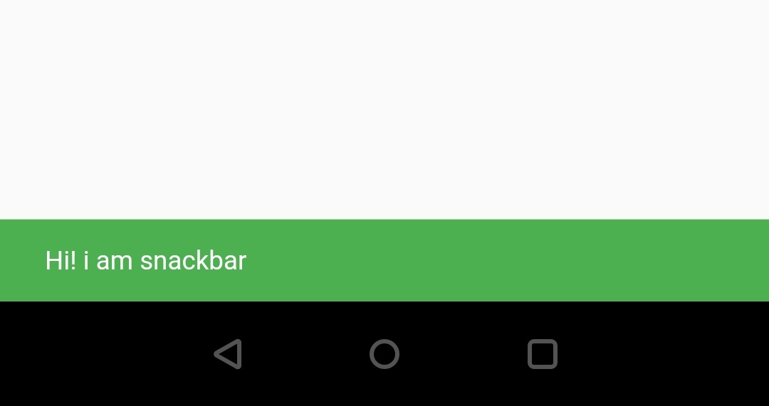
We can set or change background color of the snackbar by using backgroundColor property. By default it will use ThemeData.snackBarTheme’s background color.
SnackBar(
    content: Text('Hi! codesinsider.com'),
    backgroundColor: Colors.green,
  )
Output :
Padding
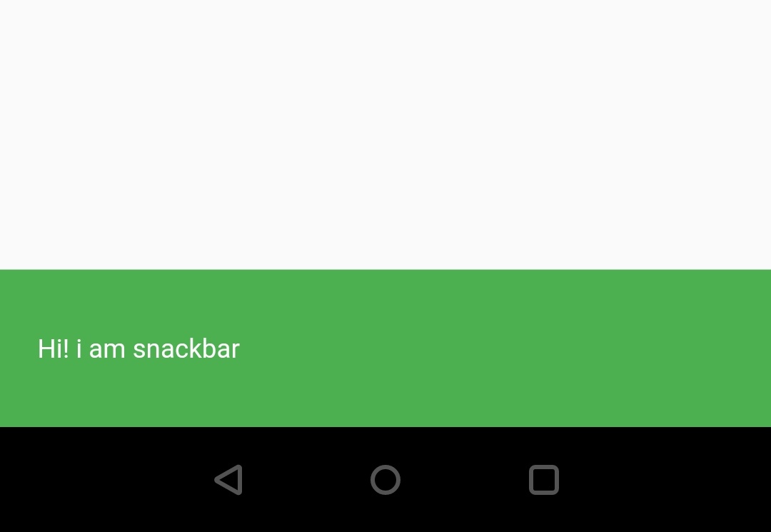
If we want to set padding to the content of the snackbar we can do so by using the padding widget.
SnackBar(
      content: Text('Hi! i am snackbar'),
      backgroundColor: Colors.green,
      padding: EdgeInsets.all(20),
      )
Output :
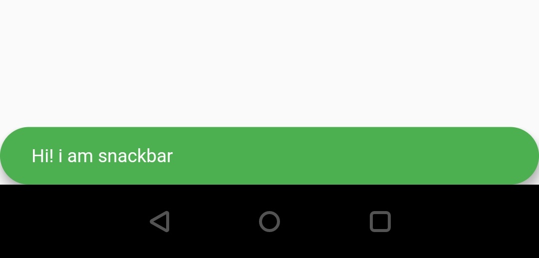
Shape
To change the shape of the snackbar use shape property. I’m just using stadium border shape in the below example, If you want to try other shapes just refer shaping RaisedButton section of flutter RaisedButton widget Example.
SnackBar(
      content: Text('Hi! i am snackbar'),
      backgroundColor: Colors.green,
      shape: StadiumBorder()
      )
Output :
Behavior
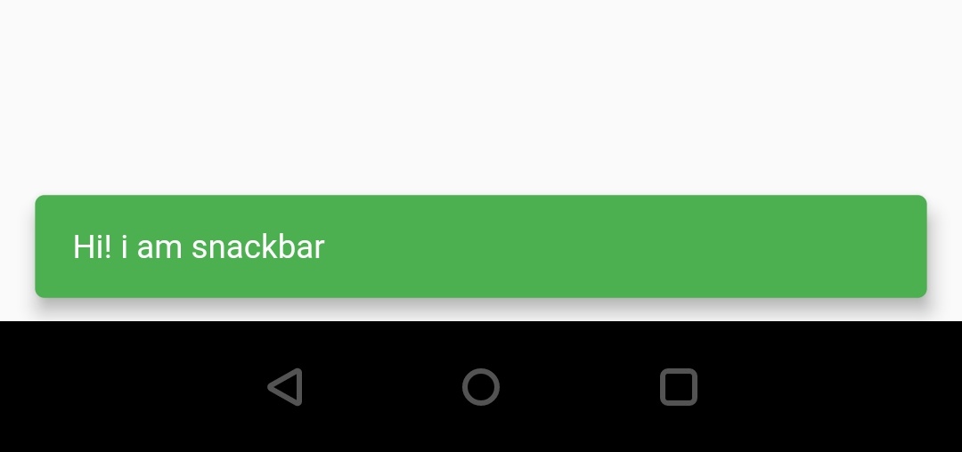
By default the snackbar behavior is fixed. If we want to change it we have to use the behavior property where we provide SnackBarBehavior constant as value. The SnackBarBehavior has two constants fixed and floating. If there is a BottomNavigationBar widget present then the snackbar will be diaplayed above the bottom navigation if the behaviour is fixed.
SnackBar(
      content: Text('Hi! i am snackbar'),
      backgroundColor: Colors.green,
      behavior: SnackBarBehavior.floating,
    )
Output :
Note: We can use width, margin and elevation properties of snackbar only when the behavior is set to floating. Also remember we have to use either width or margin but not both for a snackbar. Doing so will throw an error.
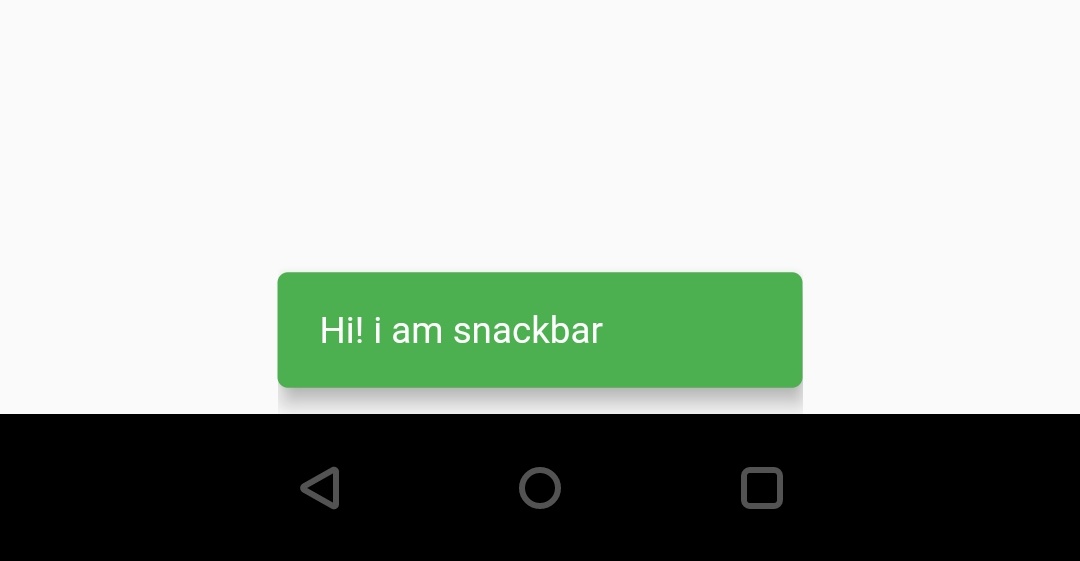
Width
We can set or change the snackbar width by using the width property.
SnackBar(
      content: Text('Hi! i am snackbar'),
      backgroundColor: Colors.green,
      behavior: SnackBarBehavior.floating,
      width: 200
    )
Output :
Margin
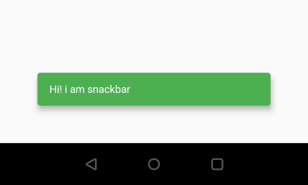
To set margin to snackbar we can use margin property. Margin is nothing but the amount of space we want around the snackbar.
SnackBar(
      content: Text('Hi! i am snackbar'),
      backgroundColor: Colors.green,
      behavior: SnackBarBehavior.floating,
      margin: EdgeInsets.all(50),
    )
Output :
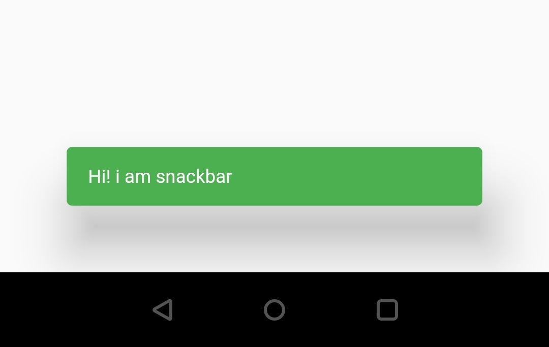
Elevation
We can change the elevation of the snackbar by using the elevation property.
SnackBar(
      content: Text('Hi! i am snackbar'),
      backgroundColor: Colors.green,
      behavior: SnackBarBehavior.floating,
      margin: EdgeInsets.all(50),
      elevation: 30,
   )
Output :
Duration
Duration is nothing but the amount of time we want the snackbar to be displayed on the screen. To change the duration we can use the snackbar ‘s duration property. We can provide duration in microseconds, milliseconds or minutes.
SnackBar(
      content: Text('Hi! i am snackbar'),
      backgroundColor: Colors.green,
      behavior: SnackBarBehavior.floating,
      duration: Duration(milliseconds: 10000),
   )
Action
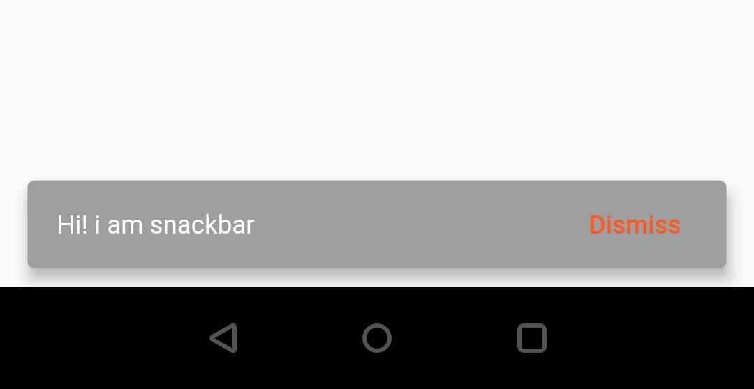
We can add an action Button which is clickable to a snackbar using the action property. The value for the action property should be a SnackBarAction(). To create a SnackBarAction we have to call its constructor. It has four main properties
- label : The name we want to display for the action button.
- textColor : To add color to the actionButton text.
- disabledTextColor : The color of the text to be displayed when the action button is disabled.
- onPressed : A callback function to perform any action when we click the action button.
SnackBar(
       content: Text('Hi! i am snackbar'),
       backgroundColor: Colors.grey,
       behavior: SnackBarBehavior.floating,
       action: SnackBarAction(
           label: 'Dismiss',
           disabledTextColor: Colors.white,
           textColor: Colors.deepOrange,
           onPressed: () {
                //Do whatever you want
           },
       ),
   )
Output :
onVisible
If we want to perform an action when the snackbar is displayed we can do it inside the onVisible() callback function.
SnackBar(
       content: Text('Hi! i am snackbar'),
       backgroundColor: Colors.grey,
       behavior: SnackBarBehavior.floating,
       action: SnackBarAction(
           label: 'Dismiss',
           disabledTextColor: Colors.white,
           textColor: Colors.deepOrange,
           onPressed: () {
                //Do whatever you want
           },
       ),
       onVisible: (){

       },
   )
That’s all about the tutorial on how to use snackbar widget in flutter with example. I hope you understand how to create and display or show snackbar in flutter. Let’s catch up with some other widget in the next post. Have a great day!!
Do share, subscribe and like my facebook page if you find this post helpful. Thank you!!
Reference: Flutter Official Documentation


Leave a Reply