
In this tutorial you will learn how to use expansion panel in flutter with example. We will also customize its style with different properties.
Flutter Expansion Panel Widget
Expansion panel is a material widget in flutter that can expand or collapse. It contains a head and body. Tapping on the head will toggle the panel between expanding and collapsing. When the panel expands the body will be visible and it will be invisible when the panel collapses. We cannot use the expansion panels individually. They can only be used as children for ExpansionPanelList.
We can use expansion panel in flutter by calling its constructor. Let’s have a look at the constructor.
Constructor of ExpansionPanel:
ExpansionPanel(
{required ExpansionPanelHeaderBuilder headerBuilder,
required Widget body,
bool isExpanded,
bool canTapOnHeader,
Color? backgroundColor}
)
Creating Expansion Panel
We can create an expansion panel by using ExpansionPanel widget provided by flutter. There are two required properties to create an expansion panel which are headBuilder and body. The value of headBuilder should be of type ExpansionPanelHeadeBuilder and the value for body should be a widget.
Basic implementation of expansion panel
ExpansionPanel(
         headerBuilder: (context, isExpanded) {
             return ListTile(
                title: Text('Click To Expand', style: TextStyle(color: Colors.white),),
             );
         },
         body:ListTile(
            title: Text('Description text',style: TextStyle(color: Colors.white)),
            tileColor: Colors.green,
         ),
         isExpanded: _expanded,
         canTapOnHeader: true,
         backgroundColor: Colors.green
    ),
Displaying ExpansionPanel
To display expansion panel we have to use ExpansionPanelList widget. The reason being we can only use expansion panel as a child of ExpansionPanelList. So lets use ExpansionPanelList and add Expansion panel as child to it.
ExpansionPanelList(
            animationDuration: Duration(milliseconds: 2000),
            children: [
              ExpansionPanel(
                  headerBuilder: (context, isExpanded) {
                    return ListTile(
                      title: Text('Click To Expand', style: TextStyle(color: Colors.black),),
                    );
                  },
                  body:ListTile(
                    title: Text('Description text',style: TextStyle(color: Colors.black)),
                  ),
                isExpanded: _expanded,
                canTapOnHeader: true,
              ),
            ],
            dividerColor: Colors.grey,
            expansionCallback: (panelIndex, isExpanded) {
              _expanded = !_expanded;
              setState(() {

              });
            },
        ),
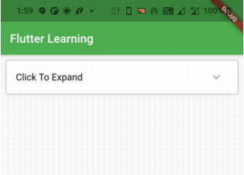
Expansion Panel Example Full Code
Let’s see an example where we create and display Expansion panel using ExpansionPanelList widget.
import 'dart:io';
import 'package:flutter/cupertino.dart';
import 'package:flutter/material.dart';
import 'package:flutter/widgets.dart';
import 'widgets/add_entry_dialog.dart';
void main()
{
  runApp(MyApp());
}
class MyApp extends StatelessWidget {
  @override
  Widget build(BuildContext context) {
    return MaterialApp(
      title: 'Flutter Learning',
      theme: ThemeData(
        primarySwatch: Colors.green,
      ),
      home: MyHomePage(),
    );
  }
}

class MyHomePage extends StatefulWidget {
  @override
  _MyHomePageState createState()
  {
    return _MyHomePageState();
  }
}

class _MyHomePageState extends State<MyHomePage> {
  bool _expanded = false;
  var _test = "Full Screen";
  @override
  Widget build(BuildContext context) {
    return Scaffold(
      appBar: AppBar(
        title: Text("Flutter Learning"),
      ),
      body: Column(
        children: [
          Container(
            margin: EdgeInsets.all(10),
            color: Colors.green,
            child: ExpansionPanelList(
            animationDuration: Duration(milliseconds: 2000),
            children: [
              ExpansionPanel(
                  headerBuilder: (context, isExpanded) {
                    return ListTile(
                      title: Text('Click To Expand', style: TextStyle(color: Colors.black),),
                    );
                  },
                  body:ListTile(
                    title: Text('Description text',style: TextStyle(color: Colors.black)),
                  ),
                isExpanded: _expanded,
                canTapOnHeader: true,
              ),
            ],
            dividerColor: Colors.grey,
            expansionCallback: (panelIndex, isExpanded) {
              _expanded = !_expanded;
              setState(() {

              });
            },

        ),
       ),
      ]
      ),
    );
  }
}
Output :
Expansion Panel Properties
The properties of expansion panel are :
- headerBuilder
- body
- canTapOnHeader
- isExpanded
- backgroundColor
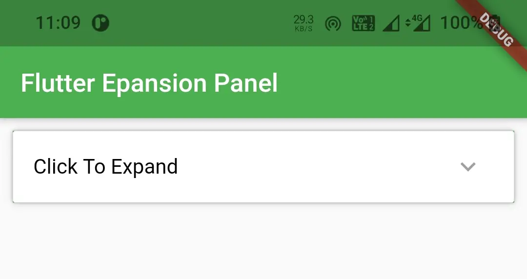
headerBuilder
We will use headerbuilder property to build the header part of the expansion panel.
ExpansionPanel(
       headerBuilder: (context, isExpanded) {
            return ListTile(
                title: Text('Click To Expand', style: TextStyle(color: Colors.black),),
            );
       },
 ),
Output :
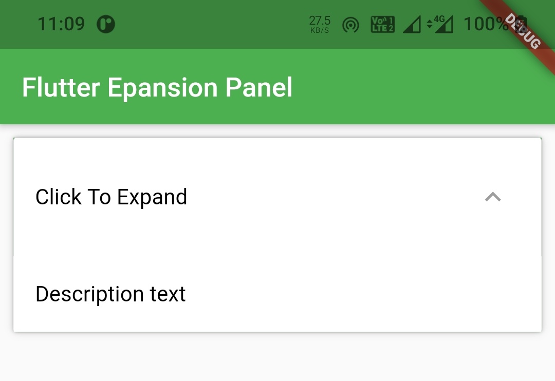
body
We will use body property to build the body part of the expansion panel which appears when it expands.
ExpansionPanel(
        headerBuilder: (context, isExpanded) {
              return ListTile(
                    title: Text('Click To Expand', style: TextStyle(color: Colors.black),),
              );
        },
        body:ListTile(
            title: Text('Description text',style: TextStyle(color: Colors.black)),
        ),
  ),
Output :
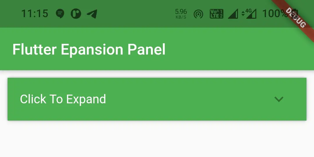
canTapOnHeader
If we want to expand the panel even if the user touches the header then we can use canTapOnHeader property. It is a boolean value which on setting true will make tapping on header expand the panel and vice versa.
ExpansionPanel(
        headerBuilder: (context, isExpanded) {
              return ListTile(
                    title: Text('Click To Expand', style: TextStyle(color: Colors.white),),
              );
        },
        body:ListTile(
            title: Text('Description text',style: TextStyle(color: Colors.white)),
            tileColor: Colors.green,
        ),
        canTapOnHeader: true,
  ),
isExpanded
This property is used to change the state of the expansion panel ie. whether the panel is expanded or collapsed. It is also a boolean value where setting to true will make the panel expand. We have to dynamically change the value by assigning a boolean value to this property to toggle between expansion and collapsing. We have to handle this in expansionCallback of Expansion Panel List widget since expansion panel can only be used as child of expansion panel list.
ExpansionPanel(
        headerBuilder: (context, isExpanded) {
              return ListTile(
                    title: Text('Click To Expand', style: TextStyle(color: Colors.white),),
              );
        },
        body:ListTile(
            title: Text('Description text',style: TextStyle(color: Colors.white)),
            tileColor: Colors.green,
        ),
        canTapOnHeader: true,
        isExpanded: _expanded,
  ),
backgroundColor
If we want to change the background color of the expansion panel header, we can change it by setting our desired color to backgroundColor property.
ExpansionPanel(
        headerBuilder: (context, isExpanded) {
              return ListTile(
                    title: Text('Click To Expand', style: TextStyle(color: Colors.white),),
              );
        },
        body:ListTile(
            title: Text('Description text',style: TextStyle(color: Colors.white)),
            tileColor: Colors.green,
        ),
        canTapOnHeader: true,
        isExpanded: _expanded,
        backgroundColor: Colors.green
  ),
Output :
That brings an end to the tutorial on how to use expansion panel in flutter with example. I hope you understand how to create and display or show expansion panel in flutter. Let’s catch up with some other widget in the next post. Have a great day!!
Do share, subscribe and like my facebook page if you find this post helpful. Thank you!!
Reference : Flutter Official Documentation


Great post.. How can I expand a specific item on the list? Thank you
Do you mean to expand by default?