
This tutorial shows you how to use choiceChip widget in flutter.
Flutter ChoiceChip Widget
Choice chip is a material widget in flutter. Choice chip allows the user to make a single selection from a set / group of chips. It contains a similar kind of text or categories. Flutter provides a widget called ChoiceChip that lets us add choice chip to our application. It requires one of its ancestors to be a Material widget.
Other types of chips are Chip, InputChip, ActionChip & FilterChip.
Creating ChoiceChip
To create a choice chip in flutter we have to use the constructor of ChoieChip class provided by flutter. There are two required property for ChoiceChip widget which are label and selected. The label can be any widget usually a text widget and selected is a boolean value which is used to indicate whether the label is selected or unselected. To use choice chip we have to provide these properties with some values.
Even if we use the required properties the chip will still be in disabled state. In order to enable the chip we have to set onSelected callback.
Flutter ChoiceChip Constructor :
 ChoiceChip(
    {Key? key,
    Widget? avatar,
    required Widget label,
    TextStyle? labelStyle,
    EdgeInsetsGeometry? labelPadding,
    ValueChanged<bool>? onSelected,
    double? pressElevation,
    required bool selected,
    Color? selectedColor,
    Color? disabledColor,
    String? tooltip,
    BorderSide? side,
    OutlinedBorder? shape,
    Clip clipBehavior,
    FocusNode? focusNode,
    bool autofocus,
    Color? backgroundColor,
    EdgeInsetsGeometry? padding,
    VisualDensity? visualDensity,
    MaterialTapTargetSize? materialTapTargetSize,
    double? elevation,
    Color? shadowColor,
    Color? selectedShadowColor,
    ShapeBorder avatarBorder}
)
Below is the example code to add choice chip to our flutter application.
ChoiceChip(
          label: Text("Codesinsider"),
          selected: true,
          onSelected: (bool value){},
        ),
Flutter ChoiceChip Properties
The properties of a choice chip widget are :
- avatar
- label
- labelStyle
- labelPadding
- side
- shape
- backgroundColor
- padding
- elevation
- shadowColor
- selected
- onSelected
- pressElevation
- disabledColor
- selectedColor
- selectedShadowColor
- avatarBorder
Since there are a lot of properties we will discuss few important ones. To know the rest refer flutter chip widget.
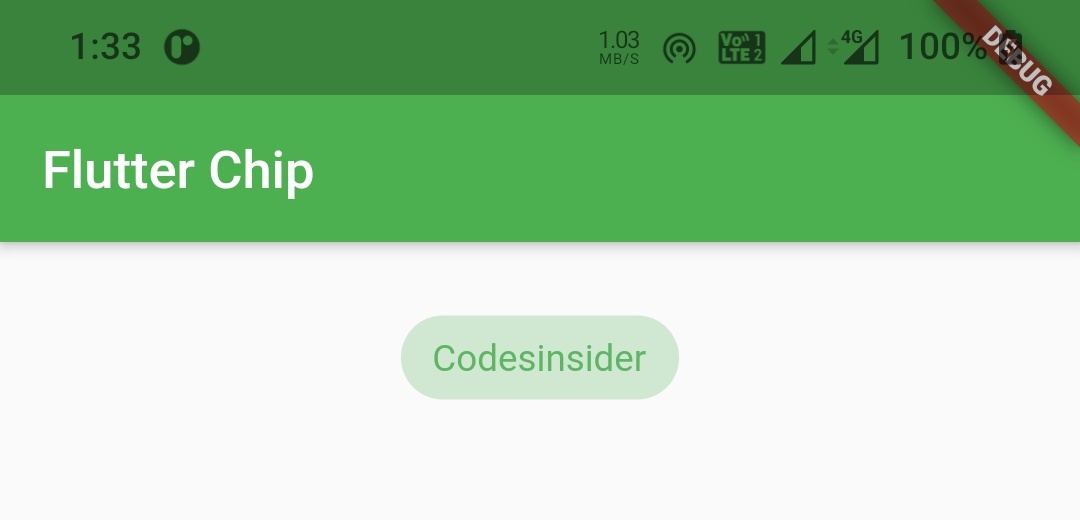
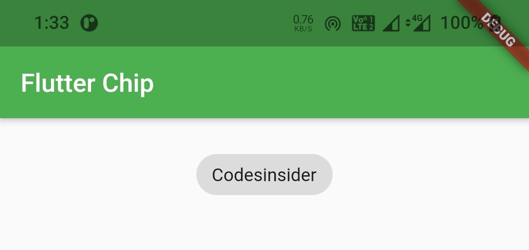
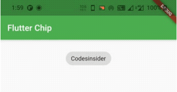
selected
We will use this property to set the chip’s state to selected or unselected. It takes a boolean value setting true will make the chip selected and false will make the chip unselected.
Container(
        alignment: Alignment.topCenter,
        margin: EdgeInsets.only(top: 20),
        child: ChoiceChip(
          label: Text("Codesinsider"),
          selected: true,
          onSelected: (bool value){},
        ),
      )
Output :
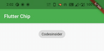
Container(
        alignment: Alignment.topCenter,
        margin: EdgeInsets.only(top: 20),
        child: ChoiceChip(
          label: Text("Codesinsider"),
          selected: false,
          onSelected: (bool value){},
        ),
      )
Output :
onSelected
We will use this property to update the selected or unselected state of the choice chip and also to perform some actions when the chip is selected or unselected.
Container(
        alignment: Alignment.topCenter,
        margin: EdgeInsets.only(top: 20),
        child: ChoiceChip(
          label: Text("Codesinsider"),
          selected: true,
          onSelected: (bool value){
            //Do whatever you want when the chip is selected
          },
        ),
      )
pressElevation
We will use this property to change the amount of elevation we want to apply when we press the chip.
nment: Alignment.topCenter,
        margin: EdgeInsets.only(top: 20),
        child: ChoiceChip(
          label: Text("Codesinsider"),
          selected: true,
          onSelected: (bool value){
            //Do whatever you want when the chip is selected
          },
          pressElevation: 20,
        ),
      )
Output :
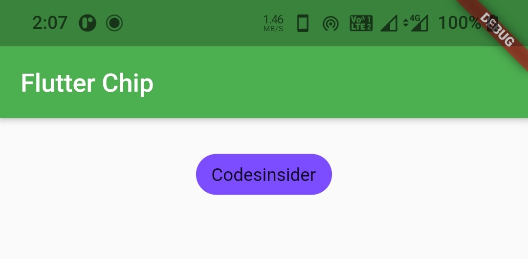
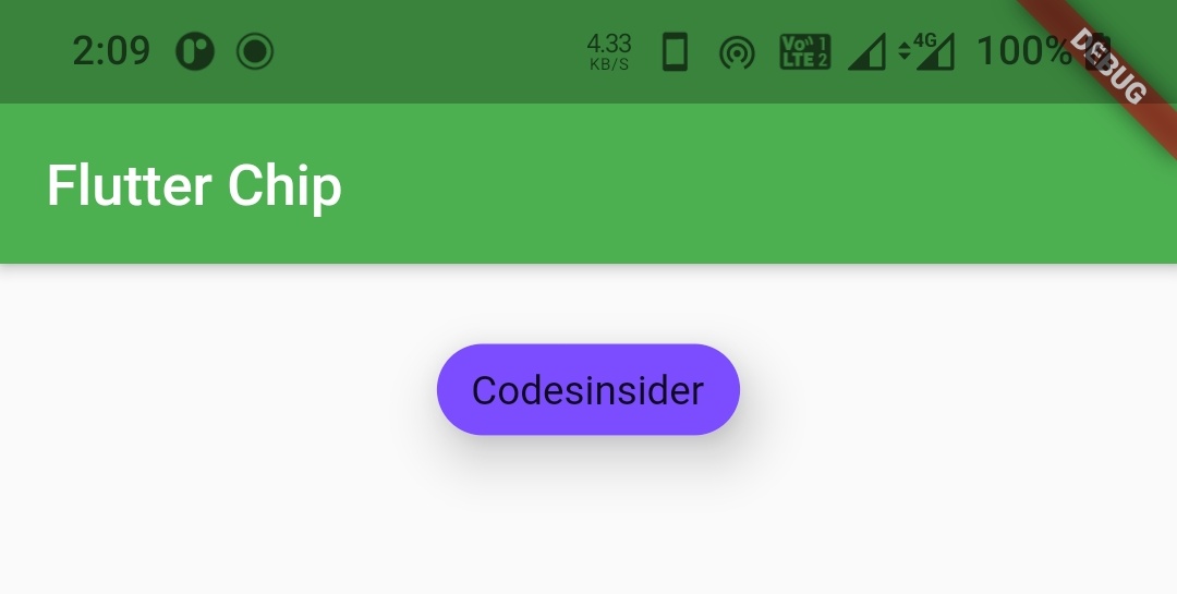
disabledColor
We will use this property to apply a color to the choice chip when the chip is disabled. So to disable the button i’m removing the onSelected callback.
Container(
        alignment: Alignment.topCenter,
        margin: EdgeInsets.only(top: 20),
        child: ChoiceChip(
          label: Text("Codesinsider"),
          selected: false,
          disabledColor: Colors.purple,
        ),
      )
Output :
selectedColor
We will use this property to apply color to the chip when the chip is selected.
bool isSelected = false;
Container(
        alignment: Alignment.topCenter,
        margin: EdgeInsets.only(top: 20),
        child: ChoiceChip(
          label: Text("Codesinsider"),
          selected: isSelected,
          onSelected: (bool value){
            isSelected = value;
            setState(() {

            });
            //Do whatever you want when the chip is selected
          },
          selectedColor: Colors.deepOrange,
        ),
      )
Output :
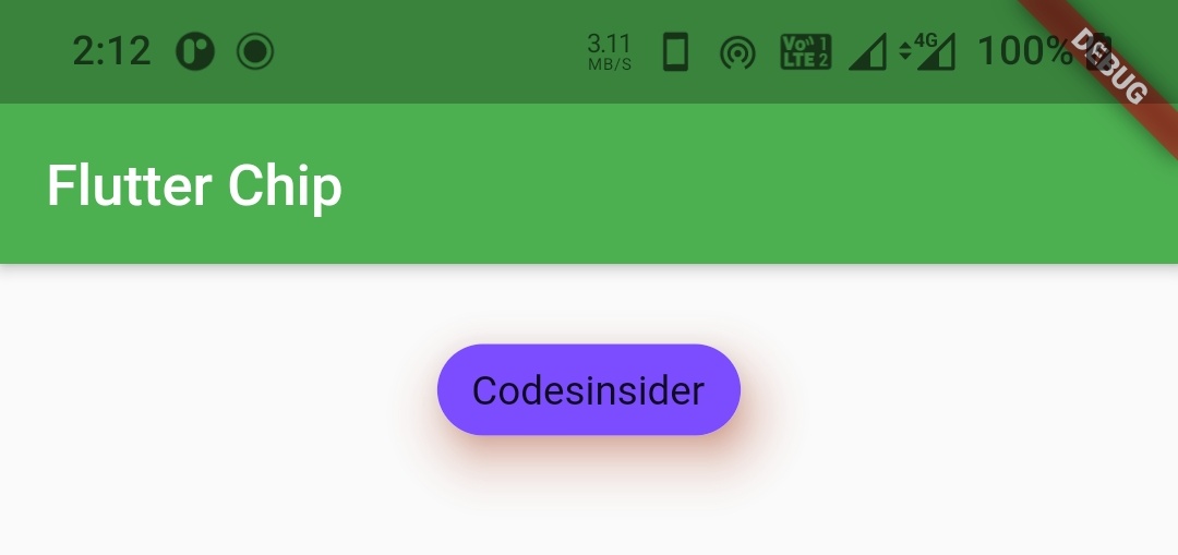
selectedShadowColor
We will use this property to apply shadow color to the chip when the chip is transforming from selected state to unselected state.
Container(
        alignment: Alignment.topCenter,
        margin: EdgeInsets.only(top: 20),
        child: ChoiceChip(
          label: Text("Codesinsider"),
          selected: isSelected,
          onSelected: (bool value){
            isSelected = value;
            setState(() {

            });
            //Do whatever you want when the chip is selected
          },
          selectedColor: Colors.blueGrey,
          selectedShadowColor: Colors.deepOrange,
        ),
      )
Output :
backgroundColor
We will use this property to add / change background color of choice chip.
Container(
        alignment: Alignment.topCenter,
        margin: EdgeInsets.only(top: 20),
        child: ChoiceChip(
          label: Text("Codesinsider"),
          selected: isSelected,
          onSelected: (bool value){
            isSelected = value;
            setState(() {

            });
            //Do whatever you want when the chip is selected
          },
          backgroundColor: Colors.deepPurpleAccent,
        ),
      )
Output :
elevation
We will use this property to apply elevation to the choice chip.
Container(
        alignment: Alignment.topCenter,
        margin: EdgeInsets.only(top: 20),
        child: ChoiceChip(
          label: Text("Codesinsider"),
          selected: isSelected,
          onSelected: (bool value){
            isSelected = value;
            setState(() {

            });
            //Do whatever you want when the chip is selected
          },
          backgroundColor: Colors.deepPurpleAccent,
          elevation: 15,
        ),
      )
Output :
shadowColor
We will use this property to apply color to the shadow that appears when the chip is elevated.
Container(
        alignment: Alignment.topCenter,
        margin: EdgeInsets.only(top: 20),
        child: ChoiceChip(
          label: Text("Codesinsider"),
          selected: isSelected,
          onSelected: (bool value){
            isSelected = value;
            setState(() {

            });
            //Do whatever you want when the chip is selected
          },
          backgroundColor: Colors.deepPurpleAccent,
          elevation: 15,
          shadowColor:Colors.deepOrange,
        ),
      )
Output :
Flutter ChoiceChip Example
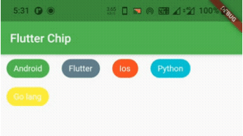
Lets see an example which shows the usage of choice chip widget in flutter. In this example we will display three choice chips. When the user selects a chips the remaining chips get unselected automatically.
For this example we need a pojo class for holding the data of choice chip. The pojo class will have two parameters label and color. The label will hold the text to be displayed as label of the chip and color will hold the backgroundColor of the chip.
Tech class ( pojo ) :
class Tech
{
  String label;
  Color color;
  Tech(this.label, this.color);
}
Now let’s create a List of type Tech (pojo) and provide the data for chips.
List<Tech> _chipsList = [
    Tech("Android", Colors.green),
    Tech("Flutter", Colors.blueGrey),
    Tech("Ios", Colors.deepOrange),
    Tech("Python", Colors.cyan),
    Tech("Go lang", Colors.yellow)
  ];
Now we will write the code for generating and selecting the chips from the above data. Let’s create a function techChips() which will return a List of widgets which will be choice chips in our case.
List<Widget> techChips () {
    List<Widget> chips = [];
    for (int i=0; i< _chipsList.length; i++) {
      Widget item = Padding(
        padding: const EdgeInsets.only(left:10, right: 5),
        child: ChoiceChip(
          label: Text(_chipsList[i].label),
          labelStyle: TextStyle(color: Colors.white),
          backgroundColor: _chipsList[i].color,
          selected: selectedIndex == i,
          onSelected: (bool value)
          {
            setState(() {
              selectedIndex = i;
            });
          },
        ),
      );
      chips.add(item);
    }
    return chips;
  }
We will set the above function to children property of wrap widget in body.
 Wrap(
        spacing: 6,
        direction: Axis.horizontal,
        children: techChips(),
      )
Complete Code :
Now let’ s merge all the code snippets above to complete the choice chip example.
import 'package:flutter/cupertino.dart';
import 'package:flutter/material.dart';
import 'package:flutter/widgets.dart';
import 'package:flutter_app_learning/NavDrawer.dart';
import 'package:flutter_app_learning/contact.dart';
void main()
{
  runApp(MyApp());
}

class MyApp extends StatelessWidget {
  @override
  Widget build(BuildContext context) {
    return MaterialApp(
      title: 'Flutter Learning',
      theme: ThemeData(
        primarySwatch: Colors.green,
      ),
      home: MyHomePage(),
    );
  }
}

class MyHomePage extends StatefulWidget {
  @override
  _MyHomePageState createState()
  {
    return _MyHomePageState();
  }
}

class Tech
{
  String label;
  Color color;
  Tech(this.label, this.color);
}

class _MyHomePageState extends State<MyHomePage> {
  int selectedIndex;
  List<Tech> _chipsList = [
    Tech("Android", Colors.green),
    Tech("Flutter", Colors.blueGrey),
    Tech("Ios", Colors.deepOrange),
    Tech("Python", Colors.cyan),
    Tech("Go lang", Colors.yellow)
  ];

  @override
  Widget build(BuildContext context) {
    return Scaffold(
      appBar: AppBar(
        title: Text("Flutter Chip"),
      ),
      body: Wrap(
        spacing: 6,
        direction: Axis.horizontal,
        children: techChips(),
      )
    );
  }

  List<Widget> techChips () {
    List<Widget> chips = [];
    for (int i=0; i< _chipsList.length; i++) {
      Widget item = Padding(
        padding: const EdgeInsets.only(left:10, right: 5),
        child: ChoiceChip(
          label: Text(_chipsList[i].label),
          labelStyle: TextStyle(color: Colors.white),
          backgroundColor: _chipsList[i].color,
          selected: selectedIndex == i,
          onSelected: (bool value)
          {
            setState(() {
              selectedIndex = i;
            });
          },
        ),
      );
      chips.add(item);
    }
    return chips;
  }
}
Output :
That’s all about the tutorial on how to create and display or show ChoiceChip in flutter. We have also seen an example where we’ve used ChoiceChip widget and customized it. Let’s catch up with some other widget in the next post. Have a great day!!
Do like & share my facebook page. Subscribe to newsletter if you find this post helpful. Thank you!!
Reference : Flutter Official Documentation.


Leave a Reply