
Flutter SliverAppBar / Collapsing Toolbar
SliverAppBar is a material widget in flutter that shows a collapsing toolbar. Using sliverappbar we can customize the appbar to hold widgets like toolbar, image, text, etc. These widgets will slide in and out of the view based on the scroll direction. It expands to show the image when we scroll down and collapses to display the toolbar when we scroll up. Flutter provides a widget called SliverAppBar which helps us to add the sliver app bar / collapsing toolbar to our app. In this tutorial, we will learn how to use SliverAppBar widget in flutter with example. We will also customize the widget with different properties.
Creating SliverAppBar / Collapsing Toolbar in Flutter
We can create a sliver app bar by using SliverAppBar class provided by flutter. Calling it’s constructor and providing the required properties will do the work. There are no required properties for the SliverAppBar widget. Generally, it is similar to normal AppBar so most of the properties are similar for both SliverAppBar and normal AppBar widgets.
Flutter SliverAppBar Constructor :
SliverAppBar(
   {Key? key,
    Widget? leading,
    bool automaticallyImplyLeading,
    Widget? title,
    List<Widget>? actions,
    Widget? flexibleSpace,
    PreferredSizeWidget? bottom,
    double? elevation,
    Color? shadowColor,
    bool forceElevated,
    Color? backgroundColor,
    Color? foregroundColor,
    Brightness? brightness,
    IconThemeData? iconTheme,
    IconThemeData? actionsIconTheme,
    TextTheme? textTheme,
    bool primary,
    bool? centerTitle,
    bool excludeHeaderSemantics,
    double? titleSpacing,
    double? collapsedHeight,
    double? expandedHeight,
    bool floating,
    bool pinned,
    bool snap,
    bool stretch,
    double stretchTriggerOffset,
    AsyncCallback? onStretchTrigger,
    ShapeBorder? shape,
    double toolbarHeight,
    double? leadingWidth,
    bool? backwardsCompatibility,
    TextStyle? toolbarTextStyle,
    TextStyle? titleTextStyle,
    SystemUiOverlayStyle? systemOverlayStyle}
)
Basic implementation of SliverAppBar / collapsing toolbar.
return Scaffold(
        body: NestedScrollView(
            headerSliverBuilder: (BuildContext context, bool innerBoxIsScrolled) {
              return <Widget>[
              SliverAppBar(
                title: Text("Codesinsider.com"),
              )
              ];
            },
        ),
    );
Flutter SliverAppBar Properties
The properties of a sliverAppBar are similar to normal AppBar in flutter. So we will be discussing the dissimilar ones in this example. To know similar ones refer Flutter AppBar Example.
- flexibleSpace
- bottom
- collapsedHeight
- expandedHeight
- floating
- pinned
- snap
flexibleSpace
This property takes a widget and shows it when the sliverAppBar is expanded. It stacks the widget behind the toolbar when the sliverAppBar is collapsed.
SliverAppBar(
                leading: Icon(Icons.arrow_back) ,
                expandedHeight: 250.0,
                flexibleSpace: FlexibleSpaceBar(
                    centerTitle: true,
                    title: Text("Codesinsider.com",
                        style: TextStyle(
                          color: Colors.white,
                          fontSize: 16.0,
                      )),
                    ),
              ),
bottom
This property let’s you display a widget below or to the bottom of the SliverAppBar. It takes a PrefferedSize Widget as value. Generally we will use TabBar with bottom widget of the SliverAppBar.
SliverAppBar(
                title: Text("Codesinsider.com"),
                centerTitle: true,
                bottom: PreferredSize(
                  child: child: Padding(
                    padding: EdgeInsets.all(15),
                      child: Text(
                        "This is bottom text",
                        style: TextStyle(
                            color: Colors.white
                        ),
                      )
                  ),
                  preferredSize: Size.fromHeight(50.0)
                ),
)
Output :

collapsedHeight
We will use this property to set or change the height of the toolbar when it is collapsed.
SliverAppBar(
                leading: Icon(Icons.arrow_back) ,
                expandedHeight: 250.0,
                pinned: true,
                collapsedHeight: 80,
                flexibleSpace: FlexibleSpaceBar(
                    centerTitle: true,
                    title: Text("Codesinsider.com",
                        style: TextStyle(
                          color: Colors.white,
                          fontSize: 16.0,
                      )),
                ),
              ),
Output :

expandedHeight
To set the height we want the sliver app bar to have when expanded, we will use expandedHeight property.
SliverAppBar(
                leading: Icon(Icons.arrow_back) ,
                expandedHeight: 250.0,
                pinned: true,
                flexibleSpace: FlexibleSpaceBar(
                    centerTitle: true,
                    title: Text("Codesinsider.com",
                        style: TextStyle(
                          color: Colors.white,
                          fontSize: 16.0,
                      )),
                ),
              ),
Output :

floating
We will use this property to set whether the sliverAppBar should be displayed immediately or not on scrolling a list. It takes a boolean value. Setting this property to true will make the appBar float immediately when we start scrolling down a list. If we set it to false the appbar won’t appear until we reach the top most item in the list.
SliverAppBar(
                leading: Icon(Icons.arrow_back) ,
                expandedHeight: 250.0,
                pinned: true,
                floating: true,
                flexibleSpace: FlexibleSpaceBar(
                    centerTitle: true,
                    title: Text("Codesinsider.com",
                        style: TextStyle(
                          color: Colors.white,
                          fontSize: 16.0,
                      )),
                ),
              ),
pinned
This property takes a boolean value. Setting it to false will make the toolbar invisible when scrolled up. When set to true the toolbar will stick at the top when it is scrolled up.
SliverAppBar(
                leading: Icon(Icons.arrow_back) ,
                expandedHeight: 250.0,
                pinned: true,
                flexibleSpace: FlexibleSpaceBar(
                    centerTitle: true,
                    title: Text("Codesinsider.com",
                        style: TextStyle(
                          color: Colors.white,
                          fontSize: 16.0,
                      )),
                ),
              ),
snap
For this property to work the floating property must be set to true. Setting this property to true will make the SliverAppBar snap into the view instead of sliding or scrolling smoothly while expanding and collapsing. When snap is true if we drag the toolbar downward to some extent and leave, it will expand completely to its full height. If we drag upward to some extent and leave it will collapse automatically from there.
SliverAppBar(
                leading: Icon(Icons.arrow_back) ,
                expandedHeight: 250.0,
                pinned: true,
                floating: true,
                snap: true,
                flexibleSpace: FlexibleSpaceBar(
                    centerTitle: true,
                    title: Text("Codesinsider.com",
                        style: TextStyle(
                          color: Colors.white,
                          fontSize: 16.0,
                      )),
                ),
              ),
You can observe the behavior of the sliverAppBar when the three properties floating, pinned and snap are used in different manners in the official documentation.
Flutter SliverAppBar Example
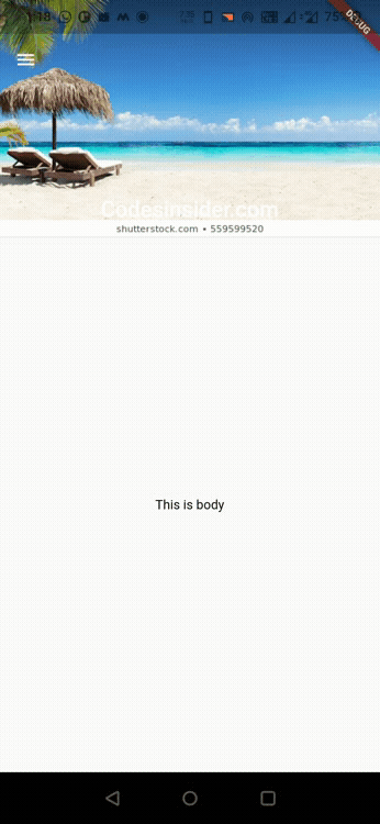
Let’s see an example where we create a sliverAppBar / collapsing toolbar with a title, drawer icon. When the SliverAppBar is expanded we will display a background image and some title text on it. When it is collapsed the image will be stacked behind the AppBar and the title will be displayed in the center of the AppBar.
import 'package:flutter/material.dart';
import 'package:flutter/widgets.dart';
import 'package:flutter_app_learning/NavDrawer.dart';
void main()
{
  runApp(MyApp());
}

class MyApp extends StatelessWidget {
  @override
  Widget build(BuildContext context) {
    return MaterialApp(
      title: 'Flutter Learning',
      theme: ThemeData(
        primarySwatch: Colors.green,
      ),
      home: MyHomePage(),
    );
  }
}

class MyHomePage extends StatefulWidget {
  @override
  _MyHomePageState createState()
  {
    return _MyHomePageState();
  }
}

class _MyHomePageState extends State<MyHomePage> {
  @override
  Widget build(BuildContext context) {
    return Scaffold(
        drawer: Drawer(),
        body: NestedScrollView(
            headerSliverBuilder: (BuildContext context, bool innerBoxIsScrolled) {
              return <Widget>[
              SliverAppBar(
                expandedHeight: 220.0,
                pinned: true,
                floating: true,
                flexibleSpace: FlexibleSpaceBar(
                    centerTitle: true,
                    title: Text("Codesinsider.com",
                        style: TextStyle(
                          color: Colors.white,
                          fontSize: 16.0,
                      )),
                    background:Image.asset("assets/images/flutter_stack.jpg", fit: BoxFit.cover,),
                    ),
              ),
              ];
            },
          body: Center(
            child: Text(
              "This is body",
              style: TextStyle(
                  color: Colors.black
              ),
            ),
          ),
        ),
    );
  }
}
Output :
That brings an end to the tutorial on how to create and display or show SliverAppBar / Collapsing Toolbar in flutter. We have also seen an example where we’ve used SliverAppBar widget and customized it. Let’s catch up with some other widget in the next post. Have a great day!!
Do share, subscribe, and like my Facebook page if you find this post helpful. Thank you!!
Reference: Flutter Official Documentation


Wow! This blog looks exactly like my old one!
It’s on a completely different subject but it has pretty much the same layout and design.
Outstanding choice of colors!
Thank you mario.