Flutter Container Widget
Container in flutter is nothing but a widget that acts as a container for other widgets. In other words, we can say it is used to hold other widgets. Using this widget we can apply styling to child widgets like painting, size & position. The container widget can only have one child.
If there are no children, the container tries to occupy as much space as possible. If there are children the container will adjust to the size of children. We can also define the height and width of a container if we want. It plays a key role in designing flutter layouts.
In this tutorial, you will learn how to create & use the container widget in flutter with example. We will also customize the widget using different properties.
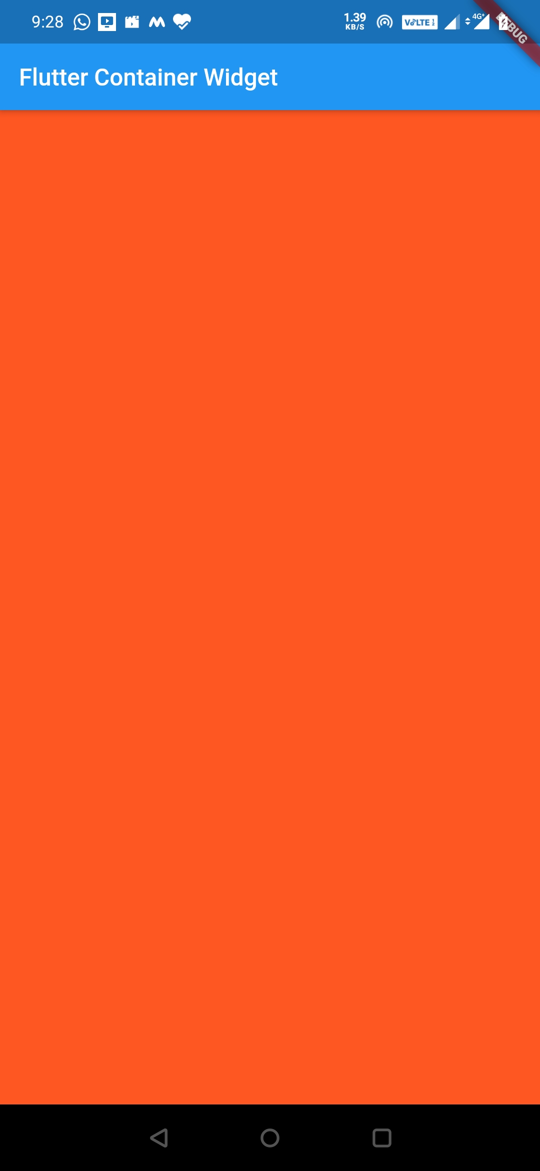
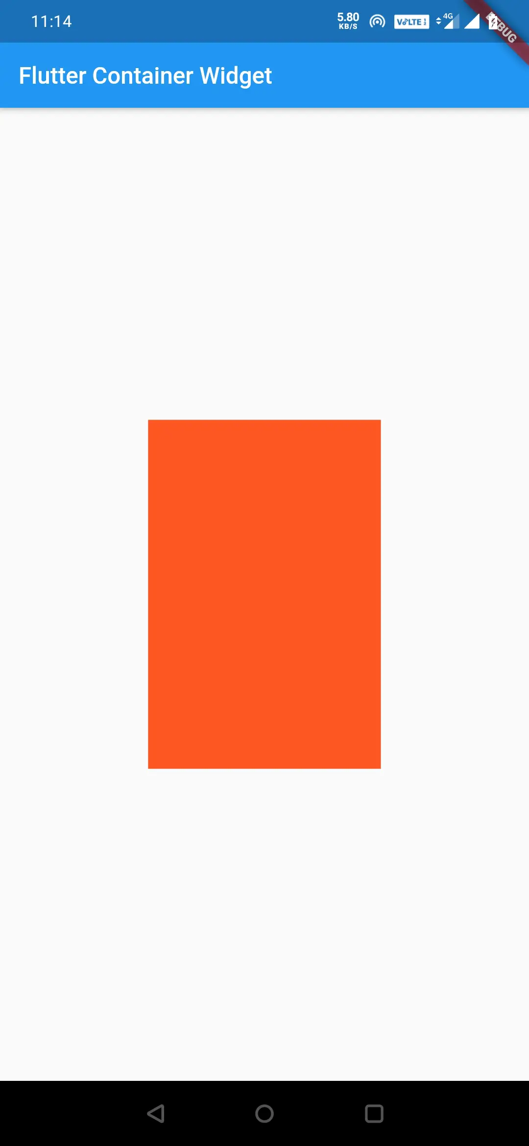
Let’s define a container and apply green color to it. As there will be no children the container will occupy the entire screen.
Center(
         child: Container(
            color: Colors.deepOrange,
          ),
Output:
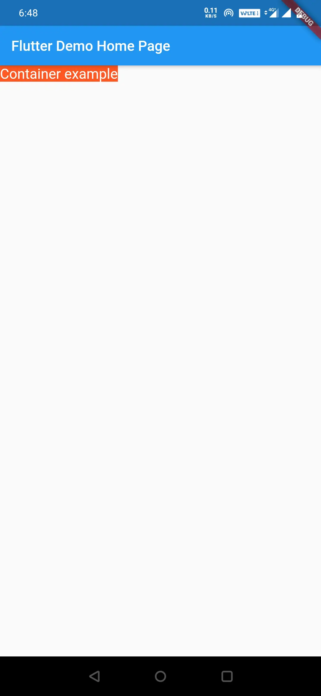
Now let’s try to add a child which is a text, now the container will resize to the text size.
Container(
          color:Colors.deepOrange,
          child: Text("Container example", style: TextStyle(fontSize: 20, color: Colors.white),)
        ),
Output:
Also read: how to add images in flutter app to learn working with images in flutter.
Creating Container
To create a container in flutter we have to call the constructor of the container class and provide the required properties. Let’s see the container below.
Flutter Container Constructor:
Container(

    {Key? key,
    AlignmentGeometry? alignment,
    EdgeInsetsGeometry? padding,
    Color? color,
    Decoration? decoration,
    Decoration? foregroundDecoration,
    double? width,
    double? height,
    BoxConstraints? constraints,
    EdgeInsetsGeometry? margin,
    Matrix4? transform,
    AlignmentGeometry? transformAlignment,
    Widget? child,
    Clip clipBehavior}

)
By looking at the constructor we can clearly say there are no required properties. But there will be no point in using the container if we don’t provide a child.
Flutter Container Widget Properties
The properties of a container widget are:
- backgroundColor
- child
- height
- width
- alignment
- constraints
- margin
- padding
- transform
- transformAlignment
- color
- decoration
- foregroundDecoration
Changing background color
The color property is used to apply background color to the container. We can use both Color and Colors classes to apply color to a container.
Colors class
While using the Colors class we use the color name.
Center(
         child: Container(
            color: Colors.deepOrange[500],
          ),
In the above example, we can observe a value in square brackets after the color name. It defines the shade of the color. The more the value the darker the color. You can just use the color name if you don’t want any shade. You can also define the shade like below.
Center(
         child: Container(
            color: Colors.deepOrange.shade500,
          ),
Output:
Color class
The color class has two commonly used methods .fromARGB(A = Alpha or opacity, R = Red, G = Green, B = Blue), .fromRGBO(R = Red, G = Green, B = Blue, O = Opacity).
The .fromARGB method can be used with color numbers or hexadecimal numbers.
Color.fromARGB(0xFF, 0x40, 0xA6, 0xF6);
Color.fromARGB(255, 66, 166, 246);
The .fromRGBO method can be used with the color number only.
Color.fromRGBO(66, 165, 245, 1.0);
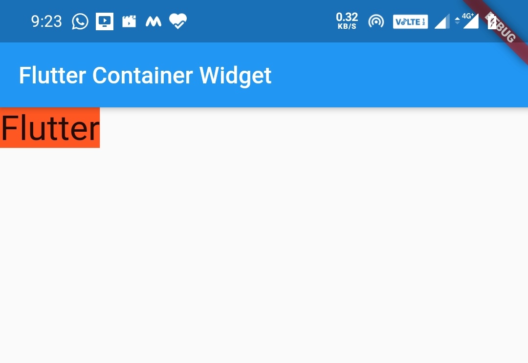
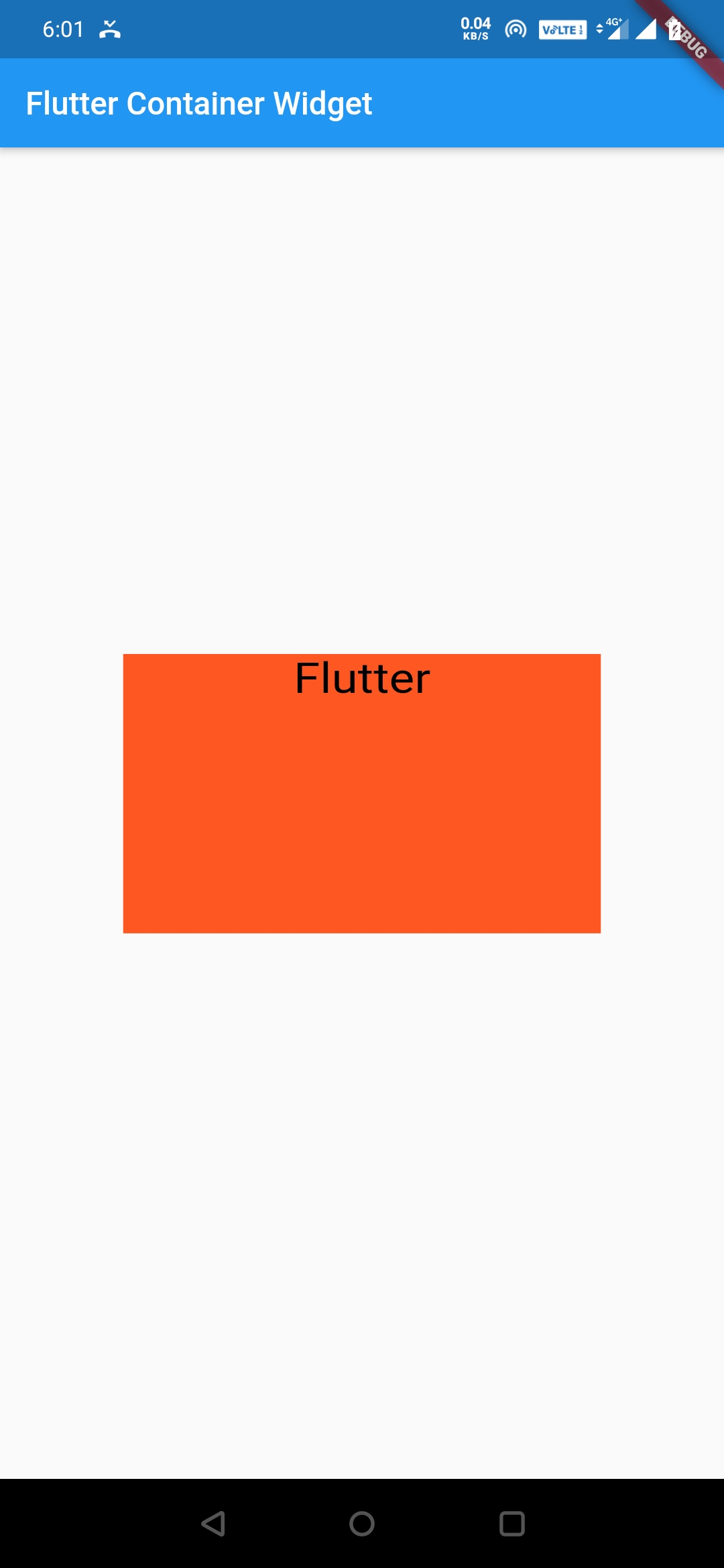
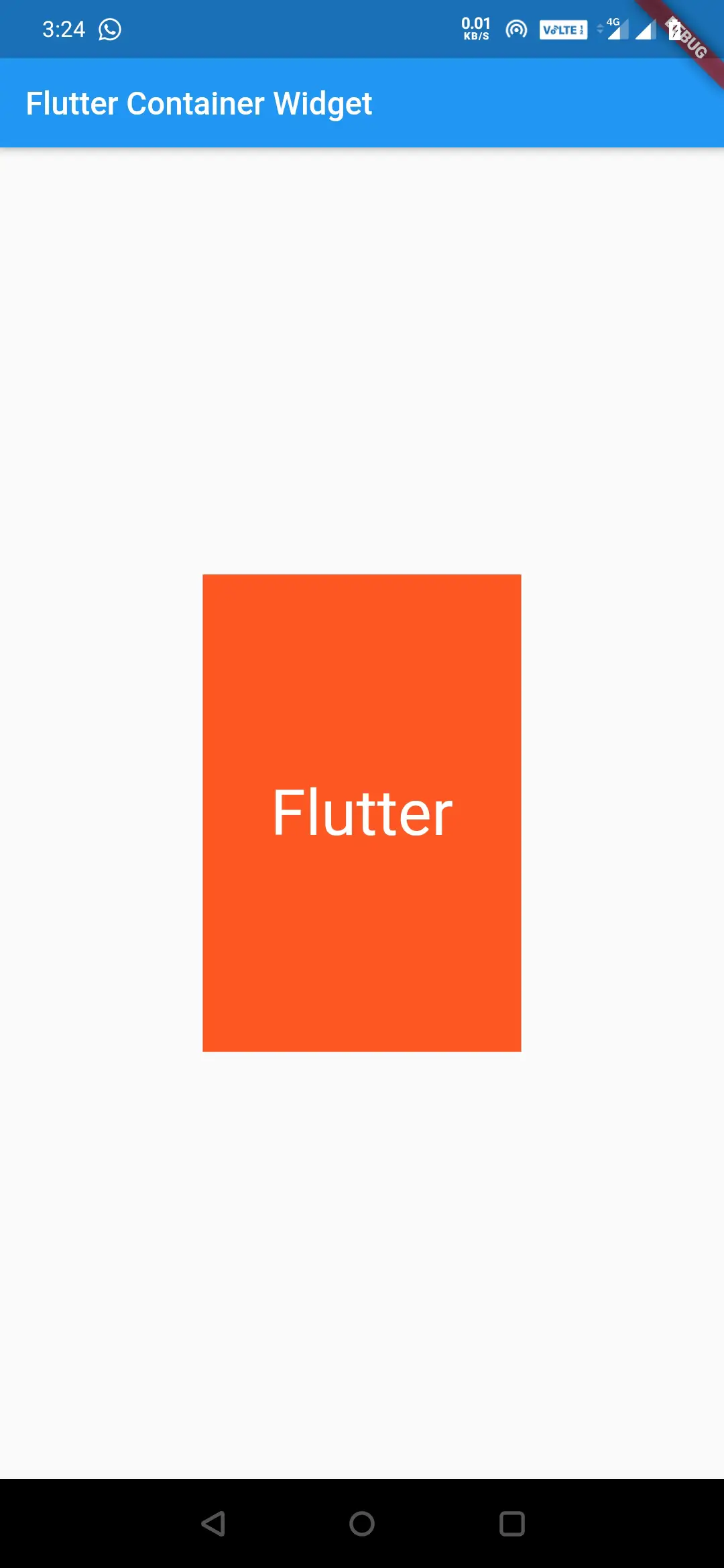
Adding a child
The container widget is a single child widget so we can only add one child to this widget. The child can be, either a single child widget or a multi-child widget. So let’s add a child widget.
Container(
          color: Colors.deepOrange,
          child: Text("Flutter", style: TextStyle(fontSize: 30),),
        ),
Output:
Changing height and width
Height and width properties are used to define, height and width of the container widget.
Center(
         child: Container(
           alignment: Alignment.topCenter,
           color: Colors.deepOrange,
           height: 200,
           width: 300,
           child: Text("Flutter", style: TextStyle(fontSize: 30, color: Colors.black),),
         )
        ),
Output:
Alignment
We can align the child widgets using Alignment, FractionalOffset, AlignmentDirectional classes in the container widget.
Alignment
Alignment takes two parameters x and y, where x is value along X-axis and y value along Y-axis. We can define alignment as Alignment(0,0), which means the center of the screen. We can also use predefined constants of Alignment class, like Alignment.topLeft.
The constants of the Alignment class are
- Alignment.topLeft which is equal to Alignment(-1.0, -1.0)
- Alignment.topCenter which is equal to Alignment(0.0, -1.0)
- Alignment.topRight which is equal to Alignment(1.0, -1.0)
- Alignment.centerLeft which is equal to Alignment(-1.0, 0.0)
- Alignment.center which is equal to Alignment(0.0, 0.0)
- Alignment.centerRight which is equal to Alignment(1.0 , 0.0)
- Alignment.bottomLeft which is equal to Alignment(-1.0, 1.0)
- Alignment.bottomCenter which is equal to Alignment(0.0, 1.0)
- Alignment.bottomRight which is equal to Alignment(1.0, 1.0)
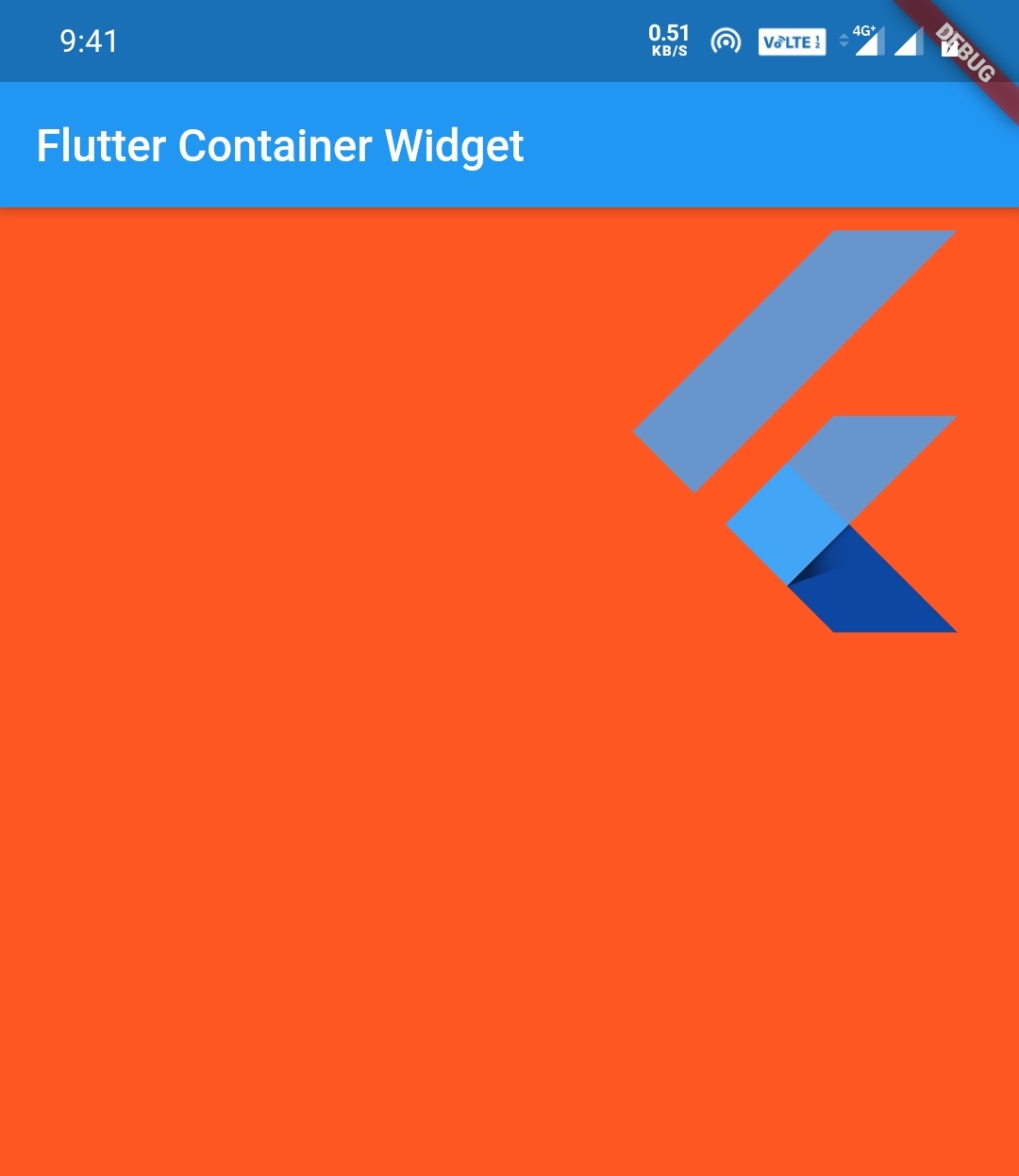
Let’s see an example
child: Container(
    color: Colors.deepOrange,
    alignment: Alignment(1.0, -1.0),
    child: FlutterLogo(
      size: 200,
    ),
  )
or
child: Container(
    color: Colors.deepOrange,
    alignment: Alignment.topRight,
    child: FlutterLogo(
      size: 200,
    ),
  )
Output:
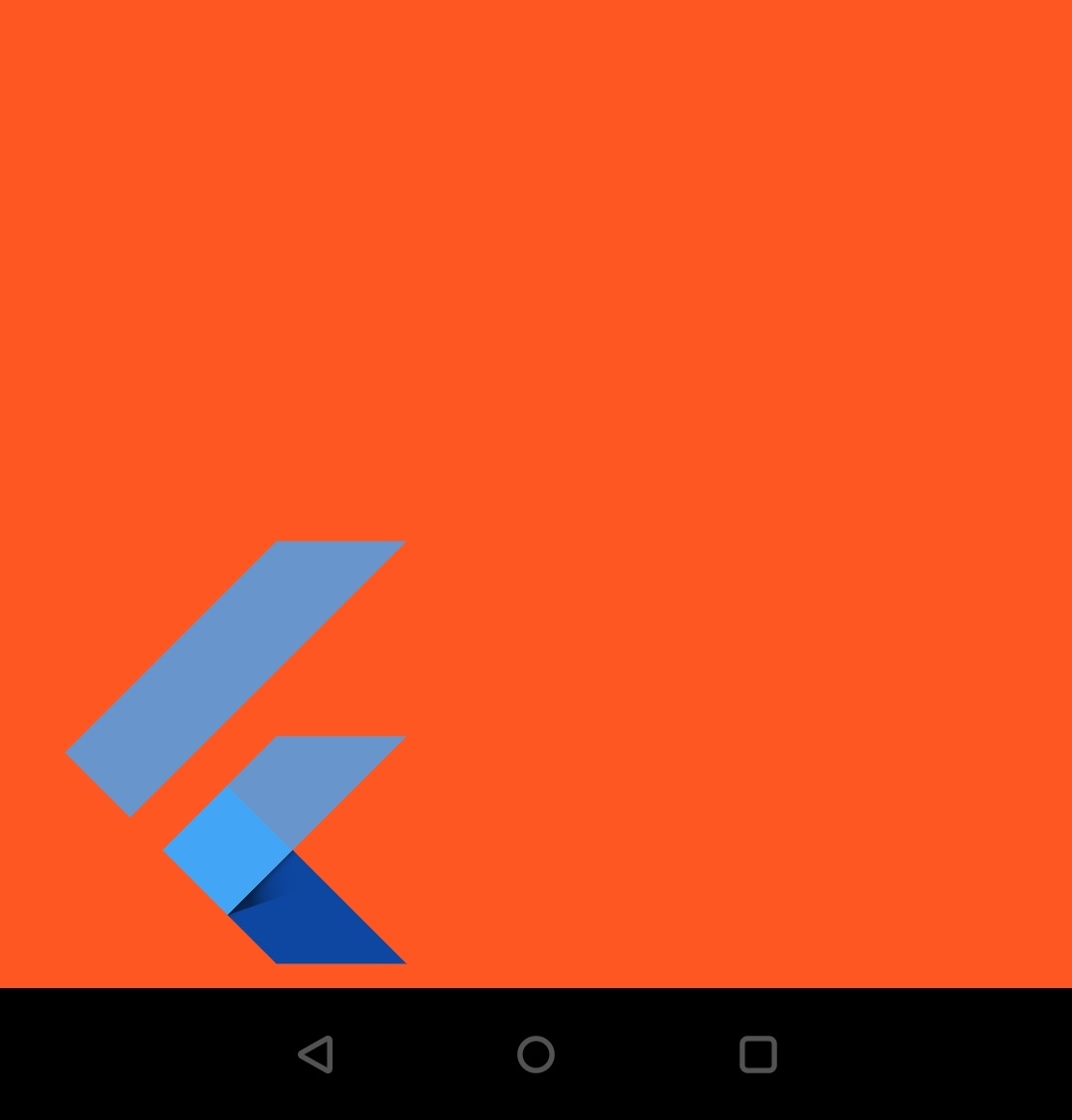
child: Container(
    color: Colors.deepOrange,
    alignment: Alignment(-1.0, 1.0),
    child: FlutterLogo(
      size: 200,
    ),
  )
or
child: Container(
    color: Colors.deepOrange,
    alignment: Alignment.bottomLeft,
    child: FlutterLogo(
      size: 200,
    ),
  )
Output:
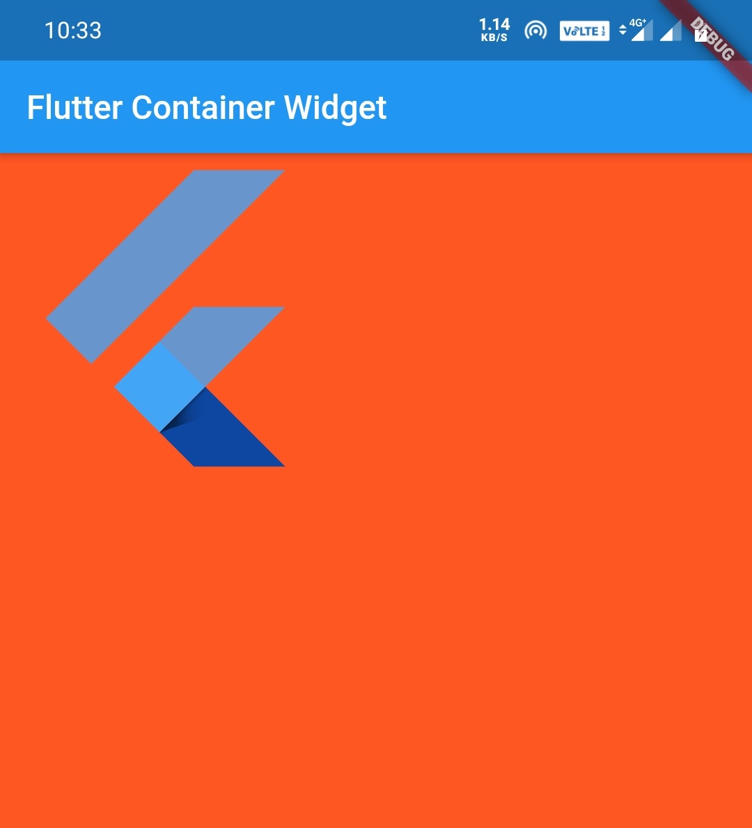
FractionalOffset
We can also use FractionalOffset for alignment in the container widget. It takes two values x, y or we can use predefined constants.
The constants for FractionalOffset are
- FractionalOffset.topLeft which is equal to FractionalOffset(0.0, 0.0)
- FractionalOffset.topCenter which is equal to FractionalOffset(0.5, 0.0)
- FractionalOffset.topRight which is equal to FractionalOffset(1.0, 0.0)
- FractionalOffset.centerLeft which is equal to FractionalOffset(0.0, 0.5)
- FractionalOffset.center which is equal to FractionalOffset(0.5, 0.5)
- FractionalOffset.centerRight which is equal to FractionalOffset(1.0, 0.5)
- FractionalOffset.bottomLeft which is equal to FractionalOffset(0.0, 1.0)
- FractionalOffset.bottomCenter which is equal to FractionalOffset(0.5, 1.0)
- FractionalOffset.bottomRight which is equal to FractionalOffset(1.0, 1.0)
Let’s see an example
child: Container(
    color: Colors.deepOrange,
    alignment: FractionalOffset(0.0, 0.0),
    child: FlutterLogo(
      size: 200,
    ),
  )
or
child: Container(
    color: Colors.deepOrange,
    alignment: FractionalOffset.topLeft,
    child: FlutterLogo(
      size: 200,
    ),
  )
Output:
child: Container(
    color: Colors.deepOrange,
    alignment: FractionalOffset(1.0, 1.0),
    child: FlutterLogo(
      size: 200,
    ),
  )
or
child: Container(
    color: Colors.deepOrange,
    alignment: FractionalOffset.bottomRight,
    child: FlutterLogo(
      size: 200,
    ),
  )

Output:
AlignmentDirectional
We can also use AlignmentDirectional for alignment in the container widget. It takes two values x, y or we can use predefined constants.
The constants for AlignmentDirectional are
- AlignmentDirectional.topStart which is equal to AlignmentDirectional(-1.0, -1.0)
- AlignmentDirectional.topCenter which is equal to AlignmentDirectional(0.0, -1.0)
- AlignmentDirectional.topEnd which is equal to AlignmentDirectional(1.0, -1.0)
- AlignmentDirectional.centerStart which is equal to AlignmentDirectional(-1.0, 0.0)
- AlignmentDirectional.center which is equal to AlignmentDirectional(0.0, 0.0)
- AlignmentDirectional.centerEnd which is equal to AlignmentDirectional(1.0, 0.0)
- AlignmentDirectional.bottomStart which is equal to AlignmentDirectional(-1.0, 1.0)
- AlignmentDirectional.bottomCenter which is equal to AlignmentDirectional(0.0, 1.0)
- AlignmentDirectional.bottomEnd which is equal to AlignmentDirectional(1.0, 1.0)
Let’s see an example
child: Container(
    color: Colors.deepOrange,
    alignment: AlignmentDirectional(0.0, -1.0),
    child: FlutterLogo(
      size: 200,
    ),
  )
or
child: Container(
    color: Colors.deepOrange,
    alignment: AlignmentDirectional.topCenter,
    child: FlutterLogo(
      size: 200,
    ),
  )
Output:
child: Container(
    color: Colors.deepOrange,
    alignment: AlignmentDirectional(0.0, 1.0),
    child: FlutterLogo(
      size: 200,
    ),
  )
or
child: Container(
    color: Colors.deepOrange,
    alignment: AlignmentDirectional.bottomCenter,
    child: FlutterLogo(
      size: 200,
    ),
  )
Output:

Constraints:
The constraint property defines the amount of space a widget can occupy on the screen. It uses the BoxConstraints value to define the size of the widget.
BoxConstraints have four arguments minHeight, minWidth, maxHeight, maxWidth.
Center(
      Container(
          color: Colors.deepOrange,
          alignment: AlignmentDirectional.center,
          constraints: BoxConstraints(
                  maxHeight: 300.0,
                  maxWidth: 200.0,
                  minWidth: 100.0,
                  minHeight: 100.0
             ),
          ),
       )
Output:
We know that if there is no child in the container, the container widget fills all the screen space. But if we observe the above image, we can see that the container fills the size of maxWidth and maxHeight defined in the BoxConstraints Property.
Let’s add some text to the container and see what will happen.
Center(
         child: Container(
           color: Colors.deepOrange,
           alignment: AlignmentDirectional.center,
           child: Text("Flutter", style: TextStyle(fontSize: 40, color: Colors.white),),
           constraints: BoxConstraints(
               maxHeight: 300.0,
               maxWidth: 200.0,
               minWidth: 100.0,
               minHeight: 100.0
           ),
         )
        ),
Output:
Generally, we know that when there is a child in a container it resizes to the size of the child, but we have defined minHeight and minWidth in BoxConstraints, so it will size to the values defined in BoxConstraints.
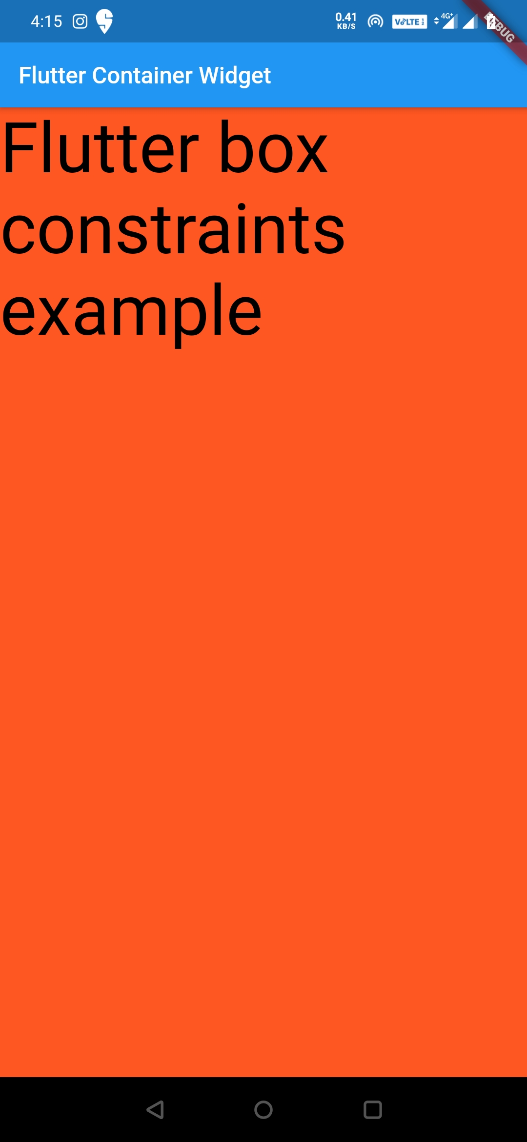
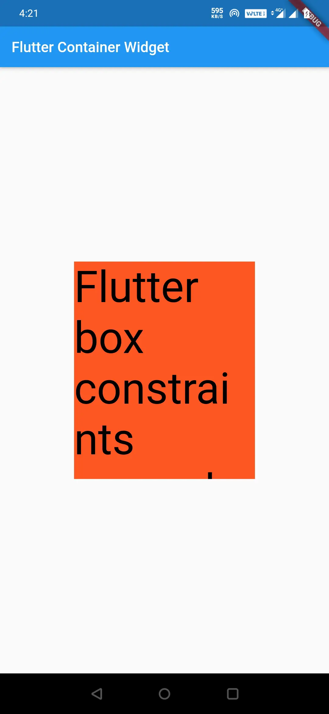
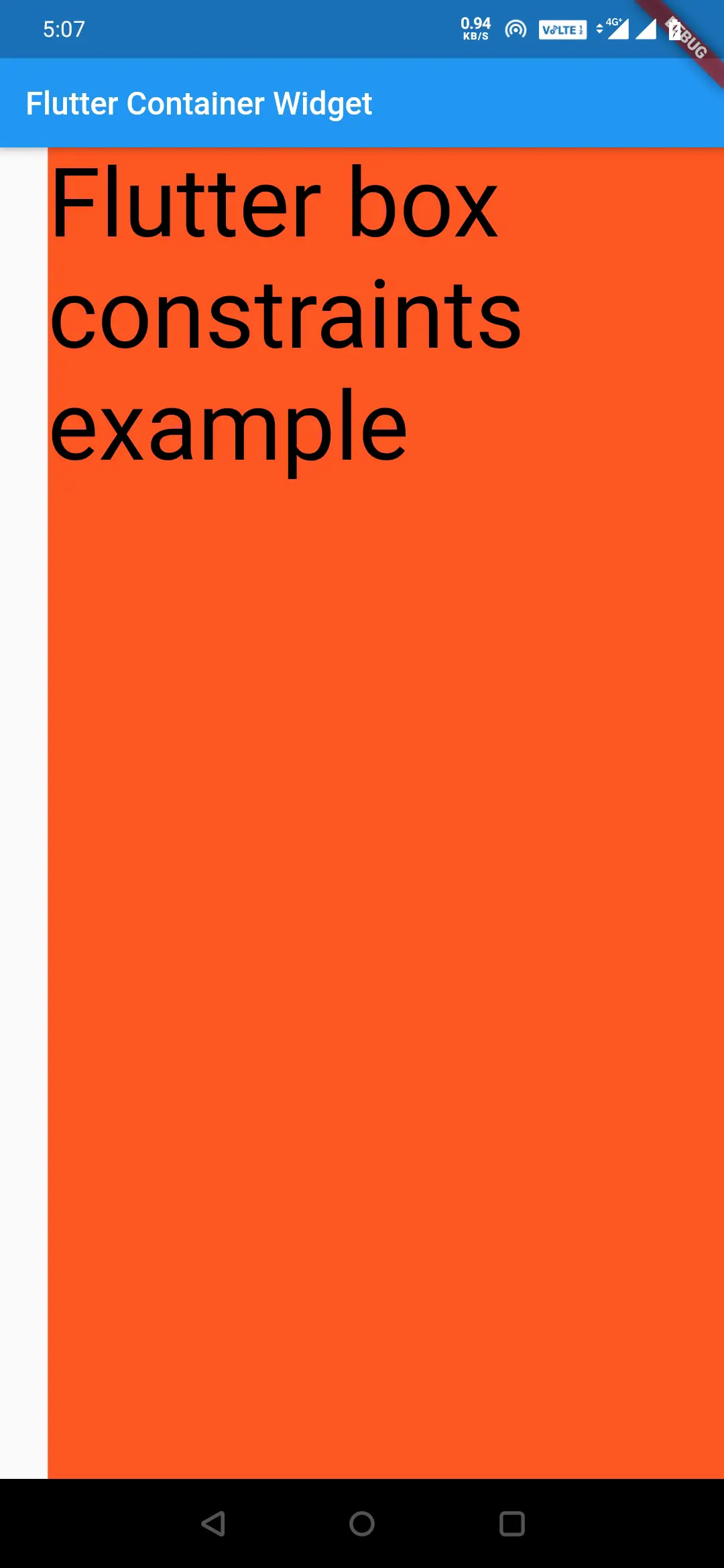
Let’s see what happens if we add a long text with more font size.
Center(
         child: Container(
           alignment: Alignment.center,
           color: Colors.deepOrange,
           child: Text("Flutter box constraints example", style: TextStyle(fontSize: 60, color: Colors.black),),
           constraints: BoxConstraints(
               maxHeight: 300.0,
               maxWidth: 200.0,
               minWidth: 100.0,
               minHeight: 100.0
           ),
         )
        ),
Output:
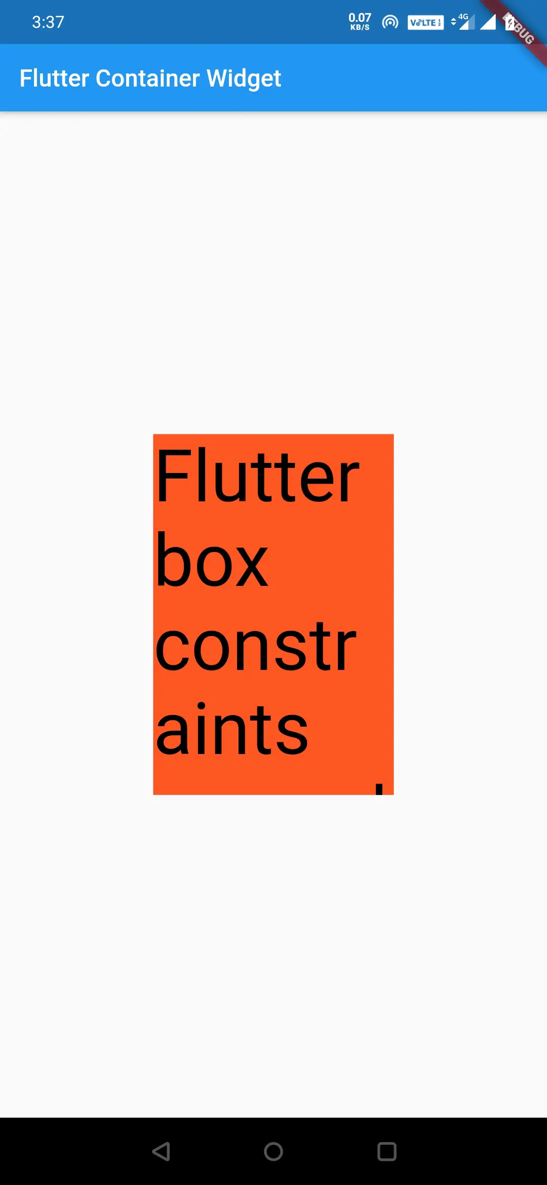
If we see the above output screen, we can observe that the container cannot expand more than maxWidth and maxHeight defined in the BoxConstraints.If we want to expand the container to fill the screen, even if there is a child, we have to use Boxconstraints.expand().
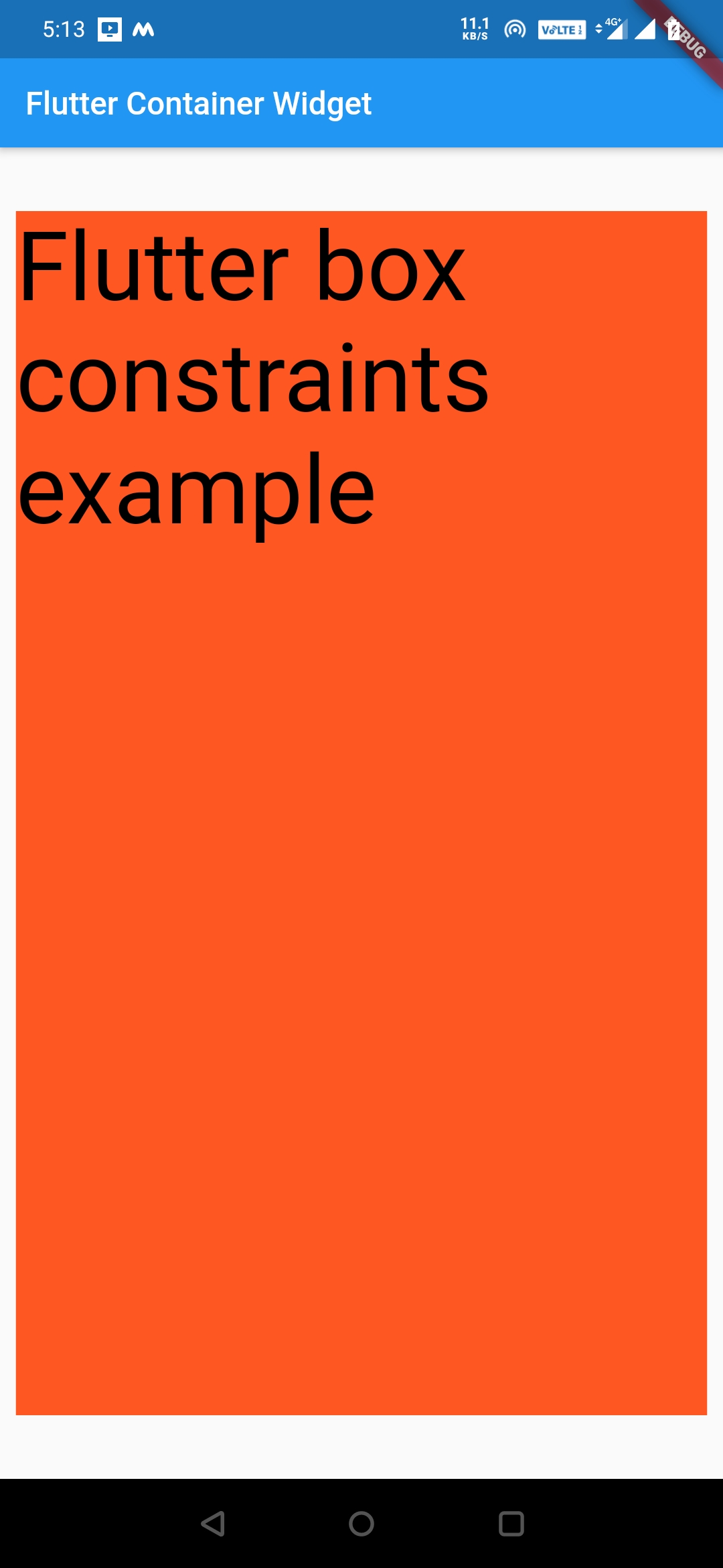
BoxConstarints.expand()
BoxConstraints.expand() constructor takes height and width as arguments.We can assign only height, only width, or both. We can also leave it without providing any arguments. If we provide height and width then the min-height/width = max height/width.If we don’t provide any arguments then it will be infinity and the container fills the entire screen.
We can use BoxConstraints as follows.
BoxConstraints.expand(height:150, width:150)
BoxConstraints.expand(height:150)
BoxConstraints.expand(width:150)
BoxConstraints.expand()
Let’s see an example
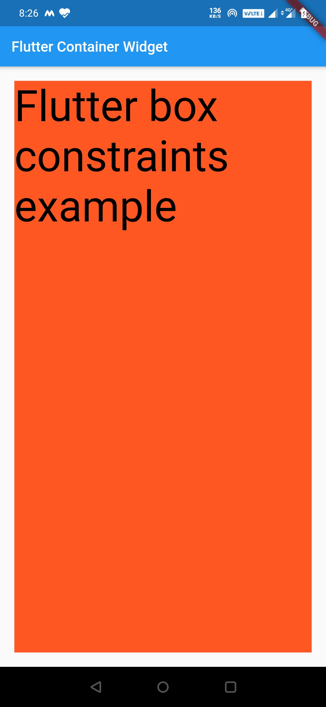
Center(
       child: Container(
          color: Colors.deepOrange,
          child: Text("Flutter box constraints example", style: TextStyle(fontSize: 60, color: Colors.black),),
           constraints: BoxConstraints.expand(),
         )
        ),
Output:
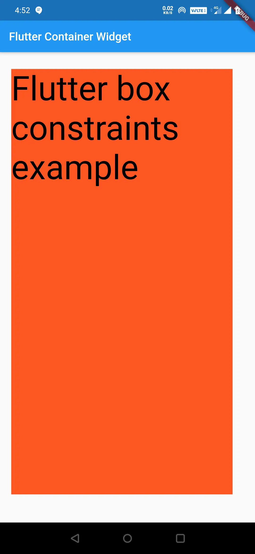
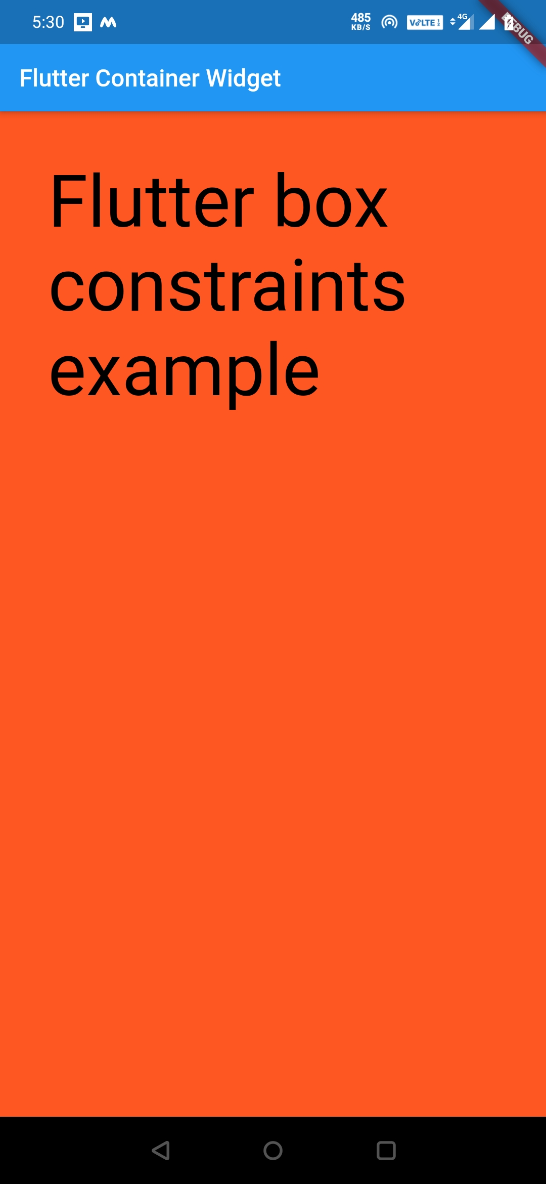
Center(
         child: Container(
           color: Colors.deepOrange,
           child: Text("Flutter box constraints example", style: TextStyle(fontSize: 60, color: Colors.black),),
           constraints: BoxConstraints.expand(height: 300.0, width: 250.0),
         )
        ),
Output:
In the above code, min and max height will be 300. Similarly, the min and max-width will be 250.
There are few other constructors for BoxConstraints, try them for yourself to better understand them.
Margin:
Margin is used to add space around the container widget. If you are a web developer, you will be using the term margin now and then while designing.
EdgeInsets.all()
When we want to add an equal amount of margin on all sides, this value comes in handy. We just have to provide a single value, for all the sides.
Center(
         child: Container(
           color: Colors.deepOrange,
           margin: EdgeInsets.all(20),
           child: Text("Flutter box constraints example", style: TextStyle(fontSize: 60, color: Colors.black),),
           constraints: BoxConstraints.expand(),
         )
        ),
Output:
EdgeInsets.fromLTRB()
This method is used, when we want to define different values for different sides. Where LTRB represents Left, Top, Right, Bottom.
Center(
         child: Container(
           color: Colors.deepOrange,
           margin: EdgeInsets.fromLTRB(20, 30, 40, 50),
           child: Text("Flutter box constraints example", style: TextStyle(fontSize: 60, color: Colors.black),),
           constraints: BoxConstraints.expand(),
         )
        ),
Output:
EdgeInsets.only()
This method takes 1 to 4 arguments, which means we can define any number of arguments from one to four.
EdgeInsets.only(left: 30)
EdgeInsets.only(left: 30, top: 20)
EdgeInsets.only(left: 30, top: 20, right: 30, bottom: 20),
Let’s see an example
Center(
         child: Container(
           color: Colors.deepOrange,
           margin: EdgeInsets.only(left: 30),
           child: Text("Flutter box constraints example", style: TextStyle(fontSize: 60, color: Colors.black),),
           constraints: BoxConstraints.expand(),
         )
        ),
Output:
EdgeInsets.symmetric()
This method takes two arguments horizontal and vertical. Horizontal will be the margin for left and right and vertical will be the margin for top and bottom. We can provide only horizontal or only vertical or both.
Center(
         child: Container(
           color: Colors.deepOrange,
           margin: EdgeInsets.symmetric(horizontal: 10,vertical: 40),
           child: Text("Flutter box constraints example", style: TextStyle(fontSize: 60, color: Colors.black),),
           constraints: BoxConstraints.expand(),
         )
        ),
Output:
Padding:
Padding is used to add space inside the container widget. If you are a web developer, you will be using the term padding now and then, while designing.
All the methods explained for margin are the same for padding. Just replace margin with padding. Let’s see how.
margin:EdgeInsets.all(20) will be padding:EdgeInsets.all(20)
I will show an example, and you guys try the rest for yourself, by replacing the margin in the above examples with padding.
Center(
         child: Container(
           color: Colors.deepOrange,
           padding: EdgeInsets.all(40),
           child: Text("Flutter box constraints example", style: TextStyle(fontSize: 60, color: Colors.black),),
           constraints: BoxConstraints.expand(),
         )
        ),
Output:
Decoration:
This property is used to paint behind the child. We can use the BoxDecoration class, to apply styles and decorations to the container widget. I will create a separate article for this concept.
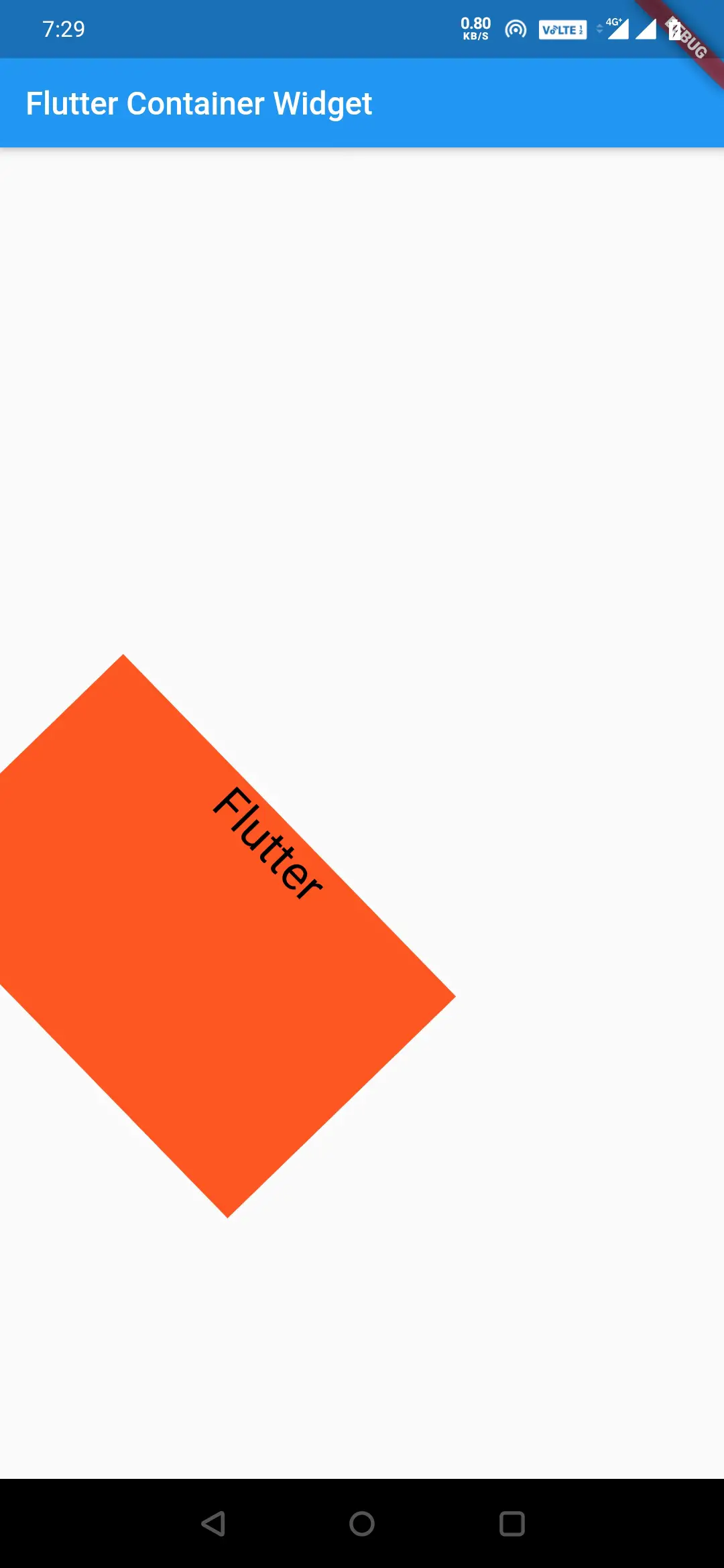
Transform:
This is used to perform a transformation on container class using Matrix class as the value.
Center(
         child: Container(
           alignment: Alignment.topCenter,
           color: Colors.deepOrange,
           height: 200,
           width: 300,
           child: Text("Flutter", style: TextStyle(fontSize: 30, color: Colors.black),),
             transform: Matrix4.rotationZ(0.8)
         )
        ),
Output:
That’s all about the flutter container widget in detail. Let’s see some other flutter tutorials in future articles. Have a great day!!
Do like and share if you find this post helpful. Thank you!!
Reference: Flutter Official Documentation


Leave a Reply