
In this android Toggle Button example tutorial you will learn what is a Toggle Button, how to create it and different types of attributes for Toggle Button with examples in android studio.
Android Toggle Button
A Toggle Button is a user interface control which is nothing but an on/off button with a light indicator that shows the checked or unchecked state of the button.The indicator is activated when the button state is on and deactivated when off.By default the toggle button state is off.
Real time examples for toggle button are wifi, bluetooth, and other controls present in the sliding notification panel of our mobile phone.
Check this android UI controls tutorial to know more about UI controls.
Creating a Toggle Button in Android
Creating a Toggle Button in android can be done in two ways. One is by declaring it inside a layout(XML) file and the second one is by creating an object of it in JAVA.
Creating in XML(layout)
<?xml version="1.0" encoding="utf-8"?>
<LinearLayout
    xmlns:android="http://schemas.android.com/apk/res/android"
    android:layout_width="match_parent"
    android:layout_height="match_parent"
    android:orientation="vertical"
    android:background="@color/white"
    android:id="@+id/layout"
    android:padding="20dp">

    <ToggleButton
        android:id="@+id/login"
        android:layout_width="match_parent"
        android:layout_height="wrap_content"
        />

</LinearLayout>
Creating in JAVA(programatically)
package androidlaouts.codesinsider.com.androidlayouts;

import android.graphics.Color;
import android.graphics.Typeface;
import android.support.v7.app.AppCompatActivity;
import android.os.Bundle;
import android.text.Html;
import android.view.Gravity;
import android.view.View;
import android.widget.Button;
import android.widget.EditText;
import android.widget.LinearLayout;
import android.widget.TextView;
import android.widget.Toast;
import android.widget.ToggleButton;

public class LayoutExample extends AppCompatActivity {


    @Override
    protected void onCreate(Bundle savedInstanceState) {
        super.onCreate(savedInstanceState);
        setContentView(R.layout.android_ui);

        ToggleButton button = new ToggleButton(this);
        LinearLayout layout = findViewById(R.id.layout);
        layout.addView(button);

    }
}
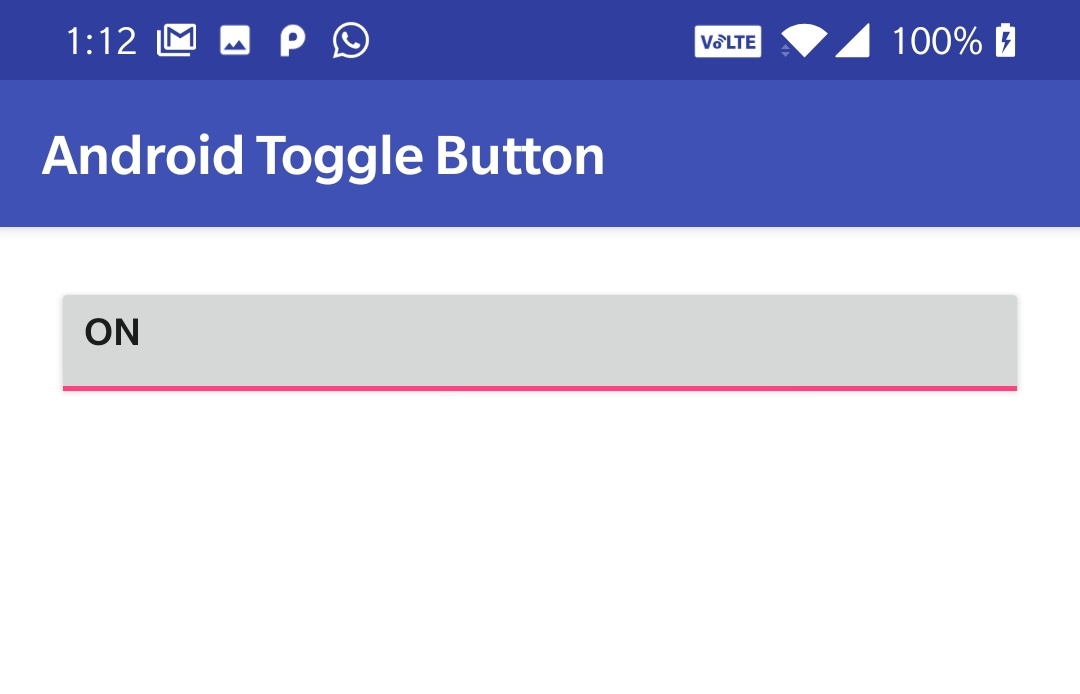
Basic Android Toggle Button
Android Toggle Button Attributes
id : The id is the most common attribute used to identify the View or ViewGroup created in xml file in java.
Example code snippet for setting an id to a Button in XML.
<ToggleButton
        android:id="@+id/togglebutton"
        android:layout_width="match_parent"
        android:layout_height="wrap_content"
        />
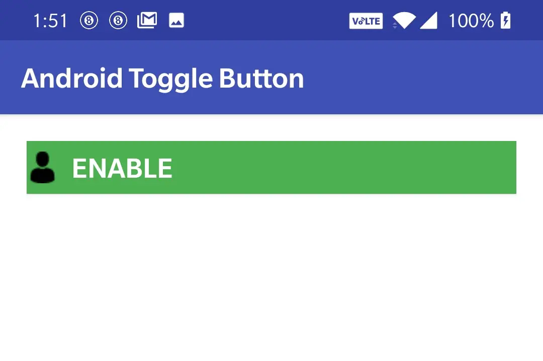
checked : Checked attribute is used to set the current state of a toggle button which can be either true or false.Setting true to this attribute indicates checked state(on) and setting false indicates unchecked state(off).By default it is unchecked(false).
Example code snippet for setting checked state of a toggle button in XML
<ToggleButton
        android:id="@+id/togglebutton"
        android:layout_width="match_parent"
        android:layout_height="wrap_content"
        android:checked="true"
        />
Example code snippet for setting checked state of a toggle button in JAVA
ToggleButton button = new ToggleButton(this);
button.setChecked(true);
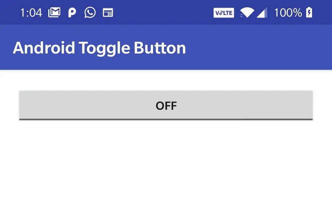
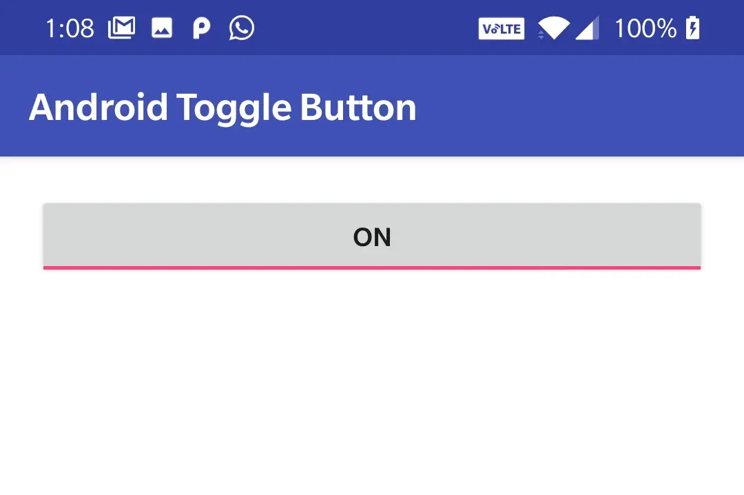
Output when checked=true
Output when checked=false

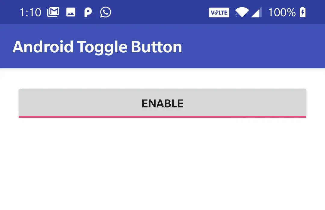
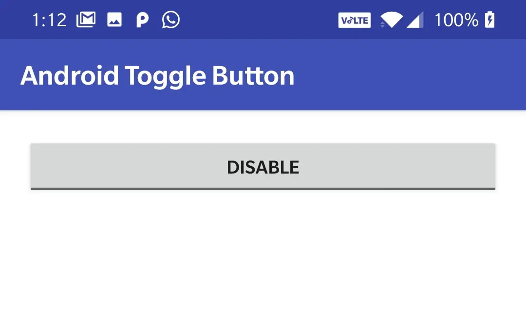
textOn & textOff : the texton attribute is used to set the text for toggle button when the state is checked(on) and the textoff attribute is used to set the text when the state is unchecked(off).
Example code snippet for setting texton and textoff for a toggle button in XML
<ToggleButton
        android:id="@+id/togglebutton"
        android:layout_width="match_parent"
        android:layout_height="wrap_content"
        android:checked="true"
        android:textOn="enable"
        android:textOff="disable"
        />
Example code snippet for setting texton and textoff for a toggle button in JAVA
ToggleButton button = new ToggleButton(this);
button.setChecked(true);
button.setTextOn("ENABLE");//setting text for checked state
button.setTextOff("DISABLE");//setting text for unchecked state
Output for texton
Output for textoff
gravity : gravity attribute is used to position the text of the Toggle Button to right, left, top, bottom, center_vertical, center_horizontal etc.By default the gravity is Center.
Example code snippet for setting gravity of Toggle Button to start(left) in XML.
<ToggleButton
        android:id="@+id/togglebutton"
        android:layout_width="match_parent"
        android:layout_height="wrap_content"
        android:checked="true"
        android:gravity="start"
        />
Example code snippet for setting gravity of Toggle Button in JAVA.
ToggleButton button = new ToggleButton(this);
button.setGravity(Gravity.START);
Output of the above code snippets
layout_gravity : layout gravity is similar to gravity but positions the entire Toggle Button instead of text.
Example code snippet for Toggle Button with layout_gravity as center_horizontal in XML.
 <ToggleButton
        android:id="@+id/togglebutton"
        android:layout_width="200dp"
        android:layout_height="wrap_content"
        android:checked="true"
        android:gravity="start"
        android:layout_gravity="center_horizontal"
        />
Output of the above code snippets
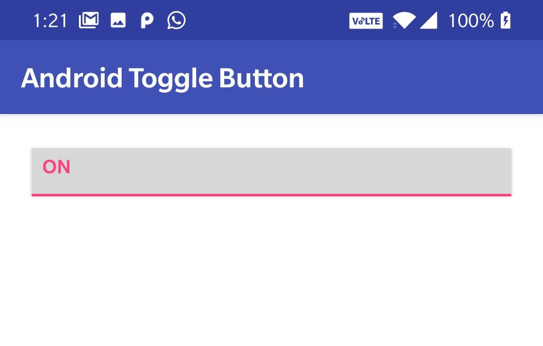
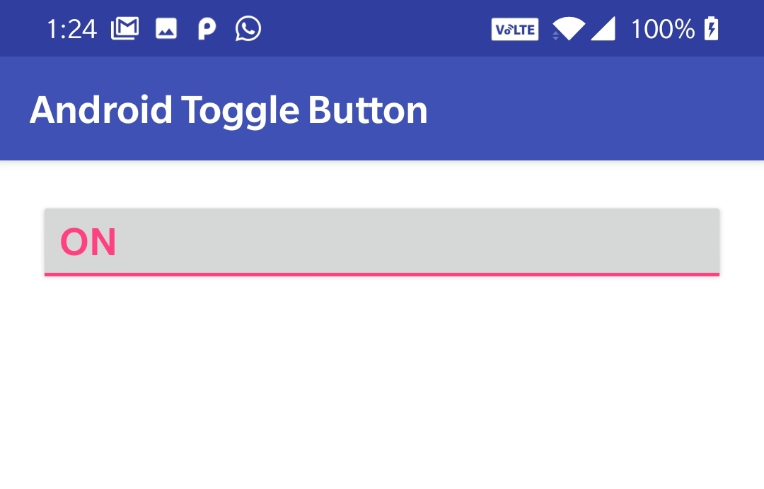
textColor : textColor attribute is used to set the text color of a Toggle Button.The value for textColor can be “#argb”, “#rgb”, “#rrggbb”, or “#aarrggbb”.
Example code snippet for setting text color of a Toggle Button in XML.
<ToggleButton
        android:id="@+id/togglebutton"
        android:layout_width="match_parent"
        android:layout_height="wrap_content"
        android:checked="true"
        android:gravity="start"
        android:textColor="@color/colorAccent"
        />
Example code snippet for setting text color of a Toggle Button in JAVA.
ToggleButton button = new ToggleButton(this);
button.setTextColor(Color.WHITE);
button.setTextColor(getResources().getColor(R.color.white));
Output of the above code snippets
Note: The standard way of using strings, colors and dimentions in android was explained clearly in using strings, colors, dimens in UI controls section of this Android UI Controls tutorial.
textSize : textSize attribute is used to set the text size of a Toggle Button whose value can be either in sp(scale-independent pixels) or dp(density independent pixels) like for example 20sp or 20dp
Example code snippet for setting textSize of a Toggle Button in XML.
<ToggleButton
        android:id="@+id/togglebutton"
        android:layout_width="match_parent"
        android:layout_height="wrap_content"
        android:checked="true"
        android:gravity="start"
        android:textColor="@color/colorAccent"
        android:textSize="20sp"
        />
Example code snippet for setting textSize of a Toggle Button in JAVA.
ToggleButton button = new ToggleButton(this);
button.setTextSize(20);
Output of the above code snippets
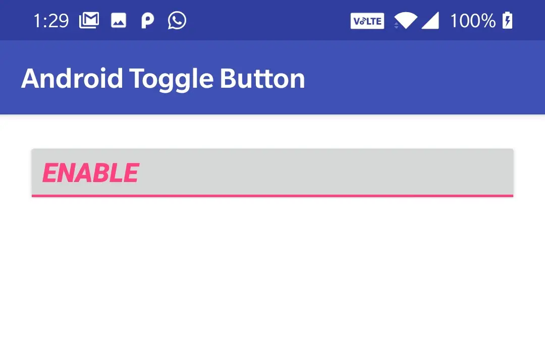
textStyle : textStyle attribute is used to style the text of the Toggle Button.There are three values for a textStyle attribute like normal, bold, italic.By default it is normal.If we want to use more than one value at a time we can use “|” operator. like bold|italic.
Example code snippet for setting text style of a Toggle Button in XML.
<ToggleButton
        android:id="@+id/togglebutton"
        android:layout_width="match_parent"
        android:layout_height="wrap_content"
        android:checked="true"
        android:gravity="start"
        android:textColor="@color/colorAccent"
        android:textSize="20sp"
        android:textOn="Enable"
        android:textStyle="bold|italic"
        />
Output of the above code snippets
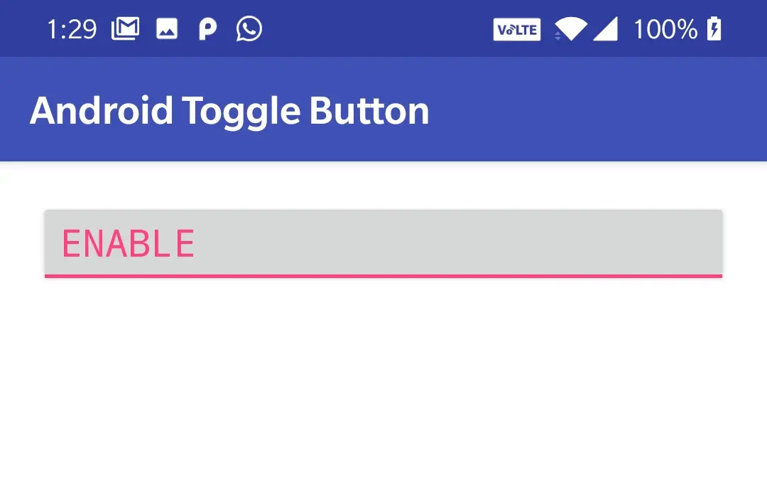
fontFamily : fontFamily attribute is used to set the font family like roboto, open sans etc to the Toggle Button.
Example code snippet for setting fontFamily of a Toggle Button text in XML.
<ToggleButton
        android:id="@+id/togglebutton"
        android:layout_width="match_parent"
        android:layout_height="wrap_content"
        android:checked="true"
        android:gravity="start"
        android:textColor="@color/colorAccent"
        android:textSize="20sp"
        android:textOn="Enable"
        android:fontFamily="monospace"
        />
Output of the above code snippets
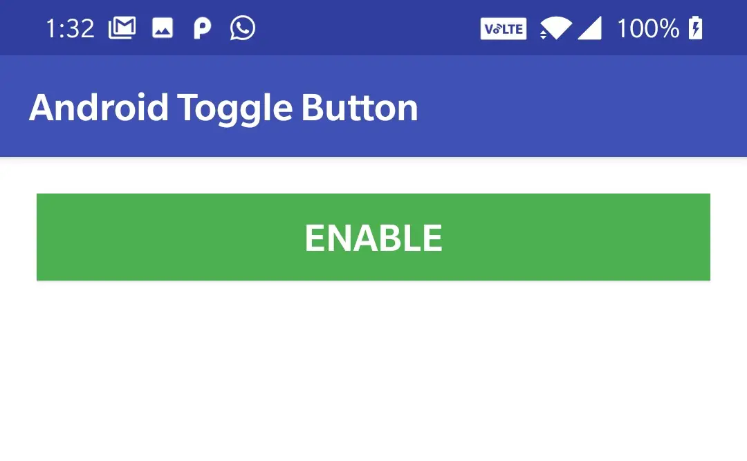
background : background attribute is common for all the layouts and UI controls which is used to set background.Background can either be a color image or a drawable resource file.
Example code snippet for setting background to Toggle button in XML.
<ToggleButton
        android:id="@+id/togglebutton"
        android:layout_width="match_parent"
        android:layout_height="wrap_content"
        android:checked="true"
        android:gravity="center"
        android:textColor="@color/white"
        android:textSize="20sp"
        android:textOn="Enable"
        android:background="@color/green"
        />
Example code snippet for setting background to Button in JAVA.
ToggleButton button = new ToggleButton(this);
button.setBackgroundColor(Color.GREEN);
button.setBackgroundResource(R.color.green);
Output of the above code snippets
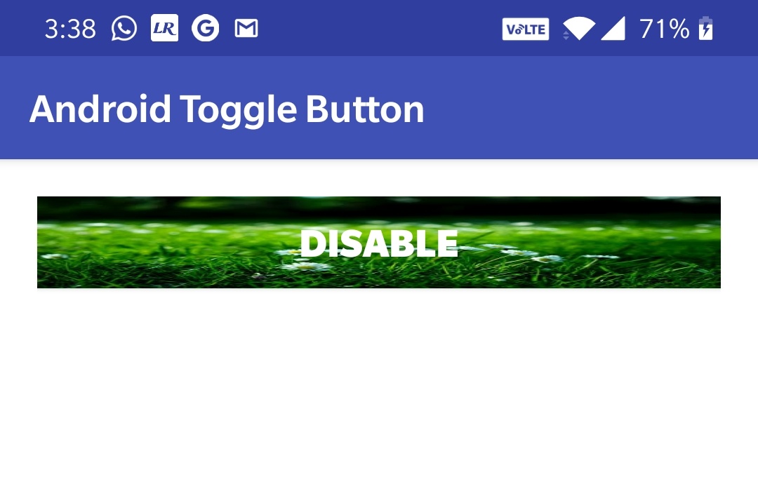
We can also use a drawable resource for Toggle Button as background.A drawable resource is nothing but an image or a drawable resource file(drawable type xml file).All the images that we use locally in android app should be saved at app>res>drawable, and to access the files in drawable directory we need to define like android:background=”@drawable/filename“.Lets see the example code snippets below.
Example code snippet for setting background resource for Toggle Button in XML.
<ToggleButton
        android:id="@+id/togglebutton"
        android:layout_width="match_parent"
        android:layout_height="40dp"
        android:checked="true"
        android:gravity="center"
        android:textColor="@color/white"
        android:textSize="20sp"
        android:textOn="Enable"
        android:background="@drawable/back"
        />
Example code snippet for setting background resource for a Toggle Button in JAVA.
ToggleButton button = new ToggleButton(this);
button.setBackgroundResource(R.drawable.back);//back is file name of image present in drawable folder.
Output of the above code snippets
typeface :typeface attribute is used to set the typeface of the Toggle Button text among the four built in typefaces monospace, serif, sans, normal.
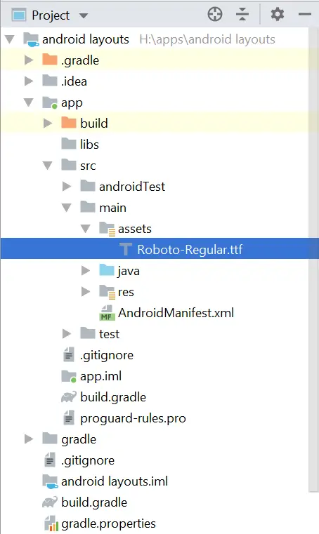
.To use custom font as typeface create a folder named assets in src>main and download .ttf file of your desired font like for example roboto.ttf and save it in the assets folder we created above.Your project will look like below
You can find .ttf files at Fontsquerrel, Google Fonts etc.
Example code snippet for setting typeface for Toggle Button in XML.
<ToggleButton
        android:id="@+id/togglebutton"
        android:layout_width="match_parent"
        android:layout_height="40dp"
        android:checked="true"
        android:gravity="center"
        android:textColor="@color/white"
        android:textSize="20sp"
        android:textOn="Enable"
        android:background="@color/green"
        android:typeface="monospace"
        />
Example code snippet for setting custom font as typeface for Button text in JAVA
ToggleButton button = new ToggleButton(this);
button.setTypeface(Typeface.createFromAsset(getAssets(),"Calibri Bold.TTF"));
Output of the above code snippets
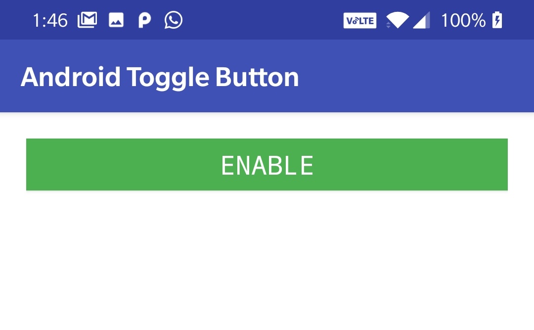
drawable : drawable attribute is used to set icons/images to any of the four sides inside of the element like left, right, top, bottom.It has four types like
drawable_Start : sets the icon/image to left of the text.
drawable_End : sets the icon/image to right of the text.
drawable_Top : sets the icon/image to the top of the text.
drawable_Bottom : sets the icon/image to bottom of the text.
There is also another attribute called drawable_padding which is used to set padding for the drawable icon/image.Eg drawable_padding=”10dp”.This is used to give space between the drawable icon and toggle button text.
Example code snippet for setting drawable to Toggle Button in XML.
<ToggleButton
        android:id="@+id/togglebutton"
        android:layout_width="match_parent"
        android:layout_height="40dp"
        android:checked="true"
        android:gravity="start|center_vertical"
        android:textColor="@color/white"
        android:textSize="20sp"
        android:textOn="Enable"
        android:background="@color/green"
        android:drawableStart="@drawable/user"
        android:drawablePadding="10dp"
        />
Output of the above code snippets
That’s all about the most commonly used attributes of a Toggle Button.To know the attributes that are common for all the elements refer the layout attributes section of this post about android layouts.
Checking Current State of Toggle Button
To check current state of a toggle button we use isChecked() method in JAVA. This method returns a Boolean value either true or false. If the toggle button is checked then it returns true if not it returns false.
Example code snippet for checking current state of a toggle button in JAVA
ToggleButton button = new ToggleButton(this);
Boolean state = button.isChecked();//true or false value will be stored in state
Click Events
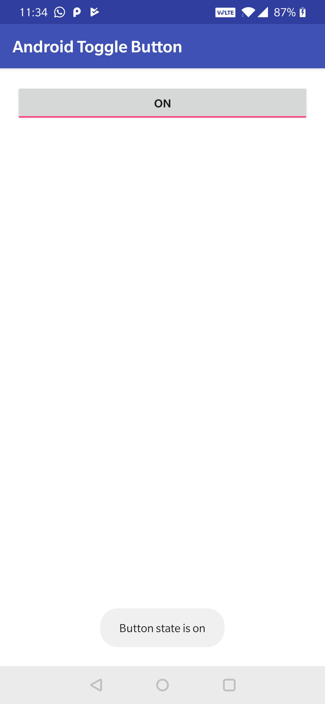
when the user clicks on ToggleButton, we can detect whether the ToggleButton is in checked or unchecked state and we can handle click event in JAVA file using setOnCheckedChangeListener method.Lets see the code below
Example code snippet for listening click events of a toggle button in JAVA
ToggleButton button = new ToggleButton(this);
        button.setOnCheckedChangeListener(new CompoundButton.OnCheckedChangeListener() {
            @Override
            public void onCheckedChanged(CompoundButton compoundButton, boolean checked) {

                if(checked)
                {
                    //write logic to perform when on/checked
                }else
                {
                    //write logic to perform when off/unchecked
                }
            }
        });
Toggle Button Example in Android Studio
Code snippet to be included in XML file.
<?xml version="1.0" encoding="utf-8"?>
<LinearLayout
    xmlns:android="http://schemas.android.com/apk/res/android"
    android:layout_width="match_parent"
    android:layout_height="match_parent"
    android:orientation="vertical"
    android:background="@color/white"
    android:id="@+id/layout"
    android:padding="20dp">

    <ToggleButton
        android:id="@+id/togglebutton"
        android:layout_width="match_parent"
        android:layout_height="wrap_content"
        />

</LinearLayout>
Code snippet to be included in JAVA file.
package com.codesinsider.androidui;

import android.graphics.Color;
import android.graphics.Typeface;
import android.support.v7.app.AppCompatActivity;
import android.os.Bundle;
import android.text.Html;
import android.view.Gravity;
import android.view.View;
import android.widget.Button;
import android.widget.CompoundButton;
import android.widget.EditText;
import android.widget.LinearLayout;
import android.widget.TextView;
import android.widget.Toast;
import android.widget.ToggleButton;

public class LayoutExample extends AppCompatActivity {
    @Override
    protected void onCreate(Bundle savedInstanceState) {
    super.onCreate(savedInstanceState);
    setContentView(R.layout.android_ui);

        ToggleButton button = findViewById(R.id.togglebutton);
        button.setOnCheckedChangeListener(new CompoundButton.OnCheckedChangeListener() {
            @Override
            public void onCheckedChanged(CompoundButton compoundButton, boolean checked) {

                if(checked)
                {
                    Toast.makeText(LayoutExample.this, "Button state is on", Toast.LENGTH_LONG).show();
                    //write logic to perform when on/checked
                }else
                {
                    Toast.makeText(LayoutExample.this, "Button state is off", Toast.LENGTH_LONG).show();
                    //write logic to perform when off/unchecked
                }
            }
        });

    }
}
Output when button is clicked in ON state
Output when button state is OFF
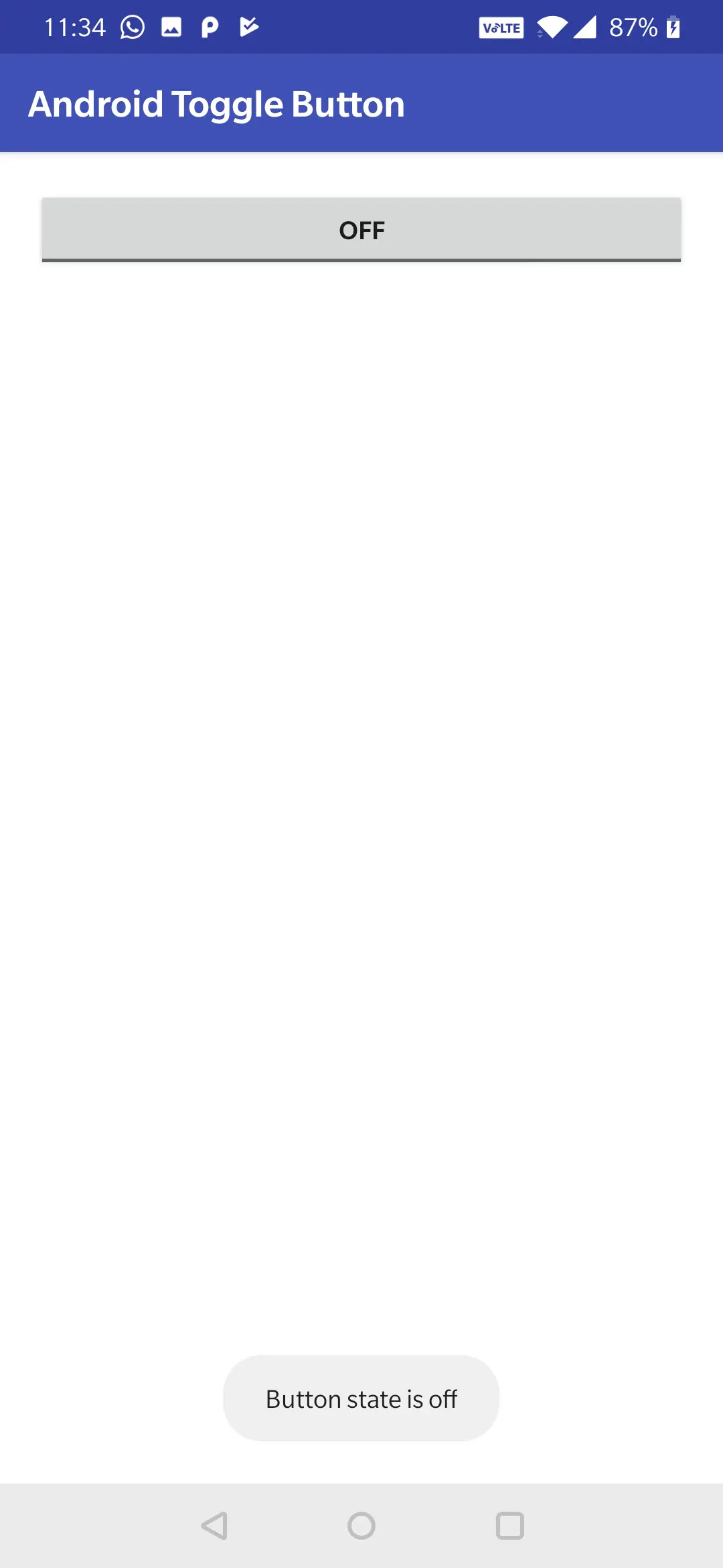
If we observe the above code snippets when the user clicks the toggle button the OnCheckedChangeListener() method listens the click event on the toggle button object for click and the onCheckedChanged() is executed with two arguments where one argument is checked state of the button which is a boolean(true/false) value.So if the value is true we are displaying a toast message “Button state is on” and if the value is false we are displaing a toast message “Button state is off”.
This comes to an end of android Toggle Button example tutorial with all the attributes explained in detail with examples.We will discuss about other UI controls in next posts.
Do like and share if you find this post helpful.Thank you!!


Leave a Reply