
In this android UI controls tutorial you will learn about different types of UI controls and how to use them in android application development with examples in android studio.
Android UI Controls
In android the components which lets the user to interact with the application on the device screen are called UI controls or components.These controls are used to design the user interface of an android application.Android provides different kinds of UI controls to develop advanced and beautiful applications.
In terms of android, user interface is made of objects of View and View Group classes.View is base class for all the UI controls or components like Text View, Edit Text, Check Box, Image View etc.All these UI controls are objects of View class.
Where View Group is subclass of View class which acts as base class for all the layouts like Linear Layout, Relative Layout etc.All these layouts are objects of View Group class.These layouts hold the views and acts as view holders for the UI controls and makes the layout(app screen).
While designing the user interface for your application every layout file in your application must contain one root element which can be either a View or View Group.This root element holds all the child elements which are Views and View Groups.
Check this android layouts tutorial to know more about android layouts in detail.
Declaring Android UI Controls
Declaring UI controls can be done in two ways.One is to declare the elements in XML file and the other one is to declare them in JAVA at run time programatically.
Declaring UI Controls in XML(layout)
<?xml version="1.0" encoding="utf-8"?>
<LinearLayout xmlns:android="http://schemas.android.com/apk/res/android"
    xmlns:app="http://schemas.android.com/apk/res-auto"
    xmlns:tools="http://schemas.android.com/tools"
    android:layout_width="match_parent"
    android:layout_height="match_parent"
    android:background="@color/white"
    android:orientation="vertical"
    android:padding="20dp"
tools:context="androidlaouts.codesinsider.com.androidlayouts.LinearLayoutExample">

   <TextView
       android:id="@+id/login"
       android:layout_width="match_parent"
       android:layout_height="wrap_content"
       android:layout_marginTop="60dp"
       android:layout_marginBottom="20dp"
       android:text="Hello World"
       android:textSize="16sp"
       android:textColor="@color/black"/>

</LinearLayout>
In the above code snippet the LinearLayout(ViewGroup) is the root element and the TextView(View) is the child control.
Declaring UI Controls in JAVA(programatically)
package com.codesinsider.androidui;

import android.support.v7.app.AppCompatActivity;
import android.os.Bundle;
import android.widget.LinearLayout;
import android.widget.TextView;

public class LayoutExample extends AppCompatActivity {

    @Override
    protected void onCreate(Bundle savedInstanceState) {
        super.onCreate(savedInstanceState);
        setContentView(R.layout.linear_laout);

        TextView login = new TextView(this);
        login.setText("Hello World");
        LinearLayout layout = new LinearLayout(this);
        LinearLayout.LayoutParams params = new LinearLayout.LayoutParams
                (LinearLayout.LayoutParams.MATCH_PARENT,  LinearLayout.LayoutParams.MATCH_PARENT);
        layout.setLayoutParams(params);
        layout.addView(login);
    }
}
Units of Measurement in Android
There are four types of units for measuring in android.They are dp, sp, pt, px.
dp : Density-independent pixel. 1 dp is equivalent to one pixel on a 160 dpi screen.
sp : Scale-independent pixel. This is similar to dp and is recommended for specifying font sizes.
pt : Point. A point is defined to be 1/72 of an inch, based on the physical screen size.
px : Pixel. Corresponds to actual pixels on the screen.
Using strings, colors, dimens in UI Controls
Whenever we want to use text, color, dimentions in android we just simply type the text in xml text attribute or color code in textColor , background attributes and dimention in sp or dp in textSize, width, height, margin, padding attributes.
The standard way of using strings, colors, dimentions in android is declaring the strings, colors, dimentions in their respective resource files provided by android like strings.xml, colors.xml, dimens.xml.We can find these files in app>res>values.
Lest see how these files look like and how to use them.
strings.xml
<resources>
    <string name="app_name">Android TextView</string>
    <string name="username">Username/Email</string>
    <string name="password">Password</string>
    <string name="login">Login</string>
    <string name="forgot_password">Forgot Password?</string>
    <string name="register">Register</string>
    <string name="forgot_pwd">Forgot Password</string>
    <string name="ci">CodesInsider</string>
</resources>
Using strings defined in above strings.xml in XML which is standard way.
<TextView
        android:id="@+id/text"
        android:layout_width="200dp"
        android:layout_height="wrap_content"
        android:text="@string/ci"/>
Using strings defined in above strings.xml in JAVA which is standard way.
TextView text = findViewById(R.id.text);
text.setText(R.string.ci);
colors.xml
<?xml version="1.0" encoding="utf-8"?>
<resources>
    <color name="colorPrimary">#3F51B5</color>
    <color name="colorPrimaryDark">#303F9F</color>
    <color name="colorAccent">#FF4081</color>
    <color name="white">#FFFFFF</color>
    <color name="black">#000000</color>
    <color name="green">#4caf50</color>

</resources>
Using colors defined in above clolors.xml in XML which is standard way.
<EditText
        android:id="@+id/email"
        android:layout_width="match_parent"
        android:layout_height="wrap_content"
        android:hint="Email"
        android:text="Codes Insider"
        android:inputType="phone"
        android:textColor="@color/green"
        />
Using colors defined in above colors.xml in JAVA which is standard way.
TextView text = findViewById(R.id.text);
text.setTextColor(getResources().getColor(R.color.green));
dimens.xml
<?xml version="1.0" encoding="utf-8"?>
<resources>
    <dimen name="small_text">16sp</dimen>
    <dimen name="medium_text">18sp</dimen>
    <dimen name="large_text">20sp</dimen>
    <dimen name="extra_large_text">24sp</dimen>
</resources>
Using dimens defined in above dimens.xml in XML which is standard way.
<EditText
        android:id="@+id/email"
        android:layout_width="match_parent"
        android:layout_height="wrap_content"
        android:text="Codes Insider"
        android:inputType="phone"
        android:textSize="@dimen/medium_text"
        />
Using dimens defined in above dimens.xml in JAVA which is standard way.
TextView text = findViewById(R.id.text);
text.setTextSize(R.dimen.medium_text);
List of UI Controls in Android
Android provides a wide variety of user interface controls for designing the layouts/screens for an android application.Lets see the list of most commonly used UI controls.
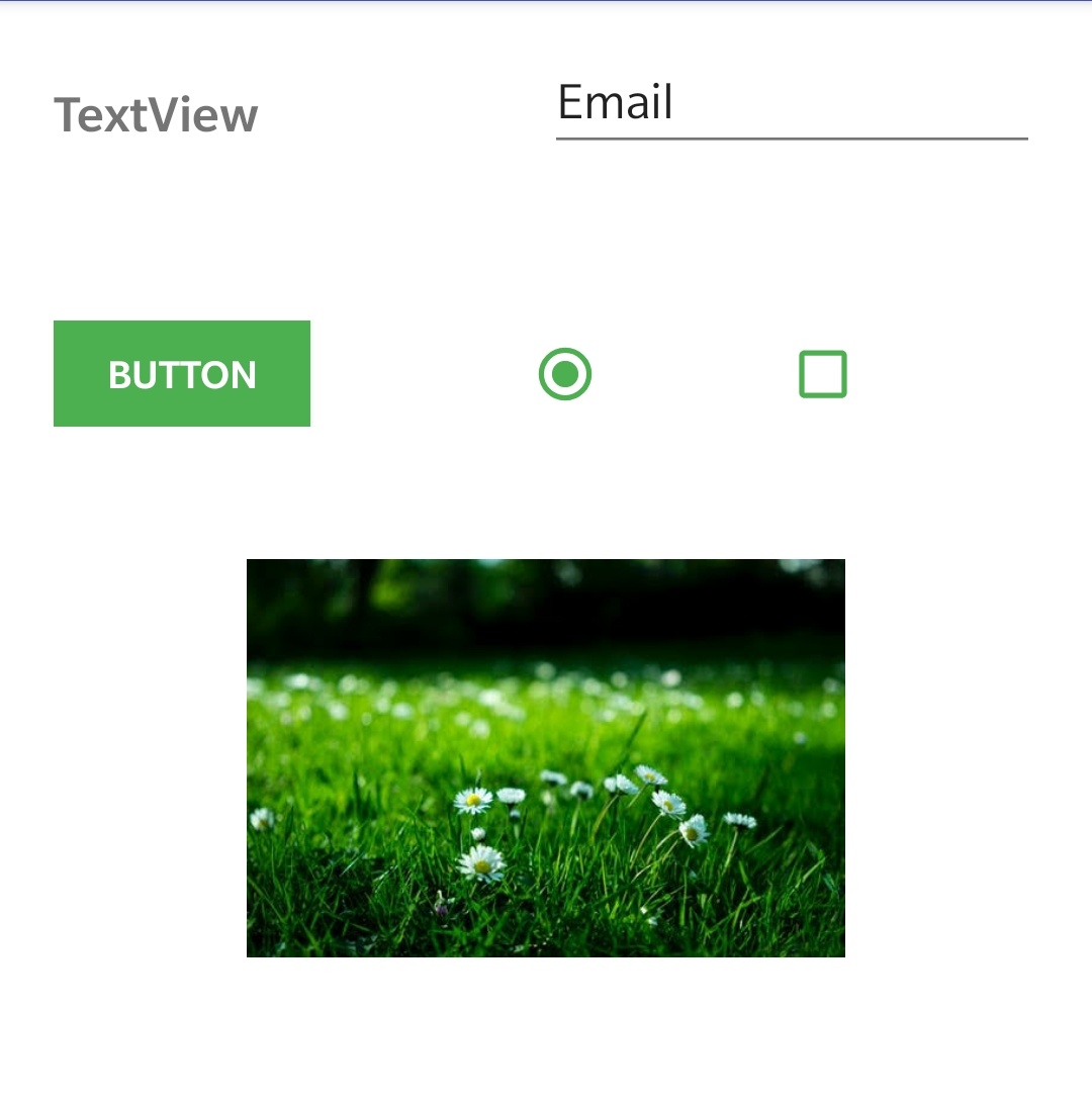
- TextView
- EditText
- AutoComplete TextView
- Button
- ImageView
- VideoView
- ImageButton
- CheckBox
- ToggleButton
- RadioButton
- RadioGroup
- ProgressBar
- Spinner/Dropdown
- TimePicker
- DatePicker
- AlertDialogue
- SeekBar
- Switch
- RatingBar
TextView : In android TextView is similar to label in HTML which is used to display text.
EditText : In android EditText is sub class of TextView which is similar to textfield in HTML.It is used to take input from the user.
AutoCompleteTextView : AutoCompleteTextView is nothing but a EditText which automatically shows a list of suggestions while the user is typing.
Button : In android Button is a control which can perform an action when it is clicked or pressed.
ImageView : ImageView is used to display an image.
VideoView : VideoView is used to display video.
AudioView : AudioView is used to display audio controls.
ImageButton : ImageButton is similar to button it can also perform some action when pressed or clicked, the only difference is we will set an image to ImageButton and text to Button.
CheckBox : ChecckBox has two states where it can be checked or uncheked.CheckBoxes are used while displaying selectable options to users so that the can check their desired options and leave the rest.
ToggleButton : In android a ToggleButton is nothing but a on/off button with light indicator.
RadioButton : RadioButton also have two states checked and unchecked which is similar to checkbox, but a radio button once checked cannot be unchecked.
RadioGroup : RadioGroup is nothing but two or more radio buttons grouped together based on user requirement.
ProgressBar: ProgressBar is used to indicate the progress of tasks that are currently running such as background tasks.
Spinner : In android a spinner is similar to dropdown in HTML which is used to display a list of options from which a user can select only one value.
TimePicker : In android TimePicker is a dialog that is used to select time of the day either in 24-hour format or 12- hour format.
DatePicker : DatePicker is used to select the date.
SeekBar : SeekBar is used to jump to a particular time or value like while plaing videos we can jump to particular time in video using seek bar.
Switch: In android a Switch is like a button that can be switched on and off.
RatingBar: RatingBar is used to display ratings(stars) in our android application.
In this android UI controls tutorial we have discussed about different types of UI controls and how to use them in android app development.We will see each and every control in detail in future.
Do like and share if you find this post helpful.Thank you!!


Leave a Reply