In this tutorial you will learn how to use expansion panel list in flutter with example. Also learn how to customize it’s style with different properties.
Flutter Expansion Panel List Widget
Expansion panel list is a material widget in flutter which is similar to listView. It can only have Expansion panels as children. In some instances we might have to display a list where the children can expand/collapse to show/hide some detailed information. To display such list flutter provides a widget called ExapansionPanelList.
In this list, each child is an ExpansionPanel widget. We cannot use other widgets as children for this list. We can handle the change in state( Expansion or collapse ) of an item with the help of ExpansionCallback property.
Using Expansion Panel List
To use expansion panel list we have to create one by calling its constructor.
Expansion Panel List Constructor :
ExpansionPanelList(
{Key? key,
List<ExpansionPanel> children,
ExpansionPanelCallback? expansionCallback,
Duration animationDuration,
EdgeInsets expandedHeaderPadding,
Color? dividerColor,
int elevation}
)
Create And Display Expansion Panel List
To create and display an expansion panel list we have to use ExpansionPanelList widget provided by flutter. It has no required properties but we have to provide at least one child if we want to use it. The widget require unlimited space along main axis. If the requirement does’nt met it will throw assertion error. To solve this problem add expansion panel list widget as a child for SingleChildScrollView.
Basic Implementation of ExpansionPanelList
ExpansionPanelList(
        children: [
          ExpansionPanel(
              headerBuilder: (context, isExpanded) {
                return ListTile(
                  title: Text('Click To Expand', style: TextStyle(color: Colors.white),),
                );
              },
              body:ListTile(
                title: Text('Description text',style: TextStyle(color: Colors.black)),
                tileColor: Colors.white,
              ),
            backgroundColor: Colors.green
          ),
        ],
        expansionCallback: (panelIndex, isExpanded) {

        },
  )
Flutter Expansion Panel List Example
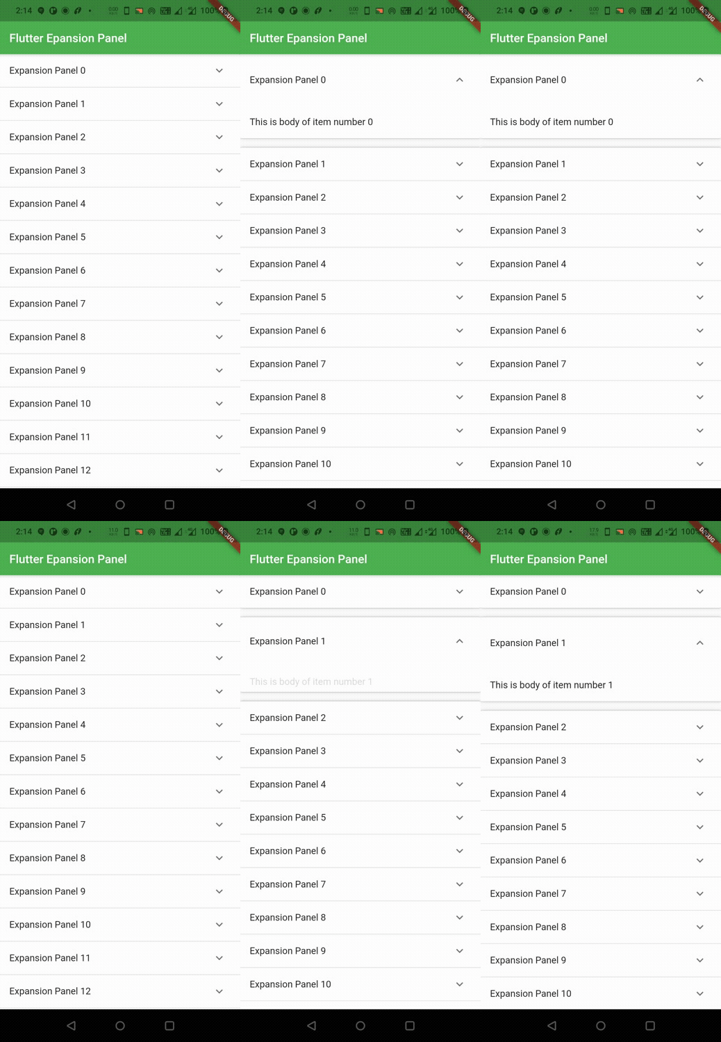
Let’s see an example where we create an expansion panel list and add 15 children to it. For this we will create a pojo class ListItem which will hold each item data and two functions generateItems() and _getExpansionPanels(). We will handle the change in state( Expanded or collapsed) of an item using ExpansionCallback property.
The generateItems function should be provided with an argument of type integer which is the number of items we want to generate. It returns a List of type ListItem ( List<ListItem> ). It will generate data for each item and returns the complete list. We will store the list in a variable called _items which is a List of type ListItem ( List<ListItem> ).
List<ListItem> _items = generateItems(15);
The _getExpansionPanels function should be provided with an argument of type List. The List type should be ListItem ( List<ListItem> ). So we will pass the _items to this function. It will return a List of type ExpansionPanel ( List<ExpansionPanel> ) which will be the children. Let’s see the code below.
_getExpansionPanels(_items),
ListItem Class (pojo) :
This class will hold data of each item.
class ListItem {
  int id;
  String headerName;
  String description;
  bool isExpanded;

  ListItem({
    this.id,
    this.headerName,
    this.description,
    this.isExpanded = false,
  });
}
generateItems Function :
This function generates data for all the list items using the pojo class ListItem and returns the List.
List<ListItem> generateItems(int numberOfItems) {
  return List<ListItem>.generate(numberOfItems, (int index) {
    return ListItem(
      id:index,
      headerName:'Expansion Panel $index',
      description: 'This is body of item number $index',
    );
  });
}
_getExpansionPanels function :
This function will generate Expansion panels using the data generated by the above function and returns a List of expansion panels. In the below example i am returning an expansion panel where header and body are a ListTile with only title. If you want to customize the expansion panel with more properties refer expansion panel widget example.
List<ExpansionPanel> _getExpansionPanels(List<ListItem> _items)
{
  return _items.map<ExpansionPanel>((ListItem item) {
    return ExpansionPanel(
      headerBuilder: (BuildContext context, bool isExpanded) {
        return ListTile(
          title: Text(item.headerName),
        );
      },
      body: ListTile(
        title: Text(item.description),
      ),
      isExpanded: item.isExpanded,
    );
  }).toList();
}
Complete Code
Below is the complete code example of how to use Expansion panel list widget in flutter.
import 'dart:io';
import 'package:flutter/cupertino.dart';
import 'package:flutter/material.dart';
import 'package:flutter/widgets.dart';
import 'widgets/add_entry_dialog.dart';
void main()
{
  runApp(MyApp());
}

class ListItem {
  int id;
  String headerName;
  String description;
  bool isExpanded;

  ListItem({
    this.id,
    this.headerName,
    this.description,
    this.isExpanded = false,
  });
}

List<ListItem> generateItems(int numberOfItems) {
  return List<ListItem>.generate(numberOfItems, (int index) {
    return ListItem(
      id:index,
      headerName:'Expansion Panel $index',
      description: 'This is body of item number $index',
    );
  });
}

List<ExpansionPanel> _getExpansionPanels(List<ListItem> _items)
{
  return _items.map<ExpansionPanel>((ListItem item) {
    return ExpansionPanel(
      headerBuilder: (BuildContext context, bool isExpanded) {
        return ListTile(
          title: Text(item.headerName),
        );
      },
      body: ListTile(
        title: Text(item.description),
      ),
      isExpanded: item.isExpanded,
    );
  }).toList();
}

class MyApp extends StatelessWidget {
  @override
  Widget build(BuildContext context) {
    return MaterialApp(
      title: 'Flutter Learning',
      theme: ThemeData(
        primarySwatch: Colors.green,
      ),
      home: MyHomePage(),
    );
  }
}

class MyHomePage extends StatefulWidget {
  @override
  _MyHomePageState createState()
  {
    return _MyHomePageState();
  }
}

class _MyHomePageState extends State<MyHomePage> {
  List<ListItem> _items = generateItems(15);
  @override
  Widget build(BuildContext context) {
    return Scaffold(
      appBar: AppBar(
        title: Text("Flutter Epansion Panel"),
      ),
      body: SingleChildScrollView(
        child: ExpansionPanelList(
        animationDuration: Duration(milliseconds: 1000),
        children: _getExpansionPanels(_items),
          expansionCallback: (panelIndex, isExpanded) {
              _items[panelIndex].isExpanded = !isExpanded;
            setState(() {

            });
          },
      )
      ),
    );
  }
}
Output :

Expansion Panel List Properties
The properties of expansion panel list are :
- children
- expansionCallback
- animationDuration
- expandedHeaderPadding
- dividerColor
- elevation
expansionCallback
When the expansion panel is expanded or collapsed, we have to update the state to make changes in the UI. whenever an item in the expansion panel list is expanded or collapsed we will pass the expansion callback with two arguments. The first one is index of the panel which is an integer and second one is isExpanded which is the state of the panel at given index.It is a boolean value. Based on the two values we will update the state and the UI.
ExpansionPanelList(
      children: _getExpansionPanels(_items),
      expansionCallback: (panelIndex, isExpanded) {
          _items[panelIndex].isExpanded = !isExpanded;
          setState(() {

          });
      },
 )
animationDuration
While expanding or collapsing we can observe some animation take palce for a certain time period. We can change that duration by using animationDuration property of expansion panel list. We just have to provide Duration in either microseconds, milliseconds or minutes as value.
ExpansionPanelList(
      animationDuration: Duration(milliseconds: 2000),
      children: _getExpansionPanels(_items),
      expansionCallback: (panelIndex, isExpanded) {
          _items[panelIndex].isExpanded = !isExpanded;
          setState(() {

          });
      },
 )
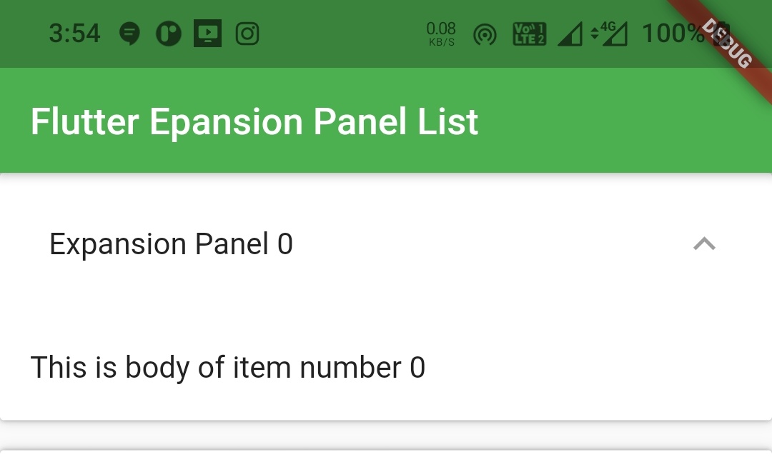
expandedHeaderPadding
If we want to set padding to header when the panel is in expanded state we can do so by using the expandedHeaderPadding property.
ExpansionPanelList(
      animationDuration: Duration(milliseconds: 2000),
      children: _getExpansionPanels(_items),
      expansionCallback: (panelIndex, isExpanded) {
          _items[panelIndex].isExpanded = !isExpanded;
          setState(() {

          });
      },
      expandedHeaderPadding: EdgeInsets.all(10),
 )
Output :

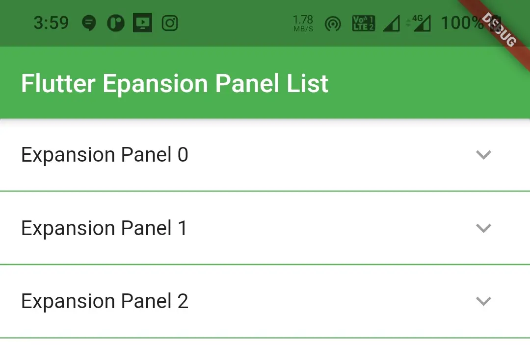
dividerColor
We can change the divide color using the dividerColor property. The value for this property should be of type Color.
ExpansionPanelList(
      animationDuration: Duration(milliseconds: 2000),
      children: _getExpansionPanels(_items),
      expansionCallback: (panelIndex, isExpanded) {
          _items[panelIndex].isExpanded = !isExpanded;
          setState(() {

          });
      },
      dividerColor: Colors.green,
 )
Output :

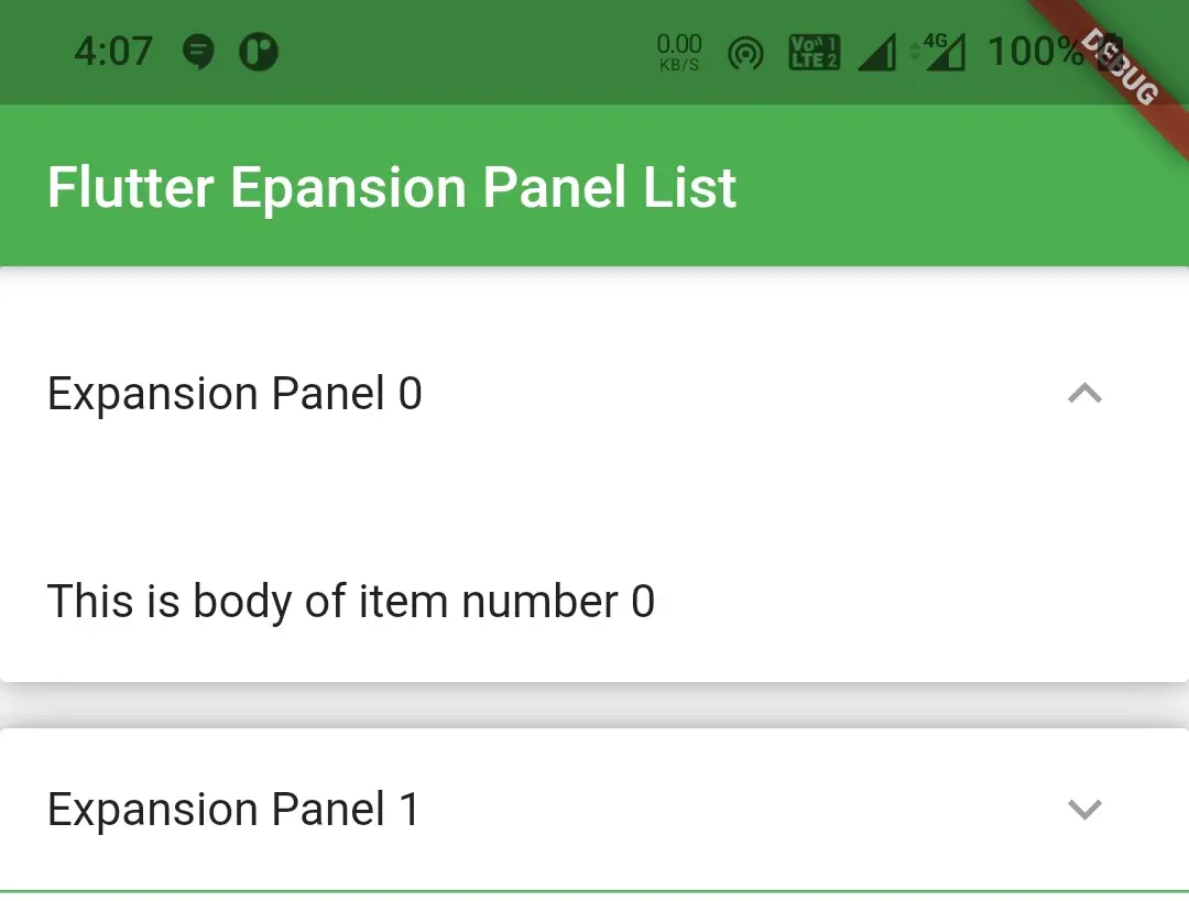
elevation
If we want to set elevation when the expansion panel is expanded use elevation property.
ExpansionPanelList(
      animationDuration: Duration(milliseconds: 2000),
      children: _getExpansionPanels(_items),
      expansionCallback: (panelIndex, isExpanded) {
          _items[panelIndex].isExpanded = !isExpanded;
          setState(() {

          });
      },
      dividerColor: Colors.green,
      elevation: 8,
 )
Output :

That brings an end to the tutorial on how to use expansion panel List in flutter with example. I hope you understand how to create and display or show expansion panel list in flutter. Let’s catch up with some other widget in the next post. Have a great day!!
Do share, subscribe and like my facebook page if you find this post helpful. Thank you!!
Reference : Flutter Official Documentation


Leave a Reply