
A switch is nothing but an on/off button in flutter. It is used to toggle between on/off which is true/false respectively. In this example tutorial, we will learn how to use a switch widget in flutter and its properties with examples.
Flutter Switch
A switch in flutter is nothing but a button that has two states ON and OFF. When the switch is turned ON or OFF the onChanged callback is invoked. It returns true when the switch is in ON state and false when it is in OFF state. So based on the value returned by the callback we can perform the corresponding action. The general use case of a switch is the settings menu in mobile where we can enable or disable a setting using a switch.
The switch cannot maintain the state. So when the switch is turned ON or OFF the onChanged callback will be invoked. Whenever the callback is invoked the switch will be rebuilt to update the UI with the current state (ON/OFF).
The switch widget displays only a simple switch without any text or label. To display a switch with text/label use SwitchListTile or wrap Switch and Text widgets in a row widget.
Note: Switch.adaptive creates a CupertinoSwitch if the target platform is iOS, creates a material design switch otherwise.
Constructor:
Switch({
Key key,
@required bool value,
@required ValueChanged<bool> onChanged,
Color activeColor,
Color activeTrackColor,
Color inactiveThumbColor,
Color inactiveTrackColor,
ImageProvider<Object> activeThumbImage,
void onActiveThumbImageError(dynamic exception, StackTrace stackTrace),
ImageProvider<Object> inactiveThumbImage,
void onInactiveThumbImageError(dynamic exception, StackTrace stackTrace),
MaterialTapTargetSize materialTapTargetSize,
DragStartBehavior dragStartBehavior: DragStartBehavior.start, MouseCursor mouseCursor,
Color focusColor,
Color hoverColor,
FocusNode focusNode,
bool autofocus: false
})
Flutter Switch Example
import 'package:flutter/cupertino.dart';
import 'package:flutter/gestures.dart';
import 'package:flutter/material.dart';
import 'package:flutter/rendering.dart';
void main() {
runApp(MyApp());
}
class MyApp extends StatefulWidget {
@override
_MyState createState() {
return _MyState();
}
}
class _MyState extends State<MyApp>
{
bool _value = false;
@override
Widget build(BuildContext context) {
return MaterialApp(
home: Scaffold(
appBar: AppBar(
backgroundColor: Colors.indigo,
title: Text("Flutter Switch"),
),
body:Container(
alignment: Alignment.topCenter,
padding: EdgeInsets.symmetric(vertical: 40),
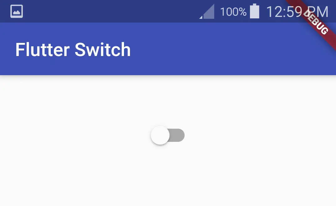
child: Switch(
value: _value,
onChanged: (value) {
setState(() {
_value = value;
});
},
),
)
)
);
}
}
Output:
Flutter Switch Properties
Different flutter switch properties are:
- value(required)
- onChanged(required)
- activeColor
- activeTrackColor
- inactiveThumbColor
- inactiveTrackColor
- dragStartBehavior
value
We will use the value property to assign a value to the switch. It represents the on/off state of the switch. When value is true the switch state is on and when the value is false the switch state is off. It is a required property which means without using it will throw an error.
Switch(
              value: _value,
              onChanged: (value) {
                setState(() {
                  _value = value;
                });
              },
            ),
onChanged
We will use onChanged property to get the value of the switch. When we on/off the switch the onChanged callback will invoke and pass the value of the switch(true/false). The onChanged is a required property.
Switch(
              value: _value,
              onChanged: (value) {
                setState(() {
                  _value = value;
                });
              },
            ),
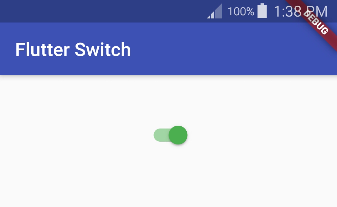
activeColor
We will use the activeColor property to change the color of the switch when it is active or in on state.
Switch(
              value: _value,
              onChanged: (value) {
                setState(() {
                  _value = value;
                });
              },
              activeColor: Colors.green,
            ),
Output:
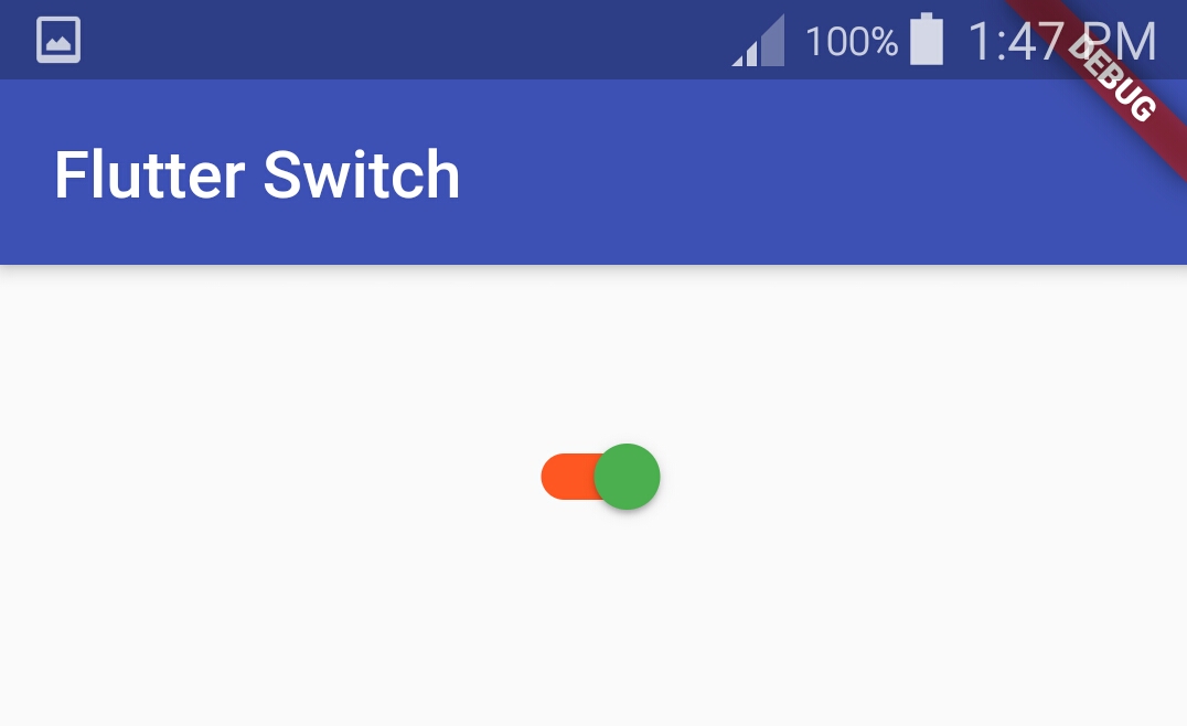
activeTrackColor
We will use activeTrackColor property to change the track color of the switch when it is active or in on state.
Switch(
              value: _value,
              onChanged: (value) {
                setState(() {
                  _value = value;
                });
              },
              activeColor: Colors.green,
              activeTrackColor: Colors.deepOrange,
            ),
Output:
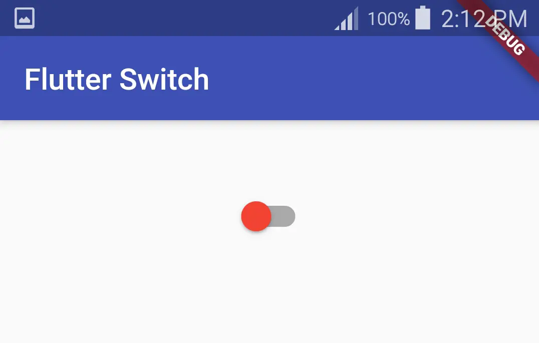
inactiveThumbColor
We will use inactiveThumbColor property to change the color of the switch when it is inactive or in off state.
Switch(
              value: _value,
              onChanged: (value) {
                setState(() {
                  _value = value;
                });
              },
              activeColor: Colors.green,
              activeTrackColor: Colors.deepOrange,
              inactiveThumbColor: Colors.red,
            ),
Output:
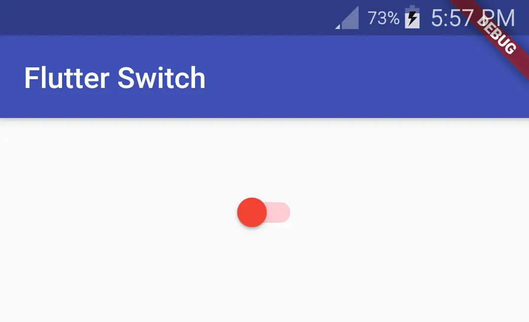
inactiveTrackColor
We can change the track color of the switch when the switch is inactive or in off state. To change the track color we will use inactiveTrackColor property.
Switch(
              value: _value,
              onChanged: (value) {
                setState(() {
                  _value = value;
                });
              },
              activeColor: Colors.green,
              activeTrackColor: Colors.deepOrange,
              inactiveTrackColor: Colors.red[100],
              inactiveThumbColor: Colors.red,
            )
Output:
dragStartBeheavior
We will use dragStartBehavior to change the way the thumb slides. We will use DragStartBehavior class which has constants like down and start. If we use down the thumb will jump from one end to the other. If we use start the thumb will slide from one end to the other smoothly.
DragStartBehavior.down
Switch(
              value: _value,
              onChanged: (value) {
                setState(() {
                  _value = value;
                });
              },
              activeColor: Colors.green,
              activeTrackColor: Colors.deepOrange,
              inactiveTrackColor: Colors.red[100],
              inactiveThumbColor: Colors.red,
              dragStartBehavior: DragStartBehavior.down,
            )
DragStartBehavior.Start
Switch(
              value: _value,
              onChanged: (value) {
                setState(() {
                  _value = value;
                });
              },
              activeColor: Colors.green,
              activeTrackColor: Colors.deepOrange,
              inactiveTrackColor: Colors.red[100],
              inactiveThumbColor: Colors.red,
              dragStartBehavior: DragStartBehavior.start,
            )
That brings an end to flutter switch example tutorial. Let’s catch up with some other flutter widget in the next post. Have a great day!!
Do share, subscribe and like my facebook page if you find this post helpful. Thank you!!
Reference: Flutter official documentation.


Leave a Reply