
In this tutorial we will discuss different types of layouts in flutter with examples.
Flutter Layouts
Designing layouts in flutter is a bit different from designing the layout in XML file or layout editor in android and using interface builder to drag a view onto storyboard in IOS. When it comes to flutter layouts are designed programatically.
Designing layouts in flutter may seem difficult as everything is done in one file(both design and logic). It also have large chunks of code, but with a bit of patience and dedication one can build awesome layouts as you progress.
Types Of Flutter Layouts
In flutter layouts are classified into two types
- Single Child Layout Widgets
- Multi Child Layout Widgets
Flutter Layouts – Single Child
Following are the most used flutter single child widgets used in designing layouts.
- Align
- Center
- Padding
- Container
- ConstrainedBox
- Expanded
- Intrinsic Width and Intrinsic Height
Align
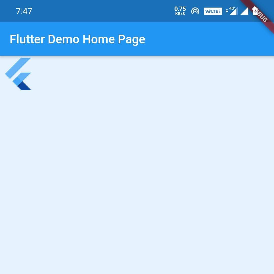
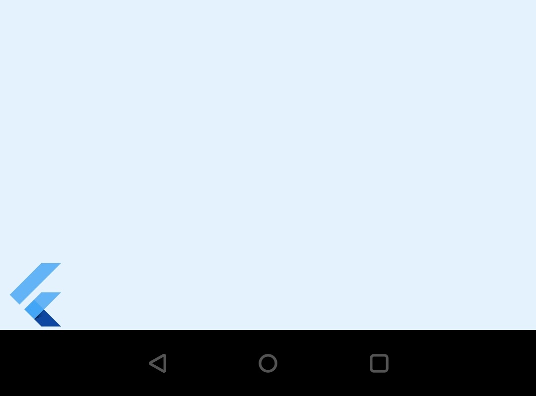
If you want to align a widget anywhere on the screen you have to use align widget. We have to wrap the widget that we want to align inside the align widget in order to align it. We can pass either values directly or we can use predefined ones.You can see them below.
- Alignment.topLeft which is equal to Alignment(-1.0, -1.0)
- Alignment.topCenter which is equal to Alignment(0.0, -1.0)
- Alignment.topRight which is equal to Alignment(1.0, -1.0)
- Alignment.centerLeft which is equal to Alignment(-1.0, 0.0)
- Alignment.center which is equal to Alignment(0.0, 0.0)
- Alignment.centerRight which is equal to Alignment(1.0 , 0.0)
- Alignment.bottomLeft which is equal to Alignment(-1.0, 1.0)
- Alignment.bottomCenter which is equal to Alignment(0.0, 1.0)
- Alignment.bottomRight which is equal to Alignment(1.0, 1.0)
You can actually use Center Widget instead of Alignment.center
Center(
        child: Container(
          height: double.infinity,
          width: double.infinity,
          color: Colors.blue[50],
          child: Align(
            alignment: Alignment.topLeft,
            child: FlutterLogo(
              size: 60,
            ),
          ),//align
        ),//container
      ),//center
Center(
        child: Container(
          height: double.infinity,
          width: double.infinity,
          color: Colors.blue[50],
          child: Align(
            alignment: Alignment.bottomLeft,
            child: FlutterLogo(
              size: 60,
            ),
          ),
        ),
      ),
Center
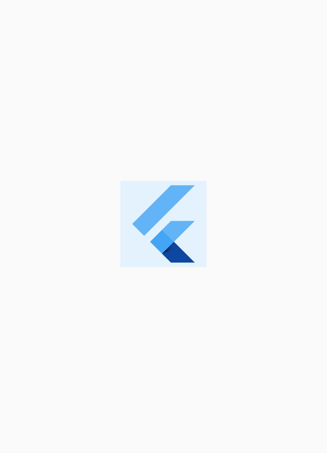
To center a widget we just have to wrap that widget inside the center widget.
Center(
        child: Container(
          height: 120,
          width: 120,
          color: Colors.blue[50],
          child: FlutterLogo(
            size: 60,
          ),
        ),
      ),
Padding
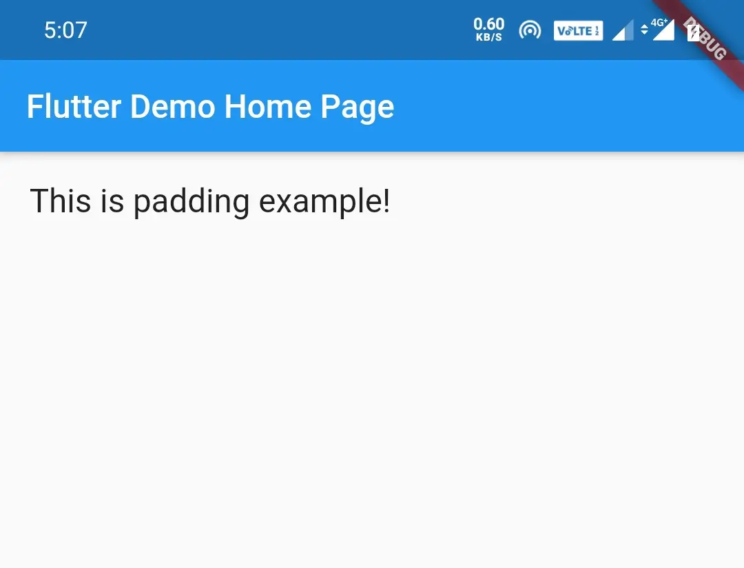
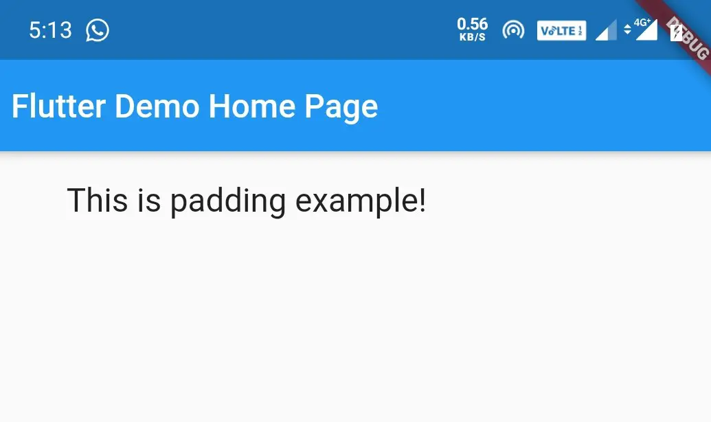
Generally padding is a parameter in Android or IOS, but when it comes to flutter padding itself is a widget. To provide padding to any widget we have to wrap that widget inside the padding widget.
We can specify padding by using EdgeInsets parameter. It takes the values all and only, where all is used to indicate equal amount of padding for all the sides.It takes one value for all sides
Eg: padding.EdgeInsets.all(18).
If we want to define different padding values for different sides we use only. It takes different values for each side
Eg: padding.EdgeInsets.only(left:18, right:18, top:20, bottom:20)
Padding with EdgeInsets.all()
Padding(
      padding: EdgeInsets.all(18.0),
      child: Text("This is padding example!", style: TextStyle(fontSize: 20)),//Text
      )//Padding
Padding with EdgeInsets.only()
Padding(
      padding: EdgeInsets.only(left: 50,right: 50, top: 18, bottom: 18),
      child: Text("This is padding example!", style: TextStyle(fontSize: 20)),
      )
Container
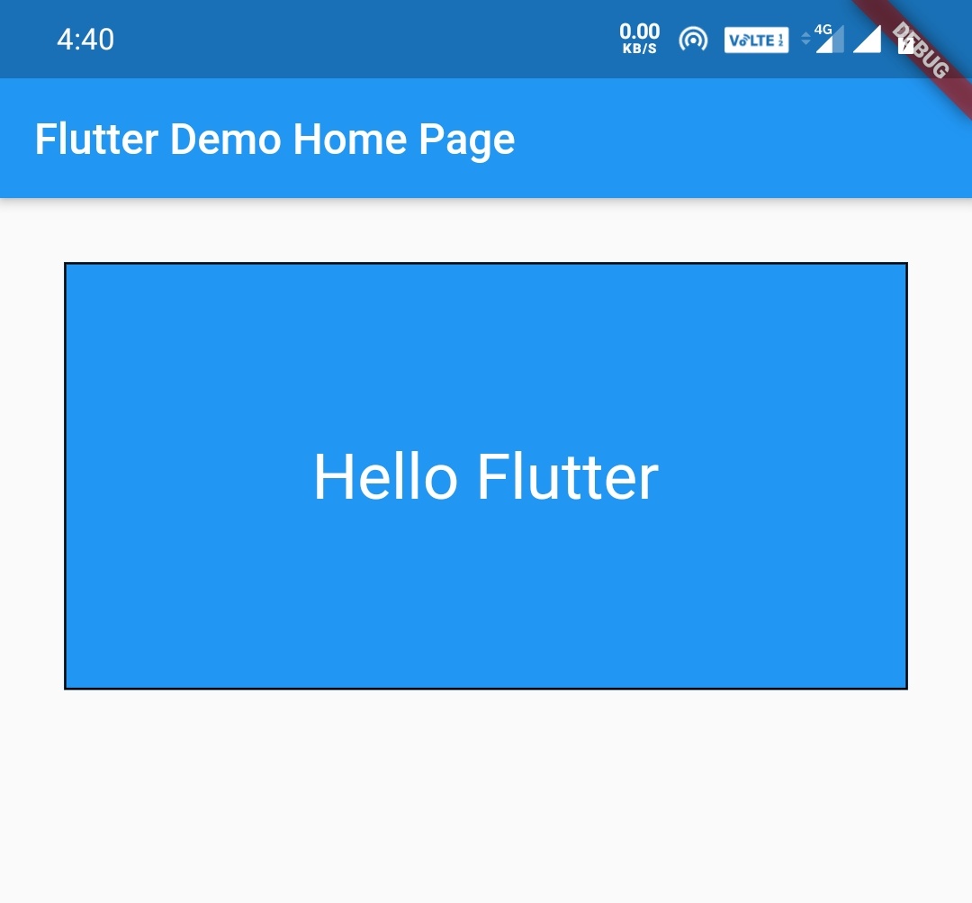
A container is nothing but a widget that holds or contains other widgets. A container widget have many built in properties like Padding, Margin, Alignment and also DecoratedBox for styling with colors and other properties. If there are no children the container try to be as big as possible and container with children try to resize itself to the children.
Refer Flutter container widget in detail to know more about container.
Container(
        margin: EdgeInsets.all(30.0),
        width: double.infinity,
        height: 200,
        decoration: BoxDecoration(
          color: Colors.blue,
          border: Border.all(),
        ),
        child:Align(
          alignment:Alignment.center,
        child:Text("Hello Flutter", style: TextStyle(fontSize: 30,color: Colors.white)),
        ),
      ),
ConstrainedBox
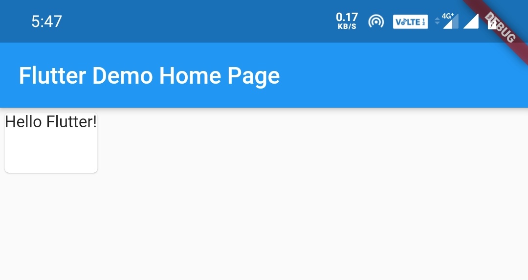
If we want to add additional constraints to the child ConstrainedBox is very useful.For instance if we want a child to have minimum height of 60 pixels, we can use ConstrainedBox. Lets see the syntax for the same below.
const BoxConstraints(minHeight: 60.0).
ConstrainedBox(
        constraints: const BoxConstraints(minHeight: 60),
        child: const Card(child: Text('Hello Flutter!')),
      )
Expande
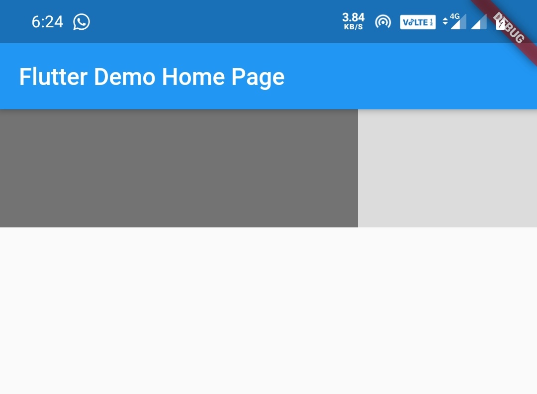
Expanded widget is used to expand the child of a Row, Column or Flex to expand so that it fills the available space along the main axis( main axis is horizontal for a row and vertical for column). If we want to expand multiple children we can use flex factor to divide the available space among the children.
Note:An Expanded widget must be a descendant of a Row, Column or Flex.
The flex parameter is used to provide weights to the widgets. It is very useful for distributing space between multiple items.
Row(
        children: <Widget>[
          Expanded(
            flex: 2,
            child: Container(
              color: Colors.black54,
              height: 100,
            ),
          ),

          Expanded(
            flex: 1,
            child: Container(
              color: Colors.black12,
              height: 100,
            ),
          ),
        ],
      )
Intrinsic Height and Intrinsic Width
Intrinsic Height is useful when unlimited height is available and you would like a child that would otherwise attempt to expand infinitely to instead size itself to a more reasonable height.
The same way Intrinsic Width is useful when unlimited width is available and you would like a child that would otherwise attempt to expand infinitely to instead size itself to a more reasonable width.
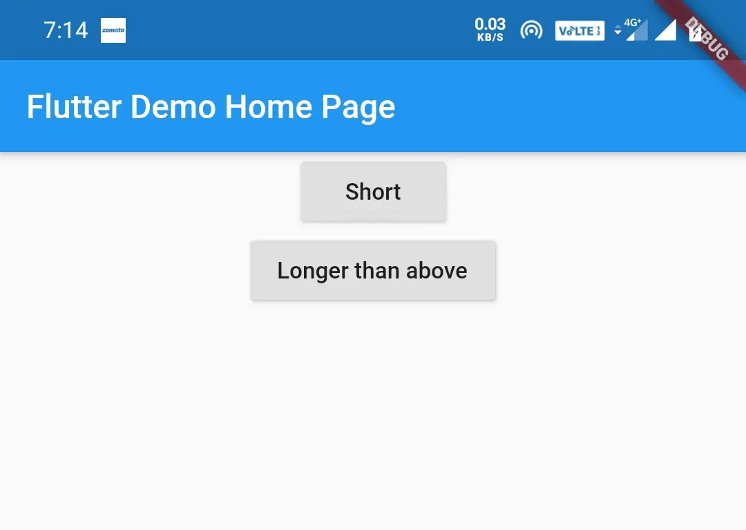
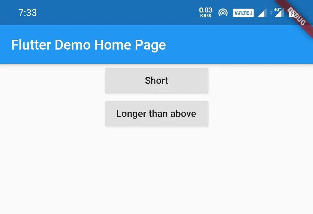
For instance if you have three buttons of different widths and want all of them to be same width then Intrinsic width is useful.
Before using Intrinsic Width
Center(
        child: Column(
          children: <Widget>[
            RaisedButton(
              onPressed: () {},
              child: Text('Short'),
            ),
            RaisedButton(
              onPressed: () {},
              child: Text('Longer than above'),
            ),
          ],
        ),
      )
After using Intrinsic Width
Center(
        child:IntrinsicWidth(
        child: Column(
          crossAxisAlignment: CrossAxisAlignment.stretch,
          children: <Widget>[
            RaisedButton(
              onPressed: () {},
              child: Text('Short'),
            ),
            RaisedButton(
              onPressed: () {},
              child: Text('Longer than above'),
            ),
          ],
        ),
        ),
      ),
Also see how to install flutter on windows with android studio
Flutter Layouts – Multi Child
Following are the most used flutter multi child widgets used in designing layouts.
- Row
- Column
- Stack
- GridView
- Listview
Row
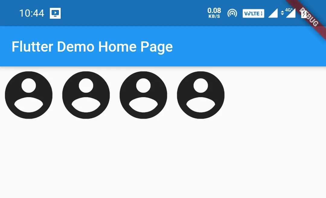
The Row widget is used to align the children in a horizontal array. To cause a child to expand to fill the available horizontal space, wrap the child in an Expanded widget.
Refer Flutter row and column widgets to know about rows and columns and different properties in detail.
Row(
        children:<Widget> [
          Icon(Icons.account_circle,size: 80,),
          Icon(Icons.account_circle,size: 80,),
          Icon(Icons.account_circle,size: 80,),
          Icon(Icons.account_circle,size: 80,),
        ],
      ),
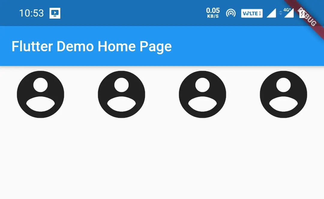
Row after using Expanded widget
Row(
        children:<Widget> [
          Expanded(child: Icon(Icons.account_circle,size: 80,)),
          Expanded(child: Icon(Icons.account_circle,size: 80,)),
          Expanded(child: Icon(Icons.account_circle,size: 80,)),
          Expanded(child: Icon(Icons.account_circle,size: 80,)),
        ],
      ),
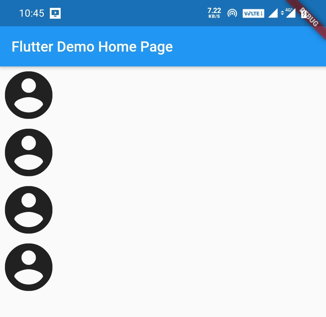
Column
The Column widget is used to align the children in a vertical array. To cause a child to expand to fill the available vertical space, wrap the child in an Expanded widget.
Refer Flutter row and column widgets to know about rows and columns and different properties in detail.
Column(
        children:<Widget> [
          Icon(Icons.account_circle,size: 80,),
          Icon(Icons.account_circle,size: 80,),
          Icon(Icons.account_circle,size: 80,),
          Icon(Icons.account_circle,size: 80,),
        ],
      ),
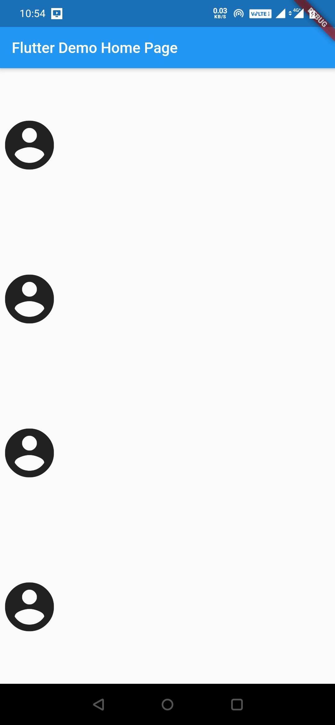
Column after using Expanded widget
Column(
        children:<Widget> [
          Expanded(child: Icon(Icons.account_circle,size: 80,)),
          Expanded(child: Icon(Icons.account_circle,size: 80,)),
          Expanded(child: Icon(Icons.account_circle,size: 80,)),
          Expanded(child: Icon(Icons.account_circle,size: 80,)),
        ],
      ),
Stack
Stack widget is used to overlay widgets on top of each other.It is similar to RelativeLayout in android. Which widgets comes first stays at the bottom and last ones on top.Its like placing a book on top of another book.
Stack(
        children: [
          Icon(Icons.account_balance, size: 60,),
          Icon(Icons.account_balance, size: 60,),
        ],
      ),
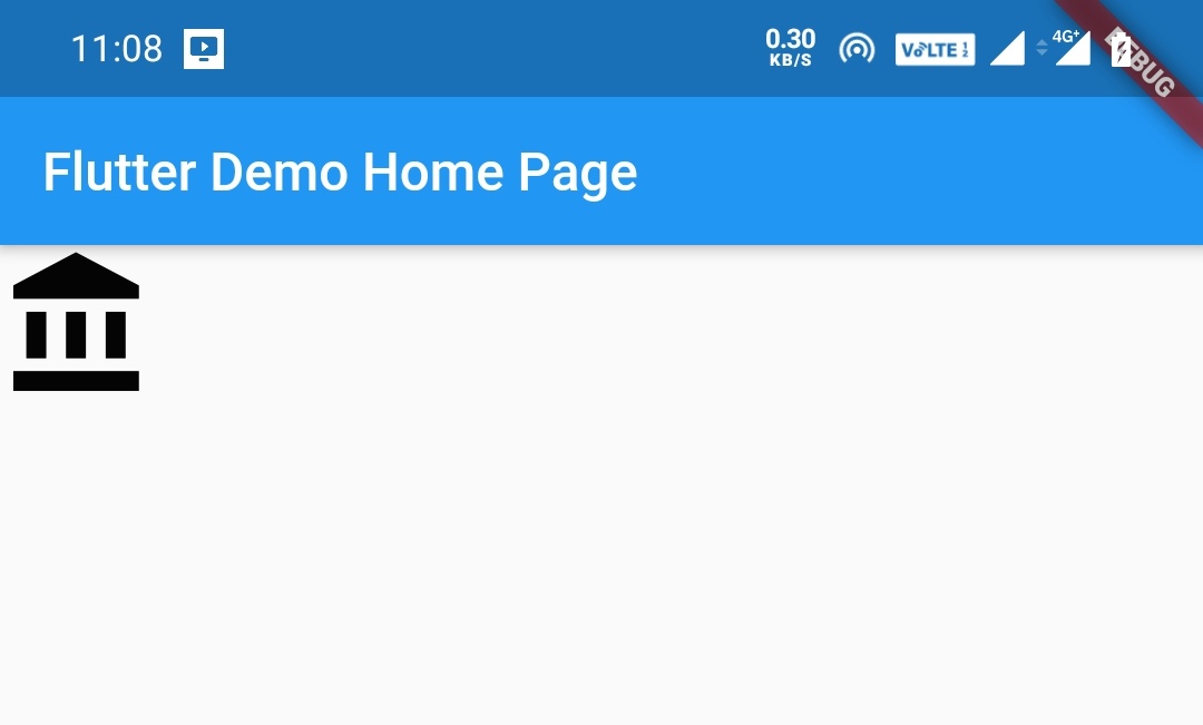
The above output shows only one icon as the other icon is underneath the top one. We cannot see the bottom icon as they are similar and on top of each other. Now lets try with an image and a text so that we can observe the use of stack.
Adding Images to Flutter Project
To add images into flutter project create a directory named assets/images in the root directory of the project Copy the image into the images folder.
Refer how to add images in flutter app for detailed instructions.
Now register your assets/images folder as an assets folder in your pubspec.yaml file under flutter: like
flutter:
  assets:
    - assets/images/
To use the image in the application use below code
Image.asset('assets/images/your_file_name.extension')
Stack example with image and text
Stack(
        alignment: Alignment.bottomRight,
        children: [
          Image.asset('assets/images/flutter_stack.jpg'), //
          Padding(
            padding: EdgeInsets.all(16.0),
            child: Text(
              'The Beach', //
              style: TextStyle(fontSize: 30, color: Colors.black),
            ),
          ),
        ],
      ),
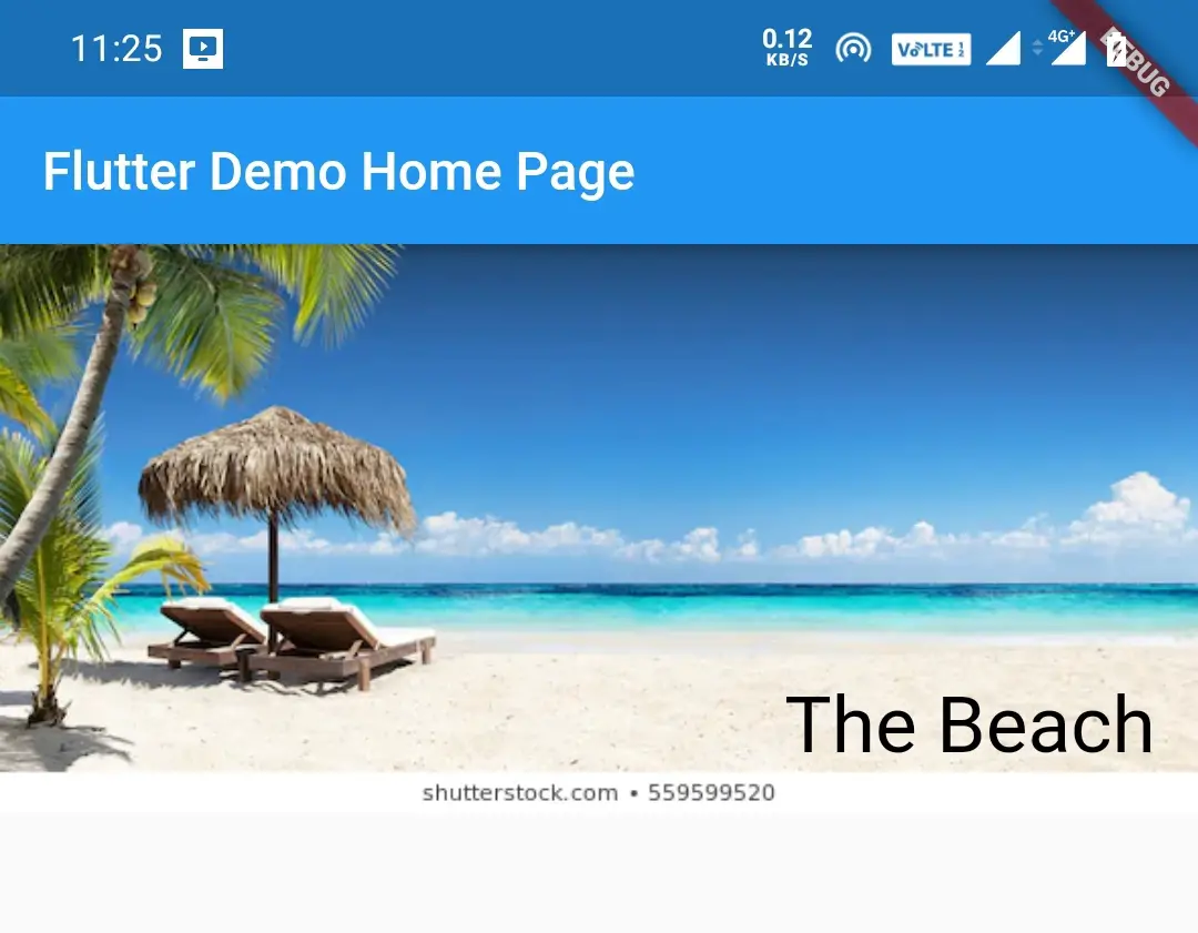
If we observe the above code, the Image is the first child so it goes bottom and the text is the second child, so it stays on top of the image.
That’s all about Flutter Layouts with examples. Lets see other widgets in future posts.
Do like and share if you find this post helpful.Thank you!!
Reference: Flutter Official Documentation


Leave a Reply